|
| Group |
Round |
C/R |
Comment |
Date |
Image |
| 77 |
Apr 20 |
Reply |
Ditto. I export to JPG from LR for images that will be online. |
Apr 9th |
| 77 |
Apr 20 |
Comment |
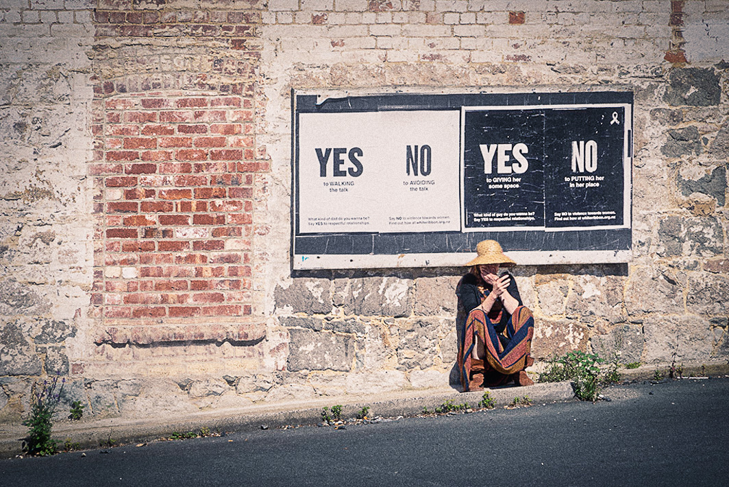
Mary, Your image is open to much interpretation based on who is viewing it. Moving the woman to the position below the sign was a perfect decision. I like the way the colors she's wearing are echoed in the bricks. The sign is fabulous and the fact that she is on her phone makes one feel like she is responding to the sign.
I did make another version of your image. I don't know how to apply the spin which I do find both interesting and disconcerting-perhaps is what you're going for. I did a simple export into Luminar 4 and applied a "UV B&W" look (reduced vignette and increased exposure) under their UV series. Back in LR, I added a little more vignette. This version has a gritty, grainy look for you to consider. |
Apr 8th |
 |
| 77 |
Apr 20 |
Reply |
Georgianne, thanks for putting into words what I can see when I look at jpeg vs. tiff images on my screen. |
Apr 6th |
| 77 |
Apr 20 |
Comment |
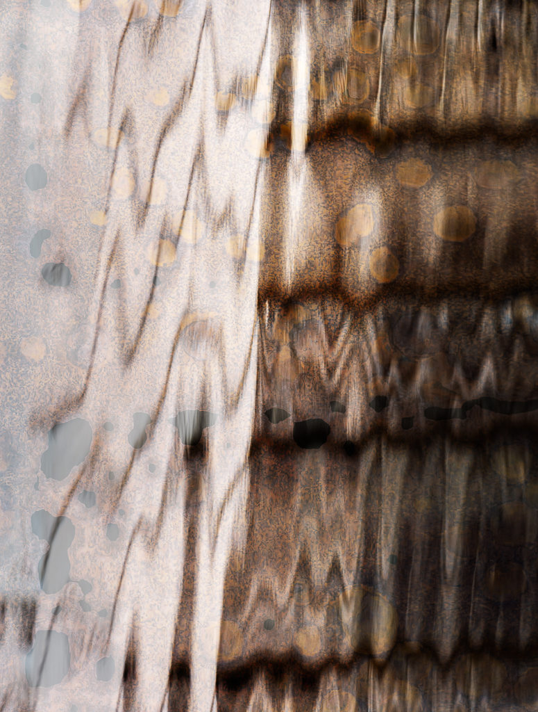
Witta, this is a lovely image with beautiful coloring. I agree that it looks like one of those amazing images of microscopic bacterias or viruses. I think you let just enough of the plant image with its white edge show through. I would have never guessed that the texture came from condensation on a lid. Well done. |
Apr 5th |
| 77 |
Apr 20 |
Comment |
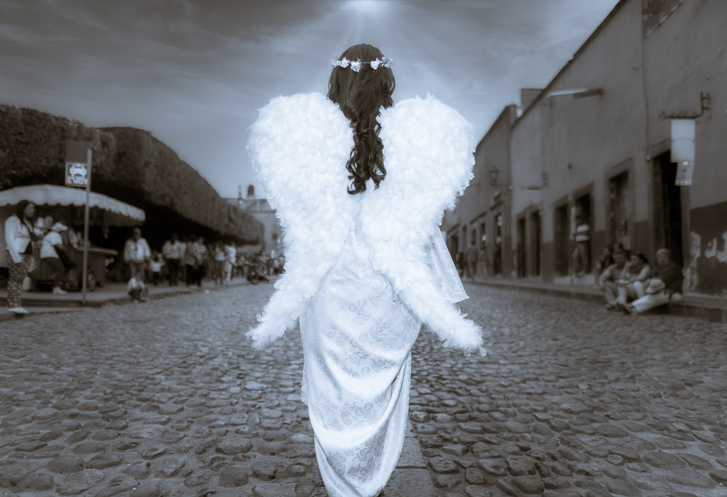
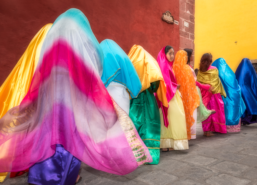
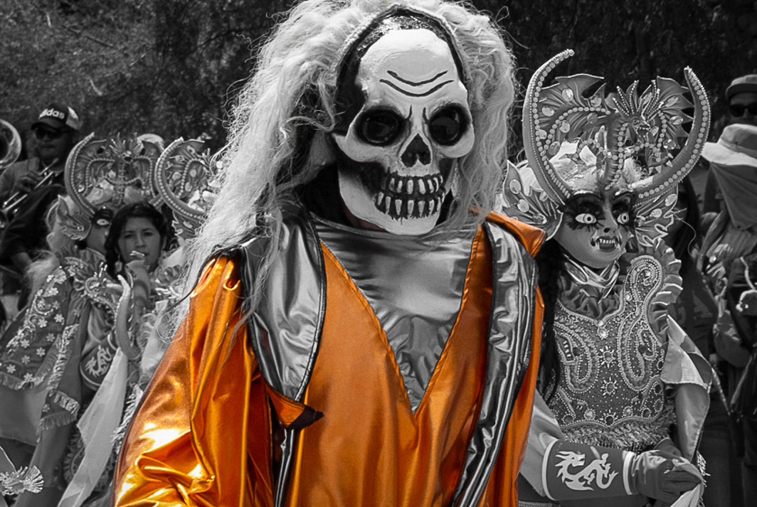
Bunny, What a fortunate meet up with this parade. This is a fabulous, strong image. The B&W conversion with selective color really works here.
Your foreground person's mask and the yellow costume really grab one's attention. To keep the focus on that person, I suggest toning down the highlights in the wig the person on the right is wearing and removing all color from her/his mask as well. You might also try more edge burn on the right and left to further camouflage distractions.
I reworked your image in LR. I left it in color, but reduced saturation in all colors except red, yellow, and orange. Then, I used the brush to remove any residual red, yellow, orange from the rest of the image. There wasn't much. Next I used the brush to darken both the right and left sides including the white wig on the right. Used a medium strength vignette as well.
|
Apr 5th |
 |
| 77 |
Apr 20 |
Comment |
Connie, What a great experience to immerse yourself in such a beautiful space. The chandelier is exquisite but lighted a very difficult subject to photograph. As you did, the only way to capture the extremes in contrast is to resort to HDR. You would have had more latitude if you had done 5 or more exposures perhaps 1.5 to 2 stops apart. The highlights are still too bright in the original "underexposed" image.
I like the detail in the ceiling medallion and wall that you uncovered when you increased the exposure in the shadow areas. As you alluded, I think the image still lacks the contrast needed in the shadow areas, and darkening the ceiling and background some would really highlight the chandelier. I love the starbursts on the lights and agree with Witta that you should clone light into the burned out bulb and starburst all the lights.
Straightening would improve the overall composition but will cut off some of the important parts of the image like the ceiling medallion. You may be able to clone back some of the edges lost by straightening.
|
Apr 5th |
| 77 |
Apr 20 |
Comment |
Georgianne, This looks like a place that you could lose yourself in while searching for hidden treasure on a rainy day. The image is cluttered with those treasures, but the softness of the colors make it feel restful.
I agree with Witta on the following points:
1. removal of the centered fence post, and
2. brightening of door and increasing saturation of begonia and tree.
I am not a fan of over sharpening anything, so don't suggest that. Although this is such a small image, it looks to me like there is ghosting in the upper branches of the tree that hang in front of the roof. Also perhaps in the white flowers in the right foreground.
|
Apr 4th |
| 77 |
Apr 20 |
Reply |
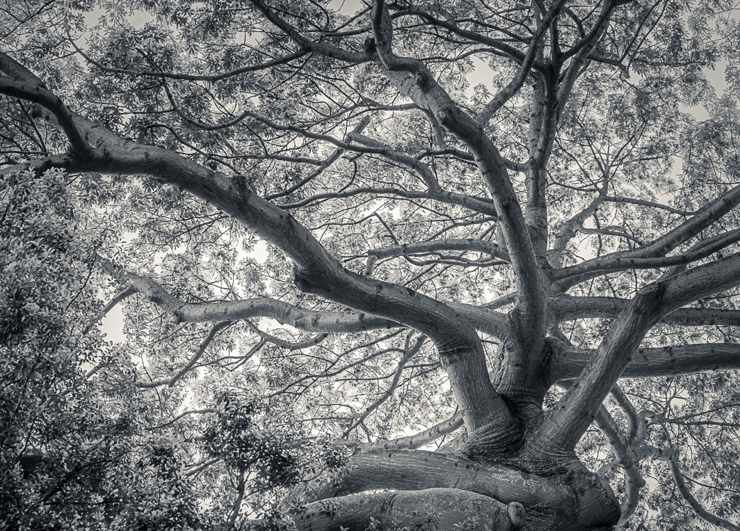
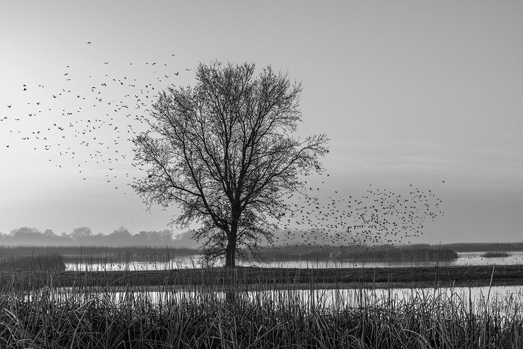
Witta, thanks for the review. I find that with leaves or any other thing that moves, HDR doesn't work so well for me. I also find for my photos that HDR adds noise. So, even though I often bracket, I choose the exposure that gives me what I'm looking for as an end result.
Regarding your comment, "the vignetting has made the sky behind the tree seem a bit too bright (relative to the rest of the sky) to be natural", I see what you mean. I went back and eliminated vignetting, reduced the vignetting in Luminar, and didn't add any vignetting for the final image. Because of the glow effect in Luminar there was indeed a substantial vignette added.
I wanted the leaves to have detail but be light and airy. I have noticed that contrast increases/changes when I convert my tiff image to a jpeg file. When I look at the tiff image, there isn't such an unnatural brightness. The only way for me to know if it isn't right is to print.
Thanks for the tips. I'll summarize next time.
|
Apr 4th |
 |
5 comments - 3 replies for Group 77
|
5 comments - 3 replies Total
|