|
| Group |
Round |
C/R |
Comment |
Date |
Image |
| 77 |
Mar 20 |
Reply |
Georgianne, I started with the original. I did add some texture & clarity to the sand in the foreground but only minimal sharpening to the rest of the image as I masked out the areas without texture. The images are so small that it's hard to see the fine detail. |
Mar 13th |
| 77 |
Mar 20 |
Reply |
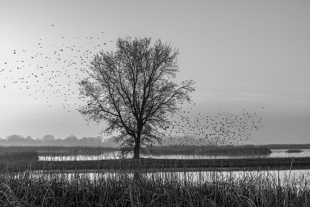
Witta, I am normally more of a minimalist when it comes to photographing images and also in post processing. This busy image is a departure in my style. It is truly busy and that is why I call it The Furies. I will continue working on this one and several others that are in my mind. Thanks for taking a look and thanks for the suggestions. |
Mar 12th |
| 77 |
Mar 20 |
Comment |
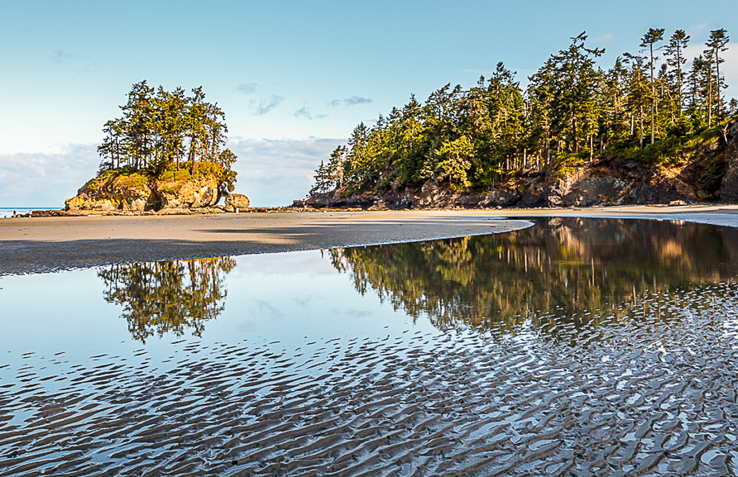
Witta, I can see why this is a favorite spot. This low tide image is truly calm. Since you enjoy noticing the different sand/water patterns that change with the tide, I cropped and altered the image a little to give more weight to those patterns. All changes were made in LR: Cropped sky and left side to provide a little more balance to the image and more emphasis to the island; changed WB based on selecting the white of the almost hidden cloud on the right side (+17 temp/-1 tint) which warmed the landscape features but left the sky blue instead of violet; I went to HSL and increased the luminance of the blue sky +7 Aqua/+21 Blue; in the basic module Exp -0.44, contrast +6, highlights -63, shadows +25, whites +8, blacks -19, vibrance +11, sat +3; light sharpening 25/1.0/25 with masking at 73. Using a graduated filter diagonally on the sand/water textures I emphasized the texture with texture 14, clarity 14 and gave that area more weight by reducing exposure -0.21. I also used the brush set at -16 shadows to slightly darken the reflection of the land formation on the right. |
Mar 12th |
 |
| 77 |
Mar 20 |
Comment |
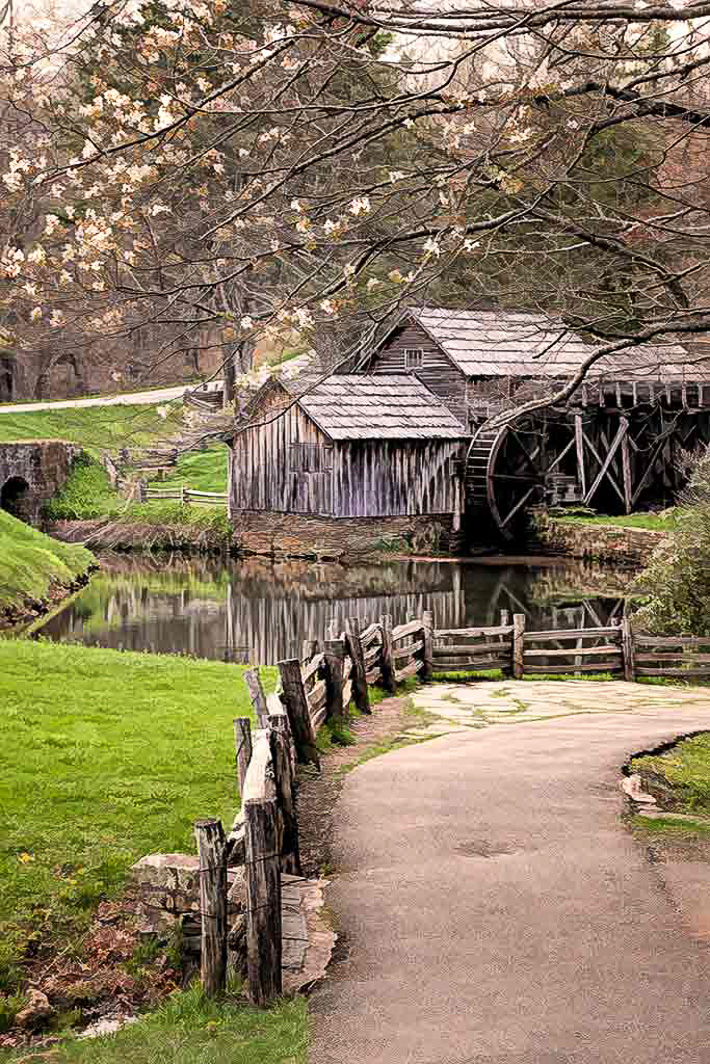
Connie, This is a lovely, pleasing composition with the curving pathway leading the viewer's eye to the mill and its beautiful reflection. When you warmed up the image, the spring blossoms on the tree became more muted. To my eye I'd like for them to stand out a little more. In LR with a brush I added +40 highlights and +25 white to brighten a few of the blossoms. |
Mar 6th |
 |
| 77 |
Mar 20 |
Comment |
Georgianne, I don't use many textures and I've not heard of the ones you used here, but the way you used them is spectacular. The golden color scheme you chose blended the three varieties of flowers together into a homogeneous composition. The peeling background texture and the etched leaves further complement the image. I, too, am inspired to work on this technique. |
Mar 6th |
| 77 |
Mar 20 |
Comment |
Bunny, I like your composition and the contrast between an old cast iron kettle and fresh, colorful flowers. I like the way the pot is just light enough to separate from the background. And, the coloring provided by the iridescent sheet is a nice touch.
I would like to see the flowers slightly less veiled so they pop a little more. Otherwise a lovely still life. |
Mar 4th |
| 77 |
Mar 20 |
Reply |
Guy, thank you for the encouragement. You are right about the hours of fun and frustration. |
Mar 4th |
| 77 |
Mar 20 |
Reply |
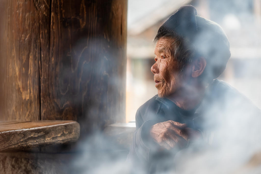
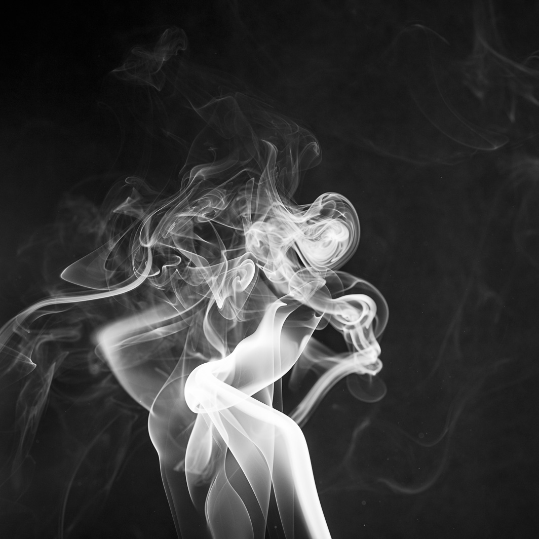
Georgianne, thank you for taking a look at this image. It is nice to get a second, third, fourth opinion. It's one of those projects that consumed my imagination for many hours both at the computer and in my mind.
Because I didn't have a clean plume of smoke rising up I didn't think I would have anything at all. Upon review, I thought maybe by compositing several, I could create a story. It's a project that I'll keep returning to until it works.
Thanks for the input. |
Mar 4th |
| 77 |
Mar 20 |
Reply |
Bunny, to create the smoke a small incense cone was put into an ashtray and lit. Sometimes it had to be relit. The ashtray was on a table covered with a black cloth. A black cardboard divider was set up behind. The person who created this vignette directed that my camera settings should be Manual/ISO 100 f/8 and 1/125 on a tripod with cable release. My histogram seemed quite dark so I opened up to f/6.7. The vignette was set up outside due to the smoke issue. There were still some air currents that swirled the smoke. I recommend also having black backgrounds on each side as I also noticed that the outer edges of the images show light creep.
I enjoyed finding figures in some of my smoke images and trying to composite them into a semi-abstract composition that would lead the viewer to discover their own shapes and story.
I also like image one as a solo image. |
Mar 4th |
 |
4 comments - 5 replies for Group 77
|
4 comments - 5 replies Total
|