|
| Group |
Round |
C/R |
Comment |
Date |
Image |
| 96 |
Nov 21 |
Comment |
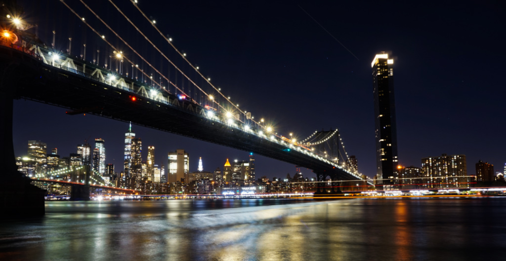
Gorgeous shot and great editing, Bob. I love the deep, lush, jewel-toned colors of glass sculpture, the building, and the night sky. Your photo is a prime example of why I love doing night photography in cities/places that are luminated. I have seen some of Chihuly's work on display at the Corning Museum of Glass. So, it's very cool to see an even larger work of his illuminated and on display. |
Nov 22nd |
| 96 |
Nov 21 |
Comment |
Great photos and editing work, Cheryl. I think your editing technique is a good way to work around some of the difficulties of night sky photography (which is something I miss doing in upstate NY and SW Colorado, but the NYC light pollution makes it practically impossible to do well). I like how your 1st re-edit (based on Robert's feedback) brings out more of the smaller, fainter stars. I also like how your 2nd re-edit (based on Bob's feedback) is more contrasted, which highlights the different colors of the stars. |
Nov 22nd |
| 96 |
Nov 21 |
Comment |
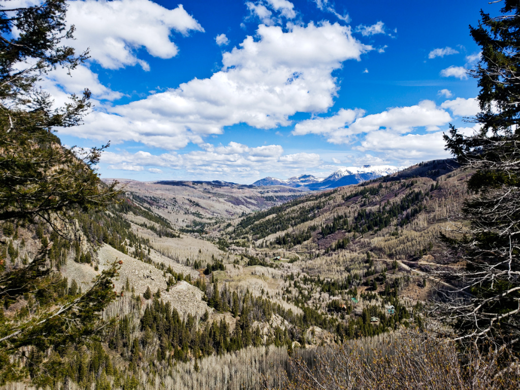
Amazing photo and edit Dan. I love how the different elements in the scene create great depth and feelings for foreboding (e.g. the dark, rolling clouds), secrets (e.g. the barns), happy calmness (e.g. the field of yellow flowers), and lightness (e.g. the lightest layer of clouds). |
Nov 22nd |
| 96 |
Nov 21 |
Comment |
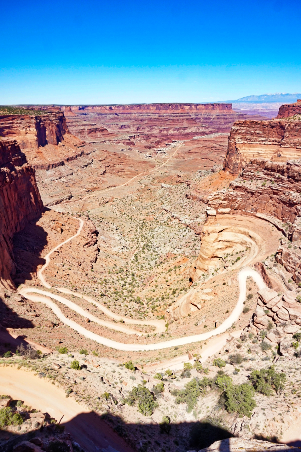
Great photo composition Robert. I love how your canyon series shows off so many of the simple yet striking canyon spaces. Much like a magic eye poster, after a bit of gazing, I see an animal (like a fox, coyote, hyena etc.) in the image, though it looks like it's turning its neck/head at an awkward angle. But, that is a cool effect. I attached the photo with the outline added as a reference.
The only small thing that caught my eye was in the 2nd layer of canyon. It's the small section of ground that is visible. The texture of the ground is different from the canyon walls, and the bottom of the canyon wall is slightly angled. As a reference, it is the top of the fox's nose in the outline
Interestingly, when I rotate the image a bit counterclockwise so that the ground is level, I then notice the heart shape more.
It made for fun rorschach test-type viewing experience, thank you. |
Nov 22nd |
 |
| 96 |
Nov 21 |
Comment |
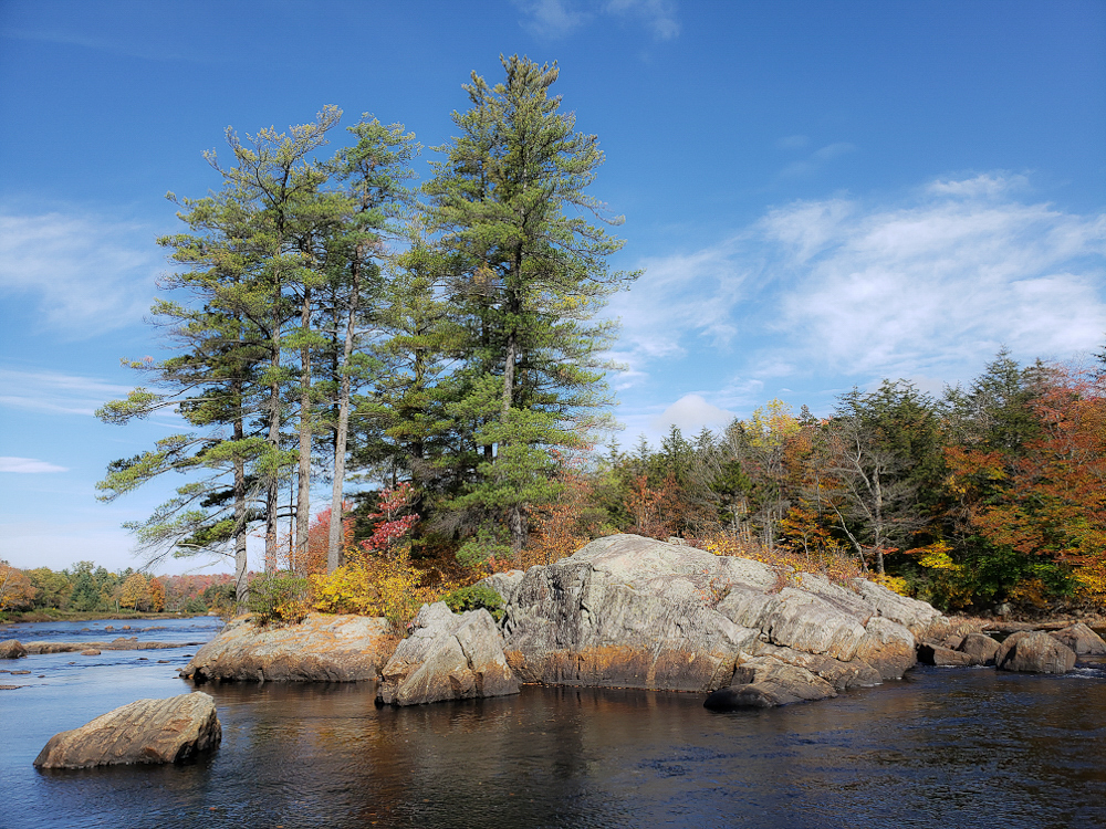
Great shot and very interesting edit Haru. I especially like the edited versions based off Cheryl and Dan's feedback. Your image reminds me of the antique/vintage hand-painted photographs and postcards. The colors you selected a muted and delicate, and really give the composition depth and three-dimensionality. Thinking about the scale of the tree compared to a boat or human is pretty amazing too. |
Nov 22nd |
| 96 |
Nov 21 |
Reply |
Thank you Dan. I also usually shy away from bright mid-day light as it can hit or miss, depending on the scene. Plus, I am usually working during the day on weekdays, so it's only on a weekend days that I get to see mid-day light "in real life". Here's the image edited with the Clarity decreased. It makes the pine tree a bit fluffier looking, but decreases the details of the rock. So, I will try to play with it a bit to find a happy medium. |
Nov 22nd |
 |
| 96 |
Nov 21 |
Reply |
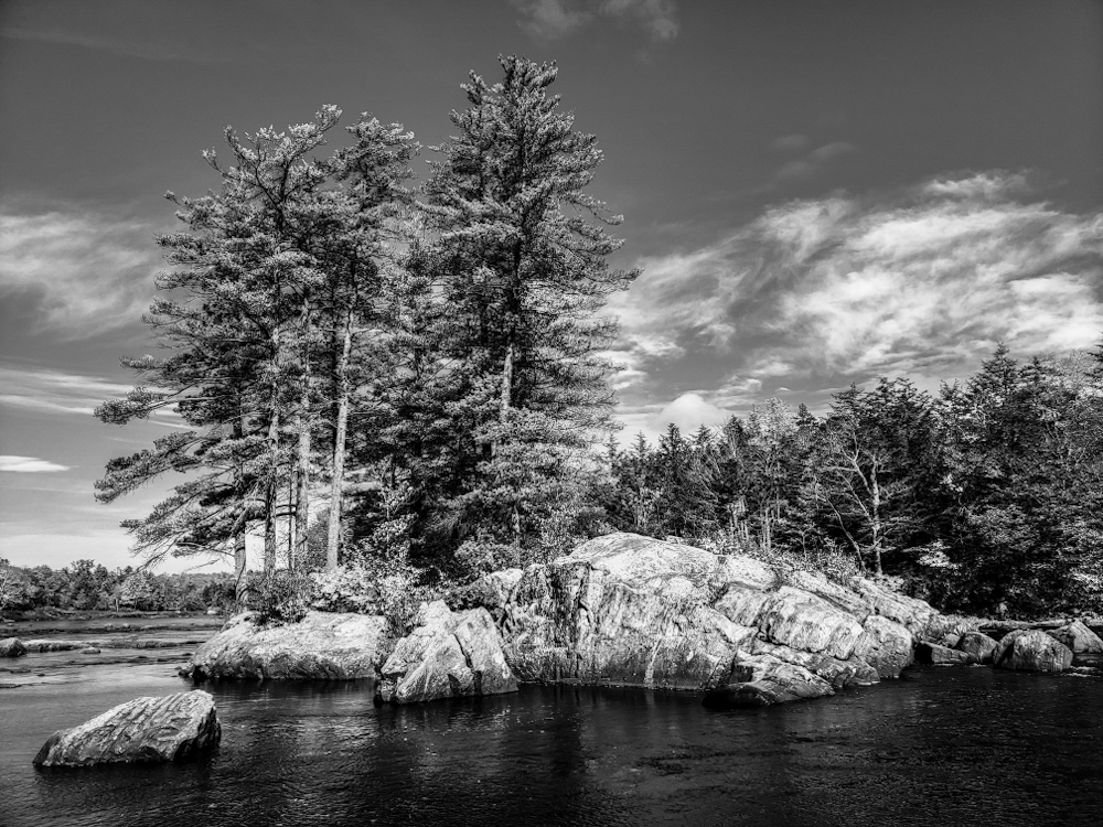
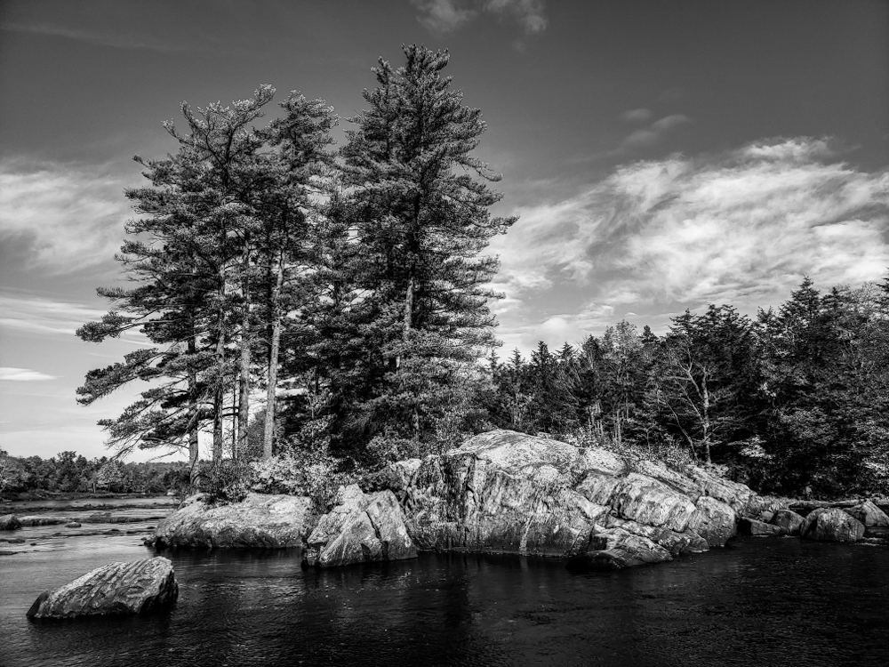
Thank you Bob. I agree that the scene looks nice in B&W, but does lack the colors that make autumn so recognizable and lovely. I like how your edit deepens all of the colors a bit more and brings out the fullness of the pine tree on top of the rock. |
Nov 22nd |
| 96 |
Nov 21 |
Reply |
Thank you Cheryl. It is hard to tell with trees, since they were growing on top of the rock and may have grown in angled for more support and/or to reach the sunlight more directly. I like how your edit brings out some of the darker rock texture and colors. |
Nov 22nd |
| 96 |
Nov 21 |
Reply |
Here's an alternate B&W version. |
Nov 22nd |
 |
| 96 |
Nov 21 |
Reply |
Thank you Robert. The scene reminded me a bit of a Japanese garden (æ�”�æ�“¬å��å�“’, nihon teien) with the stream, rock placement and collection of trees. I edited it as a B&W image and had trouble deciding which of the many B&W presets looks best. So, I am curious which one looks better. I attached the 1st version. |
Nov 22nd |
 |
| 96 |
Nov 21 |
Reply |
Thank you Haru. I agree, Autumn usually brings to mind more red/orange/yellow leaf colors (and the pine trees stay eternally green). I sometimes struggle with naming my images, so I'd be curious to know what you or others might title it. |
Nov 22nd |
5 comments - 6 replies for Group 96
|
5 comments - 6 replies Total
|