|
| Group |
Round |
C/R |
Comment |
Date |
Image |
| 96 |
Oct 21 |
Reply |
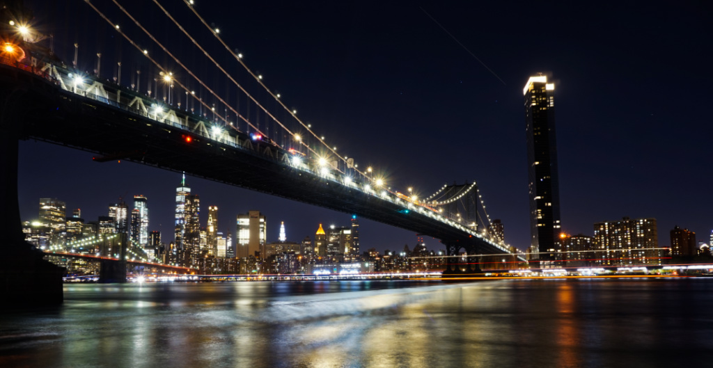
I can definitely understand and relate to that experience. Sometimes, we have to work within the limits of what the space allows safely. I often want to take more shots of the bridges at night while riding the MTA ferries, but I also don't want to risk having my tripod and camera fall over every time the ferry speeds up and gets very bumpy criss-crossing the waves (which is a very frequent occurrence). |
Oct 21st |
| 96 |
Oct 21 |
Comment |
I am sorry to hear that you're experiencing chronic pain (which can be debilitating as well as very distracting in terms of coping with day-to-day life). I hope you recover and/or are able to find some effective pain management strategies that work for you.
I think Haru's questions (which have also been similarly posed by Dan and Robert in other comments in the past) are helpful prompts in terms of digging deeper in the "why" behind your (and anyone's) image(s).
I find that macro photography and flowers can be an interesting subject, though I don't take as many here in NYC due to the lack of flora. I find myself drawn to the colors, clearly defined edges (of petals, pistols etc.), and the often symmetrical, geometric shape of the flower and petals (despite it being an organic object) - so, that's what draws my eye to them.
Like any composition and what Haru's questions pose, it is useful to reflect on what draws our eyes to a certain scene/subject. I like how Robert's edits sharpened up the details and toned down the strong red. But, I think that your original edit of the slightly less focused, more red flower might also be unconsciously expressing your/its own meaning/feelings, (which is the purpose of art therapy, be it photography or another medium). Thank you for sharing some of the context behind the image. I hope that you feel better and more comfortable again soon. |
Oct 21st |
| 96 |
Oct 21 |
Comment |
This is an interesting composition. The intentional positioning of the statue (so it's looking towards the city) really gives the impression that the Indigenous scout is actually surveying the cityscape from a safe distance. I agree with your preference to keep skies as they appear (and not adding in clouds that weren't there at the time). Like Rober, I think that this image could work well in B&W, though it would definitely might change the feeling of the scene/image. Great job composing the shot, given the limited space you had to take it. |
Oct 21st |
| 96 |
Oct 21 |
Comment |
As someone who also appreciates crisp details in my photos, good for you for taking what you learned and trying out a new artistic style. The vertical and horizontal lines in your final image feel a bit heavy and jagged (even though they are smudged and not sharp per se). I agree with Robert's sentiments, and like his first edit of the tunnel of trees leading to a more illuminated background. I also like Bob W.'s edit, which reminds me of a more "traditional" impressionistic style. I haven't used Photoshop for about 20 years, so kudos to you for using some of the different features to try taking things in a new direction. |
Oct 21st |
| 96 |
Oct 21 |
Comment |
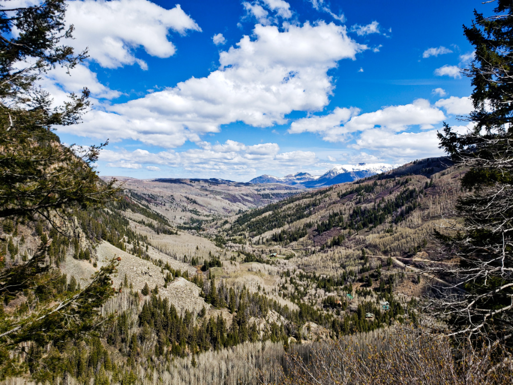
Another amazing photo, Dan. I think you really succeeded in capturing all the elements as well as making the rocks in the foreground look realistic and 3-D (while also keeping the rest of the image sharp). The colors of the sky are lush and the water mirrors the mountains and sky perfectly. Thank you for sharing your process for creating the composite image. Great edit and lovely photo! |
Oct 20th |
| 96 |
Oct 21 |
Comment |
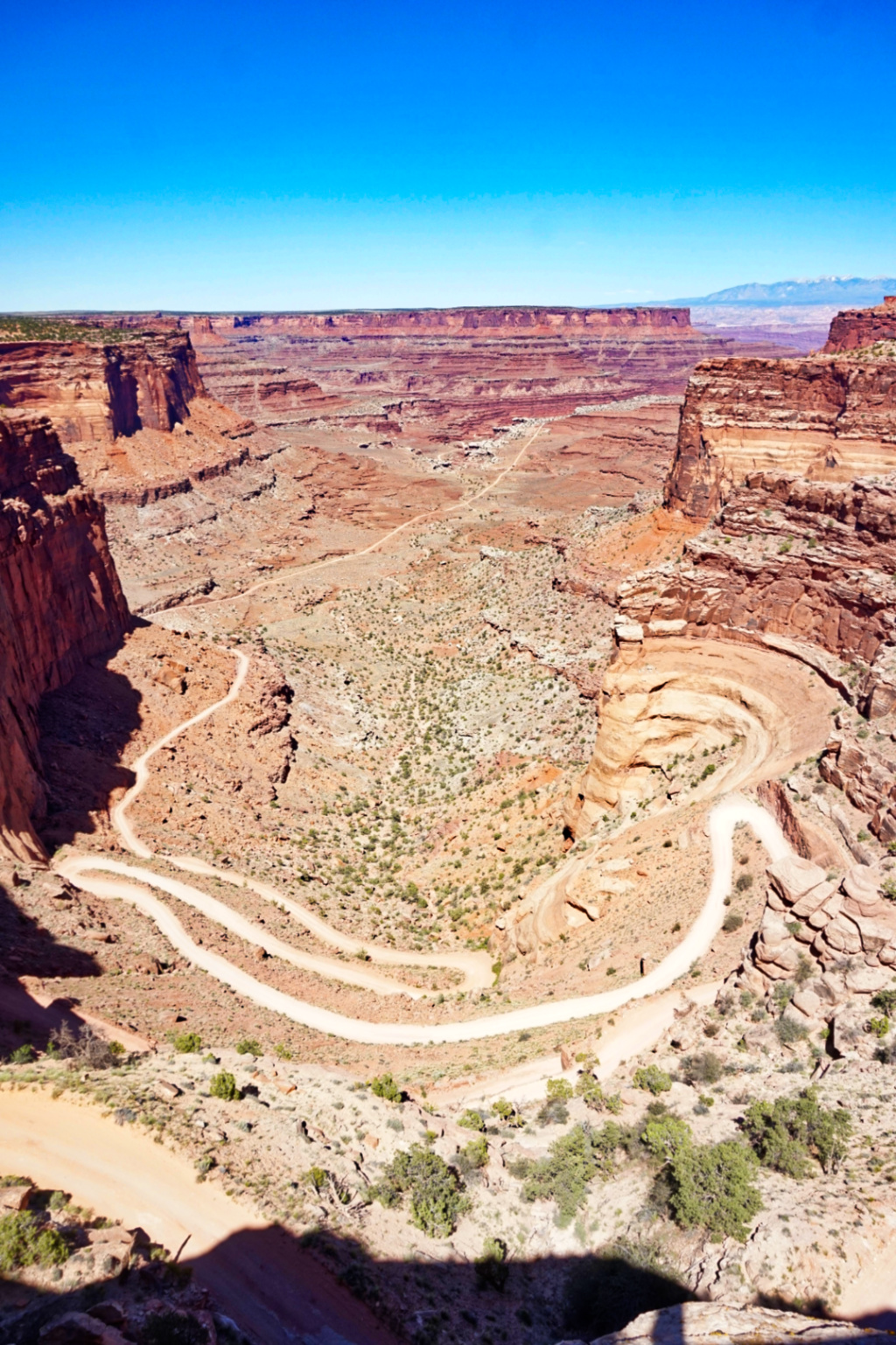
Wow, beautiful shot Robert. I will have to look on a map where this is, as your image is so striking, it makes me want to view this topography in person. I love how the slight tinge of color from the sunrise really illuminates the one side and top of the mesa. You captured the details of the rocks, crags, and valleys perfectly clearly. Those details contrast and are nicely balanced with the smooth sky and its ombre color. The valleys and rocks also create a slight zig-zag pattern. |
Oct 20th |
| 96 |
Oct 21 |
Comment |
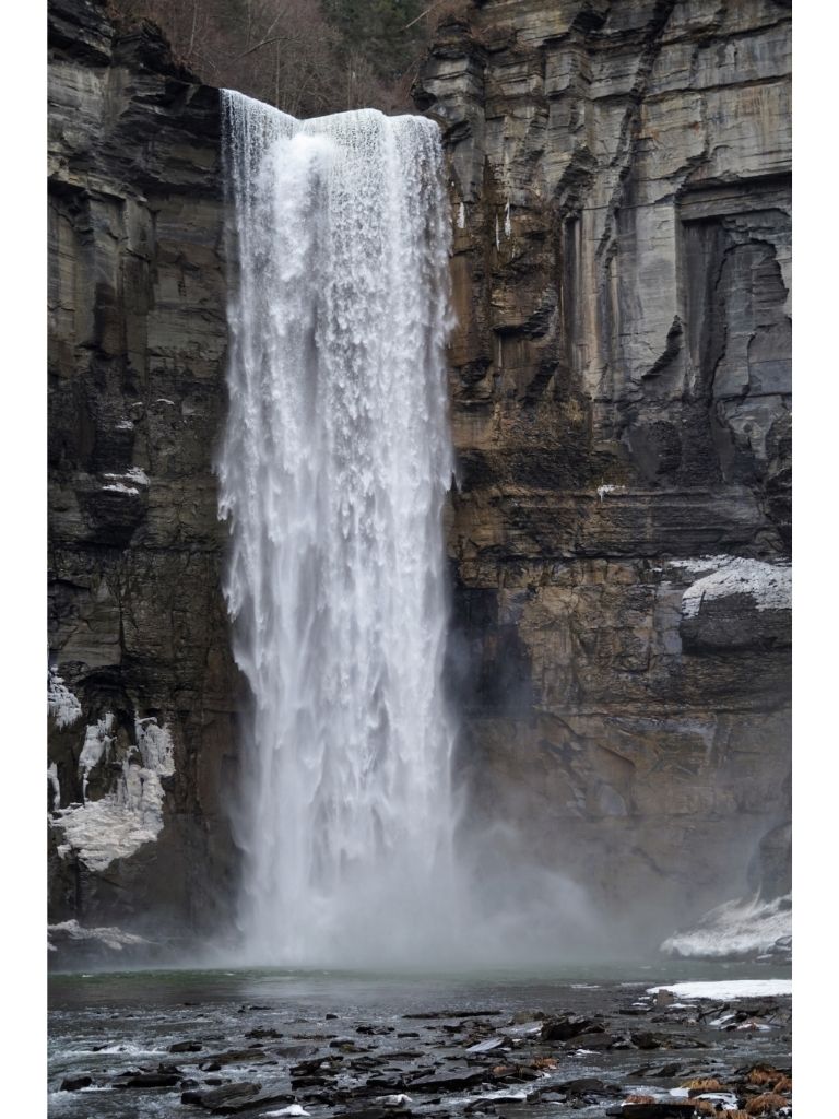
Beautiful image and great edit Haru. I think you the scene nicely balances all the elements and layers - none of them dominate the scene and they work together to create a strong composition. You captured the silkiness of the water very well. To me, the delicate fog/mist makes sense with a grey/lighter colored sky. I agree with Bob M. - the first elements that captured my eye were the mossy rocks, as well as the curtain of water and the different colored layers of green foliage. Your image feels very serene and still. It definitely took my mind totally away from my morning commute on the subway as I looked at it and thought about my feedback. |
Oct 20th |
| 96 |
Oct 21 |
Reply |
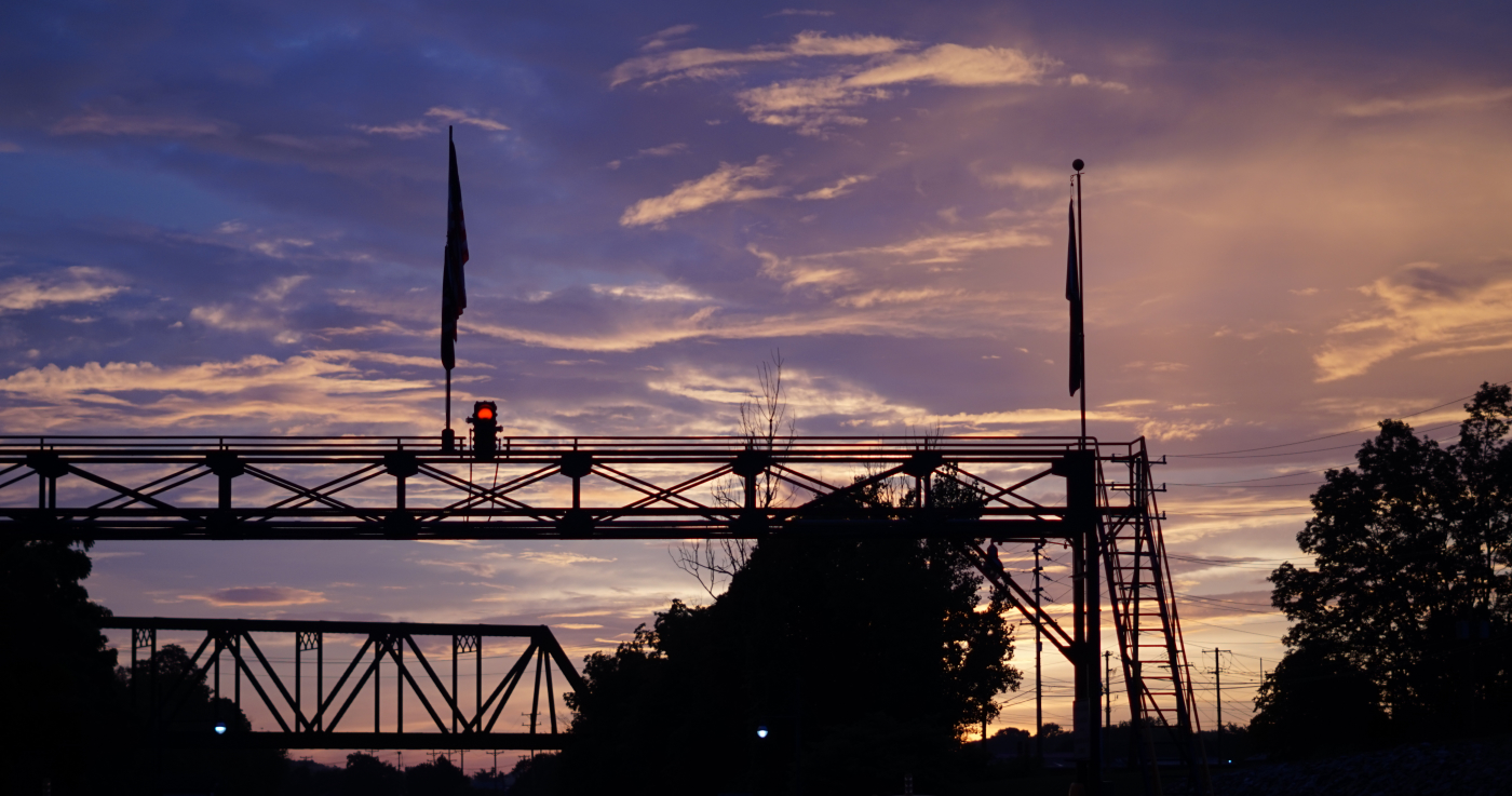
I don't usually shoot with RAW (due to the file size), though that seems like something to start doing moving forward. Using the original, unedited version, here's a vertical crop around the red light, based on your suggestion. I'd be curious to hear how the cropping and original color work compared to the above image (i.e. edited and not cropped). |
Oct 20th |
 |
| 96 |
Oct 21 |
Reply |
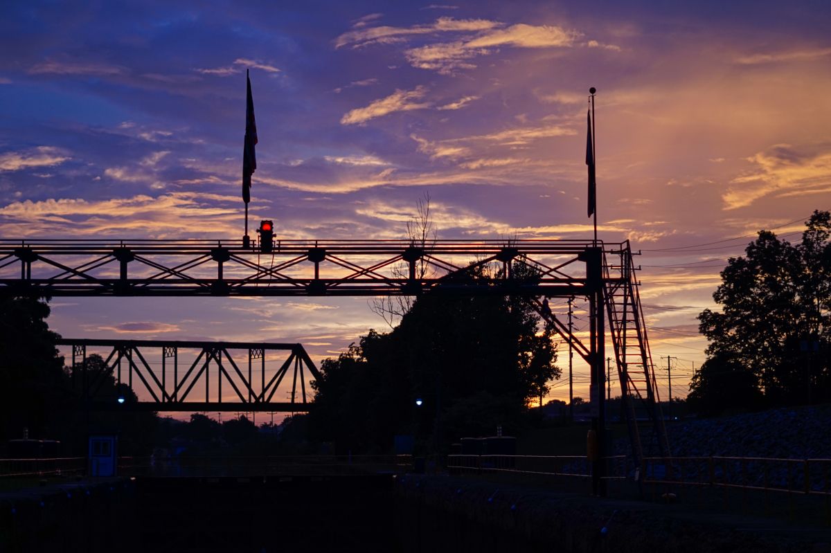
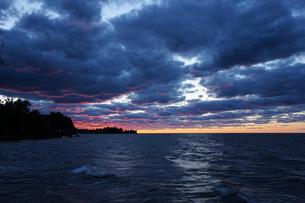
Thank you Haru. I agree that some things (e.g. the silhouette format) work well. The sky in Finger Lakes produces some very spectacularly colored sunset skies, almost to the point of being unnaturally colored. So, the image is a work in progress to try to find balance. |
Oct 20th |
| 96 |
Oct 21 |
Reply |
Thank you Bob. I like how your edit pulled out more of the details of the canal and lock itself, which matches more to the title of the image itself. |
Oct 20th |
| 96 |
Oct 21 |
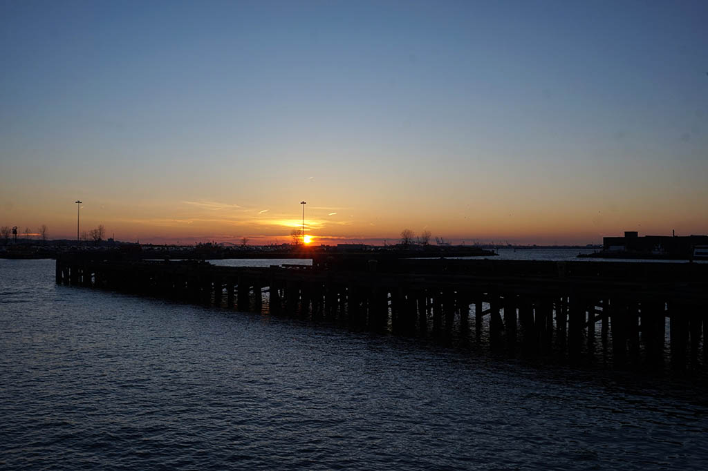
Reply |
Thank you Robert. It was actually fortuitous that I was there at and able to capture not only the sunset, but the red light turned on too. Here is the original unedited image. I will play with the image more and see if I can pull out more of the details in the bottom. |
Oct 20th |
 |
6 comments - 5 replies for Group 96
|
6 comments - 5 replies Total
|