|
| Group |
Round |
C/R |
Comment |
Date |
Image |
| 96 |
Jun 21 |
Reply |
That is really impressive. Kudos Dan! |
Jun 23rd |
| 96 |
Jun 21 |
Comment |
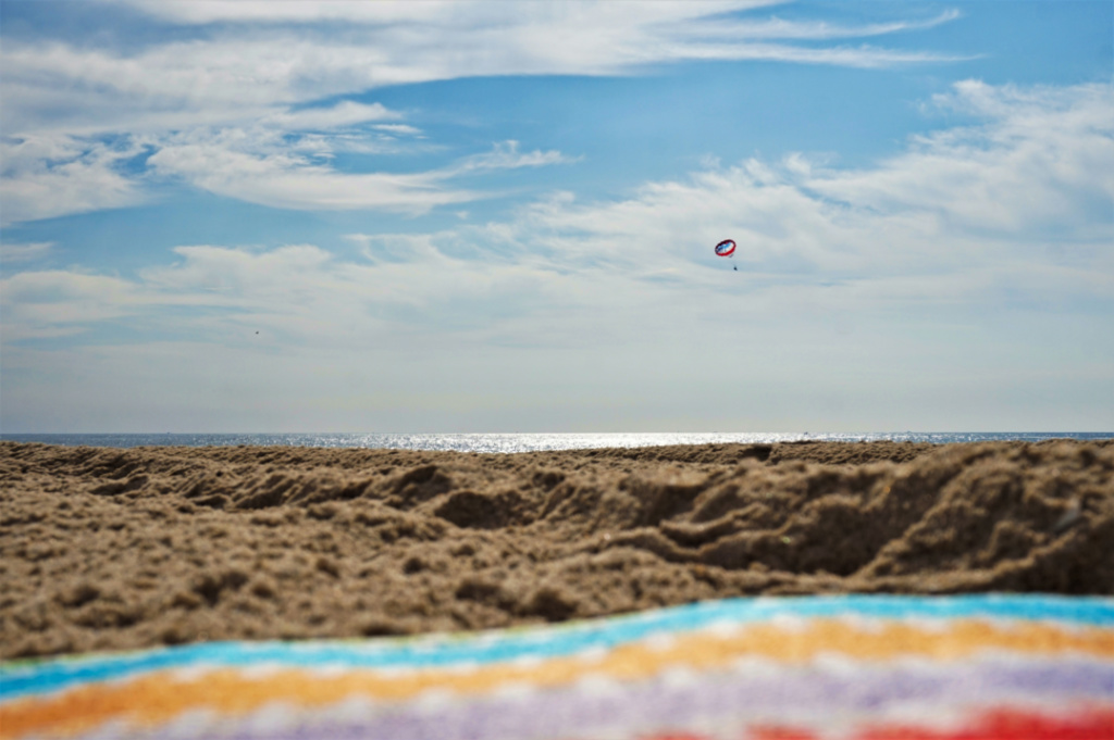
Very creative composition, Bob. I like how the swirl in the sand kind of mimics the swirl of clouds in the sky. You captured the details of the rocks and sand really clearly. The subtle triangle shapes/elements plus the choice of a warm hue is unusual and catches my eye - it makes the beach seem more active than passive, if that makes sense. Also, Dan asks great questions. Great image and editing! |
Jun 22nd |
| 96 |
Jun 21 |
Comment |
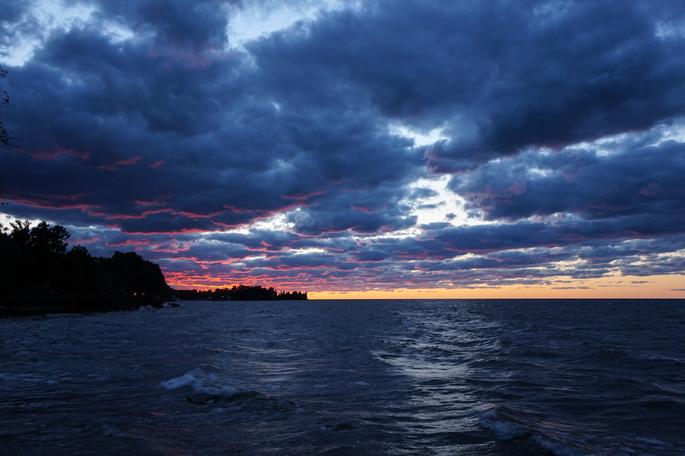
Beautiful shot Cheryl. I like that your image captures the softness of the clouds, the sharper rock edges, the reflections in the wet sand, and the bright sunset. The array of colors is quite soothing. Kudos for all of your hard work at removing people from your shot - I would have never guessed there were ever people there to begin with. |
Jun 22nd |
| 96 |
Jun 21 |
Comment |
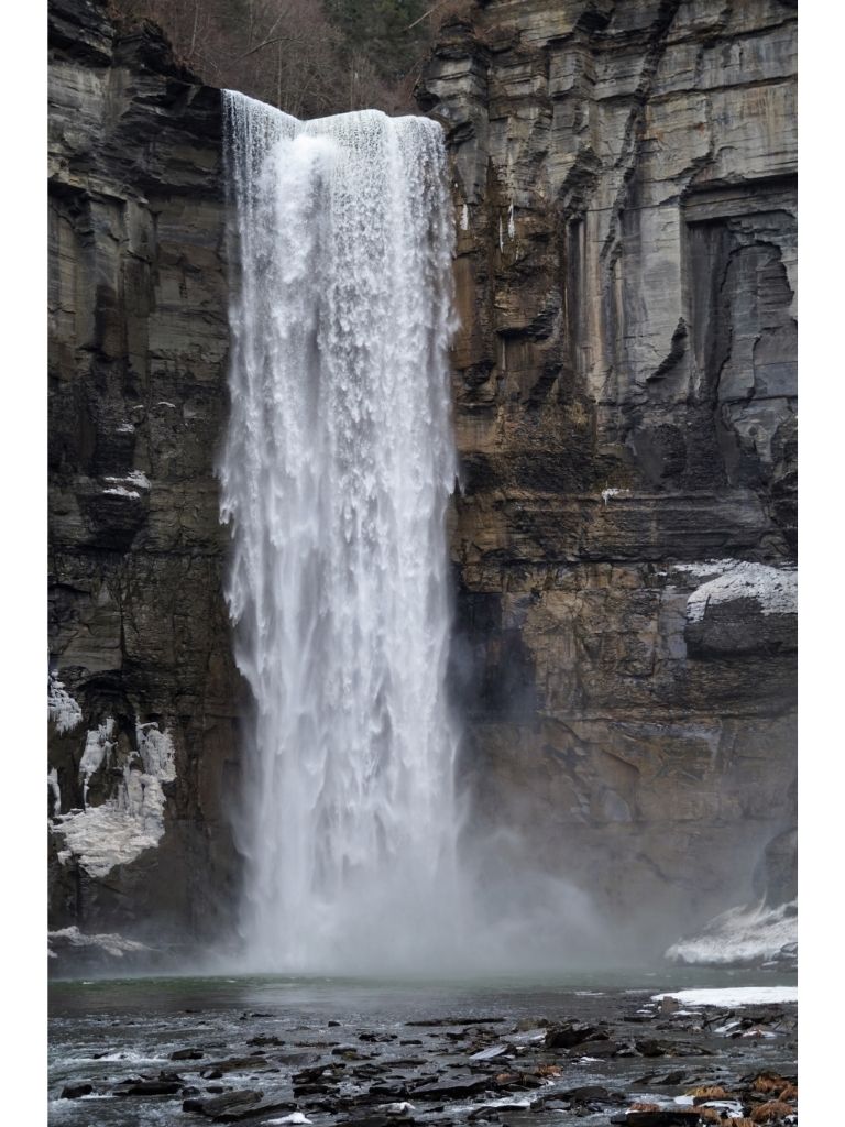
Beautiful shot and edit Dan. The scene looks surreal with the combination of the cracked land, the colorful sky, and the rotted poles/tree stumps. You edited it well, so the two images blend into a great composite image. Great job! |
Jun 22nd |
| 96 |
Jun 21 |
Comment |
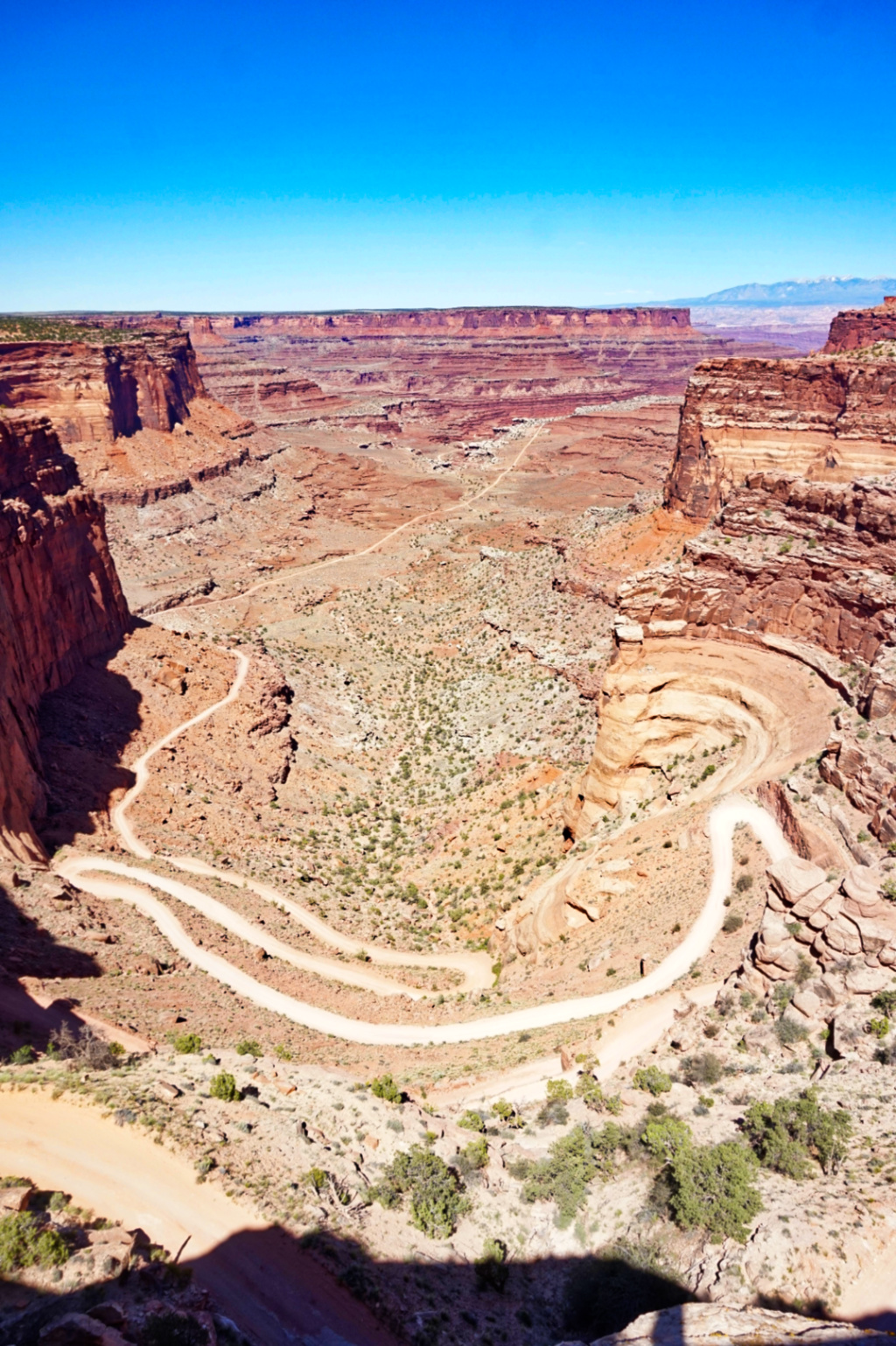
Beautiful image Robert, and kudos for your hard work in getting it! I love the different elements, textures, and angles of the canyon. The range of colors on the rock walls really has a nice palette of rich tones. I agree that in this case, the lens flare didn't add as much to the image. I played around with your image in Luminar 4, but I wasn't quite able to get the lens flare to be more defined. So, perhaps adjusting the landscape enhancer and/or the details enhancer might help you to achieve your desired image? I also find that lens flare can look good with some images, but can be hard to edit and work with oftentimes. |
Jun 21st |
| 96 |
Jun 21 |
Comment |
Tim, I love how you captured the ripples in the water and the birds flying over the water in such clear detail. The coloring of the birds (black outlines and white body) really helps to differentiate each bird from one another. The sharply outlines of the birds in flight above the blurred reflections of the birds plays with the eye a bit - they are in motion yet captured as perfectly still. The yellow-gold hue of the background and water reflections provide a nice contrast to the birds. Great image! |
Jun 21st |
| 96 |
Jun 21 |
Reply |
Thank you Bob. I agree that Cheryl's edit is more impactful. |
Jun 21st |
| 96 |
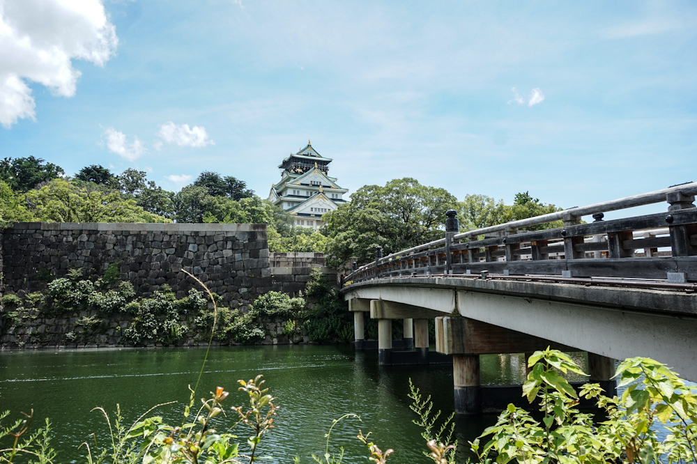
Jun 21 |
Reply |
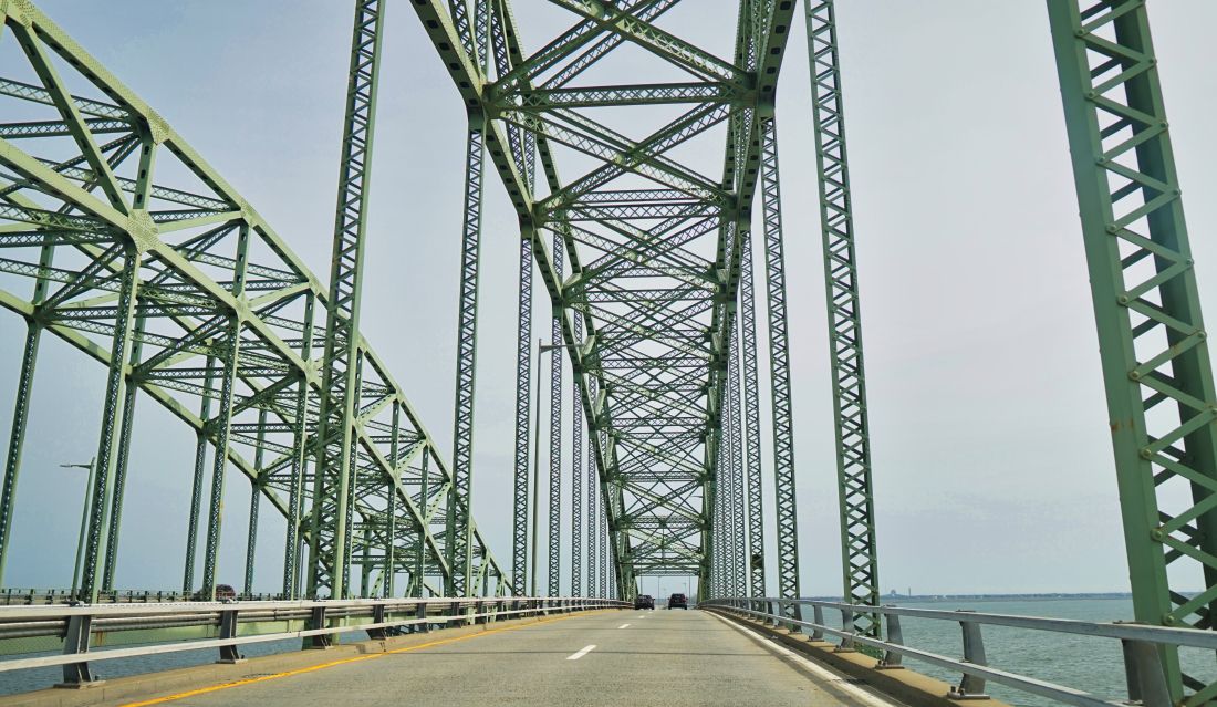
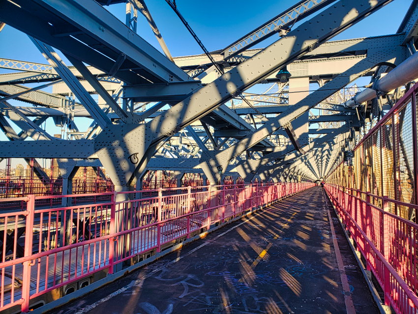
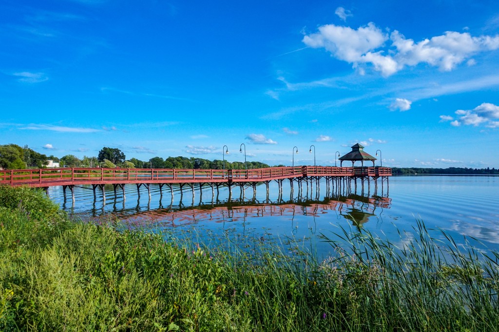
Thank you Robert. I am not currently doing a bridges project, but that is a great idea for a series. I like how your edit creates a lighter, softer, nostalgic, summer-y atmosphere. Your edit really captures how "a memory of driving over the bridge in summer" would look if it was a photograph. Great suggestions and edit! |
Jun 21st |
| 96 |
Jun 21 |
Reply |
Thank you Dan! I agree, Cheryl's edit is a great interpretation. Yes, I struggled with the leveling a bit. I have to get it straightened. |
Jun 21st |
| 96 |
Jun 21 |
Reply |
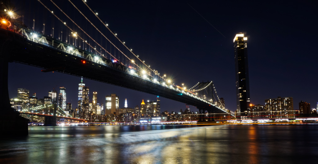
Thank you Cheryl. I like how your inverted B&W edit really brings emphasizes the geometric patterns of the bridge and sharpens up the details. Great suggestions and edit! |
Jun 21st |
5 comments - 5 replies for Group 96
|
5 comments - 5 replies Total
|