|
| Group |
Round |
C/R |
Comment |
Date |
Image |
| 48 |
Feb 21 |
Comment |
This is an amazing capture. Your shot has amazing detail and clarity. The bright vermillion hue of the bird is highlighted, especially against a simple background. Great shot! |
Feb 20th |
| 48 |
Feb 21 |
Comment |
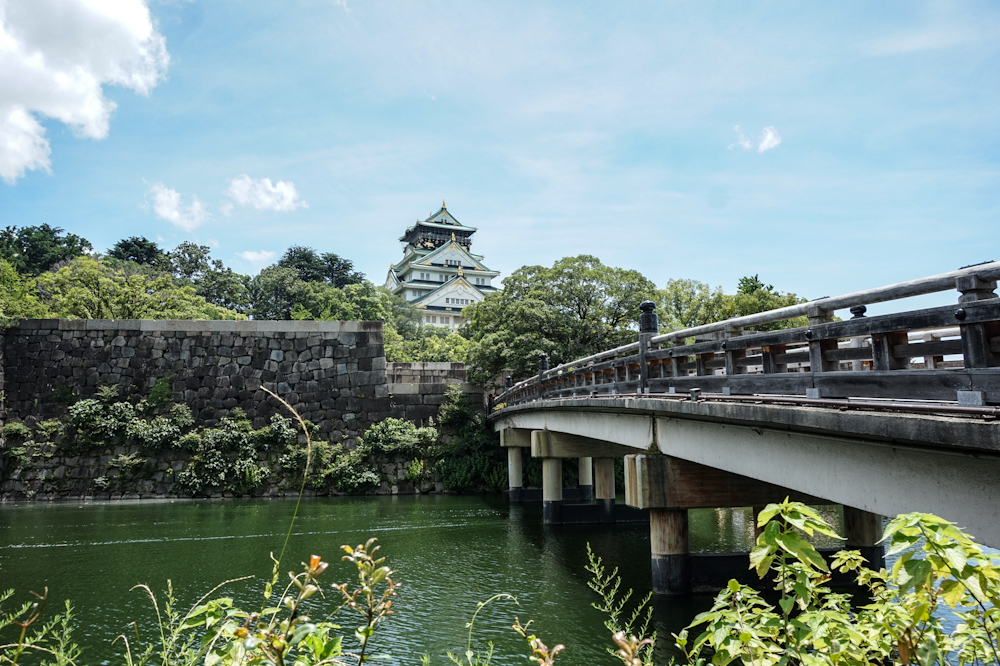
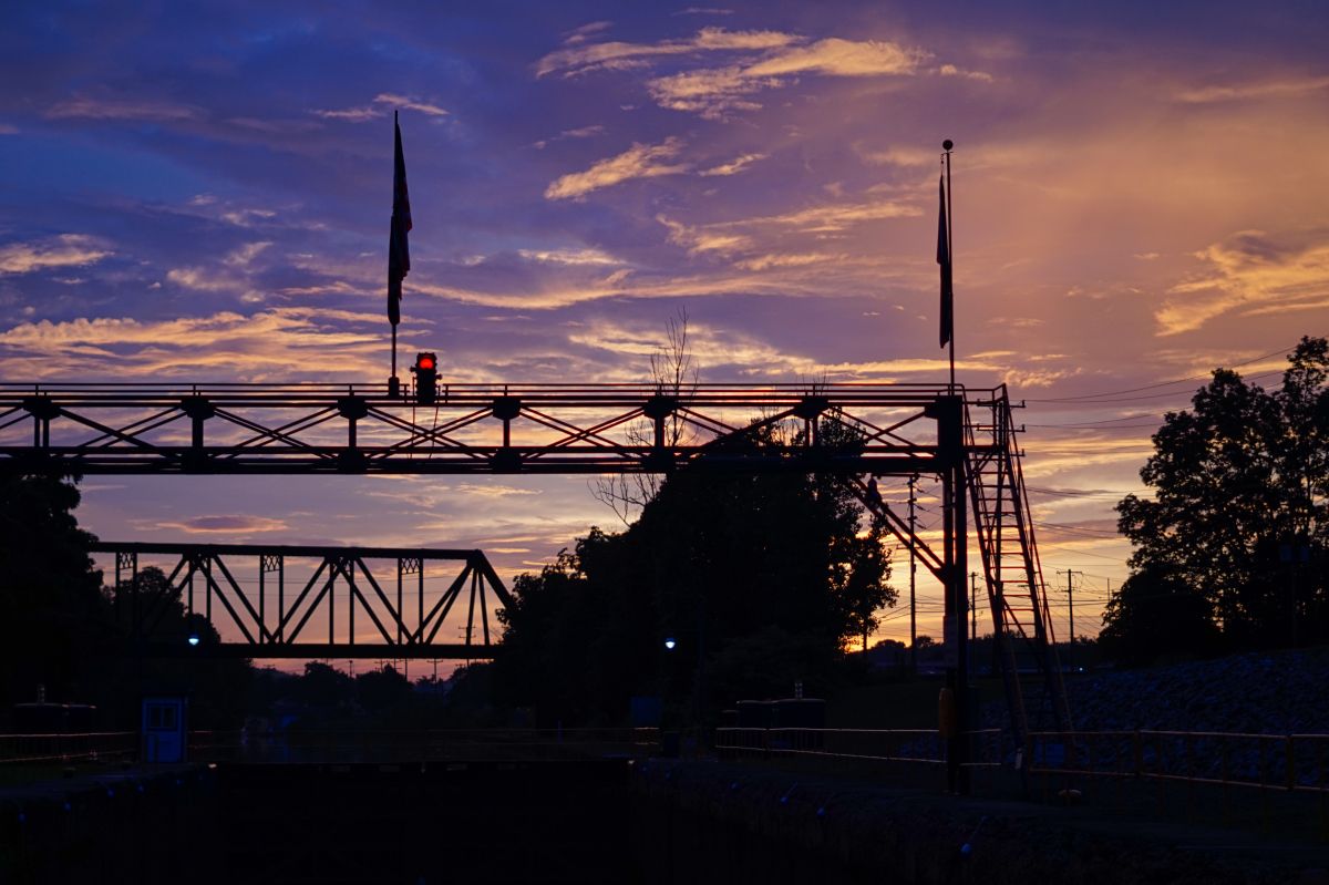
Jean, the image is lovely. The sky reminds me of a Botticelli sky! Great balance between the river, land, and sky. Great shot! |
Feb 20th |
| 48 |
Feb 21 |
Comment |
I actually quite like your original image. But, in terms of creating a more abstract version of it, the edit seems to have done that quite effectively. Very creative, and great colors! |
Feb 20th |
| 48 |
Feb 21 |
Comment |
Your edit really brings out the details of the flower petal texture. I like the flower in the original image, but think that your edit improved the background (compared to the blinds on the kitchen window). Great edit and image! |
Feb 20th |
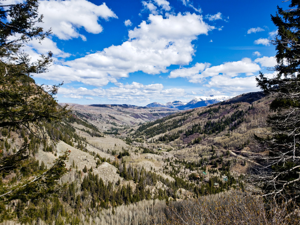
| 48 |
Feb 21 |
Comment |
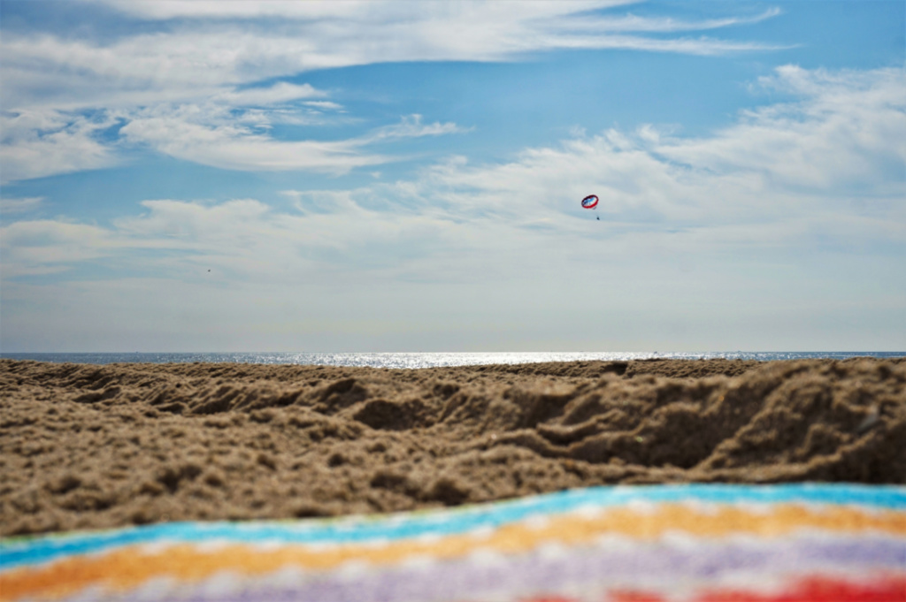
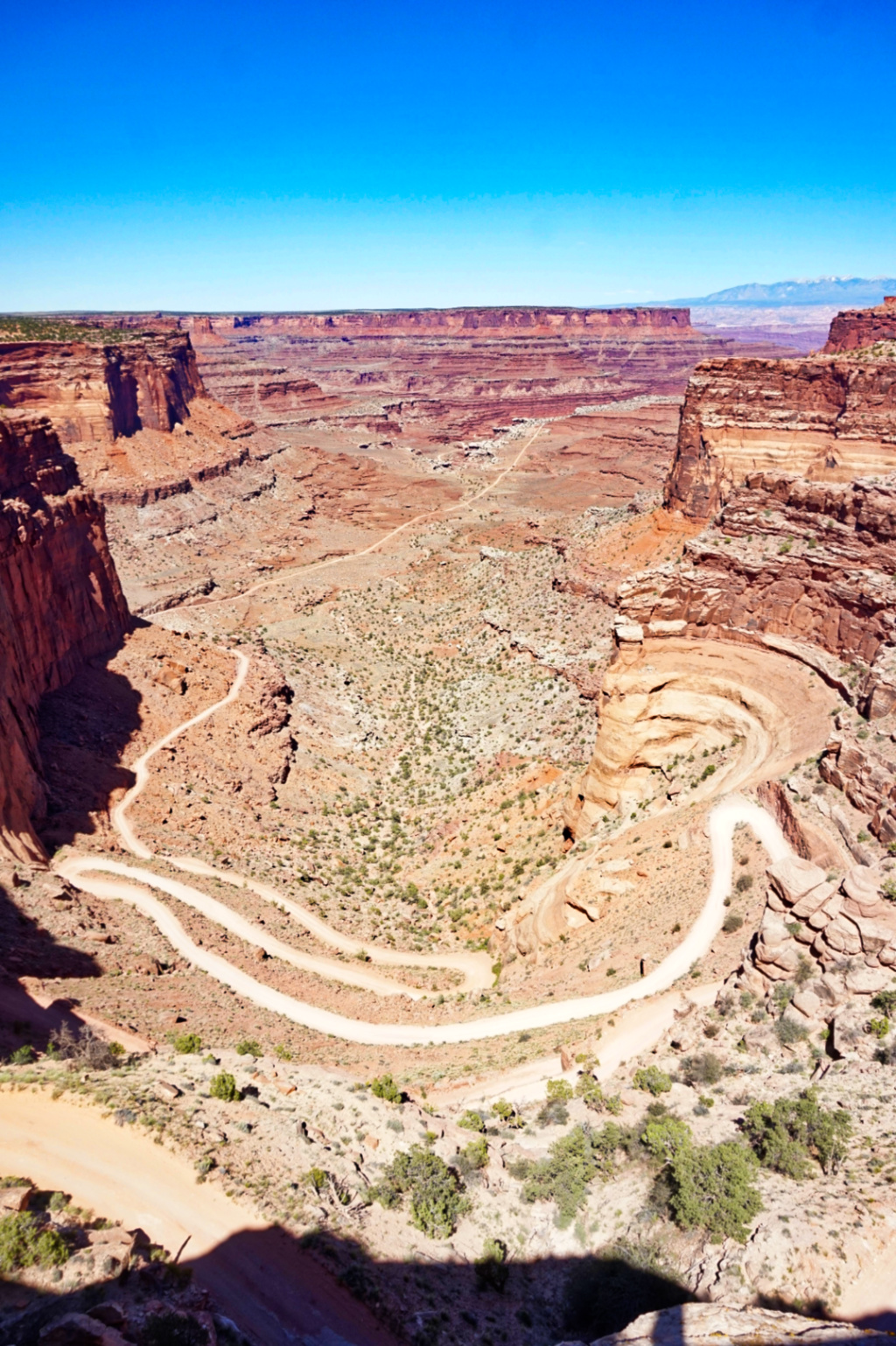
I like how you captured the details of the topography. The gold sand color contrasts nicely with the blue sky. Great shot! |
Feb 20th |
| 48 |
Feb 21 |
Reply |
Thank you Lloyd, now that I know this shutter speed works well for this setting, I'll definitely get some other shots from different views. |
Feb 18th |
| 48 |
Feb 21 |
Reply |
Thank you Margaret, the intersection of art and physics is pretty amazing to consider! |
Feb 18th |
| 48 |
Feb 21 |
Comment |
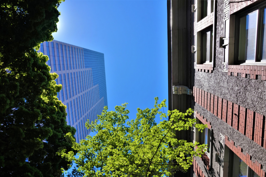
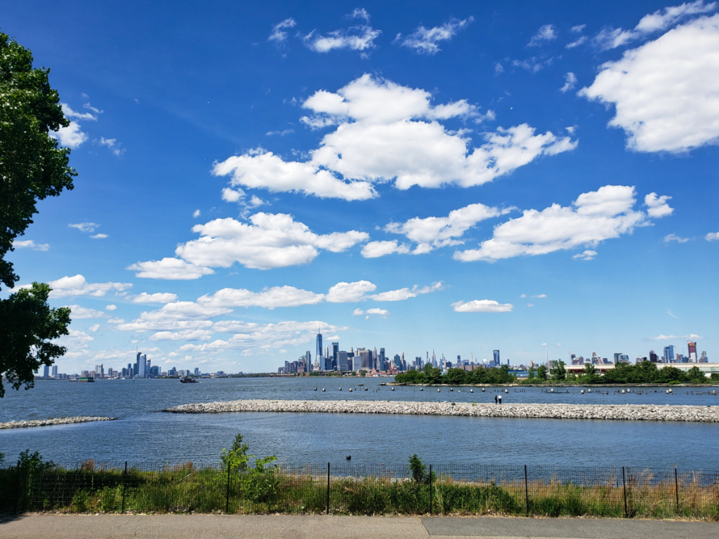
Mary, this is a very cool capture. I love how the reflection (which is the front, but also literally the back, behind you) captures the details, but the glass windows still show some of the rows of office lights on different floors. The glass section in the bottom left is a subtle reminder that this is actually a 3-D building, rather than just a flat image (like a mural or billboard). The tree and grass on the right side are also interesting because they are in front (i.e. not a reflection of something behind you) and also create a bit of an optical illusion. The different shades of blue are soothing and the geometric shapes of the windows and reflected building make the architecture seem softer and a bit dreamy. It looks like a lovely place to visit and take photos. Great composition and great shot! |
Feb 15th |
| 48 |
Feb 21 |
Reply |
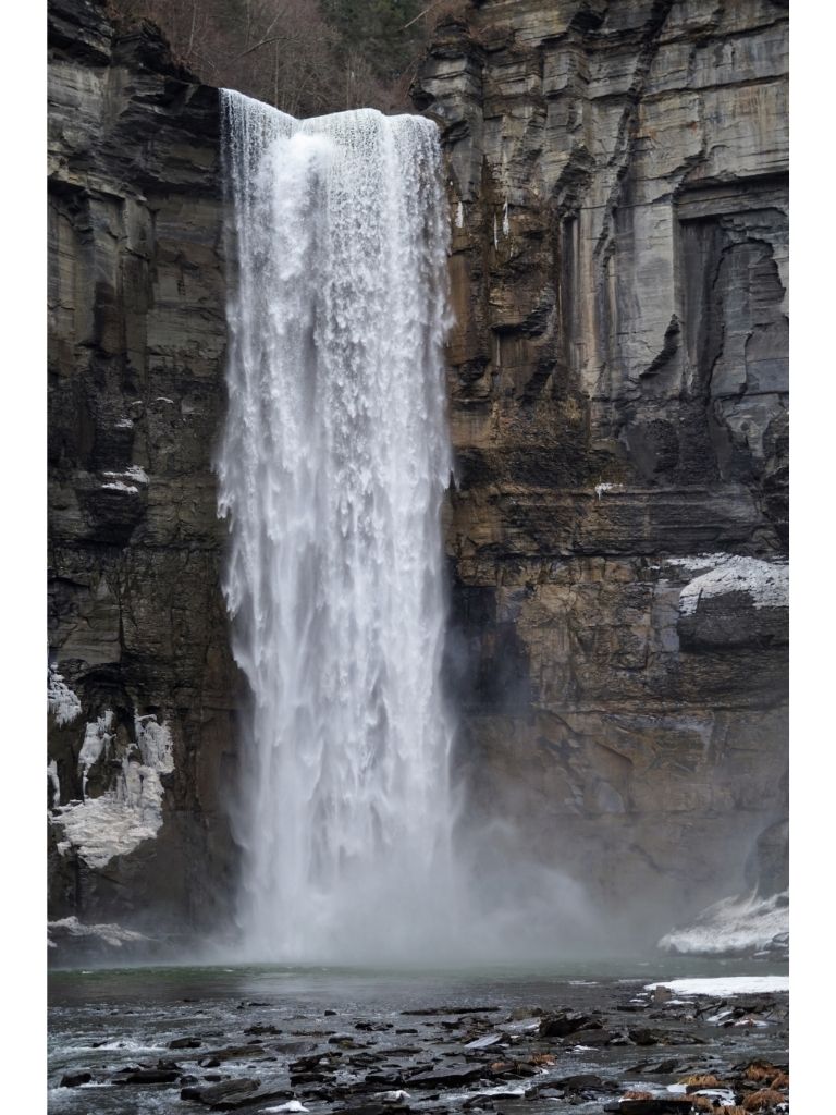
Hi Mary, thank you. It wasn't too cold of a day, at least not compared to now (as we have been buried under several feet of snow since then). The water spray when approaching closer to the falls was definitely chilly. |
Feb 14th |
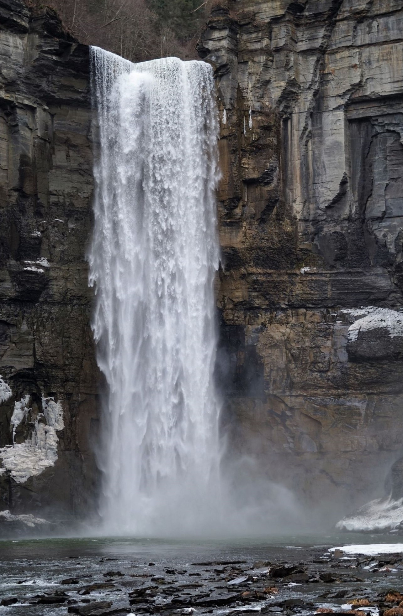 |
| 48 |
Feb 21 |
Reply |
Hi Stephen, thank you. That's very cool! The height of the falls is 215 feet (it's 33 feet higher than Niagara Falls). I'm very curious to know the size of the blur, thanks! |
Feb 9th |
| 48 |
Feb 21 |
Reply |
Hi Beverly, thanks for catching that. I resize my photos in Canva to ensure that they are the exact required size. So, it think Canva adds the border when an image is resized smaller than the original dimensions. Thanks for cropping it out. The edit also looks great, thank you! |
Feb 9th |
6 comments - 5 replies for Group 48
|
| 96 |
Feb 21 |
Reply |
Hi Cheryl, Thank you. I agree that the B&W version brings out different elements than the color version, and creates a different feeling in the image. |
Feb 27th |
| 96 |
Feb 21 |
Reply |
Hi Gerard, thanks, that's good to know. I did some research into different options and ended up getting Luminary 4 (not the annual subscription, just the one-time cost). So, I'm looking forward to playing around with that now. |
Feb 25th |
| 96 |
Feb 21 |
Reply |
Hi Dale, thank you. I like how the cropped version brings the focus to the treeline silhouette on the left, the sky, and snow. I agree that this photo really is suited for b&w. |
Feb 25th |
| 96 |
Feb 21 |
Reply |
Gerard, I like how your edit really brings out the subtle shades of the sky and clouds, as well as cropping out the tree on the left (so the tree silhouettes form a kind of triangle-shape). I am looking into photo editing software that isn't Adobe Photoshop. Would you recommend Nik as a good option? I have Lightroom, but it's just on my phone (so it's limited in how well I can actually edit in detail). |
Feb 22nd |
| 96 |
Feb 21 |
Reply |
Hi Gerard, you are correct, and you said it much more eloquently than I did. |
Feb 21st |
| 96 |
Feb 21 |
Reply |
Here's the image slightly less cropped. |
Feb 21st |
 |
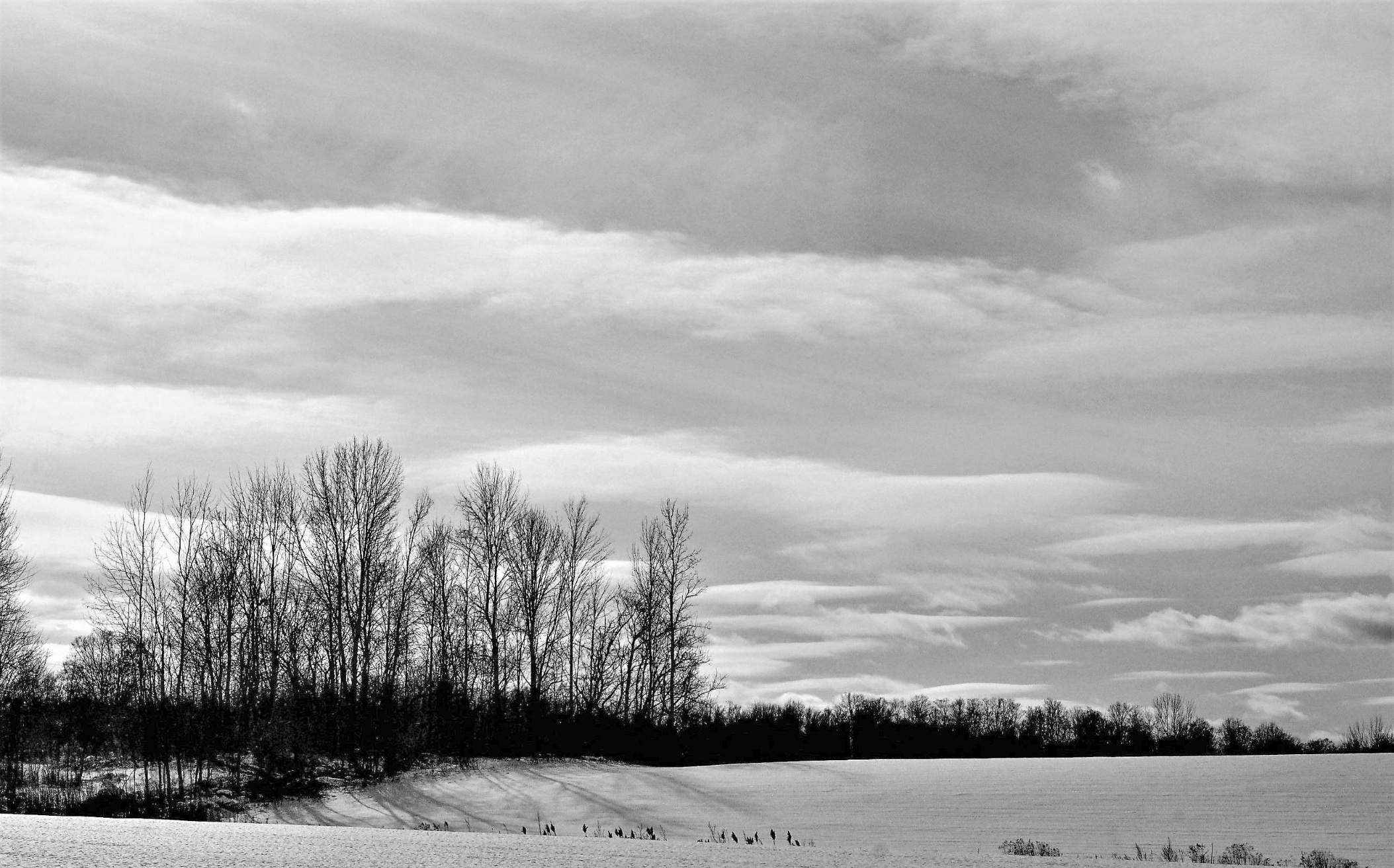
| 96 |
Feb 21 |
Reply |
Here's the image not quite as cropped. |
Feb 20th |
 |
| 96 |
Feb 21 |
Reply |
Here's another edit as well |
Feb 20th |
 |
| 96 |
Feb 21 |
Reply |
Thank you Dale. I agree that this image works in both color and b&w. Ansel Adams' words are so true, the photographer can tell a story and yet the viewer will interpret it as they choose. I edited the photos and lightened the shadows of the treeline, both in b&w and in color. I also did a cropped version of both, to remove the lower level vegetation. |
Feb 20th |
 |
| 96 |
Feb 21 |
Reply |
Thank you Dan, your words are truly appreciated! I always have found that whatever art medium I am working with, creativity, fun, and self-expression are all crucial ingredients. I also agree that one of the joys of photography and viewing other people's work. Viewing other photographers work really provides new ideas/inspiration, is a learning tool, and shares some interesting clues and insights into their personality, perspectives, and interests. Agreed, like everything, photography takes practice, and some things work better than others, I have found. I think it's also important for everyone to remember that anything in life, be it photography or whatnot, the not-successes aren't failures - they are learning experiences. |
Feb 20th |
| 96 |
Feb 21 |
Comment |
Hi Cheryl, this is a beautiful shot and it was interesting to see your process/different edits. I agree with Robert that I'm not so much a fan of "original". "Original 2" is a lovely, deep color. But, I think that the final version works nicely because it is a bit brighter, you can see a bit more detailing on the snow, and clouds and sky in the sky have more color variety. Lovely winter composition and great shot! |
Feb 20th |
| 96 |
Feb 21 |
Comment |
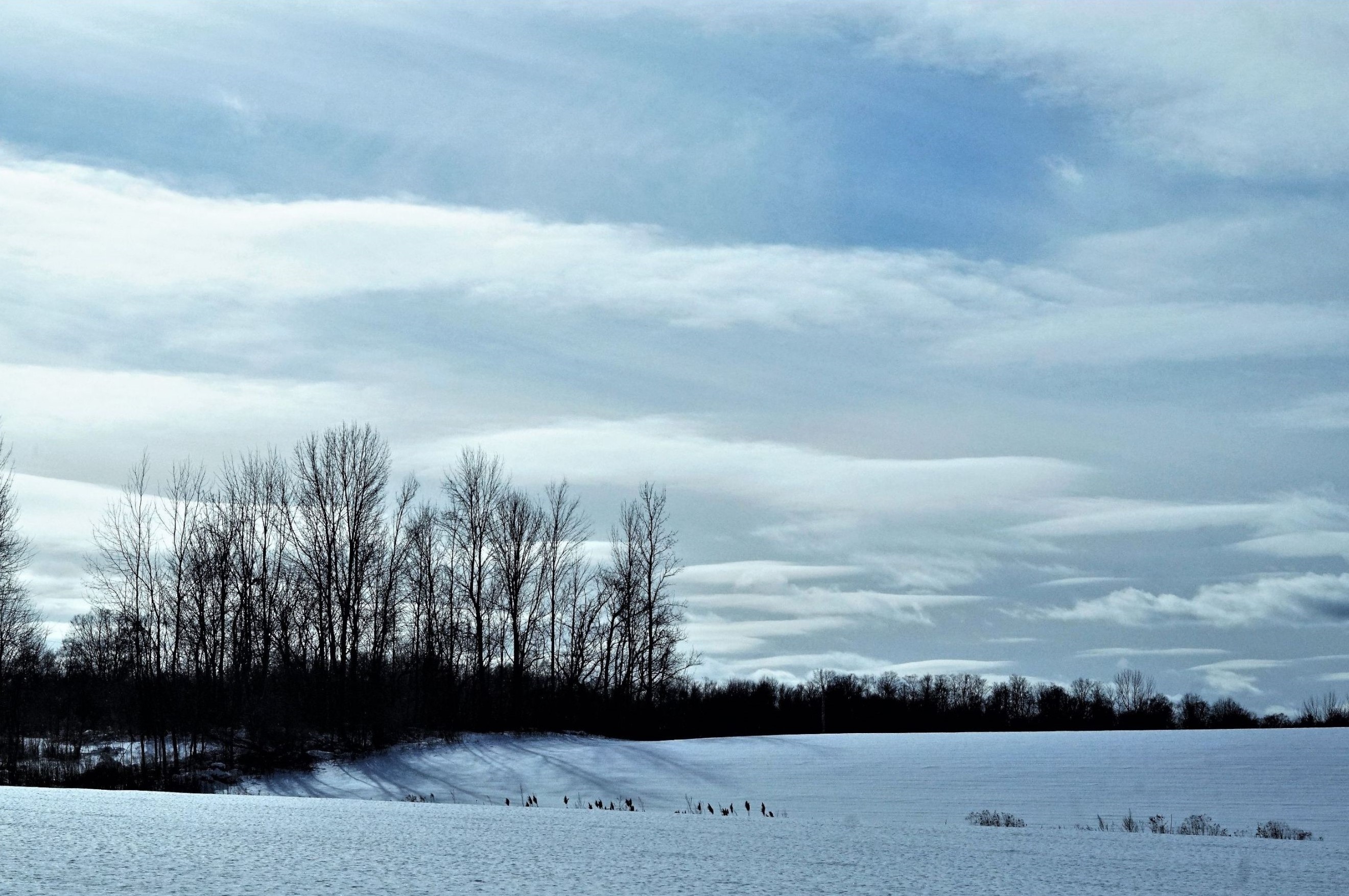
Hi Gerard, I like your image. Being in upstate NY, I am very familiar with this type of scene. I think that you captured the sky and clouds perfectly. The shade of blue sky looks unreal (in a good way). The snowmobile tracks in the foreground run from left to right and are perpendicular to the long rows of corn in the background. The succession of telephone poles give a sense of depth and scale to the image. Great shot! |
Feb 15th |
| 96 |
Feb 21 |
Comment |
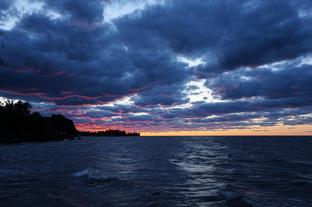
Hi Dan, this image is so dreamy and calming. I like how all of the elements (snow-covered trees, clouds, ice-covered lake/pond, the swirl pattern on the ice) are have clarity yet still look soft. The reflection of the trees is perfect and the symmetrical balance between the sky/land and the ice/water is spot on. I love how you captured that color of the sunset sky. It reminds me of a Botticelli sky. Great shot! |
Feb 15th |
| 96 |
Feb 21 |
Comment |
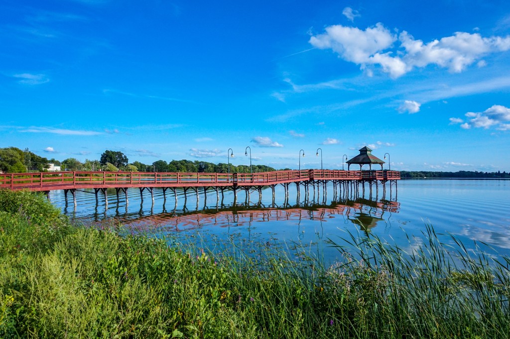
Hi Robert, this has a lot of great visual elements (the geometric shapes and clarity of the grasses/trees growing vertically vs. the rounded curve of the river/water, the blur of the ripples on the water, and the mist/fog in the background). The deep color with the whiteness of the pine trees remind me of a Bob Ross painting. It looks like a beautiful place to enjoy, lose yourself in nature, and take amazing photos. Great shot! |
Feb 15th |
| 96 |
Feb 21 |
Comment |
Hi Dale, I really like how your scene captures so many different elements (the smooth water, the rough texture of the ice, the yellowish grass, the bare trees, the ripple in the water, the clarity of the swans etc.) The muted yellow-brown colors of the scenery contrasts the different shades of blue really nicely. The smoothness color gradient of the cloudless sky creates the perfect backdrop/negatie space for the scene. The reflection is the water is perfect. Great shot! |
Feb 15th |
| 96 |
Feb 21 |
Reply |
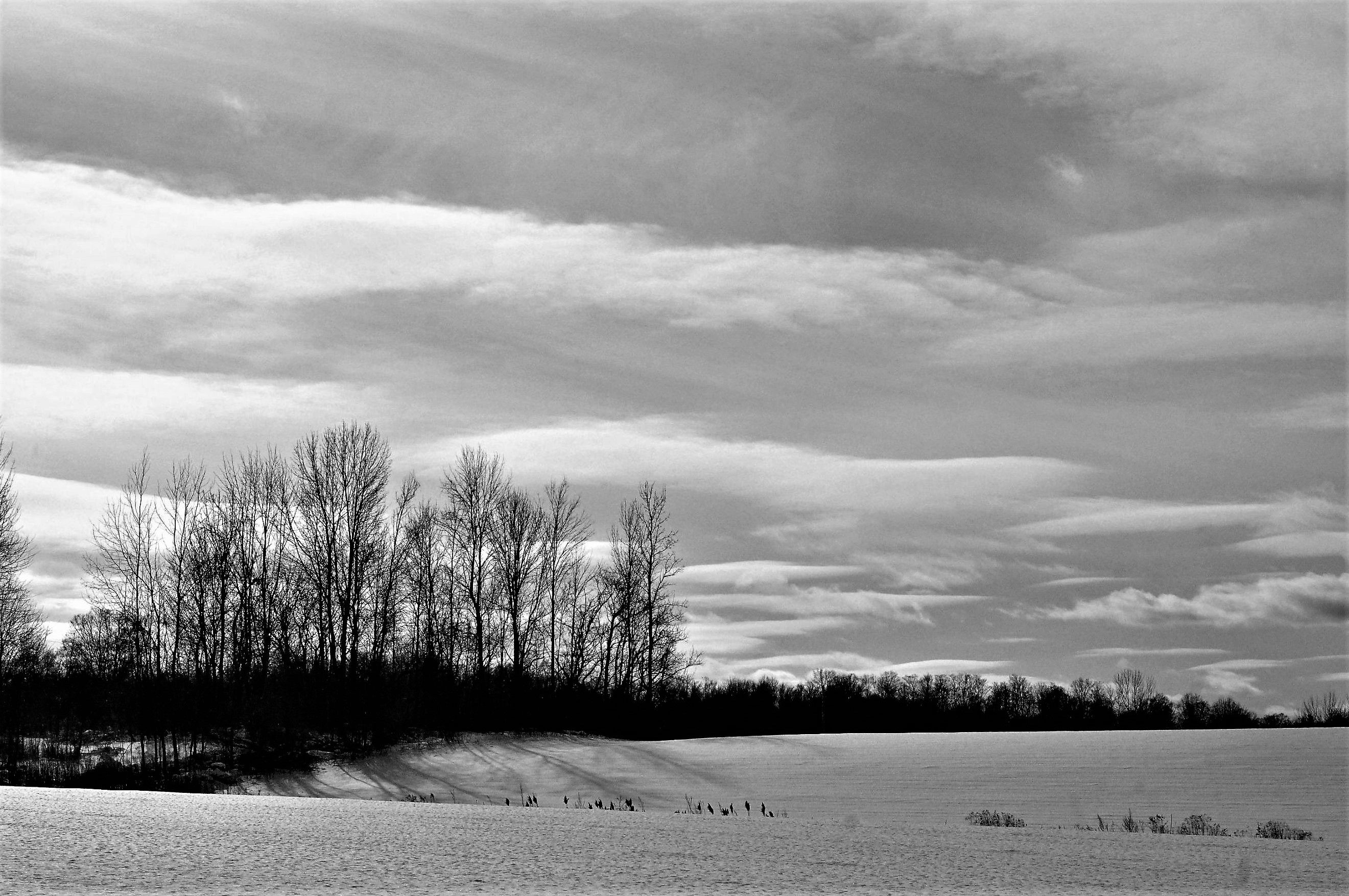
Hi Robert, great suggestion. Thank you. Here's the image in B&W. I agree that the B&W tones really bring out the different layers and elements, especially the silhouette of the trees, the shadow on the snow, and the layers of clouds and snow on the fields.
In terms of context (which many photos generally lack), this field is usually full of animal life (including deer, birds, people etc.) in spring and summer. So, driving past it in other seasons shows a flurry of activity. In contrast, the scene in winter is calm, still, and cool. But it is also a bit lonely by comparison, at least for me. But, it's completely valid that you see the image as calm and still. I agree, it definitely is. It is many things.
In terms of titling images, this is one area in which I struggle both artistically and philosophically. I was trained in and taught VTS (Visual Thinking Strategies), which goes against established artistic convention. In VTS, one core tenet is that titles limit and unduly influence what/how viewers view and understand images. I think that titles can be useful depending on the context (i.e. to provide a short explanation of a photo to explain an abstract image, like the close-up view of a microscopic cell in a science textbook).
So, I prefer to NOT title my images whenever possible and let viewers decide what they see/feel/think about an image. Or, if titles are required, I tend to stick with utilitarian titles.
So, your response is helpful for me. I wasn't trying to make an "lonely" image per se. This was more my attempt to come up with a title that is more PSA-ish. In hindsight, I should have just titled it "Winter". It's a scene that evokes different feelings for everyone, which is totally normal and okay. In future, I think I will stick with my preferred titling strategy (i.e. non-descriptive, utilitarian titles), which allows images to be more open to interpretation. |
Feb 14th |
 |
7 comments - 11 replies for Group 96
|
13 comments - 16 replies Total
|