|
| Group |
Round |
C/R |
Comment |
Date |
Image |
| 48 |
Dec 20 |
Reply |
I like the flower in black & white a lot! The edit really captures the shading and texture of the front flower petal really clearly. In the black & white edit, I can also see a bit more of the out-of-focus background more distinctly (i.e. blades of grass, other petals/flowers etc.) It's a really lovely black & white edit, with lots of layers of shading. Great job! |
Dec 20th |
| 48 |
Dec 20 |
Comment |
This is a really interesting photo because the copy space almost makes it look like an optical illusion. I also like how clear and detailed the dark-colored ducks and nest are in comparison to the rest of the composition. Great shot! |
Dec 19th |
| 48 |
Dec 20 |
Comment |
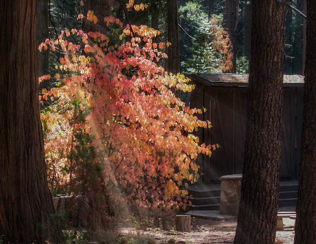
I love the capture of sunbeams streaming through the leaves and forest growth. I played with it in lightroom to try to bring out the details of the leaves a bit (like what Beverly suggested). I decreased the highlights and whites, increased the shadows, and increased clarity and debate slightly. Regardless, great shot! |
Dec 19th |
 |
| 48 |
Dec 20 |
Comment |
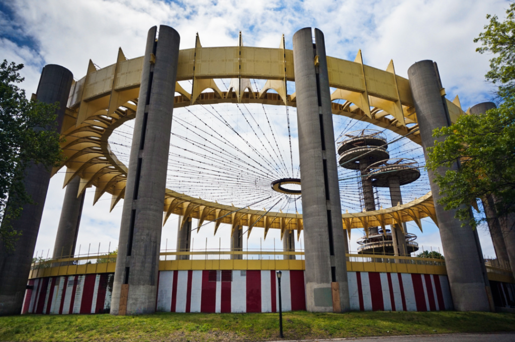
This is a gorgeous building. I love the warmth, the colors, all of it. I think my only note (which could just be my perception) is that the image leans slightly to the left. But aside from that, it's lovely. Great shot! |
Dec 19th |
| 48 |
Dec 20 |
Comment |
Jamie, great choice of image. I like the color version as well as the edited, monochromatic version. I'd be curious to see it in black & white. The sepia tone also has a warmth to it. So, great edit and great shots! |
Dec 19th |
| 48 |
Dec 20 |
Comment |
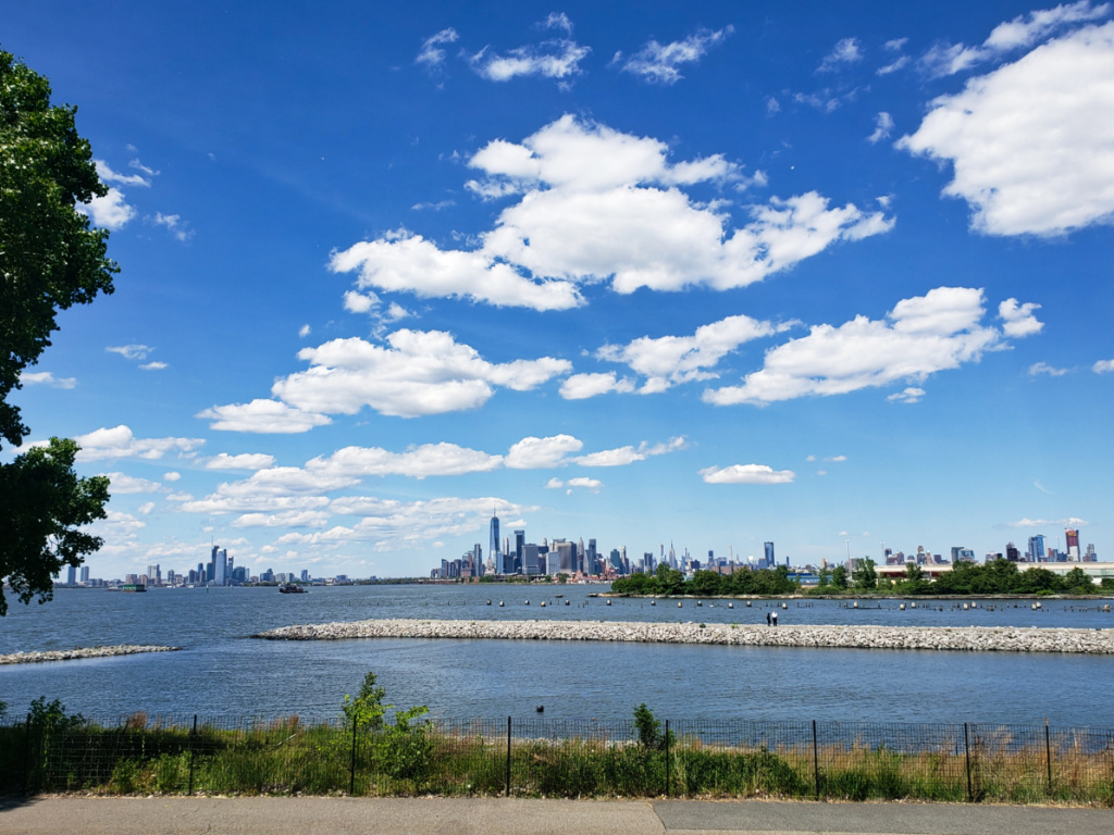
Margaret, I am really impressed at how clearly you were able to capture the busyness of city life. Getting a shot where all the moving elements are sharp and not blurry is very difficult. So, good job and great shot! |
Dec 19th |
| 48 |
Dec 20 |
Comment |
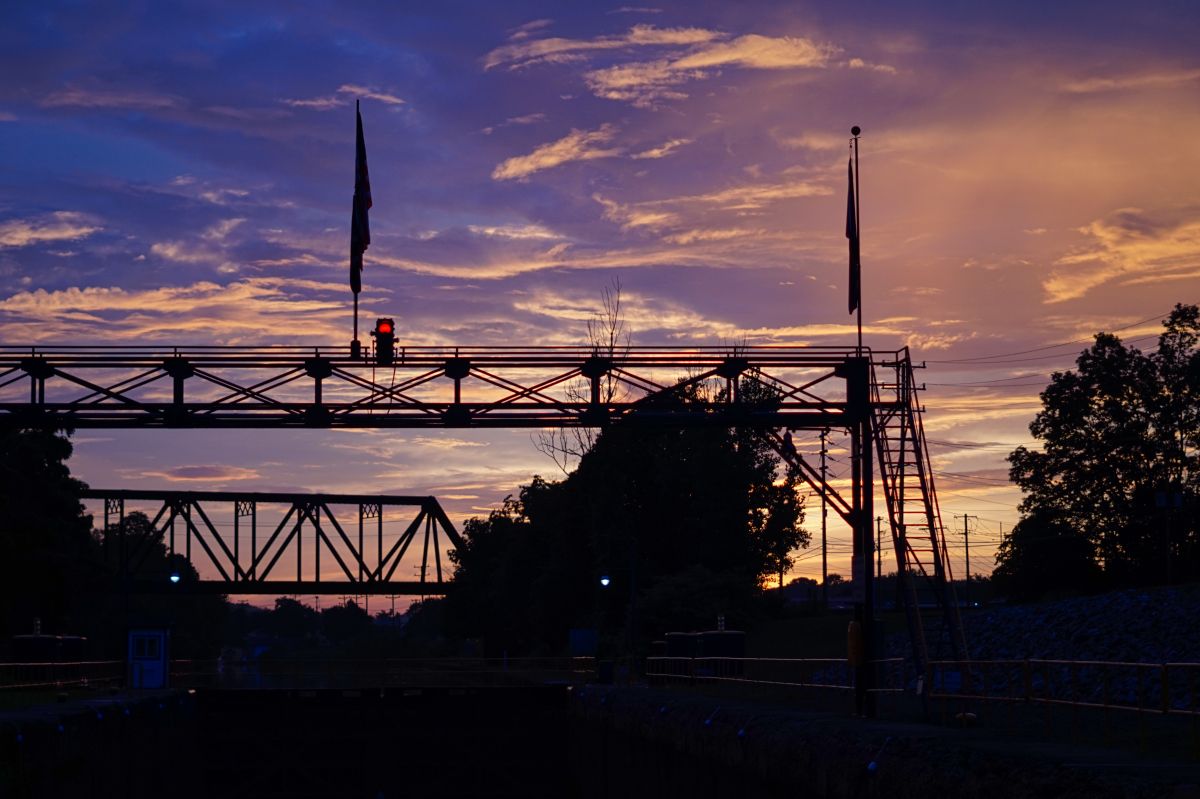
Bev, great shot. I think the image is visually appealing thanks to the "layers" that the different elements create as well as the repetition of colors. I agree that the sign isn't ideal. However, I don't know how it edit it out, though I'm sure someone else can explain how. Regardless, it's a serene image, great job! |
Dec 19th |
| 48 |
Dec 20 |
Comment |
Bev, great shot. I think the image is visually appealing thanks to the "layers" that the different elements create as well as the repetition of colors. I agree that the sign isn't ideal. However, I don't know how it edit it out, though I'm sure someone else can explain how. Regardless, it's a serene image, great job! |
Dec 19th |
| 48 |
Dec 20 |
Reply |
Thanks Beverly, great suggestions. I agree that your editing brings out the colors nicely. Thank you and great edit! |
Dec 19th |
| 48 |
Dec 20 |
Reply |
Thank you Stuart, I agree that a crop really suits this image. I like how your edit brings out the colors of the sky, water, and buildings as well. Great edit! |
Dec 19th |
| 48 |
Dec 20 |
Reply |
Thank you. I agree that the crop really brings the scene closer. I like how you brought put the sky colors as well. Great edit and suggestions! |
Dec 19th |
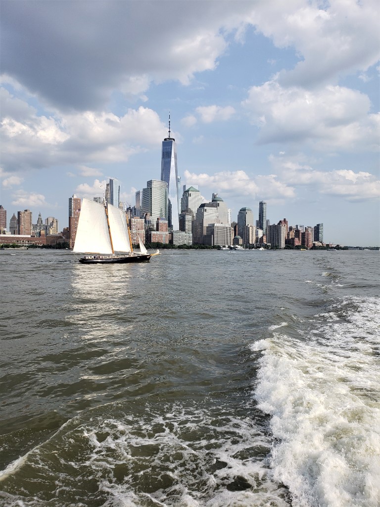
| 48 |
Dec 20 |
Reply |
Great suggestion Margaret, thank you! Yes, I didn't edit the sky because changing the highlights/exposure would also impact the white of the sail and the white foam in the water. That's an interesting observation. I think that I don't always automatically look for the three layers when taking a photo, but I definitely mention them when describing the image. I think this is just a force of habit left over from my art class days of "describing what you see in the layers". Here's the image with a square crop, which I like. The square crop also lines it up so it follows the Rule of Thirds almost perfectly. |
Dec 11th |
 |
7 comments - 5 replies for Group 48
|
| 96 |
Dec 20 |
Reply |
Very cool link, thanks for sharing! I like how the "uniform sky" can act as negative space and bring more focus to the other details and elements in an image. |
Dec 28th |
| 96 |
Dec 20 |
Reply |
I have the issue with spots as well. Personally, it's been an issue that just requires cleaning the lens with cleaning fluid and q-tip and the special fabric for wiping lens/glasses etc. If spots are showing up more frequently in all of your photos, then I might consider if it is a technical issue. But don't beat yourself up about it, I have posted photos for licensing (and they were accepted by Getty) that I now see have a few faint spots in the sky area, ugh. So, I think the spots issue can be appreciated and understood by many photographers. |
Dec 23rd |
| 96 |
Dec 20 |
Reply |
I really like the vintage look of this edit. Your edit also brings out more details in the sky/the cloud on the left and really sharpens up the details. Very cool edit, I like it! |
Dec 23rd |
| 96 |
Dec 20 |
Reply |
Thanks Dale, that's helpful to know. I will definitely look through my collections of images with limited colors to see what else I could experiment with in terms of black & white/sepia etc. Here's an edit of the above image in black & white. I agree that monochrome seems to be the way to go for images like this. |
Dec 21st |
 |
| 96 |
Dec 20 |
Reply |
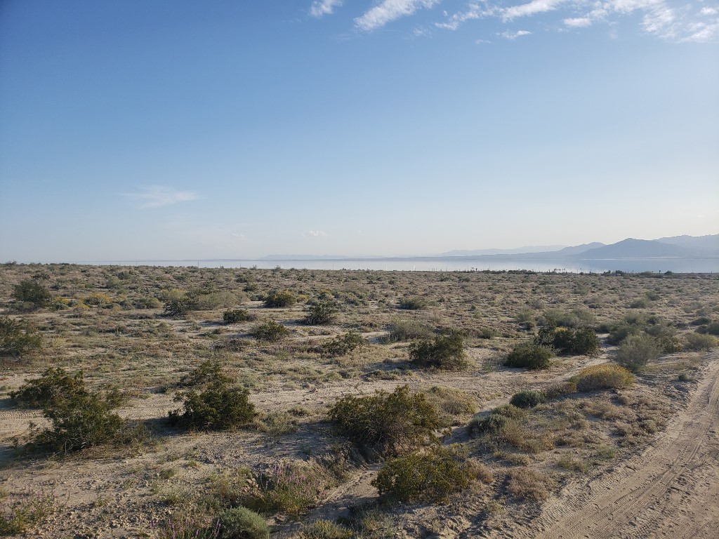
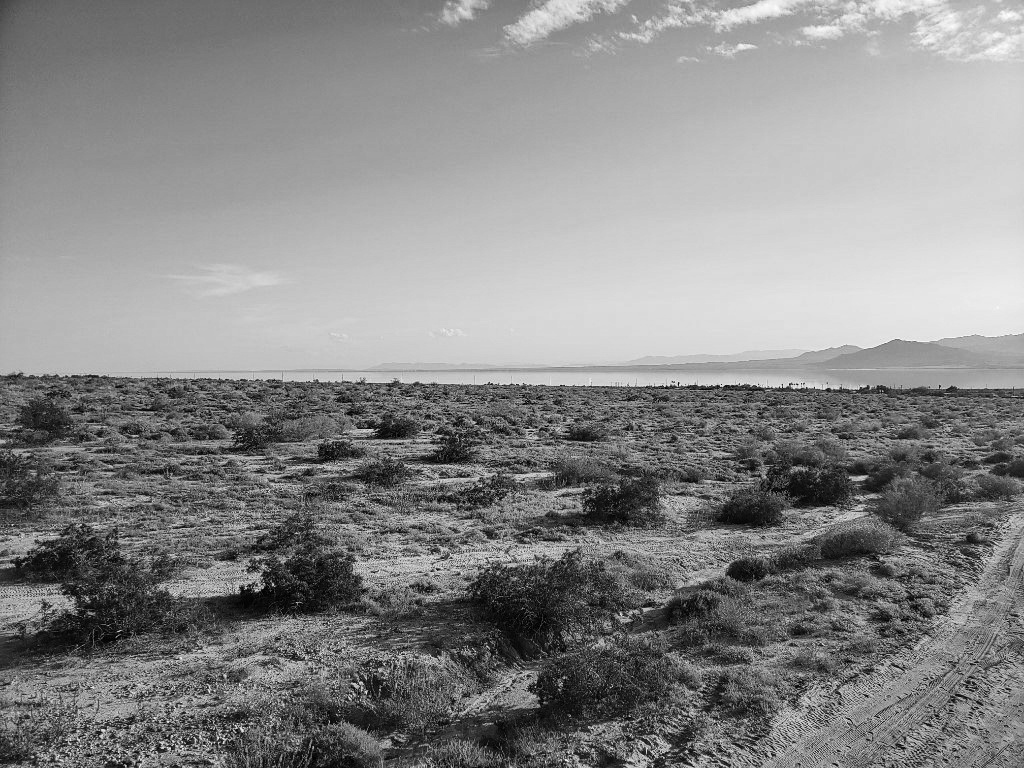
I agree, Dan. The sepia tone works well for this scene and the cropping really brings the focus the desert and the Salton Sea in the distance. Thank you, it was a really different environment to visit and photograph compared to what I am used to photographing. So, it was a fun challenge. |
Dec 13th |
| 96 |
Dec 20 |
Reply |
Thanks Robert, that is great advice and really helpful. I like the idea of using sepia tones versus standard black and white (which have a great quality, but maybe not as ideal for this image compared to sepia), especially for this scene. I love the edit and think it really captures the atmosphere that I was going for! |
Dec 13th |
| 96 |
Dec 20 |
Reply |
My pleasure. I reviewed a lot of my photos and notice that light flares work well for my night photography, especially long-exposure photos. As for daytime photos, I noticed light flares tend to look best when I'm taking photos of leaves overhead and the sunlight flare is visible between a group of leaves or branches. So, those are just some ideas, in case you want to play around and figure out what works for you. |
Dec 12th |
| 96 |
Dec 20 |
Comment |
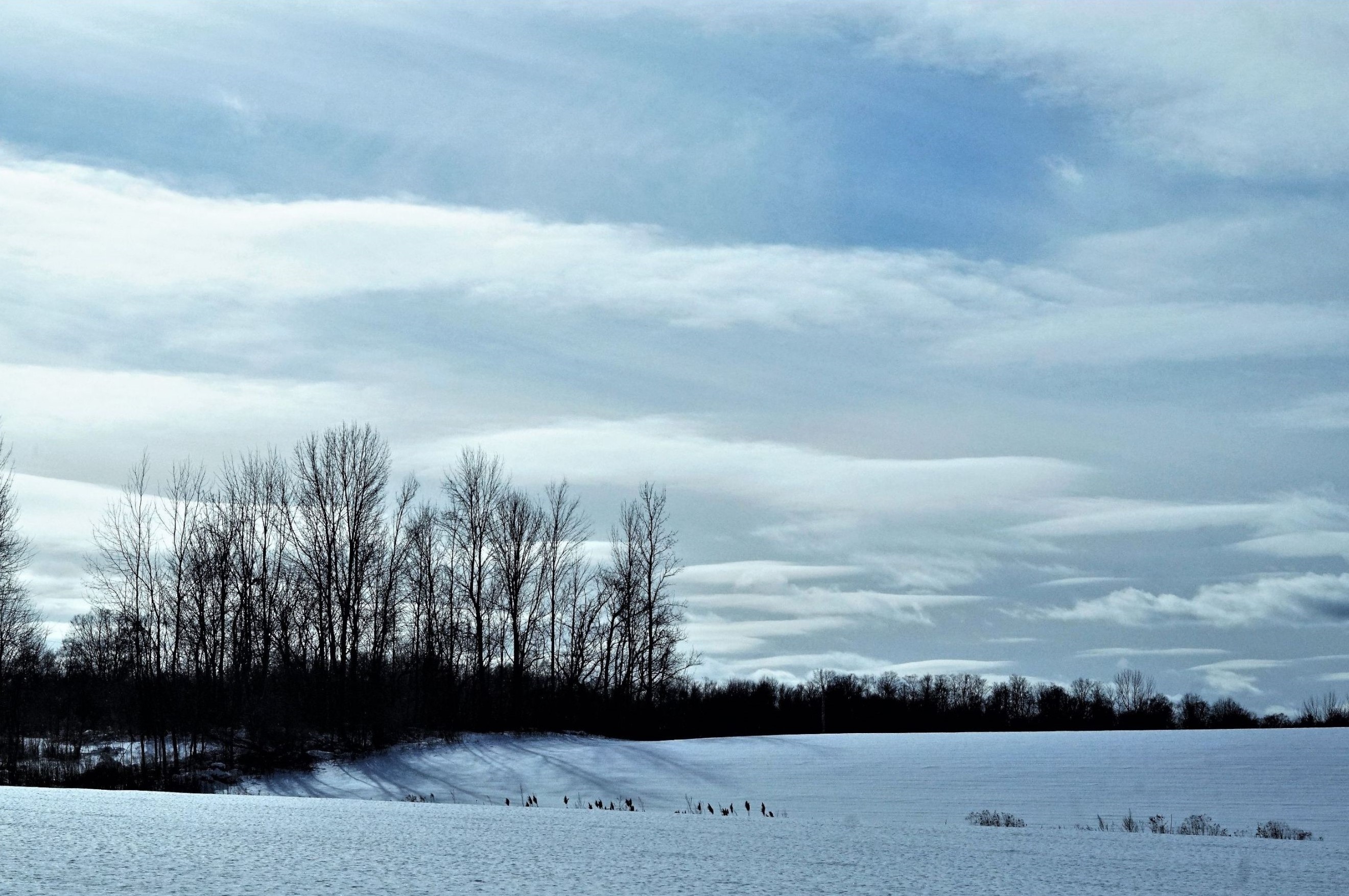
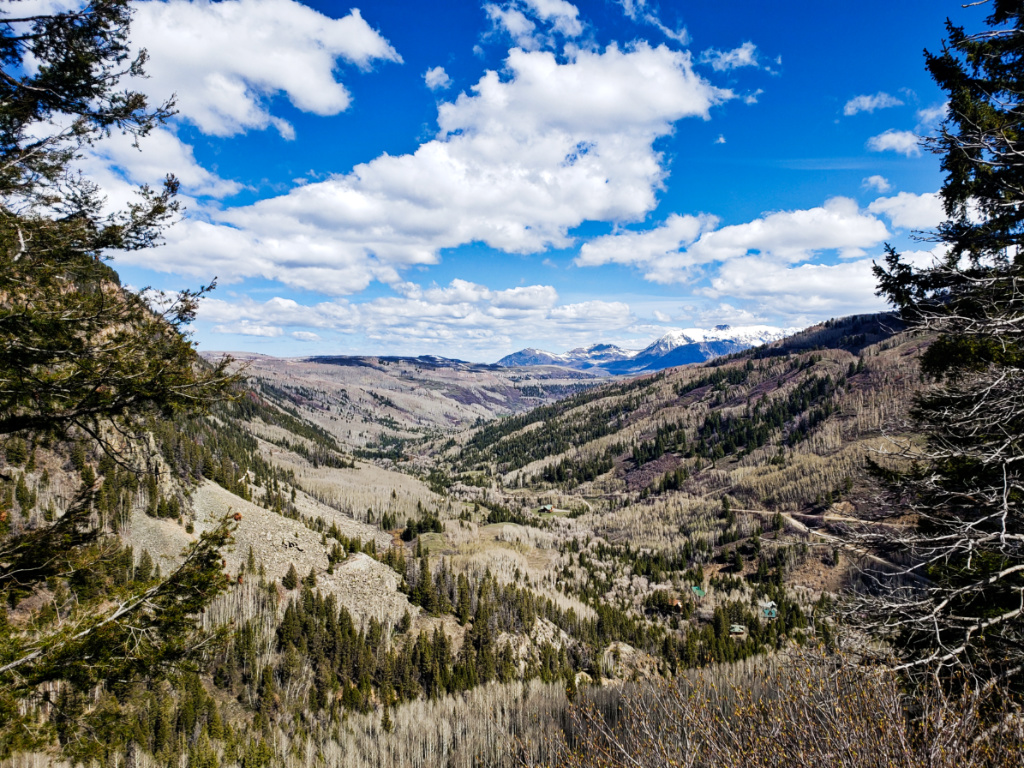
Gerard, this is a lovely composition that captures less-common weather phenomena (which for amazing photos). I like how the composition has layers of "horizontal lines" (I.e. tree lines, separations between field rows, mountains etc.) which keep my eye moving and give it a nice balance. I like how the green of the grass contrasts the muted, neutral tones surrounding them. Small sensor spots are something I also often discover in some of my images after I edit them and think they are all set. Thankfully, if they are in an area like the clouds that is soft/not sharply detailed, then smudging them out is easy. I also think Robert's suggestion about the color wheel is helpful. I will have to try Robert's suggestion with my own work as well. Anyway, Great shot! |
Dec 11th |
| 96 |
Dec 20 |
Comment |
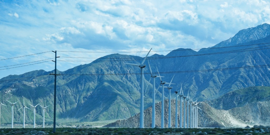
Wow, this is an amazing image. You captured the sky and light perfectly. The different shapes and textures complement each other really well and provide the perfect balance for the composition. My eye keeps trying to figure out what the long things are (snakes, hoses, long tube things etc.) - are they snakes? Regardless, it is a beautiful image. Great shot! |
Dec 11th |
| 96 |
Dec 20 |
Comment |
Great shot Dale. First, your photo makes me a bit nostalgic because I used to live in Hungary, which is different of course, but also has the ubiquitous yet beautiful architecture of Eastern Europe (i.e. rows of historic buildings painted yellow/orange/beige with wrought iron balconies, running along narrow streets, with a tall church situated right in the neighborhood, and unplowed streets of snow). I also think the editing that you did gives it the effect of being almost a drawing painted with watercolors, yet it is three dimensional a real. Very cool! I also notice that the image seems to lean to the left just a smidge. But aside from that, it looks great. Great shot AND great editing! |
Dec 11th |
| 96 |
Dec 20 |
Comment |
This is a really interesting piece, Robert, and a departure from your usual work. I really like the soft, dappled light because it gives the space a very ephemeral quality. I appreciate your describing the process. It sounds like an interesting challenge to take on, which is important for artists to engage in as they develop their skills and work. The image almost looks like a beautiful painting. I agree that light flares seem to be less commonly used in landscape photography. In my experience, I like them, but they can sometimes detract from details or elements that I want to be in sharp focus. However, as one photography article about this topic says, light flares aren't always a bad thing - and they have an example who of when it really added to the image. Here's that article (https://photographylife.com/what-is-ghosting-and-flare) and here's the image they cite (https://photographylife.com/wp-content/uploads/2014/02/Sun-vs-Plant.jpg). So, I would recommend just keeping at it and seeing what/how different types of flares work for your different images. Regardless, great shot and kudos to all your hard work! |
Dec 11th |
4 comments - 7 replies for Group 96
|
11 comments - 12 replies Total
|