|
| Group |
Round |
C/R |
Comment |
Date |
Image |
| 48 |
Nov 20 |
Comment |
Wow, I love the stark contrast of the leaves against the black background. Great use of negative space to keep the focus on he different textures and colors of the leaves. I think the variety of different leaves makes for a really interesting combination. The sharpness of the leaves and the highlights on their edges are perfect. Great shot! |
Nov 19th |
| 48 |
Nov 20 |
Comment |
Very cool composition Jean. Great capture of diminishing perspective. I like how you centered yourself on the train track (safely, I hope) and captured the trains, the rays of light, the flag blowing in the wind and the reflection of light on the train tracks. The tracks are centered nicely and draw the viewers eye straight back. I agree with Margaret that it is amazing to see all the different ways that fellow PAS members went with the original image. My only suggestion would be to straighten the image slightly (it seems to tilt to the right slightly). Great shot! |
Nov 19th |
| 48 |
Nov 20 |
Reply |
Until July 2020, I worked for American Field Service (AFS), so I led the orientation for a group of US students going to Japan, acted as their flight chaperone (it was a group of 30 students), attended the Arrival Orientation, and met with the AFS-Japan staff. I also got to be a chaperone for a small group that rode the bullet train southwest towards Osaka. I enjoyed revisiting Osaka after being away since 2013. So, it was a great trip - but definitely busy and full of responsibility. |
Nov 17th |
| 48 |
Nov 20 |
Reply |
I think the name fits the scene perfectly! |
Nov 17th |
| 48 |
Nov 20 |
Comment |
Wow, this is am amazing scene. The bright colors combined with the muted tone of the stone as well as the reflection make the perfect combination! Beautiful shot! I love it. |
Nov 17th |
| 48 |
Nov 20 |
Comment |
Jamie, I love that the coloring of four rabbits matches the bare tree branches and trunks. The muted colors nicely contrast the deep green of the grass and pine needles. Great shot! |
Nov 17th |
| 48 |
Nov 20 |
Comment |
Margaret, I love this image. That's a beautiful full rainbow that you captured in the fountain. Great shot! |
Nov 17th |
| 48 |
Nov 20 |
Comment |
Bev, I like how you focused on the person's hands rolling the cigar. Having the rest a bit more blurred due to motion etc. creates a nice vignette effect and really draws your eye to the person in action. Great shot! |
Nov 17th |
| 48 |
Nov 20 |
Reply |
Thank you Margaret, that's a helpful suggestion. Yes, I was out exploring around town and hadn't brought my tripod with me on the trip (it was a 3-week business trip that started in LA, so 90% of my suitcase was dedicated to work stuff). I will work on the clarity and shadows. I agree, I also like what Bev did with the clouds and sky. That shade of red-orange is called Vermillion/Vermilion and I also really love it. It's a really warm color that is eye-catching but not too loud (in my opinion). |
Nov 17th |
| 48 |
Nov 20 |
Reply |
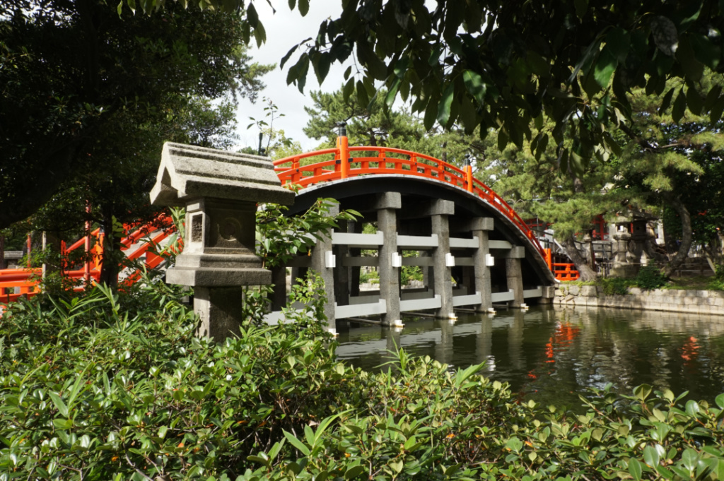
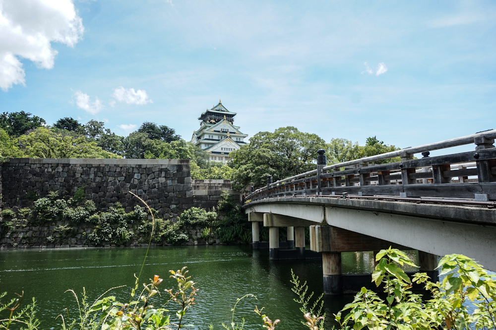
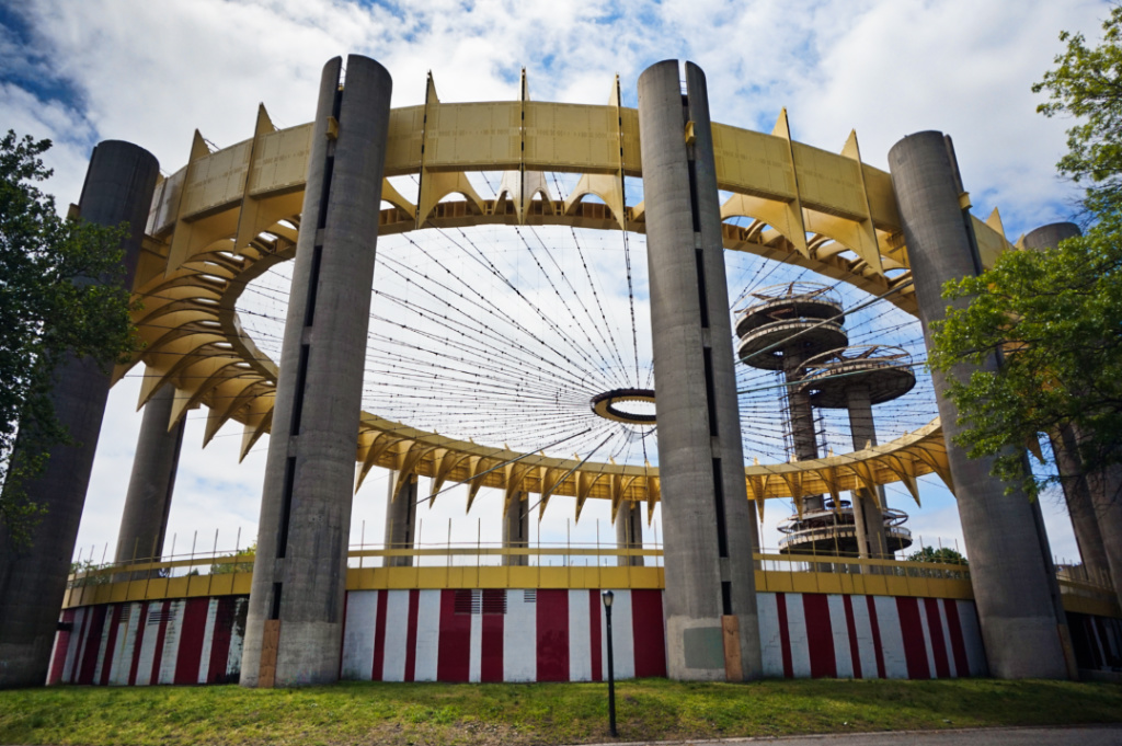
Thanks for the suggestions Mary. I also love this bridge, especially the round design and crisscrossing pillars underneath it. I struggled with that same issue when taking the photo. The row of trees and shrubbery is particularly lush and heavy there, so another photo I had taken more to the right had less greenery, but more of the bridge bridge was blocked by the stone pillar. |
Nov 17th |
| 48 |
Nov 20 |
Reply |
Thank you Bev for the suggestions. I like your edit a lot and agree that the bright colors can sometimes be a bit much. Great edit - I love how the clouds came out as well! |
Nov 17th |
6 comments - 5 replies for Group 48
|
| 96 |
Nov 20 |
Reply |
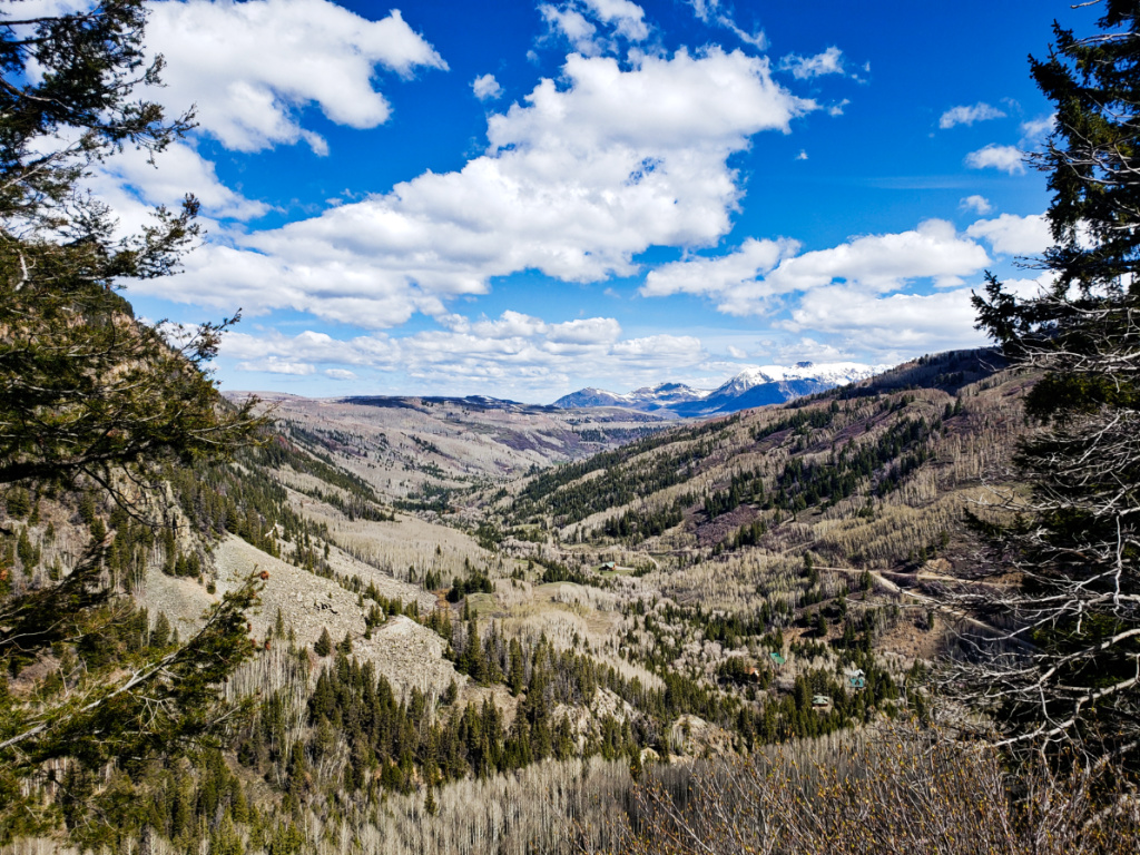
Thanks Dale. I also like to have something in the foreground. Here's another shot from a slightly different angle, taken a bit further up the hill (which looks flat in the image) that same day. I am curious to know what people prefer. |
Nov 20th |
 |
| 96 |
Nov 20 |
Comment |
Very interesting composition Gerard. I like how my eye is drawn along the coast and around the curve of the wall/shore. I think the sharp details and the desaturated capture the starkness, bleakness, and atmosphere of hardship that the scene sets. The green, rolling hills actually look like a nice oasis to escape to compared to the narrow houses and winding streets of the town, yet it seems as if the green hills are separate and either inaccessible or simply untouched/unvisited. Great shot! |
Nov 19th |
| 96 |
Nov 20 |
Comment |
Cheryl, I love the shades of pink and purple that you pulled out in the sky and clouds as well as the bright highlights of the street lamps at night. They provide a nice contrast to the sky. The reflection in the water is perfect and clear. Great shot! |
Nov 19th |
| 96 |
Nov 20 |
Comment |
I love the composition and the variety of different colors and textures within each layer of the image. The reflections in the water are perfect. It is interesting to see how many different ways your image can be re-imagined, which is part of the beauty of the PSA group in my opinion. As someone new-ish to PSA, I also struggle with titles, mostly because I, like you, don't usually title my photos. I tend to just imagine that I am seeing images as framed photos on a wall at home - which usually lack titles and explanations. So, in my case, your title didn't really impact my view of your work. Great shot!
On a side note, the practice of VTs (Visual Thinking Strategies), which is practiced in museums and with educators echoes your philosophy. Rather than tell viwers the title and explanation (which sets up expectations and frequently conforms viewers to a specific viewpoint based on said title/explanation), VTS asks viewers to reflect and say "What is going on in the picture". This question allows viewers to explain what they think is happening in the image, what is the backstory, and what they think might be going on 'outside' of the frame. Again, this is just one way, out of many, to view and reflect on art. As with anything, it's not right or wrong, it's just different. |
Nov 19th |
| 96 |
Nov 20 |
Comment |
Wow, this is a beautiful image and amazing composition. I like crispness of the trees, grass and snow. I like how the yello and orange are contrasted by the white snow and the light colored tree. I haven't tried the dodge and burn technique, so it's helpful to see how you have worked with it in your images. Great shot! |
Nov 19th |
| 96 |
Nov 20 |
Comment |
I love the shades of bright greens in your image. They blend nicely with the yellow-brown grasses. I think that both Gerard and Robert's edits are good, and both evoke different feelings from your original image. I agree that emphasizing the rays of light really bring more focus to the areas of light and shadow. I also like the patterns of the leaves on the left. All of the different plants give the image a lot of texture. Great shot! |
Nov 19th |
| 96 |
Nov 20 |
Reply |
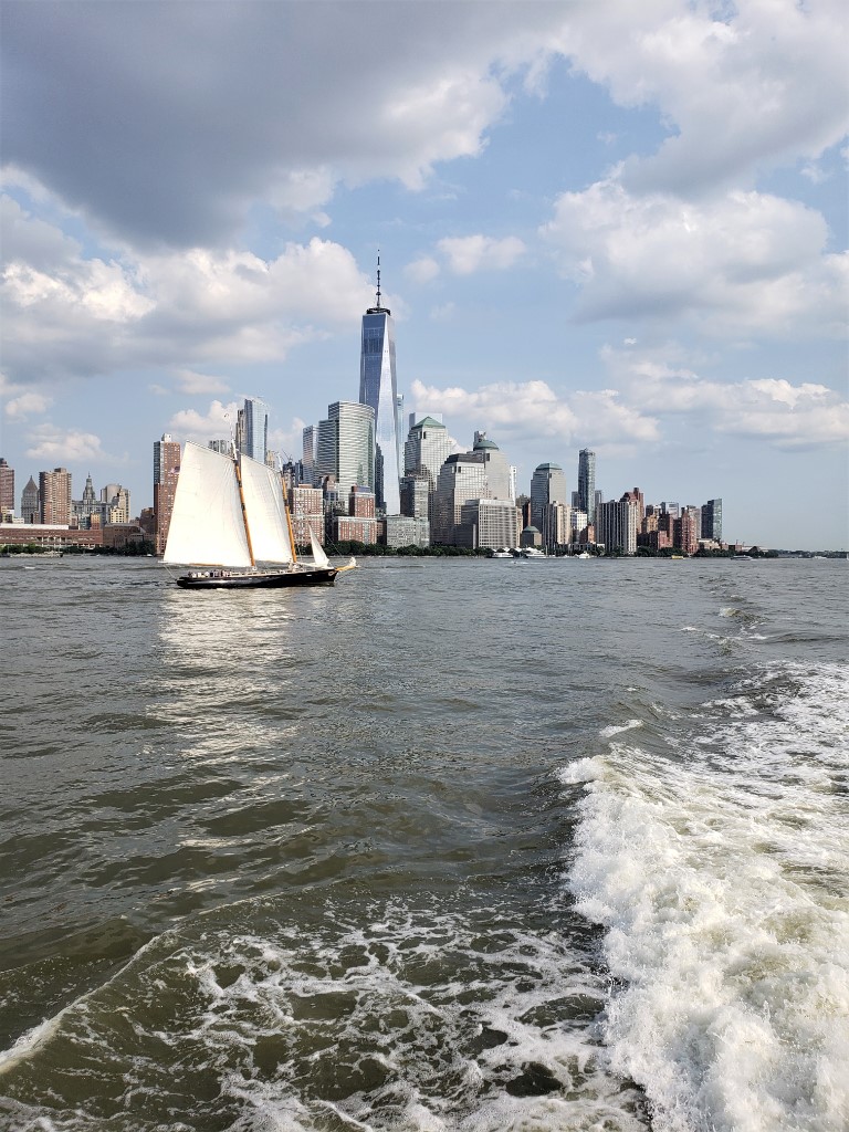
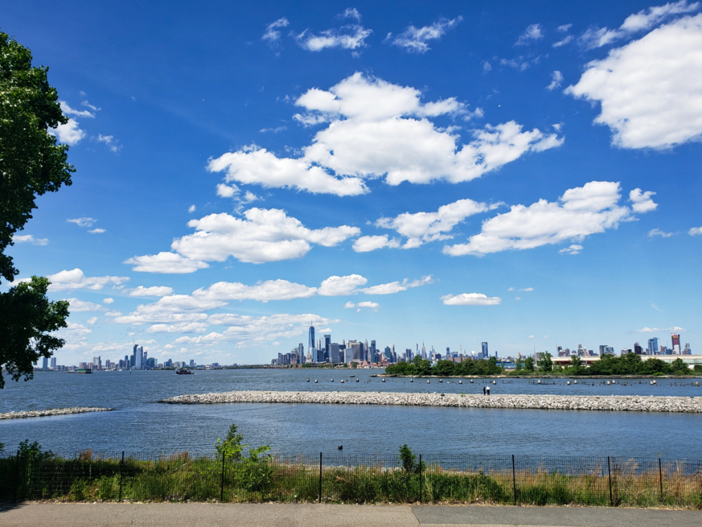
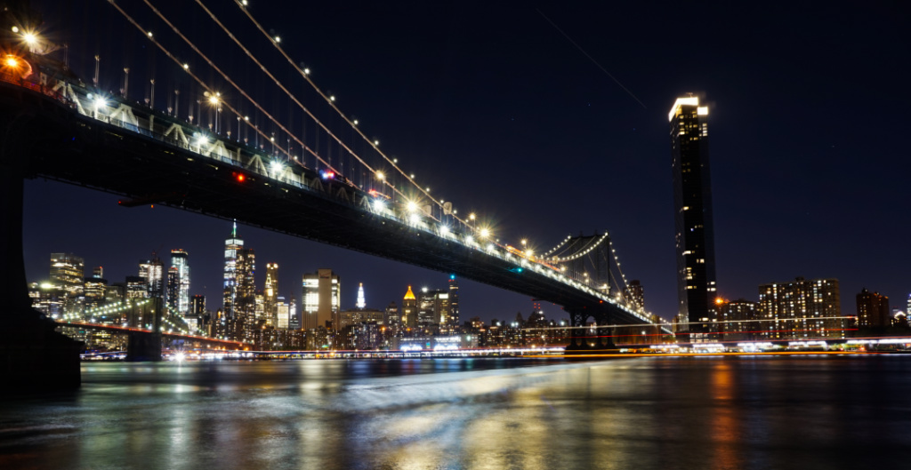
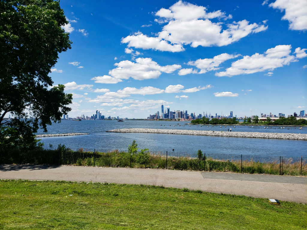
Thank you Dan. I agree that the cropping and Robert's edits are great. I also think that the gradient in the sky gives it a bit of depth. I know that for some people, images of the city might seem to lack a specific purpose or focus. But as someone who loves cities, I enjoy seeing the amazing scale of NYC as well as its unity with nature (i.e. the waterfront - Manhattan is an island after all). I think that the stillness in the scene gives me a sense of calm despite the urban surrounding. So, thank you. I appreciate that. |
Nov 17th |
| 96 |
Nov 20 |
Reply |
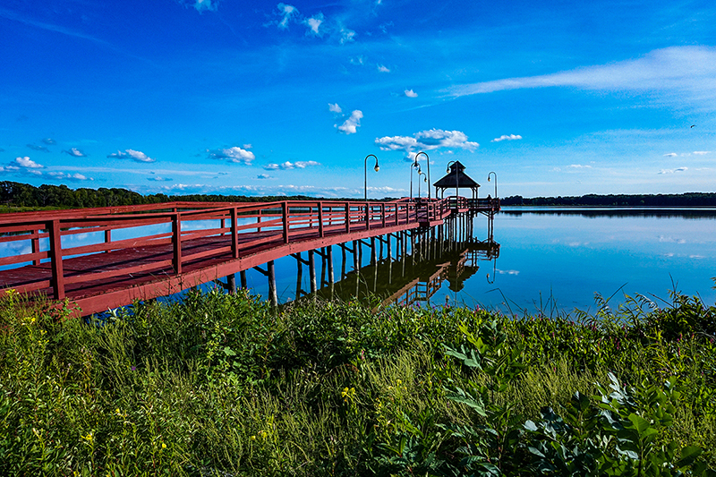
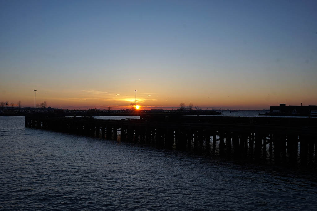
Great suggestions Robert and that's actually a great question. For me, living in NYC usually means that from most perspectives around the city, you only see one skyline (i.e. just downtown Brooklyn when there, Manhattan skyline when looking at it from Brooklyn, Brooklyn skyline when viewing it from Manhattan etc.). So, it was a really cool moment to find a place where I could clearly see the Hoboken skyline (background, left), Manhattan skyline (background, middle), AND Brooklyn skyline (background, right) - without having to do a panoramic shot or put/paste/stitch multiple images together. As someone that really loves architecture as well as exploring NYC, there's very few places where you can see almost all the skylines together. I wish the couple weren't there walking on the pier, but I couldn't ask them to move (as it is a public park and they were meandering slowly down the pier). |
Nov 17th |
| 96 |
Nov 20 |
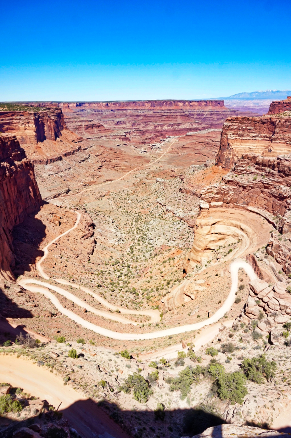
Reply |
Hi Gerard, thanks for the suggestions. I will have to return to the park to get some more shots. It's hard to tell from the image, but I was standing about 10-12 feet above the path on a hill/embankment. I tried to get some shots from next to/directly over the fence. But the difference in angle and lack of height meant that much more of the horizon and architecture was obscured by the greenery. |
Nov 17th |
| 96 |
Nov 20 |
Reply |
Hi Cheryl, thanks for the suggestions and great edit. I agree that cropping it helps keep the focus on the architecture in the background. |
Nov 17th |
5 comments - 5 replies for Group 96
|
11 comments - 10 replies Total
|