|
| Group |
Round |
C/R |
Comment |
Date |
Image |
| 48 |
Oct 20 |
Reply |
Thank you Bev. I agree that the color needed some work, but I didn't want to go overboard. I think your Photoshop edits really brighten the shot. Great edit and suggestions! |
Oct 27th |
| 48 |
Oct 20 |
Reply |
Thanks for the suggestions Margaret. I agree that the one tall stem of grass isn't ideally placed. However, as I was thinking about entering this photo under the Travel division, I am glad to know that this image is a good fit for that category. |
Oct 27th |
| 48 |
Oct 20 |
Comment |
Lloyd, I like how the light tones of the flower contrast nicely with the dark color of the leaves. Both the flower and leaves appear delicate and soft (to the touch) - which is a lovely effect. Great shot! |
Oct 16th |
| 48 |
Oct 20 |
Comment |
Mary, wonderful, clear photo of a cute baby deer! It was great that you noticed it and caught the baby deer in situ. I agree that slightly editing to remove the branch in front of/under the left eye makes it less distracting and so the viewer can see see the face clearly. Great shot! |
Oct 16th |
| 48 |
Oct 20 |
Comment |
Jamie, the diversity of the painter's works on display definitely brings even more color and brightness to an already interesting subject - the painter in action. I would be curious to hear the painter's story about his work and inspirations. I agree that cropping the building out a bit helps to focus on the painter and paintings on display. Great shot! |
Oct 16th |
| 48 |
Oct 20 |
Comment |
Margaret, I love the different layers in the image. It reminds me of the different parts of a stage (like the curtains that separate the backstage, center stage, front stage etc.). The combination of the ridges of the mountains, the soft blue sky, the rippled green water, and the beige, craggy tufas is visually striking and creates an interesting contrast. Yet, all the elements work together and create a beautiful composition. Great shot! |
Oct 16th |
| 48 |
Oct 20 |
Comment |
This is a cute photo. I find that it is always challenging to edit film photos that didn't start out as digital files. You edited the image so that the skin tone and hair color are both bright and natural. Great job! |
Oct 16th |
5 comments - 2 replies for Group 48
|
| 96 |
Oct 20 |
Reply |
Dale, thank you. I agree that the silhouetted land formation is important in the shot. I think it add a sense of scale to the shot. I will definitely play with the image a bit more, since I don't want to lose the reflections in the water. |
Oct 19th |
| 96 |
Oct 20 |
Reply |
Cheryl, I like how your edit draws out the warmer colors over the horizon. I think for your edit, the landscape format and crop looks best. Thanks for the suggestions about brightening the wave in the foreground. Great edit! |
Oct 19th |
| 96 |
Oct 20 |
Reply |
Gerard, thank you. I really like how your edit brings out more of the depth and texture of the clouds as well as the highlights on the water. I think for your edit, keeping it in landscape version works better than portrait. Great ideas! |
Oct 19th |
| 96 |
Oct 20 |
Comment |
Gerard, this is a really interesting image. Many B&W images tend to be a bit darker in terms of the tones. But I think this one being lighter works really well. I think that the lighter shades of the B&W draw my attention to the cows and the objects in the scene, with the white mist/fog working like a backdrop. |
Oct 16th |
| 96 |
Oct 20 |
Comment |
Cheryl, wow - this is a gorgeous image. You seamlessly stitched together 4 images to create one spectacular shot. I like how you were able to lighten up the image so that the ripples on the water, the texture of the mountains, the bright reflection of the mountain summits, and the fog/mist are all clear and crisp. Amazing job and great work. All your hard work really paid off. |
Oct 16th |
| 96 |
Oct 20 |
Reply |
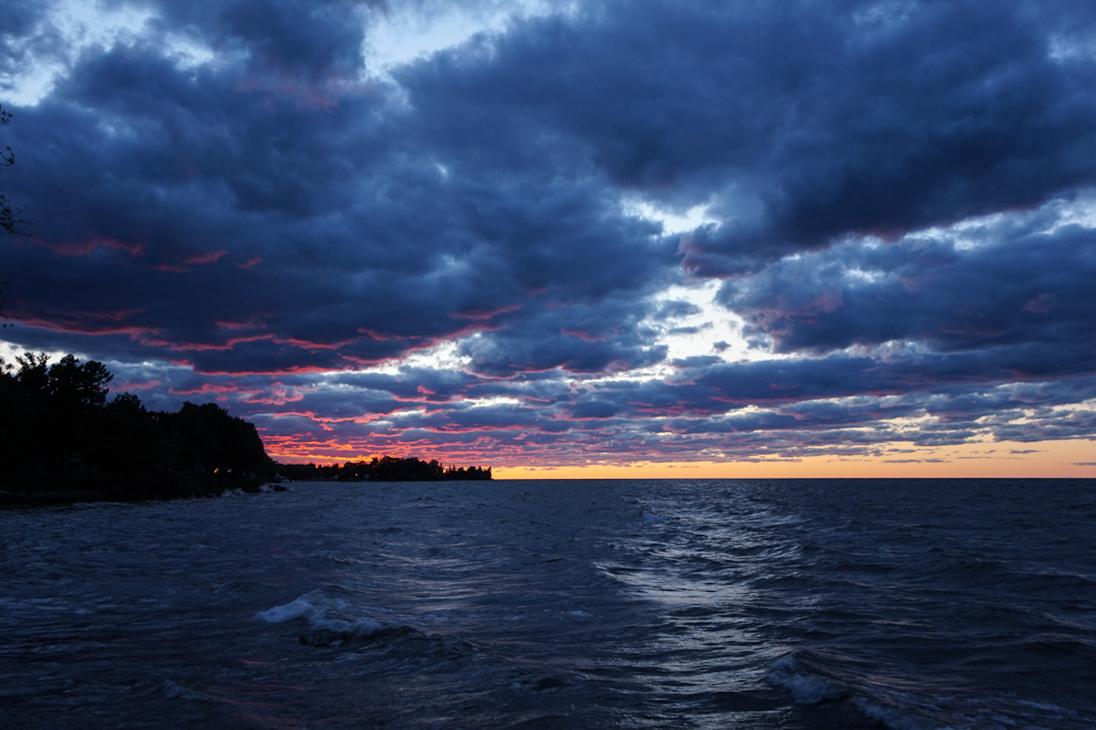
Thank you Dan! Yes, this summer I spent each weekend up on Lake Ontario, checking the weather conditions and sunset times, arriving early, staying till astronomical dusk, and catching a variety of gorgeous skies. I was glad to have been able to get a range of shots this one evening - with this shot being the best of the bunch. I agree that Robert's crop really highlights the best parts of the shot! |
Oct 15th |
| 96 |
Oct 20 |
Reply |
Robert, these are great suggestions. I like your crop and recompose - it really focuses on the colors of the sunset and the waves, which was my desire when capturing the image. I agree that the bright patch of light to the right takes a way from the left side and the sunset. I wasn't sure which crop to use - but I think for this image, the crop that you used (which I haven't played with as much) is a great fit. Thank you! |
Oct 10th |
| 96 |
Oct 20 |
Comment |
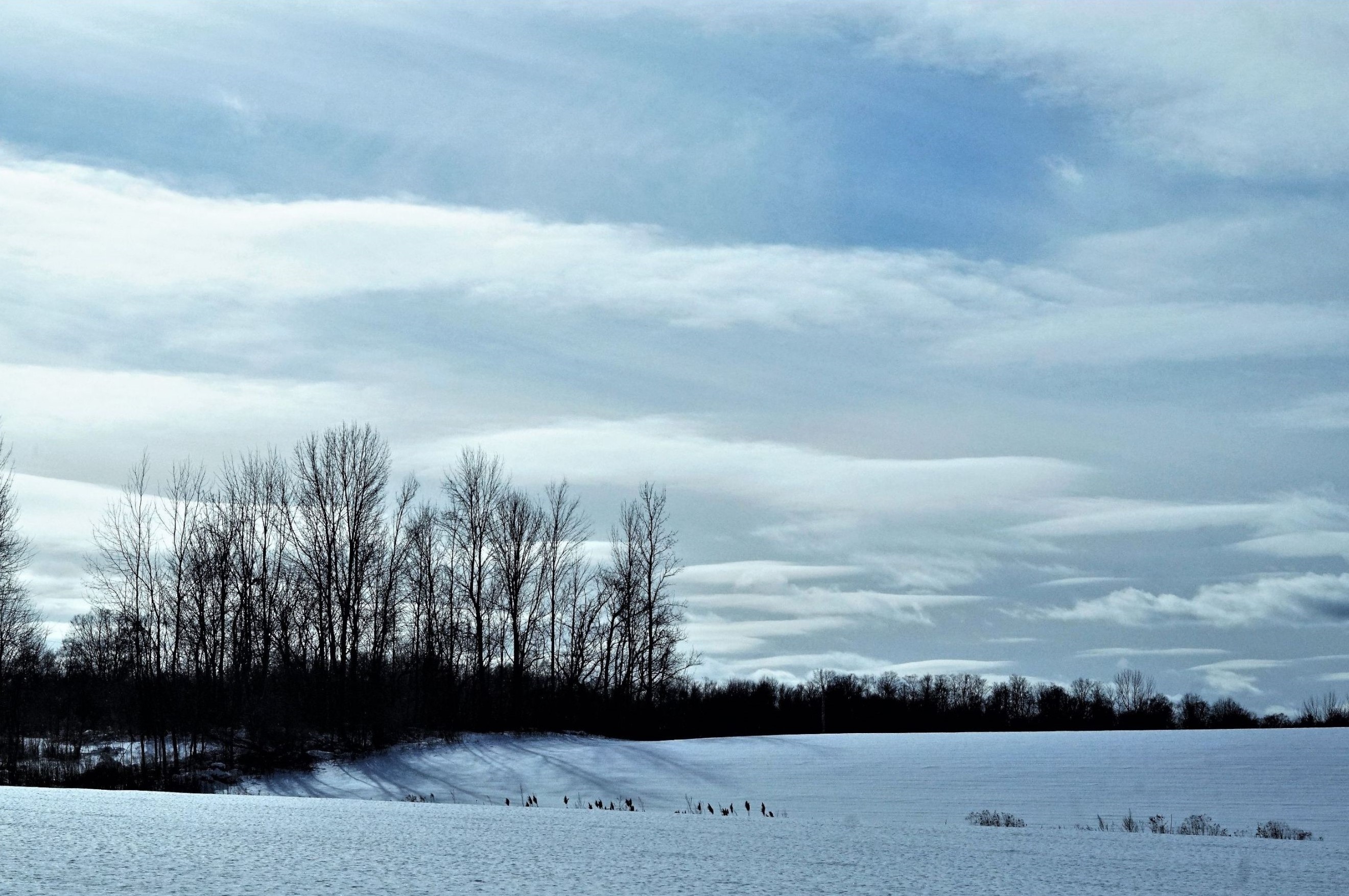
Dan, I love the mysterious atmosphere that the fog brings to the image. The bare trees in the foreground are crisp, more focused, and make the foreground seem more grounded/real (if that makes sense). The subtle silhouette of the tree line in the background contrasts nicely with the bare tree trunks, since the tree line is fuller (i.e. pine trees) yet seems more ephemeral. The pastel tones of the sky are also a lovely contrast to the dark silhouettes. Beautiful shot and composition! |
Oct 9th |
| 96 |
Oct 20 |
Comment |
Robert, this is a gorgeous. Definitely don't sell yourself short. I love the reflections in the water, the bright colors of the leaves compared to the neutral tones of the tree trunks, and how the reflected trees are just nicely blurred compared to the crisp trees/leaves. Congrats on meeting a photography hero of yours. Since you both met randomly to photograph a beautiful yet likely more unknown spot (which I will have to explore more when I am back out in CO), I think the revised adage "great minds think similarly sometimes" is quite apropos. I am sure that other in the group have more effective feedback in terms of technical stuff. But, I think this is a great shot! Superb job! |
Oct 9th |
4 comments - 5 replies for Group 96
|
9 comments - 7 replies Total
|