|
| Group |
Round |
C/R |
Comment |
Date |
Image |
| 48 |
Sep 20 |
Reply |
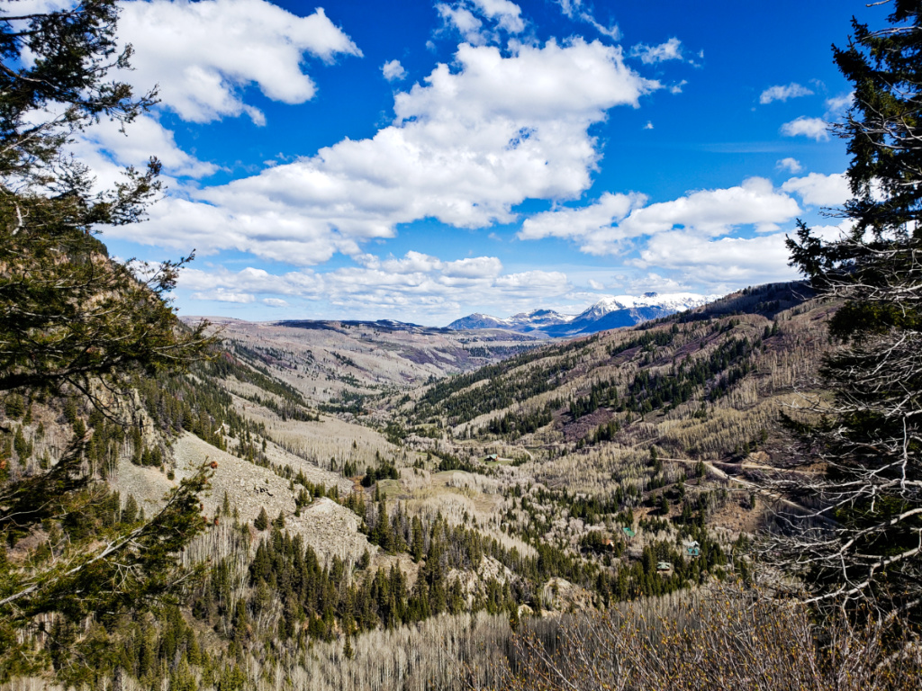
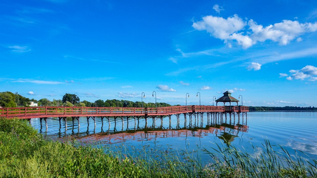
Thank you, I like it with the crop! I've noticed that cropping things to/near the 16:9 ratio really makes panorama-ish and landscape images look really good. |
Sep 14th |
| 48 |
Sep 20 |
Reply |
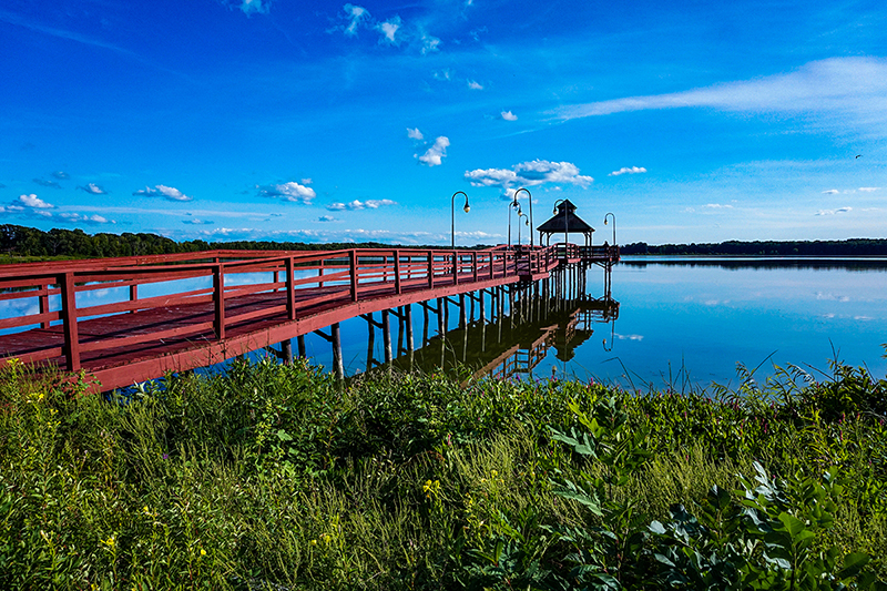
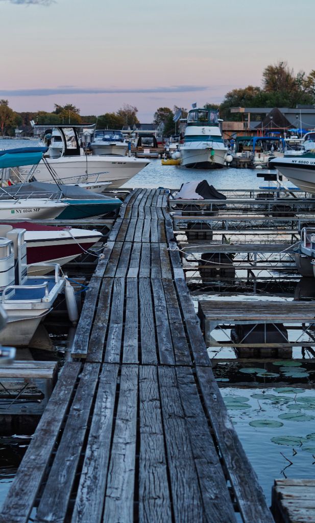
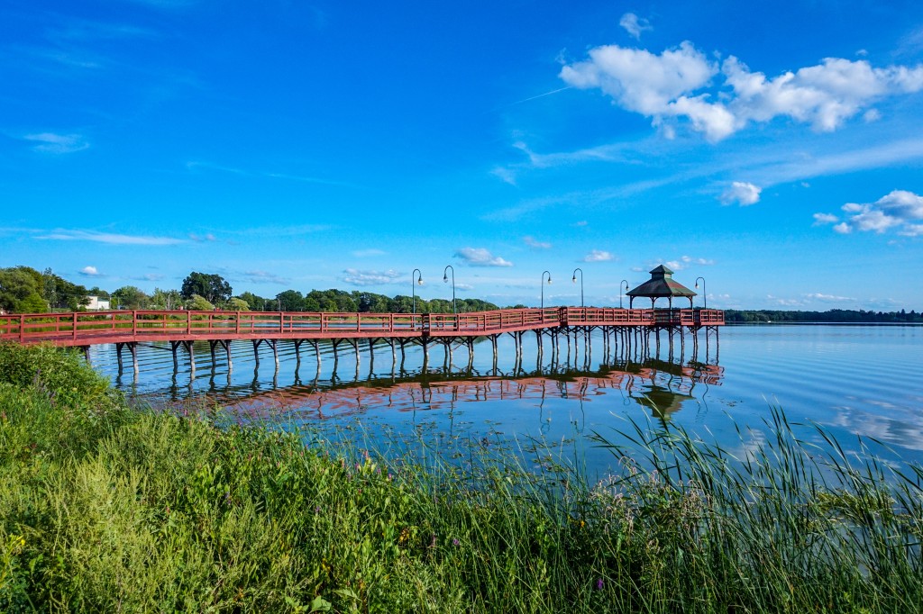
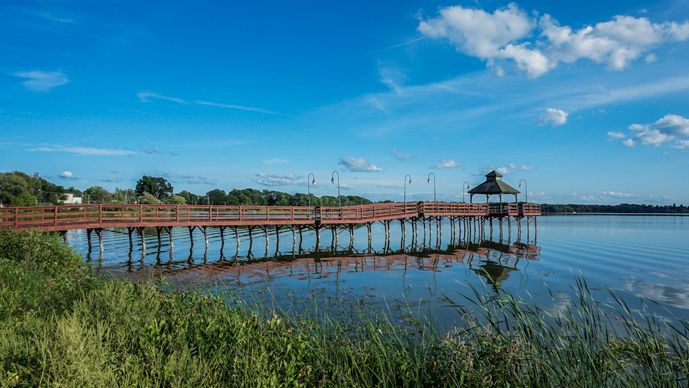
Thank you. It really was a perfect day for shooting photos on the lake. I don't know if the city painted the pier red intentionally - but whoever had that idea was really clever. The pier looks really bright and contrasts with the lake and surrounding colors perfectly. |
Sep 14th |
| 48 |
Sep 20 |
Comment |
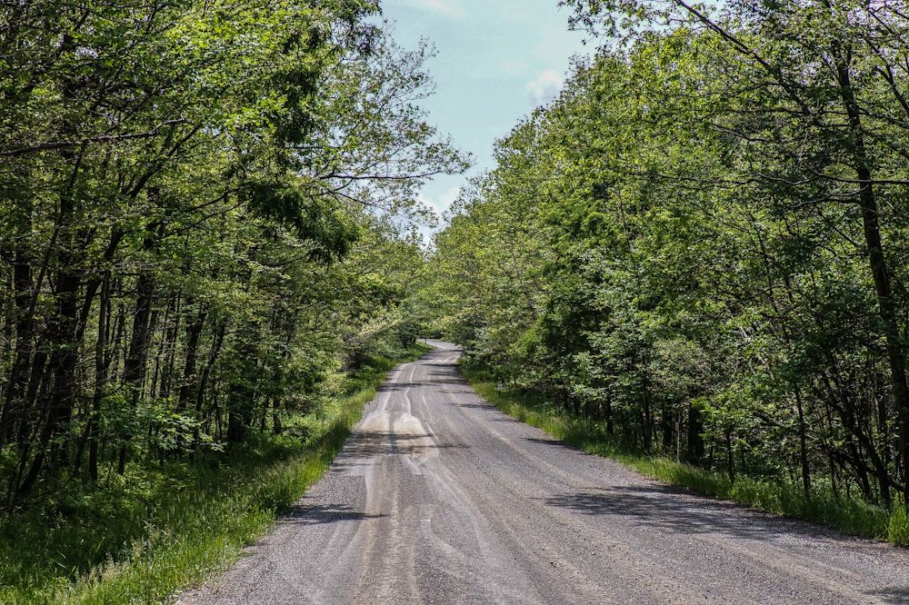
This is a beautiful scene. I love how the bright green leaves contrast to the muted tones of the ground and trees. The reflection in the creek also brings in the light from the sky. This is a really crisp, clear capture. Your method for capturing the image (merge 6 shots into a panorama) is really interesting and worked really well. Kudos, Great shot! |
Sep 14th |
| 48 |
Sep 20 |
Comment |
This is a very cool image. I like how at first, it looks like the cat is out of focus or pixelated. But, once you look at it again, then you can see that it's peering through a screen door. The cat itself has beautiful coloring and is perfect for this shot. Great shot! |
Sep 14th |
| 48 |
Sep 20 |
Comment |
Hi Mary, this is a fun image - good energy, very clear and no blurring at all. She seems like a fun photo model to work with. I like how you really pulled out the light and shadows on her face, the creases on her clothes, and in the trees and bushes in the background and foreground. Great shot! |
Sep 14th |
| 48 |
Sep 20 |
Comment |
Beautiful image and edit. I appreciate that the musician is anonymous. It keeps the focus on the music being played. I also think that cropping the image and increasing the contrast really makes the colors pop and brings the image to life. Great shot! |
Sep 14th |
| 48 |
Sep 20 |
Comment |
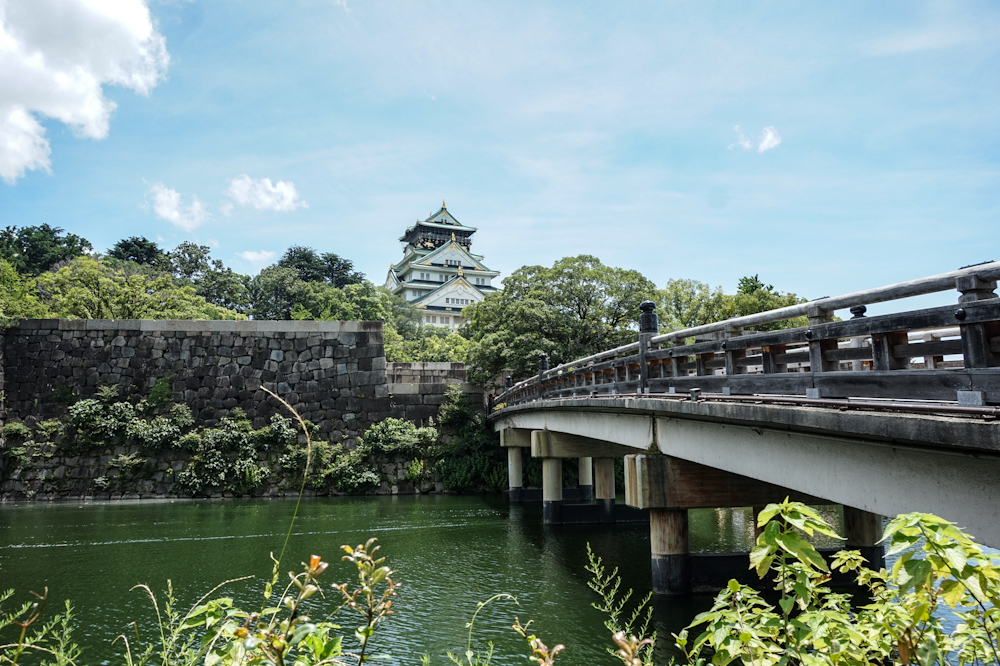
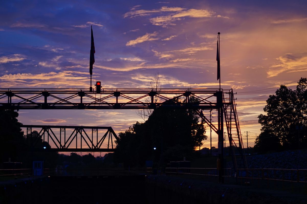
This is very cool - I like how you captured the reflection of the clock and bridge stonework perfectly. I wonder if there would be a way to draw out some more of the color in the water lilies in the foreground? I see that they might be in the shadow of something outside the frame. So, perhaps that isn't really possible/easy. Regardless - Great shot! |
Sep 14th |
| 48 |
Sep 20 |
Comment |
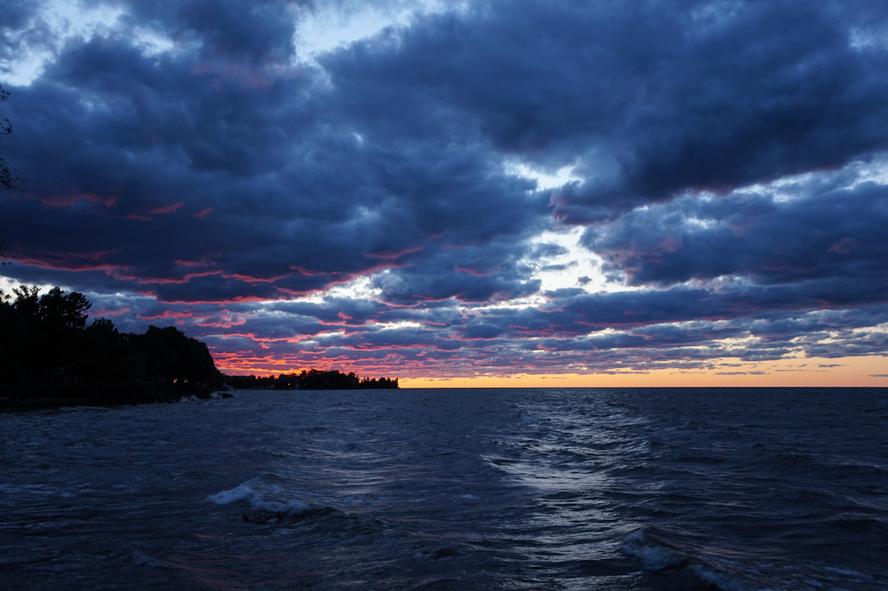
This is a beautifully composed image! I love how you captured the warm colors of the sunset, the waves rolling in, the texture of the clouds, and a bird flying by. The image is really clear the scale makes it feel like I, the viewer, am standing right there watching this scene while walking down the beach. Great shot! |
Sep 14th |
6 comments - 2 replies for Group 48
|
| 96 |
Sep 20 |
Reply |
Thank you! |
Sep 21st |
| 96 |
Sep 20 |
Reply |
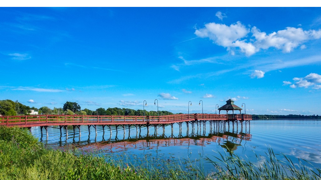
Thank you. I agree. It also challenging to work on LR on my mobile app compared to seeing it on my PC, as the screen brightness isn't quite the same. I edited the image in Adobe Photo Express on my PC. Please let me know what you think. |
Sep 21st |
 |
| 96 |
Sep 20 |
Reply |
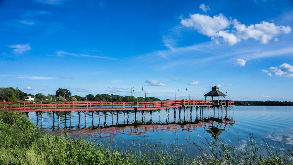
Thank you Dale. That's helpful advice. I played with the colors in LR a bit. The red doesn't 'pop' as much, but the blue is less saturated. I am curious to get others opinions on it. |
Sep 21st |
 |
| 96 |
Sep 20 |
Reply |
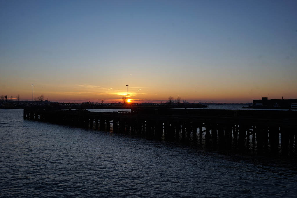
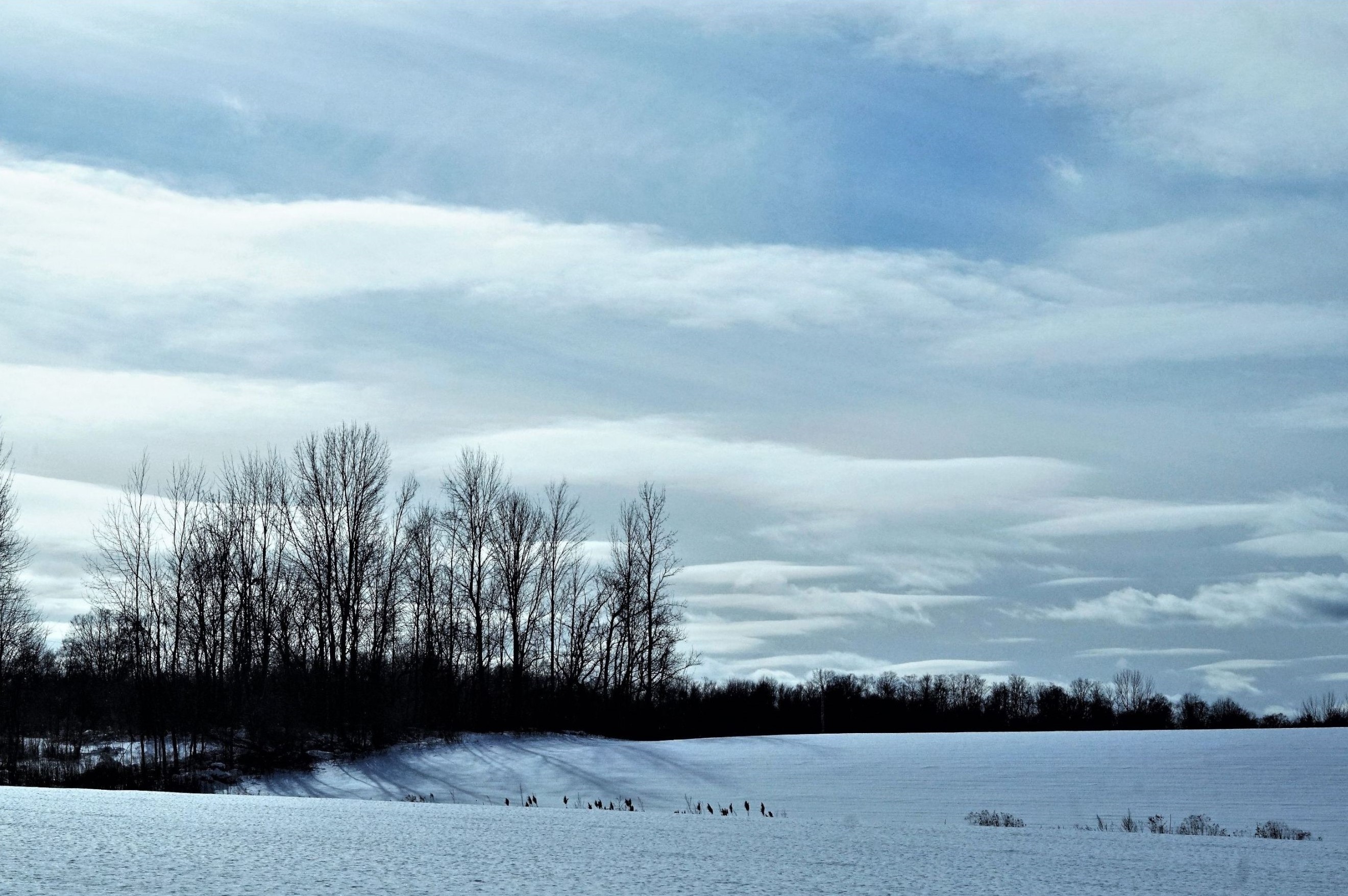
Thank you Cheryl. Yes, I definitely hope to go back for sunset (I live a few hours away from the lake, so sunrise is a tough time to get there). I tried some of your editing suggestions. I'm working with the free version of Lightroom, so the gradient filter option isn't available. But, I played with the original image (cropped, increase clarity, increase dehaze slightly, reduce color noise, increase contrast slightly). Here's the revised image. It was really bright and blue out that day, so there's not an easy way for me to mute the blue without muting all the other colors (red pier, green grass). |
Sep 16th |
 |
| 96 |
Sep 20 |
Comment |
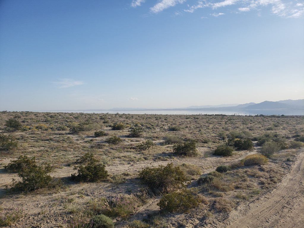
Wow Gerard, this is a really cool image. I love how you captures how the trenches/walls (?) form a pattern of separate pools/fields (?) of salt. Personally, I think the diversity of details - which do stay within a consistent theme - are what make the image really visually striking. For example, the lines in the surface of one section/pool/field (sorry if that is not what they are called) run diagonally in one direction, while the lines in the adjacent section/pool/field run diagonally in the other direction. The walls/tranches all run in different directions, but pretty much horizontally (or slightly diagonally). The muted tones of the sand are interspersed with some slight shades of muted purple/red in the pools of water in the foreground as well as the field in the mid-ground, which also shows the reflection of the house. I know that photography and what people consider to be good subjects or compositions is highly subjective. But, honestly, I LOVE this image. I like that is doesn't just have one subject, but a definite grouping of visual elements that all together make sense for the composition. Great shot and perfect capture of a unique and amazing scene! |
Sep 14th |
| 96 |
Sep 20 |
Comment |
Very cool image Zsolt! I remember seeing pools like that in Yellowstone when I visited many years ago. I like how you pulled out the deep, rich colors of the sulfur pools as well as the blues of sky and the textures of the clouds. Great shot! |
Sep 14th |
| 96 |
Sep 20 |
Comment |
Wow - this is a great shot of the Neowise Comet! I saw it both days on the weekend that it was out, but could not get a shot of it. As someone who has been doing more night photography, thank you for sharing your settings and how you edited the image to capture more stars with clarity. This is really educational and helpful. Great images and editing! |
Sep 14th |
| 96 |
Sep 20 |
Comment |
Beautiful image Dan! I love the contrast in B&W (three tones - light, medium, dark) as well as the symmetry between the sky and the beach. Great job capturing the reflection of the rock in the pool of water. That is a really interesting pair of rocks - they eroded differently but look great as a pair. The image is really eye-catching. Plus, I love the bird standing in the foreground. It adds a sense of scale to the image and helps to show how large the rocks are. Great shot! |
Sep 14th |
| 96 |
Sep 20 |
Comment |
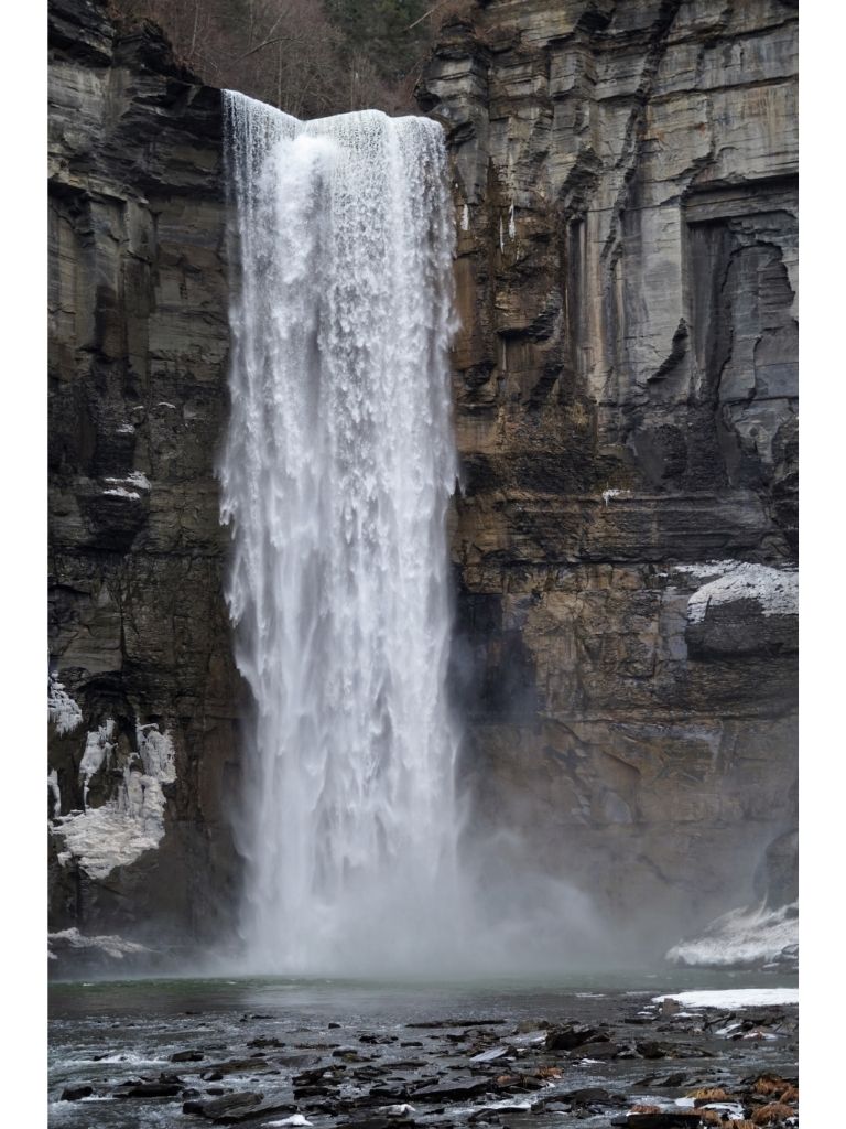
Wow, these are both amazing images. I like how the cropped, lightened image focuses on the mist over the waterfall. The shapes/brightness/color of the yellow leaves and the muted tones/shades/shapes of the mountain rocks contrast nicely with the white mist are in the mid-ground. The image definitely has a different 'feeling' than the original. However, I also like Gerard's cropping that keeps more of the contrast and shows more of the trees in the foreground - it gives it more "height" (i.e. shows more of the scale of the scene). I think all the images are beautifully shot and would each fit a different mood or sense of decor (i.e. if this were framed and put on a wall). Great image(s)! |
Sep 14th |
| 96 |
Sep 20 |
Comment |
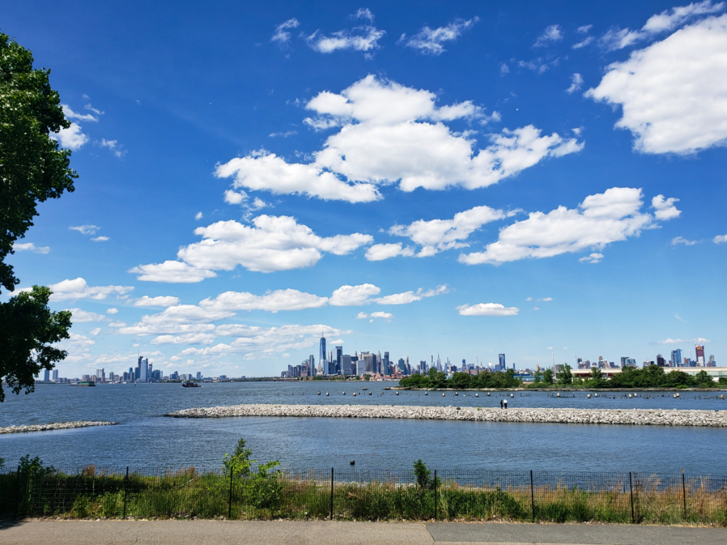
I love these types of images - seascapes that capture the layers of clouds. Personally, I really like the silhouette of the bridge of the background because it helps give a sense of the scale to the image (i.e. how grand it is and how much physical space the frame/image encompasses). I also agree with Dan and Gerard that the crop frames the image nicely. Also, FYI - if you ever edit using Adobe Photoshop Express (it's free to download and/or use online), two of the editing features are "reduce luminance noise" and "reduce color noise". I have been experimenting with those and they have been useful. |
Sep 14th |
| 96 |
Sep 20 |
Reply |
Thank you Robert! I agree - the thirds works really well with this image. |
Sep 14th |
| 96 |
Sep 20 |
Reply |
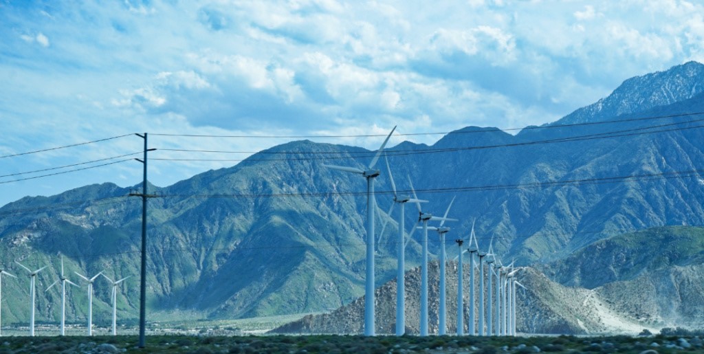
Hi Gerard, thank you for your suggestion. Yes, I wish there were some tall trees to climb to get a higher view of lake. Thanks also for the info about the 4:1 ratio - I will try that out in some of my future images of beaches or deserts/mountains in the Southwest. Would the 4:1 ratio be classified as "panorama/panoramic" or something along those lines? |
Sep 14th |
| 96 |
Sep 20 |
Reply |
Here's a slight variation of the cropping. |
Sep 10th |
 |
| 96 |
Sep 20 |
Reply |
Thanks for the suggestions Dan. I will definitely have to see if I can get more shots there using a faster shutter speed. I also like the image cropped as well. The 16:9 ratio really lines up the pier/horizon line to the thirds perfectly. |
Sep 10th |
 |
6 comments - 8 replies for Group 96
|
12 comments - 10 replies Total
|