|
| Group |
Round |
C/R |
Comment |
Date |
Image |
| 48 |
Jul 20 |
Reply |
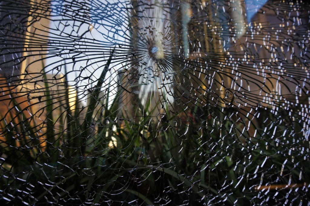
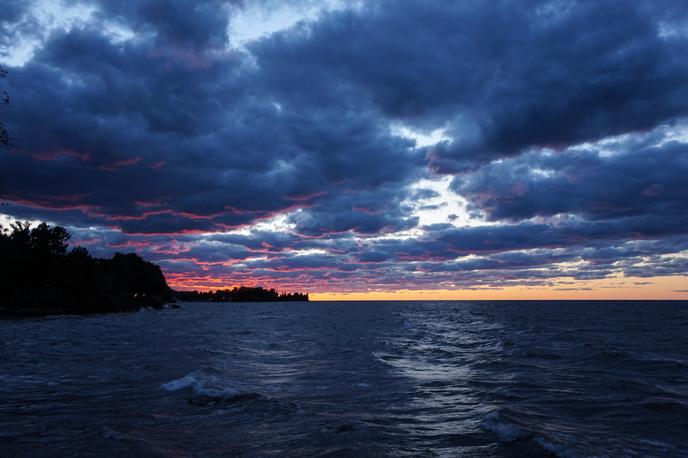
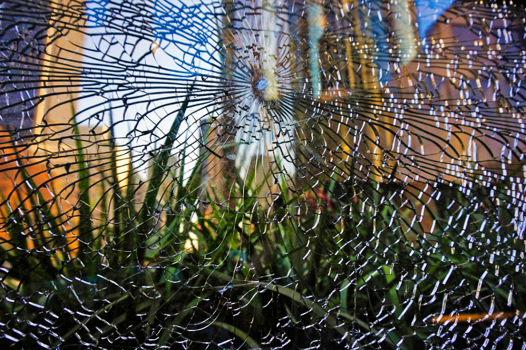
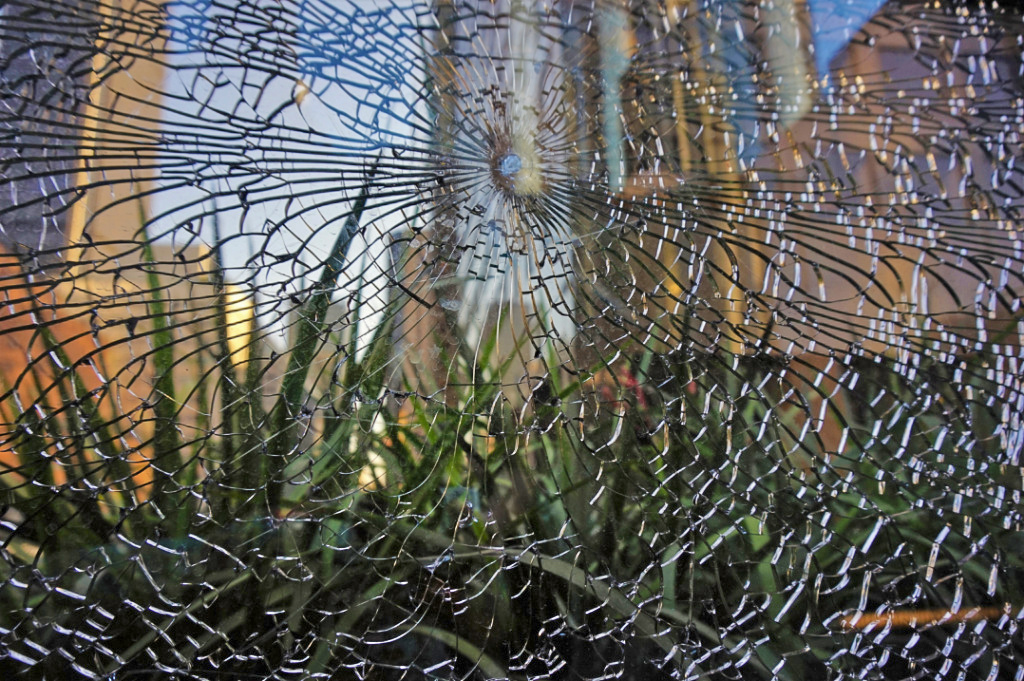
Thank you. I agree. I think that the darker original and the revised version convey different feelings (darker vs. lighter) and foci (the shattered glass vs. the buildings in the background), so it's interesting to for me to contrast the images, depending on my mood. |
Jul 30th |
| 48 |
Jul 20 |
Comment |
Welcome to the group Lloyd. This is a beautiful image. I like the pastel shades and then the contrast of the bright red flower petals just opening up. I also think that the out-of-focus background is a great contrast to the sharp, crispness of the flower in the foreground. Great shot! |
Jul 30th |
| 48 |
Jul 20 |
Reply |
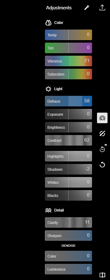
Hi Llyod, thanks for your feedback. I edited the original a bit (vibrance increased, contrast increased). This edit makes the color of the buildings in the background a brighter and bit more distinct. I'll be curious to hear what others think. |
Jul 19th |
 |
| 48 |
Jul 20 |
Reply |
Thank you! I am always trying to keep an eye out for things that might otherwise be overlooked. |
Jul 17th |
| 48 |
Jul 20 |
Comment |
I think the original image is an interesting scene. I wish there was less going on in the mid-ground and background, as these elements really distract from the desired main focus (i.e. the food on display) in the foreground, as you mentioned. |
Jul 17th |
| 48 |
Jul 20 |
Comment |
I agree with Margaret that I wish the brown weeds covering the one poppy could be moved out of view or elsewhere in the image. I really like the shapes of the green plants that are clearly outlined in the top part of the image, and wish that they were in the background directly behind the poppies. I like the bright, crisp colors of the flowers. Since the three poppies are located asymmetrically in different quadrants/areas of the image, it's hard to view them as a cluster, which my eye keeps trying to do. So, I think Jamie's suggestion to crop the image and focus on the largest poppy might be one way to focus on one the subject within the image. |
Jul 17th |
| 48 |
Jul 20 |
Comment |
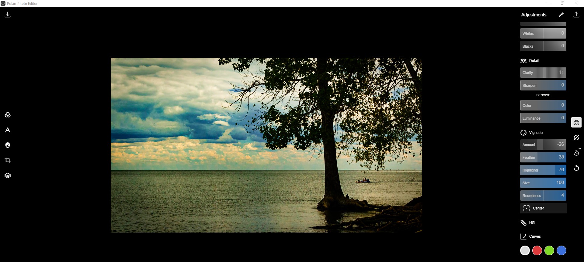
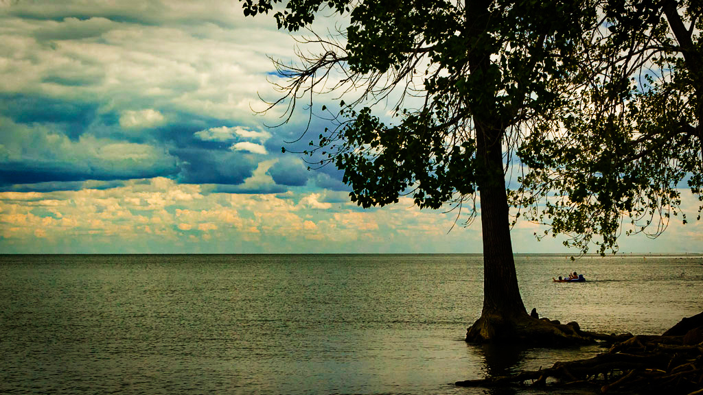
The river really leads the viewer's eyes and the geometric structures with pops of bright color nicely contrast the muted river colors and the rounded, organic shape of the river. I agree that slightly straightening it be called for. However, it is possible that the houses are somewhat slanted/at an angle, so the slight tilt is actually just an optical illusion. I like how Stuart brightened up the water and houses on stilts. Since the sky seems to have been uniformly cloudy that day, I guess that leaves it open to possibilities for editing or leaving as a plain background. It's good to have lots of options! Great shot! |
Jul 17th |
| 48 |
Jul 20 |
Reply |
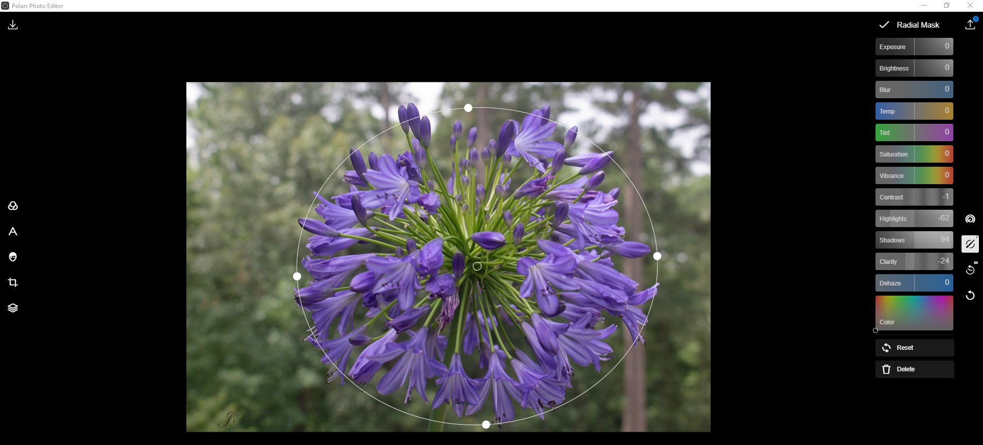
Here's how I did the radial edit. |
Jul 17th |
 |
| 48 |
Jul 20 |
Comment |
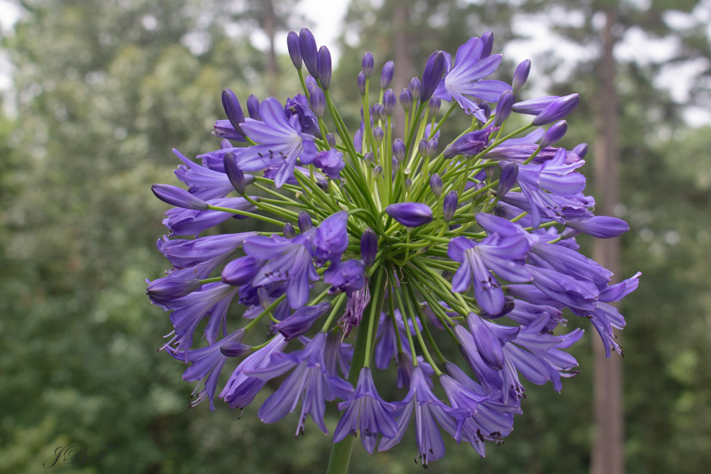
I think your original image is visually interesting because the flower looks like it's floating or disembodied, especially since the light green stem under it is very subtle. The light vignette effect is a little heavy for my taste, but I know that everyone has a different preference. I played with the image to see how a slightly different background might look. I also took a screenshot of how I did it. The radial tool seems to work well for these types of images (i.e. where the focus of the image is on one specific thing versus the entire image, such as a landscape) |
Jul 17th |
 |
| 48 |
Jul 20 |
Comment |
I like your original image. The dark green leaves contrast the brightness of the red berries. The difference between the focused/clear edges of the berries versus the slightly out-of-focus leaves really keeps my eye focused on the berries. I also like Jamie's crop, which really focuses on the center berry cluster and is nicely balanced. Great shot! |
Jul 17th |
| 48 |
Jul 20 |
Reply |
Hi Margaret, than you. It was a very random thing to capture, as I am sure many people have overlooked is when they walked past it. Thank you for your suggestions. Here's the revised version (highlights decreased, shadows increased). I will be curious to hear feedback from the group regarding the original and the revised version. Thanks again. |
Jul 13th |
 |
6 comments - 5 replies for Group 48
|
| 96 |
Jul 20 |
Reply |
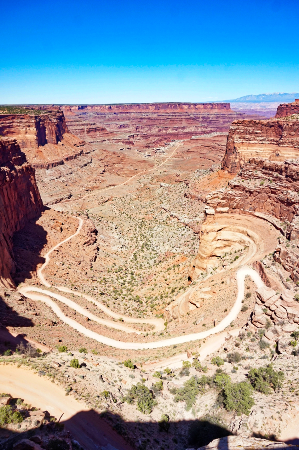
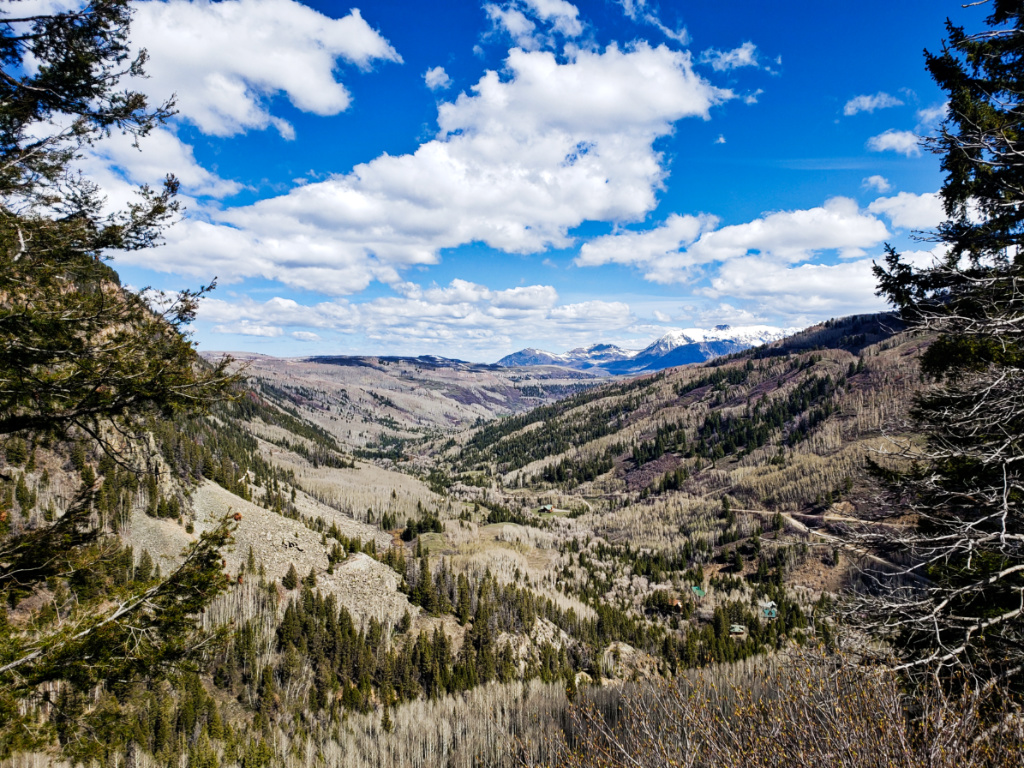
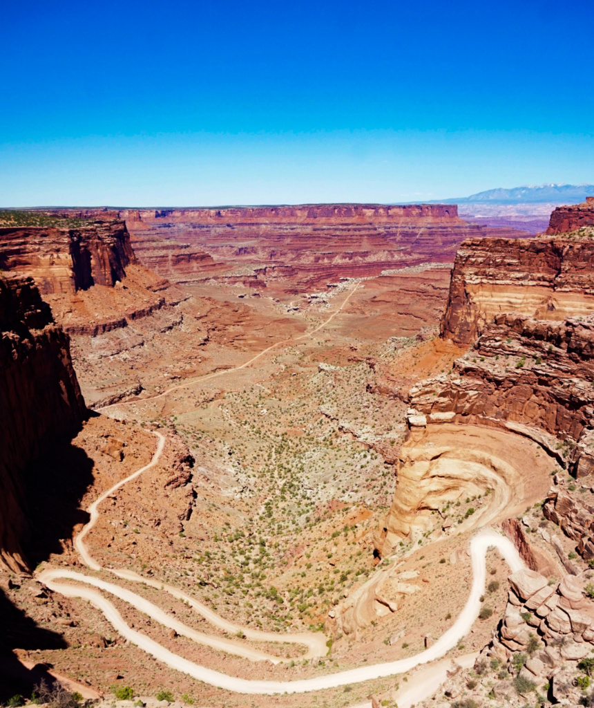
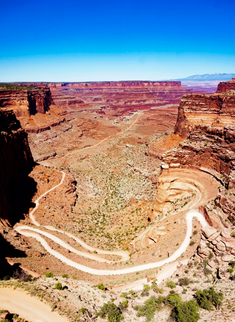
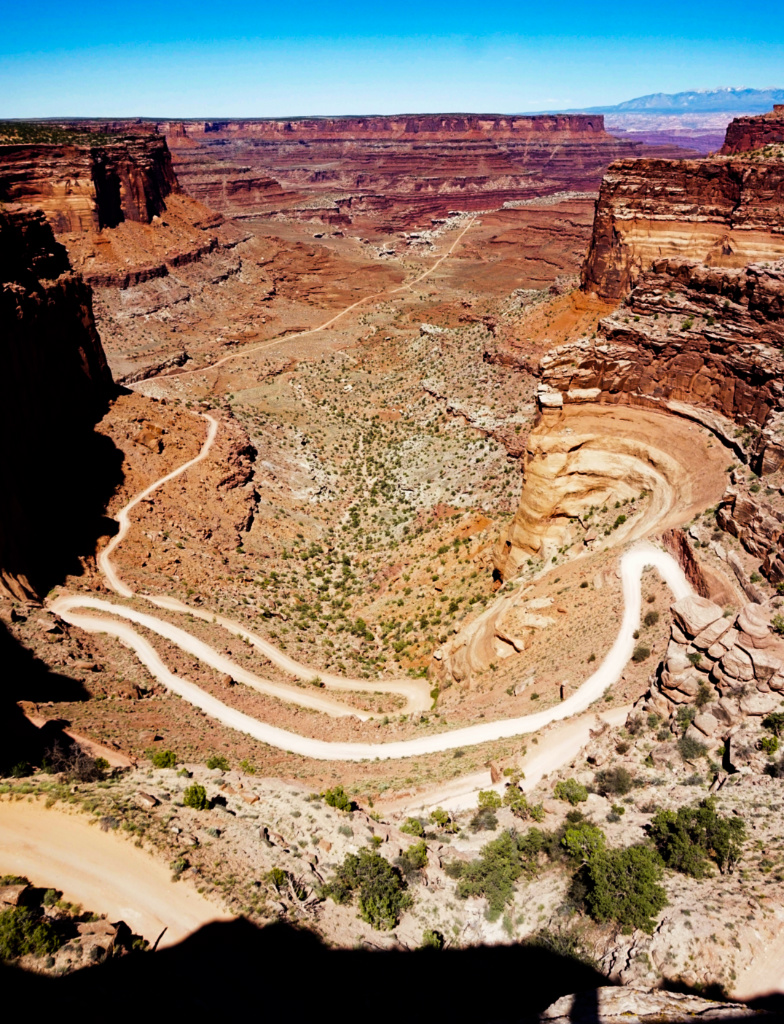
Thank you Robert for offering some more helpful insights and your feedback on the image. I agree that the specific colors could be darkened a bit to improve the contrast between the road and the rest of the canyon. It's also interesting for me to the image with the sky cropped out. Since the sky isn't adding that much to the image (i.e. there aren't any cloud formations or additional natural light elements in it), I agree that cropping out more of the sky helps to keep one's eyes on the road and the canyon, which is indeed the focus of the image. I'll definitely play with the image more. Thank you again! |
Jul 30th |
| 96 |
Jul 20 |
Comment |
I agree with Dale. This is an amazing shot and your edits bring out all the different elements (trees in foreground that frame it, the mountains, the reflection in the water etc.) that make this image really come together. It's beautiful! I can definitely picture this image on a poster or calendar, or as a one of the gorgeous landscapes that shows up as the background on my Microsoft PC. Great job!! |
Jul 17th |
| 96 |
Jul 20 |
Comment |
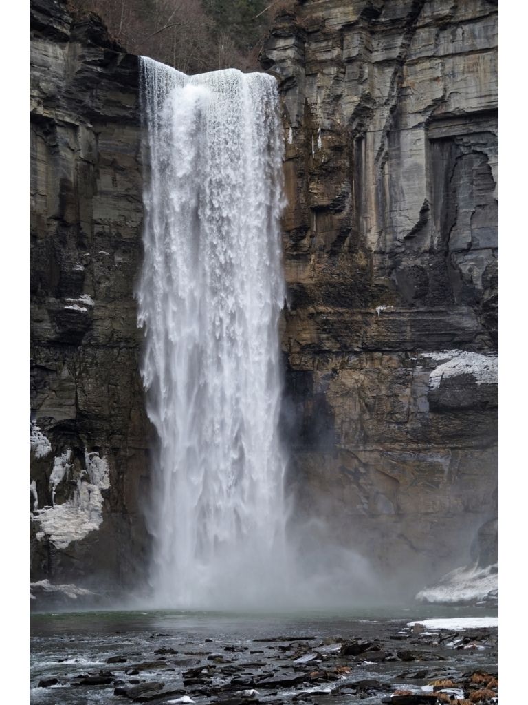
I think that your original image as well as your edits definitely convey different feelings. What I notice in both the original and first edit is the highlight and rounded shape of the water as it flows over the 3rd waterfall (in the foreground, on the right side of the image). That highlight showing the shape of the water kind of catches my eye. I played with the original image to try to bring out some of the different shades of the rocks, pools of water, light on the water etc. |
Jul 17th |
 |
| 96 |
Jul 20 |
Reply |
and the rest of the adjustments. I also cropped the aspect ration to 16:9, FYI |
Jul 17th |
 |
| 96 |
Jul 20 |
Reply |
Here's the specifics of how I edited it. |
Jul 17th |
 |
| 96 |
Jul 20 |
Comment |
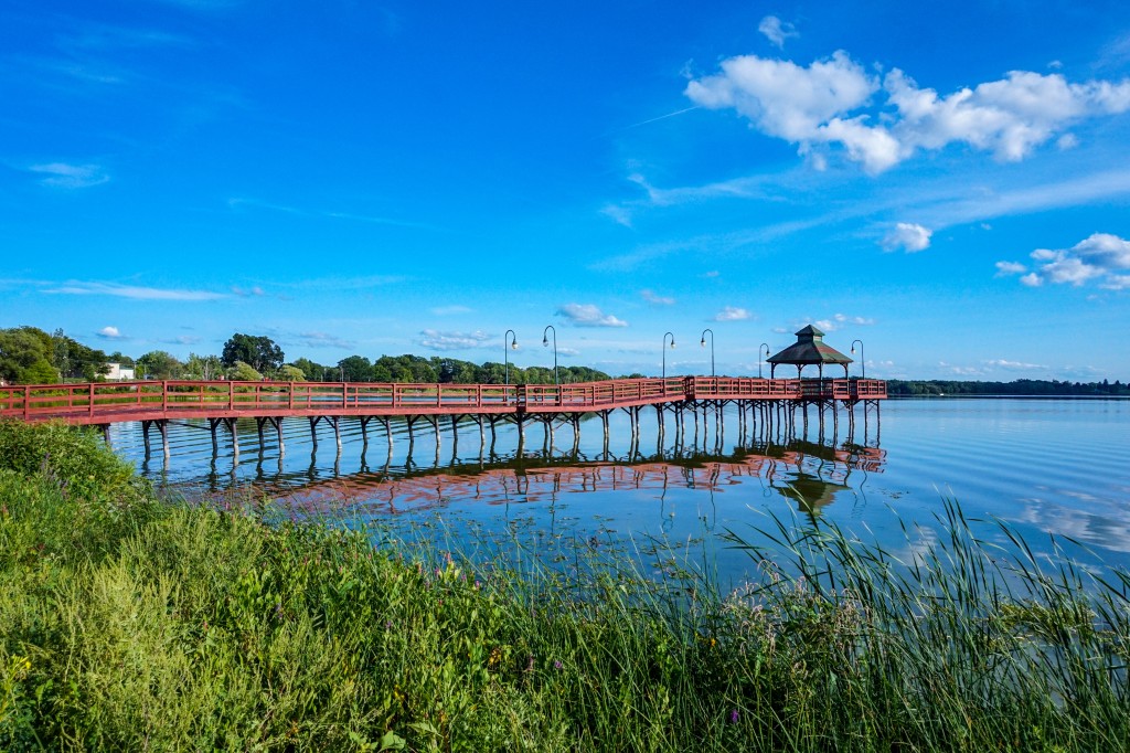
I like the contrast between textures (the clouds/sky vs. the water) and the colors (muted grey-blue vs. bright/light sky-blue). The tree and small craft add some interesting visual elements as well, and help emphasize the depth of the image. Based on your statement and desired visual effect, I edited the image to try to pull out the clouds more and create more of a framed silhouette. Regardless, your original shot is great! |
Jul 17th |
 |
| 96 |
Jul 20 |
Comment |
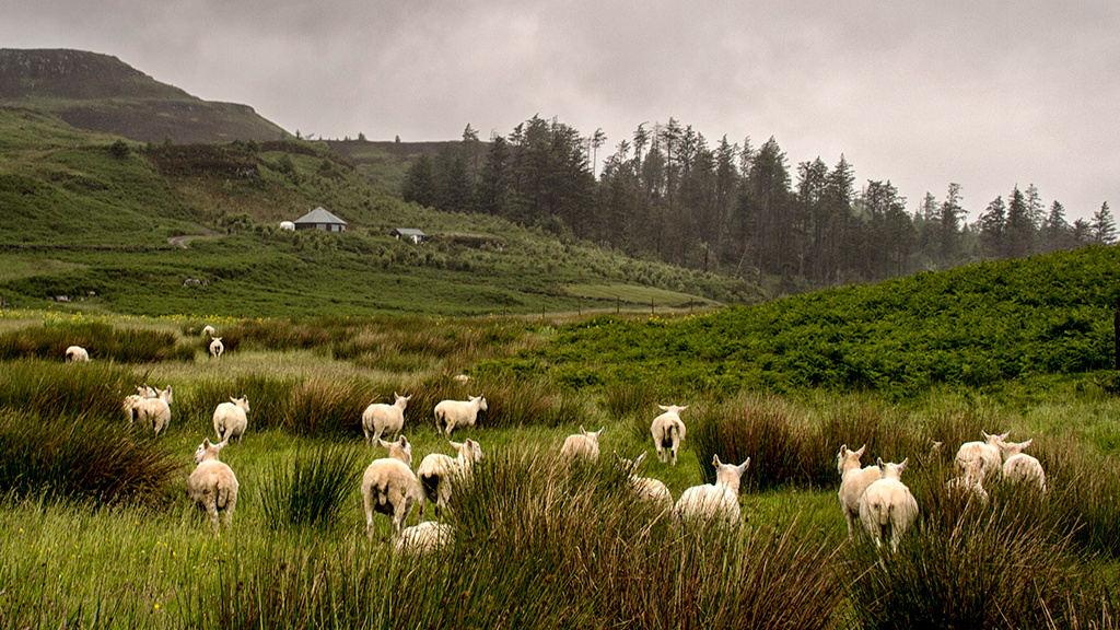
The bright white color of the white sheep really pops against the dark green grass and muted sky. I agree that I wish their faces were visible. Great shot! But as Dale said, we get what we get sometimes. Since the sky/clouds and the bushes in the lower foreground are not so much the focus, as least in my eyes, I edited the aspect ratio to 16:9 just to see how it might look. |
Jul 17th |
 |
| 96 |
Jul 20 |
Comment |
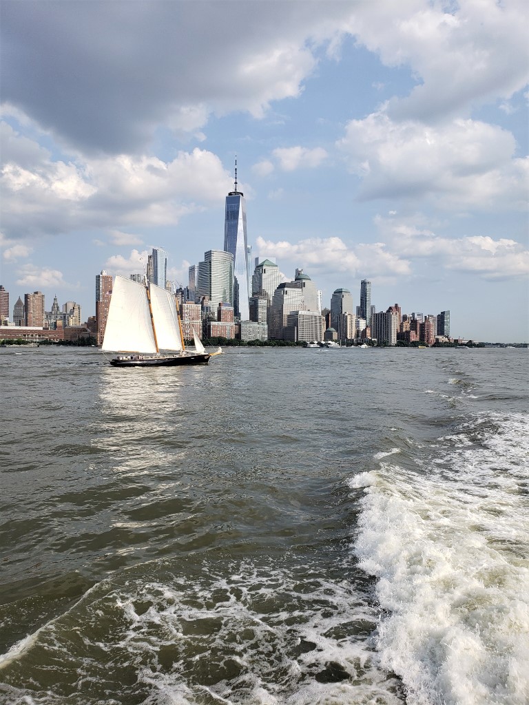
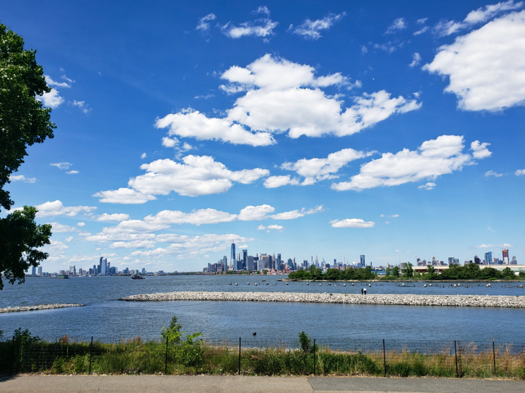
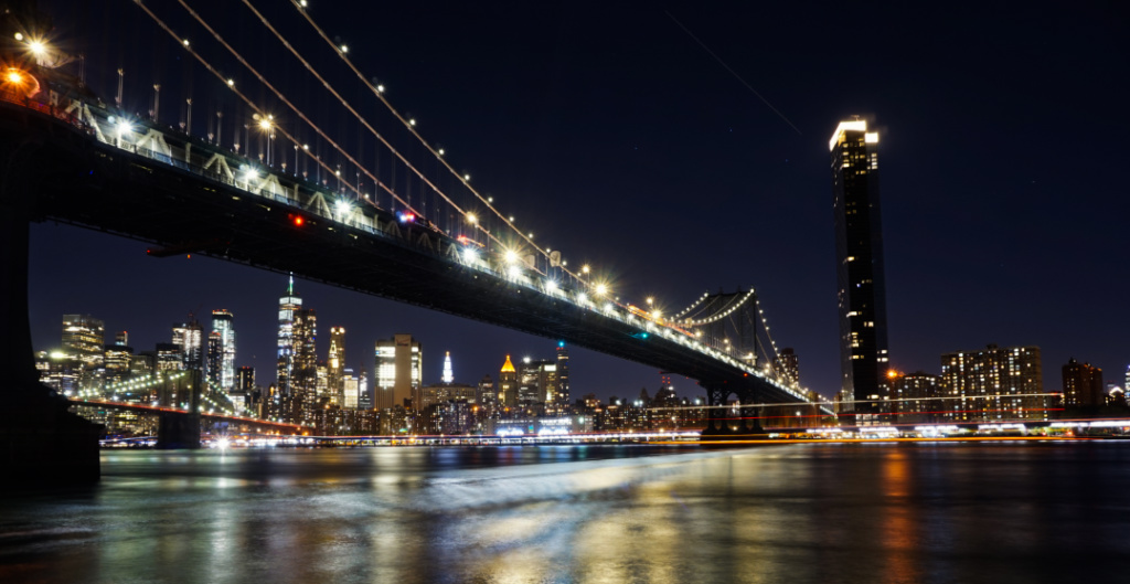
This is a great capture of the Manhattan skyline at sunset! I am glad that you shared this image, as I take many cityscapes myself (since I live in Brooklyn), but am sometimes unsure of how they may be viewed compared to more natural "landscapes". Your image also reminds me of Manhattanhenge, which is always an amazing sight to catch if you're lucky. Here's an article by Neil deGrasse Tyson that explains it. (https://www.amnh.org/research/hayden-planetarium/resources/manhattanhenge) Great shot!! |
Jul 17th |
| 96 |
Jul 20 |
Reply |
Hi Dale, Here's the revised crop with the road below. Thank you again. These are all great suggestions! |
Jul 13th |
 |
| 96 |
Jul 20 |
Reply |
Hi Dale, thank you. These are great suggestions as well. Here's the image based on them. I like how cropping the bottom shadow out doesn't remove too much of the road below but does also remove the shadow as a small distraction. |
Jul 13th |
 |
| 96 |
Jul 20 |
Reply |
Hi Gerard, greetings. Thank you for the suggestions. I am always unsure if I should eliminate more shadowing or if that might make it look overprocessed/overedited. So, your comments helpful. Based on your suggestions, here's a revised version (sky cropped, dehaze increased, contrast increased, whites decreased). I will be curious to hear from the group about preferences or suggestions for the original or revised version. Thanks again. |
Jul 13th |
 |
5 comments - 6 replies for Group 96
|
11 comments - 11 replies Total
|