|
| Group |
Round |
C/R |
Comment |
Date |
Image |
| 48 |
Jun 20 |
Reply |
Thanks, these are great tips that I will definitely use next time I am out and about. I agree, not having my tripod handy made for a less-than-crisp image. So, that's the key thing for me to remember to bring next time. |
Jun 19th |
| 48 |
Jun 20 |
Comment |
I find the bokeh effect in the original image very visually appealing and striking - and often challenging to achieve effectively (but that's just my personal preference/opinion). So, I would keep the background as-is. Great job! |
Jun 19th |
| 48 |
Jun 20 |
Comment |
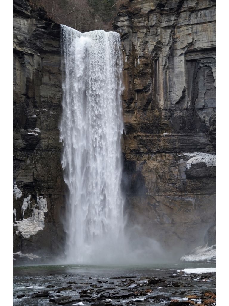
I think that your captured the mist around the rocks/cliff very well. Based on Margaret' suggestion, I put the image in B&W. The effect of this image in B&W is very striking. It brings out the texture of the wavelets as well. For scenic landscape images like these, I think you could do them in color or B&W, with both results being different yet both visually appealing. |
Jun 19th |
 |
| 48 |
Jun 20 |
Comment |
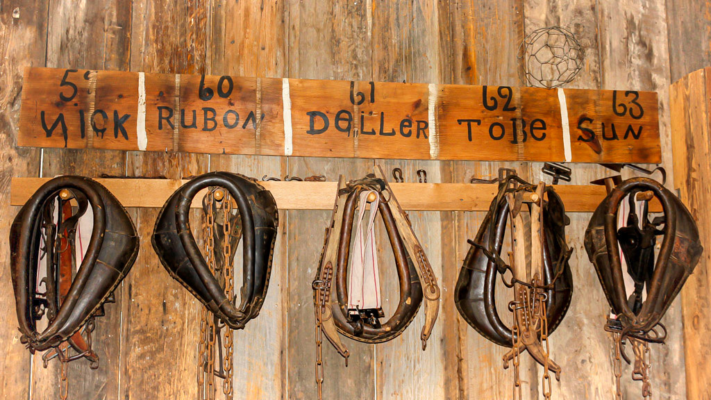
I like the contrast of textures (i.e. the leather, the rough wooden wall, the wooden signs made of a darker wood) in the image. I played with the image a little to try to reduce the spotlight effect a bit. I used the program that I usually use for editing (Polarr), but I would imagine that many photo editing programs have this setting. I increased the Vignette (+58), increased the contrast slightly (+25), decreased the Highlights (-37), and increased the Shadow (+33). It seems like using Vignette to deal with spotlight effects leaves you with the most options. |
Jun 19th |
 |
| 48 |
Jun 20 |
Comment |
I think the touched-up image is really crisp. The carriage going down the street really draws the eye. I also noticed that blue shows up as a nice accent color throughout (the sky, the cushions, the driver's vest, the seated person's top - the person sitting on the bench next to the stone steps specifically). Great job! |
Jun 19th |
| 48 |
Jun 20 |
Comment |
Your use of the background really works well with the image, particularly the setting/arid landscape and the positioning of the rock. |
Jun 19th |
| 48 |
Jun 20 |
Comment |
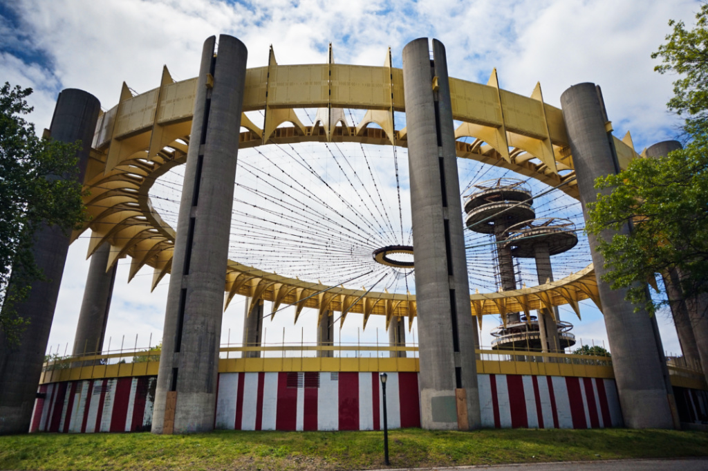
Thank you both for your suggestions. The photo editor I use does have a Transform feature, so I will have to play with that a bit. The lens was actually my standard lens (SONY 16-50mm OSS Lens). However, I think my positioning when taking the photo, in order to get all the architectural features in the shot, may have created the wide-angle lens effect.
The Pavilion has been shut down since 1965 and was never re-opened after the New York World's Fair shut down. But you can still view the exterior and interior, albeit through the closed metal gates covering the side entrances. |
Jun 10th |
6 comments - 1 reply for Group 48
|
| 96 |
Jun 20 |
Comment |
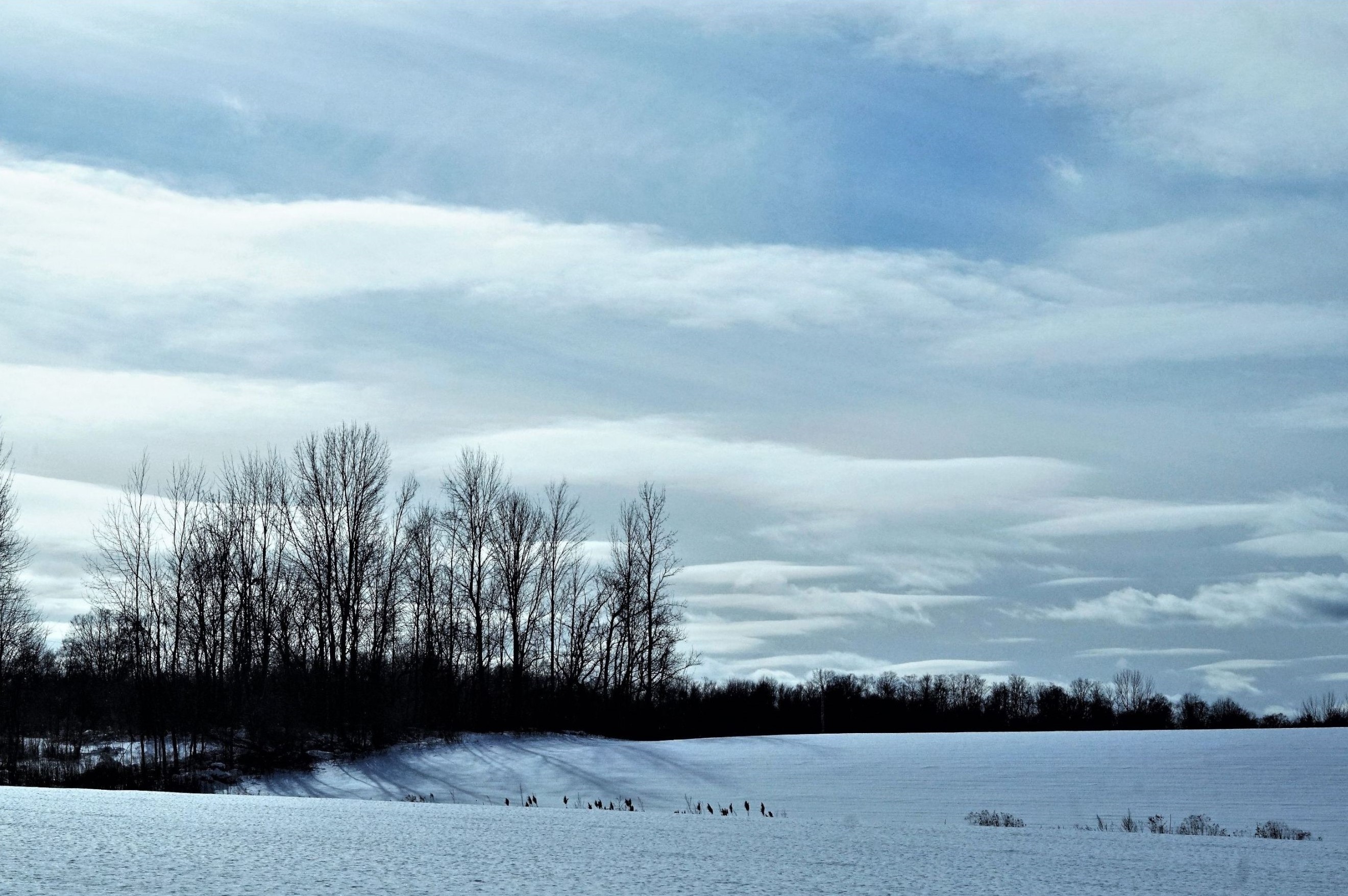
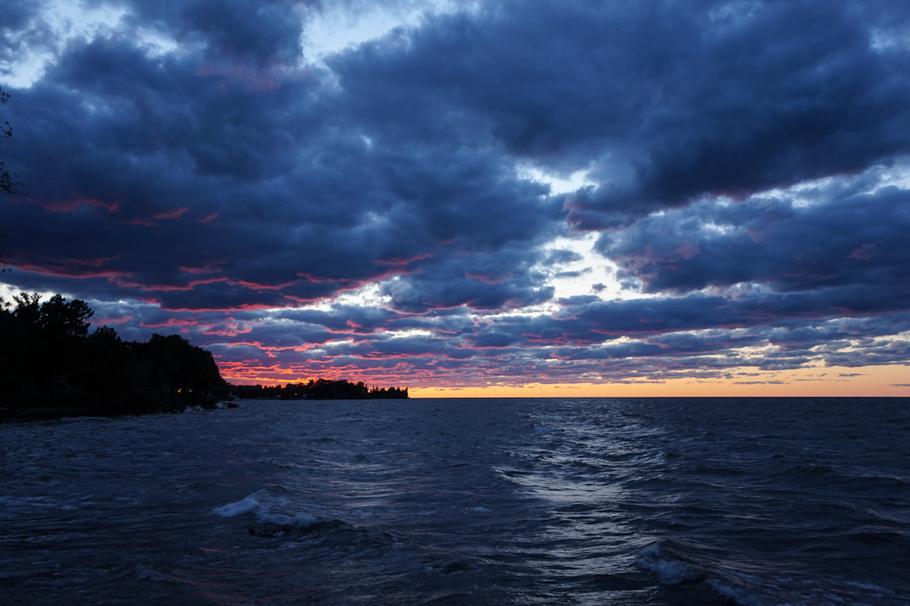
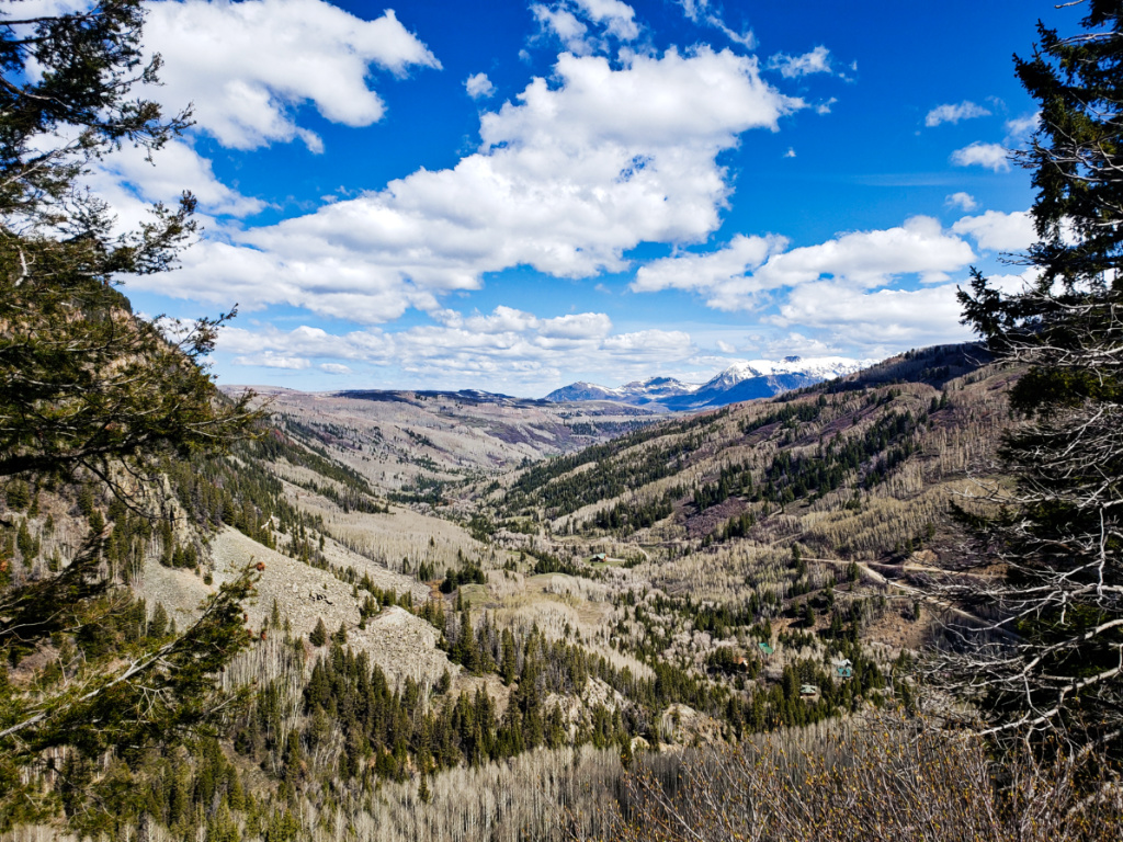
I really like your image and how the mountains in the background are crisp and clearly defined. I love the moody atmosphere and the cool tones of all the colors. Just to get a bit more detail from the darkest shades, I increased both the Shadows and Blacks, to lighten the clouds a tiny bit, bring out some details of the clouds a little more and lighten up the dark color of the land in the right mid-ground. I like the additional coloring you added to the sky in your latest post. Great shot! |
Jun 19th |
 |
| 96 |
Jun 20 |
Comment |
The B&W image is amazing and captures many details (ex: the different angles of the landscape, the mist over the mountains, the water falling over the rocks, the textures of the different types of rocks) very clearly and beautifully. Great job! |
Jun 19th |
| 96 |
Jun 20 |
Comment |
I agree with everyone's comments. The panoramic crop nicely highlights the trees and mountain in background. However, the image with the rocks in front (i.e. Cheryl's edit per Steven's suggestion) also creates an interesting contrast between the foreground and the background. So, perhaps either/both images work well, but possibly for different purposes or viewers (ex: entering a photo competition vs. stock photography). |
Jun 19th |
| 96 |
Jun 20 |
Comment |
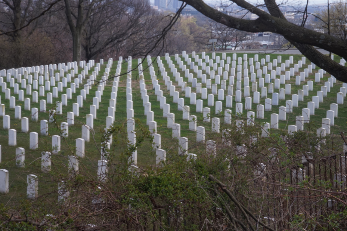
I kind of like the "pre-crop" version personally. I think the trees on the right show another row/path, which creates a similar effect to when one view' the rows in a national cemetery (i.e. the illusion of seeing a "V" when you look down a row). I like the contrast between the gray-ish color of the trees and the bright yellow/orange of the grasses and the leaves. The gap between the colorful sections is also an interesting effect. Great shot! |
Jun 19th |
| 96 |
Jun 20 |
Comment |
Thank you all for the feedback. I agree that the trees frame it well, as compared to some of my other shots that only had one tree (i.e. asymmetry). Sadly, this is taken out in SW Colorado where my dad lives. But, alas, I live in NYC, so I cannot easily get out to get shots at other times of day. However, I will definitely play with the dodging/burning effects that Robert suggested. The next time I travel to CO, I will try to go for another time of day as well. |
Jun 19th |
| 96 |
Jun 20 |
Comment |
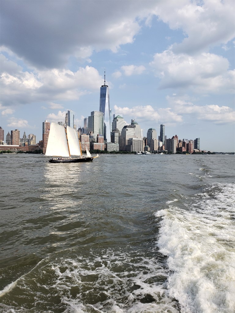
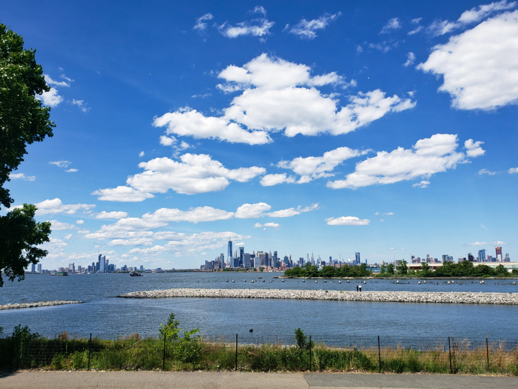
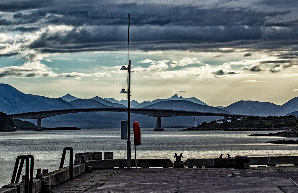
I like the angle of the shot and the way that it nicely captures all the elements in the scene (the park, buildings, boats, docks, water, trees) in one 'layer', much like a painting. Apologies, I hope that description that makes sense. I agree that the sky looks a bit washed out between the horizon and the blue clouds. So, as others mentioned, I would also suggestion considering to decrease the exposure a little. Aside from that, great image and composition. The atmosphere in the image is very cheerful and makes me smile. |
Jun 19th |
6 comments - 0 replies for Group 96
|
12 comments - 1 reply Total
|