|
| Group |
Round |
C/R |
Comment |
Date |
Image |
| 48 |
May 20 |
Reply |
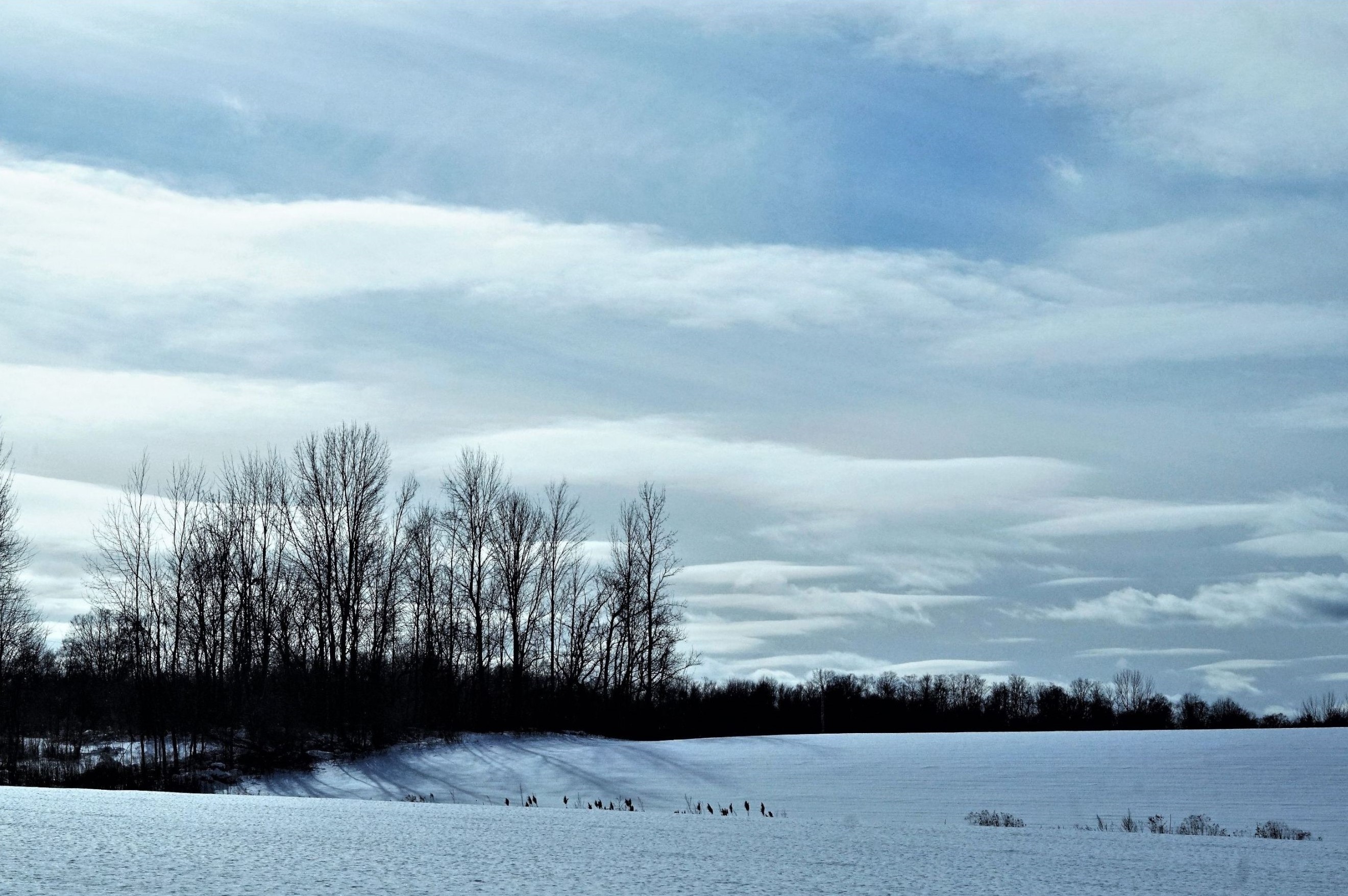
Thank you for your suggestion. I sometimes worry about oversharpening images, as it's a delicate balance and easy to overdo. However, as you mentioned, the tracks in the sand are the focus of the middleground. So, it makes sense to crop the sky and work on bringing out those details more. |
May 20th |
| 48 |
May 20 |
Comment |
I love the variety of textures in your composition - the material of his jacket in the light, the crocheted hat, his face and skin, etc. His eyes are warm and full of spirit. I also appreciate his expression, sort of a half-smile. Great shot! |
May 19th |
| 48 |
May 20 |
Reply |
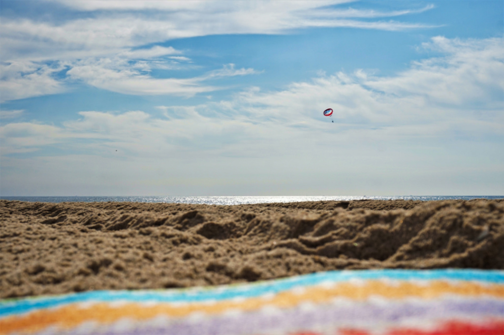
Thank you. I took it on JAN 31, 2020 in Los Angeles, before everything closed down. However, I have noticed on both coasts that many people tend not to go to the beach outside of the 'normal' beach season of Memorial Day to Labor Day, even though beaches are accessible, clean, and empty. However, I cannot complain as I prefer to shoot when no people are around/in my photos. So, I actually try to avoid going during "beach season" if possible. |
May 19th |
| 48 |
May 20 |
Reply |
Thank you. I have been looking for more opportunities to shoot with a wide angle lens, so this was a perfect day for that. I like your edit. It really brings out the sky/clouds and shows Catalina Island more clearly. |
May 19th |
| 48 |
May 20 |
Comment |
I can appreciate that it was a sudden moment and you wanted to capture it. I also use my Samsung Note 9 to shoot and often the photos are pretty good. By chance, did you zoom in to get this shot? In terms of quality or details, I have found that 'close-up' photos taken by zooming (at least on my Samsung phone) aren't ask crisp as photos taken using the 'standard' setting or distance. The same for photos at night, without a flash. Both instances tend to look pixelated or fuzzy. But good on you for trying and having a sharp eye for such details. |
May 19th |
| 48 |
May 20 |
Comment |
I love the contrasting colors of the birds bodies. Even though the birds are in motion, they are amazingly crisp and clear yet their feathers show the nice blur of being in flight. I agree that the Neil's edited version has all the birds focused and also has a bit of empty space on both sides of the bird flock, which creates some symmetry of sorts. Regardless, you did a great job of capturing a rarely seen view of nature! Thank you for bringing Belize and its nature to those of us (or at least me) who might not have the opportunity to appreciate this in real life. |
May 19th |
| 48 |
May 20 |
Comment |
Very crispy and clean. I like the original very much - the background is nicely blurred so that the foreground is the focal point. However, I also like the edited version too, since it shows off the delicate petal texture, the highlights and the range of colors very well. Great job on both! |
May 19th |
| 48 |
May 20 |
Comment |
I agree with Neil's comment that it looks a bit flat. However, I don't really know how to adjust that either. Regardless, I think the rich colors really draw in your eye, which is very visually appealing. |
May 19th |
| 48 |
May 20 |
Comment |
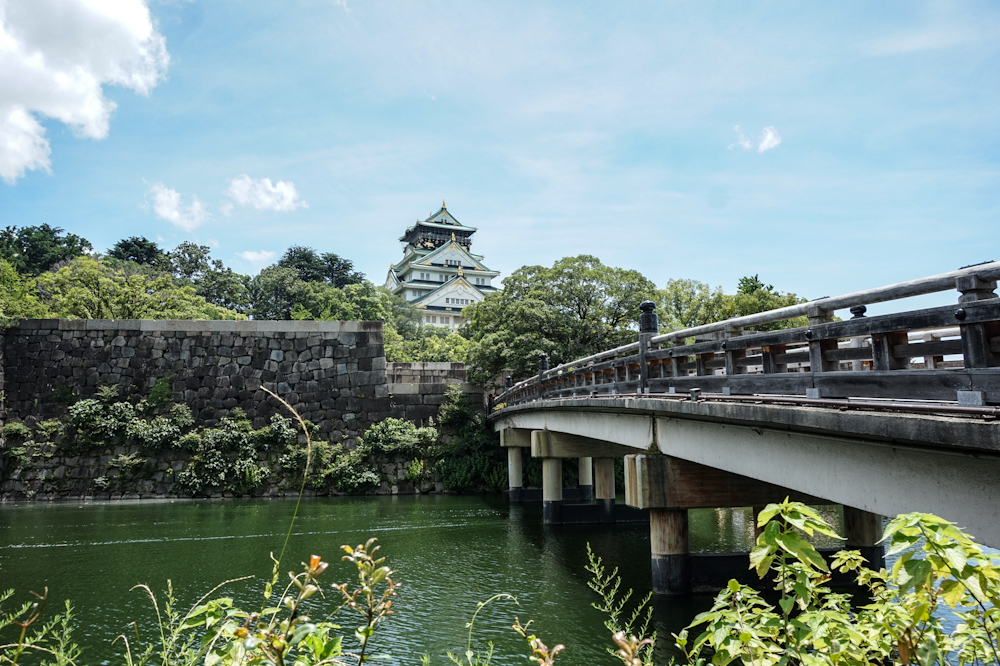
You captured the texture of the wall really well. The sky is a nice muted blue, which doesn't take too much focus away from the building. I would agree with with Stanley's suggestion about removing/cropping out the people in the far left. However, that might be difficult or end up cropping the photo too close on the back side of the castle. |
May 19th |
6 comments - 3 replies for Group 48
|
| 96 |
May 20 |
Comment |
Beautiful image and great capture of a amazing and rare scene (at least for city-dwellers). I also agree that reducing the brightness of the star reflections on the surface of the lake help keep the focus on the sky. I also like the slight tinge of yellow color over the horizon as an interesting bit of contrast to the cool, dark shades across the rest of the image. |
May 20th |
| 96 |
May 20 |
Comment |
I agree with the points that the B&W is more visually impactful than the original color version. I like your "best" version posted above, particularly the 'symmetry' (of sorts) and how the vignetting draws your focus to the centered elevator grain. Great editing and image! |
May 20th |
| 96 |
May 20 |
Comment |
I agree with everyone's points as well. I also really like the original image. However, I like the cropped image because it's almost a 'different' image and has a different mood without he light blue of the sky and the shape the of the mountain in the background. |
May 20th |
| 96 |
May 20 |
Comment |
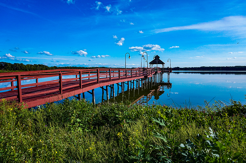
I love the mood of this scene/shot. I kind of like the dark color of the pier (?) and boat on the left as contrast to the rest of the lightness of the scene. However, I could also imagine it looking good cropped, so it's more square and focused on the beach chairs and sunset. Cropping the sand in the bottom foreground might also look good, as the sand there doesn't necessarily add as much to the image compared to the water and sky (but that's just my preference). I think that the texture of the clouds and water are nice and crisp. Great capture of sun glitter as well! |
May 19th |
4 comments - 0 replies for Group 96
|
10 comments - 3 replies Total
|