|
| Group |
Round |
C/R |
Comment |
Date |
Image |
| 1 |
Apr 20 |
Comment |
Hello, I'm visiting from Group 48.
I agree with Bev. I think the sky and clouds give the image more depth. The light blue sky add additional cool colors that contrast nicely with the giraffe's coloring. Great job on capturing all the details, especially the texture of the hair (mane?) and eyes. |
Apr 9th |
1 comment - 0 replies for Group 1
|
| 16 |
Apr 20 |
Comment |
Hi, visiting from Group 48.
I like the striking contrast between the muddy water and blue jeans. The
water droplets in mid-air are really crisp and visible. I kind of like the reflective image that shows in the original image actually. My eye seems to prefer the image straightened (i.e like in the retouched B&W version), but maybe that is just me. Great capture of an action shot that might usually go unnoticed. |
Apr 9th |
1 comment - 0 replies for Group 16
|
| 48 |
Apr 20 |
Comment |
Hi Stanley, welcome to the group. I appreciate your PS hack as I agree the learning curve for PS can be steep. I also use another shortcut, a free online program (https://photoeditor.polarr.co/) as my work PC doesn't have/won't let me add any programs (including PS) to it. I appreciate the original bright background actually, but I also like the the slightly more muted background, as it brings more focus/attention to the details and coloring of the bird. If I may ask, how close (or far) away were the birds and what film speed and ISO were you shooting in? I sometimes struggle to capture a clear foreground, the right amount of out-of-focus background, and enough light to capture all the details on the subject (ex: the birds, their bodies, beaks etc.) Thank you. |
Apr 20th |
| 48 |
Apr 20 |
Reply |
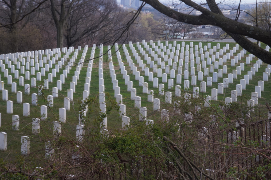
Thank you for your suggestion. I think the revised centering and brighter colors really bring out the headstones in the V formation as well as aims more directly toward the city in background. The tree limb also makes it's own sort of V shapes, so that is interesting to notice more now. Thank you! :) |
Apr 11th |
| 48 |
Apr 20 |
Reply |
Hi Bev, thanks for that background info. Very interesting! That makes a lot of sense and explains the V formation. I agree that the background in the photo doesn't add much to it, so the cropping it out is a good suggestion. Thank you. |
Apr 9th |
| 48 |
Apr 20 |
Comment |
I agree with everyone above. I think both the color and B&W version have their own unique attributes and both would work well, in different ways. I think the sort-of soft lighting draws one's eye to the colors and textures of his skin, hat and clothing nicely. The light also has a subtle vignette effect. |
Apr 9th |
| 48 |
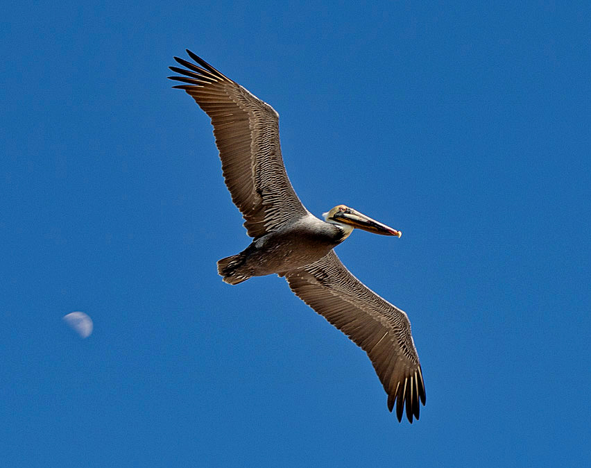
Apr 20 |
Comment |
This is an amazing, in that, I don't get to see nature/animals this spectacular very much. So thank you for bringing large birds a little closer to me.
Maybe the image could be sharpened to bring out more of the details of the bird face/beak? I just played with the image using (https://photoeditor.polarr.co/) to try to see if it might be possible. Maybe it works or doesn't? I also like Bev's suggestion of moving the moon to so the bird is flying toward it, to match the title.
Here were those adjustments:
dehaze: 30
brightness: -11
highlights: -70
shadows: 99
blacks: -5
clarity: 12 |
Apr 9th |
 |
| 48 |
Apr 20 |
Comment |
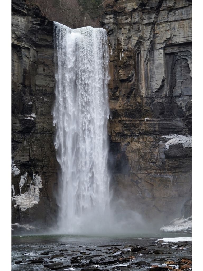
I also agree with Neil's suggestion. The slight retouch brings out the rushing water nicely. I think the gold flecks on the rocks (where the water is running over) contrast nicely with the rest of the grey rock shades. The rock in the bottom of the original doesn't have the same grey-ish color as the other rocks, so maybe that's why my eye prefers that it was removed. Regardless, it's great to see more long exposure photos being taken. |
Apr 9th |
| 48 |
Apr 20 |
Comment |
I appreciate the challenge of capturing orchids and other flowers, as it is tough to get it just right, especially the lighting and focus. I like that in the original, the background has the shades of green (i.e. the leaves). I have pretty much forgotten most of my knowledge of using masks and layers since my Photoshop days of college (20 years ago), so I tip my hat to you for putting in the extra time and work. Perhaps if the original were cropped square so the orchid was in the center and surrounded by just leaves (slightly out-of-focus), that might highlight the orchid nicely? Just an idea. I also like how the green mask of Original 2 contrasts the orchid colors. |
Apr 9th |
5 comments - 2 replies for Group 48
|
7 comments - 2 replies Total
|