|
| Group |
Round |
C/R |
Comment |
Date |
Image |
| 80 |
Oct 21 |
Reply |
Thank you for your comment Mo. |
Oct 20th |
| 80 |
Oct 21 |
Reply |
Thank you for your comment Bev. |
Oct 20th |
| 80 |
Oct 21 |
Comment |
All eyes lead me to the ice man (men) in the title, the ice vender and the customer taking a block of ice away. For me this photo shows the morning routine of fishermen preparing to bring back a fresh catch from a day of fishing. The boats in the background show the context. The men appear to be lined up to get another block of ice.
Steeling the show is the bright white shirt of the man stepping into the boat. To keep that shirt from dominating the image I would darken it considerably. That would allow you to brighten the rest of the image, making the iceman and his ice the main elements in the image.
For me the reddishness of the sun light interferes with the message, the business of the fishermen obtaining ice for their daily run. I would desaturate the reds a little so that they don't detract.
I think that a little better separation of the ice man's head from the dark cabin color would help insure that he is the star of the show. I tried brightening the left side of his face a little to get a little more separation, his dark hair is fine and contrasts with the background. |
Oct 10th |
 |
| 80 |
Oct 21 |
Comment |
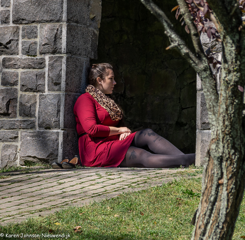
The woman appears to me to resting, quietly contemplating something.
I like the framing in this image, the tree curving in from the right, the stone wall at the woman's back. She is well separated for the background. I find the reflected light on the front of her face to be very nice, and the direct light on her cheek is effective.
For me the colors work nicely together, the red of her dress reflected in the tree trunk and leaves contrasted against the green of the grass and the grey of the stone wall. I like the way the brickwork in the path creates lines leading up to the woman. Overall a very nice capture.
I think this stands well on its own. A few suggestion that could make it work a little better. I would burn down (darken) the wall on the left a little to accentuate the framing to contain the eye. I think I would also darken the yellows in the grass and shift the yellows slightly to the green to play up the color contrast. |
Oct 10th |
 |
| 80 |
Oct 21 |
Comment |
I like the cool colors and the soft but direct sunlight. It looks to be a fine day at the beach; a slice of life image. I see two implied diagonal lines that for me give this image some of its energy; the broken line of the breaking waves in the upper right of the image and the line of people crossing the left side of the image. These lines seem to lead to the sun-bather on the far shore. There is also the line of the surf breaking on the shore and the wet sand.
It appears to me that something has been cloned in on the mid-right of the image; I see a discontinuity in the sand colors just to the left of the left most seagull walking on the beach and some repetition of elements in the waves above. I think these should be fixed.
I agree with Mo that the saturated blue band at the top of the image is a bit distracting. As an alternative to cropping you could just desaturate and or darken the blues and cyans in that area of the image. I would also crop out the bit of sunbather at the very bottom of the image and that arm reaching into the image on the far left. I would also darken the sand a bit in the lower left of the image to help contain my eye. |
Oct 10th |
| 80 |
Oct 21 |
Comment |
Nice capture of the sleeping workman in his environment. It appears that he has just finished lunch and is taking a bit of a rest. I can't tell what type of work he does; something to do with fishing nets. (Fish Market?)
I think you framed him nicely, for me he stands out well for the shaded background. I think the background adds the context needed to make the image interesting. The soft directional light works well in this image, helping his features stand out.
I am wondering if you could dodge down the brightness of the trees a little so that the sheds in the background stand out a little more, adding to the context of the man's working environment. |
Oct 10th |
4 comments - 2 replies for Group 80
|
4 comments - 2 replies Total
|