|
| Group |
Round |
C/R |
Comment |
Date |
Image |
| 80 |
Aug 21 |
Reply |
Thank you Mo. |
Aug 22nd |
| 80 |
Aug 21 |
Reply |
I think that your second image is the stronger one. I can focus in on the single man, and I think he is expressing more gesture. |
Aug 14th |
| 80 |
Aug 21 |
Comment |
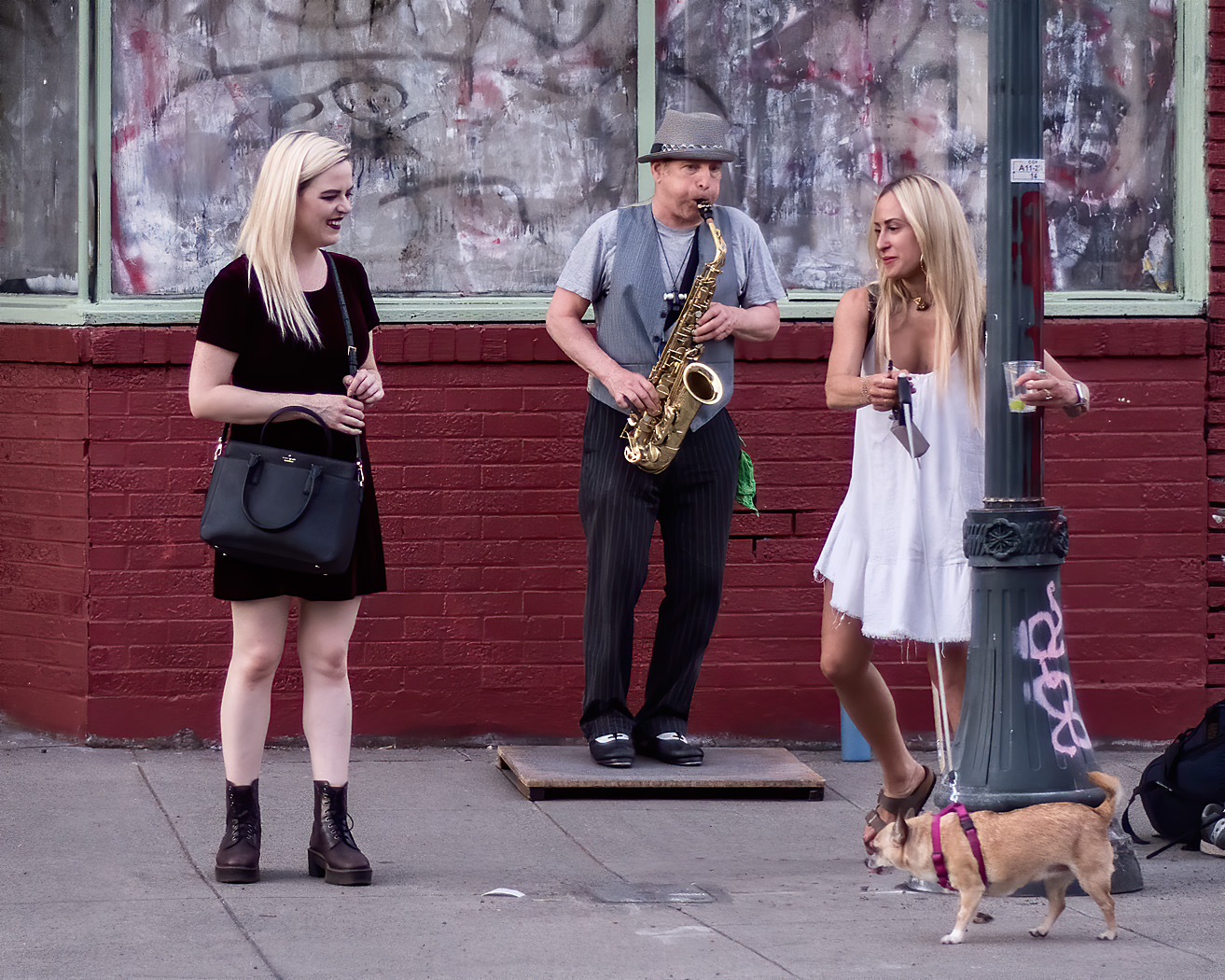
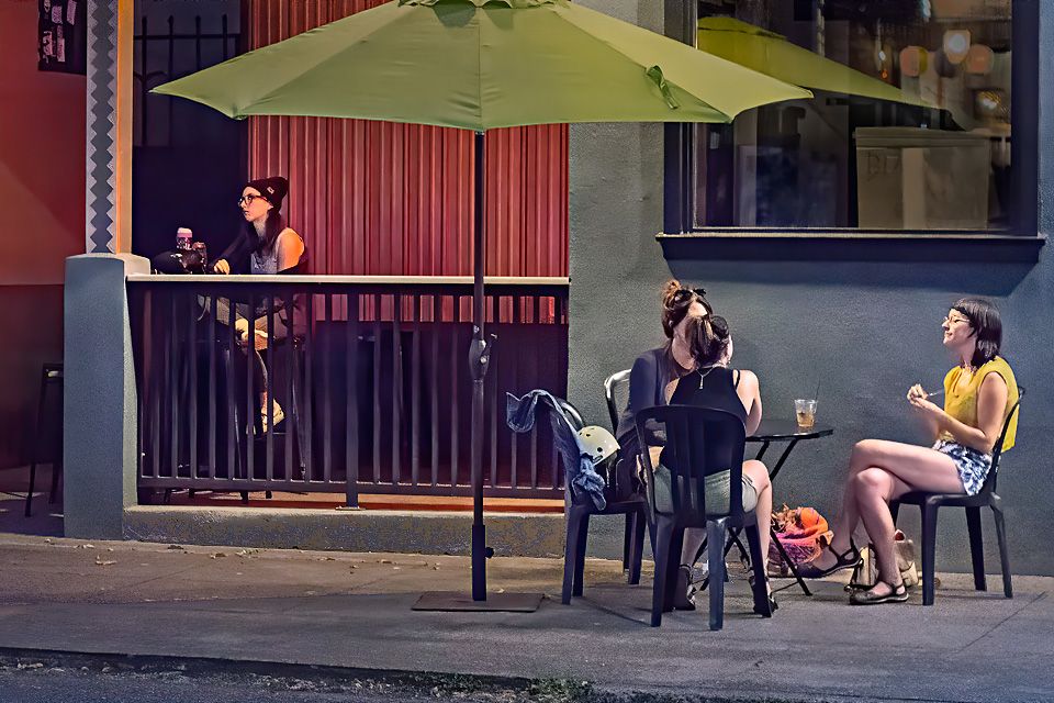
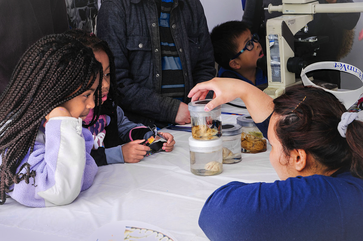
I like the intensity of the girls interest in the demonstration, their fascination with the samples. That fascination draws me to look at the biological samples so I can share in their amazement. What is in those jars? Some of them look like brains to me. I also like the look of amazement of the boy in the background. I think this image captures the feeling of the science fair well.
For me some of the background elements can draw my attention away from the girls. These elements are the ones with saturated colors or brightness; the bright red shirt on the left and the bright blue in the shirt on the boy in the middle. I don't think that these elements are adding to the image and could be desaturated and/or darkened some so that we stay interested in the main characters. That may help some with the headless boy in the background although the triangle of his neck would still be a draw. The top of the image could be cropped to remove the neck skin, Or the neck area pulled out of the frame with a warp. I would also like to see the girls faces be a little bit brighter, I did that by selectively miking the reds in that area a little brighter so I would not need to use detailed masking. |
Aug 12th |
 |
| 80 |
Aug 21 |
Comment |
I note this to be an unusual looking food cart selling a mixture of Kosher style hot dogs (Jewish) and Halal kabobs (Muslim), an interesting contradiction but not incompatible (pork free) mix of foods. The vendor looks middle eastern. For me, these type of contradictions make for interesting street photography.
I would want this image to be sharp so I can clearly see all that is being sold. I noted your camera settings were not ideal for street photography. At 1/15 of a second it is not surprising that there is so much motion blur. An f/stop of 14 also contributes a little to the lack of sharpness because of diffraction blur, a phenomena that starts in many lenses at f/stops greater than f/11. An f/stop of f/8 to f/11 would have given you sufficient depth of field to have all the cart and man look sharp and allowed a faster shutter speed, assuming this was not taken with a long telephoto lens. (I do note some compression.) And with the Canon 7D Mark 2 you could have gone to a much higher ISO before noise would contribute to softness, allowing you to shoot at much higher speed. |
Aug 11th |
| 80 |
Aug 21 |
Comment |
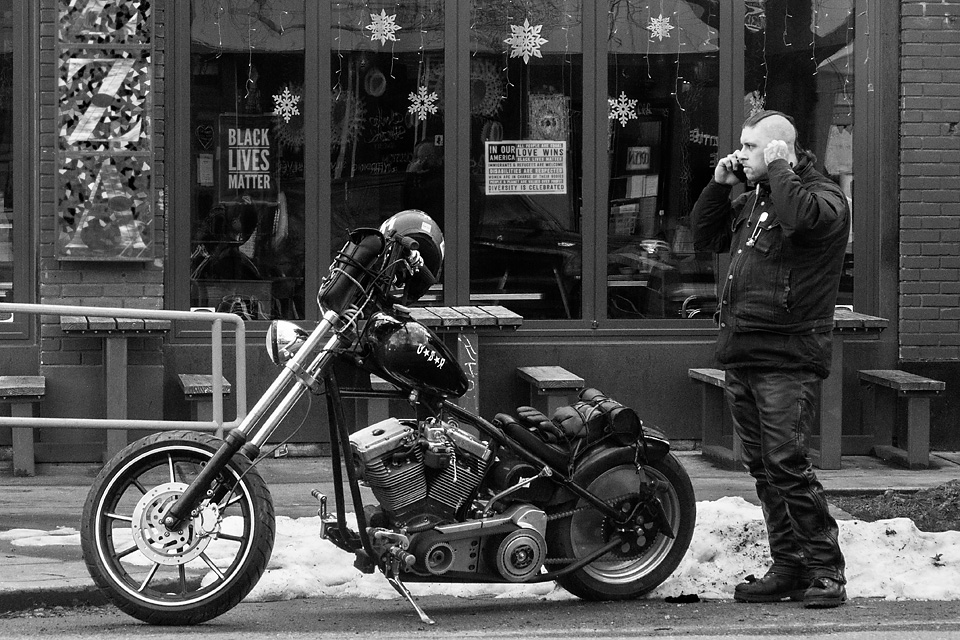
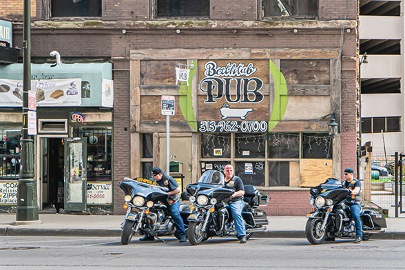
For me, the charm in this image is the motorcyclists poised in an old commercial area of town.
I think that the white parking structure on the left unbalances the image, especially when it is opposed by the black doorway on the left. If you were to substantially crop the image, say just to the left of the light pole, you would have some white area on the left that would balance the white of the parking structure. Also, think that the large windows and brickwork at the top of the image are not adding to the image as could be cropped out also, thus also reducing the amount of light area of the parking structure. I believe that you would still retain the atmosphere and sense of location after these crops, and would let us see the main subject, the bike riders, a bit clearer. The problem with this suggested crop is that the blue awning becomes a dominate element in the image. (Saturated colors are eye catchers.) I can resolve that by brightening the awning to almost white, which then helps to further balance the image. The street now becomes a dominate element because of its brightness, so I would dim that area a bit.
Here is an "out of the box" idea. If the motorcyclists are your main subject, you may want to separate them better from the background. (Figure-ground relationship.). One way of doing this is to lighten the reds in the image. This would also reduce the contrast clutter in the background and make the white parking lot structure less obvious. It would also change the mood of the picture to one of a little more a washed out desolation; you will have to decide if that is where you want to go with this image. |
Aug 10th |
 |
| 80 |
Aug 21 |
Reply |
Thanks for your comments Ed. Your feedback is helpful to allay my concerns. |
Aug 9th |
| 80 |
Aug 21 |
Reply |
Thanks for your comments Bev. I appreciate hearing what you see in the image and how you interpret it. |
Aug 9th |
| 80 |
Aug 21 |
Comment |
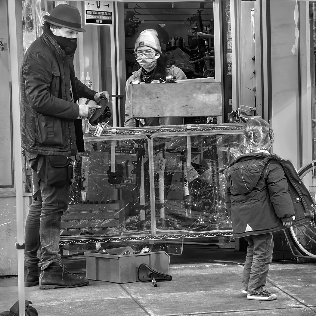
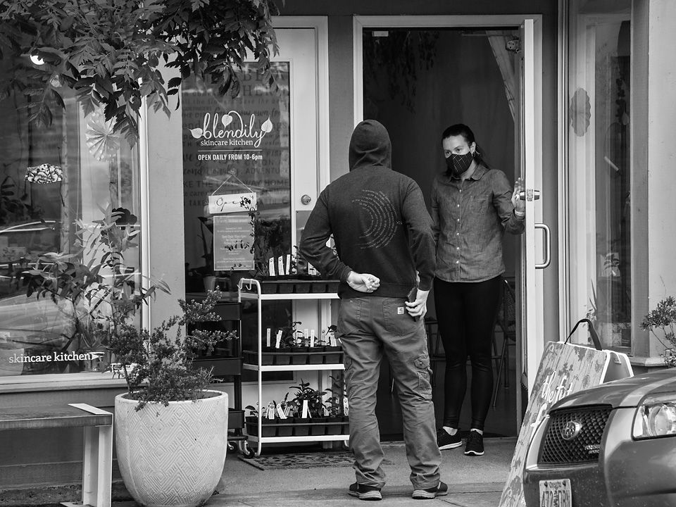
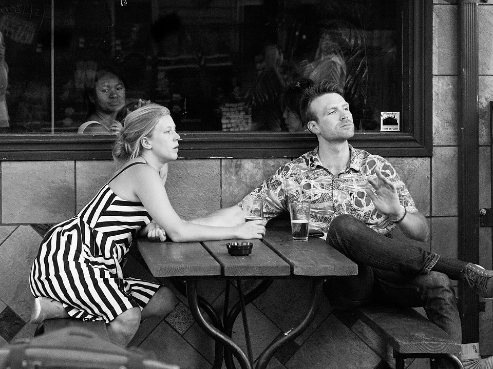
I like the interaction between the subjects and the expressions on their faces. Their gestures add to the expressiveness of the subjects. I like your choice of a low point of view. The monochrome rendition works well for me. I think the crop is just right.
I would consider darkening the wall behind the people to make their faces stand out a little more. I would also slightly darken the left hand corners to contain the eye a little. |
Aug 9th |
 |
| 80 |
Aug 21 |
Comment |
I see a lot of character in this man. That broad smile, the sparkle in his eyes. I observe that he is well separated from his background, with the background providing some sense of place. I think that this image would work well in a collection of Cuban travel photographs.
Lone musicians performing on the street are not a compelling subject for me in street photography. I would like to see some interaction with other musicians or members of the audience, some relation or connection to the setting, or sets mood.
When viewing this image, I tend to look past the man and explore the background. I think if you were to darken the background some and then brighten the image so there is more light on the man, I would spend more time looking at the man. For me, saturated colors are also an eye draw; the large area saturated orange of the guitar, a major element in the photo, draws my attention away from the man's face. If it is your intent to draw lots of attention to the guitar, then leave it be, but if the man's expression is your intent, I suggest desaturating the guitar some.
|
Aug 9th |
| 80 |
Aug 21 |
Comment |
Welcome to the group Arnab. I look forward to seeing more of your work. Nice start.
I very much like the low warm low light in this image, it illuminates your subjects nicely. I appreciate the contrasting colors of the oranges and blues. The white fishermen's gowns make the figures stand out. The shadows do make good leading lines.
I'm glad that you did not remove the plastic litter, having it there for me makes the image more authentic and places it in the present. I like the mixture of the old and new.
I agree with Beverly and Ed, that the distance between the two fishermen makes for a less cohesive image. Since there is no interaction between the two men, I agree with Ed's suggestion that you crop so that the focus is on the man on the right. There is sufficient gesture in his hands and facial concentration to carry the image. |
Aug 9th |
6 comments - 4 replies for Group 80
|
6 comments - 4 replies Total
|