|
| Group |
Round |
C/R |
Comment |
Date |
Image |
| 80 |
Jun 21 |
Reply |
Thank you Bill. I will give your bracing technique a try. I think that I need to slow down sometimes. |
Jun 11th |
| 80 |
Jun 21 |
Reply |
Thank you Mo. |
Jun 11th |
| 80 |
Jun 21 |
Comment |
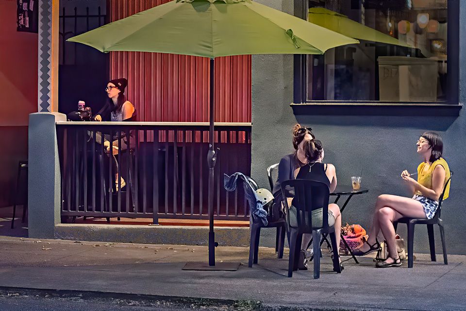
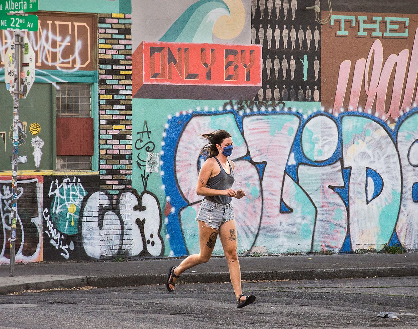
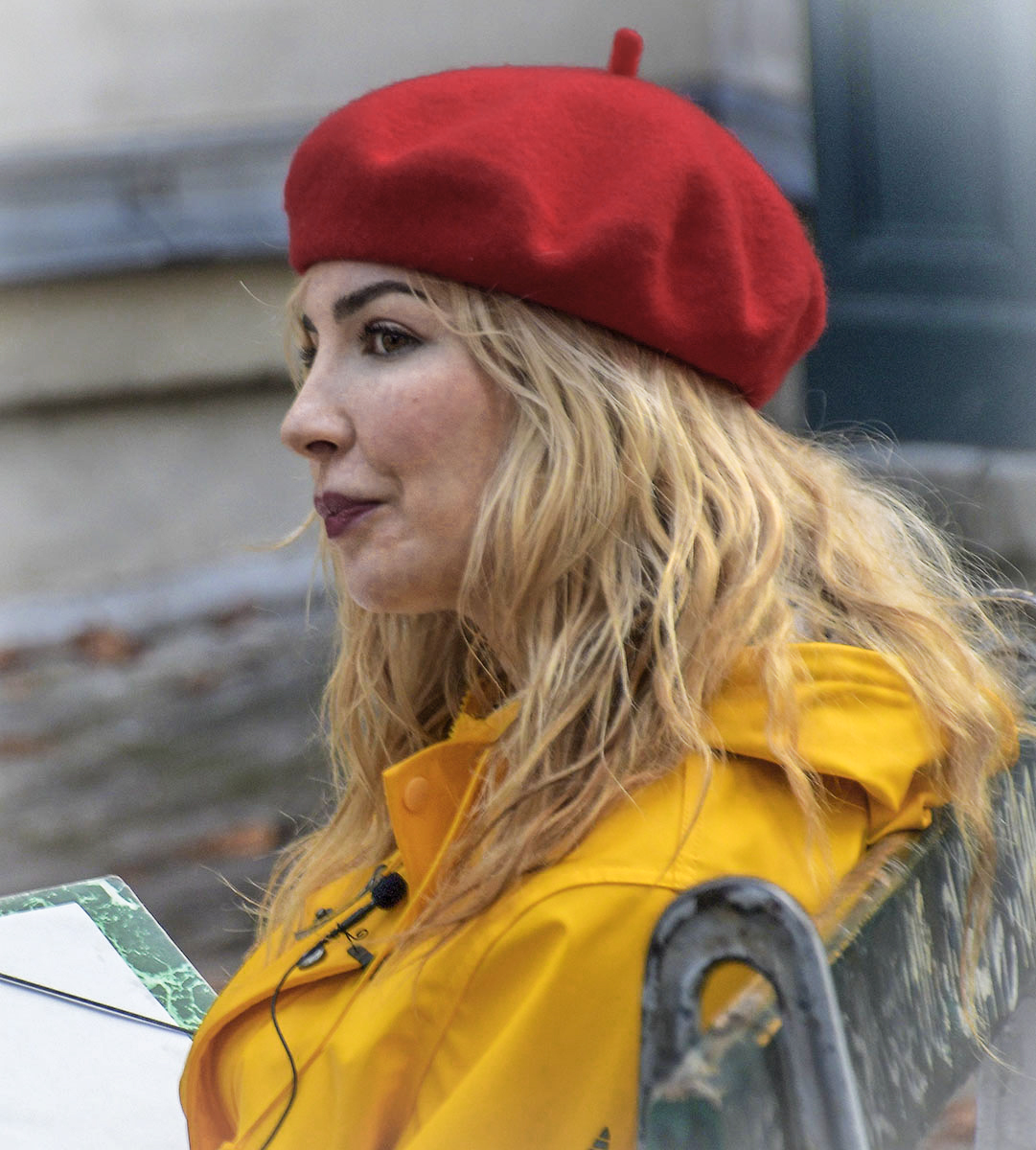
I see this as a nice street portrait that looks into the character of the subject. She is not posing in this image, just being herself, and showing interest in what is going on around her.
I see that you added some lightening vignette to the corners to balance her bright notebook in the lower left hand corner. I still find that bright spot in the lower left a bit overpowering, it keeps grabbing my attention. I suspect that to keep that area from blowing out, you underexposed the rest of the image. Darkening that area could be taken care of in ACR. The adjustments brush is great for taking care of the bright areas while leaving the tonal contrast in the rest of the image untouched, no masks needed. If you darken the yellows and reds a bit, you can then brighten the whole image to get more light on your subject. |
Jun 11th |
 |
| 80 |
Jun 21 |
Comment |
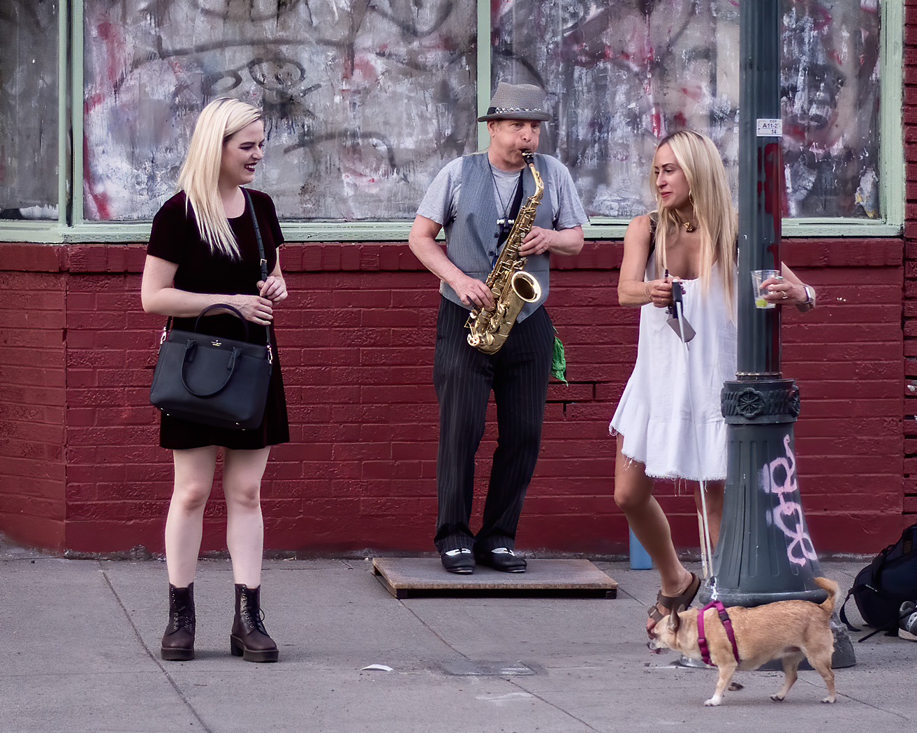
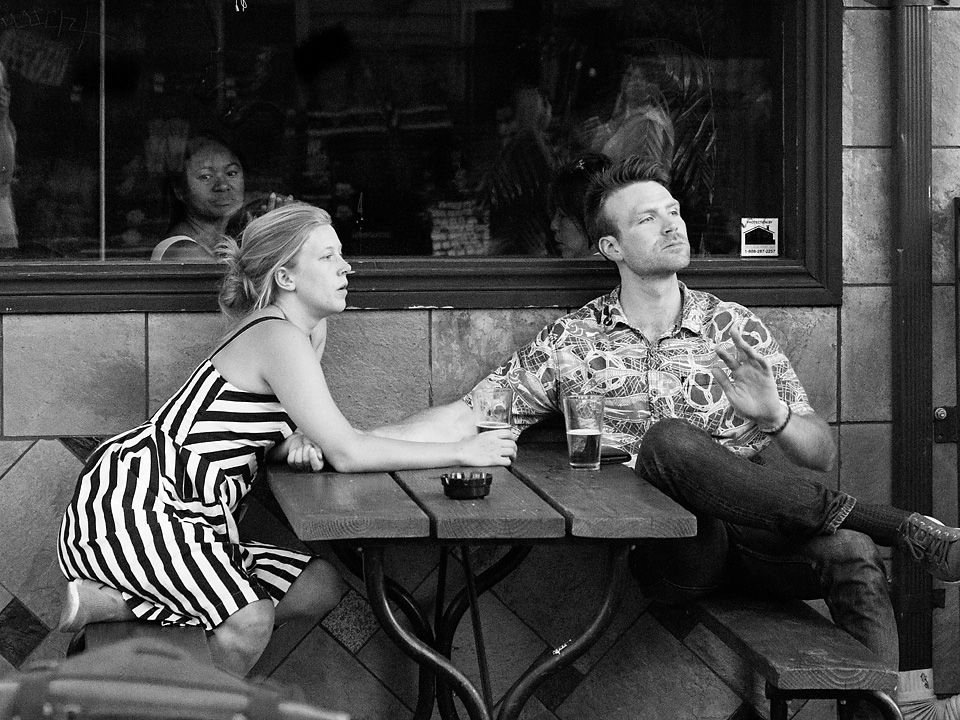
I can feel the tiredness of these two guys on that bright pink couch. What a great find. I think your composition works well. I agree with Bev that a toning down some of the background would help bring the main subjects forward a bit. I would also tone down the light on the pavement some too.
|
Jun 11th |
| 80 |
Jun 21 |
Comment |
For me, this is a complex multilayered image with a lot of depth. There is the woman with the hat in the western goods store taking a selfie or using her phone as mirror. (Do people do that?) The woman next to her looking out the window, either the other woman's companion or a sales clerk; upon closer inspection I see that she is carrying a bag, so probably a shopper. Then there is the man in the window reflection standing next to his shoes and holding a sign we can't read but looks like a rant. Lots of ambiguity for this viewer in this image, and I think that is what makes it work. I don't perceive a relationship between the women and the sign holder, other than the sign holder is a counterpoint to the shoppers.
The neon signs in the store and the reflections of street lights in the window contrasting with the dark entire of the store work nicely together, the contrast pulling my attention in that directions. Cropping of the left and top brought me right in to your main subjects.
For me, the brightness of the pavement on the lower right unbalances the image and draws my attention away for your main elements, I would try darkening that and other large bright areas a bit. I think a tighter crop on the bottom and right would eliminate that distracting white bell shaped area on the bottom right of the image. Cropping on the right in my opinion would add to the tension of the counterpoint of the man holding the sign. However, that sponge on the left of the table would have to be desaturated some to avoid it becoming a distraction.
For me, an intriguing image. |
Jun 4th |
| 80 |
Jun 21 |
Comment |
IF the colors in my image look off to you, it is likely because my image lost its color profile tag when getting posted. There is the image with the color profile intact. (srgb) |
Jun 3rd |
 |
| 80 |
Jun 21 |
Reply |
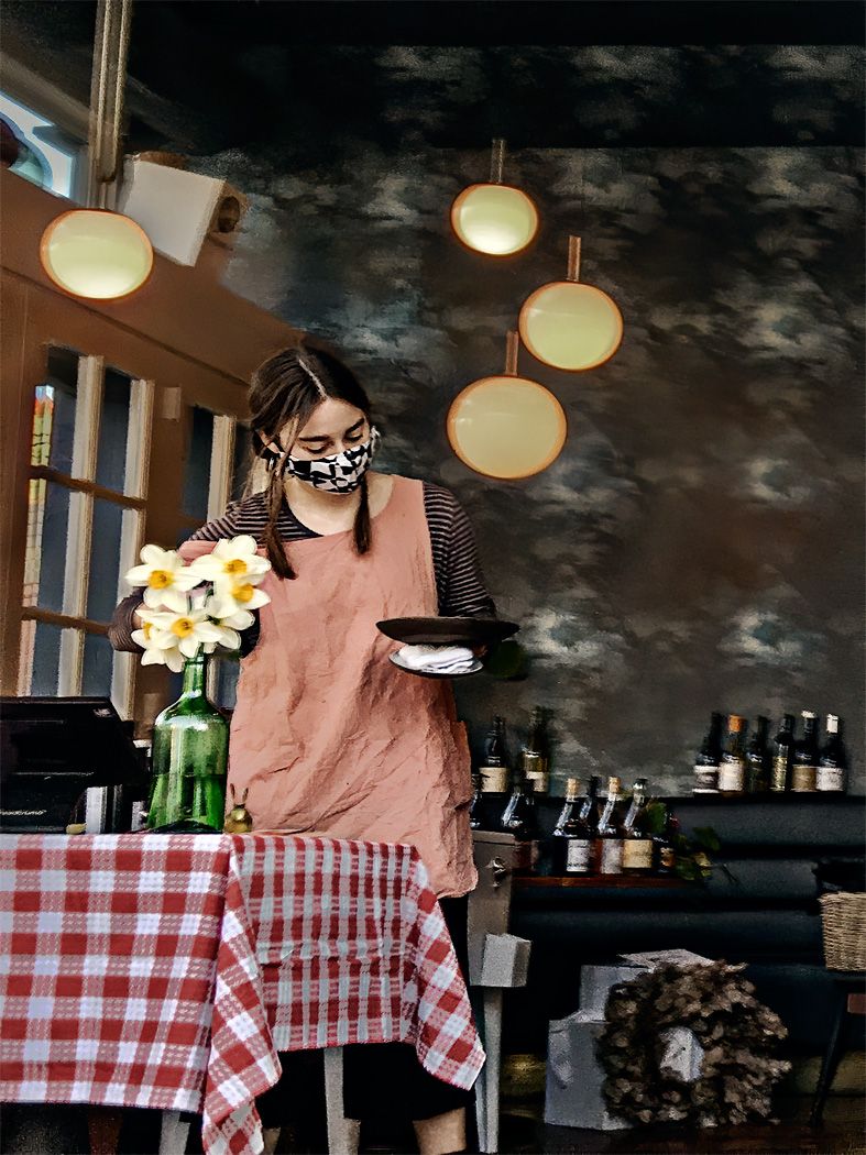
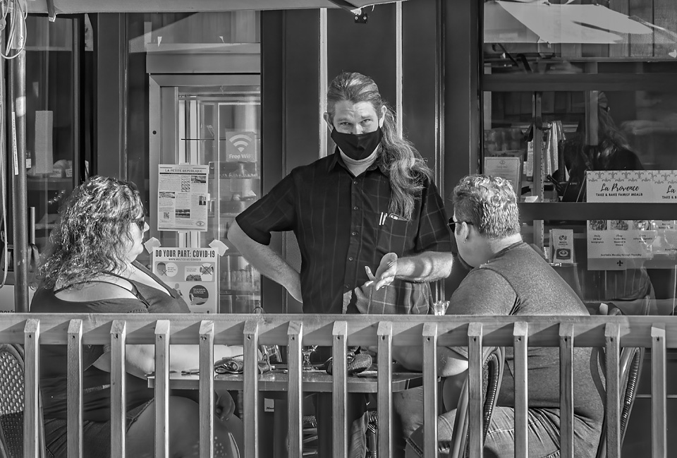
Thanks for your comments Ed.
The "motion blur" is from camera motion, not subject motion. I took the image as I was walking by, I probably was turning the camera to be facing the waitress, thus blurring both the foreground and background. I did not expect to see camera blur at 1/60 of a second with a wide angle lens, but apparently there are limits even in this range. |
Jun 3rd |
| 80 |
Jun 21 |
Reply |
Thank you Bev for your suggestions. I did tone down the lights some, but I see they could be toned down some more. I also like the idea of a little more contrast in her apron.
When looking at your edited picture, the colors and brightness was way off on my monitor. I inspected the file attributes, and saw that the color profile was untagged in my file that got posted. I am very careful about being sure that files that I post on line are tagged with an srgb profile, and the file I sent in was so tagged, but it did not get posted with a color profile intact. I know this is not your problem, but it could impact how others see both my original image and your edited image. |
Jun 3rd |
| 80 |
Jun 21 |
Comment |
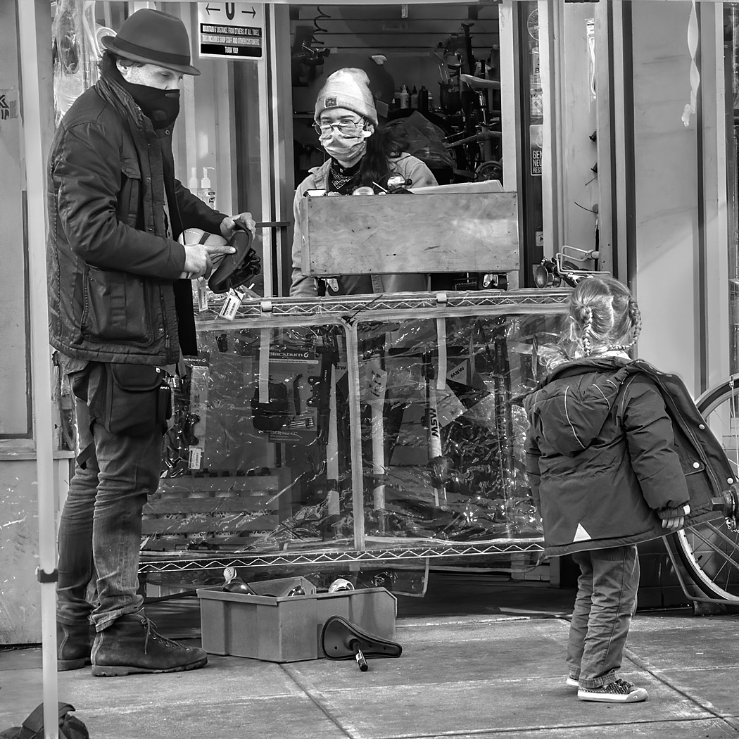
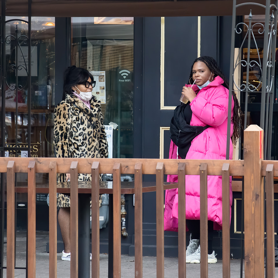
One of the things street photography does is give us a window on the human condition. I see in this image two unhappy young woman perhaps selling their wares on the street. Their identical outfits make me wonder if they are working for another person or business. Their wares look to have been provided by a single vendor.
I do not mind the cars int he background, they are part of the ambience. The mix of cars and bicycles show me a stratified society, and the two women are likely at the lower end though not at the bottom, they do have decent shoes.
Your subjects are clearly separated from the background, their blue dresses bring attention to them.
For me there are some problems that would be difficult to fix with this image such as the blown out highlights on the women's faces. Perhaps re-scanning the image while reducing the contrast of the scant might help. I think a reduced contrast might also bring back some of the detail in the trees behind the women. You can always add local contrast back in during post processing where it helps the image.
I find that the white shirt on the man on the bicycle in the mid-upper left pulls my attention away from the women perhaps more than it should, I think I might then down the bright areas in the background a bit. |
Jun 3rd |
| 80 |
Jun 21 |
Comment |
I posted my comments on on whether street images need to include people on the bulletin board. In that discussion, I touched on photographing street art.
I enjoy the humor of the painting of workpeople behind the duct.
I think that this is a highly graphical image, and that can be used to great effect to make this image your own. I am referring to triangles of light, the fence, the triangle formed by the intersection of the duct, fence, and light. For me, these are the strongest elements in the composition, the painted figures are an added bonus. The street art becomes an elements that adds interest. (I do like the painted figures in the lower left peaking through the fence slats.)
For me the most problematic element is the triangle of light on the left side of the image. I would dim that some while adding contrast to make the areas more interesting and better balance the image. I know you have expressed a practice to not do much post processing, but in this case it warrants it if you want a better image. The alternative is to go back to the location and take the image on an overcast day where the lighting on the left is not washed out. I also think that you could better balance the image by cropping out the dark area on the left; I don't think that it is adding anything to the image. Perhaps cropping from the top comes another implied triangle in the space where the figures are and removes some of the empty space at the top that makes the image a little top heavy for me.
Of course, you may have had other ideas as to what you wanted to express in this image. What you do with the image is your personal taste. |
Jun 3rd |
 |
6 comments - 4 replies for Group 80
|
6 comments - 4 replies Total
|