|
| Group |
Round |
C/R |
Comment |
Date |
Image |
| 80 |
May 21 |
Comment |
Thank you everyone for your great comments. I took them all into consideration to revise the image. Here is revision: |
May 23rd |
 |
| 80 |
May 21 |
Reply |
If you are using photoshop, it should have ACR built in. If you are using bridge, you can open the file into ACR by pressing command R or control R. If you are not using Bridge, you can get to ACR in Photoshop by opening the file as a smart object, and then saving it as a smart object. Close it, select open as a smart object, select the file, but in the dialog box where it says "Format "change it from photoshop to Camera Raw. Then click open and it will open in ACR. (thats the way it works in CS6, I don't know what happens in CC.) |
May 15th |
| 80 |
May 21 |
Reply |
No need for photoshop. I found that I could easily open up the shadows in those areas with ACR/Lightroom using the adjustment brush. |
May 15th |
| 80 |
May 21 |
Reply |
Thank you Karen. I will consider leaving the color in, though I need to deal with that yellow column above the dog's head. The circular sigh can be removed through stretching and cropping the left of the image without making it too tight along the top I will give that a try. |
May 14th |
| 80 |
May 21 |
Comment |
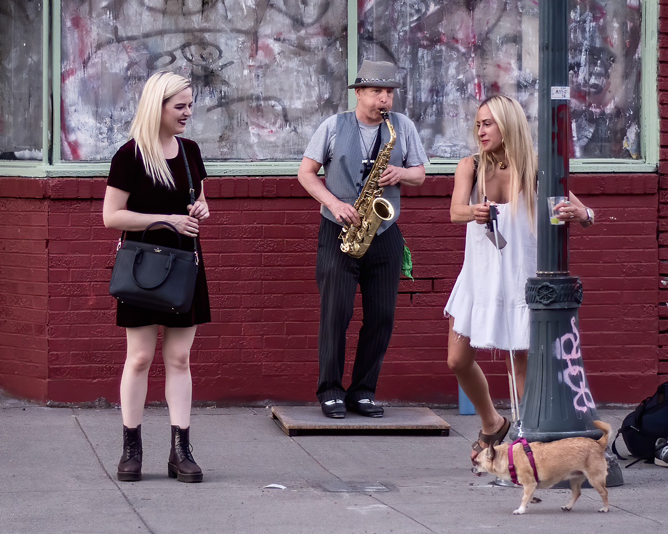
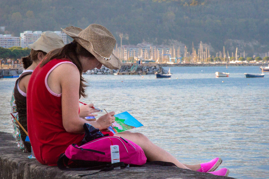
This image is not working for me. Yes, you have the story of an artist painting a scene in the afternoon, but the image composition does not draw me into that story. There are a number of elements that attract my attention, but those elements draw me away from the story. I first see the bright red of the painter's back, then to the bright boats contrasted against the hill in the background, and then to the bright sky, then the bright water, then back to the Artis's bright pink shoes, and eventually to the artwork. When looking at a photograph, I am attracted to areas that are bright, if there is color, the saturated areas especially of red and yellow, areas where there is high contrast, to human faces, and symbols. Though the artist's face is dark, I still find my way back to her face and eventually to what she is doing.
I do think the artist is well placed in the frame of the image, looking into the scene. The aspect ratio is appropriate to draw me to the wider scene. The paining is or a different scene that what we are looking at, which I think adds interest, makes me wonder what is off to the right of the scene shown behind the artist.
To change the visual pathway to enhance the story of this image I would start by cropping out the sky so the image is contained by the darkness of the hill and stone wall. I would darken that red dress so that it does not contrast with the black shirt and be such an eye pull to the woman's back. The pink backpack then becomes more of an eye draw towards the crux of the image, the painter's hand working on the image. I would try to brighten the area around her hand and face to pull more attention there. I would try to brighten the woman's face some so we can appreciate her expression of concentration. Then I would darken the water so that the woman's art stands out better.
|
May 14th |
 |
| 80 |
May 21 |
Comment |
The bright red and yellow colors are the main attraction here, just as the proprietor of the "attraction" planned on grabbing the attention of the fair goers. I like the proprietor's gesture, holding a handful of what looks like money, and his intense stare. Still, I would not buy what he is selling, not because of him but because of what he is selling has no interest for me.
I don't see anything I would change in this image. I would not take out the wires because that is part of the context and is consistent with the cheesynesss of the attraction. Well done. |
May 11th |
| 80 |
May 21 |
Reply |
Thanks for your thoughts Bill. I find people's reaction to the tree shadows interesting. Another person who I showed this image to loved the shadows. I have taken several other images at this location because I like the shadows. It seems that it is a mater of taste. Just the same, I appreciate the input. |
May 6th |
| 80 |
May 21 |
Reply |
Thanks for your thoughts Mo. I tried Ed's suggestion to lighten the dark areas on the woman's face and thingk that it helps.
|
May 6th |
| 80 |
May 21 |
Reply |
Thanks Ed for your thoughts. I tried your suggestion to lighten the face of the woman and I think it helps.
|
May 6th |
| 80 |
May 21 |
Reply |
Thank you for your observations Bev. I understand your point.
|
May 6th |
| 80 |
May 21 |
Comment |
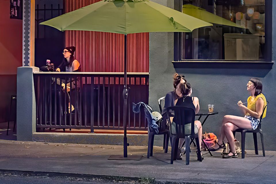
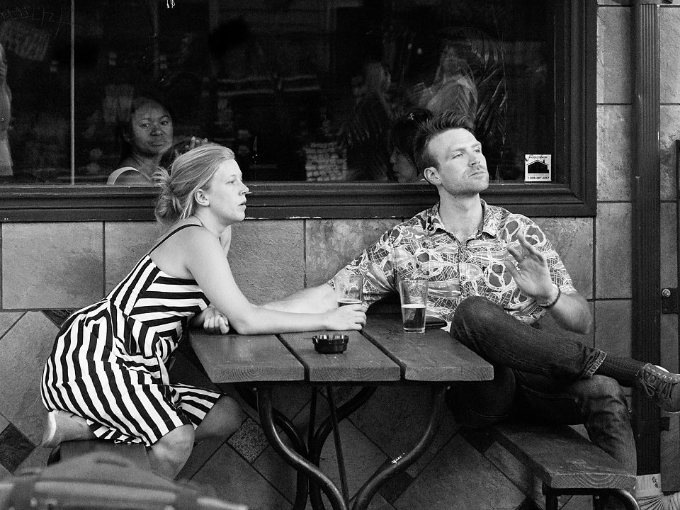
They do not look like a couple to me, the woman looks a bit older than the man and she is not wearing a wedding ring, but then they might be an un-wed couple or a family relation. It is very plausible that they are just two people sharing a bench, trying to ignore each other. For me, the bars of the bench do imply a connection, but I do not know what it is. If they do know each other, there is a different story, some sort of disagreement.
I really like the soft side light, I think that it gives the image a lot of depth and brings out the nice rich colors. For me, it also gives a mood of some languor that seems to fit the weariness of the subjects
It appears to me that you added a bit of a light vignette on the lower corners of the image, which I find interesting. I think it to be more effective than no vignette or a dark vignette in this case.
On my monitor, there is a loss of detail in the man's pants and the woman's dress on the dark side, a little more detail there would be pleasing to me. I think a little lighting of the man's hair would create some separation of it from the background.
Nicely done image. |
May 6th |
| 80 |
May 21 |
Comment |
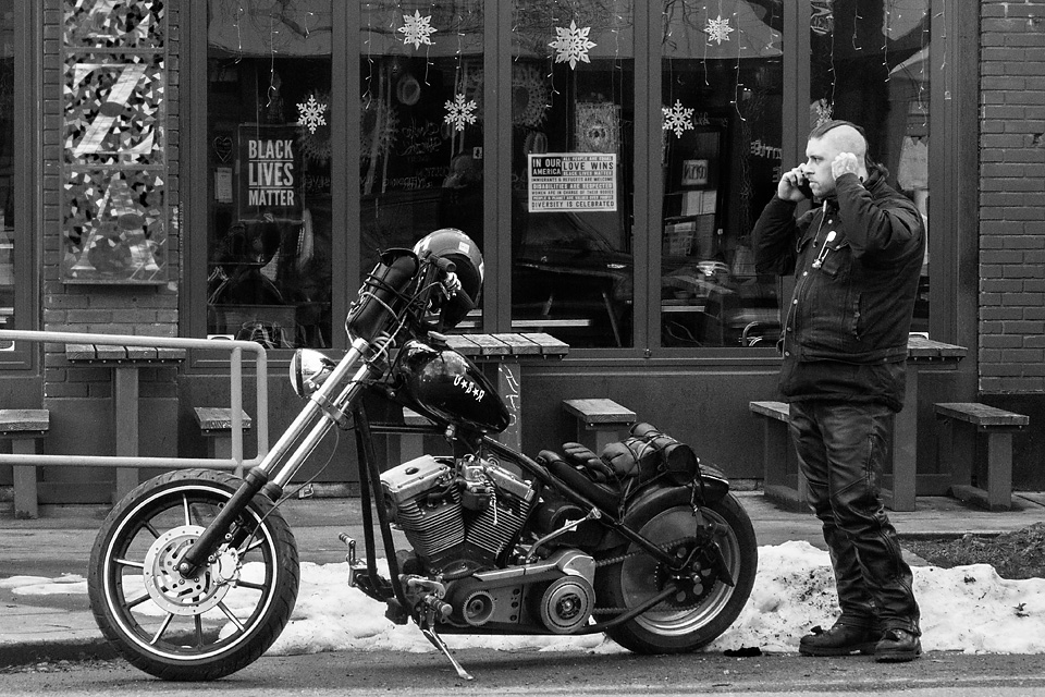
Welcome to the group Mo. I look forward to seeing your work.
To me this is a nice street portrait. I think you have captured the character of the biker well, a soft moment for what could be a tough guy. Good eye contact. You have included enough background detail to provide a sense of place, everything in the image works together in that regard, though a little more would have been nice. The sharp background provides a sense of depth for me. I think your point of view, looking up at the man, makes for a stronger image.
I would consider converting this image to monochrome. Although I find color harmony in the image, I think the yellow and red colors are eye magnets, drawing my eye from the main subject. Converting to monochrome would also take care of the. Distraction of the woman's red scarf that Bev pointed out without having to alter the image.
It would be nice to see your images a bit larger. |
May 6th |
 |
| 80 |
May 21 |
Comment |
I think this image does give us some insight into the character of your subjects, they do want to be photographed, smiling appropriately, and appear to be having fun. Their clothing tell me a little about their personalities, the woman in the center possibly a little more traditionally dressed while the one on the left is dressed in a more modern or western fashion. The clothing does not look to me to be that of field workers, so given the context of the background landscape, perhaps they are tourists from town much as you were.
I think you handled the subject well. The lighting looks soft which is good for photographing faces. I do not see anything that I would change.
For me, the story in an image is not always about some action, but can just as well be an observation, something that you see that interests you. People's character is always interesting to me. |
May 6th |
| 80 |
May 21 |
Comment |
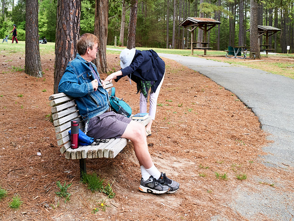
I see a man sitting and enjoying the quietness of a park, Another person who was there reading a book is taking a stretch break. We do not know if there is a connection between the two. A path leads around to the left where there is a couple with a stroller and a few people in the background. It appears to be pleasant place to spend an afternoon.
I too was bothered by the slope in the background and the tilt in the trees. I took a stab at leveling the horizon line using the trees and structure for a vertical guide, leaving some slope, by using the skew tool in photoshop so that the couple with the stroller would still be in the image. I thought that much of the path was not needed and the composition would be better balanced without it. I would consider cloning out the white sigh near the right edge of my crop, or cropping in just a little bit tighter. |
May 5th |
 |
7 comments - 7 replies for Group 80
|
7 comments - 7 replies Total
|