|
| Group |
Round |
C/R |
Comment |
Date |
Image |
| 80 |
Apr 21 |
Reply |
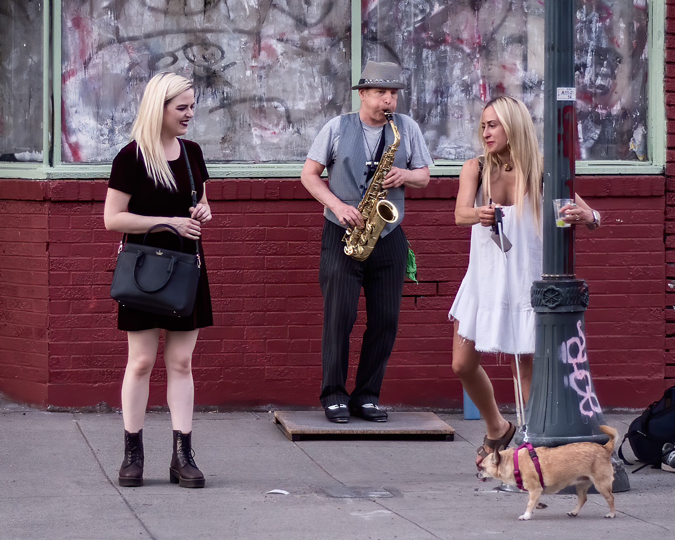
Thank you for your comments Jim. I agree that the background is a bit busy and that has been bothering me some. Your comment induced me to try decreasing the contrast of the background some so that the three main figures stand out better. I think that helps. |
Apr 15th |
| 80 |
Apr 21 |
Reply |
Thank you for you comments Carol. |
Apr 15th |
| 80 |
Apr 21 |
Comment |
Great action, good story. I find it very interesting to see how people live and play in other cultures. You caught the action at just the right moment.
Regarding the ball on the right, I agree with others that it would be nice to have just a little more space between it and the edge of the frame, but I have no idea what might be over there that would also be distracting. Another way of dealing with it is to crop it a little bit in on the ball.
For my personal taste, the image looks a bit over saturated for me, especially the blue and red colors on the shirts, taking my attention away from the wonderful expressions on the man's and boy's faces and looking at the shirts. |
Apr 15th |
| 80 |
Apr 21 |
Comment |
I very much like the action and gesture in this image, the four figures in a synchronized jump for the photographer. For me, that the jumpers are lined up on a diagonal gives the image its energy. I too don't mind that the photographers feet are not shown in the image. Very nicely done.
One small nit; I would darken the bright area in the upper left corner a bit to contain my eye movement in that direction then brighten the image some.
|
Apr 15th |
| 80 |
Apr 21 |
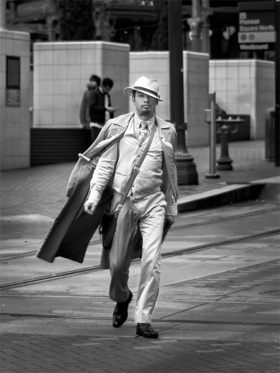
Comment |
showing his stride, a good thing. I like the repeated circle and arch shapes in both the foreground and background, they provide a strong sense of place and are beautiful their own right. You did a great job of taking care of the perspective distortion.
I did not notice any processing artifacts other than possibly concentrating the color when brightening the shadows. I did note a little chromatic aberration that could be easily removed in ACR or Lightroom.
The background is a bit bright for my tastes. I found that I could reduce the brightness there in ACR while retaining some of the detail there.
For me, the contemplator would the viewer, the priests stride does not look contemplative to me.
Some thoughts on color theory and moods colors represent. This image is very strong on oranges on my monitor, orange is a vibrant and energetic color, representing change and movement. I think that the orange is working against your theme of contemplation. Blue often represents calmness, tranquility, contemplation, and peace and would possibly be a better pallet to use to fit your theme. The difficulty would be how to incorporate these notions into this image. One possibility would be to make the image monochrome, then using split toning in Lightroom to add back some blues in the shadows and possibly a little warmth in the brighter areas. This would be a radically different image than what you presented us with, loosing all the color of the stonework, and perhaps not to your taste. I'm not sure if I like it that way either, but here it is just for comparison. |
Apr 15th |
 |
| 80 |
Apr 21 |
Comment |
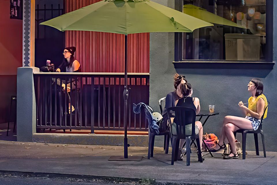
For me the motion, gesture, and action in this image is wonderful. You caught it at the exact right moment, with that red hair flying.
I like the way the colors of the tiles and the boy's red shirt complement each other. However, for me the background colors are a bit strong and pull my attention away from the boy. Perhaps desaturating the background a little would make it less of a pull. Along the same line, I think reducing the contrast of the background some would help. And as Carol noted, it would be nice to see a little more light on the boy to fix our attention there.
|
Apr 15th |
| 80 |
Apr 21 |
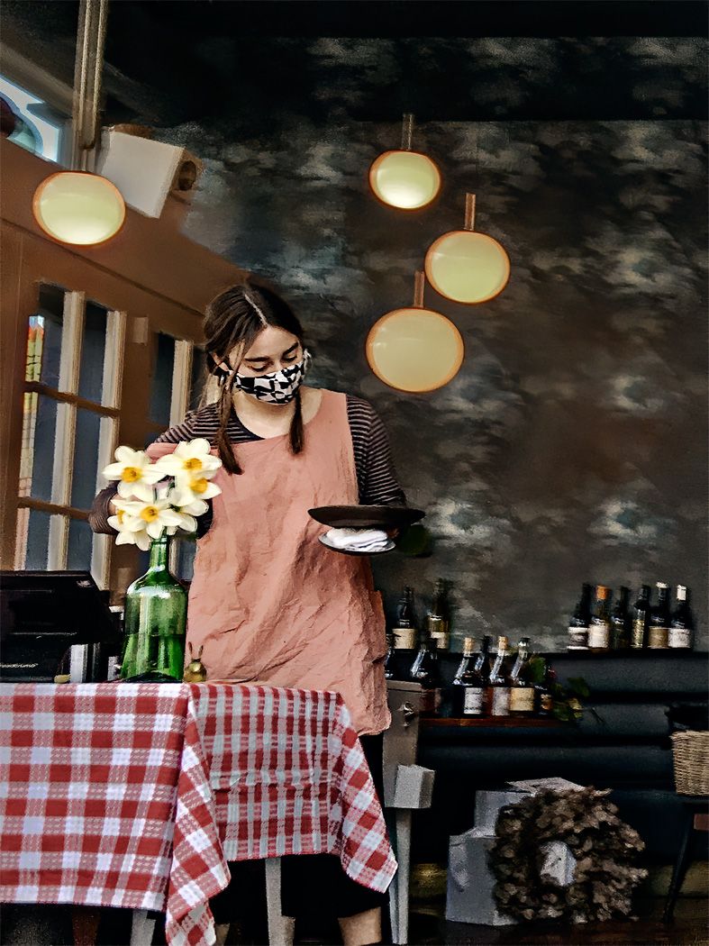
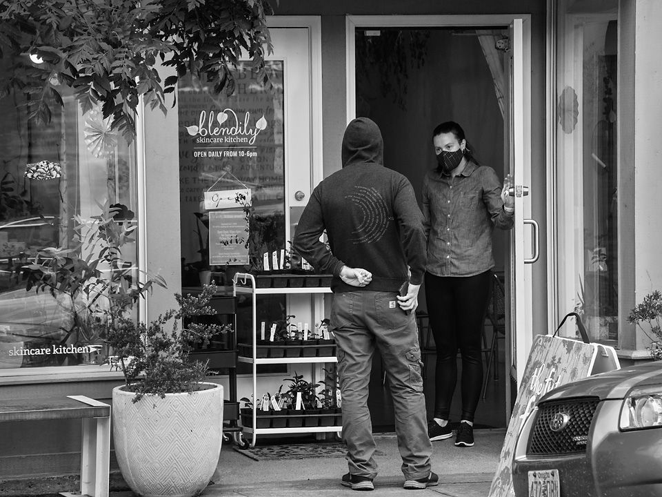
Comment |
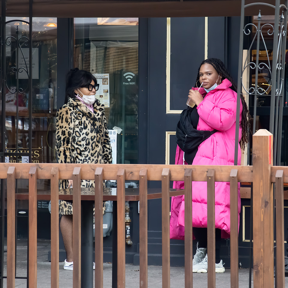
It appears to me that these two are friends meeting in a safe manner outdoors for a conversation during this pandemic. It has been a long time since I have had friends inside my home, but do meet them often masked and outdoors for walks, talks, and other activities. So, I can relate to what is happening here. This is an image of our times. With faces covered by masks, it is hard to see expressions; in this image you have captured the interconnectedness of the two women through hand gesture and eye contact.
I noticed you cropped to a wider aspect ratio than what would come out of your camera, putting the subjects to the right. I think that it gives the image a little unbalanced feel, but I think that is appropriate for the times, I like it, life feels a little unbalanced to me.
I don't mind the slight hand blur from the slower shutter speed. For me it gives the image a little more dynamic. One nit, the focus appears to be behind the main figures, on the background leaving you main subject slightly your of focus.. Perhaps that is part of the feeling. |
Apr 15th |
5 comments - 2 replies for Group 80
|
5 comments - 2 replies Total
|