|
| Group |
Round |
C/R |
Comment |
Date |
Image |
| 80 |
Mar 21 |
Reply |
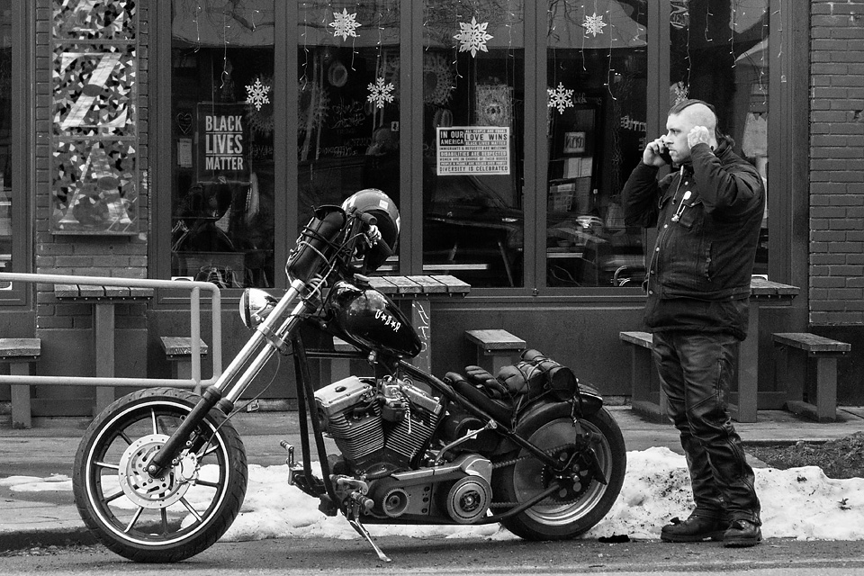
Thank you for your thoughts Karen. I do find motorcycles and their riders to be interesting subjects and hope to get more in the future. The color vs B&W question will have to be resolved depending on if this goes into a color or B&W collection. Most of my other motorcycle pictures are in B&W so I leaned in that direction. I appreciate you comment on the mood color sets in this image. |
Mar 30th |
| 80 |
Mar 21 |
Reply |
Thank you for your comments Jim. |
Mar 30th |
| 80 |
Mar 21 |
Comment |
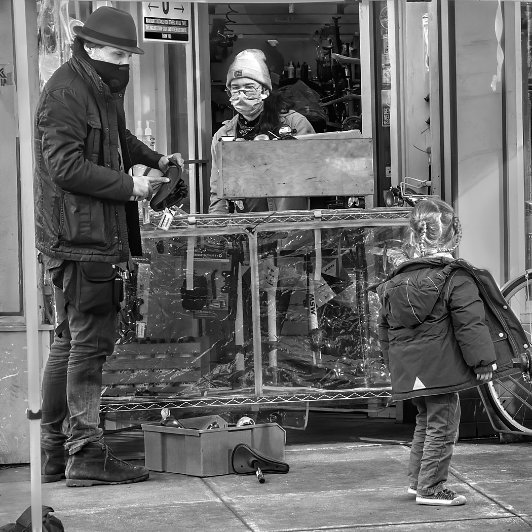
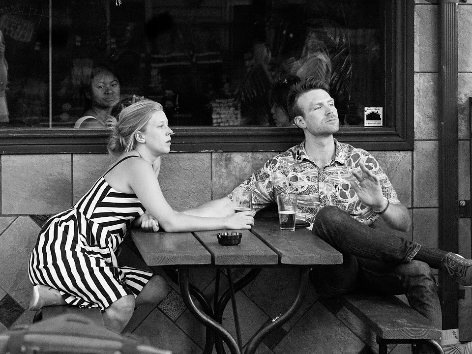
Thanks for posting the original. I can see what it is you were dealing with in this image. For me, there are three different aspects that need to be taken care of: The focal plane being behind the two subjects, making them slightly out of focus, the busy background, and the splotchiness of the subjects skin. I will take them one at a time.
The busy background can be taken care of as you did, by blurring it some. This requires generating a mask so that the subjects are not blurred. Making a good mask is difficult for this image because you want to retain the detail in the hair. I made a reasonably good mask using selective color and then refining it using the paintbrush, then softening the edge by about one pixel to keep it from looking too much like a cutout. When blurring the background, I cloned in background over the figures to prevent a halo from being formed around the figures. (There might be a simpler way of doing this but I have not come across it yet.). I then put the blurred layer with mask into a group of one, then made a gradient mask for the group so that the blur of the background was applied to distant objects but not as much to close objects to give a more natural shallow depth of focus feel to the modification.
I used Topaz Detail and some unmask sharpening to add some faux sharpness to the faces. Perhaps Topaz Focus AI would do a better job, I do not have that plugin. Adding detail did accentuate the skin blotchiness whereas an AI program might not.
To address the splotchiness, I used an advanced photoshop technique called Frequency Separation. The idea of frequency separation is that you can smooth out the tones and hues but retain the fine detail, unlike a lot of the smoothing apps that make faces look like plastic. The procedure is too complicated to post here, but there are excellent tutorials on line such as https://expertphotography.com/frequency-separation-photoshop/.
I know this is a lot of stuff, but may be worthwhile for this wonderful interaction between the man and girl. The resulting image is: |
Mar 23rd |
 |
| 80 |
Mar 21 |
Comment |
Thank you Jamie for your comments, they are appreciated. I think your suggested crop for this image works for me. I often find that trade-off between character and context hard to judge; how much the context adds to the story or how much it can distract.
I think the color version works as well. Again, for me its a question of the trad-off between whether the color adds to the story, detract, or is neutral. In this image I think the color could be neutral so it could go either way - though I do see your point that the snow stands out a little more in the color version. My initial thought was that the strong yellow of the pizza sign down the left side was too much of an eye draw, but when the yellow intensity is reduced in your crop, it becomes more neutral. Thanks again for your perspective. |
Mar 18th |
| 80 |
Mar 21 |
Reply |
Thanks for your comments Bill. I got a chuckle out of your last line. |
Mar 18th |
| 80 |
Mar 21 |
Reply |
Thank you for your comments Beverly. I appreciate hearing about what you see in the image. |
Mar 13th |
| 80 |
Mar 21 |
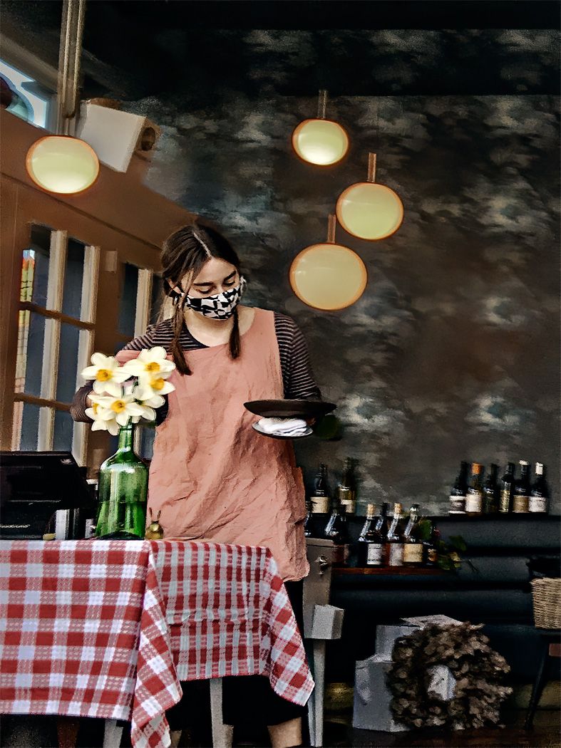
Comment |
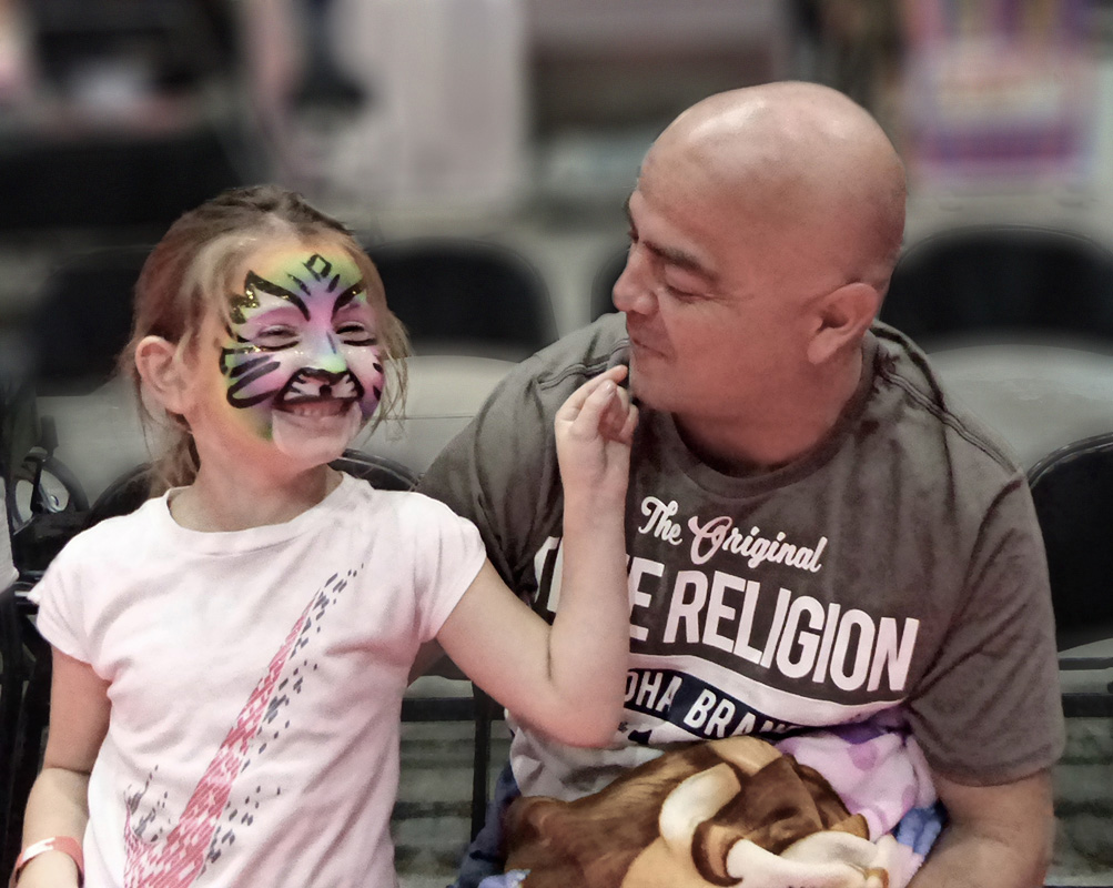
For me the expression and gesture in this image are excellent. I like the girl's smile through that painted face and the grandfathers connection to her. I also think that the simple color pallet, pinkish tones and grey works wonderfully. I think that the shallow depth of field simplifies the image nicely to just the two figures.
For me, the additional processing on the figures does not work. It makes me wonder if there was some flaw that you were trying to cover up. I wish you had posted the original image to see if there were alternatives to the distracting paint stroke effect. |
Mar 13th |
| 80 |
Mar 21 |
Comment |
For me, this image sets the scene for potential drama, fire trucks and smoke.
What is lacking in this image for me is a sense of action. You have the alarming situation of smoke pouring out of a house and an assemblage of fire trucks. The firemen appear to me to be preparing to do something, holding a ladder, taking stuff out of the firetruck, but not actually in action, climbing up the ladder, fighting the fire, working with firehoses. If you have some later images of the firefighters in action, I think that it would make a better image.
|
Mar 13th |
| 80 |
Mar 21 |
Comment |
I find this to be a wonderful image of the interaction of a boy and his dog on a snowy day. I think the colors in this image are wonderful, the blue of his coat, the orange-brown dog, set off by the white snow, and his oh so rosy cheek. Perfectly exposed in my opinion.
I think that your crop is good, eliminating the distractions of the disk sled and shovel. I would have liked to see a little more on the left, the dogs tail is close to the edge of the frame, and if the image were to be framed it might create a tangent with the frame. I would consider expanding the frame in that direction and cloning in some snow. You could also do that along the top so that when you re-crop, the boy would move down some in the image.
|
Mar 13th |
| 80 |
Mar 21 |
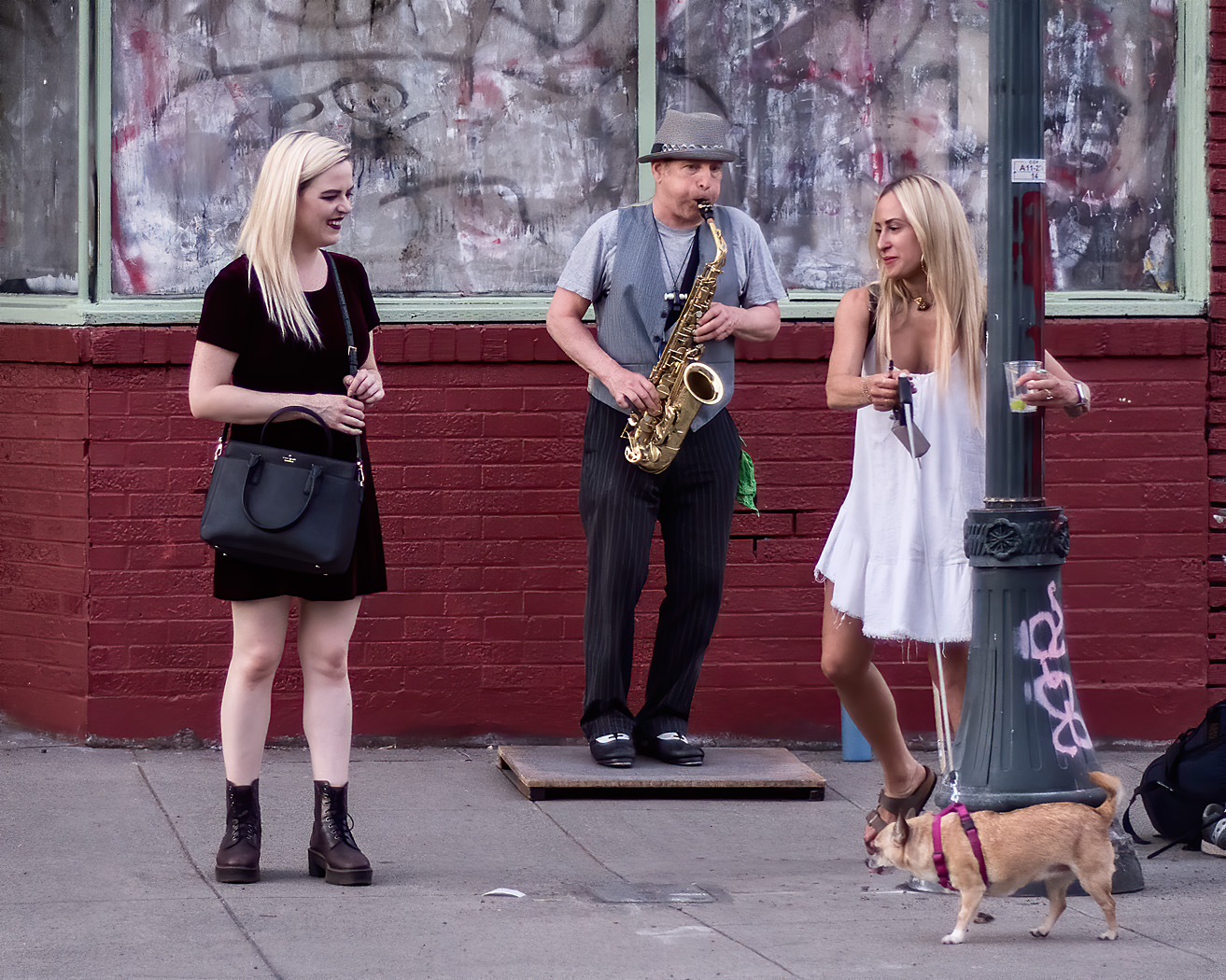
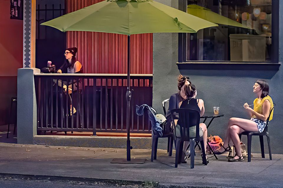
Comment |
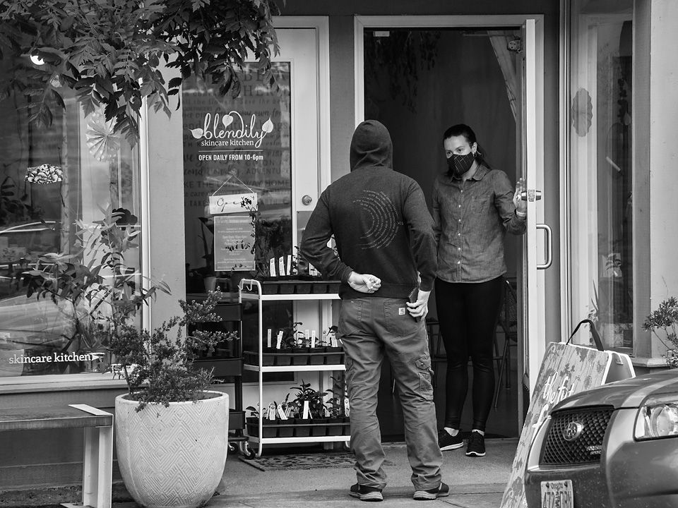
This appears to be a vibrant corner in town with people coming and going from the inn. I like that the elevated point of view lets me look through the scene, giving it a bit of depth. I think that the traffic is an integral part of the scene, expanding the story some. The longish exposure works for me, giving the perception of motion for the people walking, and the traffic jam with the cars still. (Isn't vibration reduction wonderful for getting those longer exposures?)
For me, the cars and traffic are the dominate part of the scene; I am attracted to the lighter areas in a photograph so my eye goes there. I think that brightening the area along the sidewalk would bring more attention to that area help balance the image .
I think this image works well in both color and black and white. |
Mar 13th |
| 80 |
Mar 21 |
Comment |
For me, the man's focus as he reaches for his tool makes the photograph interesting. There is definitely story here, two men working together on a common task that leads to your image title. I think that your crop is ideal, cutting out the extraneous parts of the scene bringing me to the essential part of the story. I like the soft light coming down from directly above, creating the shadows that give so much contour and distinction to the pipes.
I noticed that you changed the white balance from the original, warming up the image bit. Given that the light direction is from straight above, I expect the whites to be mid-day white; if the light was from the side I would think it might be warmer. Also, I think you lost some blues in the pipe that would contrast nicely with the oranges when you warmed up the image. In my opinion, a slight vignetting on the right side would help balance the light and darks in the image. I would also desaturate and darken the orange barriers on the left so that they would be less of an eye pull.
|
Mar 13th |
7 comments - 4 replies for Group 80
|
7 comments - 4 replies Total
|