|
| Group |
Round |
C/R |
Comment |
Date |
Image |
| 80 |
Feb 21 |
Comment |
For me this image is all about the fishmonger's inquiring expression; what was being said by the customer and how can I satisfy the customer's desire. We have the context of the fish market. For me, a secondary draw are the price tags, there brightness are strong attractors. I think this is a wonderful capture.
I think this image also would work well in black and white; I don't think the colors are adding to the central story, and the bright yellow tags draw away from that story.
I agree with Carol that the fishmonger's face is a little soft, it looks to me that the focal plane is behind the fishmonger; the sweater of the woman behind him appears to be tack sharp. I would prefer that the fishmonger's eyes were tack sharp. For me, the bottom part of the image is a bit bright, darkening it and increasing the contrast may bring better definition of the fish and the ice. |
Feb 17th |
| 80 |
Feb 21 |
Comment |
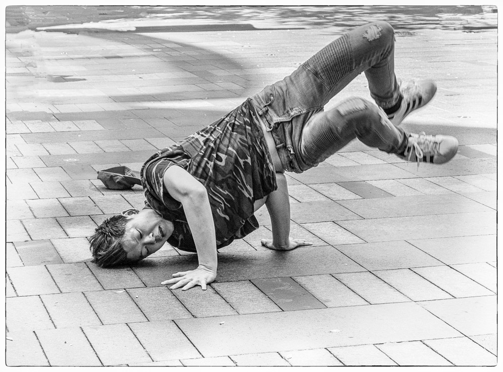
Ouch! That looks painful. Thats my reaction when I see break dancers perform. I think you caught the action here at a good moment when we can see the expression on his face. I think that the B&W version is better than the color version, his face and arms are brighter. In my opinion, you did well to remove the people in the background, they were minor distractions from the action.
I often look for ways to make the main subject stand out better, often looking at brightness/darkness to focus attention. In this image I tried some darkening vignetting, darkening the bricks during conversion to black and white by darkening the blue colors, and lastly, going for a high key or white vignette. I think the last experiment worked best for me. |
Feb 13th |
 |
| 80 |
Feb 21 |
Comment |
Great photo! Everything in this photo works for me. I think that the positioning of the riders in the frame is effective, riding into the space, the skateboard at the edge of the frame gives it that little extra tension. The beach umbrellas and clouds in the sky give a strong sense of place. The slight motion blur gives me the feeling of movement. I think the rider's gestures and smiles are wonderful.
One small suggestion, try increasing the contrast on the man's lower face to make it similar to the contrast on the woman's face. You might consider lightening up his dark glasses a tad, for me they dominate his face rather than his smile. |
Feb 12th |
| 80 |
Feb 21 |
Reply |
Thank you Ed. You are right about the de-noise process. On inspection, I see that it was uneven in its application, removing more noise in some areas than others, and softening parts of the image. I will go back and re-do that paying particular attention to not overdoing de-noise in the places it softened the image, and applying more in areas that are yet too noisy, blending several layers of different strengths of de-noise to get the best of each. |
Feb 12th |
| 80 |
Feb 21 |
Reply |
Thank you for your observations Karen. |
Feb 12th |
| 80 |
Feb 21 |
Reply |
Thank you Jim.
|
Feb 12th |
| 80 |
Feb 21 |
Comment |
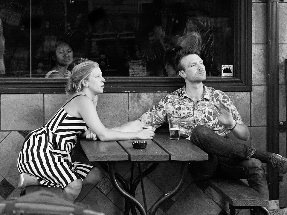
For me their gestures does look like they are having a heart to heart conversation. I think you framed the image well, we do not need to see the rest of the fountain, what you show gives the image a sense of place. I like that you included the statue looking down at the couple, and you left some space above the statue's head. I also like that you worked your camera position so that the couple is framed by the dark area behind them. For me, the tonality of the image Is nice and I like the monochrome presentation. Well done.
For me, the brightness of the statue makes it the primary element in the image, I would consider toning it down to make it more of a secondary element, with the couple being the primary. |
Feb 11th |
| 80 |
Feb 21 |
Comment |
I find this a strong observation of the human condition, the contrast of youthful wonderment and aged torpor. The image creates a tension between melancholy and yearning moods.
I think that the composition works, my eye follows bright areas, man forehead, arm, leg, boy, boys upward gaze. The boy's upward gaze into the dark may symbolize bleak future. I like the tonality in the image. Is this tonality a setting in the fujifilm camera or did you achieve it in post processing. I have seen similar tonality from fujifilm cameras..
For me, the image has an odd mix of smooth and grainy textures along with what looks like compression artifacts. I would look to trying to fix that. I also noticed a few bright pixels that I would remove, especially that one the boy is looking at. I would also remove the the thin bright areas along the left edge of the frame. |
Feb 11th |
| 80 |
Feb 21 |
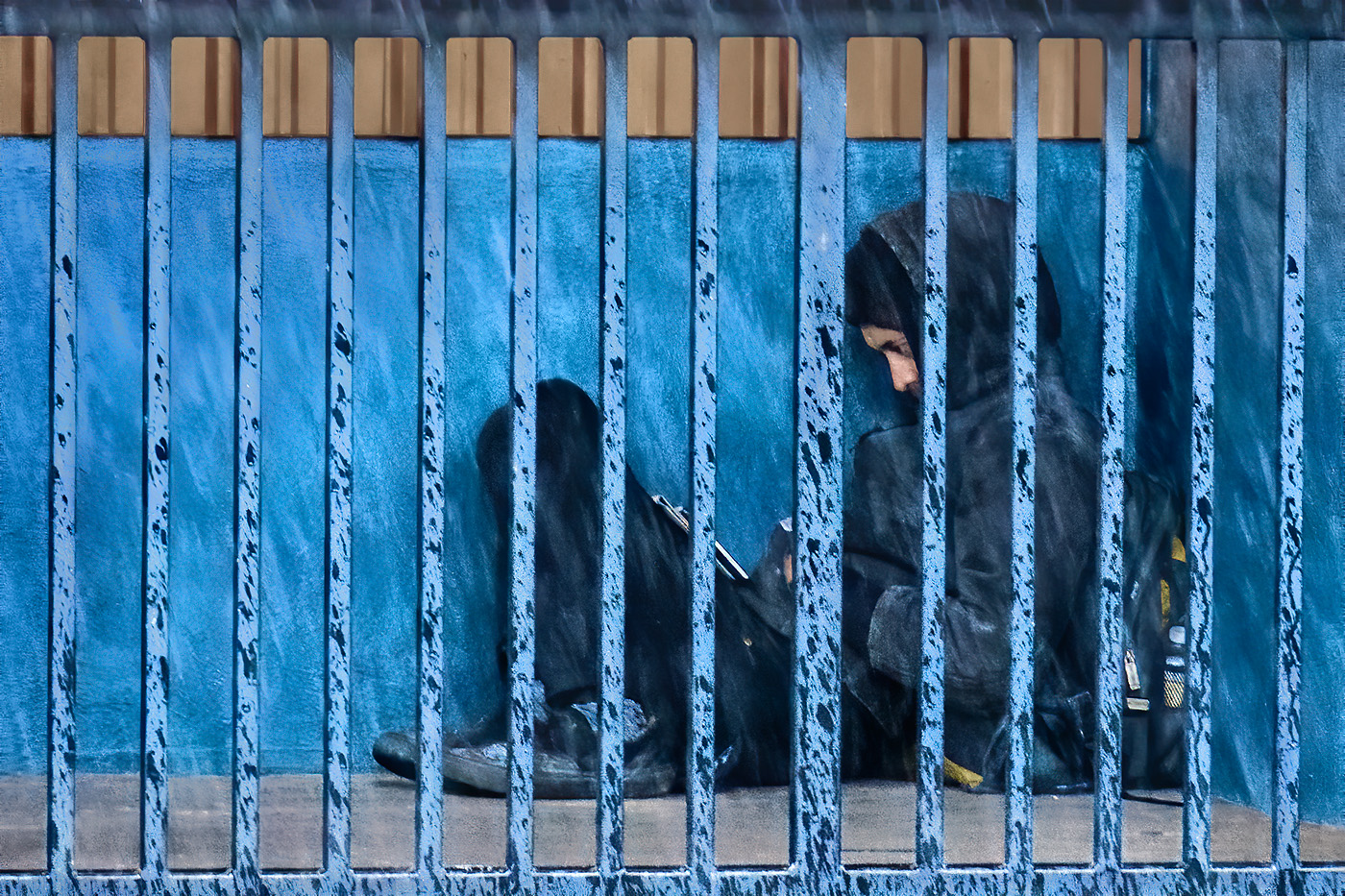
Comment |
Homeless in New York Beverly Caine
It was nice that the gentleman posed for you. I do like the way he looks so relaxed and has a friendly expression. I like that you caught the highlights in his eyes that make hime look lively.
I think this image works equally well in black and white or color, for me the three main colors in this image work well together.
Recovering blown out areas can be incredibly tough, especially in areas where you would like to see fine detail. I try to avoid blowing out whites by setting my exposure composition to a negative value, usually -0.7 or less depending on the lighting condition. For full sunlight like in your image where there are some bright spots, I would set my exposure compensation to less than -1.5. I can adjust the image exposure in post processing. I prefer to use RAW files so I have more dynamic range to work with in post processing than I would get with jpeg files. For your B&W image, I used the clone stamp tool to replace blown out areas on the beard using a sample from a more intact area; I suspect you did the same for your color versions. In the color versions, the head and beard hair looks thicker, perhaps because the color images are at a lower resolution, or that the images were sharpened using too high a radius.
I think that I would leave the vegetation as the background, though I would reduce the contrast in that area and or desaturate the yellows and greens some.
There appears to be a bright area added to the man's shirt in the color version.
Overall a nice image, worthy of making improvements to. |
Feb 11th |
6 comments - 3 replies for Group 80
|
6 comments - 3 replies Total
|