|
| Group |
Round |
C/R |
Comment |
Date |
Image |
| 80 |
Jan 21 |
Reply |
Thank you Bill. I have thought about having a whole series of images called "Caught," some of which I have posted to this group for comment. Perhaps this image would fit in the series using Beverly's crop. Good suggestion. |
Jan 20th |
| 80 |
Jan 21 |
Reply |
Thank you Carol. |
Jan 19th |
| 80 |
Jan 21 |
Reply |
Thank you Beverly. No ned to be sorry. Sometimes an image just does not work out. i do think your crop is an improvement. |
Jan 16th |
| 80 |
Jan 21 |
Reply |
Thank you Jim. |
Jan 16th |
| 80 |
Jan 21 |
Reply |
I guess I am old school. I do as much as I can with a RAW processor, then bring them into photoshop. I feel that I have much greater control with the masking in photoshop, and I do make extensive use of blend modes and blend-if functions, functions that I don't see in RAW processors. I do not know if Capture One has those tools. |
Jan 16th |
| 80 |
Jan 21 |
Reply |
I like what you have done with it. |
Jan 16th |
| 80 |
Jan 21 |
Comment |
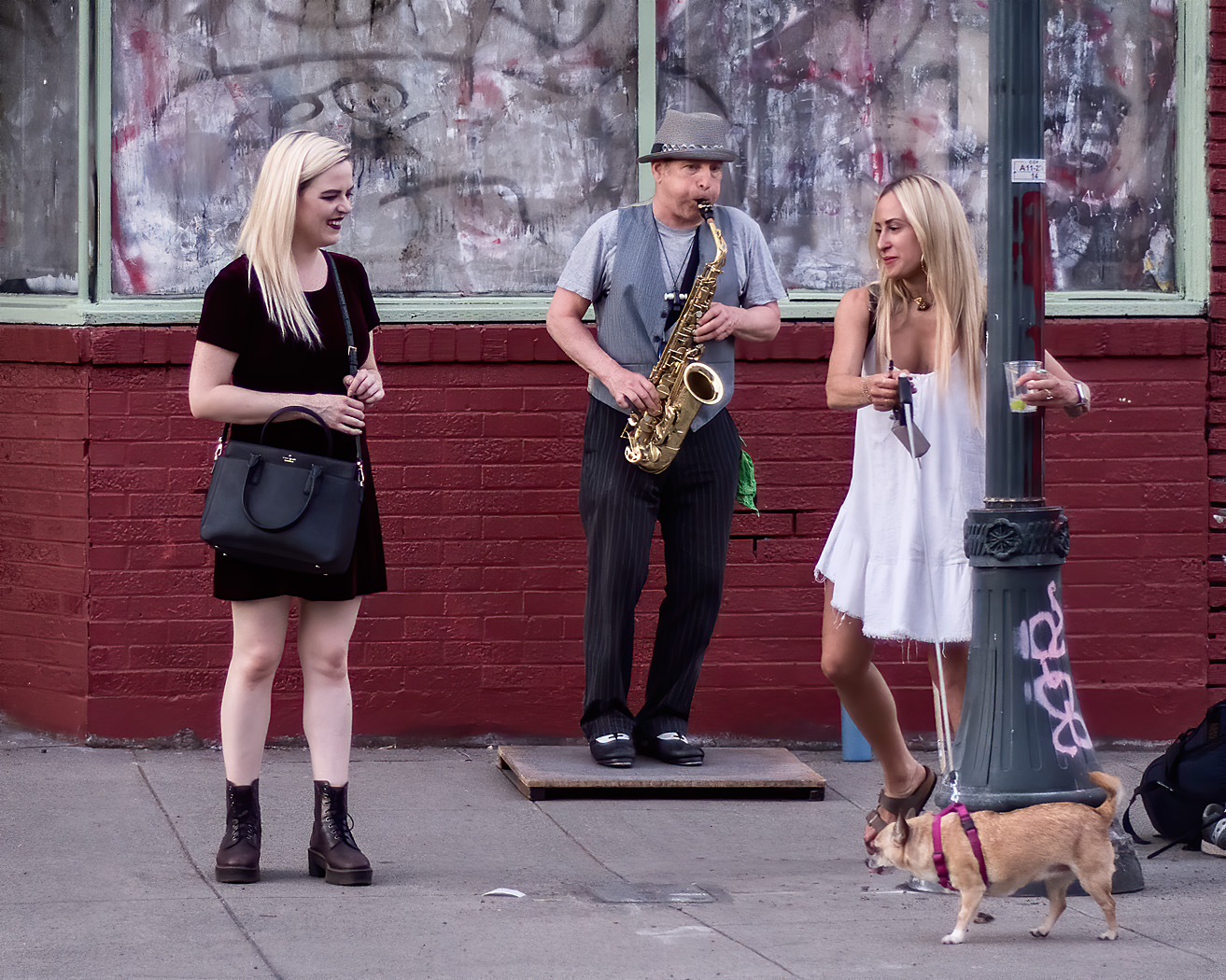
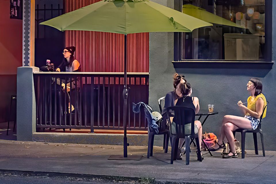
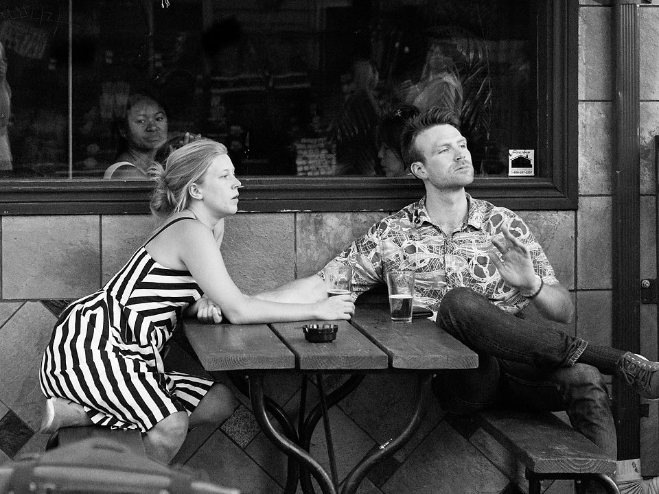
I see several elements in this image: a crowd transfixed by something mesmerizing, possibly fireworks, A child and mother also mesmerized, and several people facing the other way busy with some other purpose. My focus goes to the woman front and center and her daughters or grand children, assuming that the woman leaning over is the mother. For me, the crowd in the city setting provides context. I also note the woman behind the grandmother. The hat on the man next to the grandmother gives us a hint as to the location, Philadelphia. I find it interesting to explore the expressions on the peoples faces.
For me, along with Carol,Jim and Ed, the central theme brought out by the lighting are the grandmother and children. The grandmother grandfather, mother and children make a family grouping with interaction. The choice for you to decide is: do you want to make this image about the family grouping, or as you indicated in your note, the disinterested man walking through the crowd.
If your interest is the man, I suggest using brightening and darkening different parts of your image to attract or dissuade the viewers attention from from different elements in the image. For example, toning down the brightness of any persons in the crowd that is attracting attention such as the girl in front, that bright hat on her mother, and the woman's face behind the grandmother, and brightening the man slightly to differentiate him from the crowd. I find the blue thing by the face of the the girl in front to be distracting, so I think it could be desaturated and toned down a bit. Also to make her red muff less of an eye draw from your story, I would desaturate it a bit.
To focus in on the family interaction, I would crop out most of the crowd on the left of the family group including the man walking into the crowd and crop off the bright woman on the right edge of the frame on the right, brighten the lower part of the family group, and darken the woman behind the grandmother. Enough of the background remains to provide the setting. |
Jan 15th |
| 80 |
Jan 21 |
Reply |
Thanks for your thoughts Ed. |
Jan 11th |
| 80 |
Jan 21 |
Reply |
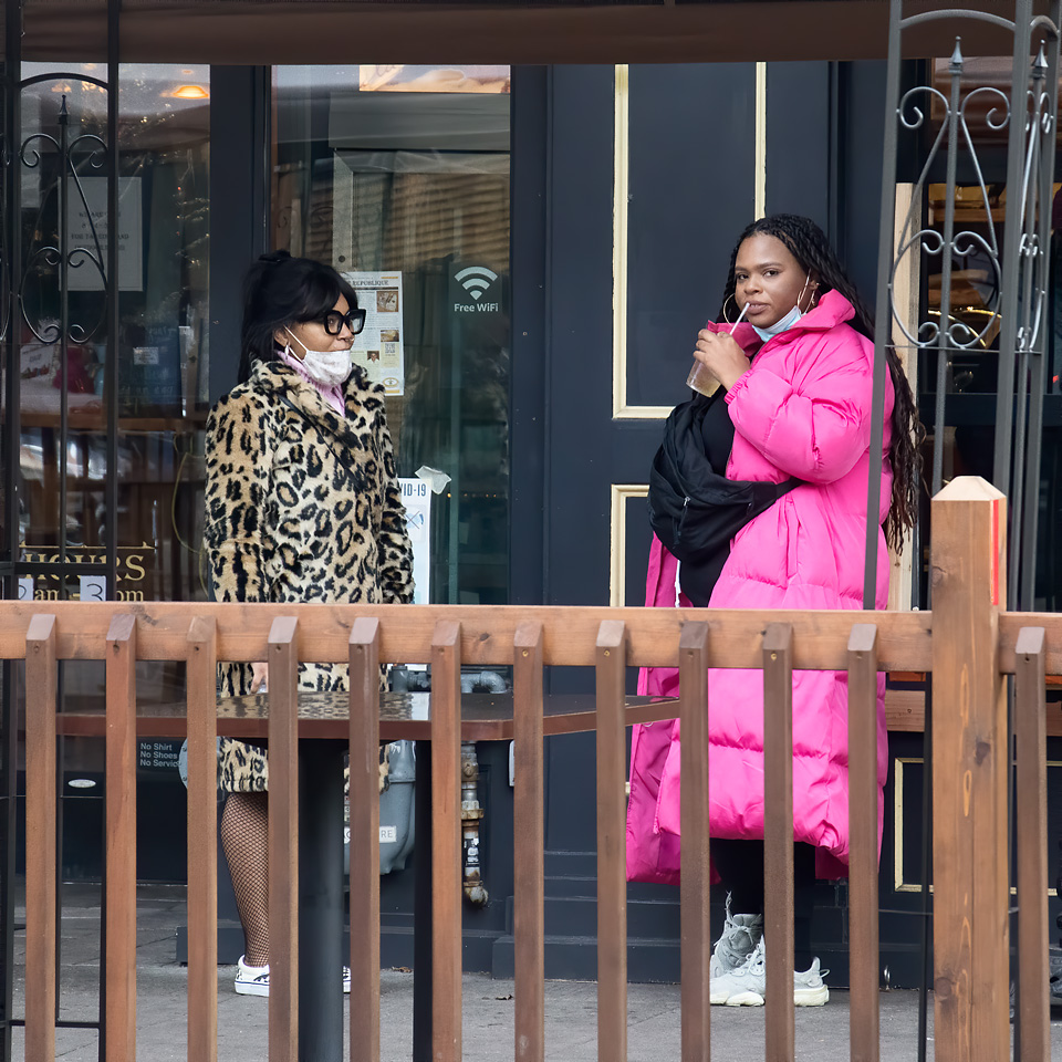
Thank you for your comments Jim. The story I I am trying to tell?: I sometimes do street portraits of interesting people and character studies, this could have been just that with a much tighter cropping of the woman with the pink coat. The coat is ostentatiously bright and stands out from a distance. What can you say about a woman that would wear such a coat? She does look comfortable in it. But I also found the second leopard coat to be somewhat contrasting, an older less ostentatious style, perhaps a distraction. Then, as Carol said, just the coats are not enough to engage her. There is not enough character showing in the woman to be engaging. |
Jan 11th |
| 80 |
Jan 21 |
Reply |
Thank you for your comments Carol. You have a good point. It is usually the interactions creating story in a street photograph that make them interesting. I often have a hard time choosing which images to show or keep, this one I was uncertain about, and you have weighed in on the side that it should be in my discard pile. And I agree with you that the image is quite busy with lines. Yours are the type of comments that I hoped to get from this group. Thanks again.
|
Jan 11th |
| 80 |
Jan 21 |
Comment |
I think you have wonderfully caught the action of this game at just the just the right moment. I like the crop, with the ball in the catcher's bit you have created attention in the image by leaving lots of space in front of the batter and him looking where he intended the ball to go.
I am not a sport's photographer and have little experience in it, but I did just attend a lecture from a very good sports photographer on what he considers to be important elements in sports photography. I am just cribbing from the notes I took. You have included most of what he says are essentials in a good sports photography image: catching the action at the peak moment, sharp focus, frozen action through high shutter speed, nice lighting, and including the environment. Cloning out the other player focused to story on just the two players in opposition to each other. A few the things that are missing from his list are seeing a face, and a bit of distraction background.
In reviewing his list, it looks to me like the same elements make good street photographs.
I agree with Ed that the discontinuity in the fence should be addressed. For me, the red in the soil around the batter and catchers feet makes that area a dominate part of the picture, pulling my attention away from the action. I would consider either desaturating the reds in the soil, desaturating the hole image, or converting the black and white. I think that the color does not contributing much to your story, though the red-green complementary color pair works well in this image. |
Jan 10th |
| 80 |
Jan 21 |
Comment |
For me, this image has a sense of place, it appears to be a residential street in a northern European town. I think you caught the bible rider in an ideal position and the parked truck serves as a nice stopper for lines leading toward the edge of the frame. I find the shadows of the rooftops of houses on the opposite side of the street intriguing. The man looks cold to me, and the slight bluish tend in the shadows adds to that feeling of coolness.
On my monitor, the sky near the top looks muddy. (Color space untagged.) Perhaps you could blend a cooling filter to the sky to give the sky a more natural color. Or as Ed suggested, crop out more of the sky.
A little color grading for this image might be effective, warming the bright areas and cooling the shadows. I think it would give it more of that early morning feeling when the low light angle tends to be warm. |
Jan 9th |
 |
| 80 |
Jan 21 |
Comment |
I like what you were trying to do here, the lights around the fountain and the soft flow of water at its base, and the jets streaming in are captivating. My attention also goes to the background street, providing a setting for the fountian.
I agree with Ed's comments. I think that you would have done better by waiting a little longer into the blue hour to take the image to let the sky brightness decrease so that it was not so dominate in the image. It is difficult to fix in raw processing or photoshop. Since the fountain is the star of your image, my preference would be that it would be better lighted, bring up the shadows in raw processing. Perhaps shooting a little later in the evening would have put more light on the water jets so all of their arcs would be completed. I also think that the street light on the left edge of the frame would be better cropped out to avoid that eye draw.
|
Jan 9th |
 |
| 80 |
Jan 21 |
Comment |
The expression on the woman's face, along with her retracted gesture, saying "This is MY lunch" makes this image. The dog's expectant stance completes that story. The dog appears to be saying "all I get is water when there is delicious food on the table. "
Your crop works for me, it eliminates unneeded parts of the image. The conversions to monochrome also works for me, helping to reduce some of the background distraction, the red area behind the woman's face. It appears to me that you used a gradient in post processing to darken the top of the image a little, in my opinion, a good move. Perhaps just a little more darkening at the top would help keep my attention on the woman. I also think that the woman's expression would be more effective if her face was a little brighter and had a little more contrast.
Happy new year to you. |
Jan 9th |
5 comments - 9 replies for Group 80
|
5 comments - 9 replies Total
|