|
| Group |
Round |
C/R |
Comment |
Date |
Image |
| 32 |
Dec 20 |
Comment |
Visiting from Group 80.
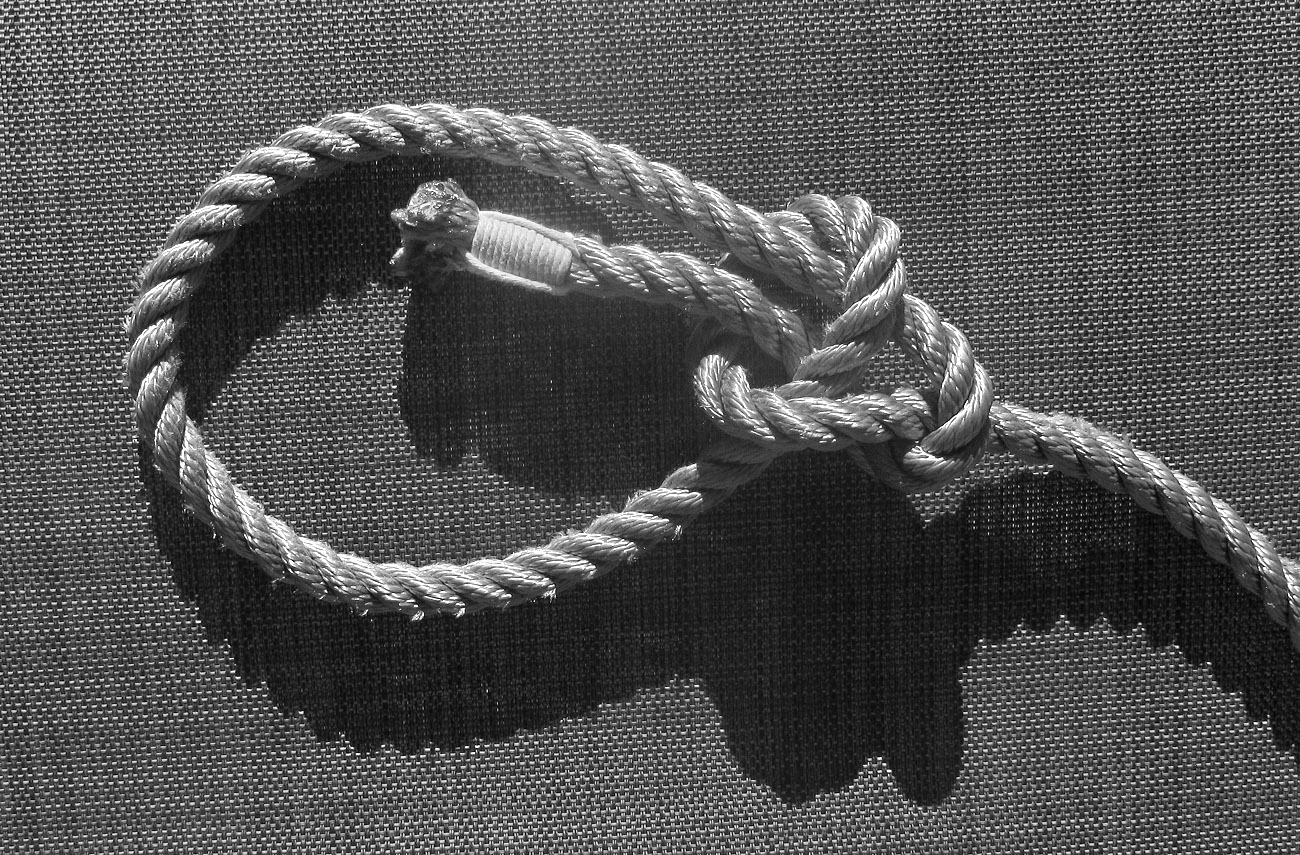
I remember well how I was taught to tie this knot when I was a young teenager: Make a loop in the rope with line coming toward you laying on top, then with the other end follow: the squirrel comes up from the hole, runs around the tree, and back down into the hole. Definitely a useful knot to know. I also learned to do whipping on hemp rope and cotton line. Later as a climber, I used Goldline, though we did not whip the end of it, just melted the end to keep it from fraying.
I like the way you kept your composition clean and simple, I think that it is cropped just right. I like the side lighting that gives the rope its definition and produces the nice shadows. For me, the rope leading in at an angle gives the image a more dynamic feel. For the same reason, I like that the weave in the background is also at a slight angle, though I may have tried a slighter steeper angle there.
I think that you could make the rope stand out more by decreasing the brightness and contrast of the light part of the background (remove the highlights), and then brightening the whole image except for the whipping. I think this would let you take more advantage of the range of tones in the image. |
Dec 17th |
 |
1 comment - 0 replies for Group 32
|
| 80 |
Dec 20 |
Reply |
Thank you Jim and Ed. I agree with you about the tonality. I tried adjusting the contrast in the B&W version but could not achieve a tonality that pleased me. |
Dec 29th |
| 80 |
Dec 20 |
Reply |
Thank you Carol. I submitted it for competition with a few adjustments based on the input from this group and will know how it did soon. |
Dec 29th |
| 80 |
Dec 20 |
Reply |
Your changes work for me. You did a better job of blending in the shallower depth of field, it looks more realistic. Nice image. |
Dec 29th |
| 80 |
Dec 20 |
Reply |
Thank you for your comments Stephen.
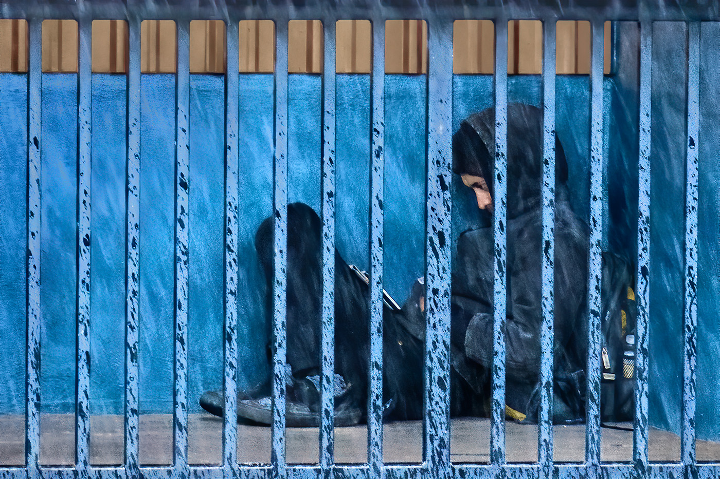
In many cases I much prefer B&W images, especially when color does not add to the story or idea of the image. I think that the color does add to this image. What drew me to my particular crop was purely graphical, the interplay of shapes. I think that the color contrast adds to the graphical nature of the image, some of the shapes get lost in the monochrome version. I thought the bright areas along the top rail and concrete curbing detracted from the graphical presentation, drawing my eye to the edges of the frame rather than to the intricacies of the bars and rain streaks.
Also, I am a sucker for complementary color combinations, in this image the blue-orange pair. Nonetheless, I am considering the intensity of the blueness, whether as you mentioned, it looks over processed. Your comments have also made me consider reducing the blueness of the fencing to get a little more separation from the back wall, or darkening the fencing so that the eye goes past it to the figure.
I think there are times when context adds to an image, and times when it can detract. Context can add a sense of place or develop depth and interest in an image when these are important to the concept or story. Too much context can diminish an image when it adds clutter, distractions from the subject, or too much meaningless or empty space. In this image, I think that removing context adds an element of mystery, leaving the viewer to wonder about or make up hers or his story. What you leave out of an image is as important as what you include.
Again thanks for your comments. They are useful to for me to re-evaluate my images and decisions on how to modify. Sorry to have rambled on so much, but it seemed there were a lot of ideas to explore. |
Dec 10th |
| 80 |
Dec 20 |
Comment |
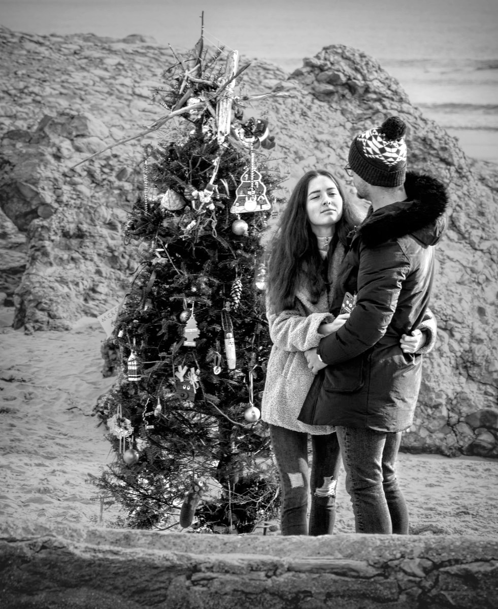
I like that you caught the couple hugging each other; they look proud and pleased with their decorated tree. For me, the lighting on the woman's face is very nice. It is an interesting location for a Christmas display; I wonder how long they last before the waves sweep them away. I like that they incorporated some drift wood into their decorations.
In my opinion, the foreground is not well separated from the background; the contrast in the background is too much like the contrast in the tree, causing them to visually blend into each other. Also, the bright areas in the background coupled with its contrast pull my eye past the couple and tree. My suggestion is that you decrease the contrast of the background, making the bright spots less bright, and the lightening up the dark areas. Then the image could be brightened a little without making the background brighter. |
Dec 10th |
 |
| 80 |
Dec 20 |
Comment |
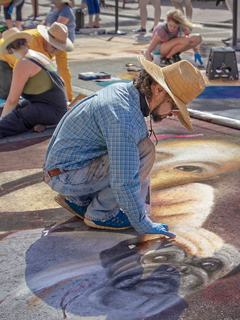
I like the way the artist is crouched to carefully refine his painting. His case takes us right to the art he is working on. For me, the colors in the image work nicely together.
I like that the original image includes background that shows the context in which the artist is painting, filling out the story of a gathering of street painters. I would prefer to see the background to be in focus; however I understand why you wanted to blur it some to try to keep our attention on the artist in front. Adding a blur to an image to simulate a shallower depth of field is very difficult to do in a way that looks natural. I think that another approach would work better for your image. I think that the difficulty you are trying to overcome is the high contrast created by the very bright sunlight; these images work better with softer light. I took an approach to try to soften the lighting in post processing.
I took the original image back into ACR (Lightroom) and reduced the highlights as much as possible, increased the shadows as much as possible, decreased the contrast some, and increased the blacks. (I peaked at the file meta data which indicated you had not made any adjustments to these parameters.) The downside of this maneuver is that it can increase the color saturation on a persons face, so in photoshop I compensated by desaturating the artist's face and some color hot-spots in the background. I then increased the clarity of the color in his painting with a brightness/contrast adjustment layer with the blend mode set to multiply and at about 50% opacity, selectively applied to the paining and some background). I lightened the artist's face and his shadow a little. I cropped out the persons foot and leg along the right edge of the frame by using the warp tool to bull that part of the image out of the frame while keeping all of the bull dog drawing in the frame. I darkened the top of the background just a little. These are just some ideas about the kinds of things that could be done with the image in post processing. I hope this helps. |
Dec 9th |
 |
| 80 |
Dec 20 |
Comment |
I like the way you got in close with the telephoto to narrow our view to this woman's intriguing face. This could be anywhere, but definitely has the few of being on the street, and from her style, in Europe. To me, her face is nicely lit, showing shape and form. The shadow depth of field works nicely to obscure distracting foreground and background. I also like the nice tonality of the image.
For me the second woman's face adds another point of interest. However, I think the image would have been cleaner without the other woman's face being a little further away from the subject, though I do like the shape of the space between them. The second woman and the other person's presence does indicate that this was taken in a crowded situation, possible on a busy street.
For my taste, I would have darkened the lower left corner a bit more as well as a little along the top to help keep the eye from being pulled out to the edge of the frame. I considered cropping out part of the third persons coat, but I like the balance of the image better the way you have it cropped. Perhaps a little crop from the bottom and right would retain the balance while removing some of the empty space of the coat. Tough decisions. |
Dec 6th |
| 80 |
Dec 20 |
Reply |
Thank you Carol. |
Dec 6th |
| 80 |
Dec 20 |
Comment |
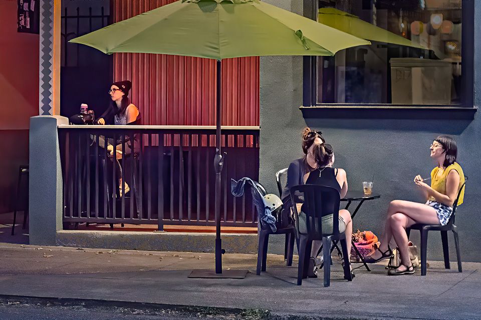
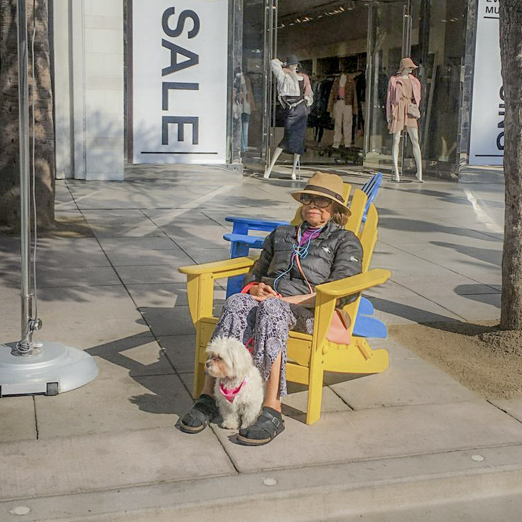
I like the sense of mystery in this image; why is this woman sitting out in from to a store on a cold day? That bright yellow chair brings my attention right to her. We can suppose that the chairs were there and that she was waiting for someone to pick her up, or perhaps she was just enjoying the sunshine. Her dog looks like it is expecting someone, or something else has caught its attention. Lots to contemplate.
I agree with the others that a little cropping would bring us in a little tighter to the story without loosing context. I think that Jim's crop is a little too tight for me. The pole on the left does not bother me, and is consistent with the chairs assuming that it supports an umbrella. I think that you could crop using the trees to frame you subject, cropping to the one on the left to take out the brea to the left of the tree but leave to pole and its base in the image, and crop on the right to the tree, cropping out the light area on its trunk so that you do not have a bright area along the edge of the frame. A little cropping from the bottom would help remove the empty space there that does not add to your story. I think that you could end up with a square crop.
To generate some processing ideas for you, I took the image back into ACR (like Lightroom) and filled in the shadows a bit so we could see the woman's eyes better, and peer a little more into the store. By darkening the highlights I could increase the exposure a little, but needed to recover some contrast by darkening the blacks. These changes in Lightroom tend to saturate the colors, so I desaturated and darken the yellows a bit to compensate. |
Dec 6th |
 |
| 80 |
Dec 20 |
Comment |
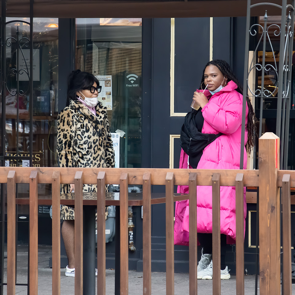
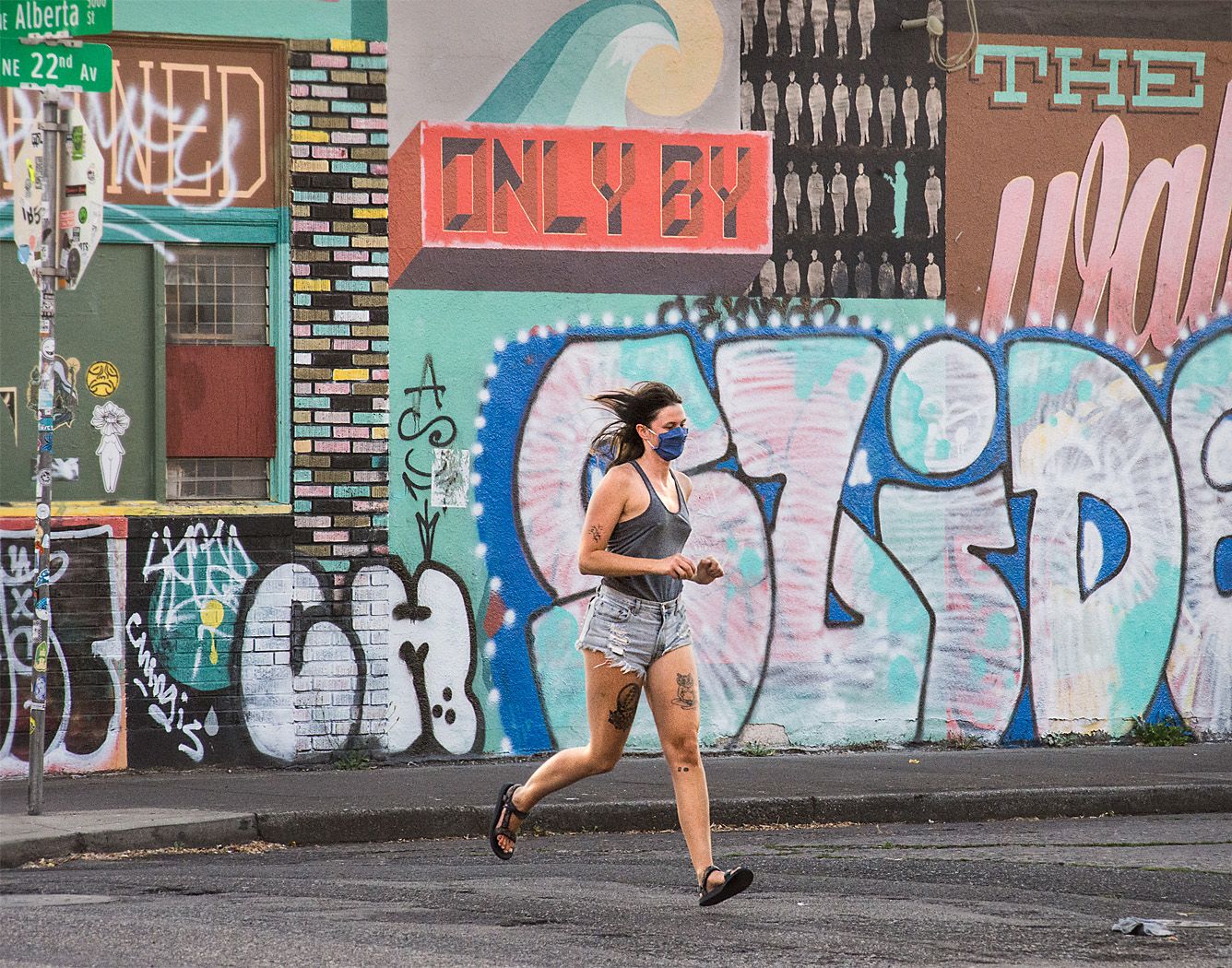
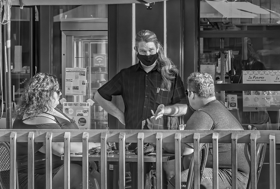
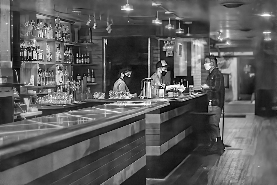
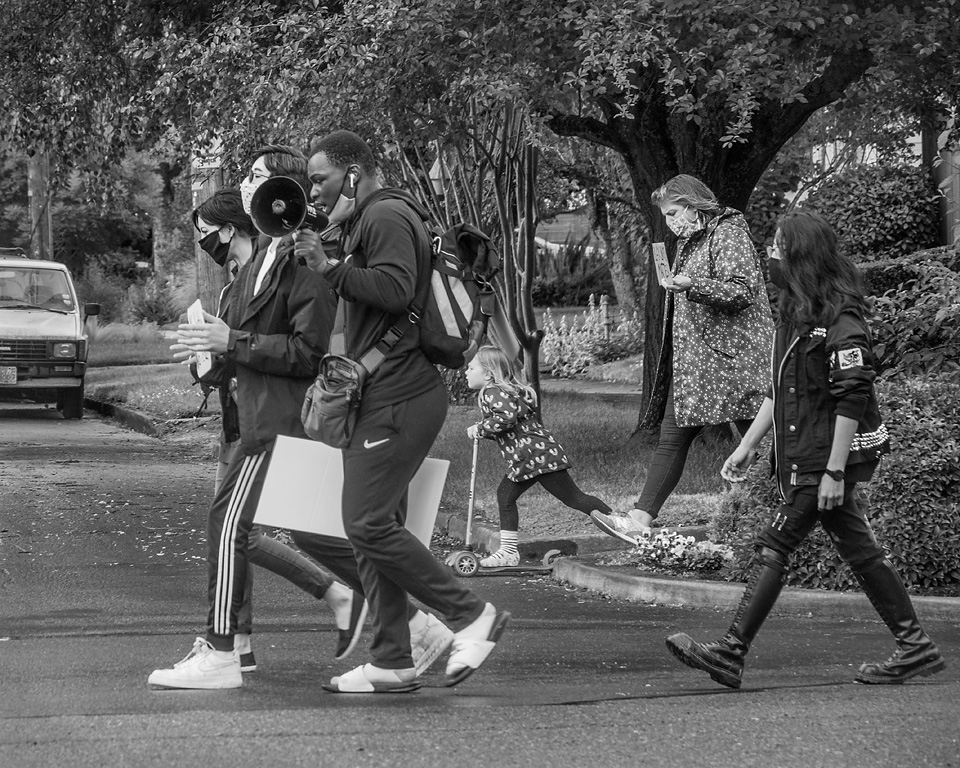
I like to see that these times are being documented. Many can use some emotional comfort with all the stresses of the pandemic. I can't tell if the gal is just weary of the wait, weary of all the restrictions, or has lost a loved one, but the her emotional state comes through. I can only assume that this is a family group based on how close they stand to each other.
I think that the conversion to B&W works well for this image. There were many ways you could have gone with the conversion, I think you chose a good one�; letting the window frames behind the women's faces to blend into the background.
I would have cropped out the white door frame on the far left to avoid the bright area at the edge of the frame. I somewhat agree with Carol that the the white hoodie of the fellow on the right to be a bit powerful, but I would not crop him out. I see that you toned the hoodie down some, which was helpful, but toning it down a little more might make the hoodie a little less natural looking. I think that there are enough bright areas in the image to keep it balanced.
Overall, a good solid image. |
Dec 5th |
| 80 |
Dec 20 |
Comment |
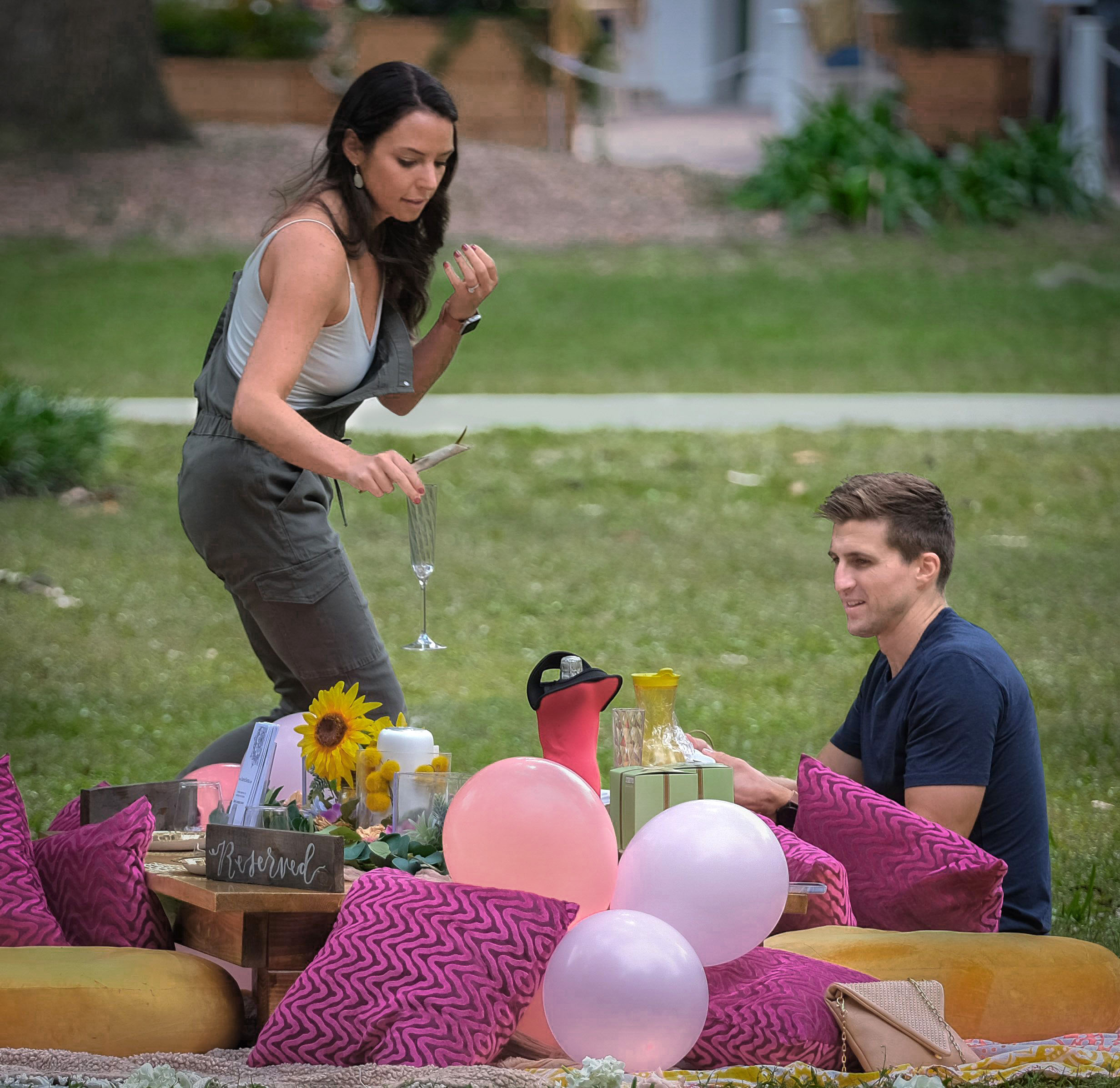
That cerdinally looks like this could be a special occasion with all the bright pillows, balloons, flowers and champagne. But, as you note to Carol about this not being a romantic occasion, the brochures on the table and the reserved signs for additional guests indicate that this ocassion is perhaps some sort of promotional event.
I really like the gesture of woman setting out the champagne glass, and the smile on the man's face. Great timing in the capture. I like that you cropped the image tightly to the scene. I like the circular eye movement in the image, from the woman's face to the man, from the man to the splendid table, and from the table back up by the champagne glass and woman's face. In my opinion, the image is nicely composed.
I do agree with Ed that the background is a bit bright, pulling my eye past the couple into the background. In playing around with the image to see what could be done with it, I selectively darken the yellows and greens in the background to let that area recede, and selectively brightened the reds to lighten their faces and pull them more into the foreground. I also toned down the path a bit and added a little color to it so it would not go grey. I suggest that if you explore making these changes that you do so before sharpening otherwise some sharpening artifacts become very apparent. |
Dec 5th |
 |
| 80 |
Dec 20 |
Reply |
Thank you Ed. I see what you mean about the small deviations in the lines close to the edge stand out, something a critical judge would pick up on. The lens I use has a slight barrel distortion; the lens correction was supposed to take care of that but didn't quite do the job. I could make some small corrections using the warp function to make it as streight as I could. Yes, the street is angled. Also the thickness of the concrete stoop changes and the fence rail bottom is not parallel with floor, so other crops appear to make the problem worse. Thanks for pointing it out, it was worth looking into further. |
Dec 4th |
| 80 |
Dec 20 |
Reply |
Thank you J. Lanning. You give me confidence to move ahead. |
Dec 4th |
6 comments - 7 replies for Group 80
|
7 comments - 7 replies Total
|


