|
| Group |
Round |
C/R |
Comment |
Date |
Image |
| 80 |
Nov 20 |
Reply |
Hopefully you may have the chance to get back to Portland for a visit. If you do, I would love to meet you and get out to make some images.
By the way, the above image was taken in Sellwood, probably not far from your Daughter's house if she lived close in. |
Nov 18th |
| 80 |
Nov 20 |
Reply |
Thank you Bill.
Opps, see the rest of my reply below. |
Nov 18th |
| 80 |
Nov 20 |
Comment |
Thank you Bill.
I am thinking of reducing the contrast between the branch and background as a way to make it less obvious.
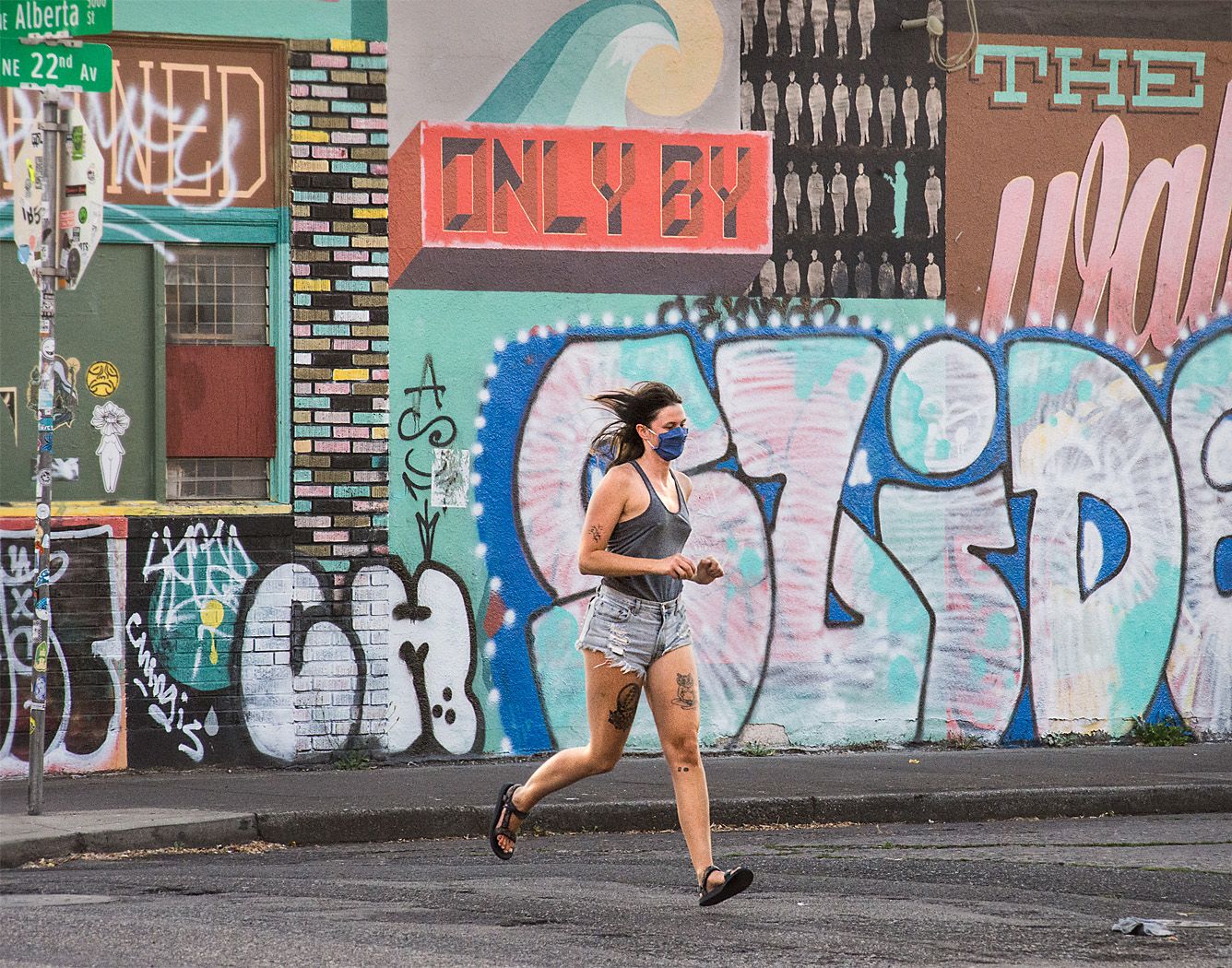
Portland is a vibrant and active city with lots of interesting people, so there are lots of opportunities for shooting on the street. Most of the images I have posted here I took within walking distance from my home; I have not ventured far since the beginning of the covid pandemic. Fortunately, the neighborhood where I live has a lot to offer, though diminished somewhat from pre-covid days. I miss the street festivals and other street gatherings throughout the city that provided so many more phot opportunities. |
Nov 18th |
| 80 |
Nov 20 |
Reply |
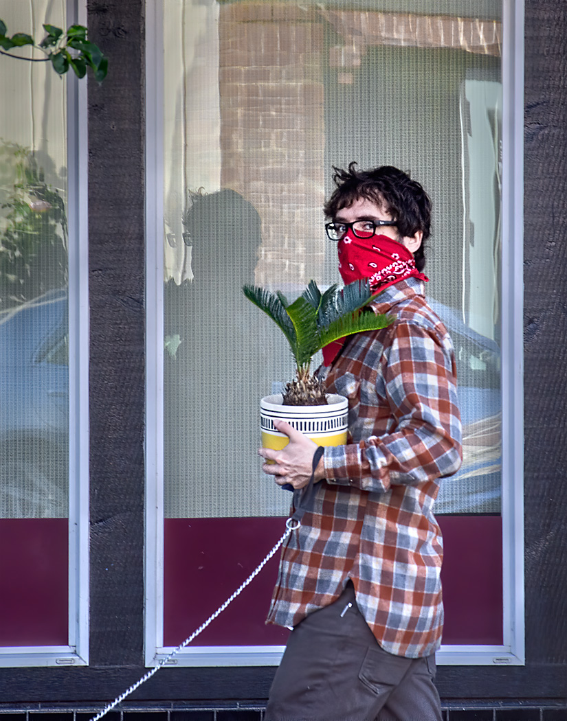
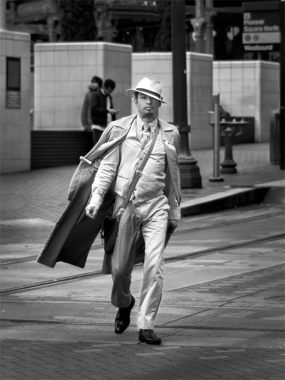
Thank you J. Lanning. I do sometimes find an interesting composition and wait for someone to walk into it, but this time was the opposite. I saw the interesting character walking down the opposite side of the street, and started looking for a way to get a clear shot of him. There were parked cars along the street, and I found an opening between them and waited and hoped no cars in the busy traffic would block the view. Fortunately, the traffic passed just as he reached the critical moment. I was very fortunate that the background fit the subject so well. There is a lot of luck involved in street photography.
I am thinking of reducing the contrast between the branch and background as a way to make it less obvious. |
Nov 18th |
| 80 |
Nov 20 |
Comment |
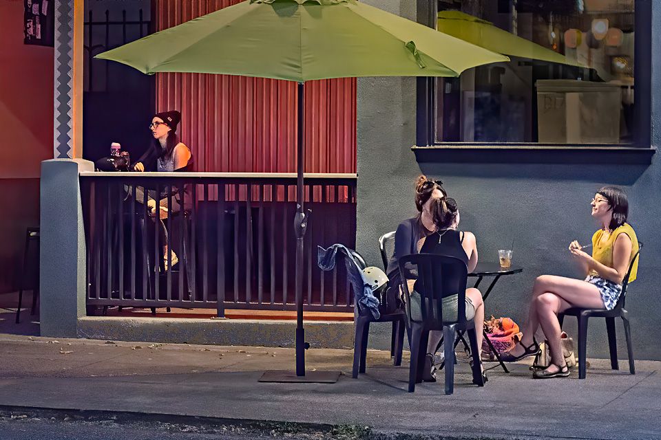
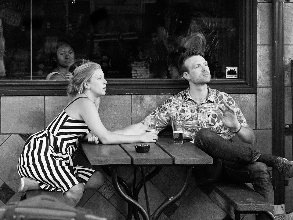
To me, the essence of this image is the couple watching swans. Each of the couple is wearing same type mask, light blue shirts, and darker sweatshirts removed and draped in a similar fashion around their necks. I like their gestures of interest and observation; watching what the swans may do.
I agree with the others that there is a lot of empty space that does not contribute to the overall image. For me, the question is how to get down to the essence of the image, eliminating what is not needed. I don't think that the larger setting tells you where this is. And therefore is not important to the image; a lot less of it would still show me that it was outdoors somewhere.
I'm thinking a crop that eliminates one of the swans, keeping one so we know what the couple is looking at. I don't perceive much interplay between the swans and the couple, so it does not hurt to loose one although I wish it was the other one; it is the more interesting of the two for me. I would put as much space as possible on the right so that it does not feel too tight. Another more radical alternative would be to crops out the swans entirely; making the image more mysterious; what is it the couple is looking at? The bright spot to the left of the tree can go. I wish there was a little more space above the couple's head. These are just ideas, hope they help. |
Nov 18th |
 |
| 80 |
Nov 20 |
Reply |
Good luck with your show. What are you putting in it? |
Nov 15th |
| 80 |
Nov 20 |
Reply |
Thnk you Karen. I too think that the expression on the person's face makes the image. |
Nov 15th |
| 80 |
Nov 20 |
Reply |
Thank you Ed. Odd how I did not notice the branch at the top. I suppose I was concentration on other aspects of the image. Cloning it out is not so difficult but cloning is something I avoid with my street photography. Croping it out does change the composition. Oy vey. |
Nov 15th |
| 80 |
Nov 20 |
Reply |
Thank you Beverly. |
Nov 11th |
| 80 |
Nov 20 |
Reply |
Thank you Angela. |
Nov 11th |
| 80 |
Nov 20 |
Comment |
All dressed up for a little travel; turistas. Cute puppies with interesting gesture relating to each other, like they are having a conversation. Good timing on the capture.
I like the soft pastel colors in the image. I think you have cropped well, making your subjects front and center, removing all unnecessary information from the image.
You have carefully cropped to include the words Viaje Cachito in your image, I wonder why you din't include the translation to English in your title. For me that would make the image a little more coherent. Otherwise I would suggest cropping a little off the left to improve the balance; the visual weight looks to me to be a bit heaver on the left.
The lighting on the puppies looks a little flat to me, perhaps a tad of contrast in the darker tones would help. I think that the image could do without the red stroke, I don't think it is needed and for me is a little distracting.
A fun image to view; well done. |
Nov 11th |
| 80 |
Nov 20 |
Reply |
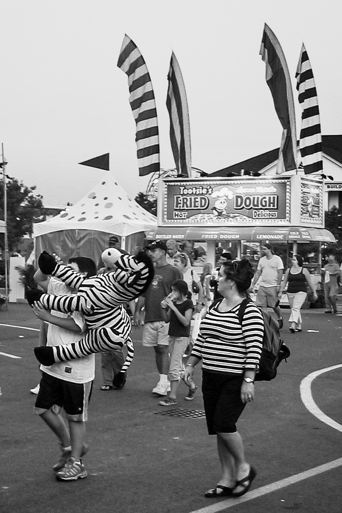
Compositional rules are to be broken - when done with purpose. It looks to me that the boy carrying the zebra and the woman in the striped shirt are leaving the fair, and thus should be walking out of the picture rather than into it to be more consistent with the story of taking home the prize. Besides, the zebra is facing upward, not outward, it is not going to be bumping its head into the edge of the frame, and for me is not too crowded. The boy caring the zebra is sufficiently hidden by the zebra. The man walking out of the frame is not the subject of nor necessary to your story, is up against the edge, and could be removed in my opinion. The choice is yours, you need to decide if the intent of compositional guides apply in this situation or not. |
Nov 11th |
| 80 |
Nov 20 |
Comment |
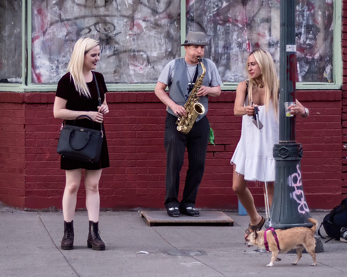
Capturing synchronicity is one of the hallmarks of street photography and you have certainly done it well with the stripes, including the woman's striped shirt, the zebra, and the stripes in the flags. The polkadots on the tent contrast nicely to the stripes, all comping together to make a playful image. I also like that the gaze of the woman in the striped shirt and the zebra are in the same direction; what has caught their attention?
The man walking out of the picture is unfortunate, but could be cropped out. Since the zebra is the emphasized element here, I don't think that it is too close to the edge of the frame, and the fact that its feet are out could be construed to indicate that it is resisting exiting the frame. I think such a crop works. I think I would like to see the contrast on the flags increased a little bit to make them stand out more and come closer to the contrast on the woman's shirt and zebra to better unify the image. The brightness of the lower half of the image could be increased to make that area crisper. I like to see faces be well lit so I can peer into them, so I think a little selective brightening there could help.
I like the capture very much. Well done.
|
Nov 10th |
 |
| 80 |
Nov 20 |
Comment |
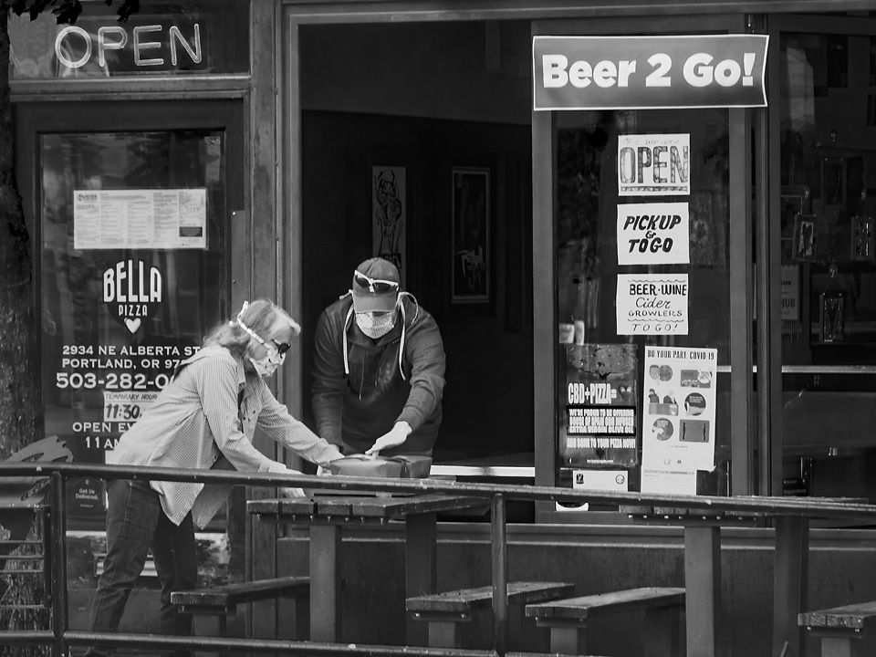
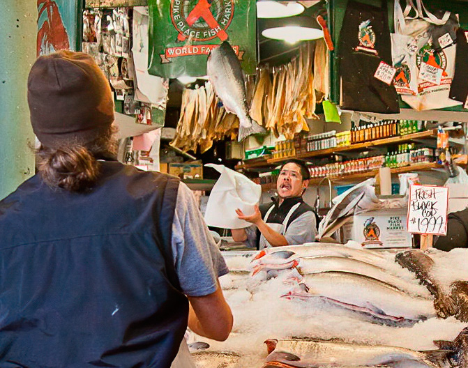
Pike Place Market is a wonderful place for street photographers, so many interesting characters and action going on there. Some of my favorites images are from there.
For me, the essence of this image is the salmon being thrown and the interaction between the fish mongers. I am pulled in by the expression on the fishmongers face. Perfect timing on the capture.
The engaging story is here, the challenge is to make it clear and simplify the image to the main idea. For me, the flying fish and the fishmongers wonderful expression and gesture are the main ideas, the rest of the image is context. I would consider a major crop removing much of the clutter on the right. I think there are some implied leading lines that you could take advantage of such as the dark fish (black cod) in the center of the image (more to the right after a crop) the row of fish heads and rows of condiments that lead to the fishmonger's face. The fishmonger tossing the fish remains a dominate idea because of how much space he takes up in the image.
In my opinion, the fish in front are a bit bright, pulling my eye away from the fishmonger; decreasing the brightness and increasing the contrast of the fish would help (be careful here, increasing contrast and darkening in photoshop can cause color shifts, be sure to set you blend mode for the adjustment layer to "Luminosity."). It would be nice if the bright lights could be darkened some, but that is difficult to do without them turning grey, which just looks wrong. I could do a little of that using the selective color adjustment layer, working on the whites to darken and add a little orange to make it look more natural. For me, an improvement that could make the flying salmon stand out better would be to darken the green in the banner behind the fish. Lastly, a little edge control, darkening the outside edge of the green column on the left side of the image would keep my eye from drifting out of the image there. There are a few artifacts along the left of the image that you could clean up or crop out.
|
Nov 10th |
 |
| 80 |
Nov 20 |
Comment |
I find this image to be an interesting combination of a posed and unposed moment. The puckered lips are obviously posed for a photo of the couple, the picture taker being unposed in the gesture of composing the image.
I think your selection of a shallow depth of field nicely simplified the background, letting your subjects stand out. I appreciate that the couple' faces are sharply in focus; that the photographer's is a little less so does not bother me. I think this image works well in monochrome. I like the side lighting, that for the woman's back-lit whereas the man is front lit.
For me, the crop on the top is a little tight, it would be nice if you had a little more image there. For me, the bright area at the woman's elbow is an eye pull, I would darken that area a bit. |
Nov 10th |
| 80 |
Nov 20 |
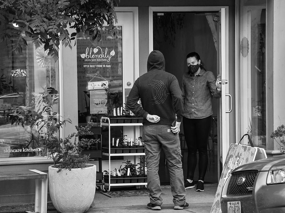
Comment |
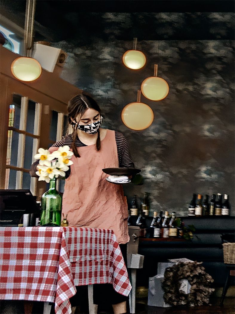
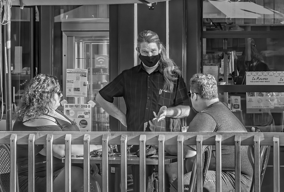
So many stores and restaurants struggling to keep open. A lot of restaurants in my area have moved to the streets, setting up outdoor eating areas where parking used to be, in some cases closing off whole streets to become open air dining areas. I don't know what they will do when the rains come, though some are starting to set up dining tents.
Sorry that you show at the gallery was canceled or delayed.
I like the implied motion in the gesture of the man holding out the takeout box to be filled. For me, the strong eye contact among the participants directs my vision through the image. The people in the background seem to be enjoying their meals. I appreciate that the people stand out clearly and are in sharp focus. For me, the image has a sense of place. I think the crop is right on. I think the B&W presentation makes the image much stronger, I perceive that you selectively adjusted the brightness of each color. This is a very well done image.
I have a few picky suggestion for improvement: a very light, almost non-noticeable vignetting of the lower left hand corner, darkening the bright brick in the upper left hand corner, and a very slight crop on the left to eliminate the bright edge on the far left.
|
Nov 10th |
7 comments - 9 replies for Group 80
|
7 comments - 9 replies Total
|