|
| Group |
Round |
C/R |
Comment |
Date |
Image |
| 80 |
Oct 20 |
Comment |
Thank you every one for your comments and ideas. I like Ed's crop, so will go with something close to that.
|
Oct 25th |
| 80 |
Oct 20 |
Comment |
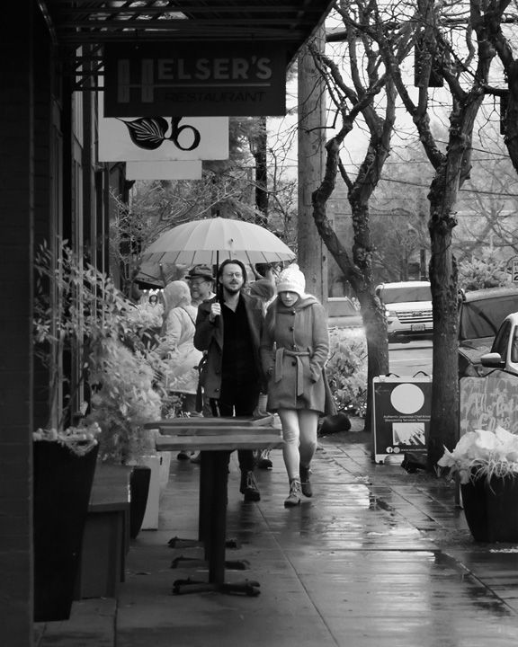
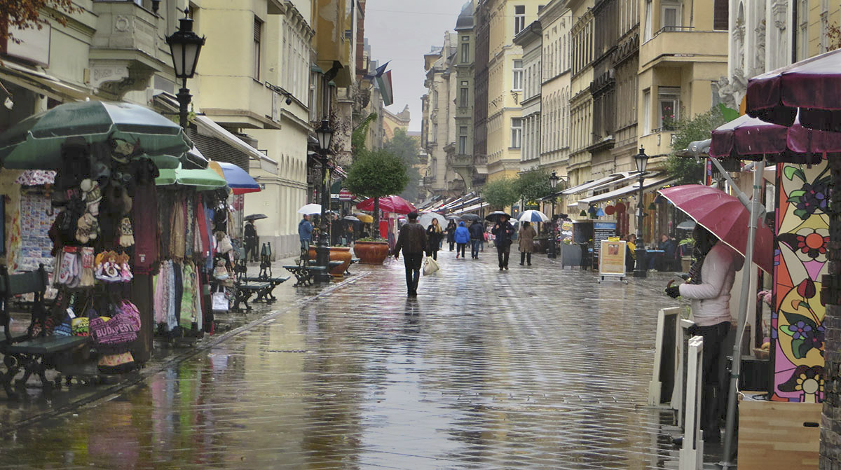
This image makes me want to explore old downtown Budapest, to wander the streets and find the surprises and delights that could be there. It pleases me that so many European central district streets have become pedestrian walkways. This images displays that well. Even on a rainy day, people ore out shopping.
I like the mood the soft lighting establishes, it enhances the feeling of a rainy day. I also like the way the lines in pavement lead me down the street, the way they give the image more depth. I enjoy the reflections in the wet pavement.
For me, the area that could be the most interesting in this image is the darkest part of the image whereas the areas of least interest are the lightest. I would like the interesting areas to be lighter while the light areas are darkened. After trying this on the image, I thought the bright colors on the right were a little strong, so I mildly desaturated them. I also increased the contrast in the center of the image to draw my eye there. I do like the color version because of the red umbrella down the street draws my eye there. |
Oct 11th |
 |
| 80 |
Oct 20 |
Comment |
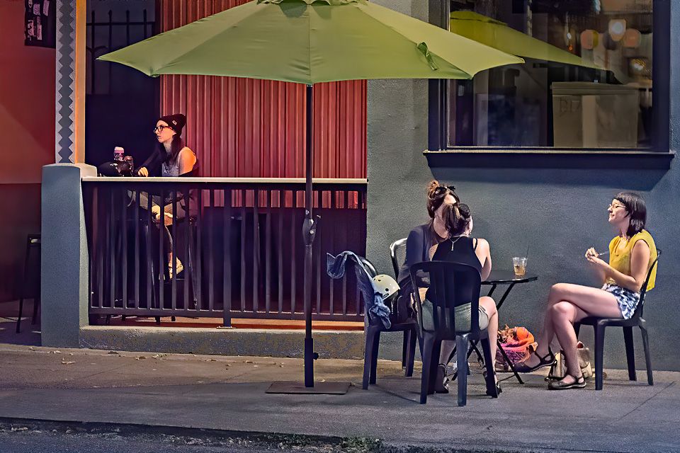
For me, this image conveys the difference in interest of the men and women depicted. The men are interested in the sports on the TV while the woman is interested in the content on her phone. The two men have crossed their arms, a gesture that indicates some resistance to what they are watching. Are they engrossed in the TV show but unhappy with what they are viewing? The woman appears to be a companion who has interests other than what is on TV.
The overall reddishness of the bricks distracts me from the people, I think that this image would work better in monochrome. To make the B&W conversion to work, I think it would help to overcome the dominance of the sign on the window by brightening the TV screen to draw more attention there. (Brighten greens and cyan during the conversion to B&W and or just brighten the image in the TV.) |
Oct 11th |
| 80 |
Oct 20 |
Comment |
This boy appears to me to be really enjoying his merry-go-round ride. I like the joyous expression on his face. The highlights in his eyes makes his smile sparkle. Overall a wonderful capture.
For me, I would like to see the boy's face a bit brighter and the background a little darker to bring the boy more forward in the image, as suggested by J. Lanning. To do this in Lightroom, I reduced the bright areas in the background by moving highlights and whites all the way to the left (Darken) and increased the overall image exposure to brighten the boy. (Or just add some light to the boy's face as J. Lanning suggested.) The lighting on the boy's face looked a little flat after that, so compensated by increasing the contrast there using the local adjustment brush.
I my perception, the white balance looks a little off, I thought the boy's skin color looks a little more natural to me when I adjusted the white balance using his teeth as a neutral reference. ( I checked the calibration on my monitor when evaluating this image.) This made the background a bit blue, so I desaturated the, Aquas and Greens a bit. Adjusting the white balance in images with mixed light source types can be a bit tricky. |
Oct 11th |
 |
| 80 |
Oct 20 |
Reply |
I think the changes you made make this a stronger image. The changes brought more attention to the couple to help convey what you wanted to show. I like that you filled in the background a little more. |
Oct 7th |
| 80 |
Oct 20 |
Reply |
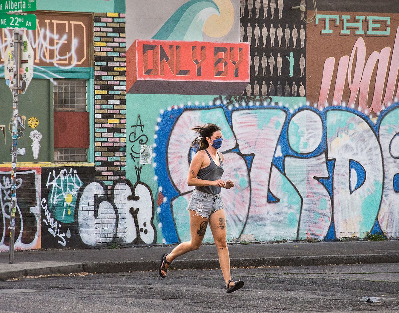
Thank you Ed. Your crop is worthy of consideration. Perhaps I was too attached to the original wording on the wall before it got cluttered by the graffiti, but only partially revealed in my image: "You are only confined by the walls you build for yourself." Your crop brings the image back to its main elements, the runner and the graffiti in the background. My wife prefers your crop because it removes the the distraction of the bright red rectangle above the runner's head, but then notes that it removes some of the other interesting stuff on the wall.
|
Oct 5th |
| 80 |
Oct 20 |
Reply |
Thank you Carol:
I really appreciate you comment about comping up with a better title. I have a hard time titling my images, but do understand the importance of having a good one. I am open to any suggestions. |
Oct 5th |
| 80 |
Oct 20 |
Reply |
Thank you for your comments. The stickered street and stop signs removed by Beverlys crop are part of the character of the area, and would be a large part of the story if I had cropped from the right. For local consumption, the street sign shows the exact location, but does not have much meaning for a wider audience. |
Oct 5th |
| 80 |
Oct 20 |
Reply |
Thank you Beverly. Your crop removes some of the clutter of the street sign but retains the original feel of the image. |
Oct 5th |
| 80 |
Oct 20 |
Comment |
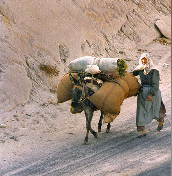
I think this is a wonderful image, showing the hard life and age old in rural Turkey. I like that the woman is looking at us and that her face is nicely lit. She and the donkey are walking into the frame along at diagonal, which for me gives the image energy and movement. I like the thin subtle stroke around the image.
I think that the image would be made stronger by cropping a bit off the top and bottom of the image, for me those areas are not adding much to the story. It would also move the woman face out of center and would strengthen the diagonal formed where the edge of the hillside meets the road. I would also darken the upper left corner a little to balance the bright areas in the image and keep the viewer from drifting out of the frame there.
One last touch, I would brighten the donkey and woman's body a little.
Overall, a very nice capture. |
Oct 5th |
 |
| 80 |
Oct 20 |
Comment |
I think that the strength of this image is that the women's faces line up to form strong implied diagonal lines down toward their phones, giving energy to the story. I like the intense expressions the women's profiles. I think that the back lighting works well in this image.
For me, the image itself does not provide the context given in your explanation; this could have been anywhere.
The far woman's glasses come right out of the middle woman's mouth, they could be toned down a bit to be less of a distraction.
I see that the image was taken at a very high ISO (12800), and guess that you used
Topaz DeNoise AI to deal with the noise. If not, disregard the following comments.) ( The high compression makes the image a little difficult to analyze the technical aspects of the image.). It is my experience with DeNoise AI that it will overly smooth out some portions of an image while dealing with high noise levels. For example, the middle woman's face is very smooth, there is no pour structure there, as there is a lack of detail in parts if the near woman's hands. In my experience, as much as DeNoise AI does a wonderful job on many images, it falls down on some. I have dealt with this problem in some of my work by blending images using different noise reduction applications, using the portions that work best from each. For example, I would blend in a part of an image processed with Topaz DeNoise 6 into the area of the woman's faces and hands that lack detail to provide some texture there. (I see that you use Lightroom to process your images, you may need to jump to Photoshop to blend layers.) |
Oct 5th |
| 80 |
Oct 20 |
Comment |
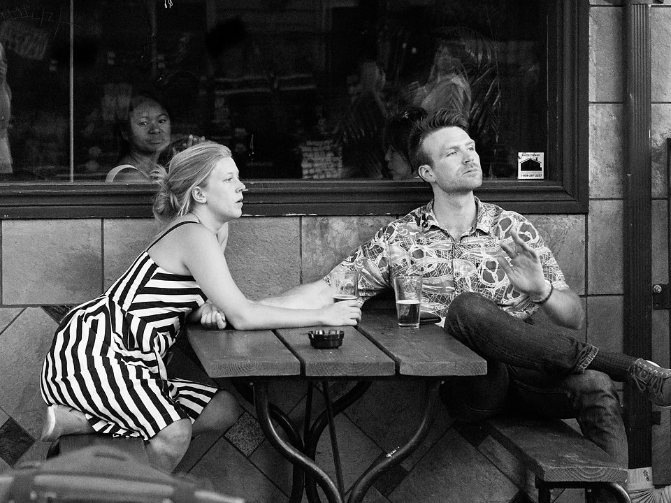
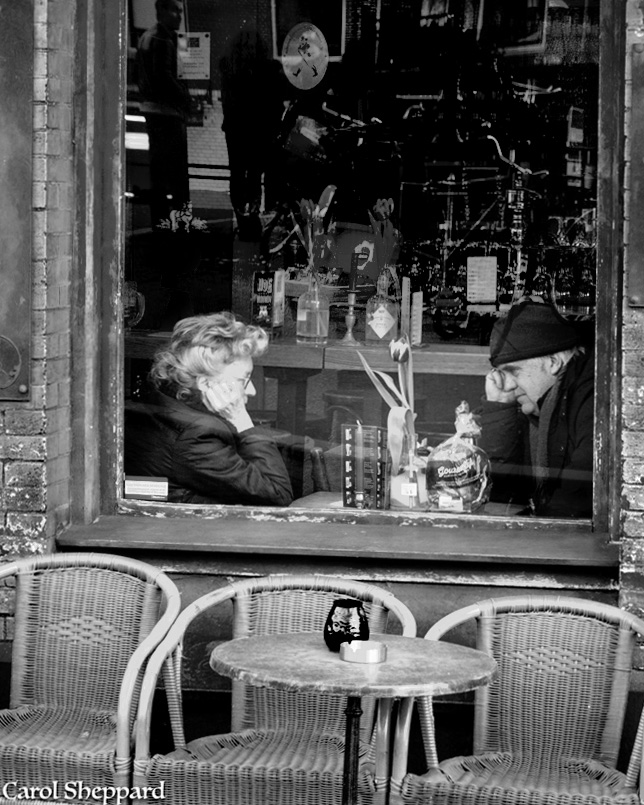
I like the strong relationship shown in the two figures, the sameness of their gestures, the way they are looking intently at each other. The heavy coats and three tulips tell me that it is early spring, too early to be sitting outside.
I prefer the B&W version; it takes care of one problem of the image for me; the red of the window frame pulls my eye away from the main subject. (I do like the blue table against the orange of the wicker chairs, I miss that nice set of colors.) That said, when converting to B&W, I suggest that you darken the reds so that the bricks are darker and don't pull at my eye and develops some nice lighting on the couple that really pulls me into them. Darkening the bricks is not really a vignette that fades into the image, but a natural looking darker shade of bricks.
For me, the signs at side of the image do not add context, are a bit of a distraction, and could be cropped out. This would also allow you to crop out the bright lights at the top of the image. I also suggest that the contrast be reduced in the room behind the couple mostly so that it does not look like such a dark hole there.
With these changes, I think you have a wonderful image with some nice tonality. |
Oct 5th |
 |
7 comments - 5 replies for Group 80
|
7 comments - 5 replies Total
|