|
| Group |
Round |
C/R |
Comment |
Date |
Image |
| 80 |
Sep 20 |
Reply |
Hi Bill:
I have noticed that phone cameras often apply unsharp-masking sharpening to the images, resulting in halos. Zoomed in cell phone images are just a heavy crop of what the sensor sees. Phones manufacture pixels to fill in to make the image pixil dimensions equal to what the sensor is capable of. The sharpening halos can thereby become quite wide. I don't use the zoom function on my phone much, I prefer to crop in post processing where I have control over how the extra pixels are filled. When I have time, I will shoot in RAW mode on the phone. RAW mode does not allow zooming at all.
I remove halos using the clone stamp in photoshop. So thatI do not have to be extremely careful when painting over the areas I want to fix, I set the brush mode to darken when removing light halos, or to lighten when removing dark halos. I clone from the area right next to the halo I am fixing. When using the brush set to darken to remove light halos, I do not need to worry about impacting the dark area that caused the halo because the near by material will always lighter than the dark area and therefore will not show when painting over the dark area. I can work very fast and sloppily this way with good result. I usually only fix areas where the halos are quite apparent. |
Sep 23rd |
| 80 |
Sep 20 |
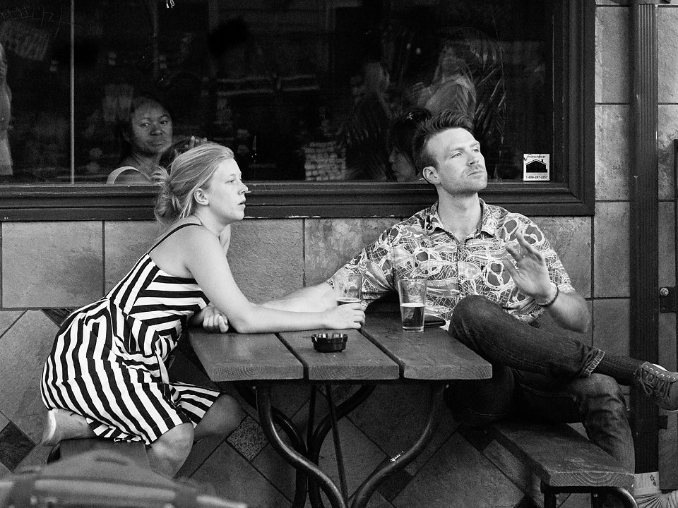
Comment |
I can almost hear that fiddle playing.
I think you caught the fiddler at a great moment, nice gesture, showing his involvement in his music. I like the broad sidelight and the backfill on the drummer. I think you felt well with the clutter of microphone stands, choosing just the right perspective to get both the fiddler's and drummer's faces clear of obstruction, something that is often difficult to do on a crowded stage. I like the color contrasts in the image, the blue of the fiddler's shirt against the oranges of the fiddles. The cropping works nicely for me, I am glad you kept the clutter around his feet in the frame, it adds to the atmosphere of a stage performance.
I don't mind the lettering behind the fiddler, to me it is just part of the scene.
Perhaps just a nitpick on the cropping, I think I would have left a little more on the right in the image, that microphone is mighty close to the edge, and if the image were framed would cause a tangency.
Overall very well done. |
Sep 10th |
| 80 |
Sep 20 |
Comment |
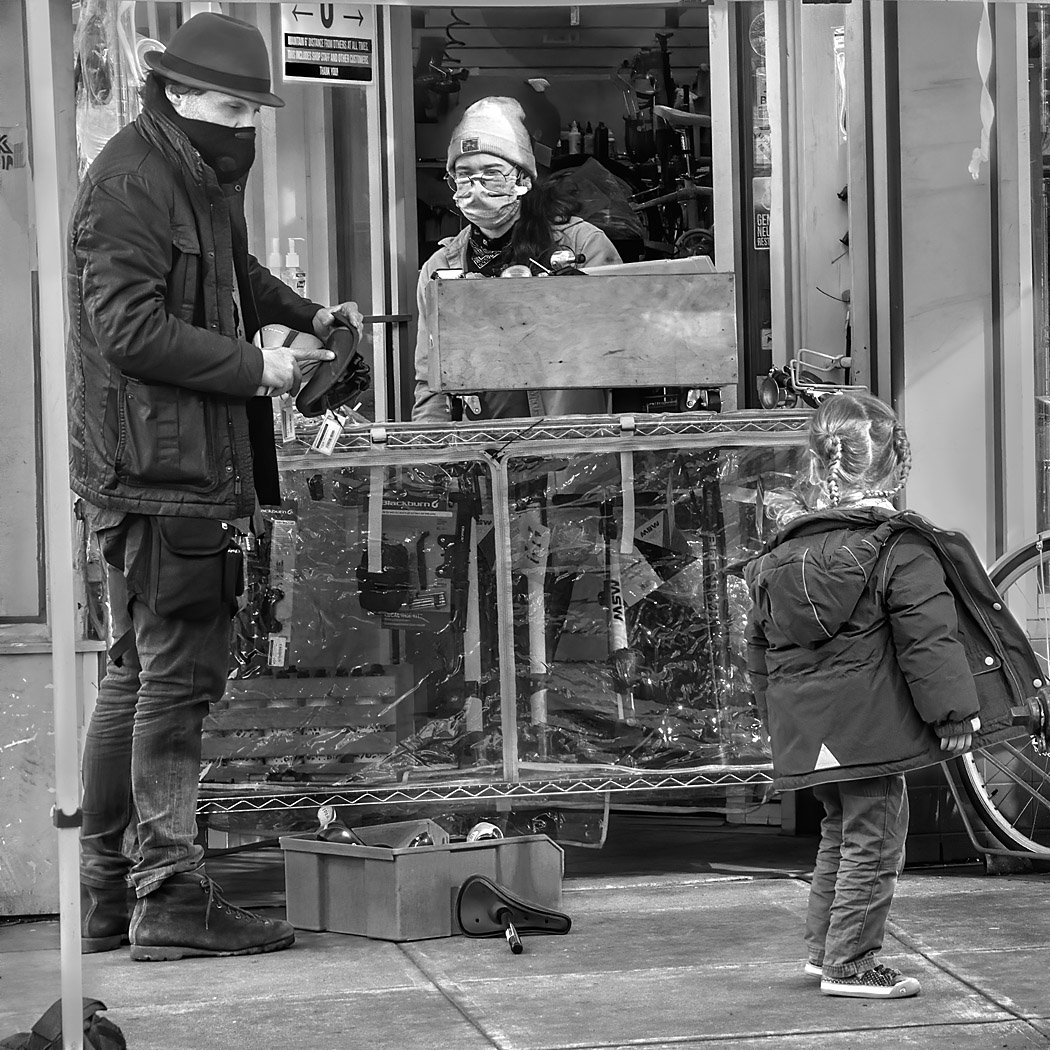
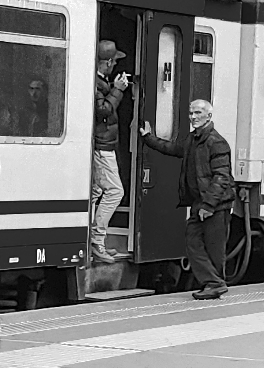
I think the relaxed postures of the two gentlemen shows us a bit about their character, the the man on the right does not appear too happy about being photographed. It is nice that he is looking straight at the camera. I also like that the person sitting inside the train is looking out the window straight at the camera, giving the image a bit of mystery.
I think that the image is well composed, getting all three figures in. The image works well in black and white.
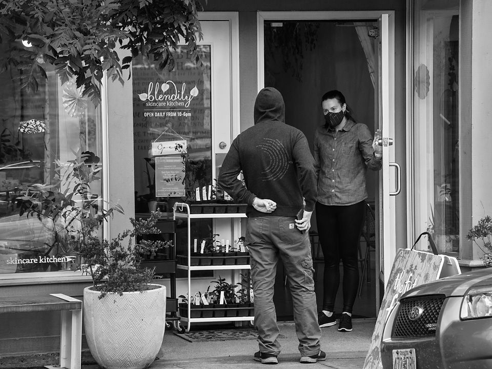
For me, the sharpening halos detract from the image. It appears to me that they could have been introduced in an early version, then became quite wide when the image was enlarged and cropped. If not introduced earlier, then you have an opportunity to go back and reduce the sharpening width and intensity.
I tried removing some of the halos from this image to see how it would look. |
Sep 8th |
 |
| 80 |
Sep 20 |
Comment |
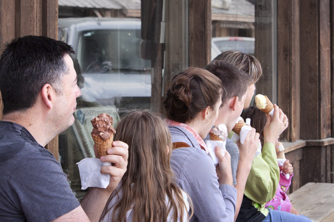
What captivates me in this image is that everyone is looking away from the camera, making me wonder what is going on out of the frame that has overpowered the enjoyment of ice-cream. For me a little bit of mystery adds a lot to the image.
I agree with Ed that toning down the brightness of the trucks helps, the bright background pulls my eye past the main subject, the family. I find that the reddishness of the wood also pulls my eye away from the family, I think that you could desaturate the background some, but leave the family fully saturated or increase their saturation some rather than go to completely black and white. Then decreasing the brightness along the family's arms would help bring my eye to their faces and the icecream. |
Sep 8th |
 |
| 80 |
Sep 20 |
Reply |
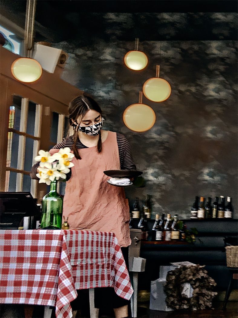
I like Bev's crop too. I wrestled with going with color of B&W, but was concernd that the red shirt was too powerful and detracted from the expression on the waiter's face. I do see what you mean by the color version appears to have more depth. Saturationg the background too does seem to draw me in a little more; I will have to remember this technique for adding depth. Perhaps desaturating the red shirt would help with my concern about it being an eye magnet. Thanks for your comments. |
Sep 6th |
| 80 |
Sep 20 |
Reply |
I think you are right Ed. I could brighten up the image some without blowing out too many of the details. That would give it more room to develop contrast. Thanks for the suggestion. |
Sep 6th |
| 80 |
Sep 20 |
Reply |
Thank you Beverly. I like your suggestion that I include more of the context in the image. I think it helps tell the story. I do have a tendency to crop in on the people in an image that I need to be more cautious about. I have had a suggestion (not from this group) to crop in on just the waiter, but I like your direction better. |
Sep 6th |
| 80 |
Sep 20 |
Reply |
Often it is those small suttle details that can make an image shine or detract from it. Please keep bringing them forward. |
Sep 6th |
| 80 |
Sep 20 |
Comment |
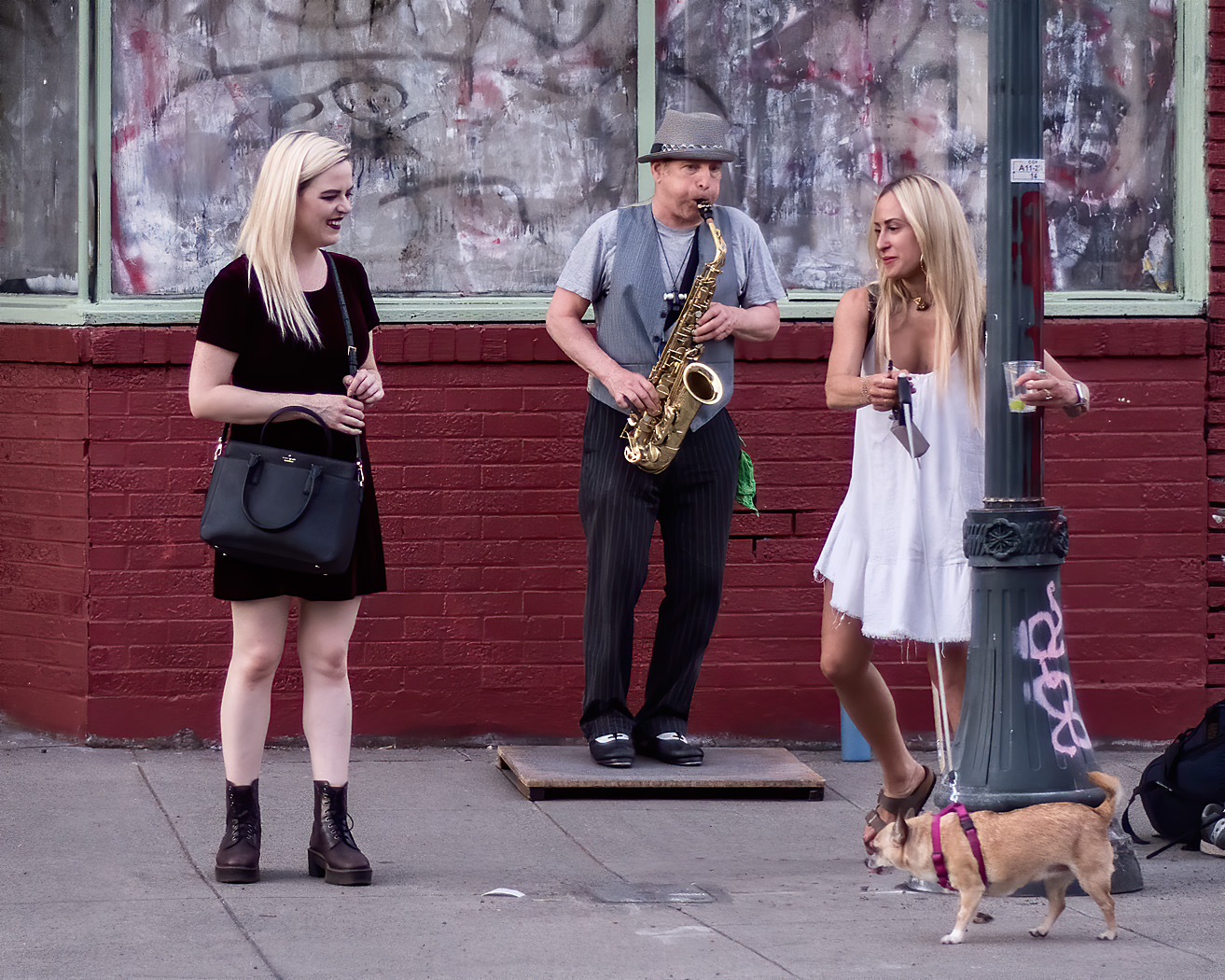
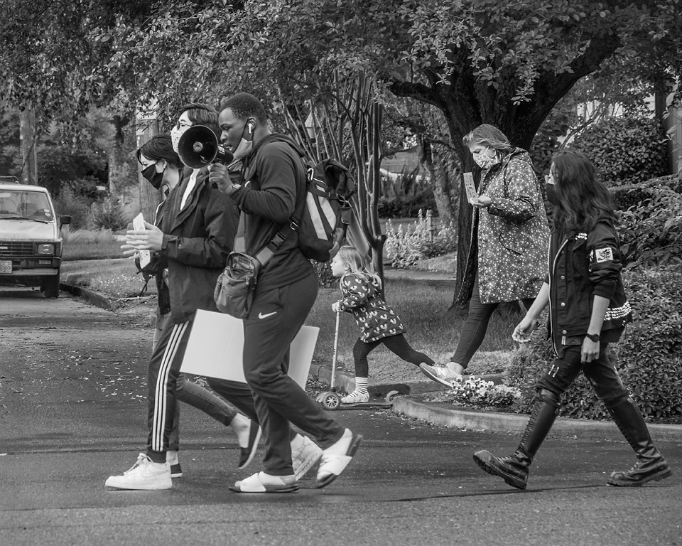
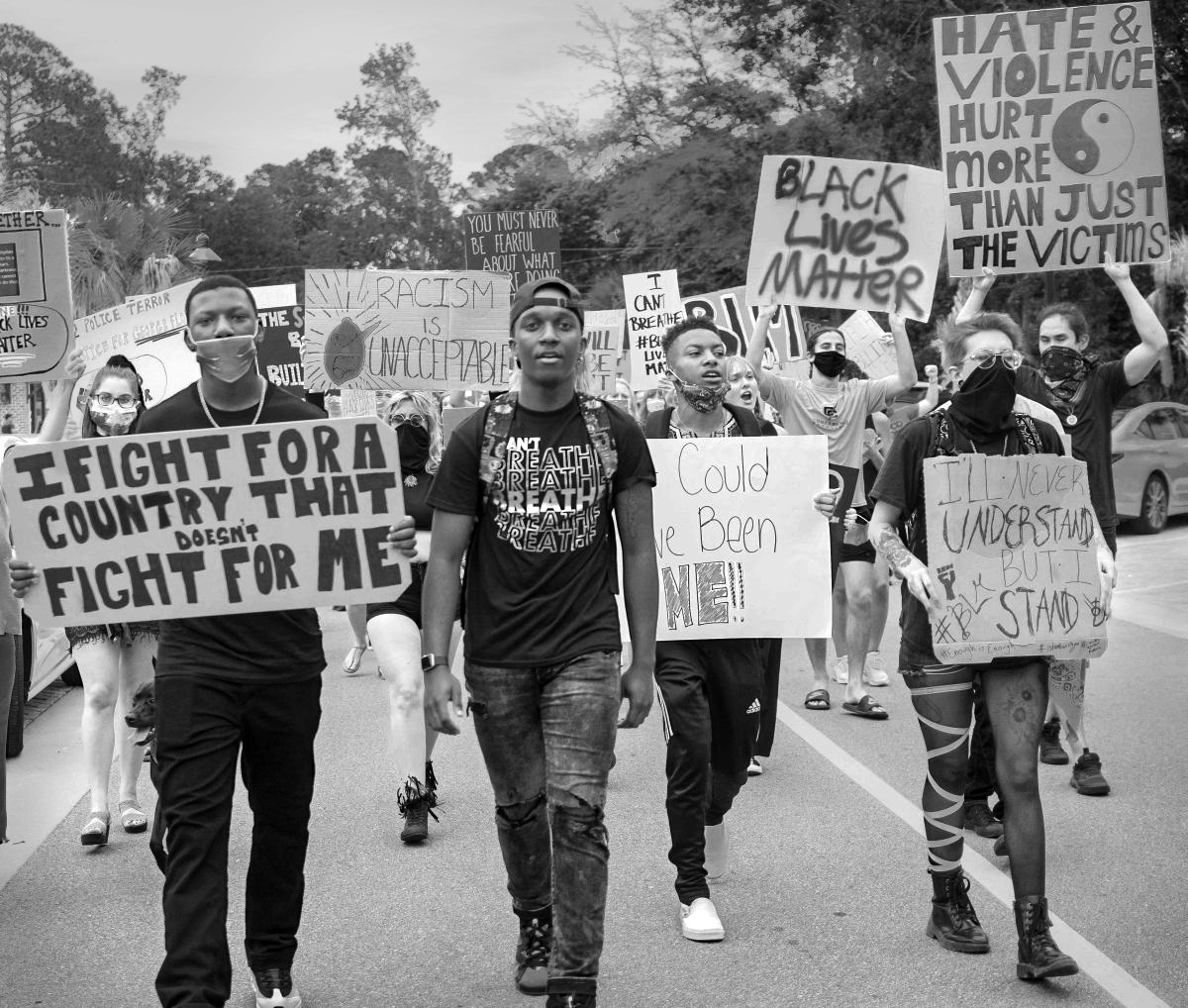
You are capturing the feel of the times. These peaceful protest scenes are far more common than what we see in the news which tends to be dominated by more dramatic images of fire and smoke but are actually a small part of what is happening in the streets. The news portrays my town of Portland as a city burning from riots, (most of that footage comes from about two city blocks from a few hours late at night.) but is far from the broader picture, what you have shown is far closer to what is really going on here.
The gesture of the person in the middle, his expression and the way he holds his hands, draws me into this image. I then explore the signs and what I can see of the faces. I think that the closeness to the marchers works well in this image, and that the view is normal, not compressed as with a telephoto lenses.
I agree with Beverly and J. Lanning that the image could use some more pop. I think there are a lot of grey tones in the image that could brightened. First, I would darken the sky which would allow you to brighten the rest of the image. In photoshop I would use the white channel of the selective color adjustment tool and apply it to the sky and trees, it does a nice job of controlling the whites without affecting the darker tones, thus avoiding having to make a complex selection. You could also apply a little of it to some of the brighter signs to make them less prominent. Then brighten the rest of the images with levels and add a little contrast. I think that a small amount of discrete vignetting of the brighter corners would help. |
Sep 6th |
 |
| 80 |
Sep 20 |
Reply |
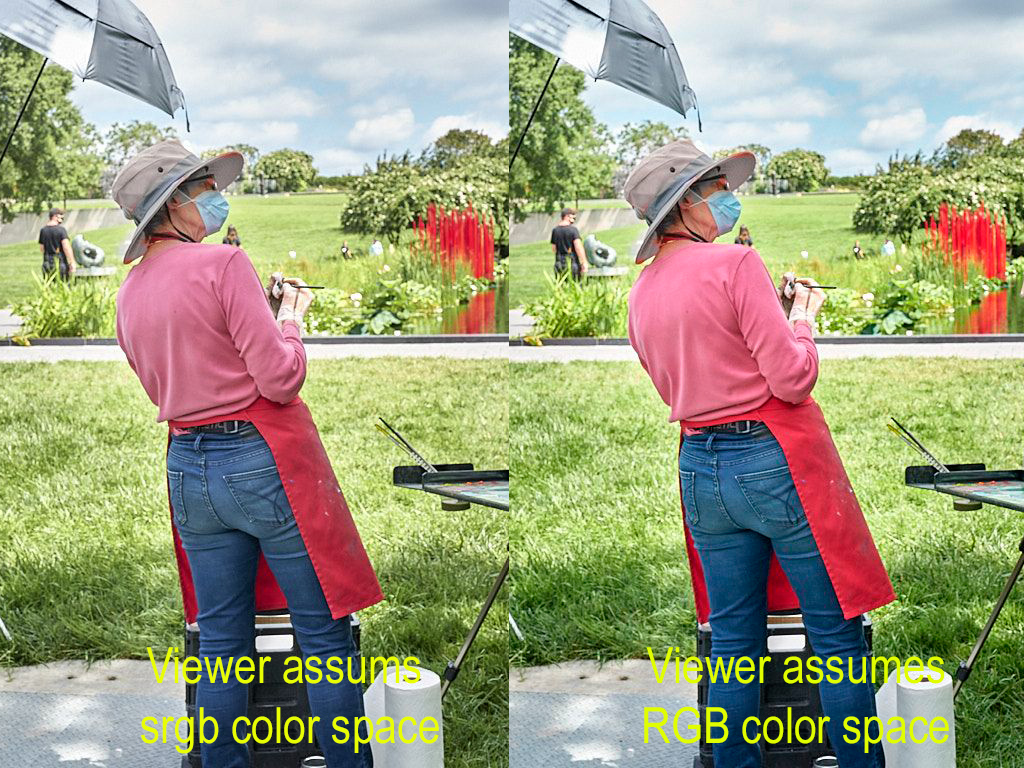
I notice that a lot of images posted to group 80 have an untaged color space, though some do specify the color space. Your image did not have a color space specified, so it would appear different in different viewers depending on what they assumed the color space to be. My browser assumes sRGB for untaged images whereas photoshop asumes adobe RGB. I do not know if the images are sent in with an untamed color space, or are they loosing the tag along the way. The rest of the Exif data seems to be intact.
Here is a comparision of how the images look depending on the assumed color space. Not the differences in the reds and the blues in the sky.
|
Sep 6th |
 |
| 80 |
Sep 20 |
Comment |
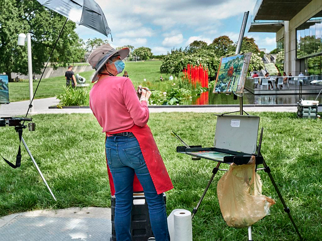
I like the woman's pose, leaning back and contemplating her work, what to do next. You caught her at just the right moment. The three points of red color against the complementary green draw try eye to those parts of the image.
This is a difficult situation to photograph. The subject is in the shade and the background is highly lit. The bright background pulls my eye past the subject and into the background. One thing that might help is to darken the yellows, they contribute a lot to the brightness of the grass. You also might try increasing the contrast in the top half of the image. |
Sep 6th |
 |
| 80 |
Sep 20 |
Comment |
I like the gestures of all hands on the board, each says something about the player. I wonder about the hand with bandages on it. I was reading a book about poker players that said watching hands would tell you a lot more about whether your opponent was bluffing or not than watching faces, but I don't know how might apply to dominos. We are at the start of the game in this image, what do the hands tell us about the strength of each players hand, some look eager to play and others are more reserved. The player on the lower left does not have a good move and is reserved, it looks like the player on the lower right has removed one of his tiles and is ready to play it, indeed, his right hand appears to be in motion.
I think the shallow depth of focus is effective here, we don't need a lot of detail in the hands. The hands lead my eye from the sharp focus area in front around the circle and back to the beginning. The pile of green tiles in the from if for me another focal point because of their color and and sharp focus. I think the soft lighting works well for this image.
I agree with J Lanning, the patch of bright light on the ground is a distraction. I also think that the brightness of the playing board could be darkened a little bit, allowing you to brighten the the overall image to bring more attention to the hands.
Overall, a very nice image. |
Sep 6th |
6 comments - 6 replies for Group 80
|
6 comments - 6 replies Total
|