|
| Group |
Round |
C/R |
Comment |
Date |
Image |
| 80 |
Aug 20 |
Reply |
Thanks for your thoughts Karen. I have been trying to re-shoot the scene with the people in focus, but the reshoots don't have the feel of the original. You have provided some insight as to why that might be. Thanks. |
Aug 30th |
| 80 |
Aug 20 |
Reply |
Thanks for your comment Beverly. I think I percieve what you were trying to do, give more space to the empty bar to give it more prominence. Unfortunately, I took only one other shot, and it was from a little different perspective, and there was no more floor to work with. I have been trying to re-shoot the sceen but not with satisfaction yet. I can try to get more floor. I tend to shoot high, I neet to work on shooting a little lower.
|
Aug 30th |
| 80 |
Aug 20 |
Reply |
I personally do not have Lightroom, so I can't help you much there. I did drop this image into Luminar and can make the changes I recommended. In Luminar I droped the highlights and increased the shadows to even out the contrast. (Just adjusting the contrast makes the image look bland in my opinion.) I found that increasing the shadows in the "advanced contrast" section also helped. The "Accent AI Filter" is another control to play with to adjust contrast and clarity. Anyway, these are just some stuff to mess around with and see what you like. Good luck and have fun. I hope you have a chance to get out. |
Aug 15th |
| 80 |
Aug 20 |
Reply |
Thanks for your comments.
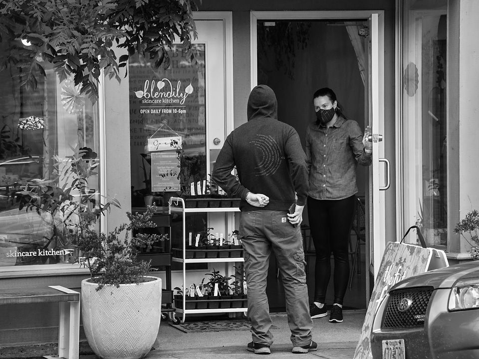
I have gone back now to try to re-capture the scene. Of course, the scene has changed over time, the bar is now serving outside on the sidewalk, so there is not much traffic at the cash register as people are paying from their tables. One of the charms of street photography is capturing the moment, the one time event, so it will be hard to repeat. I still have not re-captured an interesting exchange between customer and bar tender, but I have remembered to pre-focus to get the area sharp that I want. I don't stay long so as not to attract attention, so am propably missing some interesting interactions. I am still forced into a narrow depth of field because of the low light and am the limit of my ISO, and I do not want to use a tripod to steady the camera for this type of shot. But, as this is not far from where I live, I will keep trying. |
Aug 15th |
| 80 |
Aug 20 |
Comment |
Bruges looks like it would be an interesting city to explore, ether on a tourist boat or by just wondering around, both would have their advantages. I am enjoying the movement in this image, the boat passing by, the one just comping into or leaving the dock, and the anticipation of the due to board the next boat. I find the architecture to be interesting. My first focus is on the white building that stands out from all the rest.
I think that the image is well composed, with the lines of the dock and water edge leading my eye deeper into the photo, to the architecture of the building behind. The movement of the boats add a lot to the image for me.
This image appears to me to have been taken on a bright but overcast day (Noted from the diffuse shadows under the white buildings ledges.) The darks in the water along with the blown out highlights in the water for me tends to be a bit contrasty. I think you could soften the image a bit by taking the image into Lightroom or ACR and filling the shadows and blacks while reducing the highlights. (If you are working with a RAW image you will have a lot more dynamic range to play with than the jpg version.)
The image appears a little soft to me as presented, perhaps a little sharpening would help.
I don't think that the added blue sky is consistent with the rest of the image, the soft shadows indicate an overcast day. If the sky area was overblown white, I understand that you would like to tone it down a bit. Perhaps a more subdued grayish blue would be more consistent with the rest of the image. (I would also expect some of the sky color to be reflected in the highlights in the water, which I don't see. Also, I would expect the highlights on the water to be less bright than the sky.)
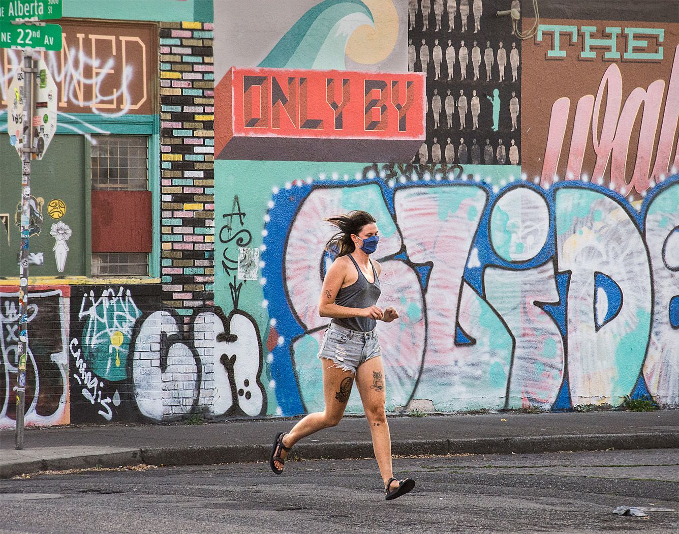
I think that street photography is a component of travel photography. Travel photography includes larger overview place setting images, and then works closer, including the people that populate a place (Street) and some detail images. I think this image contains some aspects of environmental setting and people, tourists in this image. In its broadest definition, Street photography is any image taken from the street or public place in an urban environment that may or may not contain people. This image certainly fits that definition. |
Aug 15th |
| 80 |
Aug 20 |
Comment |
I ran across an humorous article about "mansplaining" that reminded me of your image: https://www.nytimes.com/2020/08/10/books/nicole-tersigni-men-to-avoid-in-art-and-life.html?surface=most-popular&fellback=false&req_id=836254935&algo=top_conversion&imp_id=630164517&action=click&module=Most%20Popular&pgtype=Homepage |
Aug 11th |
| 80 |
Aug 20 |
Comment |
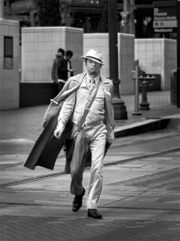
Yes, quite the interesting character, with that blue suit, fedora hat,
argyle socks and spectator pumps. Seeing people like this is what makes street photography fun for me. I think he displays an engaging gesture, with his hand on his chin looking straight at you with that grin. That "Babe" sign behind him fits right in.
For my tastes, I find the shadows to be a bit blocked up, it would be nice to see some of the detail in the dark area above the man. I also think that some of the bright areas could be toned down a bit.
The color space is un-tagged, so the colors appear different when shown with different viewers. Photoshop assumes it is in the RGB color space whereas my browser assumes it is in the sRGB color space. I suggest that when you convert the image to .jpg, you set the color mode to sRGB so that we see it as you intended across all viewers. (In photoshop go to the Edit Menu, / Convert to Profile.) I attached a comparison of the colors I see when the viewer assumes different color spaces. |
Aug 8th |
 |
| 80 |
Aug 20 |
Comment |
I think this is a wonderful street portrait, looking back at a dying profession of street book and newspaper vending. How many people are reading a print newspaper or books these days, instead reading or watching on their mobil devices? He appears calm and content. I would not have placed this in Paris, it could be in New York or some other eastern seaboard town; I can't quite make out the language of the text other than the blue headline which appears to be in English.
I think the soft side lighting is wonderful. You did well to put some additional light on his face to emphasize it. The diagonal lines formed by the building base and line of books leading to him work well for me. His body forms a diagonal line in the cross direction, leading again to his face. I like the tight crop on the man, making the scene a little more intimate. I think this is very nicely composed.
The presence of the trash on the street does not bother me, it is part of the scene as it was. I would leave it in, but perhaps tone it down a bit to avoid it becoming a distraction. |
Aug 7th |
| 80 |
Aug 20 |
Comment |
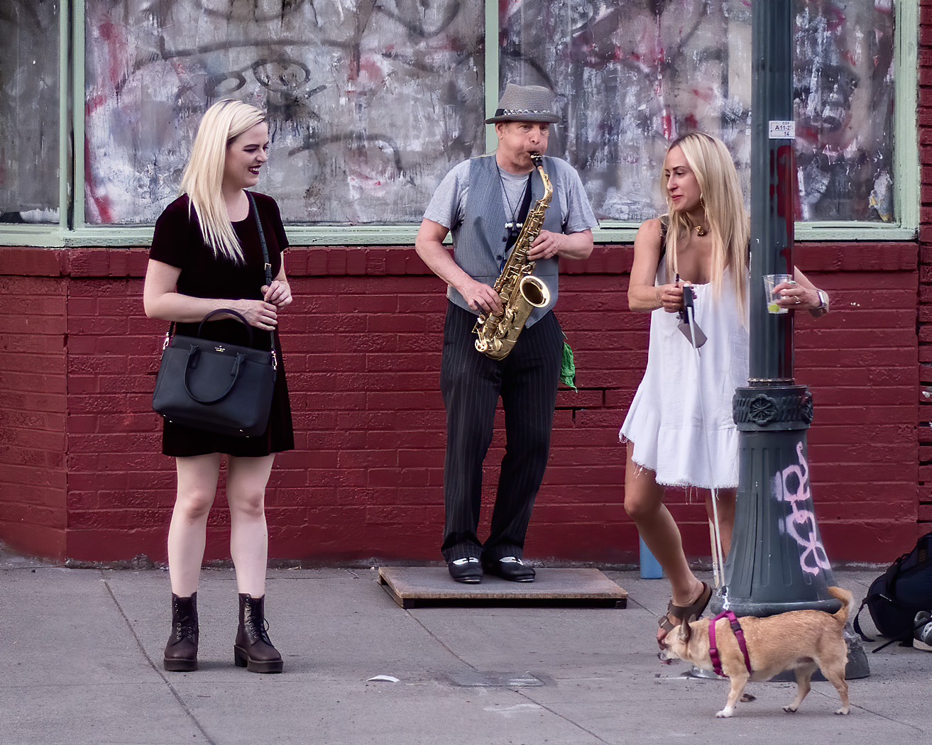
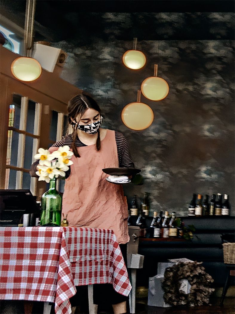
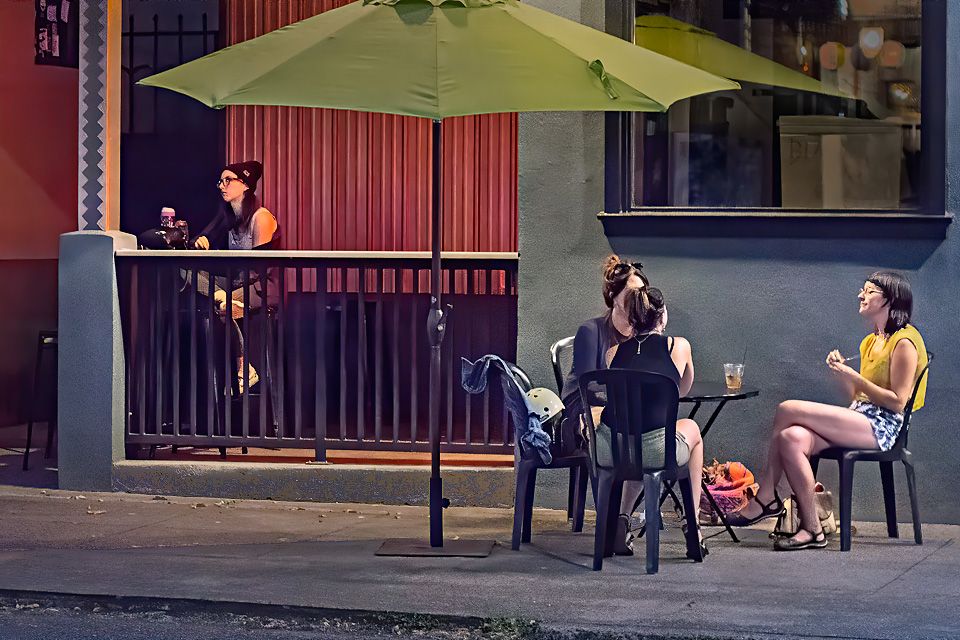
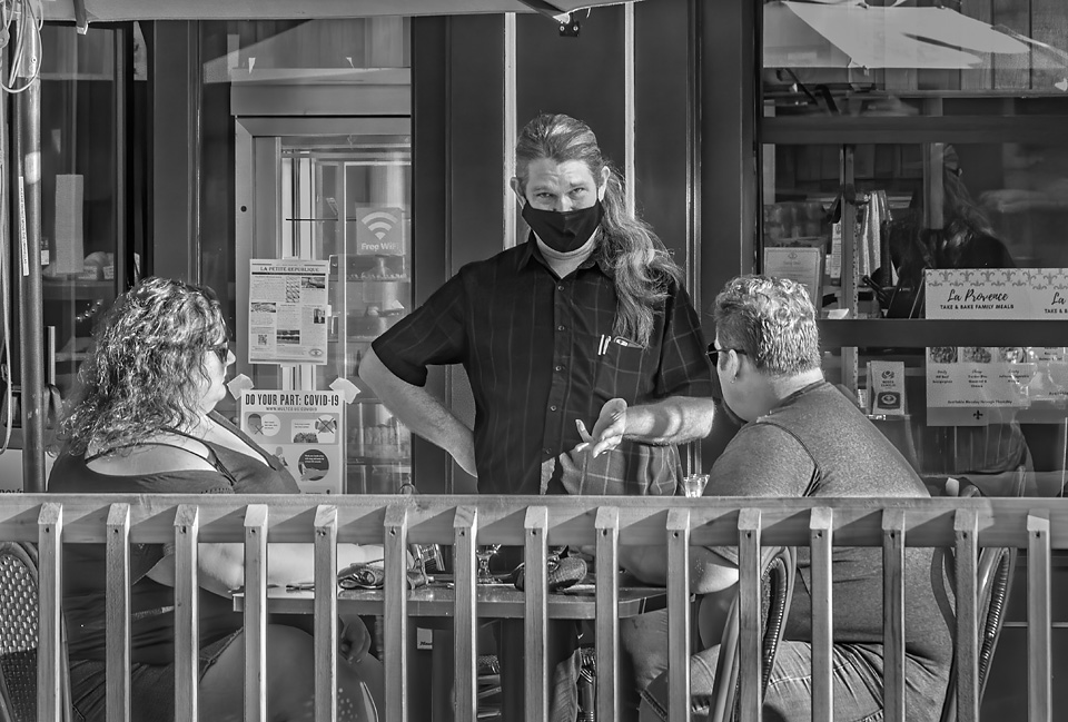
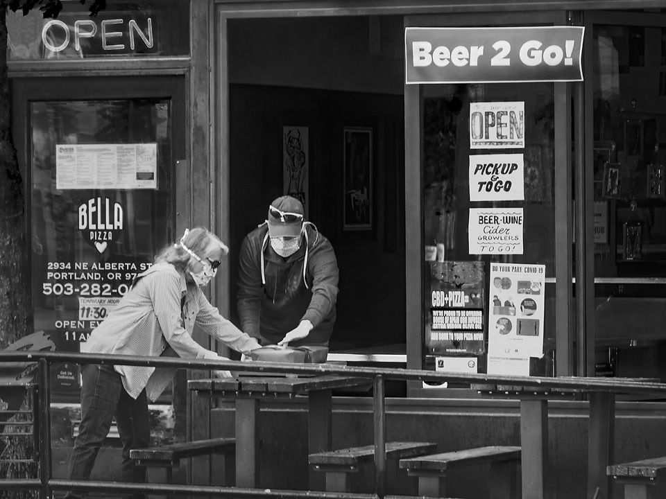
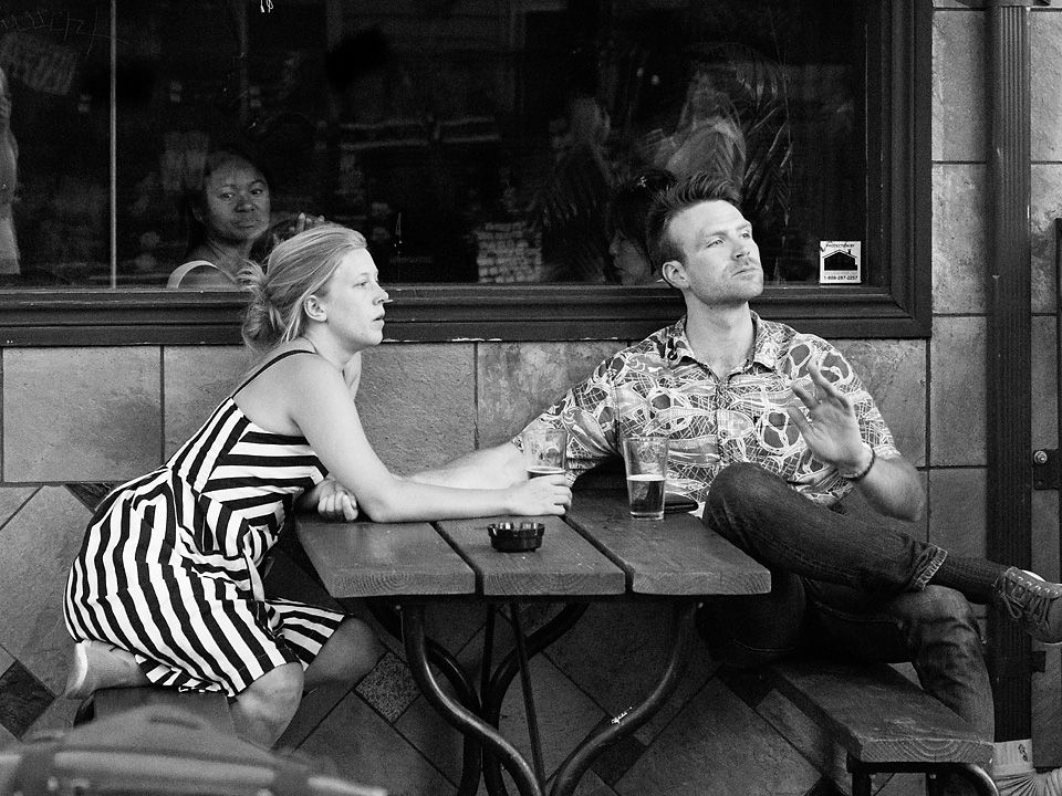
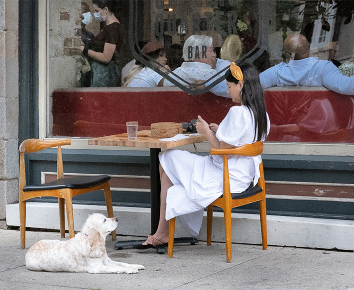
This image captures one of those moments of contrasts in behavior of our current times: dining on the sidewalk in fresh air distanced for other diners (which I am still uncomfortable with because you do not know who will be walking by masked or unmasked), the relaxed and conversational group inside apparently unconcerned with social distancing, and the wait staff who are masked as they should be. I think it is a nice capture.
I like that you brightened up the interior of the restaurant a bit so we can more fully appreciate the scene inside.
I do think that a little tighter crop on the right would tighten the image a little, for me the woman facing out of the frame and well as the mans arm lead my eye out of the frame. However, I think it important to keep as much of the mans arm in as it's gesture expresses the relaxed feeling of the group.
I like the dog in the original. Although it alters your story somewhat, for me It adds another layer of information, and it adds a circular visual pathway through the image. It draws the eye up to the woman in the white dress, into the window, over to the waitress, and back down past the chair to the dog. |
Aug 6th |
 |
| 80 |
Aug 20 |
Comment |
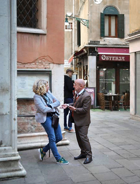
I think the gestures in this image are great; the man explaining something with expressive hands, the woman reluctantly considering what he has to say with crossed arms. For me, the soft lighting and pastel colors work well in this image.
I think you could increase the emotional content of the image by including the pillar to the left of the woman in the image so that it appears that she has been backed into a corner. (On closer inspection, you can see that she is leaning against a railing.) On the other hand, having her so close to edge of the frame for me creates some tension. I think that the area on the right is not contributing to the image, and for me, makes the image a little unbalanced. I do not know if you intended to have us wondering what a Caribbean pirate themed store is doing in Venice, but that would be a mixed message image. I think that a vertical crop would also make you feel more like you were in the tight streets of Venice. My preference would be to have a closer view of the people in the image.
The man in the background is not a distraction for me. |
Aug 6th |
 |
6 comments - 4 replies for Group 80
|
6 comments - 4 replies Total
|