|
| Group |
Round |
C/R |
Comment |
Date |
Image |
| 80 |
Jun 20 |
Comment |
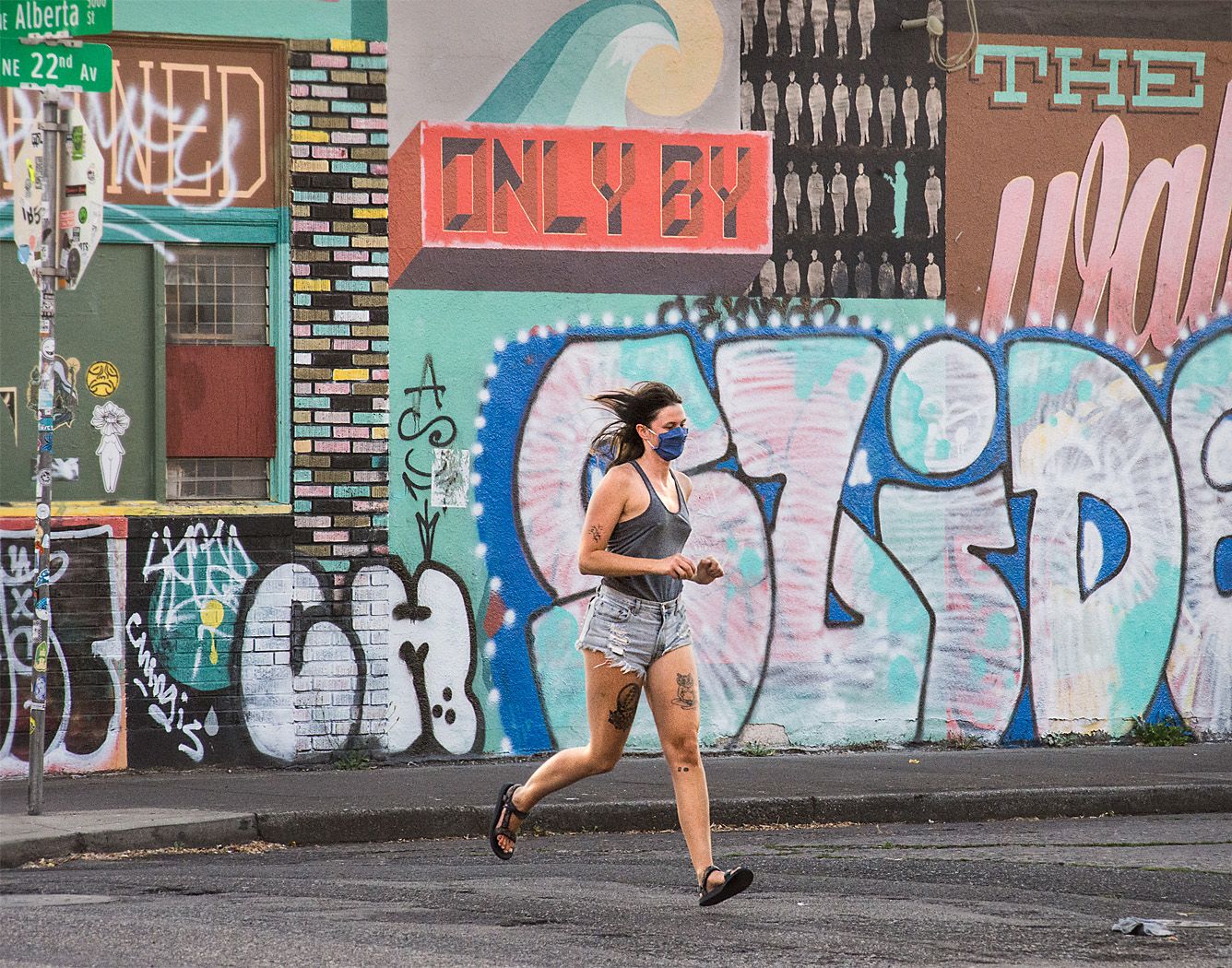
These are strange times we live in, when normally busy crowded spaces are emptied out. For me, the image has a feel of recent abandonment, empty but not run down, well kept, indicating there is normally a lot of activity in the area. There are still a few people out and about, at least one is wearing a mask, giving me a clue that this is a pandemic related image.
For me, the main focal point of the image is the traffic free street and the capitol building, the lines of then street lead me there. I think the image has a nice tonal range including both black points and white points.
For me, I would like to see a little more detail on the dome, it looks a little overexposed there. Perhaps, a slight darkening of the mid-tones would make the image pop a little more. Otherwise, I think the image works well. |
Jun 13th |
| 80 |
Jun 20 |
Reply |
I was looking at some of the metadata for these files and noticed that your color profile was untaged. That means that the colors I see on my monitor may be considerably different than what you see on yours. I have no idea what color profile my system assumed the image was in. I always set my color profiles to sRGB when posting to the web, though most browsers these days will properly display colors for other specified prifiles such as Adobe RGB or Pro-Photo. |
Jun 12th |
| 80 |
Jun 20 |
Reply |
I watched the webinar too and thought it was well done, bringing forth a lot of considerations when doing street photography.
I agree there is rarely a perfect set-up instreet photography, but we do our best to capture the mood and setting while minimizing that which distracts us from our subject(s). |
Jun 11th |
| 80 |
Jun 20 |
Comment |
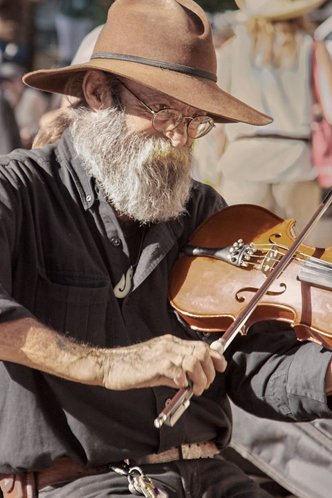
I like the concentrated expression of the fiddler as he plays his tune. To me, I feel he is listening intently to other musicians to keep in sync with the rest of the group. To that observation, I like that his ear is so prominent. The highlights in his eyes make him look lively. From the background, I can tell the setting is a festival or he is a street musician. I think this is a nice portrait.
Photographing in strong harsh sunlight can be very difficult. The range of light is often beyond what the dynamic range of our sensors can handle. For photography where there is no movement, some people us High Dynamic Range (HDR) photography, but for street photography, this is not possible. Often or choice it these circumstance is to go to black and white, the high contrast just looks better in black and white. Because of the limited dynamic range, we have to decide whether we want detail in the brights or the darks, and adjust our exposure that way. On bright sunny days I often adjust my exposure compensation down one or more stops to maintain as much detail in the brights if possible. If the brights are over-exposed, you can not recover any information, and the image appears blown out. I find that there is still a lot of information in the darks that can be recovered in post processing. I always shoot in RAW so that there is more information in the shadows to work on. This approach gives me more options on what to do with the image, to either keep the brights as very bright areas, or tone them down and bring up the brightness of the rest of the image. There are some technical considerations with this approach; mainly if shadows are brightened in ACR or Lightroom, the colors tend to shift, especially skin tones, they become redder.
For me, the white shirt in the background is a distraction, toning it down in the color version results in it becoming grey because the area is over-exposed and "blown out" is still distracting because it has been obviously modified. However, toning down that area in a b&W image would not be so distracting.
Another possibility would be to highly desaturate the image, leaving a little color for pastel tones. To me, the high contrast between the red in the mans face, and white shirt in the background makes it difficult to stay focused on the man. Then the grey from darkening the shirt is a little less obvious. I find that adding a little color to the shirt also helps reduce the contrast.
Sorry about the long rambling observations. For me, this image had a lot of possibility. |
Jun 11th |
 |
| 80 |
Jun 20 |
Comment |
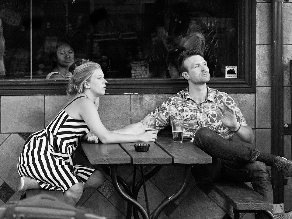
Yes, very much in the style of Henri Cartier-Bresson. In my opinion, that moment was perfectly captured. I think you caught both the photographer and yoga practitioner with good gesture and implied motion. The fountains in the background add to the feel of motion in the image. In my opinion, the composition comes together nicely with the placement of the two figures against the horizontal lines in the background. I do not see anything that I would change. Well Done
Regarding the angled wires, I think they work nice as framing devices. In my opinion, they also break up the strong vertical and horizontal lines some, adding to the dynamic feel of the image. Without them the image feels a little more static to me. |
Jun 10th |
| 80 |
Jun 20 |
Reply |
I think that it was the deep shadow in her eyes that made me think that brightening up her face would help. |
Jun 10th |
| 80 |
Jun 20 |
Reply |
Thank you Beverly.
I replied to the comment about licence plates in my comments to Ed above. It is good to keep in mind what the limitations and restrictions to photographing other people and property are, including legal, ethical, and courtesy considerations.
|
Jun 9th |
| 80 |
Jun 20 |
Reply |
Thanks for your comments Ed. I tried your suggestions for darkening the perimeter of the image, especially some of the bright door frames, and then brightening the subjects. That brought better attention to the subjects.
As far as I know, there is no law about photographing licence plates or any other subject when they are in a public place in this country. Bluring it out would be more of a courtesy for someone who does not want to be photographed. The only restrictions that I am aware of is that I can not use the images for commercial uses without getting model releases from people or for images of private property. |
Jun 9th |
| 80 |
Jun 20 |
Comment |
Could this be Robin Hood or one of his very very men. A telling expression on the man's face and his use of the pole for support shows us he is enjoying is grog. The slight blur of his face likely reflects his state of mind.
I think that you cropped the image well, the figure being well placed looking into the image, and the necessary sand in front of him and the bright grass in the upper part of the original image removed. Removal of the yellow tape and blue tape, and wood on the grass was for me an improvement. I find the color set to be pleasing, with no distractions. For me, darkening the sand in the foreground is effective in keeping the man as the center of interest.
I find the little bit of the remaining yellow ribbon by his hat is distracting, is it part of his hat or something else? I would consider removing the fence in the background, I do not think is part of the story you are trying to create. I also find the image to be a little over saturated for my taste.
|
Jun 9th |
| 80 |
Jun 20 |
Reply |
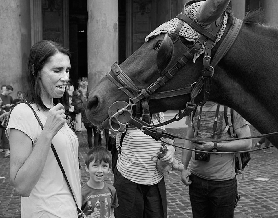
PS. I am not at all bothered by the two figures behind the horse. They add to the story telling us they are tourists by evidence of the camera.
|
Jun 9th |
| 80 |
Jun 20 |
Comment |
I like the interaction between the woman and horse, her expression of delight with a hint of of trepidation in that the horse is reacting to her. I can tell that she is not used to being around horses. Is the horse looking for a bit to eat from the tourist? The expression on the boys face is precious, it looks to me that he is thoroughly enjoying the interaction. Nice story.
I think the choice of B&W works well, I find the spots of red and cyan distracting. I think cropping out the people on the left removed some distraction there and allowed you to level the horizon. I like the highlight in the horse's eye, it makes the horse look more lively. I like that the boy is looking right at us.
I see you increased the contrast of the image, I am guessing that you did so to improve the tonality of the mid-tones. I think one has to be careful when doing so to keep from over-brightening the brights or over darkening the darks, which appears to me to have been done here. |
Jun 9th |
 |
| 80 |
Jun 20 |
Comment |
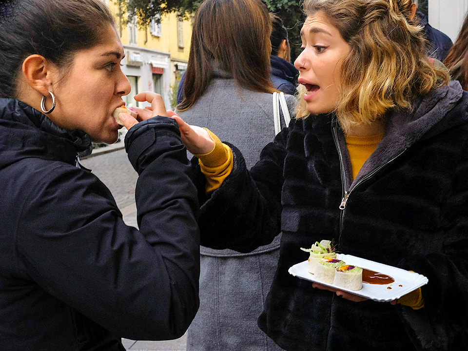
I like the interaction between the two women, the sharing of street food. I enjoy the strong gesture and expression, a story of sharing. The little bit of street in the image indicates to me that the image was taken in Europe.
I like the tight cropping, it focuses on the action. I think that the colors, primarily in the orange-bluish complementary color set, works well in this image. Converting to B&W would loose some of the detail and interest in the food on the plate.
I would like to see a little more detail in the dark areas. I also think that by brightening and increasing contrast of the face of the woman on the left would make her stare more intense and help balance the light and darks in the image. I also think you could crop a little off the bottom to reduce the size of the bright area down there.
Over all a well done image with a story. |
Jun 9th |
 |
6 comments - 6 replies for Group 80
|
6 comments - 6 replies Total
|