|
| Group |
Round |
C/R |
Comment |
Date |
Image |
| 80 |
May 20 |
Comment |
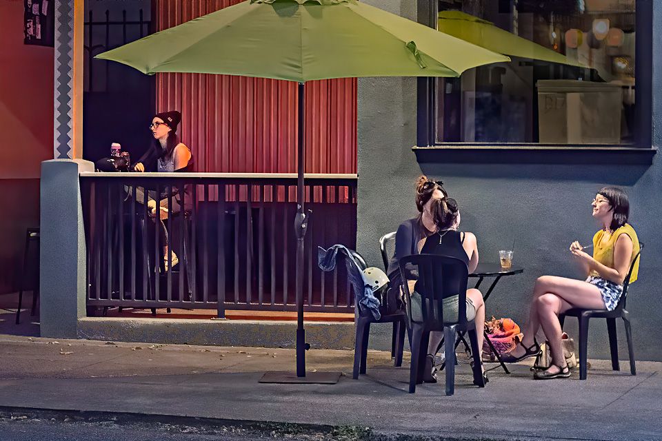
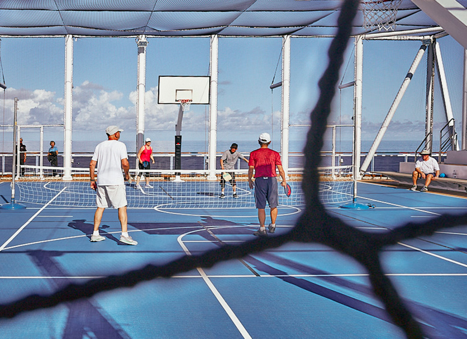
You have captured what appears to me to be the action of the game about to start. I think that by breaking the image into areas with the foreground netting, the figure on the right is separated from the game, adding to his anticipation of joining. I think that the picture would not be as interesting if there was no foreground netting.
I have mixed reaction to the netting in the upper left corner, I would like to see more of it to keep the theme, or none at all. Cropping it out may take some the netting over the top of the court out, which provides context for the netting we are seeing through, and would be a loss in my opinion. Using the skew function, drawing the top down some, could help keep a little more of that netting in the image.
The white balance appears to be on the magenta side to me. I suggest using the grey t-shirt to adjust white balance. |
May 17th |
 |
| 80 |
May 20 |
Comment |
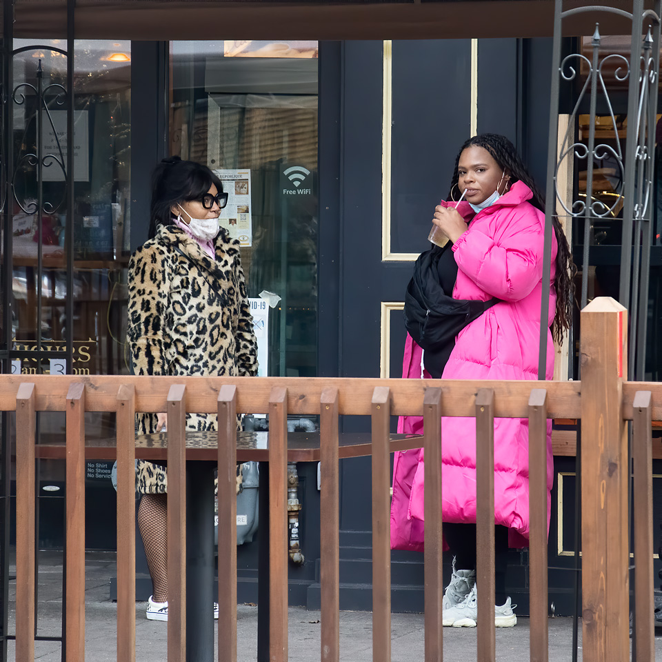
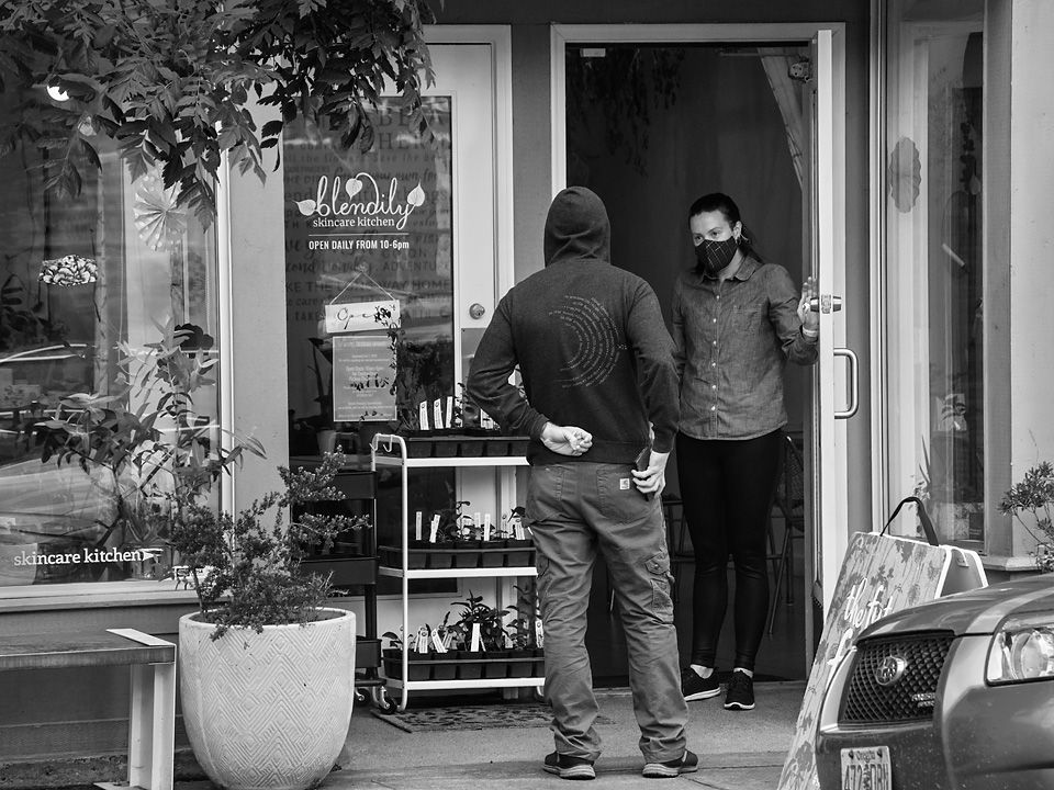
I like the way the man on the moving truck is keeping his balance while adjusting the load and the onlookers showing some concern.
I think that the image is framed well with man and truck on the left and the two woman, especially the one with the bright cyan shirt holding down the right side of the image.
I would like to see a little more separation of the man from the very busy background. Perhaps a little shallower depth of field would have helped.
|
May 17th |
| 80 |
May 20 |
Comment |
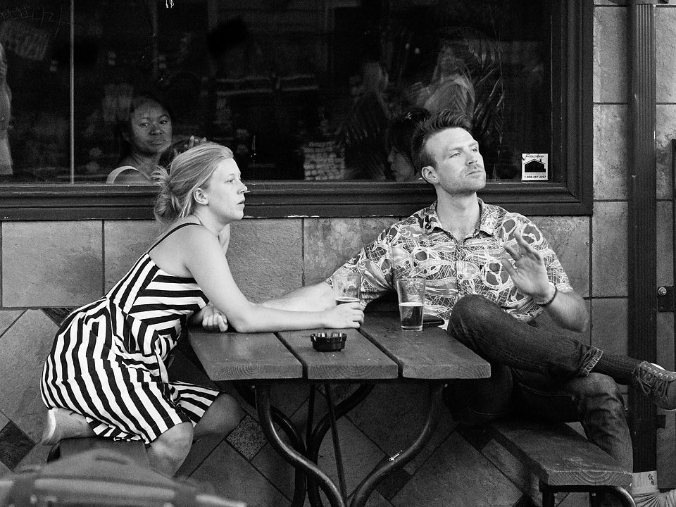
I enjoy the theme, the young couple cuddled in the shade in front of the murals. They are the center of interest, from them I take in the murals. The perspective of the top mural being different from the benches below catches my attention. I think the image works as a unified whole.
Then there is that leg comping in on the bench on the left, stocking feet and the shoe on the ground
I find the brightness of the sunny areas in the foreground distracting; In Lightroom you could reduce the brightness of the brights some. I think that reducing the brightness of the upper part of the image would allow you to brighten the rest of the image some. The couple is somewhat lost in the shadow, any additional brightness there would help me keep my attention there a little longer |
May 17th |
| 80 |
May 20 |
Reply |
Thanks for the suggestions Ed. I think your crops are effective and retain the parts of theimage I think are important.
|
May 10th |
| 80 |
May 20 |
Comment |
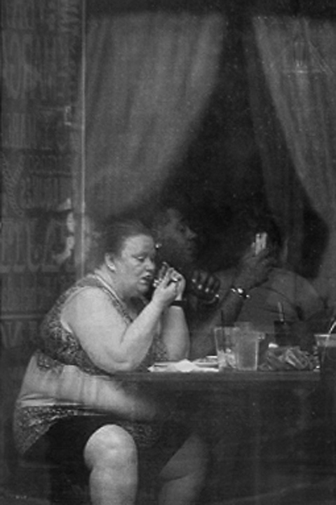
Two lonely figures, each in their own space with an illusion to me of being separated by a window. This image of eating alone certainly is poignant for those who have experienced much of it. I used to travel a lot and had many meals on my own, which for me were usually not relaxing and I hurried through them, probably not eating as healthily as I should have.
I like the carrell gesture of the two woman, with their hands signed up in a row. For me, the f line from the formed by woman's back up along the Curtin edge to the top of the image forms a nice framing of the subjects. I think you have cropped the image well. I see that you cloned out the lamp in the upper right corner of the image, I think a good move.
For me, the lack of detail and flat light detracts from the image. I think that the reflection from the glass adds a lot of haziness to the image; perhaps a polarizing filter would have helped to provide a little more clarity (assuming you did not use one). I think you could preserve some of the detail in the conversion to monochrome. I like the detail in her blouse and think that you could bring that out more by darkening the cyans. Play around with the sliders some to get the best balance of light and dark. (Watch that dark object on the right side of the table, it is a distraction to me.) My personal preference is to have more contrast in the image, checking to see if I have a white point and a black point. Curves or levels in photoshop, or curves in ACR or Lightroom do a nice job.). I think that a little selective vignetting along the left side would help contain the image.
I saw an earlier version of this image that included some of the building around the window. I think that the building did provide some context, explaining the lack of clarity in the image. For me, just the image in the window is blurry and looks like poor photographic technique. I think you would do we'll to add back in some of that context. |
May 10th |
 |
| 80 |
May 20 |
Comment |
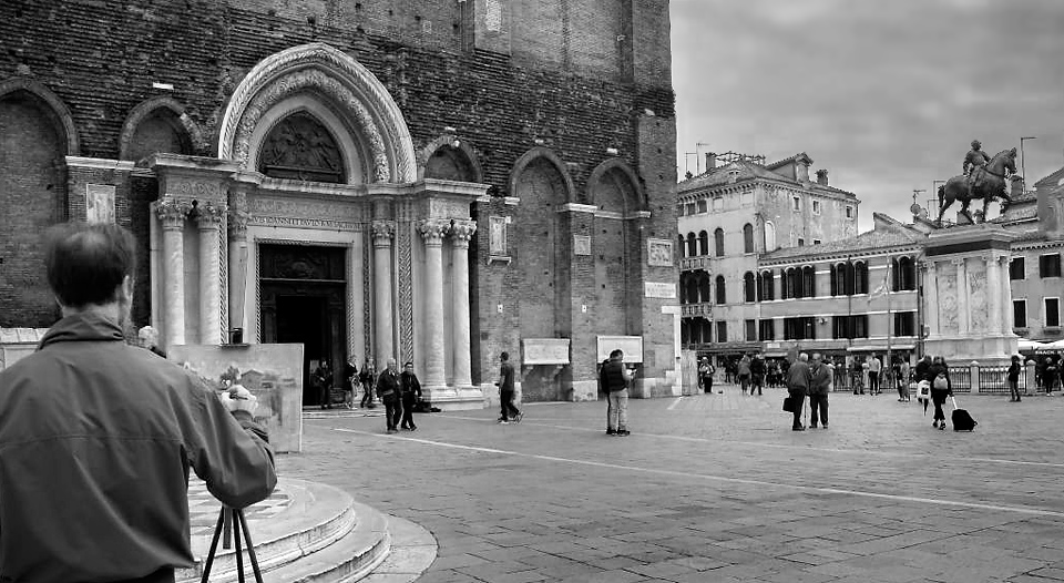
Artists at work are to me interesting subjects. Here I see the artists painting of the scene before us, but at a slightly different perspective, with the statue of the horse being more central to his composition. I also enjoy the architecture of the columns and arches on the building before the painter. The whole scene comes together well.
I perceive that you exposed for the sky since it is not blown out and there is some detail hidden there. I suggest that you try darkening the sky to reduce the impact of the bright area in that part of the image and to add some detail and mood there. I think this would allow you to brighten and add contrast to the rest of the image to counteract the flat lighting in that area. I think that darkening and adding contrast to the pavement in the lower part of the image would improve balance and could provide a subtle "shade line" to guide the eye from the statue back down to the painter. Since the painter is a main subject, I would lighten him up a little to draw more attention to him. Also, my preference would to see the complete arch above the door in front of the painter; with the sky darker you can include more at the top of the frame without more of a bright area in the upper right. |
May 10th |
 |
| 80 |
May 20 |
Comment |
For me, this image expresses an emotional state. Choosing to convert natural colors to red to evoke strong feelings about the the pandemic situation takes what is for am a quite bland image and converts for me gives it a sense of feeling danger with regard to the virus. I also get a feeling of desolation from the image, the empty street, a lack of motion.
Given the artistic expression and extreme processing, I can't say much about the technical aspects of the image. Compositionally it works for me. I think the large empty space in the lower left balances with the sky above, the cloud mirrors the line in the road. Leading lines of the road line, tree tops, shine of the cars, pulls my eye down the empty road. |
May 10th |
6 comments - 1 reply for Group 80
|
6 comments - 1 reply Total
|