|
| Group |
Round |
C/R |
Comment |
Date |
Image |
| 80 |
Apr 20 |
Reply |
|
Apr 24th |
 |
| 80 |
Apr 20 |
Reply |
Hi Bill:
I looks to me on close inspection that that an unsharpen mask has been applied to the image at some point in its life as evidended by the lightness and darkness along numerous edges. Just a few of them are apparent to me when looking at the image at its natural size. I marked those in the attached image. |
Apr 24th |
| 80 |
Apr 20 |
Comment |
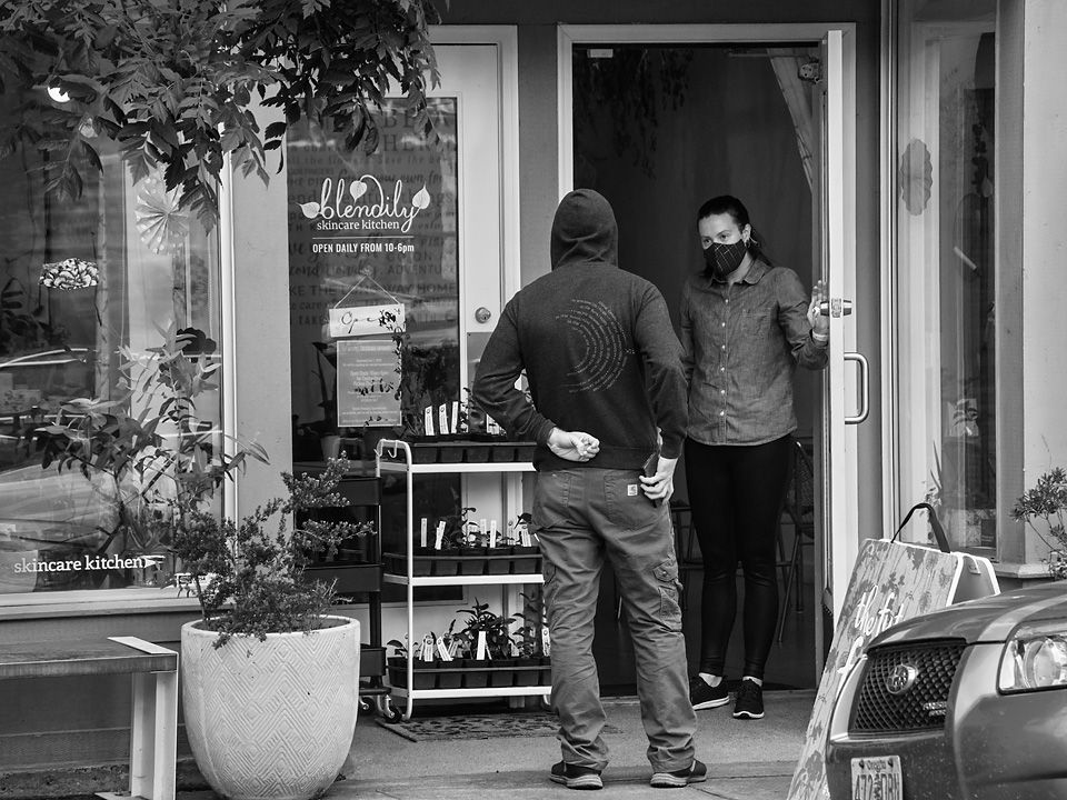
Thank you all for your comments and insights. I have made several changes to the image based on them, pluss a few more that occured to be when revising. You have helped me achieve a better image. Thanks |
Apr 16th |
 |
| 80 |
Apr 20 |
Reply |
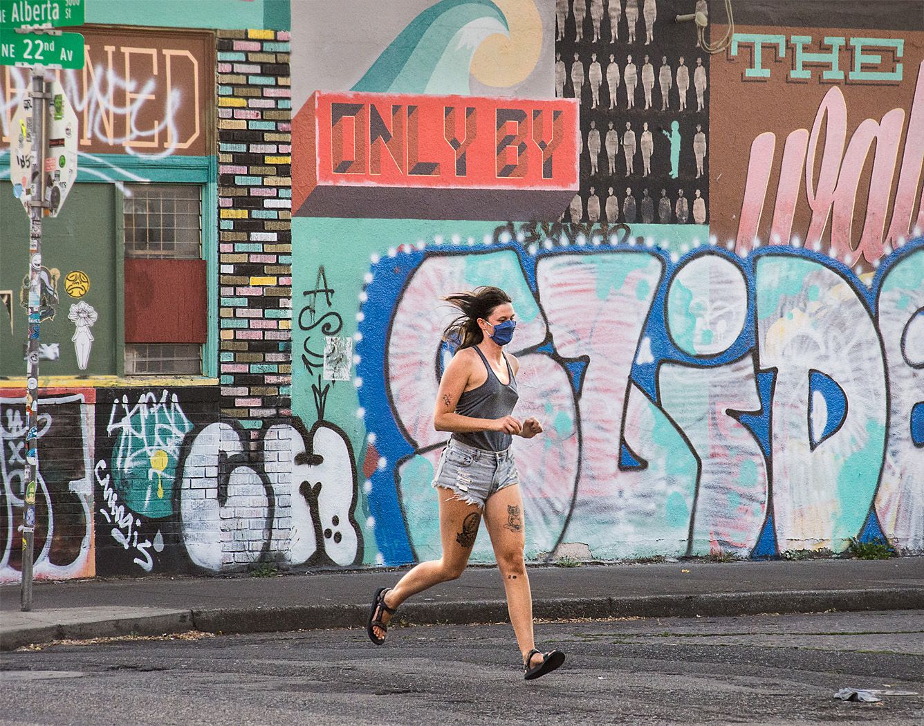
Thank you Beverly.
I will try to tone down the foliage on the left some to make it less distracting. |
Apr 14th |
| 80 |
Apr 20 |
Reply |
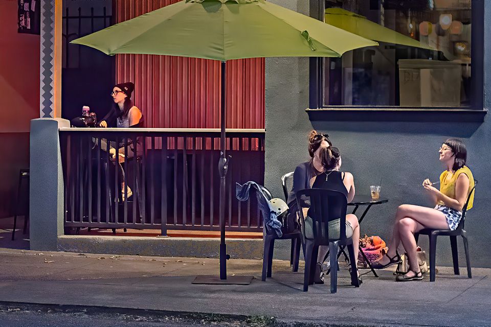
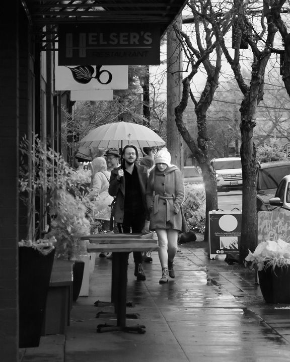
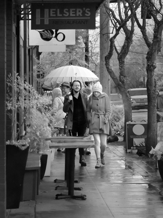
Thank you for your comments Bill. I did not have to wait that long. I spotted the couple some distance down the street and was lucky enough to be near a spot where I could make a decent composition. I chose my composition, then waited for them to approach. I do not recall the color of the umbrella, this was shot in B&W in an IR converted camera; many colors come out as white such as the dark green foliage along the left side. None the less, the umbrella stands out against the background. |
Apr 14th |
| 80 |
Apr 20 |
Comment |
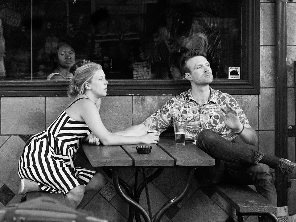
The man in this library appears to be intently studying his text. Between the man and the camera is an empty round table surrounded by 4 chairs casting a round shadow on the floor. For me, the man and the shadows beneath the table are strong visual elements. I can't figure out how they relate to each other.
Just looking across the table top at the man (cropping just below the table top) for me is a strong composition with the repetition of the chair backs forming circles around the tables. I think that the man is well separated form the background books, and placed pleasingly to one side of the image. The lighting is nice, giving shape to the man. You did a nice job of conversion to B&W.
I also find the shadows beneath the near table to be interesting, the repetition of circular shapes, the chair backs and their shadows also repeating the roundness of the table top and the table base.
I think that I would split the image into two parts. I think the top half would be the stronger of the two, cropping out the area beneath the close table entirely. Possibly I would tone down the bright spots on the books on the shelf on the right, or crop them out entirely. I think I would also darken the row of white books in the upper left corner a bit further than you did. |
Apr 13th |
| 80 |
Apr 20 |
Comment |
This is a wonderful view of St Basil's. The walkway stripes lead us right into the cathedral with all of its glorious colors. The reds and oranges of the cathedral contrast nicely with the blue in the sky. The clouds in the sky are a nice addition to the image.
To me, the image looks a little unbalanced. All the subjects of interest, the people in the foreground are on the left side of the image. I think the if you had cropped in from the other side of the image, the balance would be better. In addition, the two men close to the left edge looking out of the image would not be so close to the edge. The people spaced down the sidewalk then become another leading line, taking my eye to the right side of the cathedral, then up through the spires and back down to the group near the front. (In your crop I am led to the sidewalk along the cathedral and on to white building behind.). I think I would lighten the group of trees at the left base of the cathedral to ease the flow of eye movement.
For me, the image appears to be a bit over sharpened. I see sharpening halos around cathedral, lamp-posts, as well as the clouds in the sky. I think that it makes the image a bit contrasty on the micro scale. |
Apr 13th |
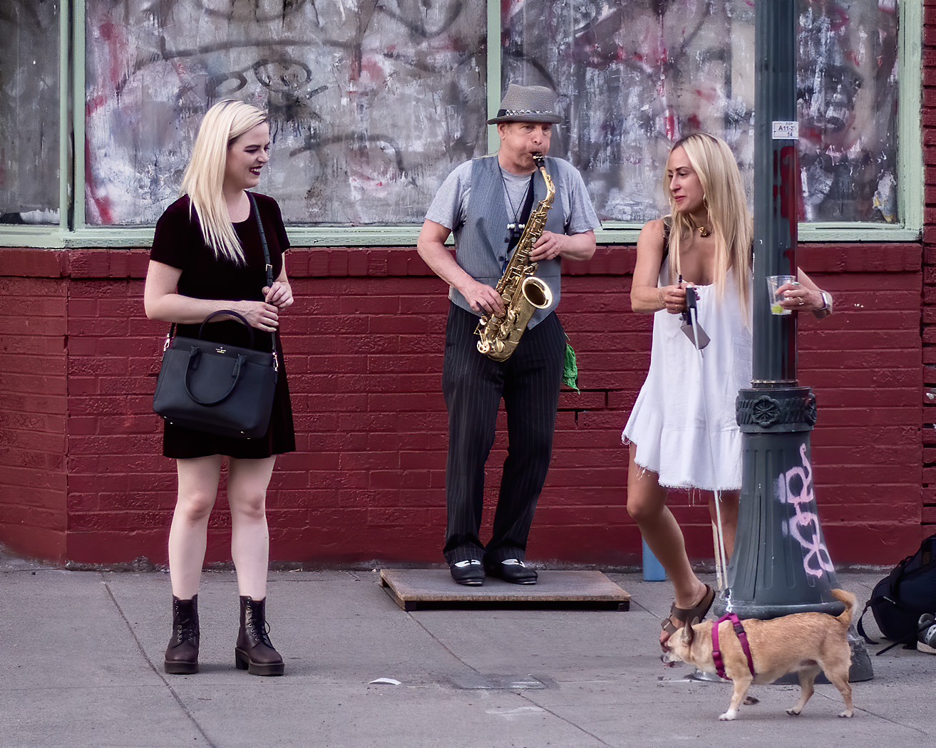
| 80 |
Apr 20 |
Comment |
All that pigeon activity around the girl makes for an interesting subject. Pigeons strutting around in the foreground are really nice and give a sense of movement to the image. The girl's case at the man and his backwards the girl as well as the red of the mans jacket and the girls knapsack pull the two visual elements together.
For me the composition works well. I like that you kept the couple with the red bag on the far left in the image, it provides a place to look after I have finished with the main theme, the red bag attracts my eye there, and then on round to the other nearby groups of people, to the cart, and back to the man with the red jacket.
For me, I like may main subject to be in the brighter area off the frame. The lightness brings the subject forward. In this image, the background is the brightest part and that pulls my eye there, away from the subject. I would brighten the midtowns in the area around the girl with the pigeons and the man in the red jacket to keep them as the main focal points. I would also consider cropping a bit off the top since that is not adding much to the time of pigeons in St Mark's Square. |
Apr 13th |
| 80 |
Apr 20 |
Reply |
Thank you for your comments Stephen. I appreciate the reference to Caillebotte's painting. We have so much to learn from the great painters of the past. |
Apr 4th |
| 80 |
Apr 20 |
Comment |
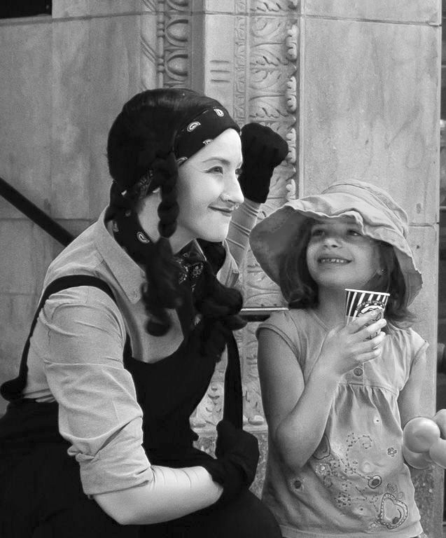
I think this is a nice photo showing the interaction between a street mime (living statue) and a using girl. Was that a look of surprise and pleasure from turning around and seeing the mime there? Their gestures make this image work.
I like the way you cropped the image, nice and tight to the subject though I would like to see a little more of her left hand, I suspect there was a distracting element over there. To me, there is a very nice circular motion in this image, the look from the living statue to the girls face, to her cup, down her arm, to the living statues arm, and then back up to her face. I like that you caught highlights in the living statue's eyes, to me they make her look more lively.
I perceive that the color balance is a little off on this image, the statue's face appears a bit green on my monitor, I fixed the white balance by clicking a white balance correction tool on the statue's forehead. I think that I would desaturate the yellow item the young girl is holding since the bright yellow pulls our attention down and out of the frame. On the other hand, I think that the image works very well in B&W. I would slightly brighten the area under the young girls hat so we can see her eyes a little better. I would also slightly darken the right side of the image. |
Apr 4th |
 |
| 80 |
Apr 20 |
Comment |
I think your image captures the feeling of people moving their stuff around on a shoe string. For me, the precarious load on the car reflects life on the backroads where traffic or life does not move at freeway speeds. Perhaps a little more on the bottom would have been good, but you captured the essentials and enough of the man in the back seat that you could discern some of his character. I like the woman's expression of boredom, have done this too many times, this is not a pleasant adventure for her. I think that this image would fit nicely in a photobook about the area.
I think there are some things you could do to make this a stronger image and bring out more of your intent. Contrast attracts attention; to me, there is too much contrast in the background of this image, I would reduce it some so that that area is not as eye-catching. I also think that increasing the contrast of the boxes on the top of the car will bring more attention to that area to enhance your story.
I also think that the balance of light and shadow reduce the effectiveness of the image. The image feels top heavy to me, I would brighten some of the dark areas on the top, and darken some of the lower areas such as the hood of the car. |
Apr 4th |
| 80 |
Apr 20 |
Comment |
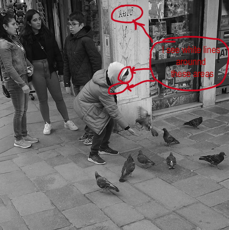
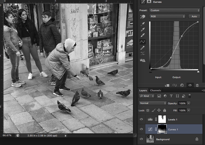
I enjoy the gesture of the boy feeding the pigeons gathered around him, the movement of the pigeon that is approaching his hand, and the nonchalant expressions on the group behind him.
I think that the composition in this image works well, the three main interest areas, The 3 friends, the boy feeding the pigeons, and the group of pigeons fall on a diagonal, which for me gives the image its energy. I find that my attention goes from the pigeons up through the display window to see what is there, then to the text on the pillar, then back to the group of friends. I think that the crop works well. I also like the image in monochrome, I do not find the colors in the original to be that exciting.
To me, the image appears under exposed. When brightening the image, I noted that it was mostly the sharpening halos that became blown out, and the boy's hood. The boy's hood appears to have been brightened during conversion to B&W by brightening the cyan slider and could be darkened a little if the entirety of the image is the be brightened. Brightening the whole image could make the pillar a little too bright, so I would avoid brightening that area.
One thing I like to do when there is pavement in my images is to increase the contrast of the pavement. This gives the foreground a little more substance.
I also watch sharpening halos created when using unsharp mask in photoshop carefully. It is usually the lightened edges that stand out and can be distracting, such as the ones around the "AtM!" text on the pillar in this image. I deal with that by duplicating the image into another photoshop layer and set that layer's blend mode to darken, and then do my sharpening. This sharpens only the dark side of the high contrast areas and makes text stand out.
|
Apr 4th |
 |
7 comments - 5 replies for Group 80
|
7 comments - 5 replies Total
|