|
| Group |
Round |
C/R |
Comment |
Date |
Image |
| 80 |
Mar 20 |
Comment |
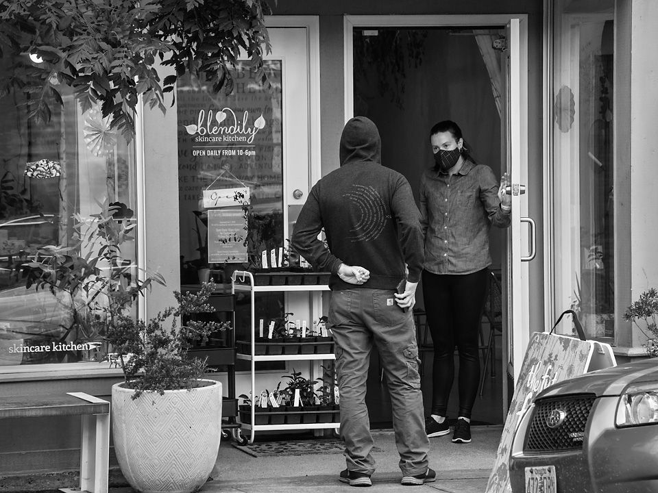
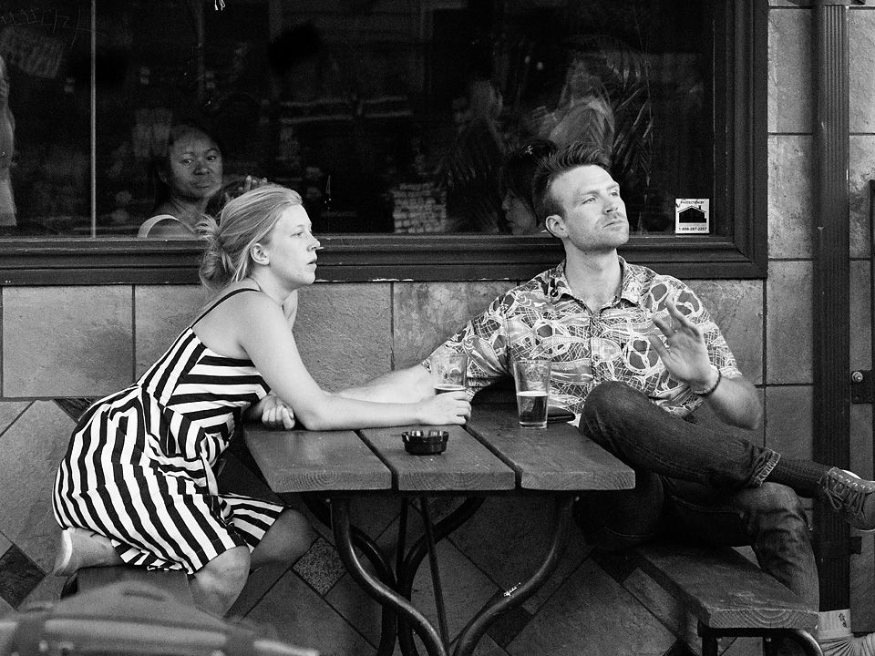
It takes a moment to grasp what is going on in this image, the woman holding up a wreath so the photographer can get an image with the "we" in the middle of it, but that is the charm of the picture and what draws us into it. At first, the leading lines formed by the car tops and bottoms led me to the group of people on the sidewalk across the street, but the angles were wrong for the line of sight of the photographer. The image works well for me.
I like the choice of B&W in this image, the mix of colors in the original resulted in clutter; I like the simplification. I also like that you darkened the reds and blues in the conversion to optimize the contrast. The choice of crop works well for me, taking out un-necessary elements and distractions.
I may have cropped a little more from the bottom and the left, but that is just a personal preference. I also noticed that the image was a bit over-exposed, but did not find that to be a distraction; the white of the hood of the car on the lower right balanced the white of the sky on the upper left. |
Mar 11th |
| 80 |
Mar 20 |
Reply |
I agree that some vignetting helps keep the viewer from wondering out of the frame. I generally try to keep my vingnetting suttle and barely noticeable. I did do some suttle vingettting in this image, perhaps a little too subtle; after your comment I added a little more and think it helps. Thanks for your observation.
|
Mar 10th |
| 80 |
Mar 20 |
Comment |
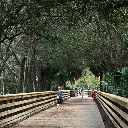
What I think is nice in this image are the arching tree branches, the light at the end of the bridge, and the lines leading back toward that space. For me, the figures in lighted space at the back add interest to the image. I think that the image has some nice complementary color pair hues, the redish brown of the walkway against the green of the trees.
I find no interest in the foreground, I would much rather be closer to the background so I could see it better. I think that cropping off the bottom half of the image resulting in a square aspect ratio with a little straightening could improve the image if the file has enough detail. I also like the cleaner look in the original much better than the added texture, just my personal taste. I also think lightening up the overall image while keeping the bright area at the back as is would help. |
Mar 6th |
 |
| 80 |
Mar 20 |
Comment |
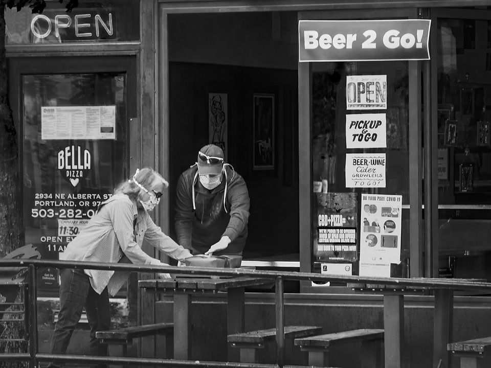
Those big bright orange gloves shut attracted my attention. Both men have nice smiles.
I like that the men are nicely framed by thee equipment and building corner, for me it contains them in the picture. Getting a good image as I think you have done in harsh sunlight is difficult, it works for me here. Normally in these conditions I would have been thinking black and white, but the bright orange of the gloves is what makes this image.
I would have liked to see a little more light in the close by man's face, perhaps if he were looking more towards the camera like the man in back we would be able to see his smile better. (Or you could brighten it some in post processing.) To me, his teeth seemed overly bright, especially against the darkness of his face, and thereby a little distracting. I also think that the men's skin tone is a little to red and could be desaturated slightly. |
Mar 6th |
| 80 |
Mar 20 |
Comment |
I don't think it ruins the spirit of street photography to make tonal adjustments or to crop. For me, the final image is a print, (either to paper ot now days a post on the internet) and from my darkroom days, tonal adjustment were always done.
If you are using photoshop, the adjustment can be done very easily, I added a brightness/contrast layer, reduced the brightness as much as possible, opend the Layer Style dialog box and set the Blend If Underlying Layer slider so that the darks were not affected (116 feathered to 160) and then masked to the general area around the feet, no selection needed. |
Mar 5th |
| 80 |
Mar 20 |
Comment |
I am amazed at the quality of chalk drawings on pavement that will only be washed away with the next rain. I think you caught the artist at good moment, studying his work and smoothing out his last stroke with his finger tips. For me, the composition comes together nicely, with interesting elements arrayed out in a circular fashion. I think that color is integral to the subject, the colors stand out nicely against the grey of the concrete.
I would like to see the artists face a little brighter, for me it is an important focal point that is now a little obscured by the its darkness. I find the white on the feet in the upper left corner a little distracting and would tone down the bright stops down a little. I think that a little overall contrast increase using a curves adjustment would show off the texture in the concrete a little more. |
Mar 5th |
| 80 |
Mar 20 |
Reply |
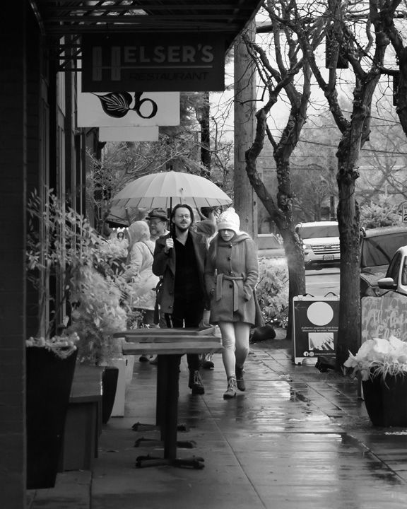
Thanks for you comments. I brightend the pants leg some and agree that it does look better that way. I also darkened the umbrella handle a little so it does not look as conspicuous, I think that helps.
|
Mar 5th |
| 80 |
Mar 20 |
Comment |
This image of man walking up an alley works well to fit the time of Urban Life. I like the way you cropped the original to eliminate extraneous detail like lettering and bright spots along the perimeter and to make the dumpsters a more promenade theme in the image. The conversion to B&W works well.
I have noticed a problem in using Topaz AI products, if the AI has not been trained to handle a detail in an image, it either blurs it out or leaves it be. In this image; it appears to me that a lot of blurring has taken place that does not work for me. It appears to me that the AI has sharpened things that do not need to be resulting in an odd mix of blur and sharpness. IF the blurring was men't to simulate fog, the sharpening counteracted that. The original image appeared to me to have halos on the man's legs that were also further exaggerated by the sharpening. I am guessing here, but it appears to me the dark then light halo on the mans shoulder, that an unsharp mask was used twice on this image. I suggest going back to the original file and reprocess without sharpening. |
Mar 5th |
| 80 |
Mar 20 |
Reply |
A 28mm lens on the D500 cropped sensor is equivalent to 42 mm full frame, which is somewhat wide angle. Wide angle lenses have a greater depth of field whereas telephoto lenses have a narrower depth of field. Also, the smaller the sensor, the greater the depth of field. These coupled with f/8 should provide a fairly broad depth of field. Also the focal point is partway through the scene, so there is shrpness in both the foreground and background. |
Mar 5th |
| 80 |
Mar 20 |
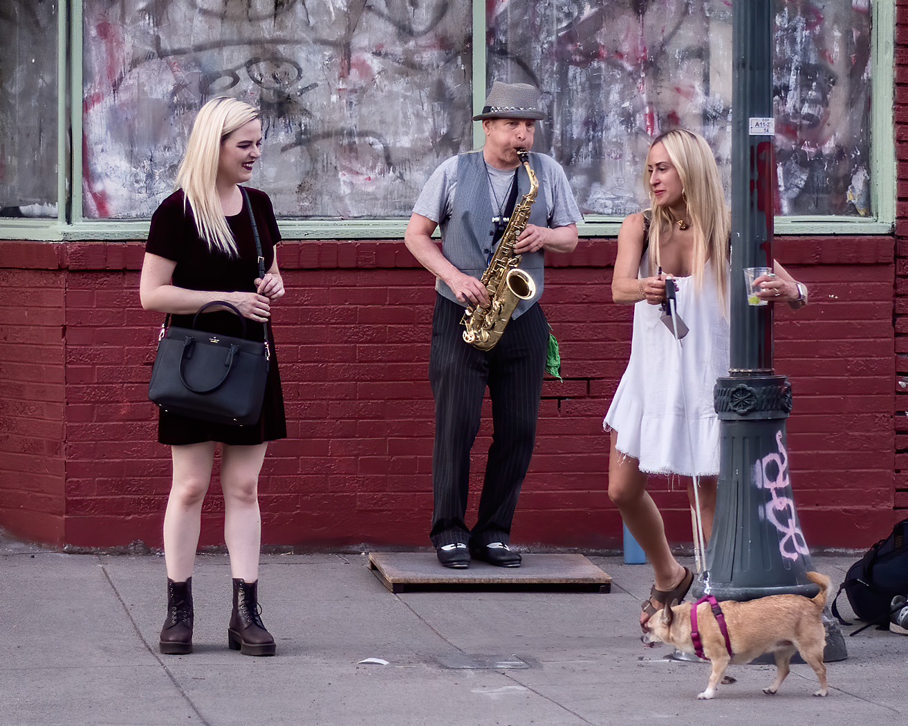
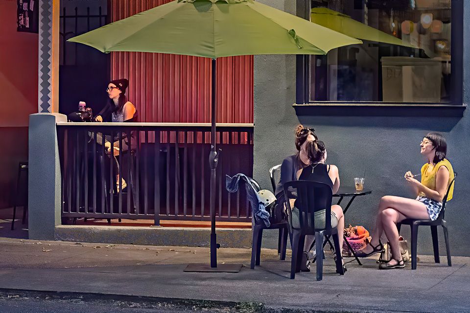
Comment |
Nice scene in the shellfish market. I like the interaction between the vendor and customer, him trying to satisfy a demanding customer on a cold day; their gestures tell the heart of the story. I like that the story is completed by the display of the various selfish available. You have captured the scene and action well.
I think that the placement of the vendor and woman works well, balanced by the display of shellfish. I think that the wide depth of field is appropriate in that the foreground shellfish is sharp as well as the vendor and customer, and that the background is not cluttered and adds context.
I would like to see a little more light in the vendors face, I think his expression is important. For me, the brightness of the buildings in the upper right is a little distracting, I would have reduced the brightness there a bit. Did you look at this in B&W? For me the color is not contributing to the story and the bright reds are a bit distracting.
|
Mar 5th |
7 comments - 3 replies for Group 80
|
7 comments - 3 replies Total
|