|
| Group |
Round |
C/R |
Comment |
Date |
Image |
| 80 |
Feb 20 |
Reply |
Thank you Beverly.
|
Feb 15th |
| 80 |
Feb 20 |
Comment |
Watching face paining can be fascinating. I admire the artists that can do it well.
I like the way the painters arm frames the woman's face. For me, the complementary colors, blue and skin-tones, work well together, creating the contrast that brings me to different parts of the picture.
For me, the simplify filter applied is a bit over done, making the skin look plasticly. I would like to have seen the original. The image posted as "Original" appears to have had a different filter applied. I assume that the blue background around the top of the image was added, it seems to me that a spot between the painter's thumb and forefinger was missed, I would fill that area in also.
|
Feb 15th |
| 80 |
Feb 20 |
Comment |
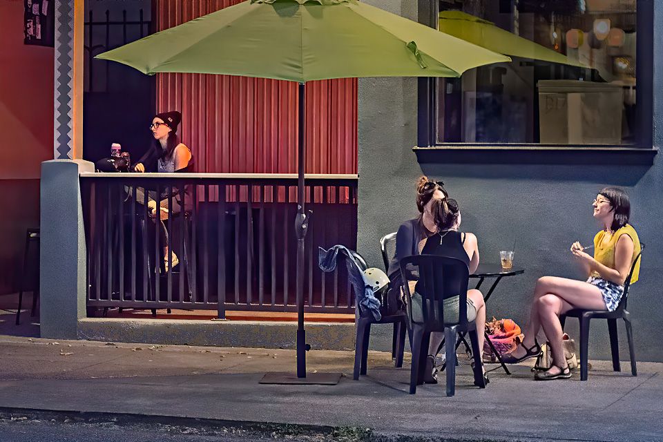
Just look at those colorful socks, and the colorful sandals. I get the feeling that the couple are dancing. The dancers stand out nicely against the gray floor. The shadow depth of field works well in removing detail from the background. I think that the image is well framed. A well seen image.
It appears to me that there are several sources of light with different temperatures, natural light on the left and in front, and incandescent light in the upper right. I would try to adjust the white balance of the upper left to match the daylight white balance in the rest of the image. I also find the upper left corner to be a bit bright, attracting my attention unnecessarily to that area, I would try darkening it there a bit. I also see what could be some sensor dirt spots In the grey floor area near the right leg and another to the upper left of the center of the image that I would clone out. |
Feb 15th |
| 80 |
Feb 20 |
Reply |
Thank you Karen. |
Feb 13th |
| 80 |
Feb 20 |
Reply |
Thank you J.
I agree with you, I should not have cut off the foot. Going back to the origional I see that it is there, I do not know why I cropped it out.
|
Feb 13th |
| 80 |
Feb 20 |
Comment |
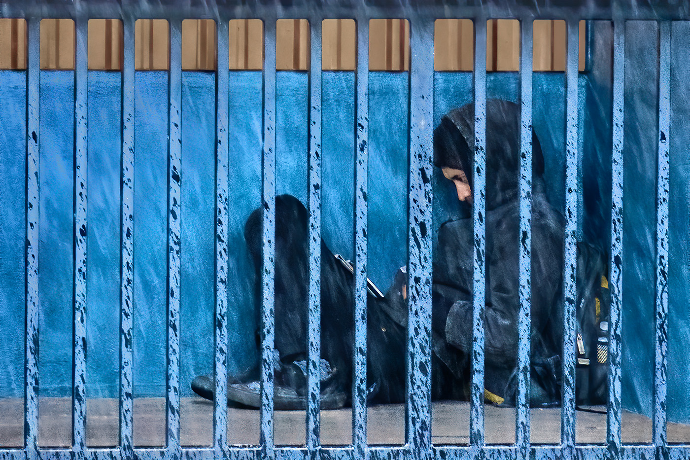
My eye is immediately drawn to the bright yellow jacket over the sleeping man. I think that the lines formed by the structure effectively leads my eye around the image, leading my eye to the sign with Steam Plant, public parking, establishing a location and explaining what the art is about, and the to the art. I find the soft lighting to be nice. The semi shallow depth of field keeps my attention towards the from the the image. I like the continuity of the yellow color throughout the image. Overall I think the image is well done.
I think if you crop off the right side of the image, the crack down the wall becomes a visual stopper, containing my eye in the image, leading it back down to the man. The space to the right of the crack just pulls my eye out of the image. If the art is one of the main themes of the image, I would like to see it presented a little brighter and a little more in focus. It seems that there is a bit of digital noise in the art, using some noise reduction in post processing may help it look better with a little bit of sharpening.
If I were to convert this to B&W, I would brighten the yellow colors in the conversion to bring up the brightness of the yellow jacket and make the art stand out more. |
Feb 13th |
| 80 |
Feb 20 |
Comment |
Abandoned or locked cycles for me generate a sense of mystery as who the riders are and where they go. This double seated bicycle is set up for a larger driver and a short companion, possibly a child. I suspect that it has not been here very long or the wheels would be gone.
I think the circular composition, Pike to utility pole, to one way sign, down the guy-wire bar to back works well. I think that utility boxes add to the feeling of the location and help balance the image. The added soft pastel pinkish color gives me the feel of southern Florida as a place, while the texture on the walls and the graffiti tagging give me a feeling of grittiness and makes me wonder why this bible is here.
I do not get a feeling of rebellion from this image. This is just a practical spot to temporarily lock up a bicycle.
The bottom and top of the image feel tight to me, the front tire is cropped off, and the one way sigh is also tight to the top. Perhaps backing away to give these elements a little more space would make a better image. Presenting it in a 3:4 aspect ration then would allow you to crop out the drainpipe on the left that I find a little bright and distracting. I find the center of the image a little bright, drawing my attention there and away from the rest of the scene. The addition of the pink tone to the B&W image landed on places where I would not expect it to be, like the grey utility pole shield of utility boxes on the wall: consider a little masking to keep it where it is most effective. |
Feb 13th |
| 80 |
Feb 20 |
Comment |
I see a woman looking at framed art, possibly a window into her past, reflecting on memories of where she lived or traveled to, or on being young and slim. I like the repetition of the women looking through frames, the woman in the center looking through the frame of the picture of the woman by the bed and the woman by the bed looking through the window frame towards the other picture of a woman looking out a window. I think that he woman in the second picture looking somewhat in the direction of the seated woman brings my eye back to her, competing a triangle, creating a circular viewing motion. All are looking outwards reflecting on something. I like the spaciousness of the setting, it adds to the contemplative mood of the image. I notice that the white balance correction has made the room slightly bluish, which I think goes well with the blue tones in the paintings.
I noticed some dark hating around the woman's hair and the photograph behind her that was not in the original, possibly introduced from darkening the highlights in her hair and picture matting. There is nothing else I would suggest changing in this image. |
Feb 11th |
| 80 |
Feb 20 |
Comment |
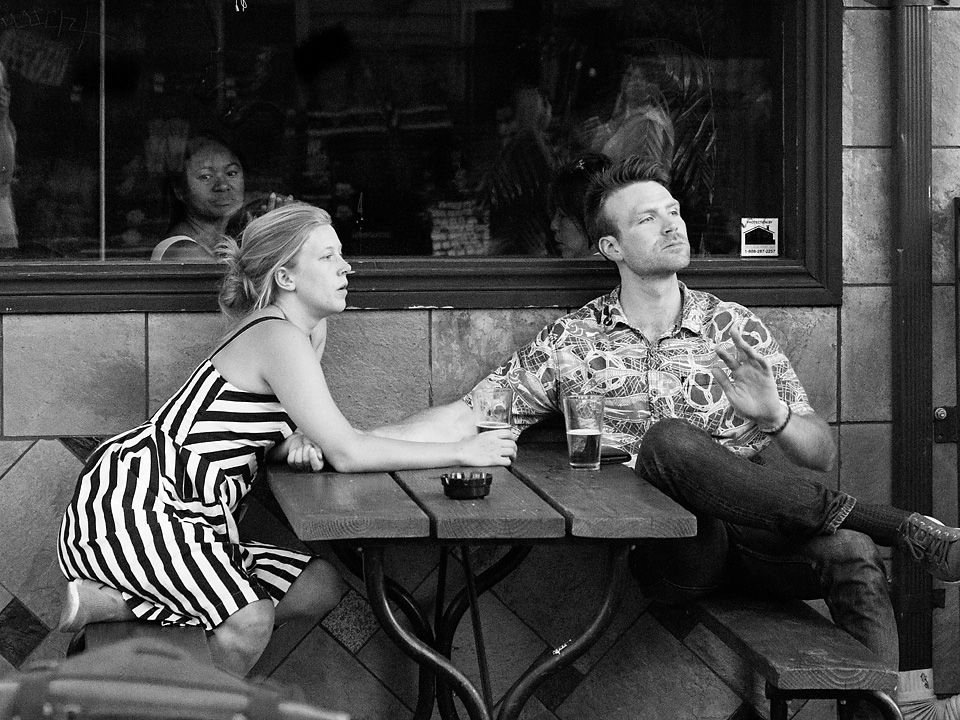
In this image of people boarding a subway train I am attracted to the figure with the black hat and glasses. For me, he alone stands out, being separated from the rest of the crowd and the contrast to the bright background. I think the slow shutter speed adds some movement to the image. How is that man rushing to the train going to fit in?
For me, I find the image a little under exposed, I would like to see the darker mid tones brightened some (curves adjustment) so I could see a little more detail in the central figure's face. (I understand that the amount of adjustment one prefers is subject to the monitor brightness, but I tend to think of what the images would look like in print, so I keep my monitor brightness down. The histogram confirms that the image exposure could be increased without blowing out the highlights.). I would also think about darkening the bright areas near the edge of the frame, especially the upper corners, to keep the viewer from checking out those areas using a local adjustment brush in Lightroom.
|
Feb 11th |
| 80 |
Feb 20 |
Reply |
Thank you Bill. My partial reflection is in the image, it is at the far left; you can see my arm and hand holding my camera up to my face. |
Feb 11th |
6 comments - 4 replies for Group 80
|
6 comments - 4 replies Total
|