|
| Group |
Round |
C/R |
Comment |
Date |
Image |
| 91 |
Mar 20 |
Reply |
Thanks for the feedback. I looked at the image upside down. While it is difficult to "unsee" the three items mentioned in the feedback, they are valid and the image can be enhanced by their removal or reduction. The tree and branches either pull my view away from the car and when inverted aids in drawing my view in toward the car. The shadow seems to stand out more as if to "point the way" The area of the man seems less obvious when inverted. Again, thanks for all the feedback. |
Mar 16th |
| 91 |
Mar 20 |
Reply |
I do not think it picky but a very valid comment. |
Mar 12th |
| 91 |
Mar 20 |
Reply |
ARRRRG! This image as shown here and in monochrome has been seen by probably by over a hundred persons and the countless times I have viewed and worked on it and you are the first to mention the tree. GREAT CATCH. I never notice it before now.
Now every time I look at it and the guy Judy mentioned I am going to see these background items. Once again the lesson of
looking at what is around the subject before I press the shutter button. Thanks for feedback |
Mar 12th |
| 91 |
Mar 20 |
Comment |
I concur with Judy and Lisa's feedback and edits. In my view
the flipping of the image, which I wondered about for a while,
helped to keep my attention in the image. I go to the white background area in forest and move to the right (like reading) and then my attention goes back to the white area to stay in the image. This is most noticeable in Lisa's work. |
Mar 12th |
| 91 |
Mar 20 |
Comment |
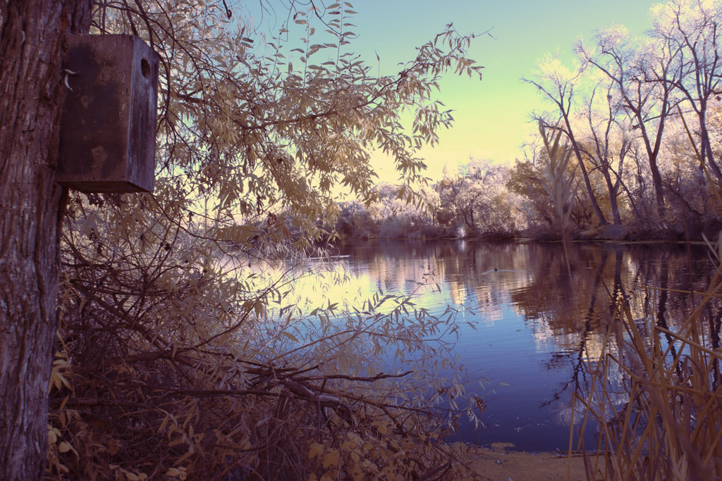
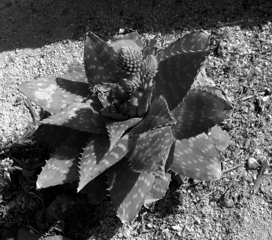
In the resolution presented, there appears to be a person in the lower right but when viewed in PS, I can see it is just the foliage. There is little in the image to gain and hold my attention except perhaps the sense of a pending storm by the clouds and wind on the palm fronds. Depth of field works as all fields seem to be in focus and no overly black or white areas.
|
Mar 12th |
| 91 |
Mar 20 |
Comment |
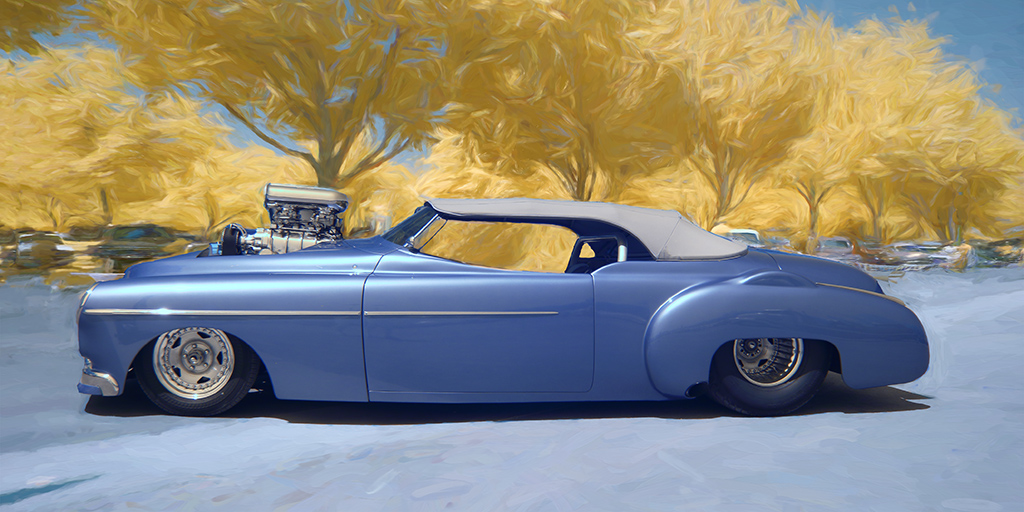
With your love of old cars, I think you have found a treasure trove of restoration projects. I counted at least six in the image. Your edits to the original are subtle and effective. I have thought about the perspective of getting lower and less tilt of the subject just as a "what if" without the loss of the aging signs on the hood which are critical to the image. |
Mar 11th |
| 91 |
Mar 20 |
Reply |
Thanks for the feedback AND additional edits or fiddling you did. A good "catch" on doing the window as well since I would imagine it would stick out like a beacon in the night. I will have to apply them to my original. Thanks again. |
Mar 11th |
3 comments - 4 replies for Group 91
|
3 comments - 4 replies Total
|