|
| Group |
Round |
C/R |
Comment |
Date |
Image |
| 87 |
Jul 25 |
Reply |
Thank you. Your suggestion is well taken, and I may give it a try before I print it. |
Jul 8th |
| 87 |
Jul 25 |
Comment |
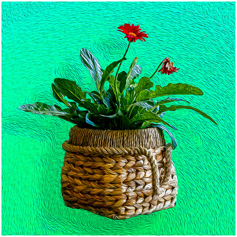
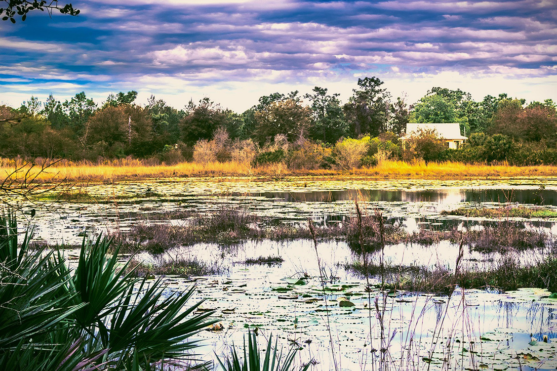
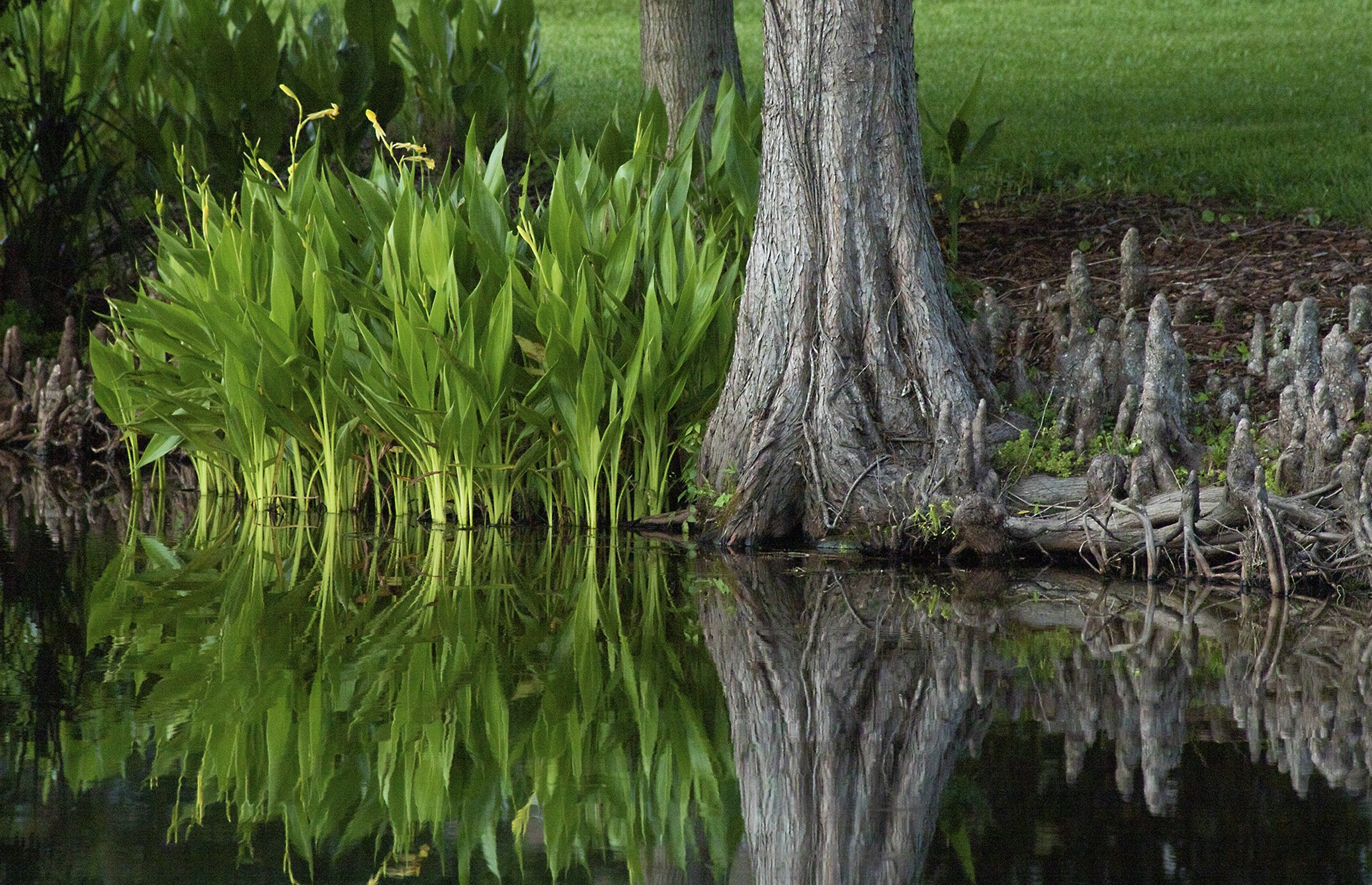
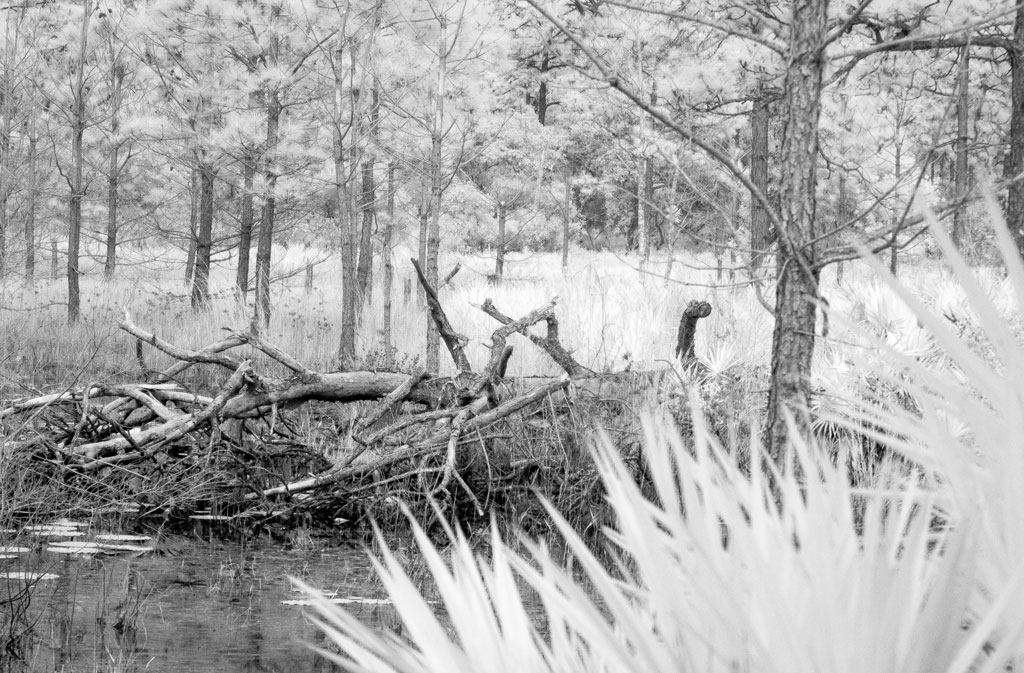
Somehow, I neglected to submit my earlier comments on this very nice image. So, I will try again. I am really taken with the impressionistic feel of the image. You present us with an image with a very restricted color palette. Mostly green with just a touch of violet. By giving a close look at the image, I can see the flooded area which leads toward the clearly seen tree at the upper left. I feel it is that tree that gives the image the needed structure.
Good work. |
Jul 6th |
| 87 |
Jul 25 |
Reply |
Dale, thank you for your comment and interest. The process I used does not rely on a filter. My original image is taken into Ps as a base layer. A blank clear layer is placed above it. I then select one of the impressionistic brushes, all of which are set to pick up the colors of the target image. By varying the size of the brush, I determine how much the color will be spread. In areas where you want more detail, I used a smaller brush. For areas where I wanted less detail, I used a larger brush. This takes time but can be a lot of fun. |
Jul 6th |
| 87 |
Jul 25 |
Reply |
Steve, no, this is not a "one click" AI filter. But the target image is the source of the color and basic structure of the resulting image. See my response to Dale above. |
Jul 6th |
| 87 |
Jul 25 |
Reply |
Thank you for commenting on this image. I first saw this process demonstrated by Jessica Johnson (see my response to Chun above) in the Photoshop Creative Virtual Summit 25 earlier this year. I also received the brushes from the Summit. The process is somewhat similar to a process I used years ago in an early edition of the program Painter. This was fun but requires a good bit of time. It is not a "one click" filter. |
Jul 5th |
| 87 |
Jul 25 |
Comment |
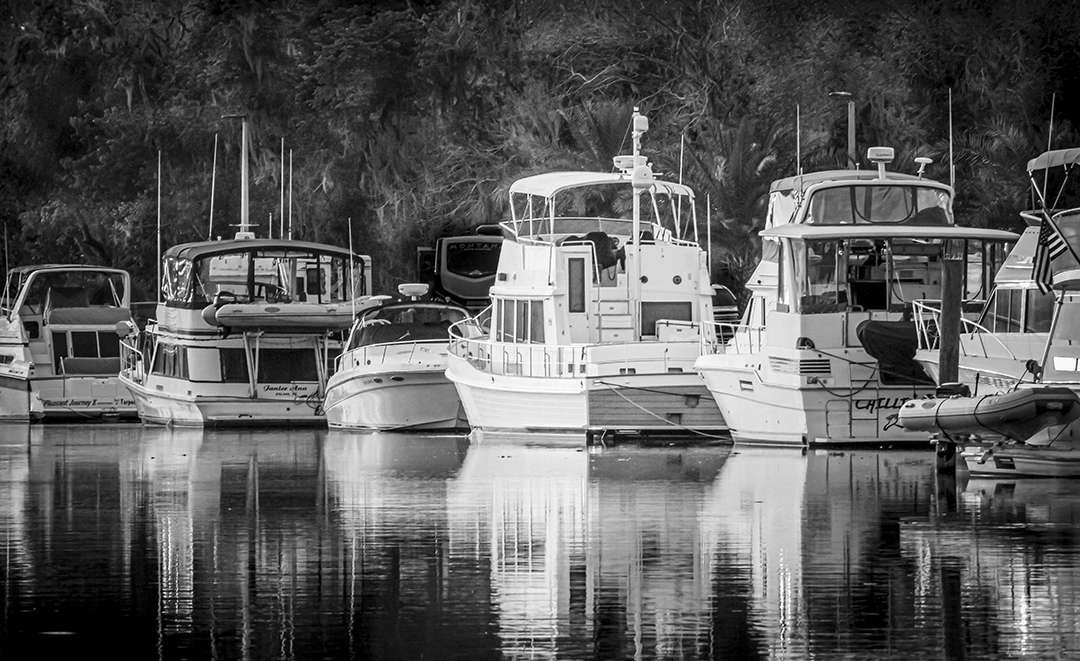
You have presented us with what I feel is a dark tone image with a very interesting story. I see very dark blacks and grays. I appreciate your willingness to experiment with this process.
At first, my eyes seemed to get trapped by the confusing dark lines at the top. My eyes finally moved down and followed the diagonal lines of the wake left by the movement of the ducks. Even when my eyes moved to the ducks, I saw only the jet-black mother duck. Finally, I saw the lone baby trying to catch up.
This image reminds me of a wood cut print. Very creative. |
Jul 5th |
| 87 |
Jul 25 |
Comment |
Your hummingbird images are, in my opinion, continuing to improve. You have done a nice job of recording the bird and feeder in sharp focus, while blurring the background. Well done. However, when I view the image, I know that the bird is there, but my eyes are first drawn to feeder and the red base. For me, the feeder overwhelms the image. Also, the background, while nicely blurred, seems overly bright to me.
I fear that the small hummingbird, so wonderfully recorded by your fast shutter speed, has a hard time competing. |
Jul 5th |
| 87 |
Jul 25 |
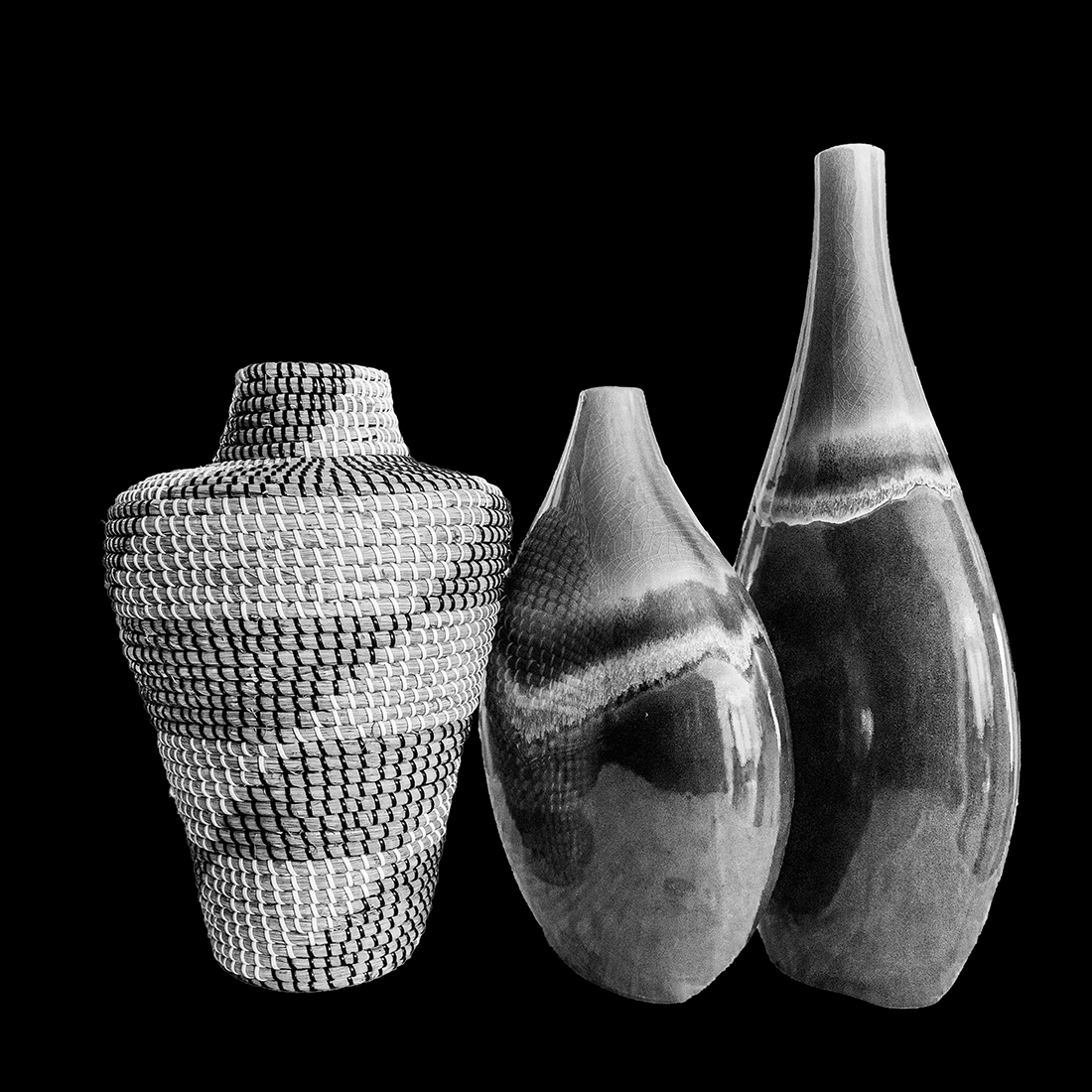
Comment |
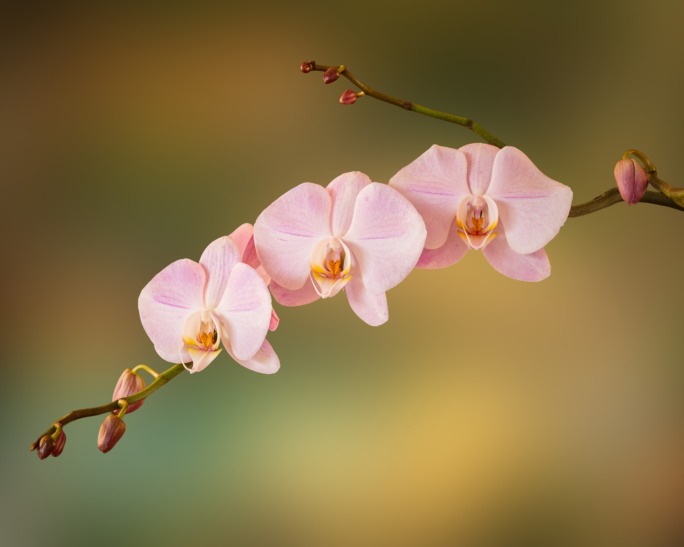
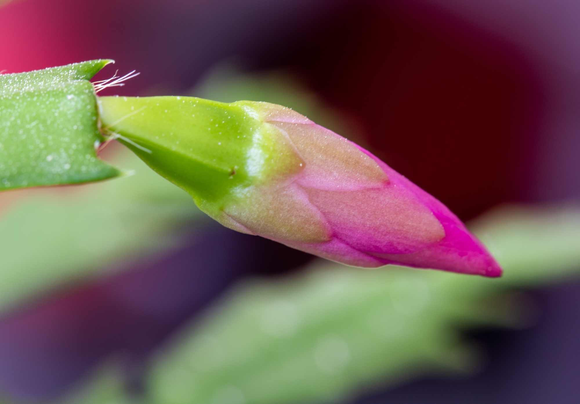
I really appreciate this image as a work of art. Without your explanation, I would have had a difficult time knowing what it is. I find that the curved, downward sweeping lines that meet on the lower center of the image, along with the narrow brightness of the interior of the flower, draw my eyes deep into the image. Well done. |
Jul 5th |
| 87 |
Jul 25 |
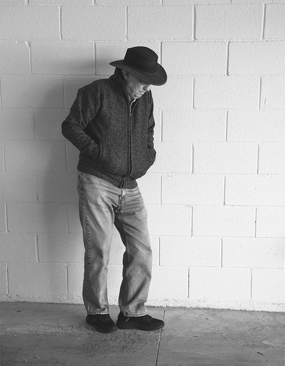
Comment |
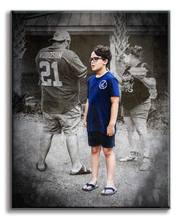
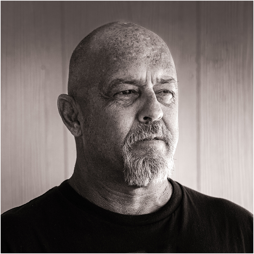
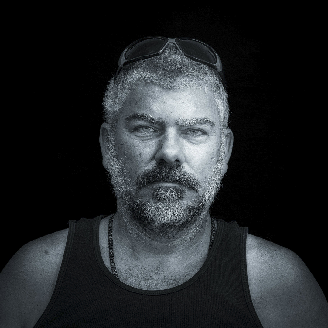
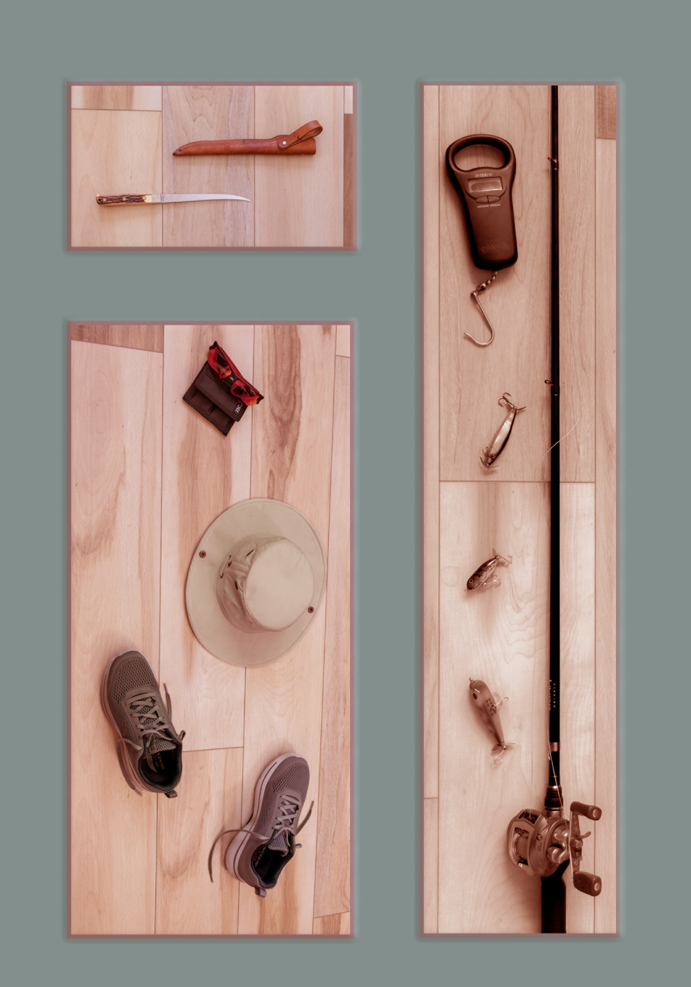
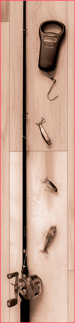
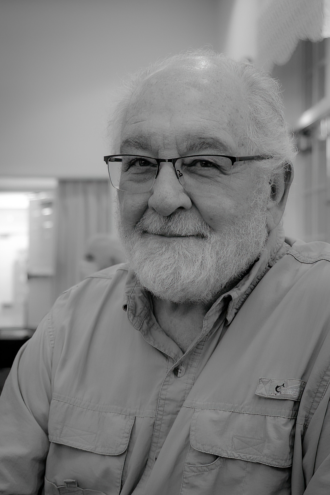
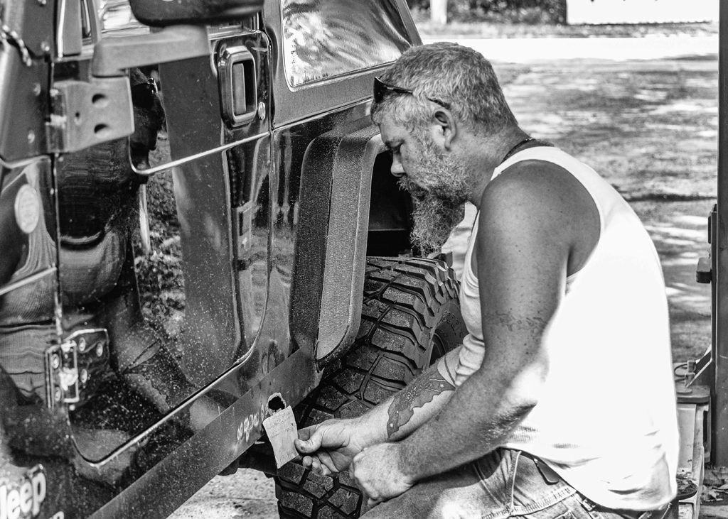
I am really taken by this image. It seems to be not a portrait, but an environmental image. You have shown us the subject in his environment. I like the placement of the man and the glass he is working. I feel the total image would be weaker if cropped closer. Perhaps a little more light could be added to the man's face. |
Jul 5th |
| 87 |
Jul 25 |
Comment |
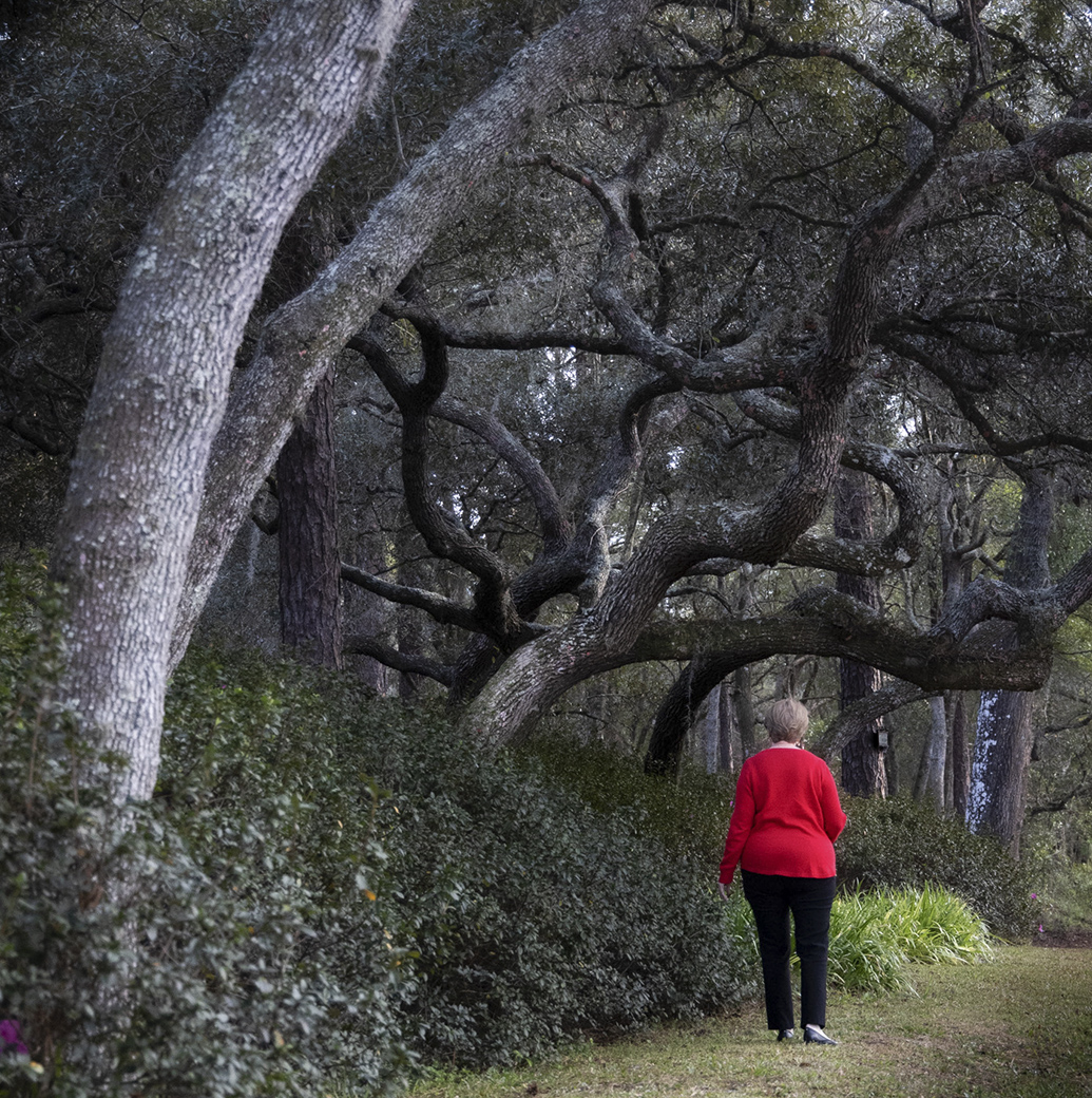
This is another nice image from you. I like the mood set here by the lone shepherd in this vast field. Normally, I would prefer not to see the horizon so near the center of the image, but it does not bother me in this image. The lone tree on the horizon gives the image a nice balance.
The work that Steven did is, in my opinion, what is needed. |
Jul 5th |
| 87 |
Jul 25 |
Reply |
The set of brushes came from Jessica Johnson https://creatorscouture.com/
Thank you for your comment. |
Jul 1st |
| 87 |
Jul 25 |
Reply |
You are so right. Thank you. |
Jul 1st |
6 comments - 6 replies for Group 87
|
6 comments - 6 replies Total
|