|
| Group |
Round |
C/R |
Comment |
Date |
Image |
| 87 |
Mar 25 |
Reply |
Thanks for your reply. What I am calling a spotlight can be done in Lightroom, Photoshop, or other post processing software. In Lr. go to masking and add a new mask. Choose Radial Gradient and place a small circle on the mask where you want the spotlight to be. Go to exposure and slightly increase the exposure in the circle. You can adjust the hue of the light as desired. It is most effective if the exposure is not so much as to be obvious. If you then click the mask off and on you will see the difference. |
Mar 9th |
| 87 |
Mar 25 |
Reply |
Thanks for the good catch. I will go back and do a little more work. For me, it is more about how I want my art to be presented, and not about a literal historical record of the image. I wish to be an artist (still working on it) and not an historian. Keep pushing me. I value your critiques. |
Mar 8th |
| 87 |
Mar 25 |
Reply |
If you would like to learn more about my approach to color, send me an email at: cjgarrett5337@gmail.com and I will send you a link. Look for the "Color Course, The Lectures." |
Mar 8th |
| 87 |
Mar 25 |
Reply |
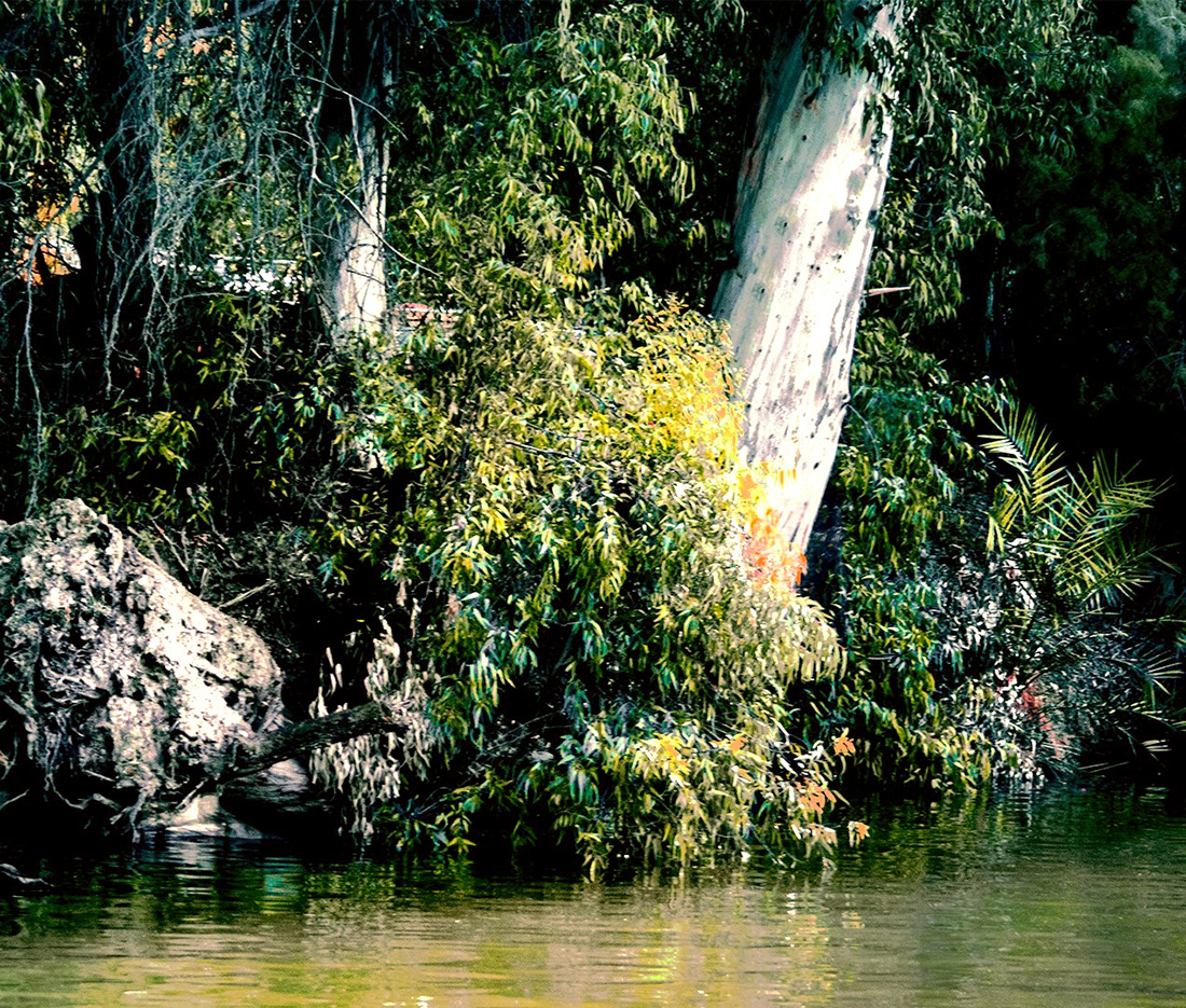
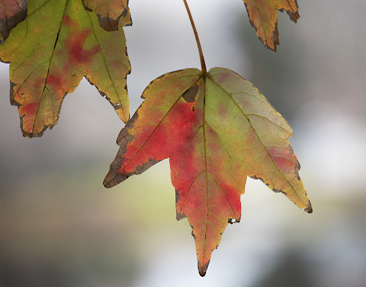
Thanks for your comments about my image. I highly value the incites expressed in this group of very good photographers.
Yes, the color in the original MAY be closer to "natural" in appearance. But if I have learned anything in my study of color, it is that the camera cannot record all of the color tones that our eyes see. Therefore, I don't worry so much about reality. I try to learn to use color as a painter would in his, or her artwork.
Don't be afraid of color. |
Mar 7th |
| 87 |
Mar 25 |
Comment |
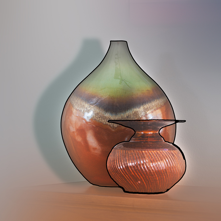
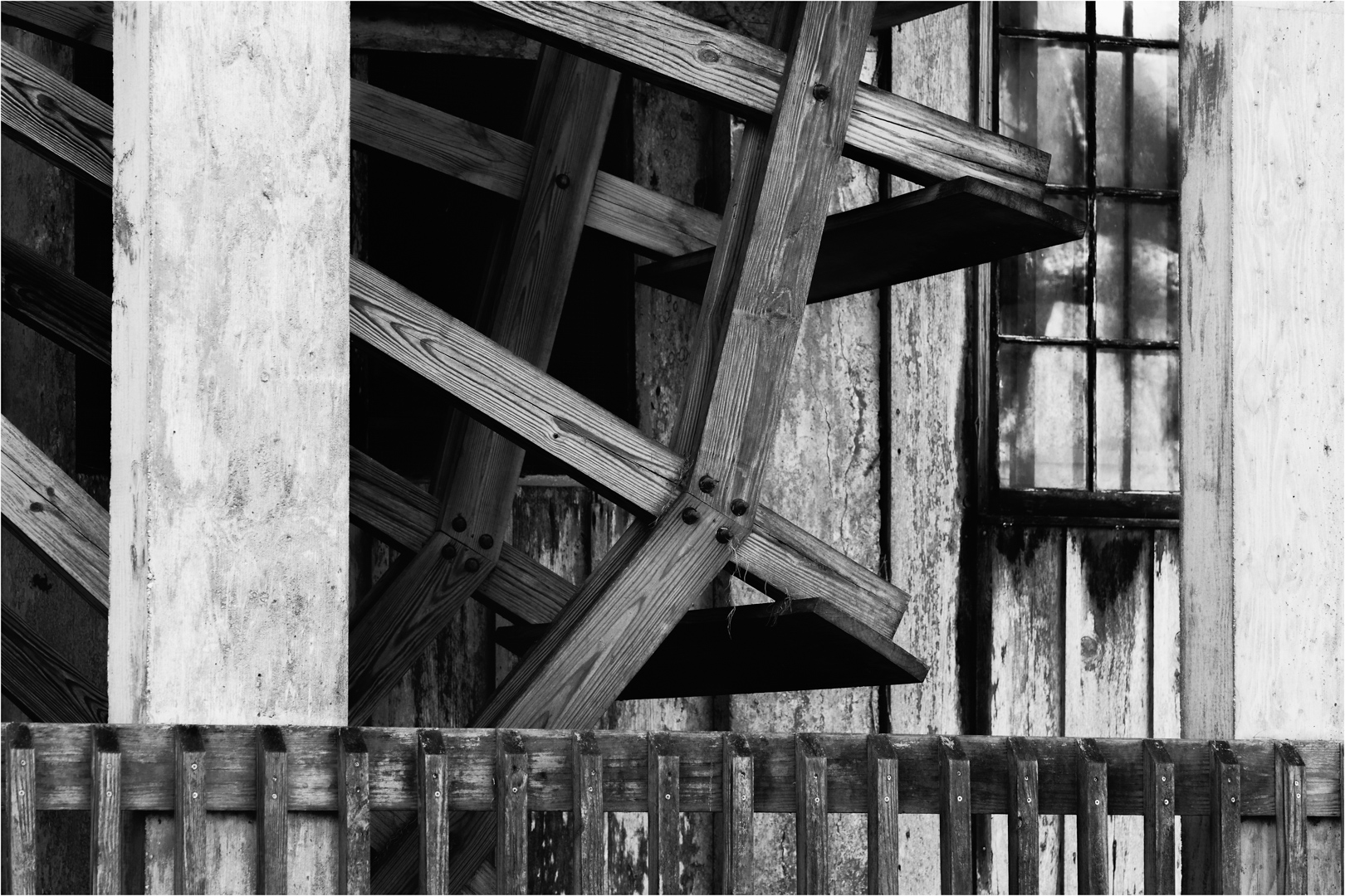
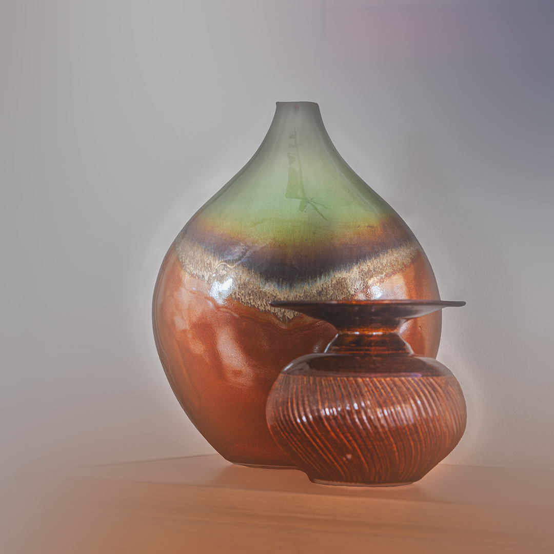
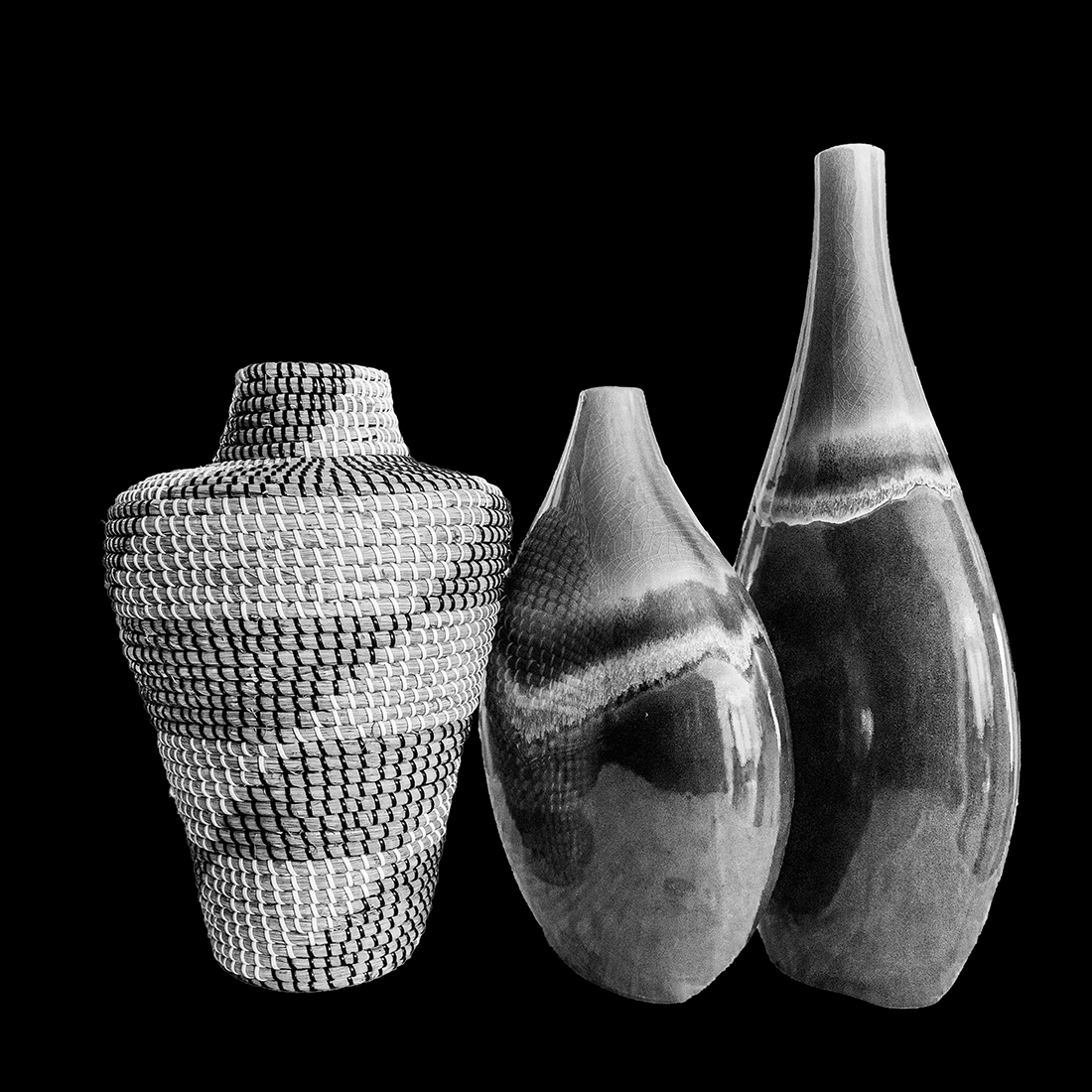
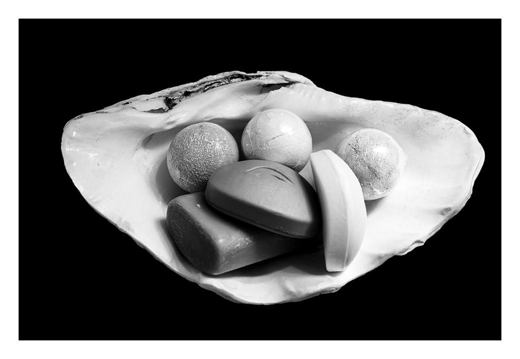
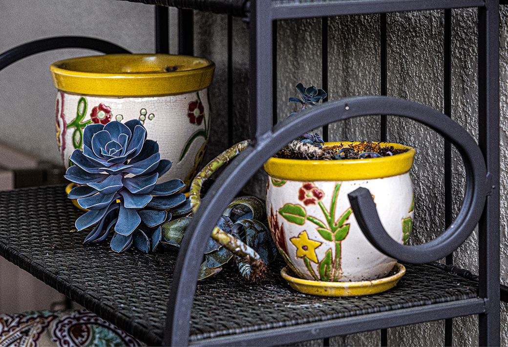
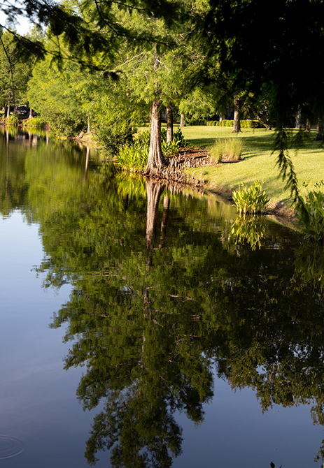
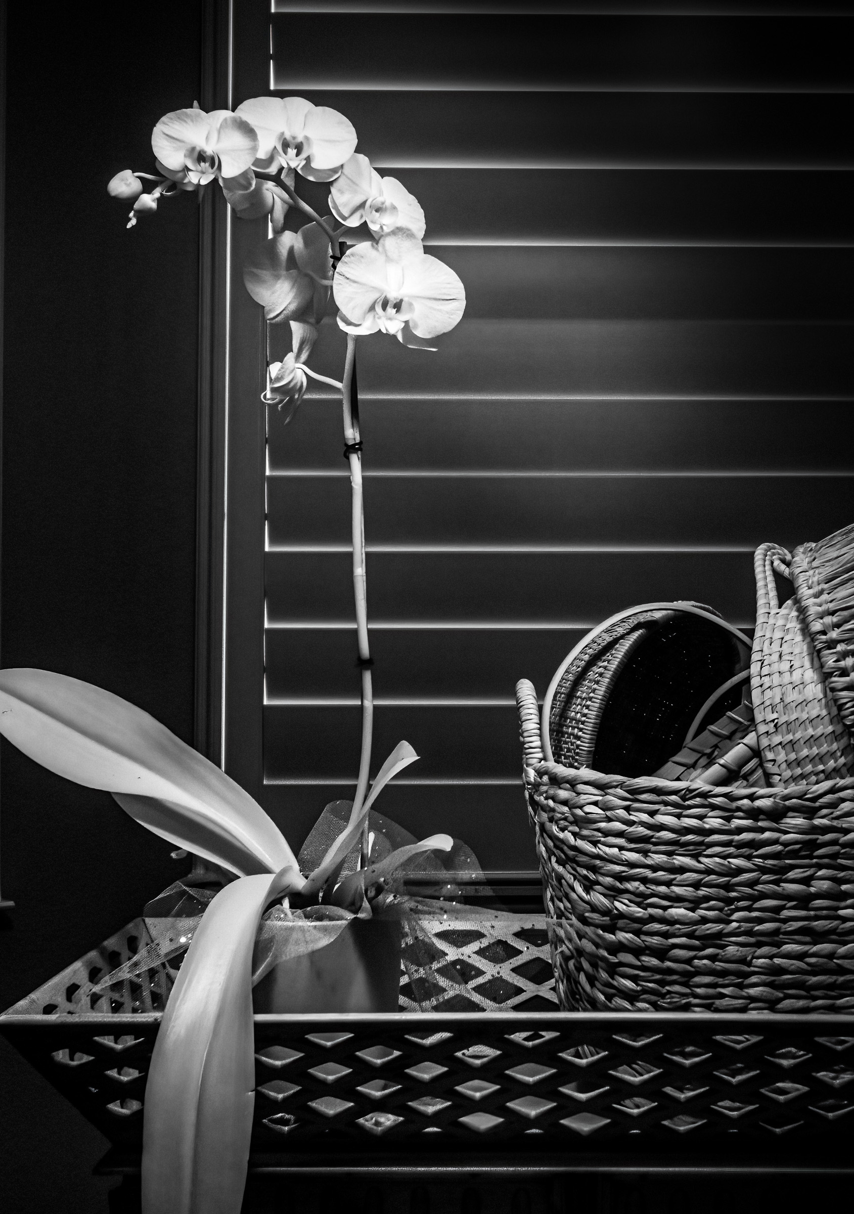
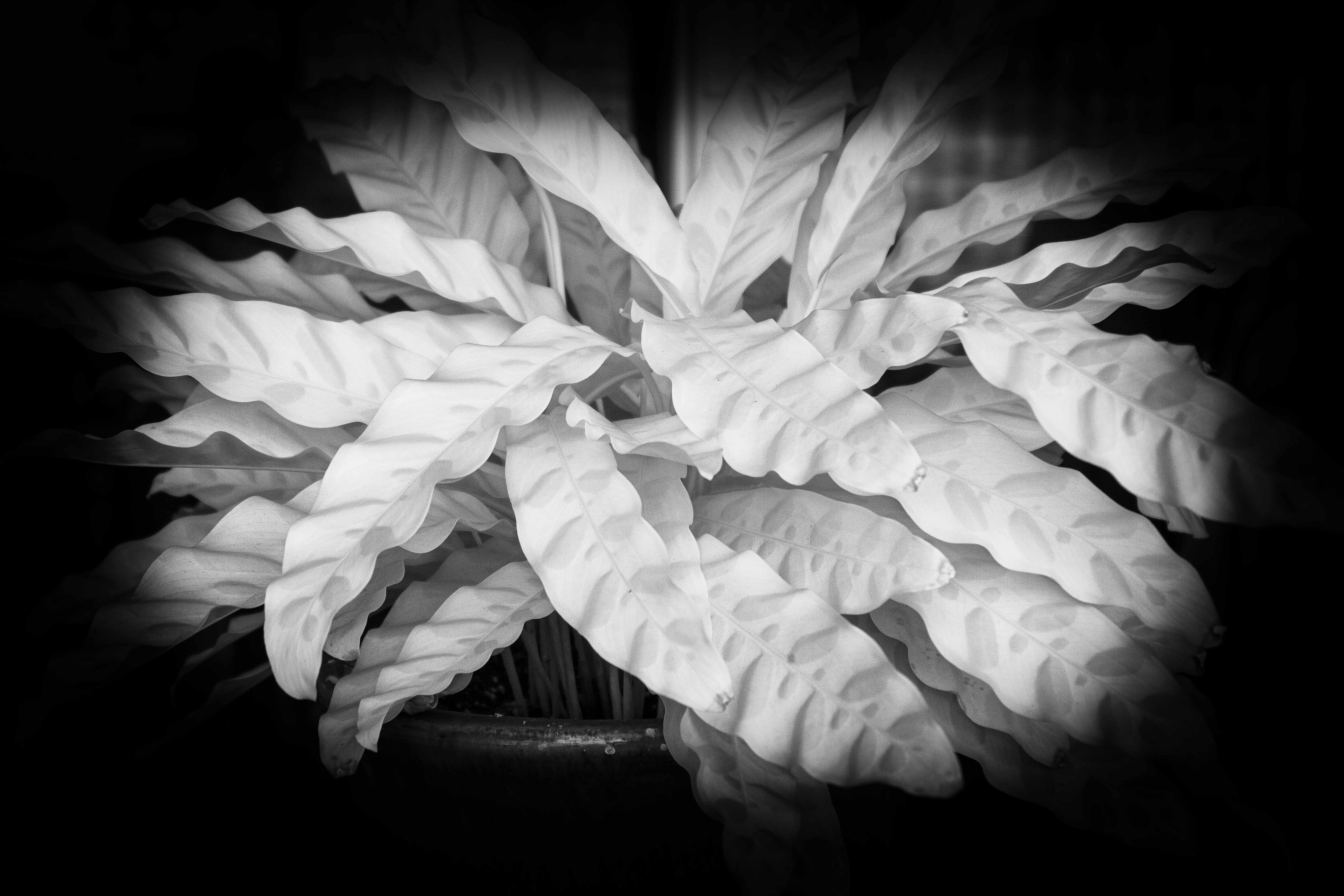
I like this high key, B&W image that you have created from the image recorded by your camera. I wish you had sent a copy of the original for comparison.
I enjoy the repetition of so many varied lines. I see curved lines, diagonal lines, horizontal and vertical lines. All of this creates for me an interesting image.
Thank you. |
Mar 7th |
| 87 |
Mar 25 |
Comment |
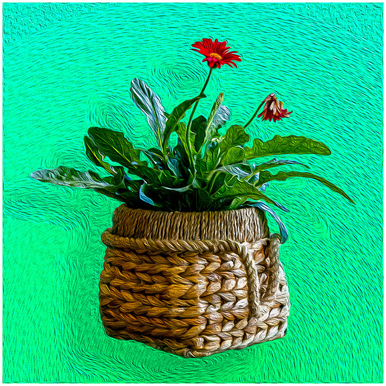
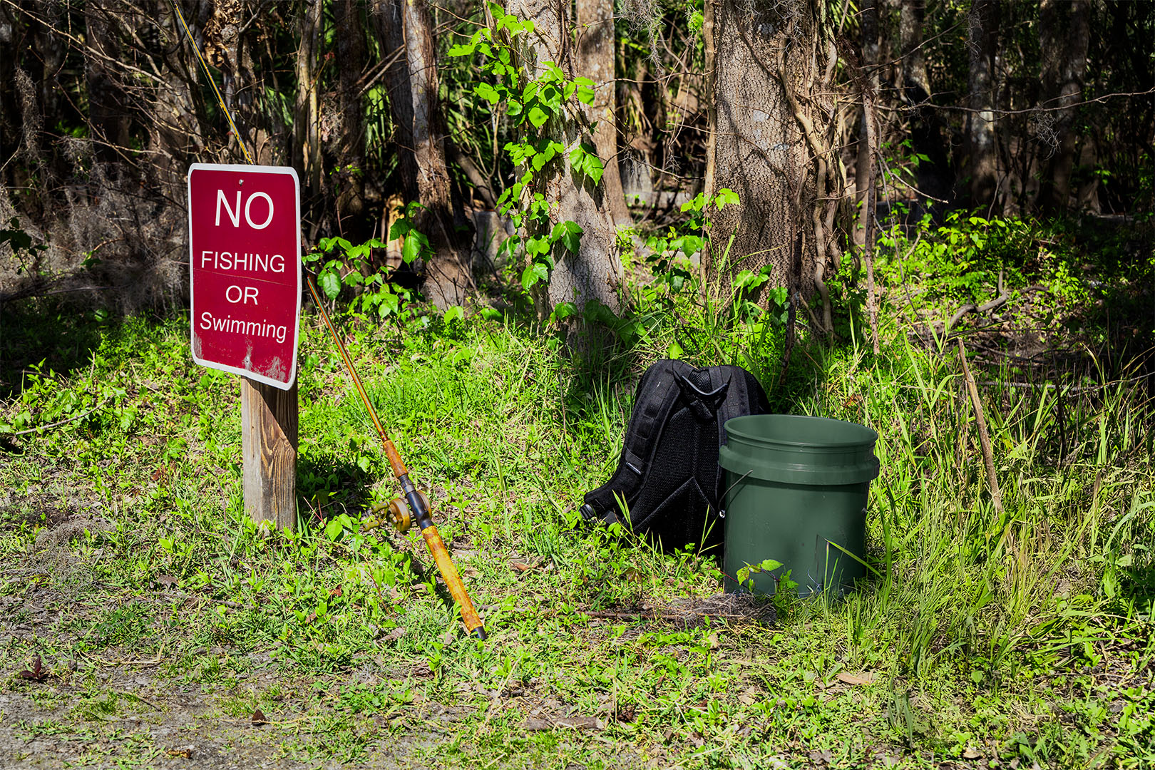
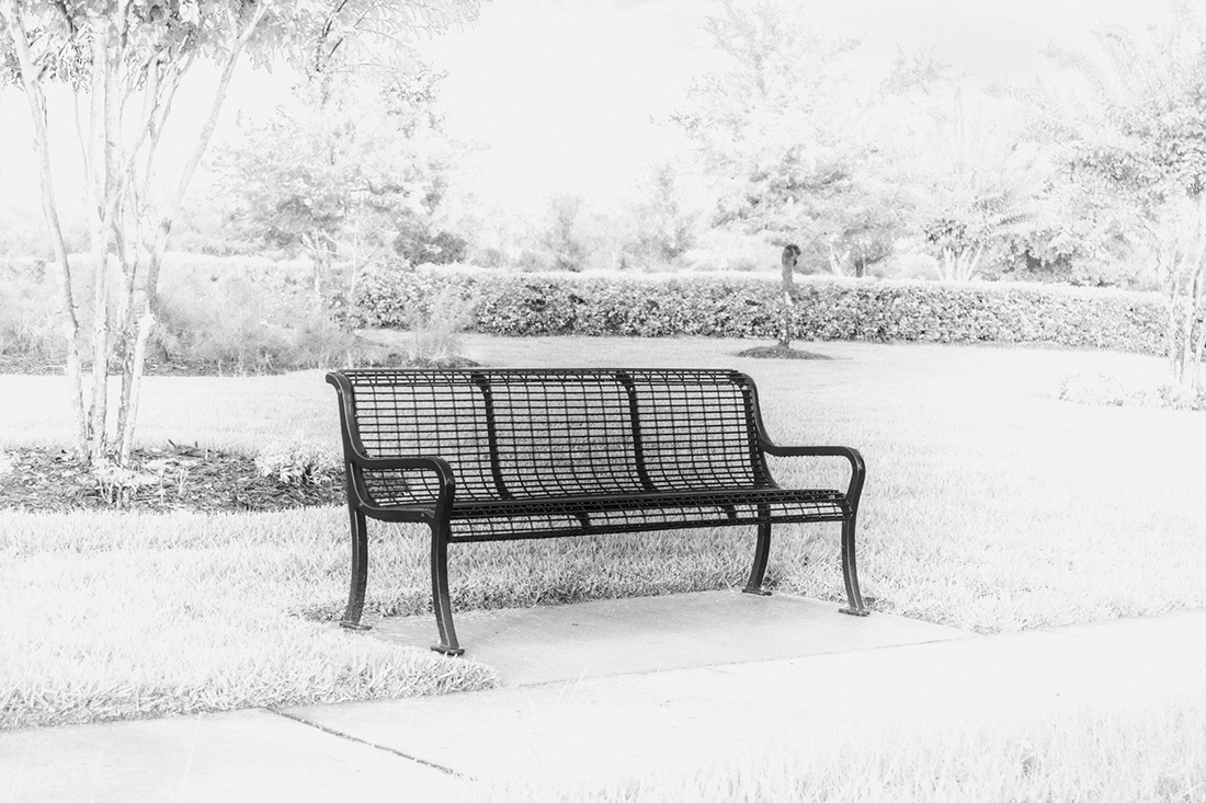
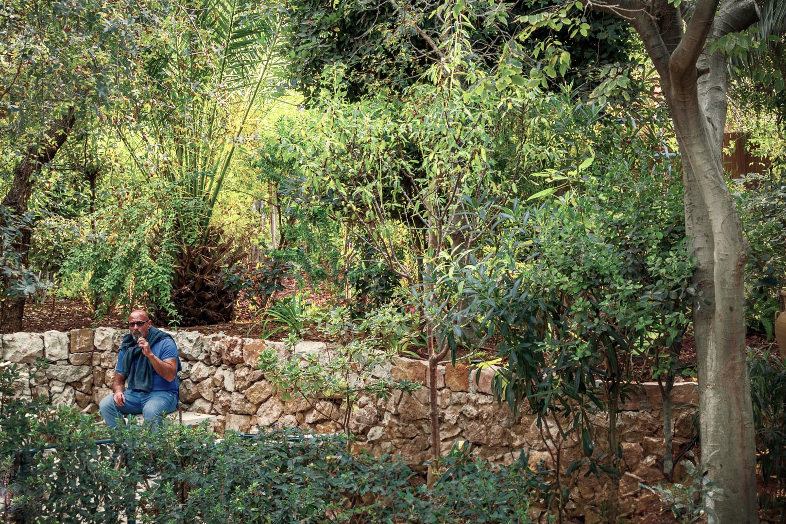
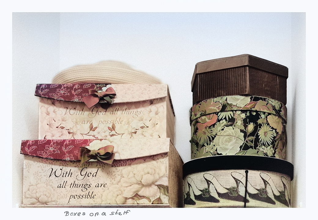
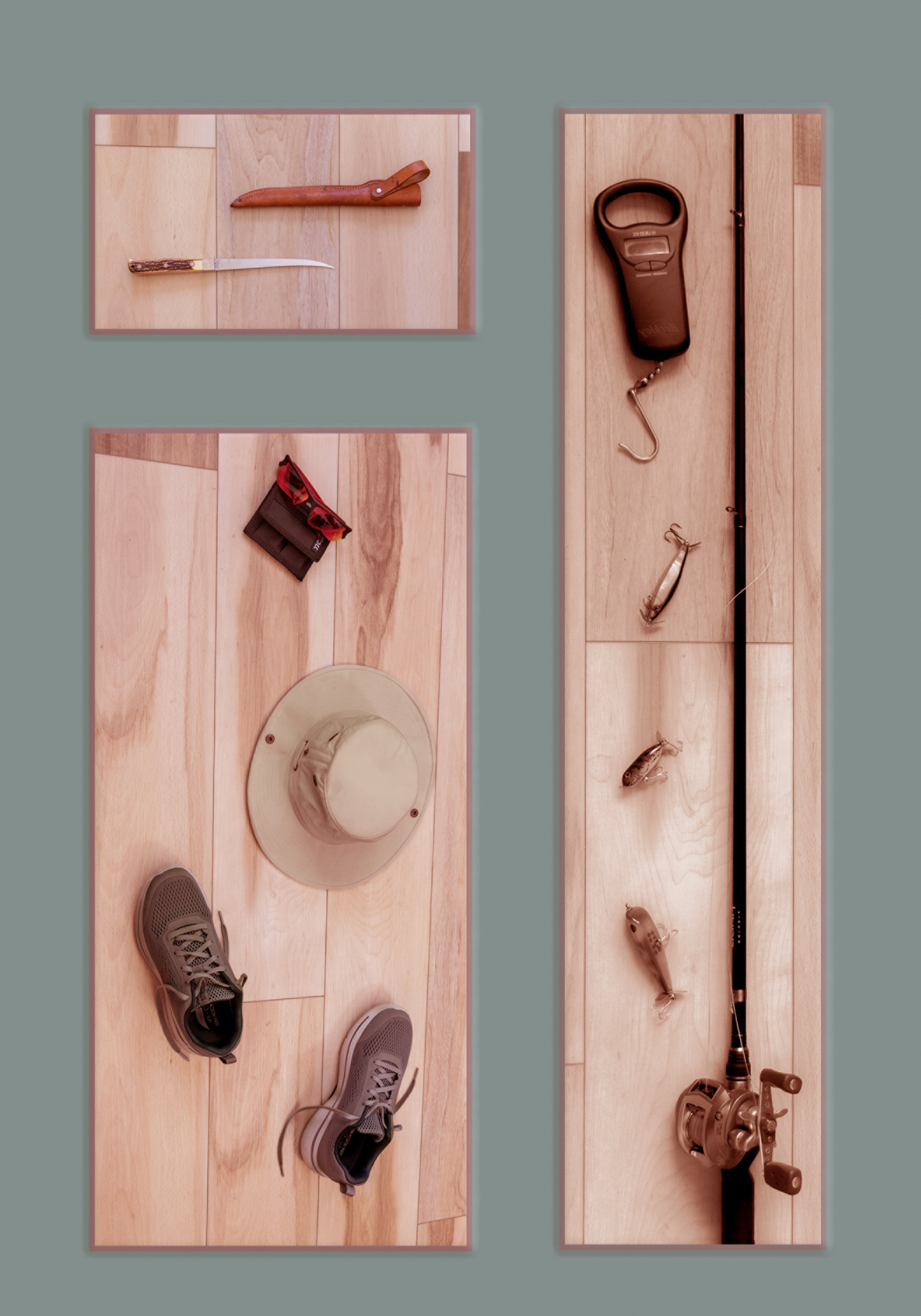
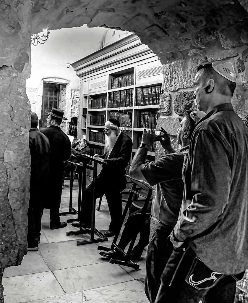
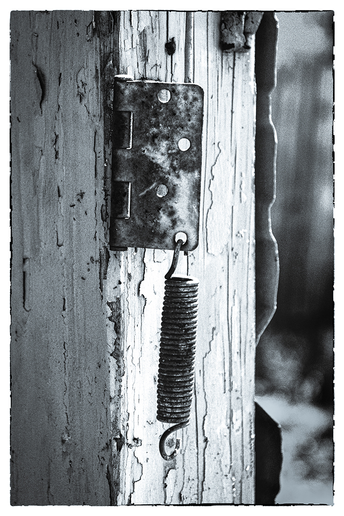
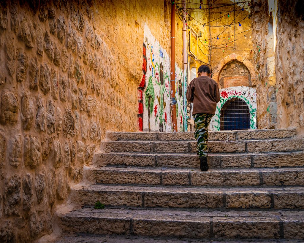
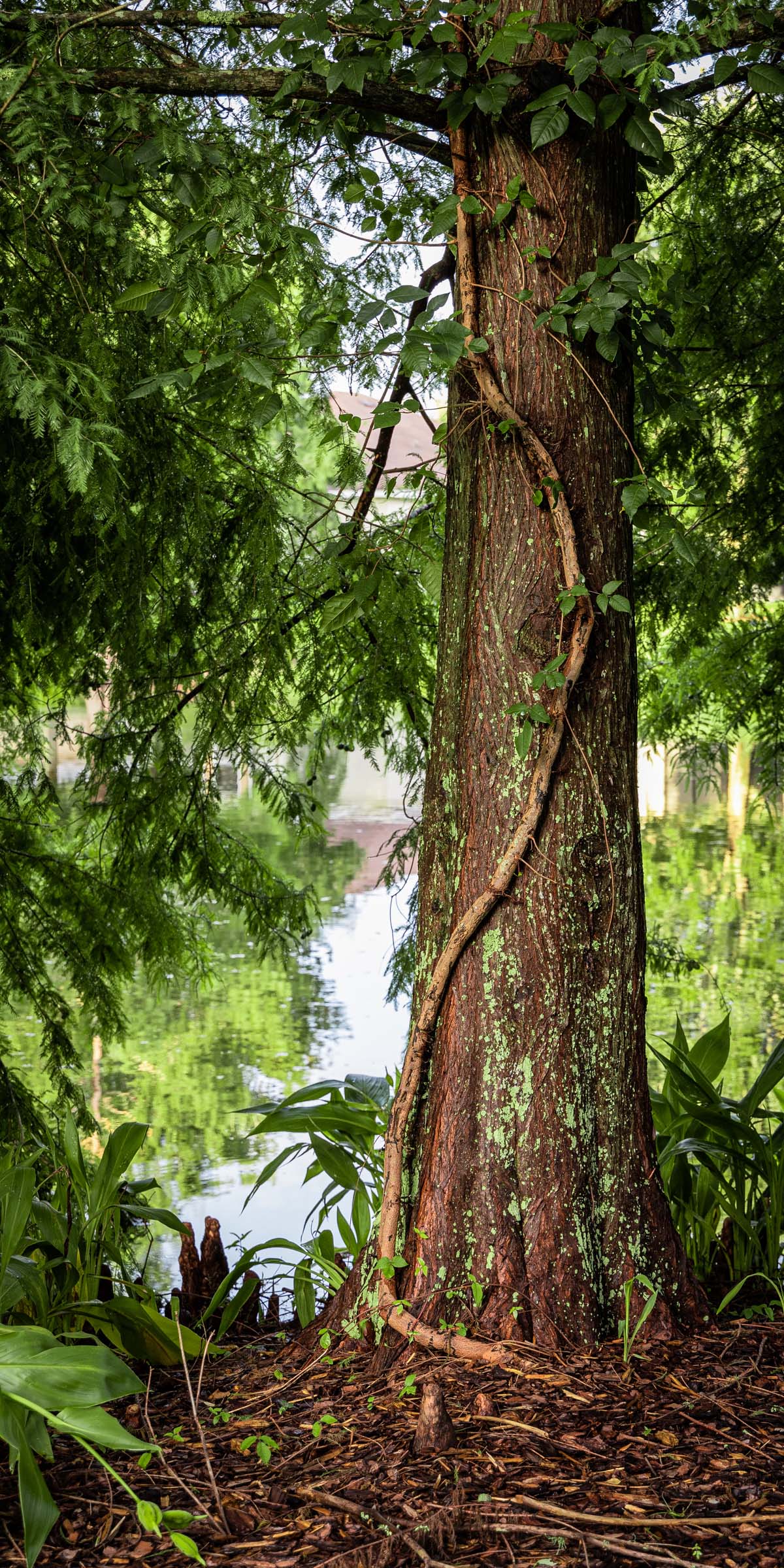
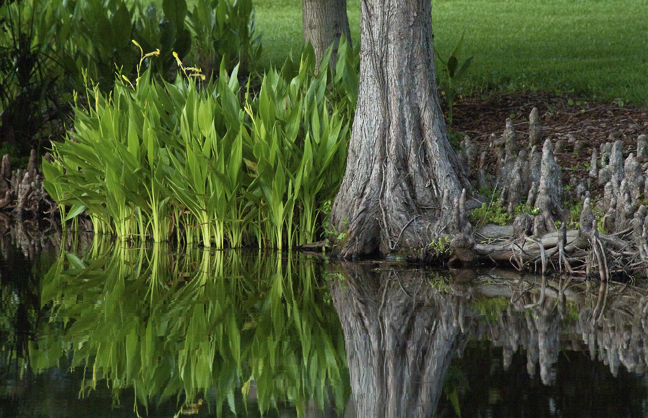
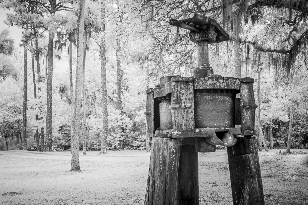
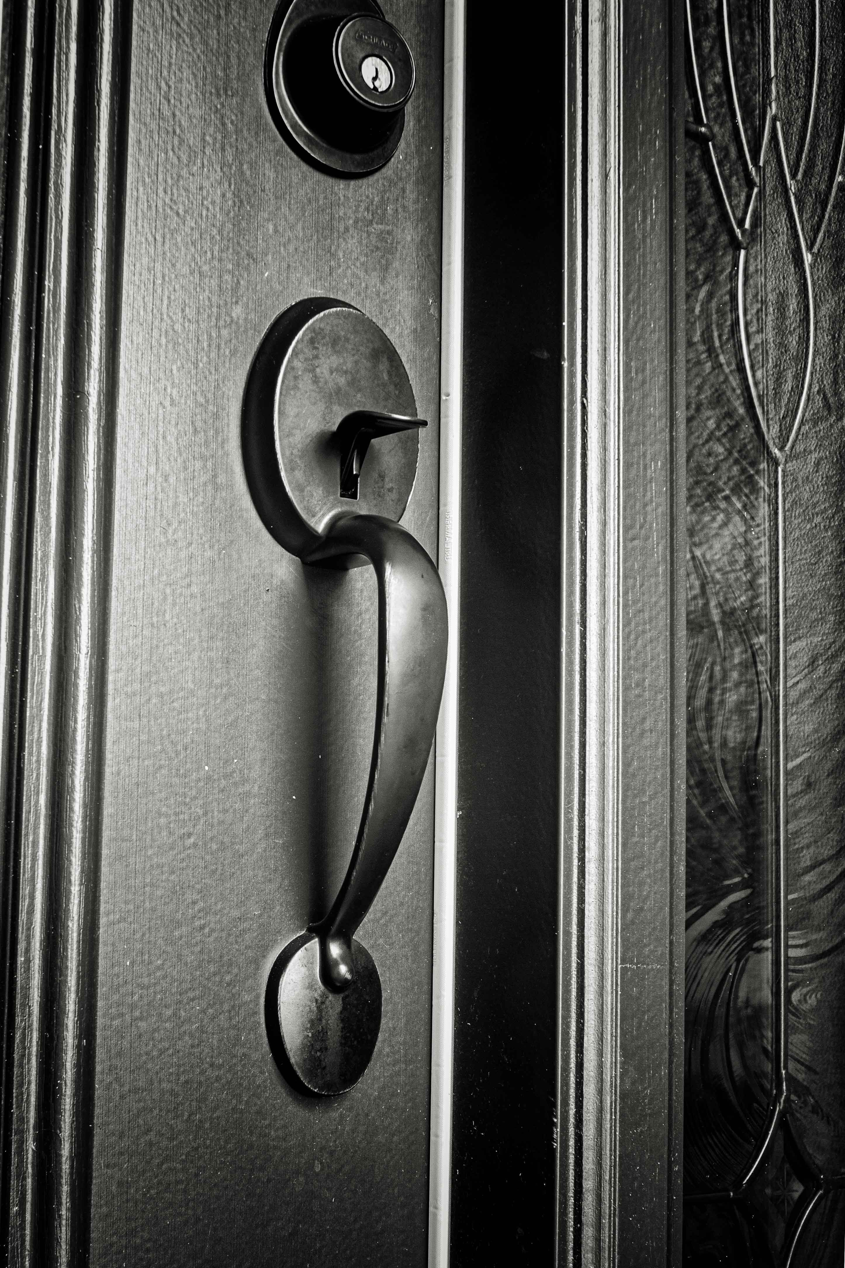
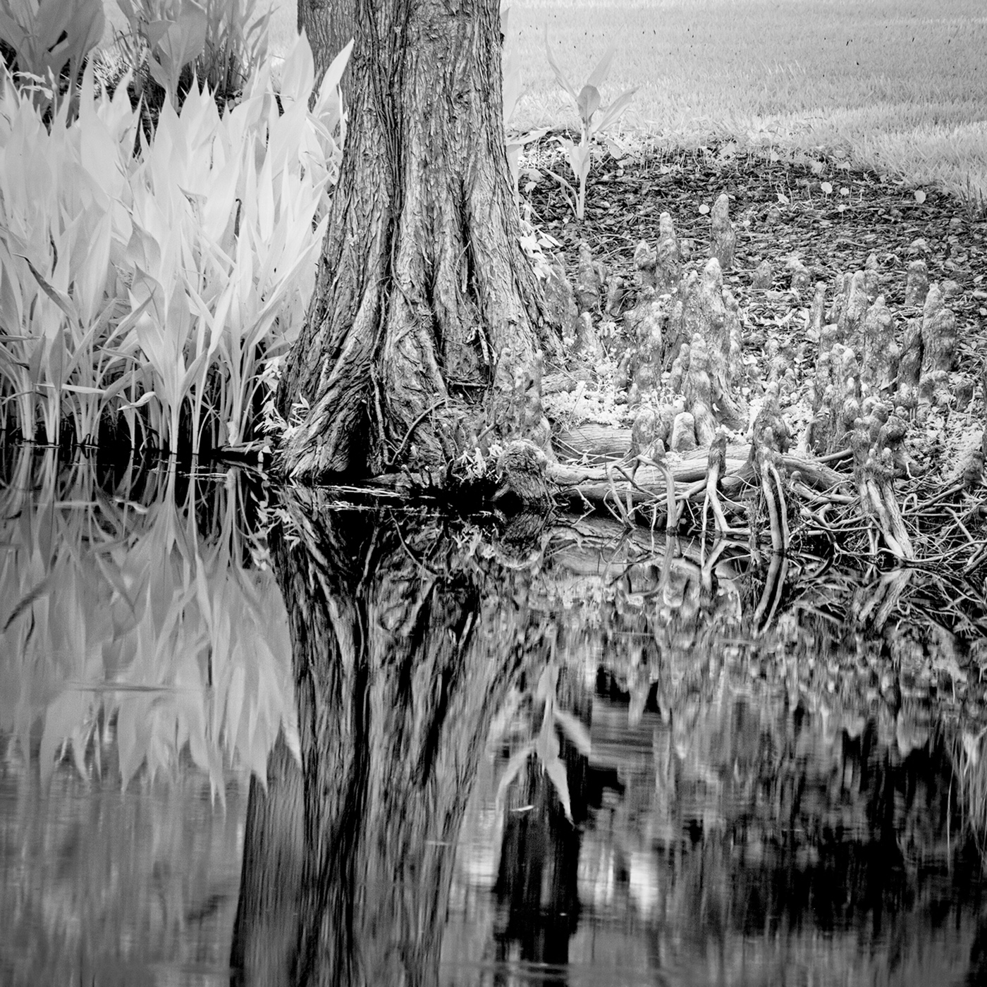
I feel that you have recorded a very interesting image. I believe that most persons would walk right by this stump and never stop to see the beauty in it. I like the fact that I see great detail in the image. I even see the directions of the cut that created the stump. I could spend much time just looking at the surface of the stump and finding imagined faces or other object. It is much like finding such objects in cloud formations. I appreciate your B&W conversion. |
Mar 7th |
| 87 |
Mar 25 |
Comment |
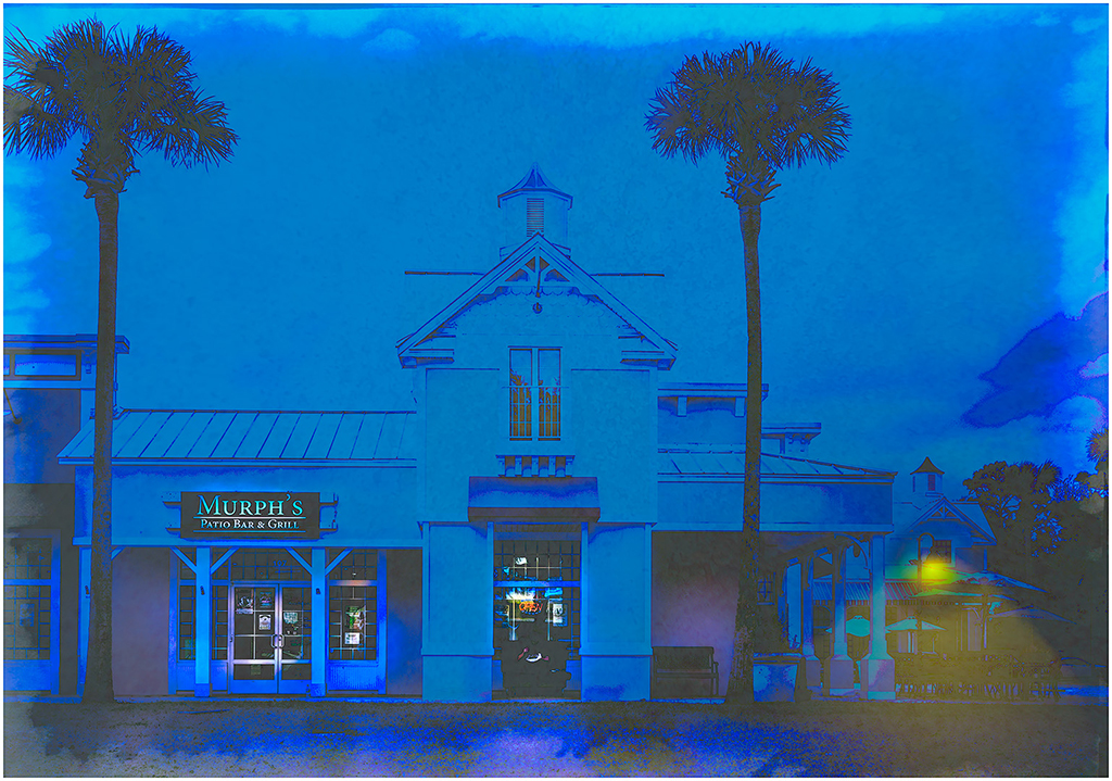
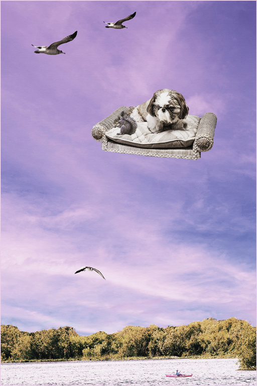
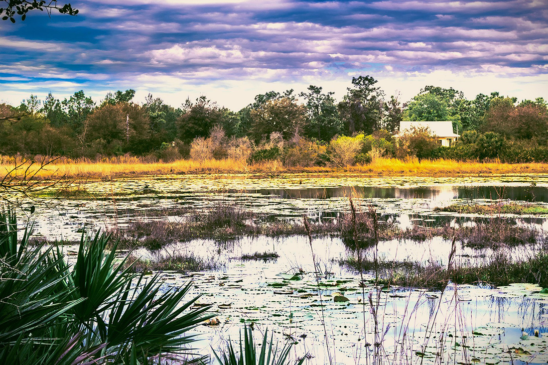
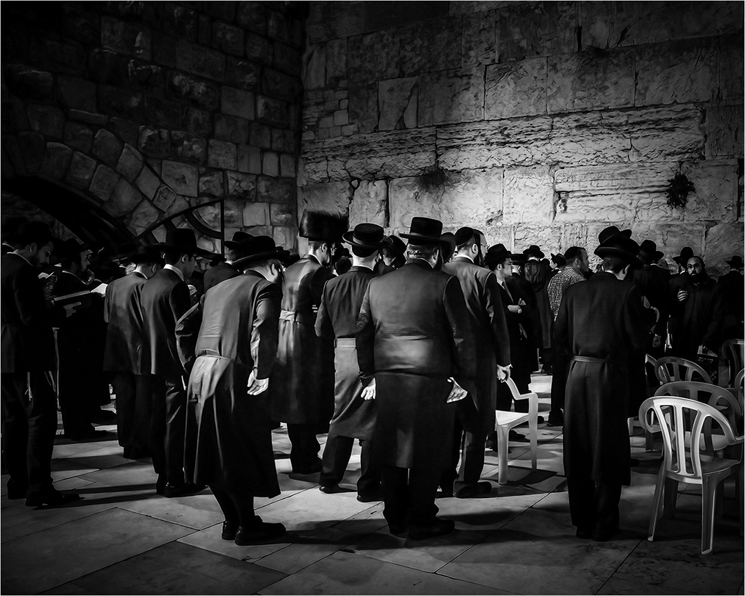
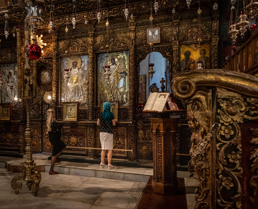
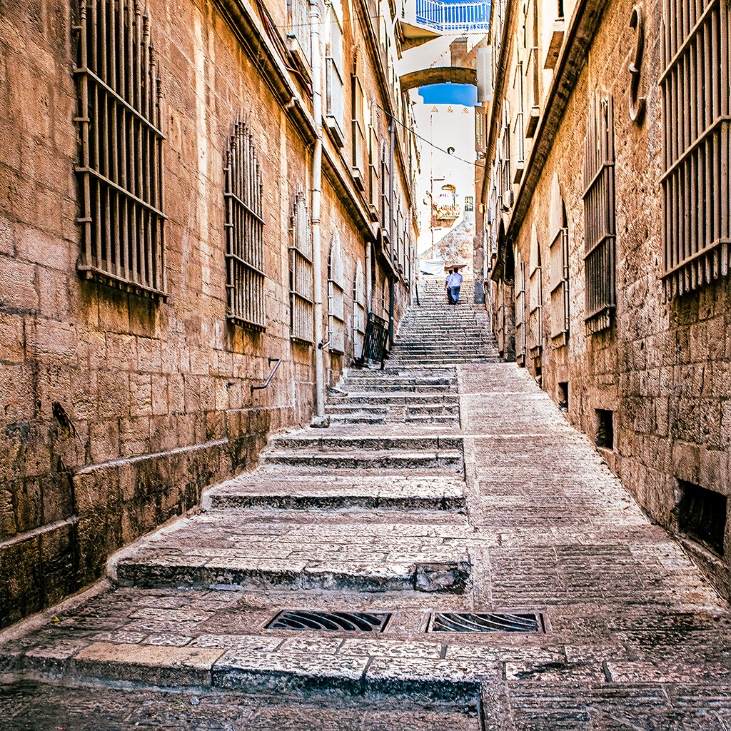
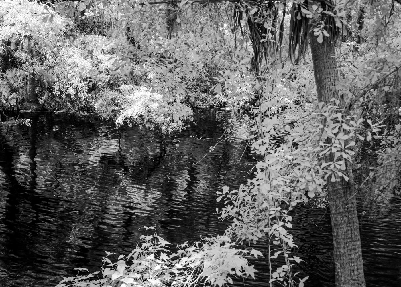
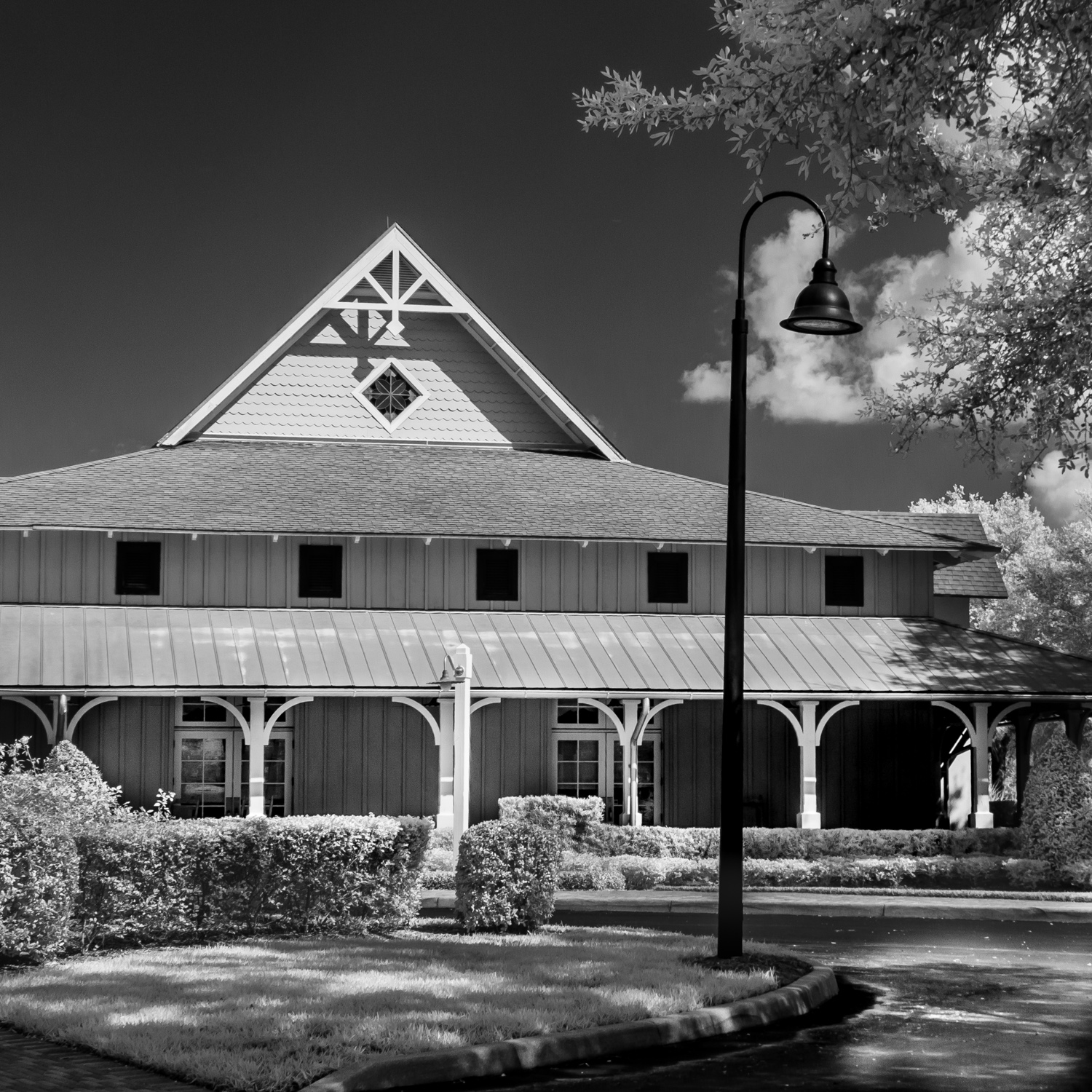
I find this to be a very interesting image. I like the birds and feel they add to the interest. The repetition of the curved lines, along with the converging sides of the buildings appeal to me.
I do feel that the image is too dark. Perhaps the exposure could be increased a bit? I realize that this image may have been recorded on a heavily overcast day. |
Mar 7th |
| 87 |
Mar 25 |
Comment |
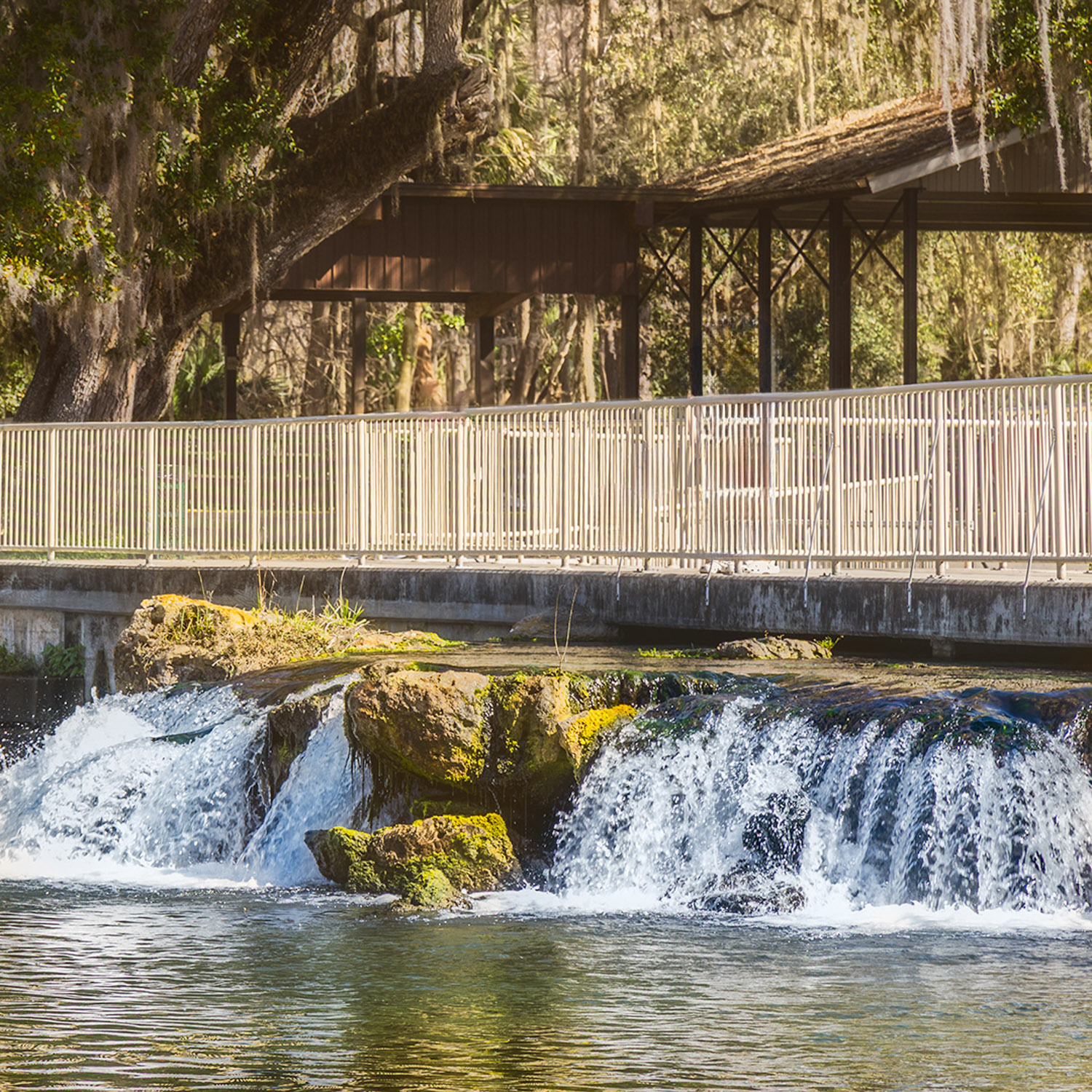
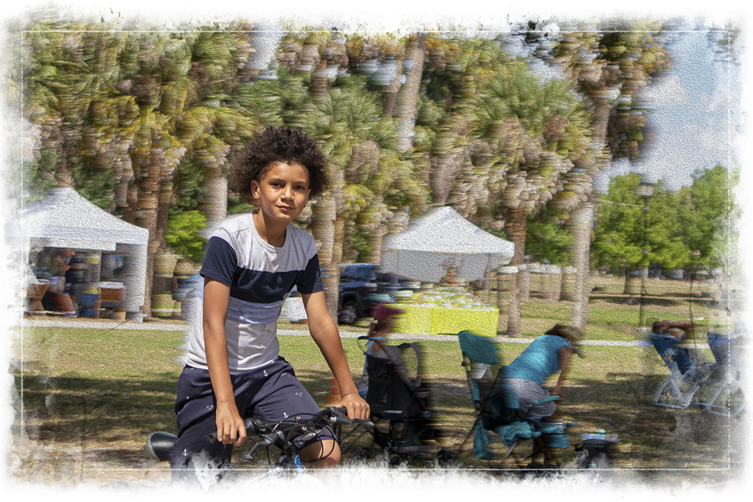
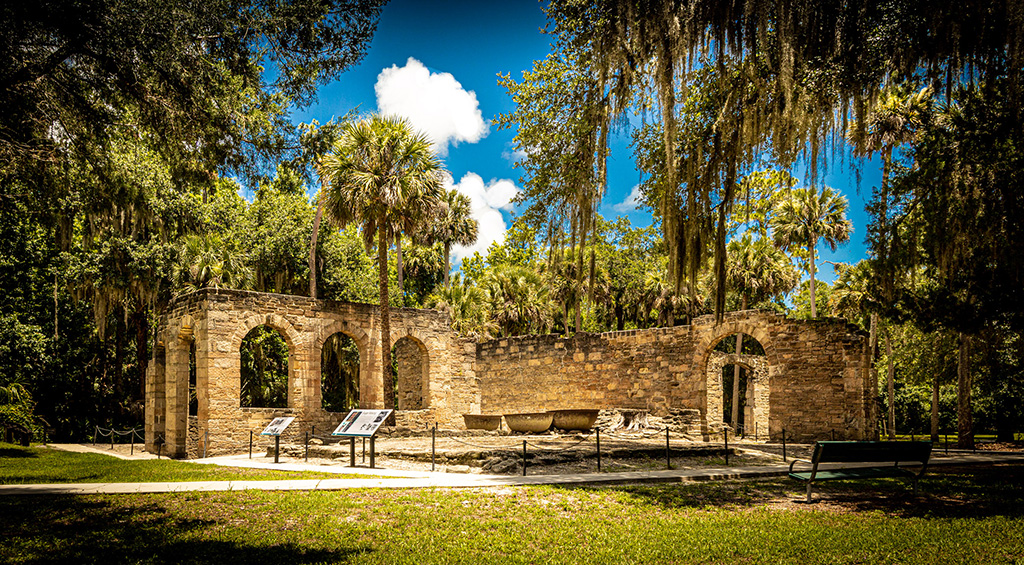
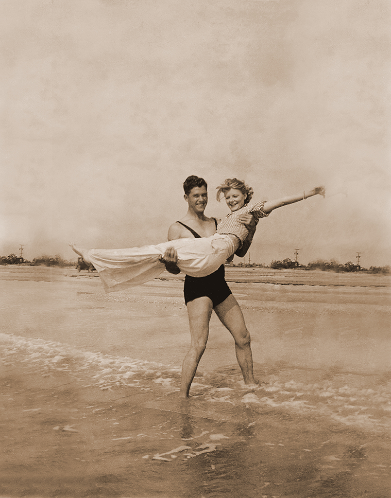
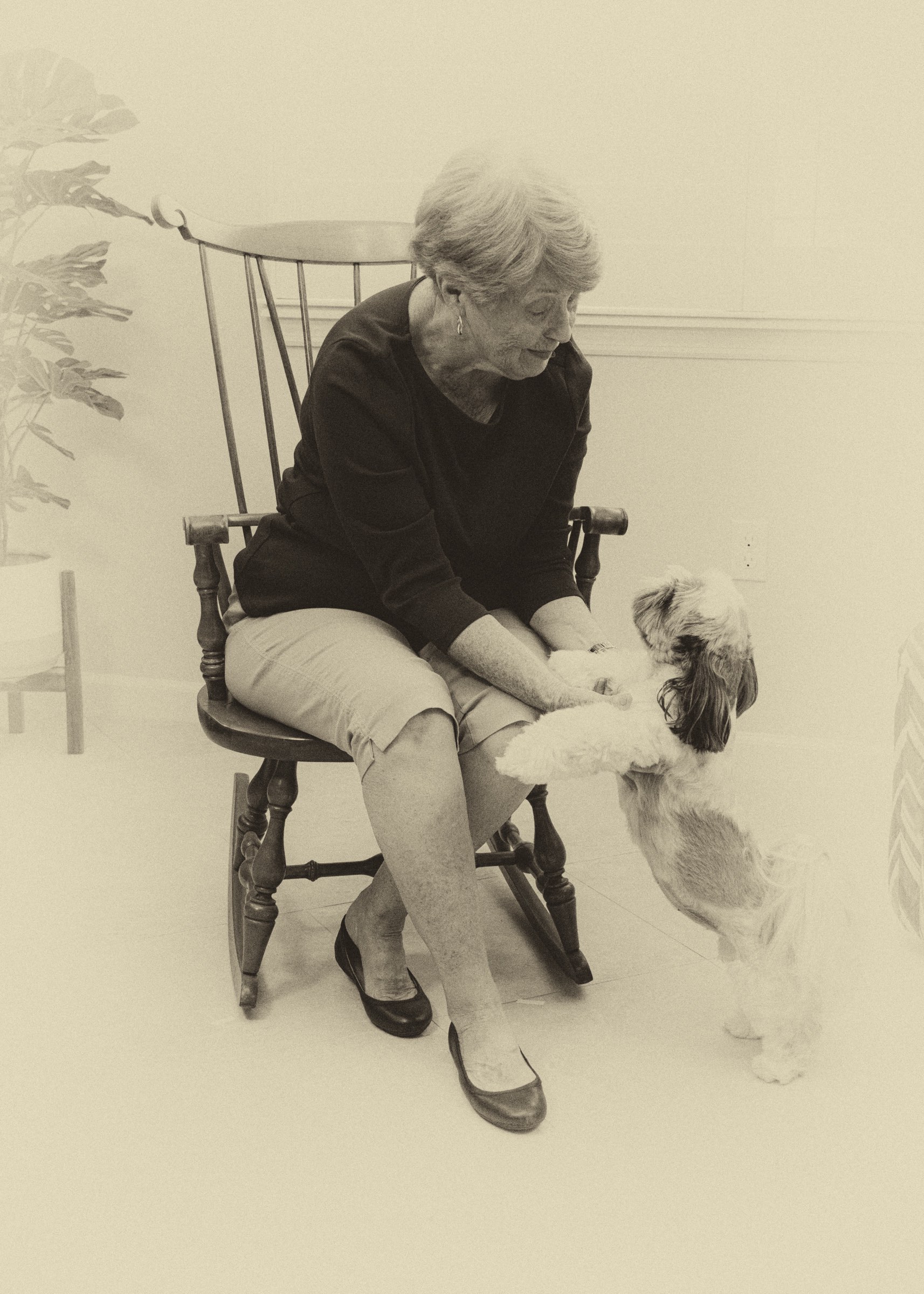
Steven, thank you for your continuing leadership of this group.
I must start by confessing that as a Floridian, I am biased in favor of well-crafted images of Florida birds. I really like this image! I enjoy very much your B&W conversion and feel that your decision to flip the image horizontally was a good one. Some might feel that you should have more space in front of the bird to leave it somewhere to go, but I feel that the splash behind the bird enhances the feeling of movement in the image.
Congratulations on a well recorded and processed image. |
Mar 7th |
| 87 |
Mar 25 |
Comment |
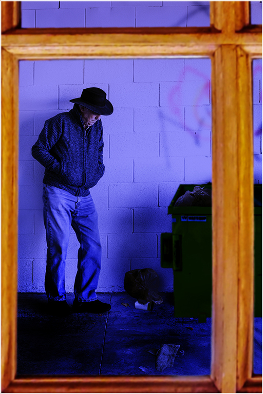
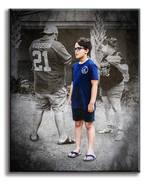
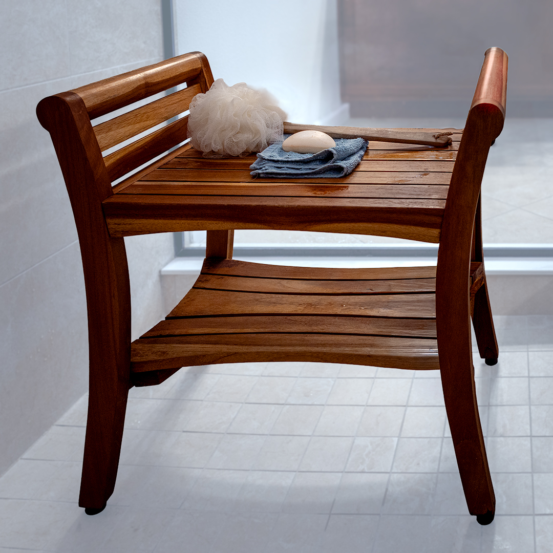
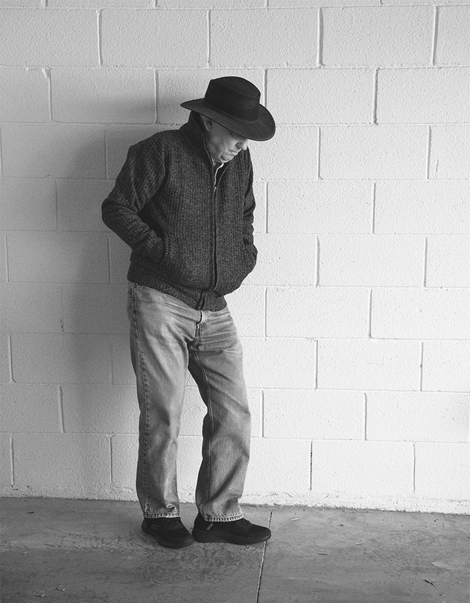
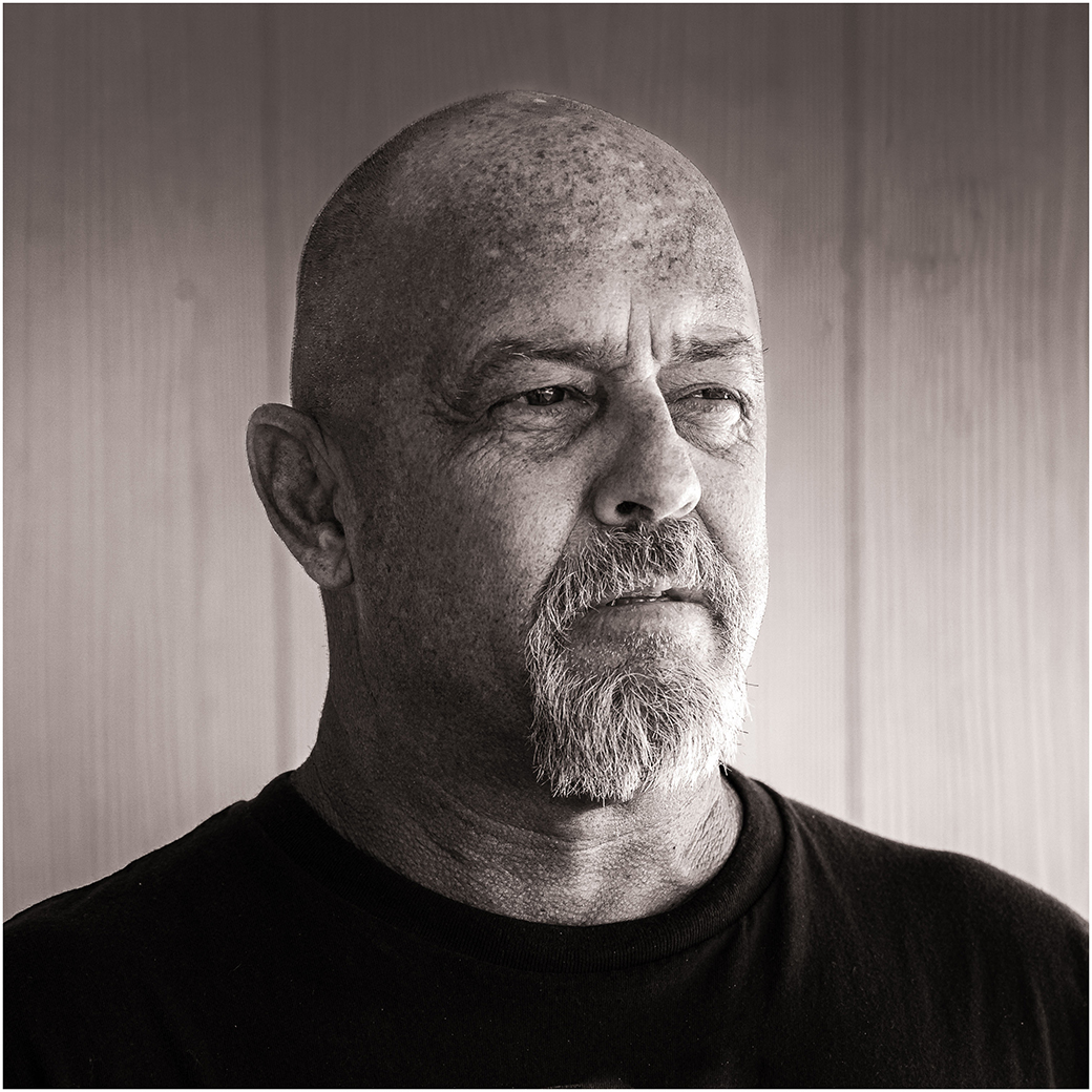
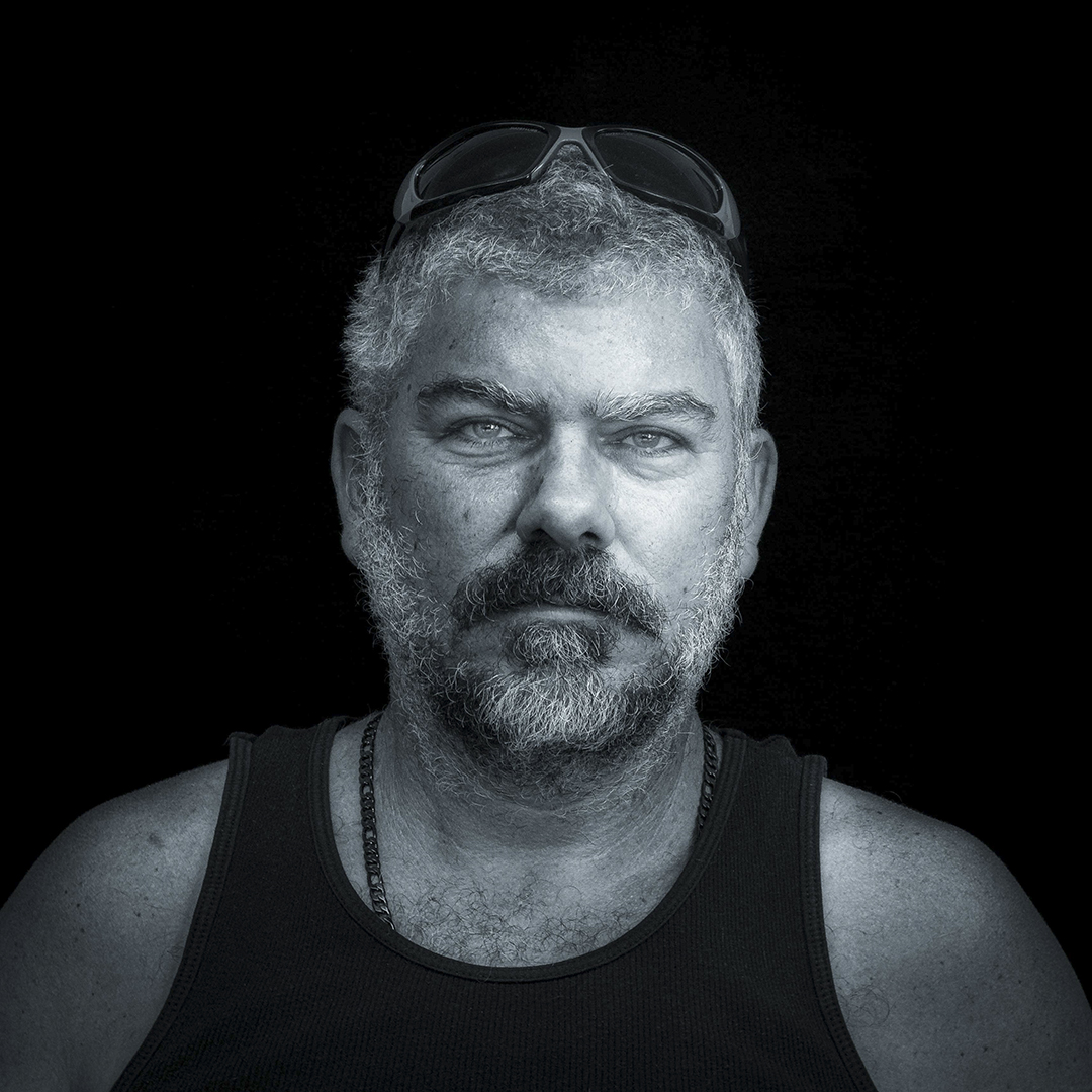
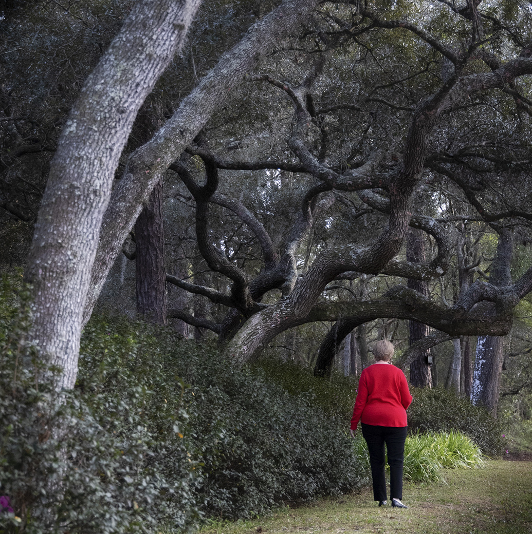
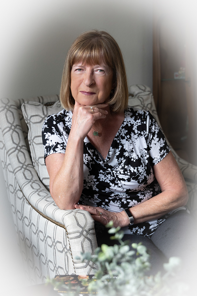
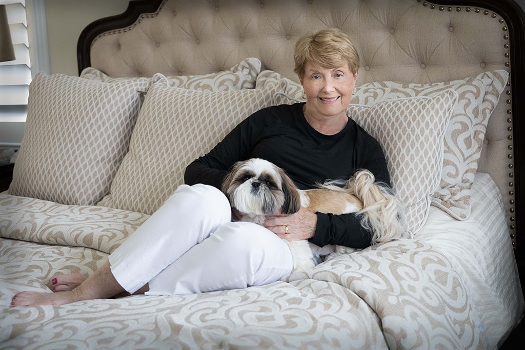
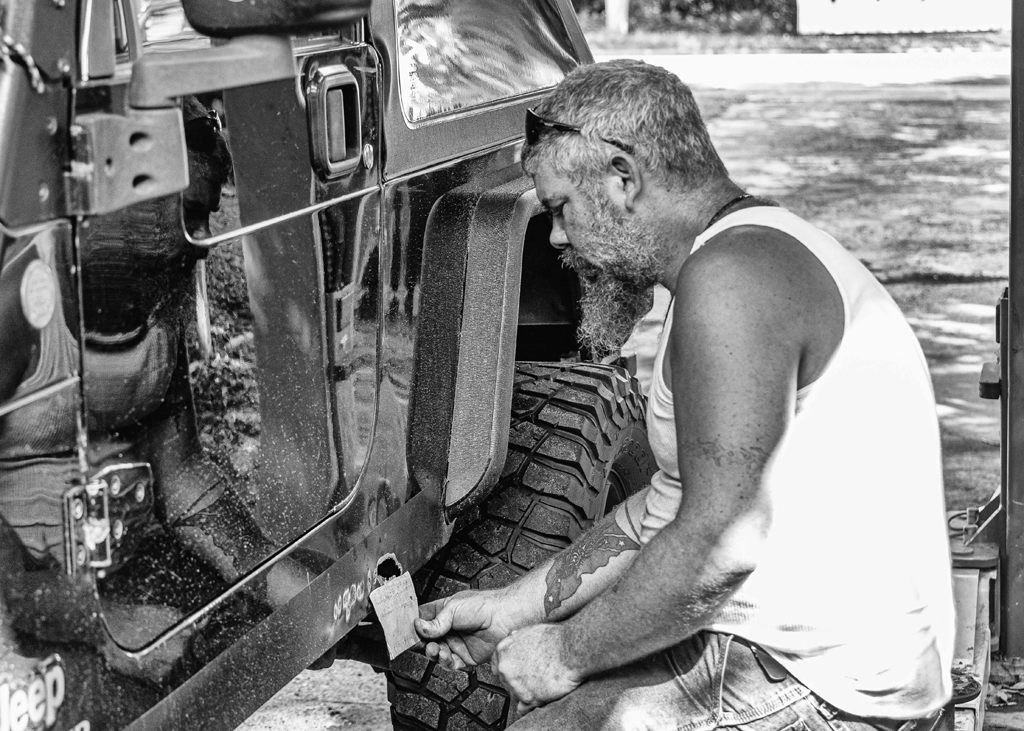
Welcome to our group. Your image leads me to believe that you are a very accomplished photographer and a valued addition to our group. I look forward to seeing new work from you each month.
I like this image. When I look at the original image, I feel that the composition is strong and well balanced.
Me opinion is that your choice to convert to B&W was a good choice. I enjoy the subtle tones of the B&W and feel they are more important than the muted colors of the original. I am drawn to the person in the image and feel that this is the subject that makes this an outstanding image.
There is one thing that bothers me. My assumption is that you have created a blur vignette around the top and sides of the image as a means of drawing the viewers eyes to the subject. If this was your purpose, you were very successful. However, I feel the vignette is far too large and strong on the right side of the image. I find myself wanting to look back at the original to see what is being hidden by the obvious blur. I also feel that this works against the otherwise well-balanced composition.
Thank you for submitting this image. |
Mar 7th |
5 comments - 4 replies for Group 87
|
5 comments - 4 replies Total
|