|
| Group |
Round |
C/R |
Comment |
Date |
Image |
| 18 |
Sep 24 |
Reply |
Thank you, Gunter. I have enjoyed our conversations and will miss that part of the group. Your comments have always been helpful and appreciated.
|
Sep 17th |
| 18 |
Sep 24 |
Reply |
Gunter, I have read, and I am well aware of the official definition. The misunderstanding of the term, "altered reality" is at the root of the problem. Technically, a conversion to black and white is altered reality. We live in a world of color. Black and white is altered reality.
However, I find my interests to be moving in another direction and will be leaving this group. At my age (approaching birthday 90 in two months) I need to narrow my focus as I continue to learn the opportunities offered in Photoshop for the development of my artistic expression. |
Sep 17th |
| 18 |
Sep 24 |
Reply |
Gunter, I very much value your critique of my work. There seems to be an ongoing discussion of what "creative photography" is. What is the meaning of "altered reality?" Is it always "altered" in the sense of a Salvador Dali painting?
My approach is to alter the original in such a way to remove the subject from the original state and create a new environment while still maintaining a recognizable image. Some time I find that my attempts are guilty of trying to push the process too far in my attempt to be more creative. For me, this is more than a fun moment of experimentation. |
Sep 17th |
| 18 |
Sep 24 |
Reply |
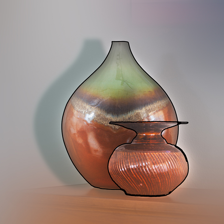
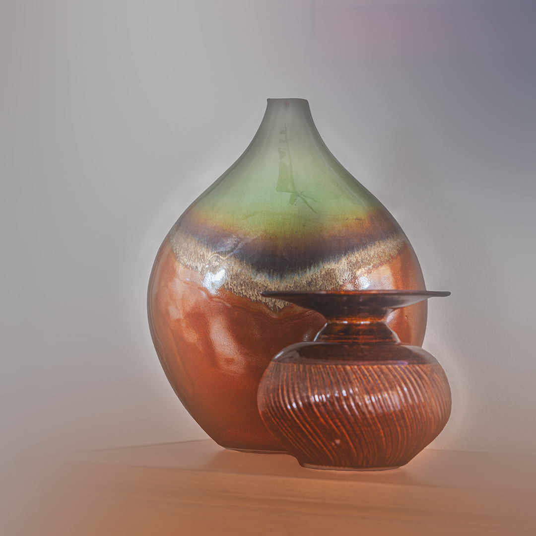
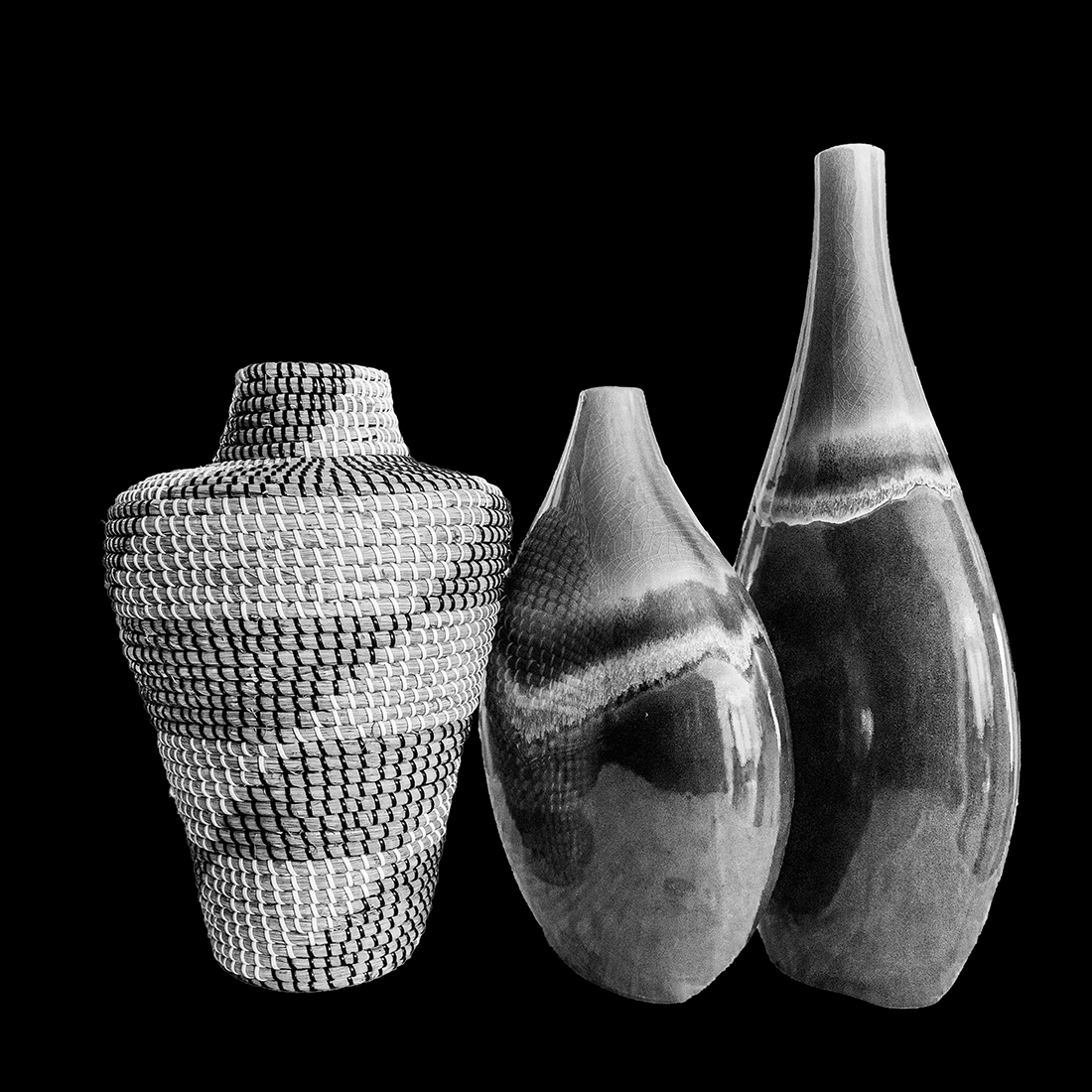
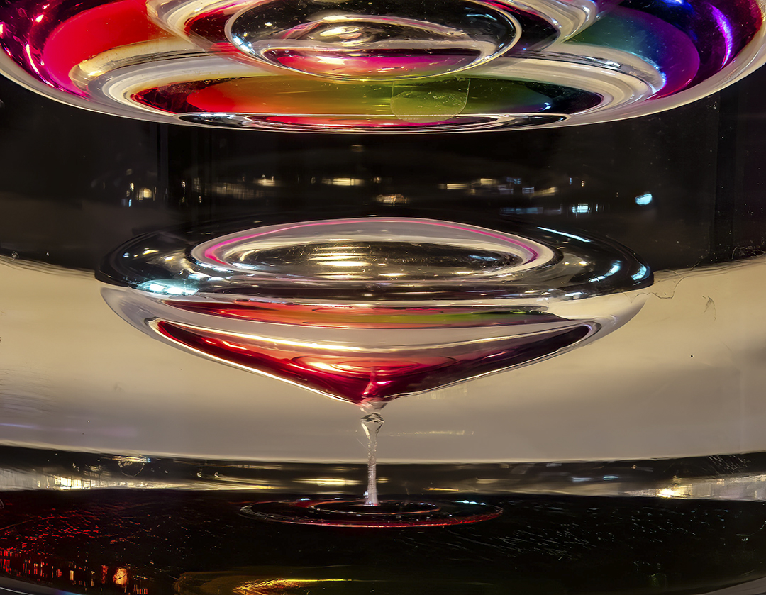
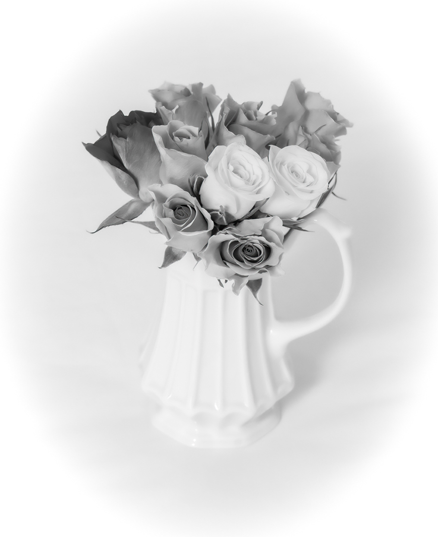
Thanks for your critique. Yes, I like your version, but it is different from my vision. Did you also notice that I had completely changed the background and added a blur to it? The image was photographed as it stood on a short cabinet in our family room beneath our TV using only available light. See the original. |
Sep 16th |
| 18 |
Sep 24 |
Reply |
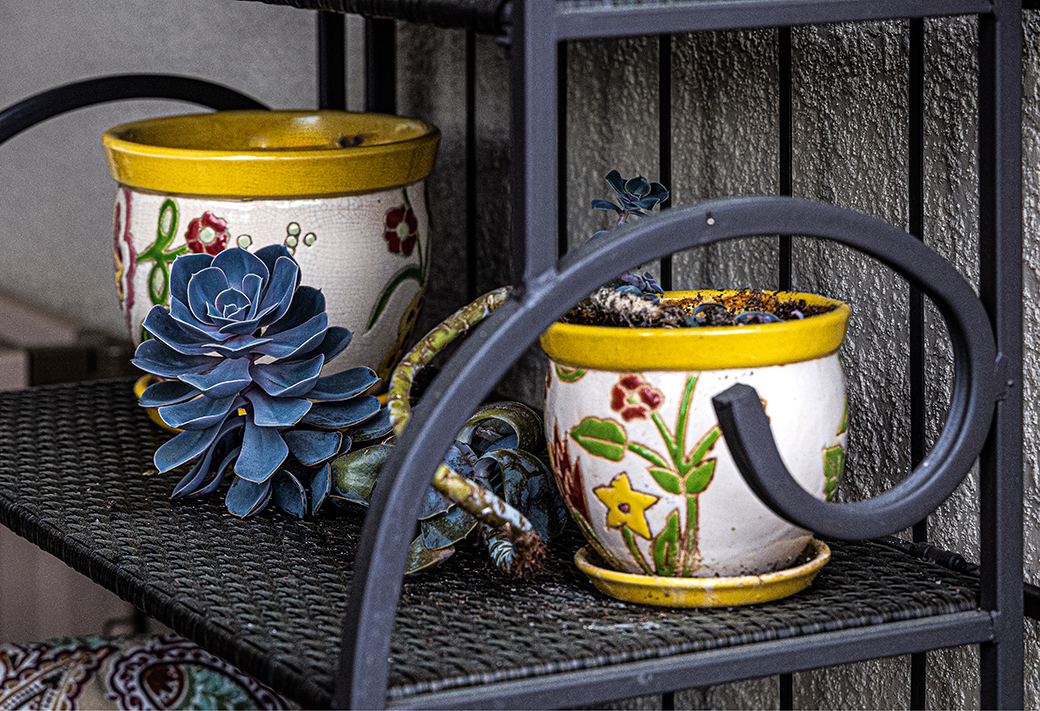
Thanks for your replies. The problem with the stroke around the vases was cause by the fact when I applied the first stroke it outlined around the outside of the two and left the remainder of the small vase without the outline. I then selected only the small vase and applied the stroke, it left a larger stroke where the two overlapped. I failed to save the new PSD file. When I noticed the problem, there was no way for me to undo it. |
Sep 9th |
| 18 |
Sep 24 |
Comment |
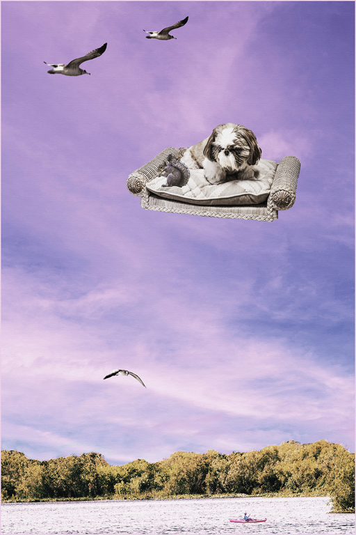
Yes, as I mentioned to Bob above, the group 87 version is best. In attempting to add to the creativity for this group I pushed two steps farther. I have been doing a brief study of Art History and ran across a movement that followed the Impressionist where it became popular for the painter to outline the main subjects in black. I decided to give it a try. I will probably remove this technique from my toolbox.
Thank you for your honest evaluation of my image. |
Sep 8th |
| 18 |
Sep 24 |
Reply |
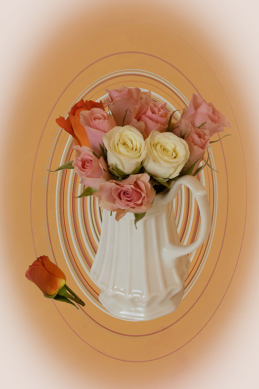
Bob, thank you for your careful evaluation of my image. Your critique is most helpful and appreciated. The image as it appears in Group 87 is what I consider to be the best image. In this image (Group 18) I have experimented in carrying the process two steps farther. Perhaps two steps too far.
It is interesting that some commenters in group 87 also feel the vases are not sharp. Others comment that they seem sharp to them. It may be that the high reflectivity of the finish and curvature of the surfaces are causing this indecision.
Please continue to honor my work by your honest critiques. |
Sep 8th |
| 18 |
Sep 24 |
Comment |
This is a very creative and technologically well-done image. The fact you used stock drawings of the hands does not bother me, as long as you are not entering the image in a competition where such use is not allowed. For me, it is the artist vision and the final image that counts. I appreciate that you may have decided that to place the clock in the center would create a less interesting image, but I feel that in this case, centering the clock may have been the better choice. I would also like to see another set of hand on the bottom section of the clock to provide summitry. |
Sep 8th |
| 18 |
Sep 24 |
Comment |
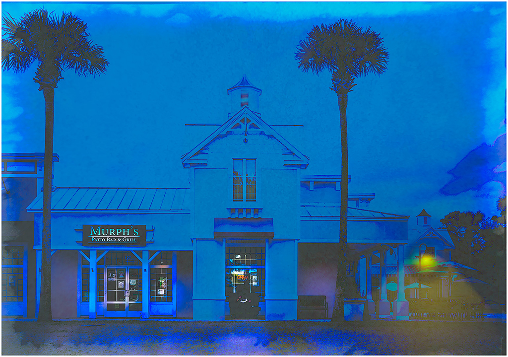
I feel you have made very good use of this creative technique. You have done enough while not overdoing it so as to destroy the original scene. You have created the feel of an impressionist painter. I do find what seems almost to be fingerprints on the top center portion of the image to be distracting. Do you know what caused this? |
Sep 8th |
| 18 |
Sep 24 |
Comment |
Bob, we share at least one thing beside passion for photography. My legs no longer allow me to walk without a cane and I must be either seated or firmly braced against some stationary object to operate a camera.
While I enjoy this image, I do find the sign in front of the car to be distracting. I know you had no opportunity to remove the sign and then press the shutter button, and I don't know how successful you would have been in removing it in post, but it does detract from what I think your vision for this image is.
That being said, you have done a very good job at creating a composite image. Now that you have demonstrated your grasp of the process, the sky's the limit. I look forward to seeing even more challenging composites in the near future. |
Sep 8th |
| 18 |
Sep 24 |
Comment |
You seem to be very skilled at looking at flowers and finding interesting parts you can use in creating a most interesting new image. I like this version which you have convert to black and white.
The second critique by Bob is spot on. |
Sep 8th |
| 18 |
Sep 24 |
Comment |
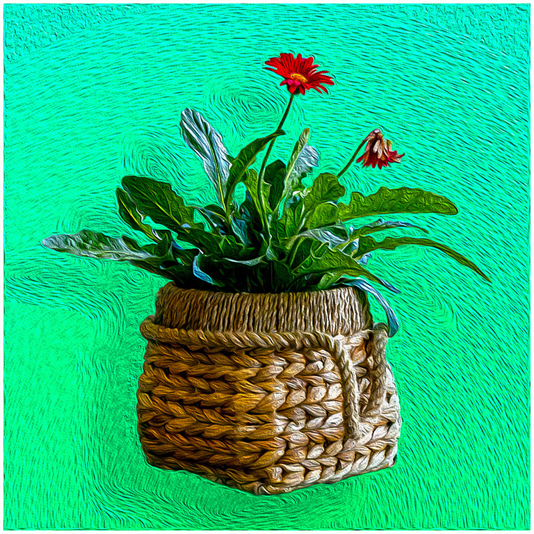
You have been able to make a very good choice of filter for this image. I feel it has taken an image I would quickly pass over and turned it into one that causes me to stop and spend some time enjoying the image before me. The creative part of the image is in the filter selection. |
Sep 8th |
| 18 |
Sep 24 |
Reply |
Lance, very good suggestions. I am enjoying experimenting with new effects. Your suggestions are most helpful and appreciated. |
Sep 3rd |
6 comments - 7 replies for Group 18
|
| 87 |
Sep 24 |
Reply |
Thank you, Lance. We look forward to your presentation. |
Sep 10th |
| 87 |
Sep 24 |
Reply |
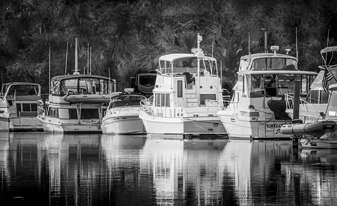
I do like it. Once I leave the brightness of the sun, my eyes feel they can wander around the scene and enjoy the added detail of the boats while still going back to the star of the show, the sunrise. This vision is not better than the original, only a slightly different one to consider. |
Sep 8th |
| 87 |
Sep 24 |
Reply |
I do appreciate the fact that you have taken the time to really look at my work rather simply replying, "I like it." Your review is always helpful. Yes, I have redefined myself from "photographer," to "Artist/Photographer." I am an artist who works with photography. |
Sep 7th |
| 87 |
Sep 24 |
Comment |
I really enjoy looking at this image. How can you miss with puffins. However, I do agree with the points Lance made. Also, the puffins appear to me to be a little over sharpened. This is most noticeable with the two on the right that almost look pasted on.
My daughter loves Iceland and has gone there every year for the last 16 years. She just returned from a six week stay. I hope to be able to go some day. If so, I will look for puffins. |
Sep 7th |
| 87 |
Sep 24 |
Comment |
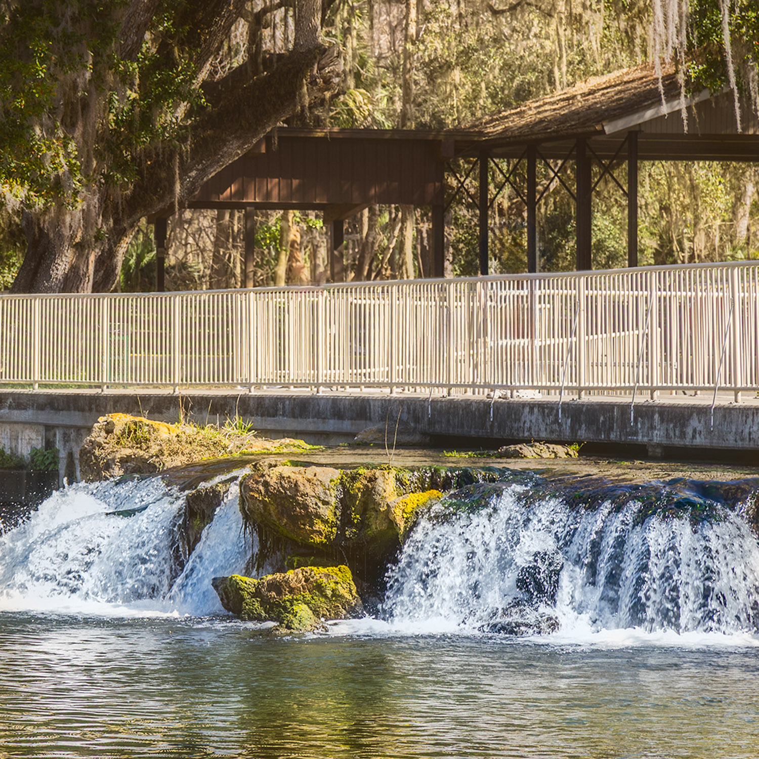
Congratulations for getting this photo of this bird. It is something I have never done. However, I can only repeat what others have suggested. It would be very helpful if you can arrange to use a much higher shutter speed to slow down the speed of the wings. The wings will still show movement blur, but not disappear. |
Sep 7th |
| 87 |
Sep 24 |
Comment |
Congratulations on following your chosen area of experimentation. Not every experiment result in a great outcome. I have no idea what the original subject could be, but I enjoy looking at the swirling patterns of color. I could do without the circles. Nevertheless, this is your vision, and I respect that. I look forward to seeing more of these experiments. |
Sep 7th |
| 87 |
Sep 24 |
Comment |
I judge this to be a very simplistic and engaging image. I do tend to agree with the crop suggestions made by Lance. You have shown a good photographic eye that sees the beauty in simple subjects. Thank you for presenting this image. |
Sep 7th |
| 87 |
Sep 24 |
Comment |
Steven, you have presented us with a very well done image of photographic art. I feel that I can understand the vision you had for this image. although I was not there to experience this sunrise with you, I feel as if I could have been.
Let me suggest another vision for the image. If you opened up the shadows a bit, the slightly more detail revealed in the boats might be interesting. I am not suggesting a better vision, just an alternative vision.
Very nice work |
Sep 7th |
| 87 |
Sep 24 |
Comment |
What a very interesting image. There is so much here to see. I feel that this is another image of yours that can stand on its own but is much stronger as a part of a collection of Ice images. |
Sep 7th |
| 87 |
Sep 24 |
Reply |
Steven, thank you for spending the time to look closely to my image. You use the terms "artificial" and "over processed." I prefer to refer to this as "artistic effect." The purpose of my work is not to present an "historical record" of what the vases looked like at a certain time and place. I prefer to think of my work as Artistic Photography. (It is fair to debate the quality of the art.)
I do appreciate and value your critiques of my work as I try to move in this new direction. |
Sep 7th |
| 87 |
Sep 24 |
Reply |
Thank you, Cindy. I have gone back to look again at the vase and have not found an explanation of the pattern to which you refer. |
Sep 7th |
| 87 |
Sep 24 |
Reply |
Thank you for your review of my image. I expect differences in responses to my work as I continue to experiment with more artistic presentations. |
Sep 7th |
| 87 |
Sep 24 |
Reply |
Lance, thank you. I will remember to give attention to the sharpness of the subject in future images. Your attention and critiques always prove to be helpful. If you look at DD Group 18, you can see this image with a couple of extra steps to add to the creative impact. These additional steps may be steps too far. |
Sep 3rd |
6 comments - 7 replies for Group 87
|
12 comments - 14 replies Total
|