|
| Group |
Round |
C/R |
Comment |
Date |
Image |
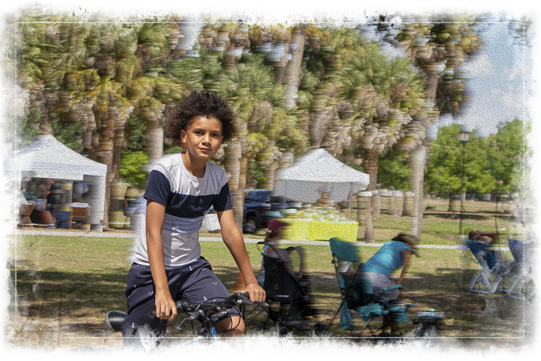
| 18 |
Sep 23 |
Reply |
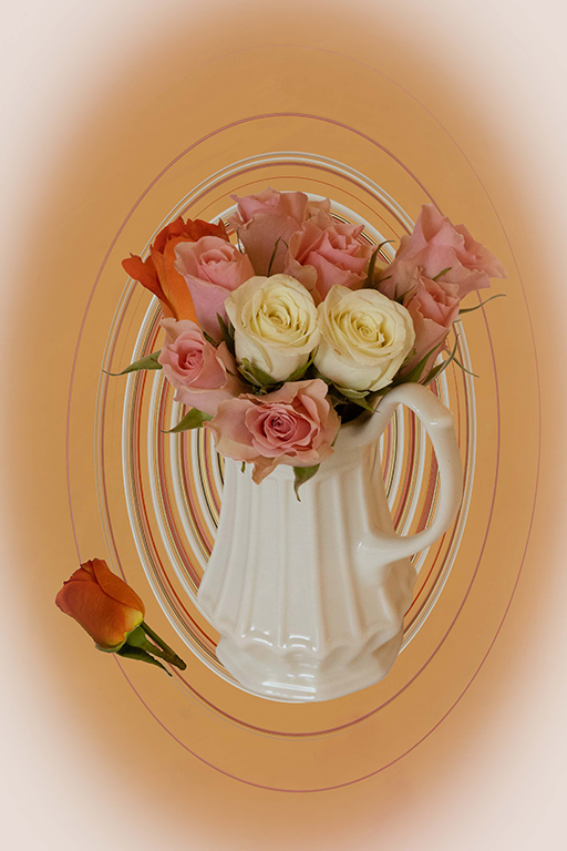
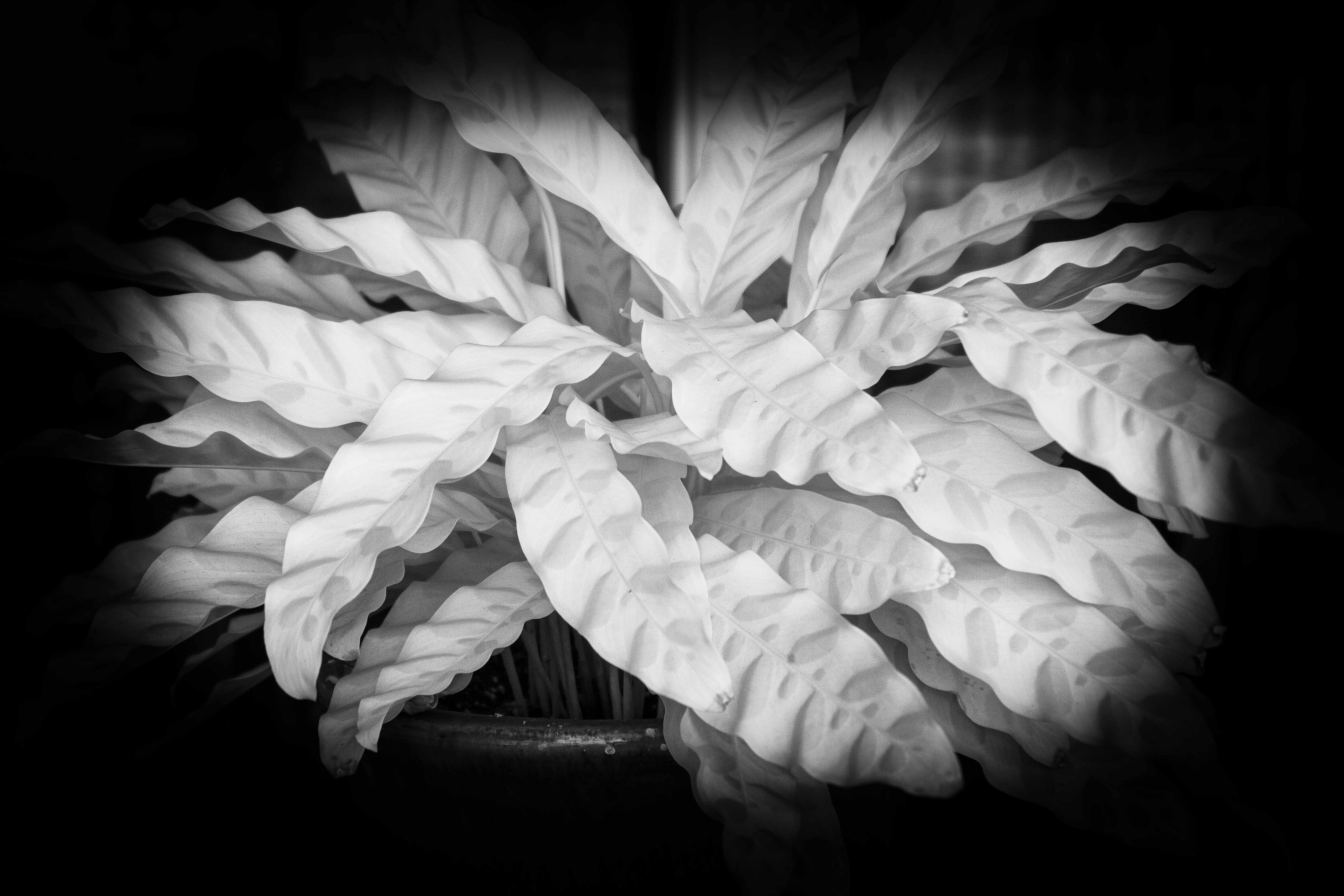
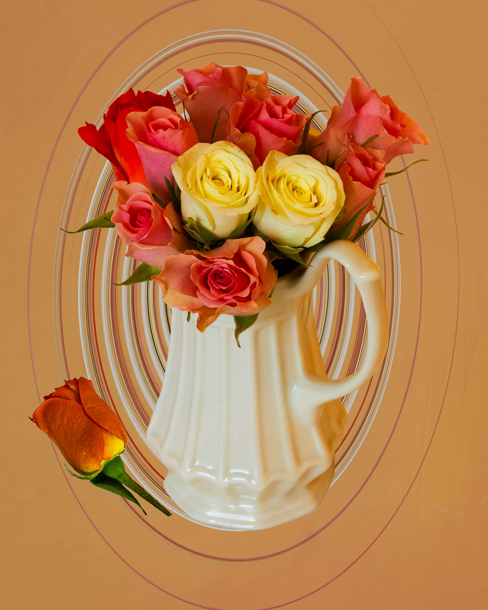
Thank you for your welcome and comments. My first rendition of this image was a high key B&W without the rose at the base, or the swirls. Some people I shared it with felt that it needed a fallen petal or blossom. I did not swirl the rose, just the background. |
Sep 25th |
| 18 |
Sep 23 |
Reply |
Thank you for your welcome. Most commenters agree with you on the light corners. I went back and corrected that in the post above. Yes, a matter of taste and I will always be open to suggestions. I look forward to learning from this group. |
Sep 18th |
| 18 |
Sep 23 |
Reply |
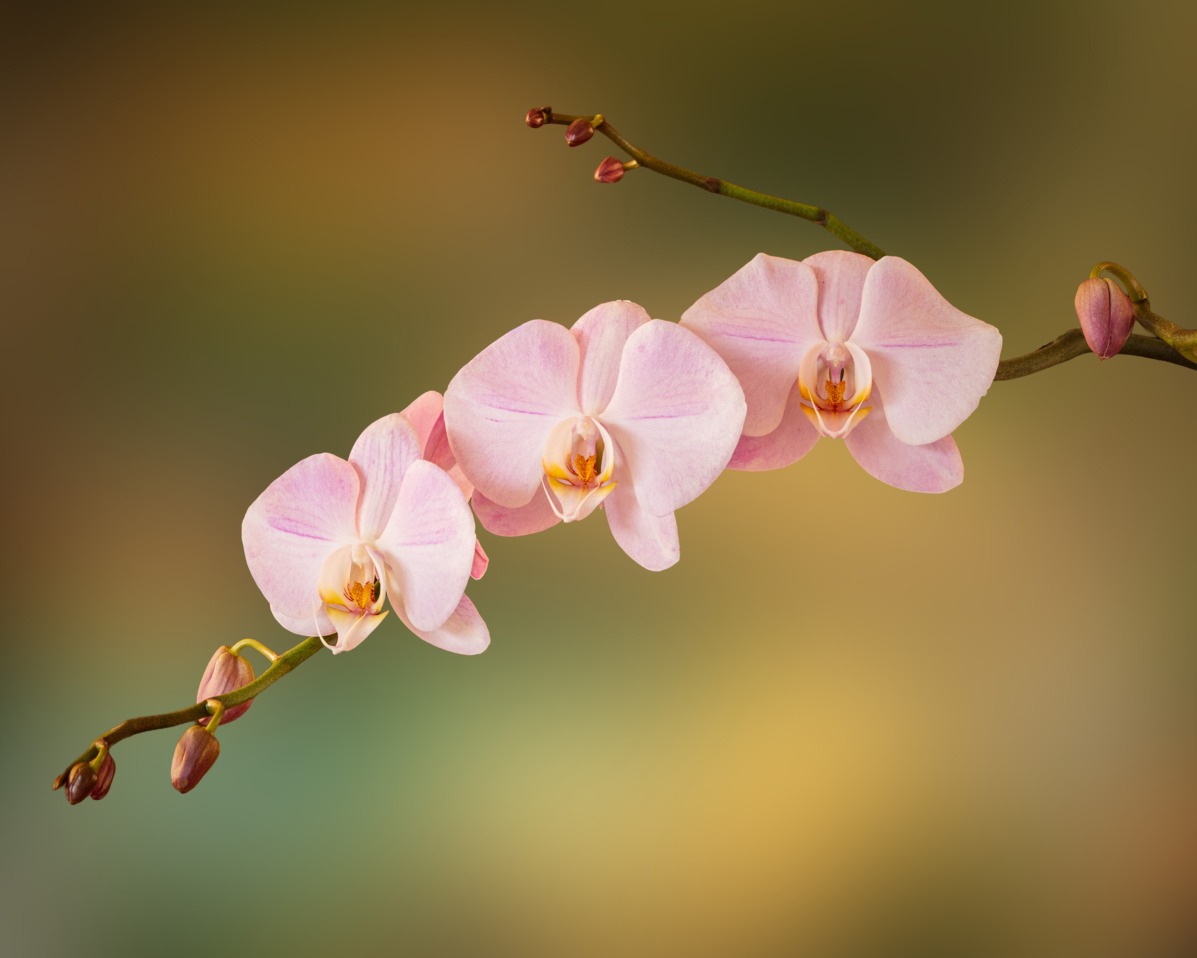
Thank you for the welcome and comments. My first processing of this image was as a high key B&W without the swirls and the single rose at the base. I like it very much, but this is a more creative version. I may still carry it through different renditions. |
Sep 13th |
| 18 |
Sep 23 |
Reply |
Here is the first image without the neg. corners. |
Sep 13th |
 |
| 18 |
Sep 23 |
Reply |
Thank you. See reply to Ian below. |
Sep 12th |
| 18 |
Sep 23 |
Reply |
Thank you. How does this compare? |
Sep 12th |
 |
| 18 |
Sep 23 |
Reply |
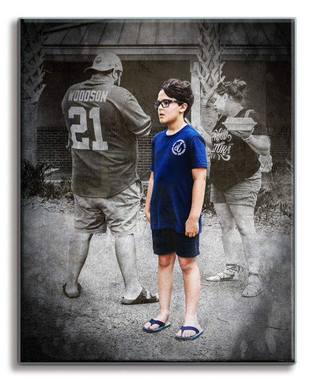
Thank you for your welcome and comments. I will revisit this image and reverse the color of the corners. This kind of critique is what I joined for. |
Sep 12th |
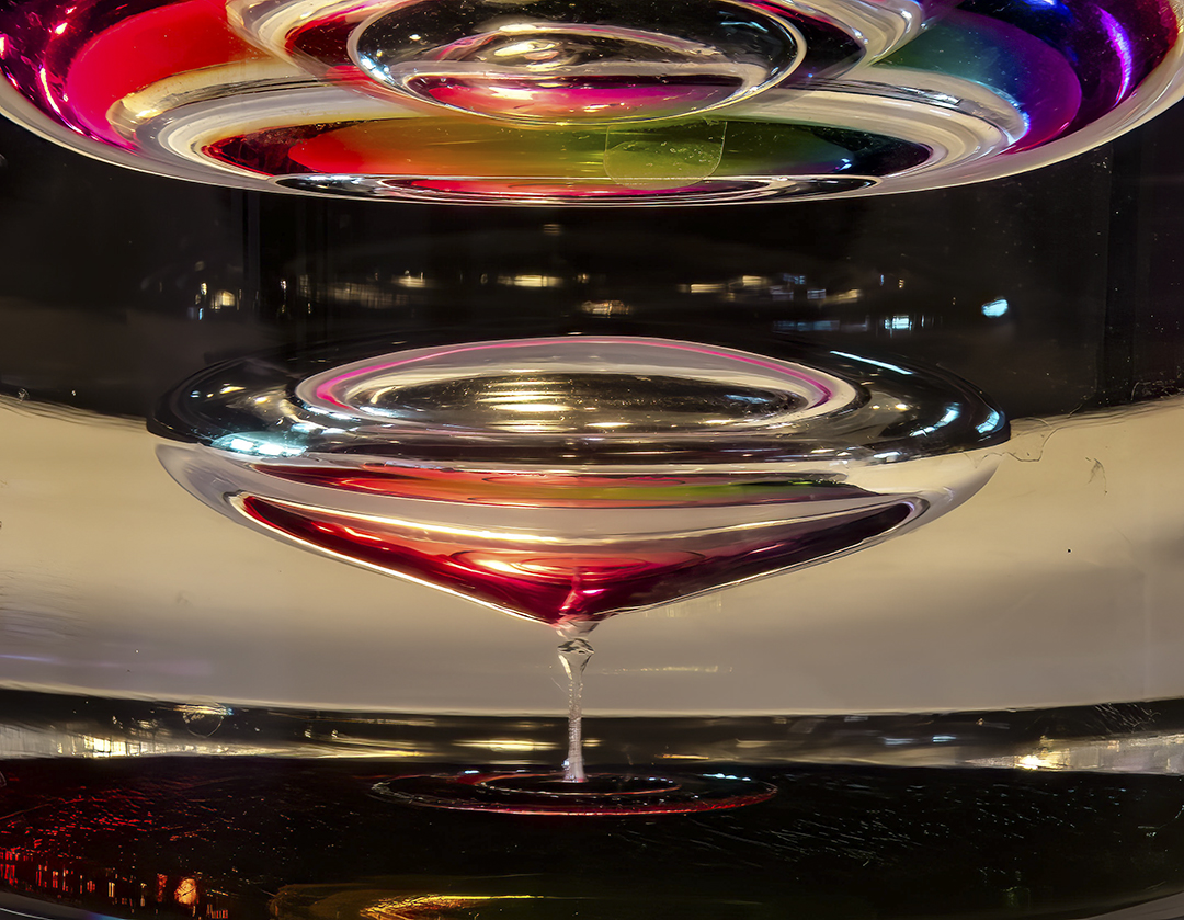
| 18 |
Sep 23 |
Comment |
What a very nice, colorful image. Very creative. I like the way you have put this image together. As for the colored spectrum, I believe it is what gives the image the most interest. The raging water gives me the appearance of being put together in three segments. The one to the left side is well done. The next two segments lack texture and appear frozen.
Thank you for sharing this image. I do enjoy seeing it. |
Sep 11th |
| 18 |
Sep 23 |
Comment |
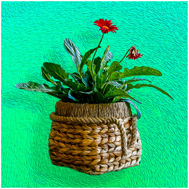
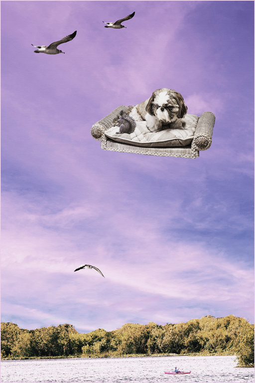
A very creative concept. I admire the amount of work that must have gone into the project. However, I feel that the blossoms are oversaturated to the point that they have lost all texture. Perhaps the saturation could be reduced. The more I have looked at the image, the more I like image 2 as a graphic image. |
Sep 11th |
| 18 |
Sep 23 |
Comment |
I like the addition of the original image to original 2. To my eyes it seems to hold the resulting image together. As I view the image the green, with the outreaching purple gives the feel of an explosion from the center. Did you experiment with different blending modes? I think I would like the image brightened up a bit. Very interesting image. |
Sep 11th |
| 18 |
Sep 23 |
Comment |
Very nice colorful image. I like the effect from topaz, and the border. I am very happy that I joined this group and look forward to learning from each member. |
Sep 11th |
| 18 |
Sep 23 |
Reply |
Thank you for your kind words. I will give real consideration to your suggestion. |
Sep 11th |
4 comments - 8 replies for Group 18
|
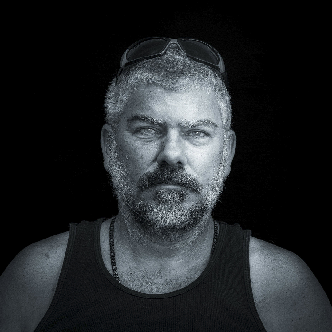
| 87 |
Sep 23 |
Comment |
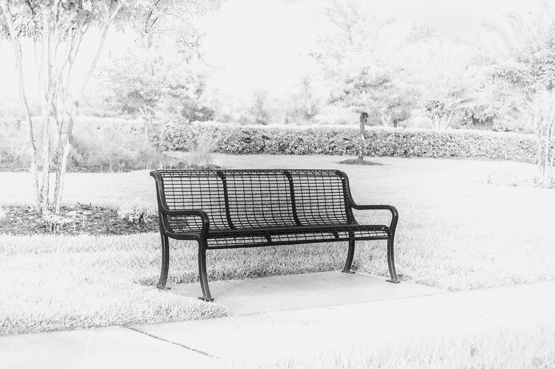
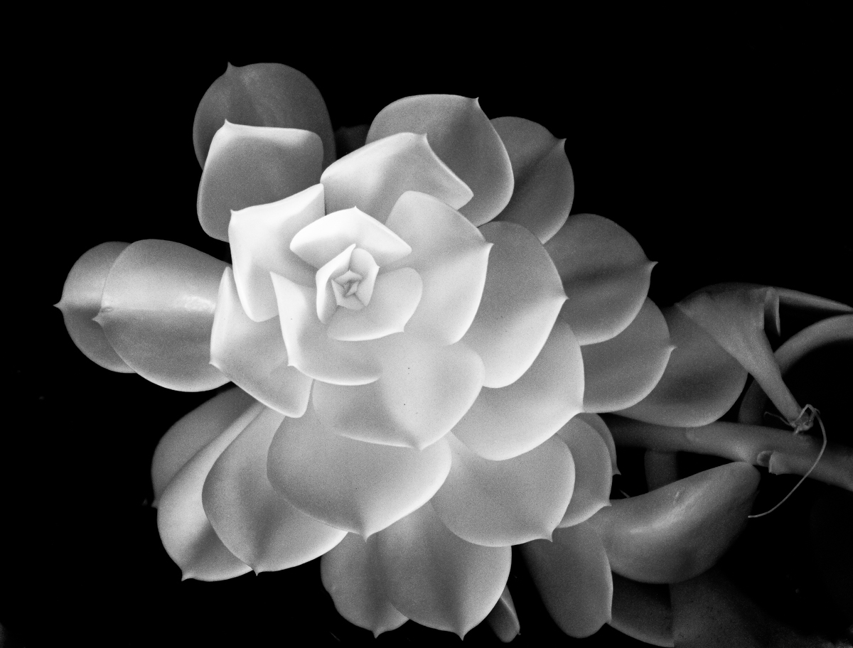
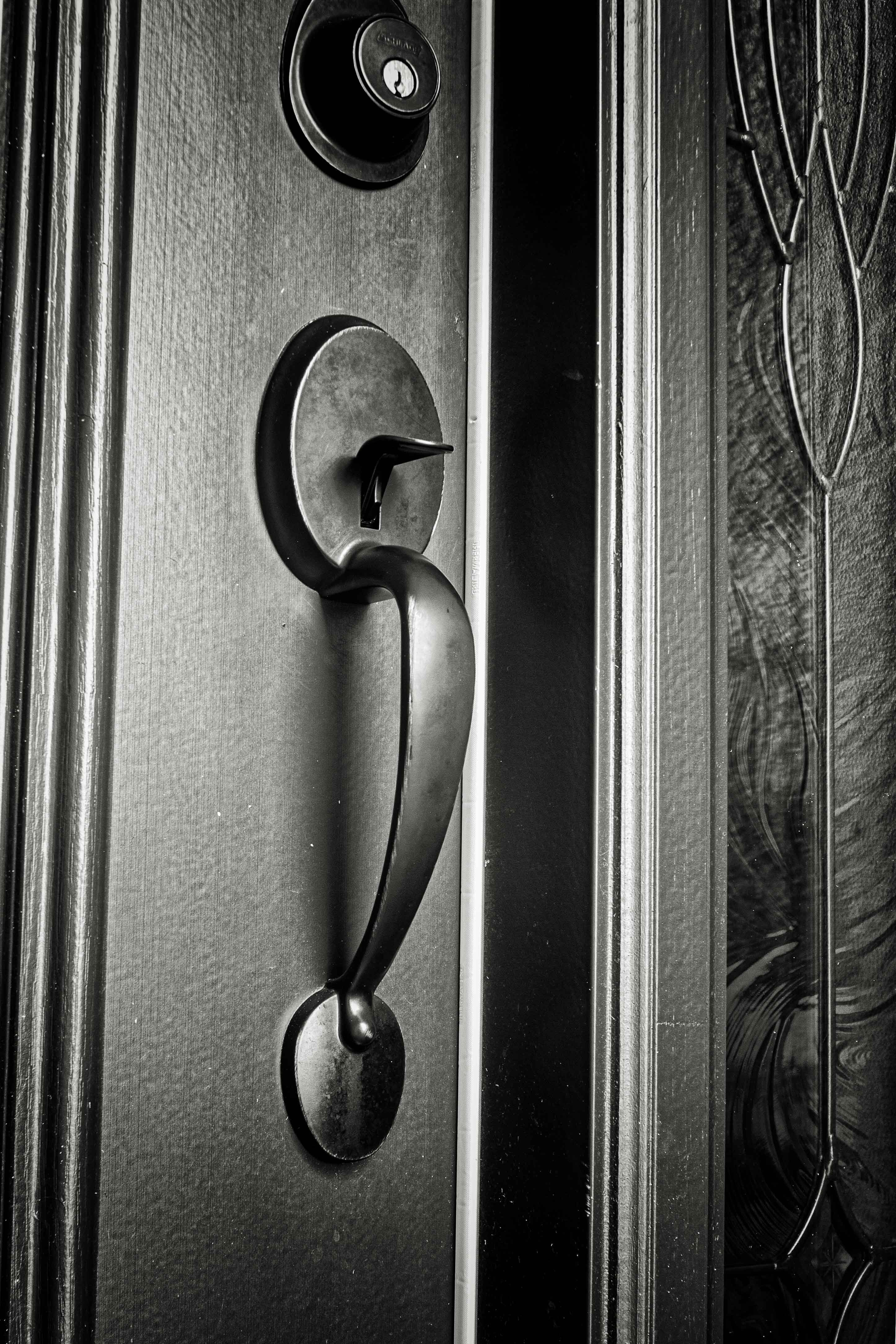
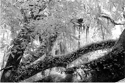
Another excellent image. I very much like your B&W conversion. The first impulse of most people in coming across this scene would be to position themself so as to be able to place the entire cacti into the frame. You have captured the more interesting image by coming close in. Well done. |
Sep 11th |
| 87 |
Sep 23 |
Comment |
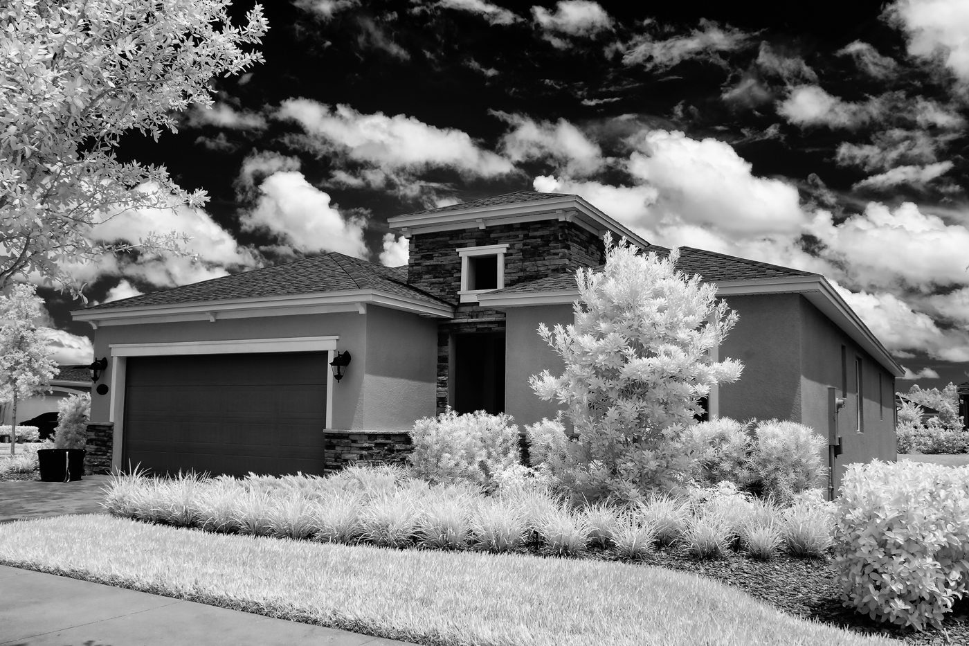
Very interesting and unusual view of the Milky Way. While I do agree with what Steven has said above, especially about the bright clouds that show movement drawing attention, the bright wave line on the beach and light and shadow patterns on the beach draw my eyes even more. I would suggest cropping up from the bottom to eliminate the beach. |
Sep 11th |
| 87 |
Sep 23 |
Comment |
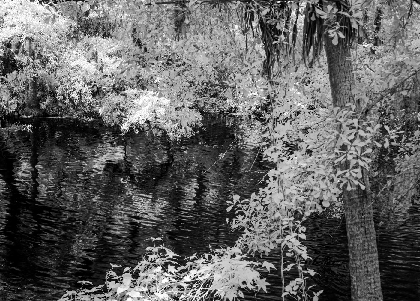
You and Lance seem to have teamed up to present us three interesting beach scenes. I like the interesting sky and the fact you placed the horizon in the lower half of the image. The driftwood adds a lot of interest. There is also what appears to have been supporting posts for a pier that would have extended out into the water. |
Sep 11th |
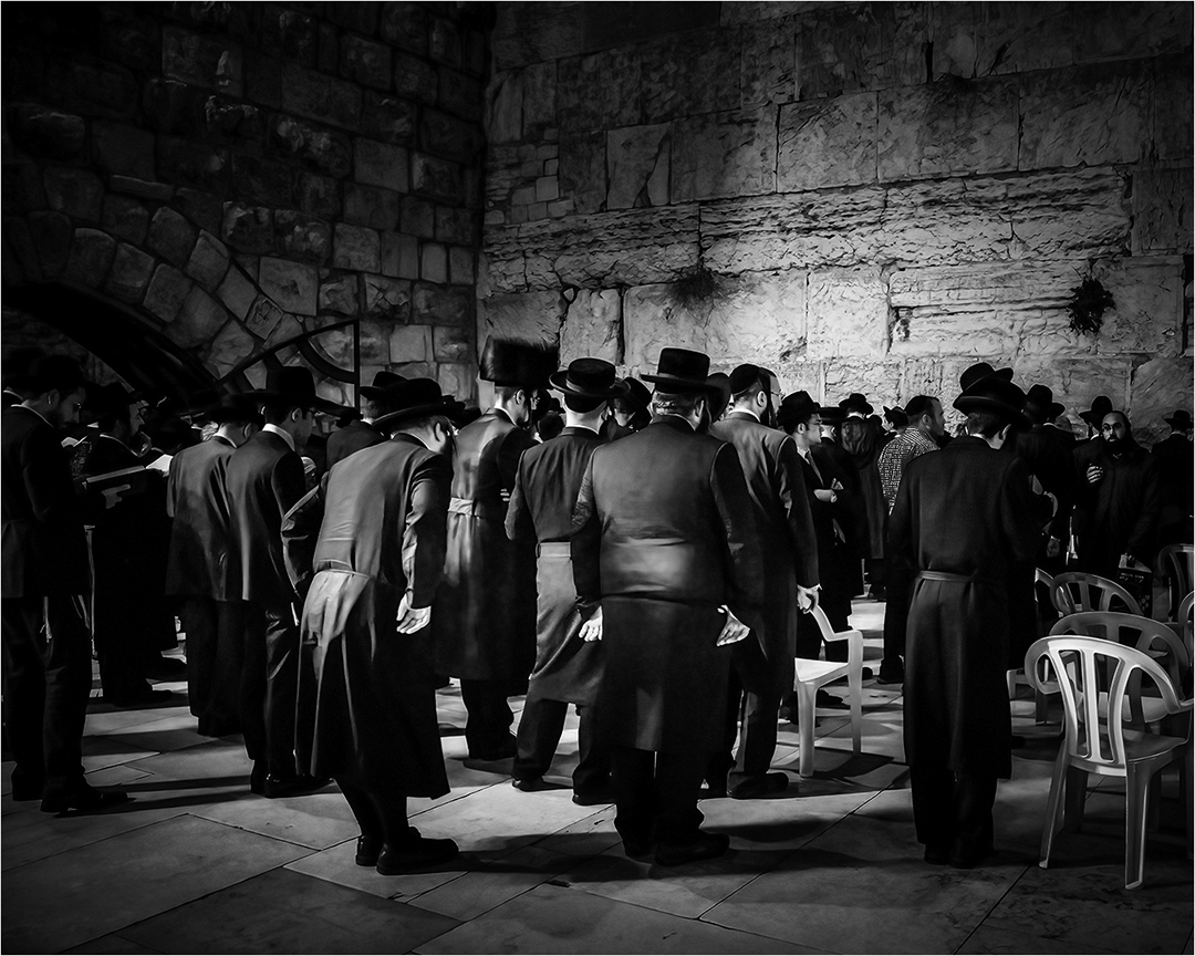
| 87 |
Sep 23 |
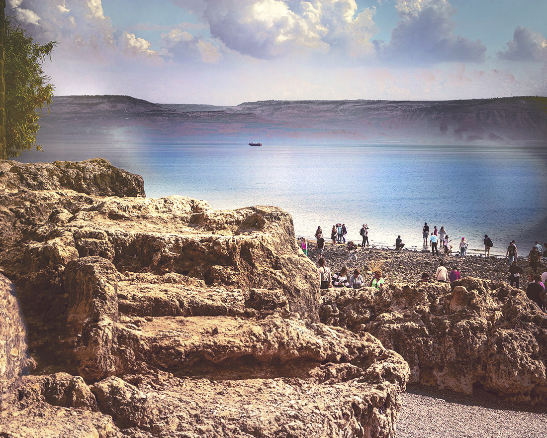
Comment |
What a really nice image. I like the graphic nature of it. Very sharp with just enough blur in the people at the bottom to give a nice feel of movement. Very well done. |
Sep 11th |
| 87 |
Sep 23 |
Comment |
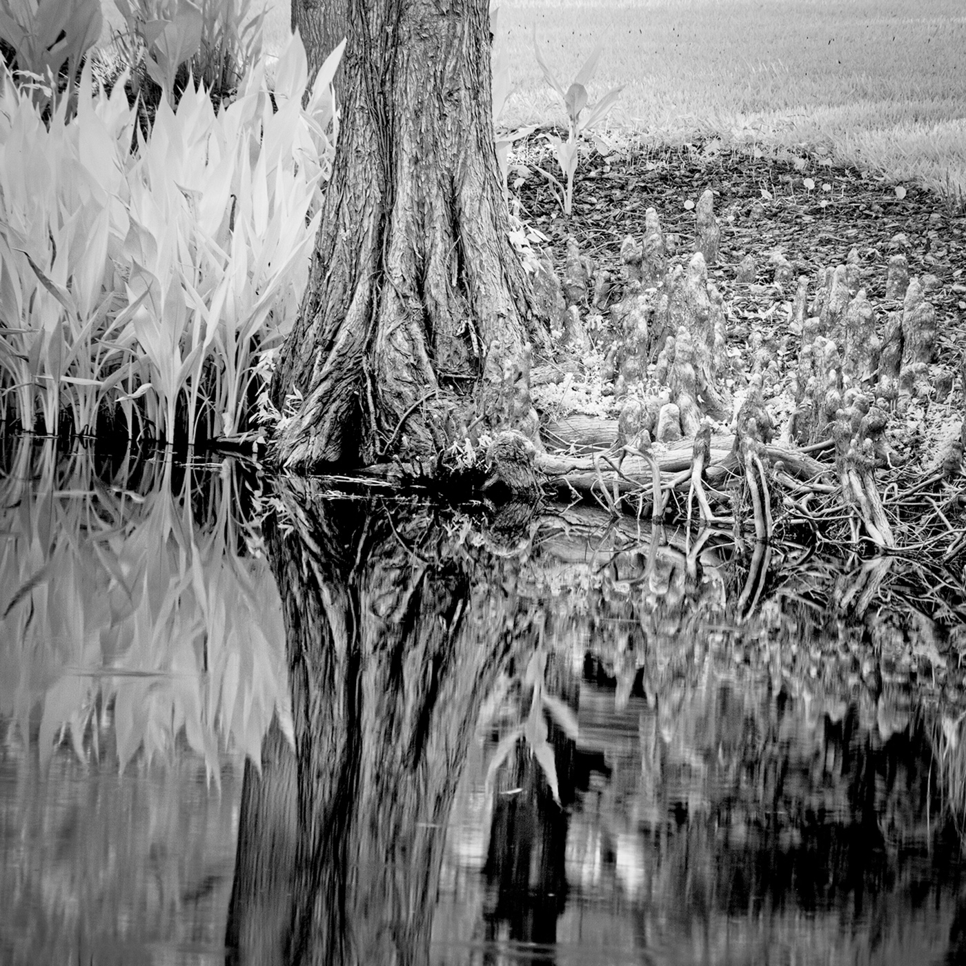
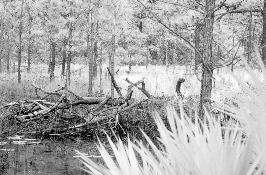
You have presented us with two very fine images. I am not sure which I like the most. I always admire your monochrome.
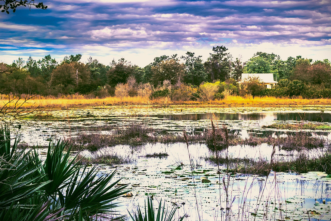
Undeveloped beaches like this with driftwood and fallen trees are harder to find in Florida these days. Nice find. |
Sep 11th |
5 comments - 0 replies for Group 87
|
9 comments - 8 replies Total
|