|
| Group |
Round |
C/R |
Comment |
Date |
Image |
| 87 |
Aug 22 |
Reply |
I always appreciate your response. Thank you. |
Aug 17th |
| 87 |
Aug 22 |
Reply |
O,K. I went back and added length to the book cover in order to change the original ratio dimensions of the book cover so that it will fit the ratio I had chosen (in order to be able to print aa 12X18 inch print on my printer) for the image. I do agree this probably looks better. My thanks to you, and most of the group for encouraging me to rethink my original decision. |
Aug 17th |
 |
| 87 |
Aug 22 |
Reply |
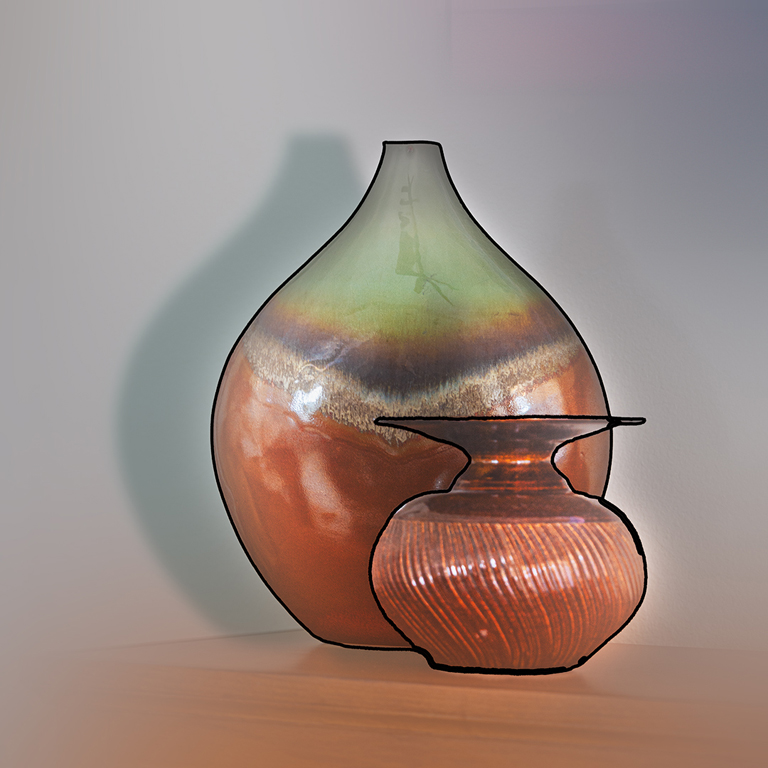
Wonderful idea! I wish I had thought of that. I still have the PSD file and may go back to try that. A new technique for me to learn and practice. |
Aug 17th |
| 87 |
Aug 22 |
Reply |
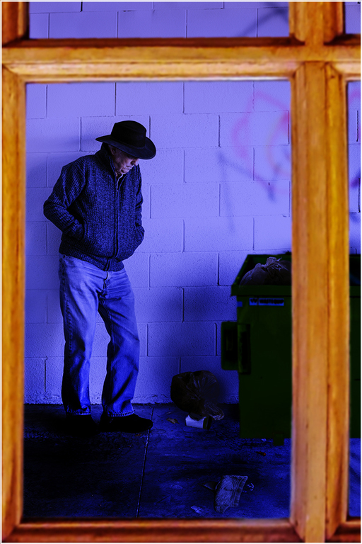
Thanks for the encouragement. My back has caused me to look in new places at home for new work. As for the book title, you notice that many mentioned the fact the entire title was not shown. I did consider this as I began and concluded that rather than doing the usual thing, I would use a crop that cut out part, but left enough to where the title could be clearly read. An artistic decision that is open to discussion. |
Aug 17th |
| 87 |
Aug 22 |
Reply |
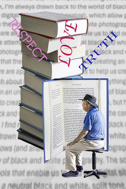
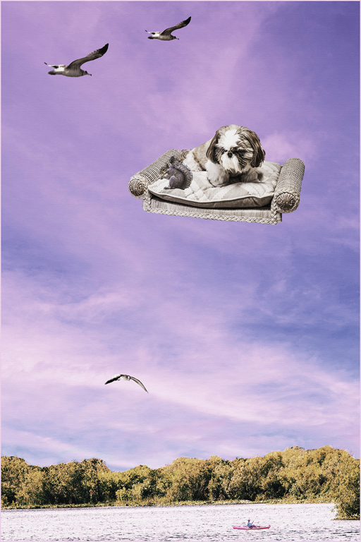
Thanks, Dale. I saw a presentation on creating this type of composite on the Zoom Photoshop Virtual Summit earlier this year and decided to work on this project. Working in multiple layers and selecting and masking the subjects are the key. I was pretty much confined to home at the time. It was a fun project. |
Aug 15th |
| 87 |
Aug 22 |
Reply |
I like the new catchlights. You did a good job of matching the direction of light. |
Aug 9th |
| 87 |
Aug 22 |
Reply |
Thank you for your comments. Yes, this was a fun practice project. As I sat at my computer, bemoaning the fact that my reoccurring back problem made it difficult for me to go outside to search for photographic subjects, it occurred to me that I could remain in my home office and find all the subjects needed for this composite. This is the first such composite of this magnitude that I have attempted. |
Aug 9th |
| 87 |
Aug 22 |
Reply |
Thanks for the explanation. Whatever works. A one or two stop neutral density filter would be another possibility. |
Aug 8th |
| 87 |
Aug 22 |
Comment |
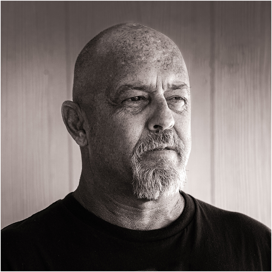
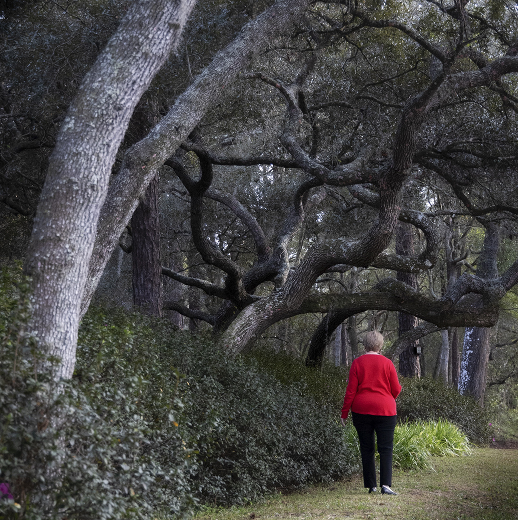
Will, it looks like the workshop was worth your time. I can see this as part of a collection of Fine Art photographs. I have never owned or used a soft-focus lens, but know they were (perhaps still are) popular with portrait photographers for use in photographing women. |
Aug 7th |
| 87 |
Aug 22 |
Comment |
Steven and Cindy have said it well. Very nice image. My one question: What was the purpose of the CPL? |
Aug 7th |
| 87 |
Aug 22 |
Reply |
Thank you for your comments. This was a fun project that could have been accomplished with the suggestions both you and Steven have made (See response to Steven above.)
Contrary to what many think, this was not that hard once you come to a basic understanding of layers in PS. Look for YouTube tutorials. |
Aug 7th |
| 87 |
Aug 22 |
Reply |
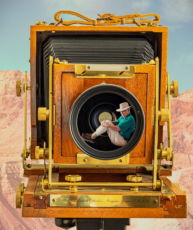
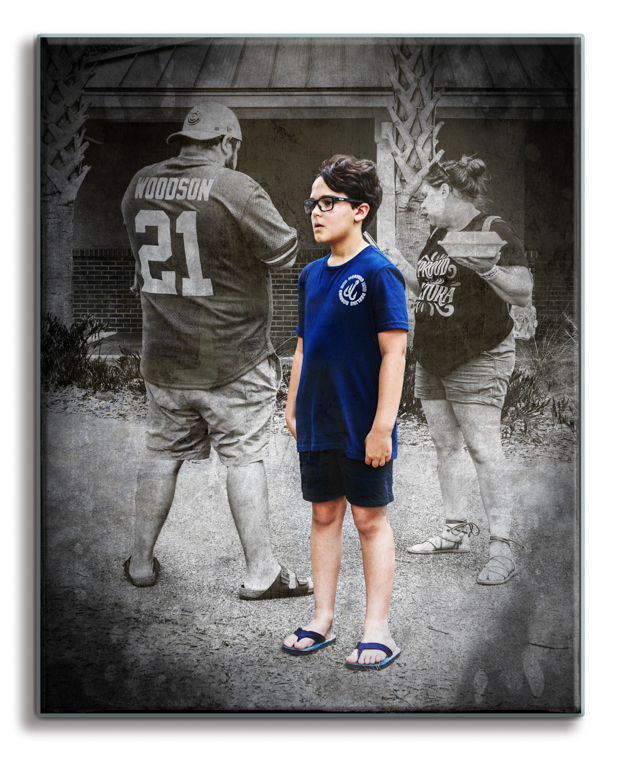
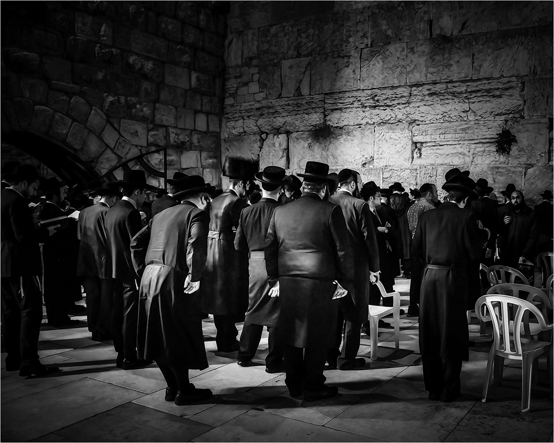
Steven, thanks for your evaluation. This was a fun opportunity to experiment with a concept and PS layers. A good learning project. No, the camera in the upper left is not a Deardorff, but a Zone VI 4X5. I found it years ago on consignment at a local camera store and liked the look. I have never used it.
I was undecided on some of the same issues you mention but chose the present arrangement. I did not reduce the opacity of any of the cameras. I did place all but the RP and cellphone camera in front of the clock face and reduced the opacity of the clock face level to let the older cameras remain visible but recognizably behind the clock as past history.
Since I also saved the file as a PS document with all levels still active, I can go back later and experiment with some of your suggestions. |
Aug 7th |
| 87 |
Aug 22 |
Comment |
What a wonderful image. This is no less than two great images in a row for you. You have captured the "decisive moment" when the rider hit the ground.
Not only is the background simple and uncluttered, but the composition is very good. The bend of the horse's neck, the position of the front legs, the curvature of the rump and the straight line of the rope being held by the rider, all act as leading lines leading to the subject. Add to that, the fact that the brightest area of the image is the rider's coat all cause the viewers eyes to go first to the thrown rider.
A Magazine cover. |
Aug 6th |
| 87 |
Aug 22 |
Comment |
I am glad to see you continuing to perfect your "Birds in Flight" techniques. Pelicans are a good place to begin as they tend to glide at a slow rate of speed. I like the position of the bird. The wings are fully extended and the right eye, though not well lit is visible. I also note you are increasing your knowledge of LrC by experimenting with the masking tools.
My one suggestion is to watch your background. I would like to see what the image would look like if you had clicked the shutter a moment earlier when the bird was in the open sky, rather than having the tree branch directly behind it. |
Aug 6th |
| 87 |
Aug 22 |
Comment |
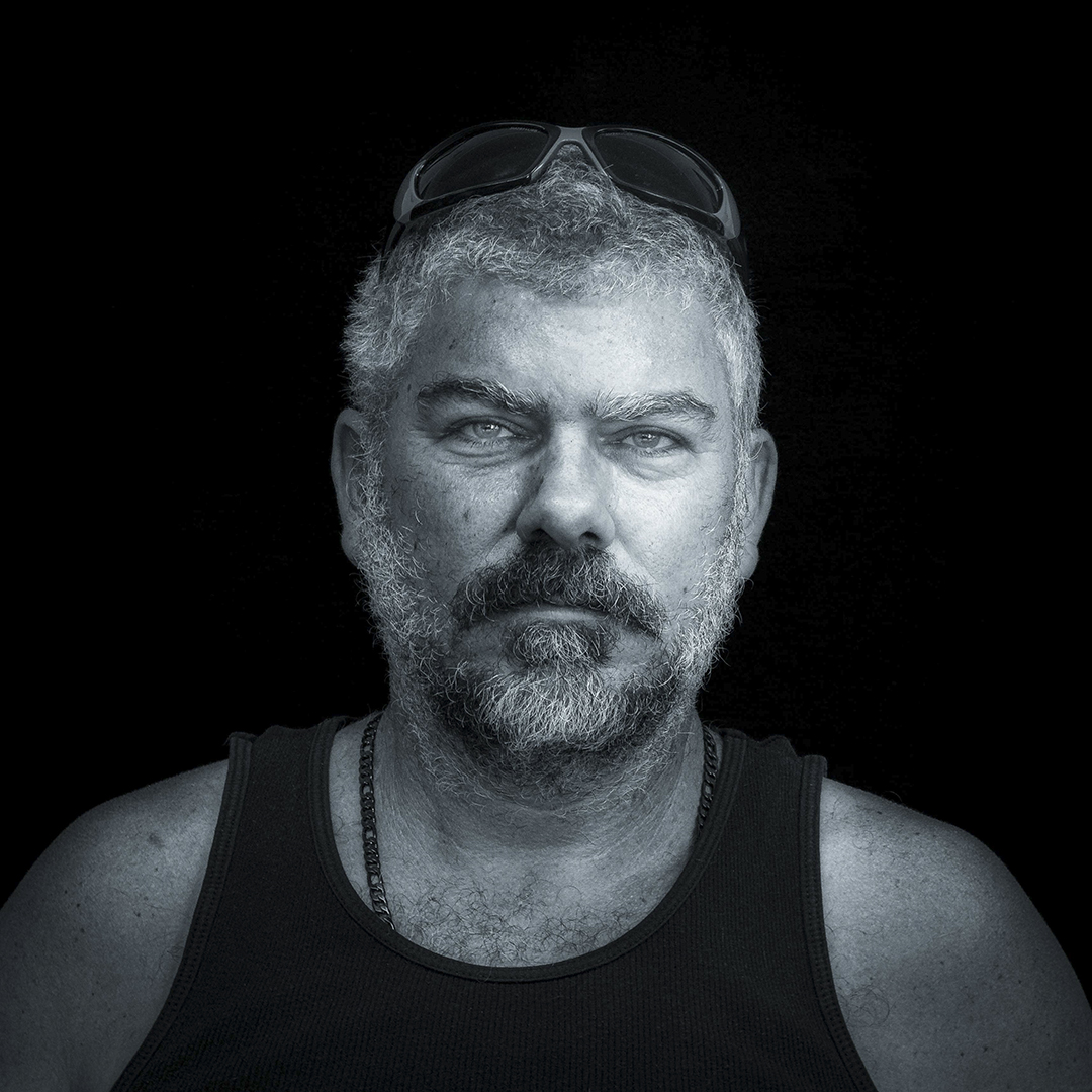
Steven, this is a very good image. What a pleasure it is to work with professional models. They actually know how to pose and give you what you are looking for.
1. I greatly prefer the B&W mode for this image. Without the color, the distracting background is greatly deemphasized. The skin tones are less contrasty and have a smooth transition of tones.
2. In a perfect world, I would want to see a catch light in the eyes. However, the whites of the eyes are well lit and provide some liveness to them. |
Aug 6th |
| 87 |
Aug 22 |
Comment |
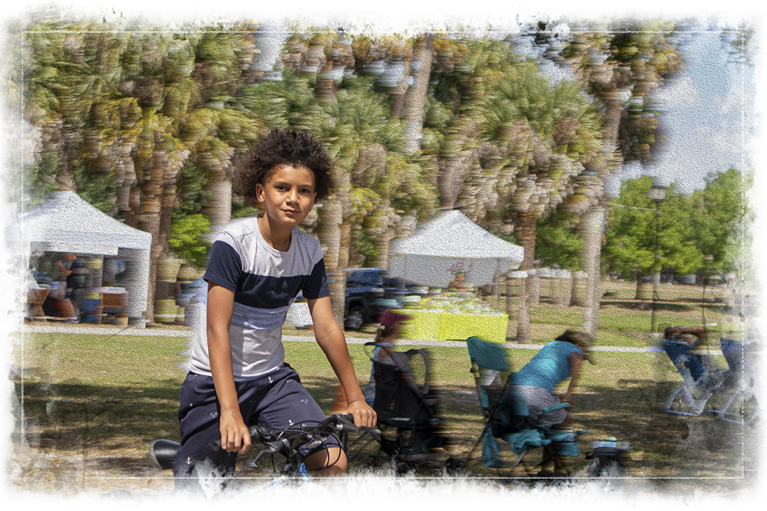
Lance, thank you. Once again you have reminded me to look for uncommon ways to photograph a scene or object. It reminds me of a piece of advice I heard a photographer give to a group of young photographers planning to start a photography business. "Find out what everybody else is doing," he said, "and don't do that."
I made a false assumption when I first looked at these images. I assumed you had used elements from Original and Original 2 to form the Final Image. Once I looked more closely, I could see that was not the case. When I made that realization, I could see what you have done.
As to Original 2, my assumption is that you wanted to use a higher shutter speed than you did on the other two, and rather than using a larger aperture, you increased the ISO by three full stoops. Your closeness to the foreground while focusing on the background gave a soft focus to the foreground. |
Aug 6th |
6 comments - 10 replies for Group 87
|
6 comments - 10 replies Total
|