|
| Group |
Round |
C/R |
Comment |
Date |
Image |
| 87 |
Feb 22 |
Reply |
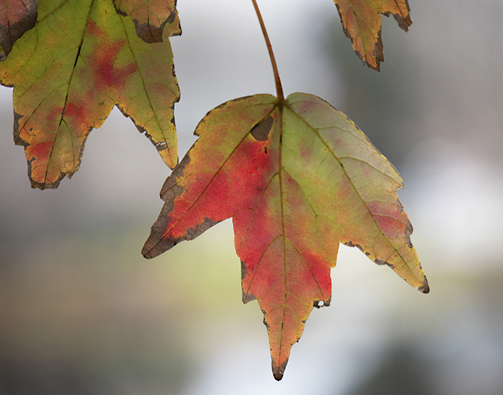
Thank you for your very encouraging comments. I may think more about, and try variations of fishing themes for future work. |
Feb 17th |
| 87 |
Feb 22 |
Reply |
Thanks for your comments. I always value them. |
Feb 11th |
| 87 |
Feb 22 |
Reply |
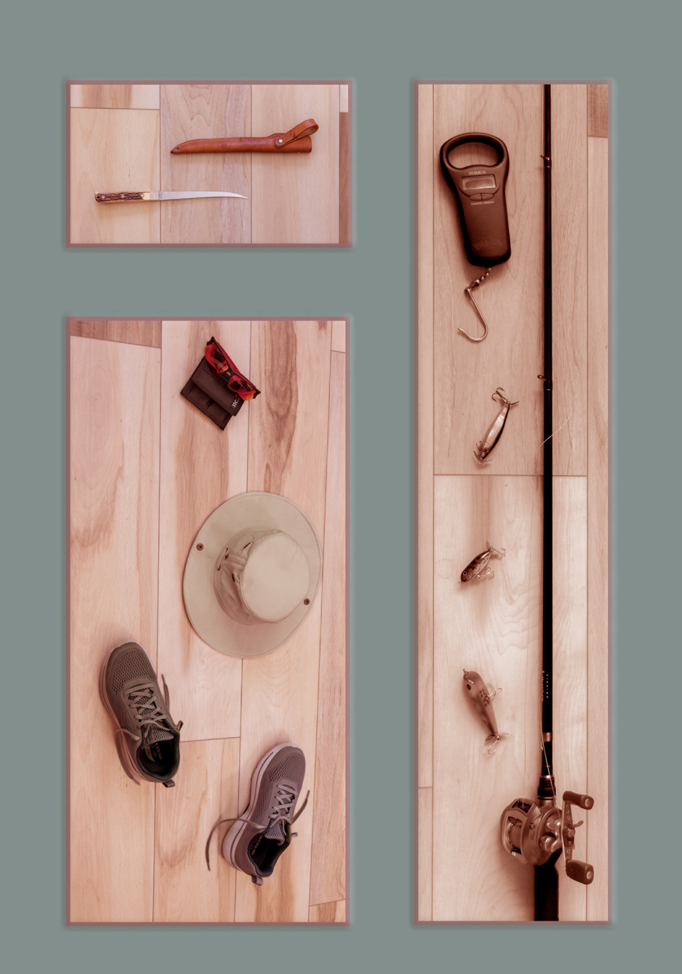
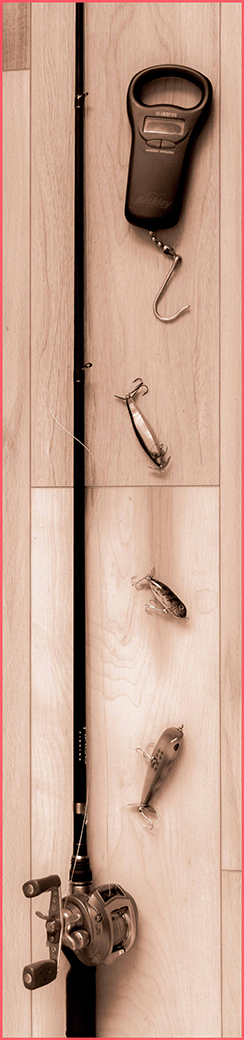
Thank for your comments and suggestions. Yes, there are a number of variations that could be incorporated to form interesting images. I will have to think about the color of the border. Perhaps black would be more appropriate. As far as the rod handle is concerned, you may notice from the original photo that just below where I cropped the handle goes back to the rod only. This handle is rather long with more handle material at the bottom. To include the entire handle would push the reel far higher in the image than I wanted. |
Feb 9th |
| 87 |
Feb 22 |
Reply |
Thank you for sharing your thoughts about my image. Yes, including more of the handle of the rod would create another view and be most appropriate. Long before I placed the elements on the floor, I had envisioned the composition in my mind. I wanted enough handle to show that it was there and enough length of the rod to let the viewer be sure what it is. Of most importance to me was the reel and the fishing lures and scale. |
Feb 7th |
| 87 |
Feb 22 |
Reply |
Yes, this seems stronger than the original color image. |
Feb 7th |
| 87 |
Feb 22 |
Reply |
I have no experience photographing birds in flight, but my understanding is that birds, like airplanes, always land and take off into the wind. |
Feb 7th |
| 87 |
Feb 22 |
Comment |
Jennifer, I do like this image. Your concept is good, and the B &W fits the image. You show a full range of tonal values from pure white to black with many tones of grey. I wish you had been a position to have the birds face you rather than showing their tails to you. |
Feb 7th |
| 87 |
Feb 22 |
Comment |
Cindy, I certainly agree with what Jennifer has said. My only other comment is that I would like to see the bird placed so that there is more space open in the direction it is looking than behind it as it is now. |
Feb 7th |
| 87 |
Feb 22 |
Comment |
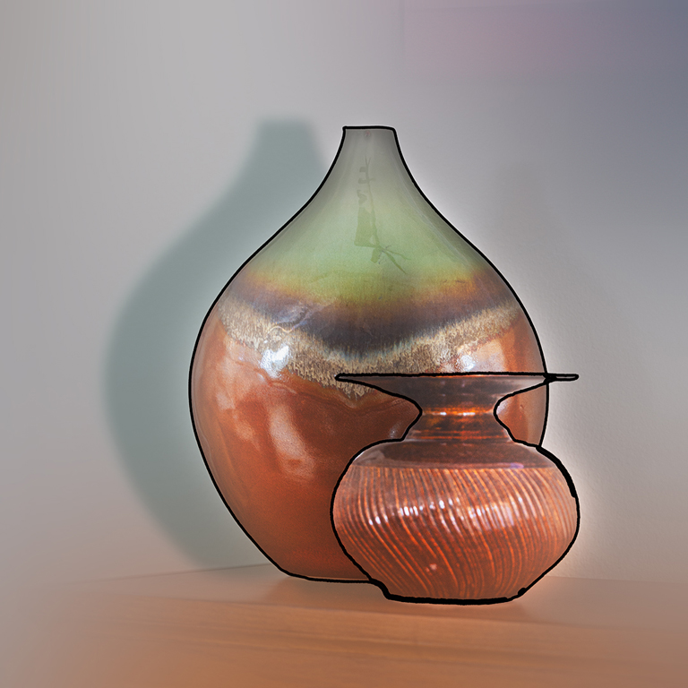
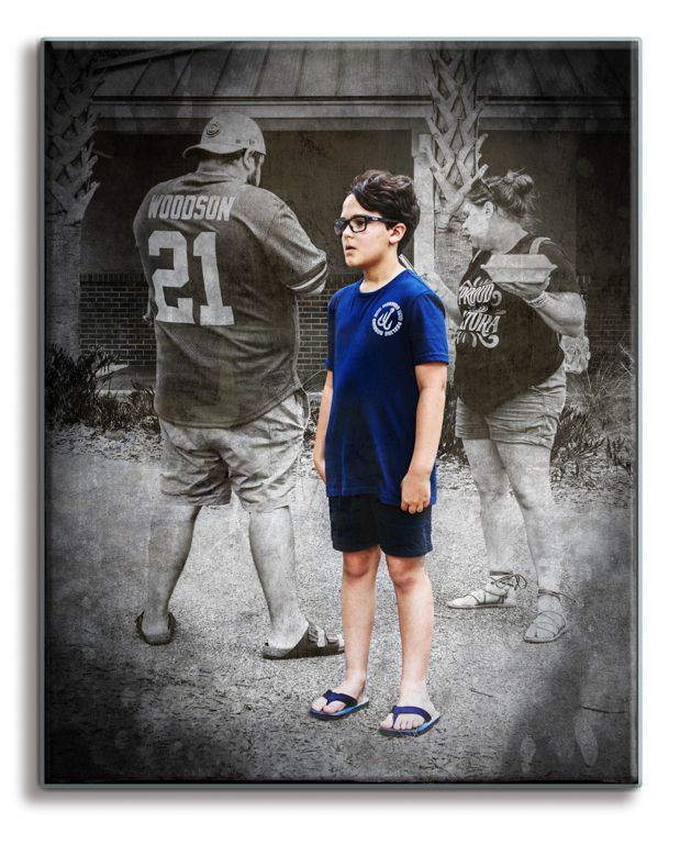
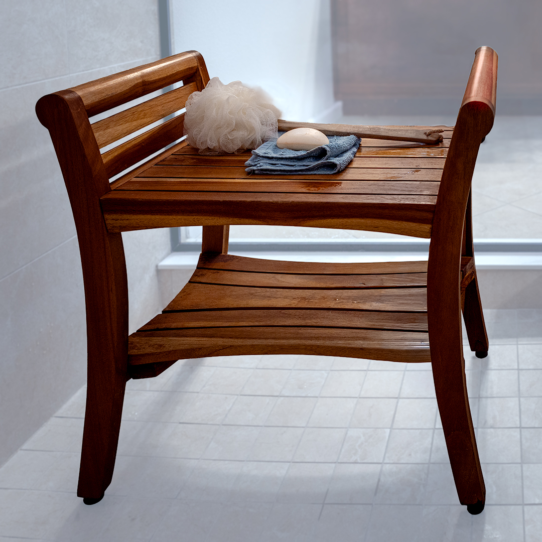
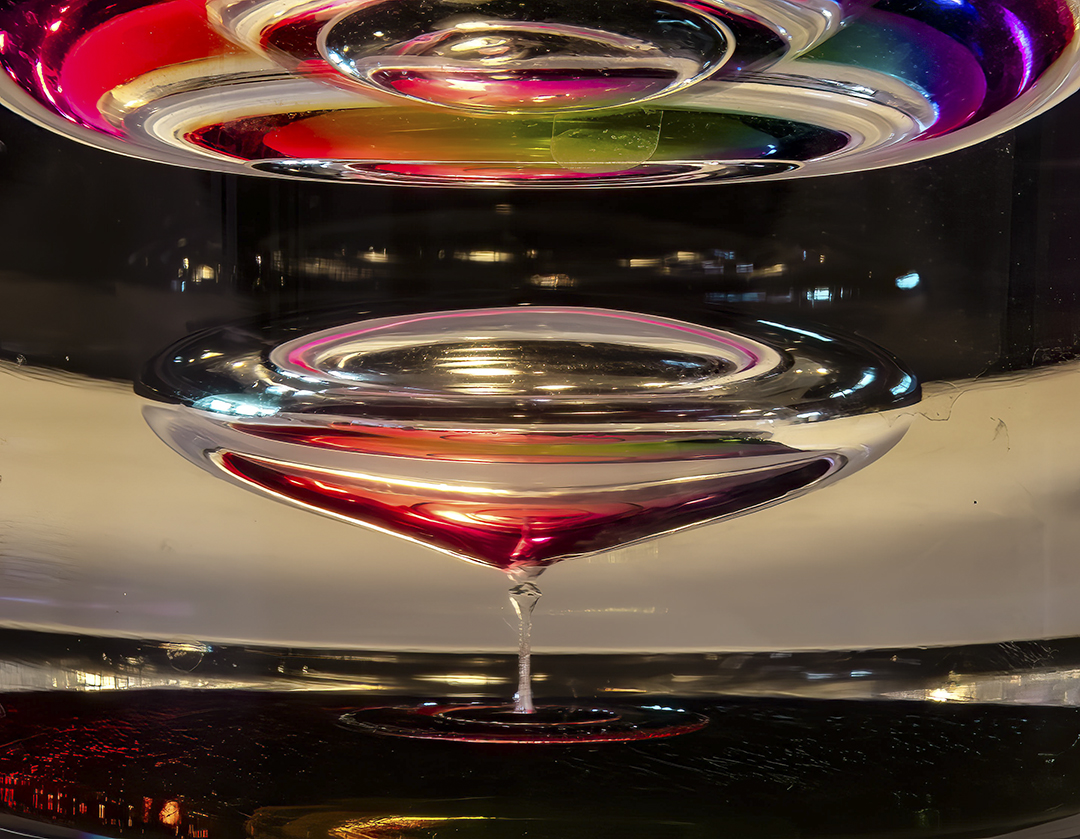
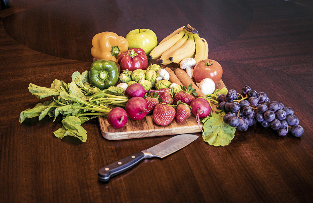
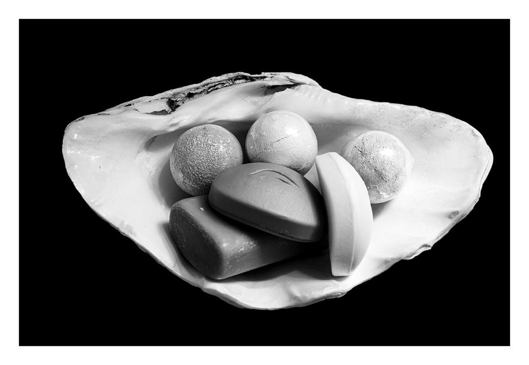
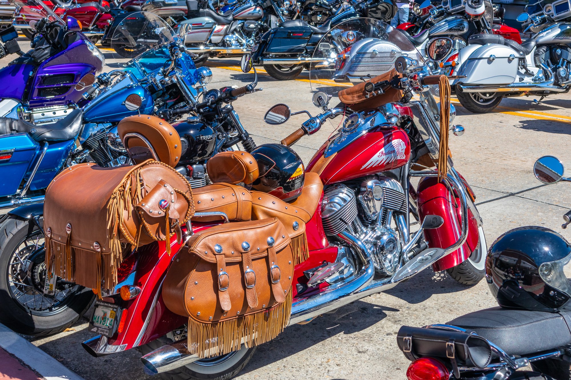
Will, I have no idea of what these objects are. There is nothing of known size by which to judge their size. I will say that I very much like the image. My eyes are immediately drawn in by the vibrant colors. The reflections add additional interest. But to me, the real clincher is the unexpected bonus of the up-curved red object that breaks the repeated pattern of the other four. |
Feb 7th |
| 87 |
Feb 22 |
Comment |
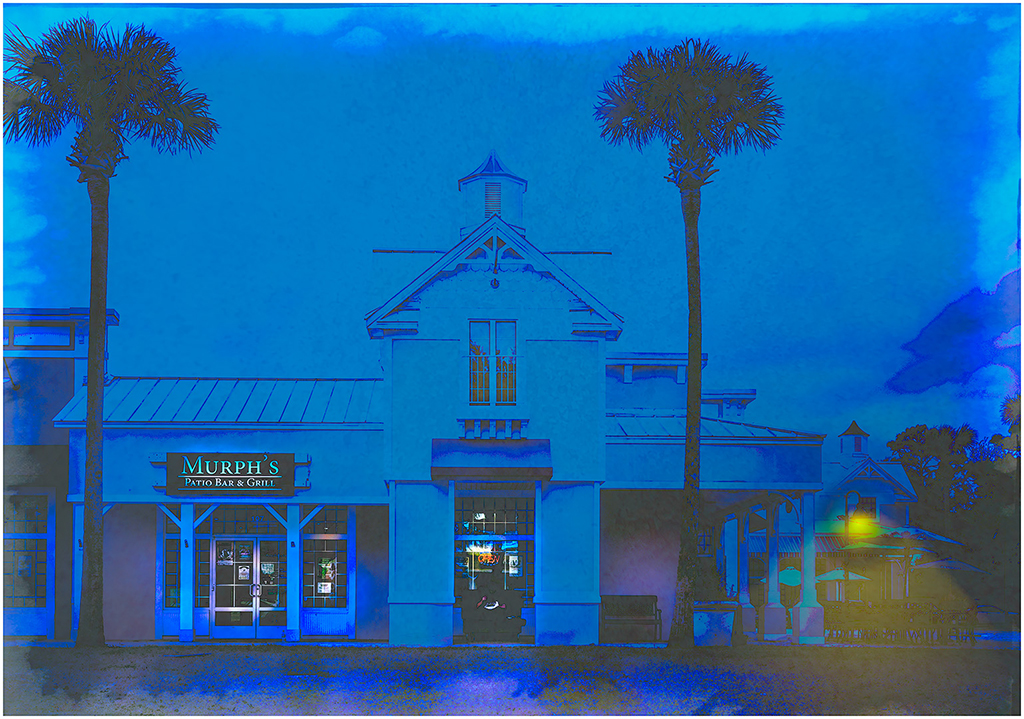
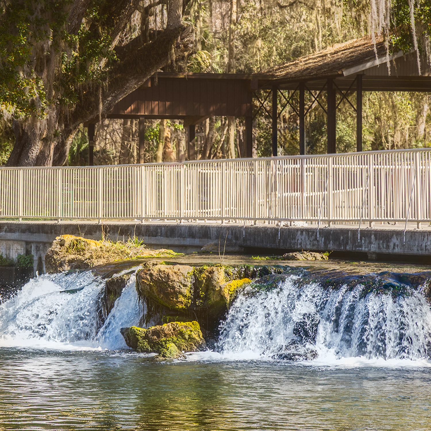
Dale, really nice job! The muted colors provide the proper feal for this cloudy, cold day. Wonderful leading lines in the structure of the bridge.
I do have two additional comments. The first is very picky and there is really nothing you could have done. The bridge provides a wonderful leading line that draws my eye in from the left side towards the middle. But I begin to feel some tension in that my eye is confronted with traffic that appears headed in the opposite direction.
Second, the main subject of the image, the tallest supporting column of the bridge is directly in the middle of the image. The right end of the bridge is now just more than 1/3rd of the way in from the right, leaving that right 1/3rd as empty space. If you had moved your camera angle more to the left, you would have corrected what I see as a problem. |
Feb 7th |
| 87 |
Feb 22 |
Comment |
Steven, I like this image. The most striking part of it, for me, is the expression on the eagle's face.
When I first viewed the image, I assumed you were using a wide-open aperture, thus, a narrow depth of focus. That assumption caused me to wonder about the unfocused patch of green just above the feet of the bird. After looking again at the camera setting you provided, I realized that the 400mm lens was compressing the depth of the image and the depth of focus was greater than I had thought. However, that patch of green looks out of place, and you may want to consider removing it. |
Feb 7th |
| 87 |
Feb 22 |
Reply |
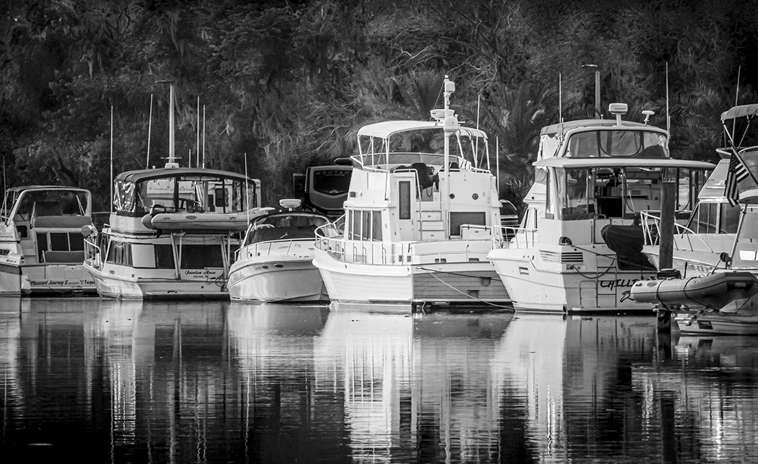
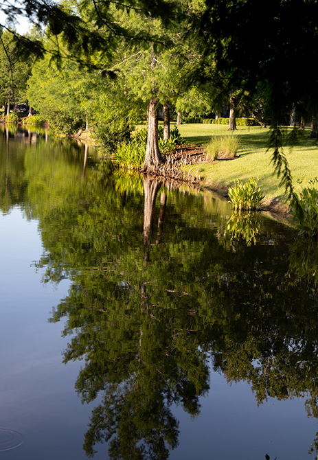
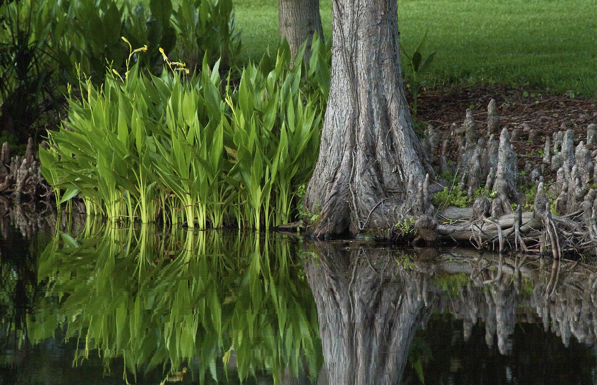
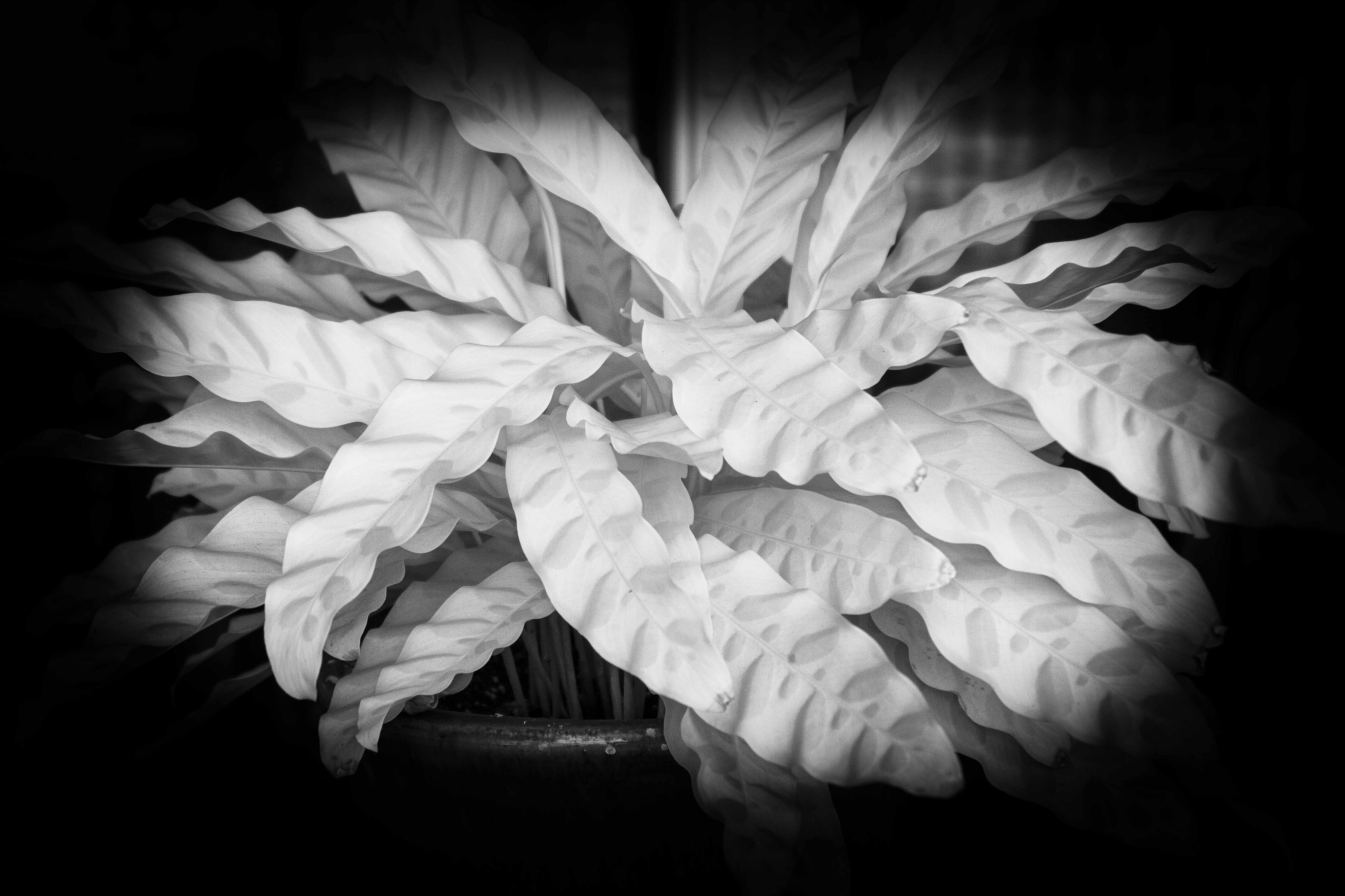
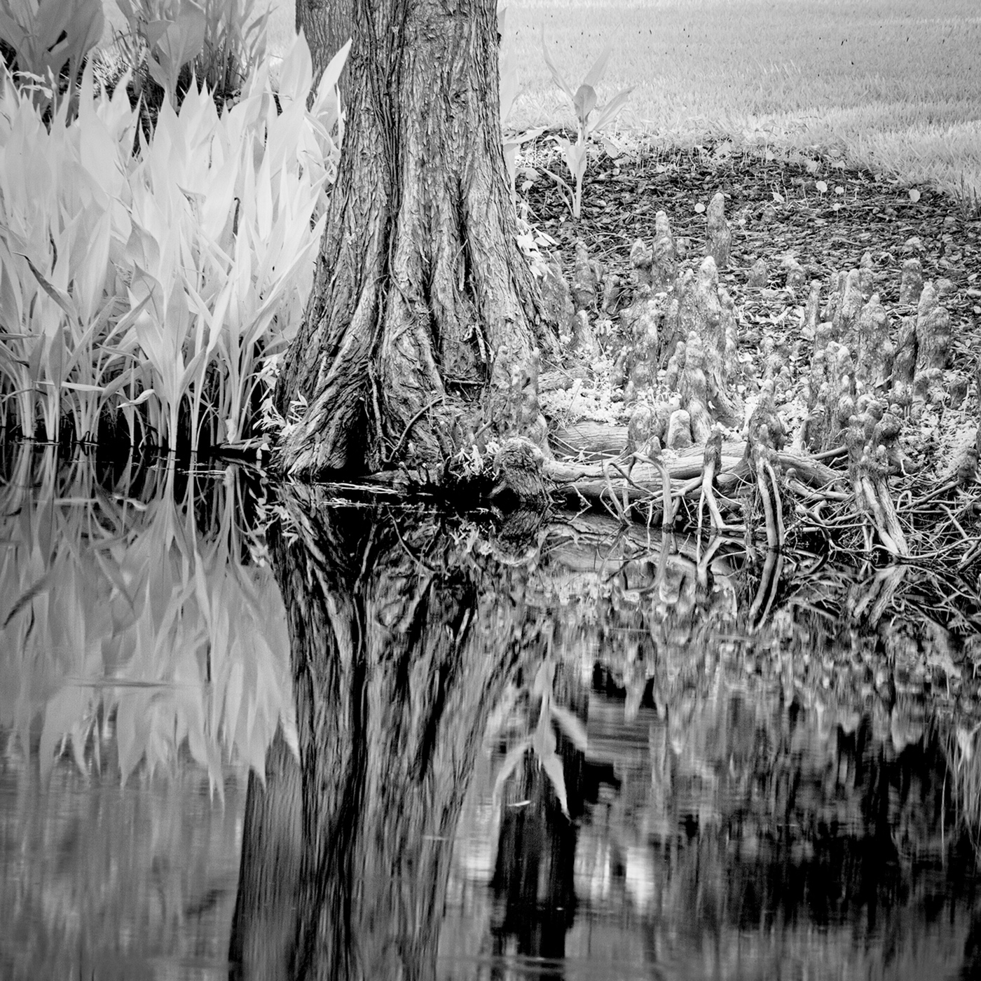
I disagree. I saw the original in B&W and find it to be the strongest image. Perhaps it is simply my early experience in B&W and the darkroom, but the color rendition of this photo seems weakened by the color. My eye finds it more confusing.
A successful B&W photograph relies on shapes and textures, which is what this photograph is all about. I am sure the color image is more representative of the scene you view each morning and may have more sentimental appeal to you. But to me, the added color serves only to dilute the strength of the shapes and textures.
I will quicky admit that the value of this, or any photograph is not dependent on my approval. Do you suppose that I could sometimes be wrong? |
Feb 7th |
5 comments - 7 replies for Group 87
|
5 comments - 7 replies Total
|