|
| Group |
Round |
C/R |
Comment |
Date |
Image |
| 87 |
Oct 20 |
Reply |
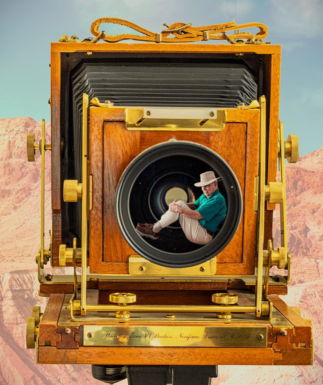
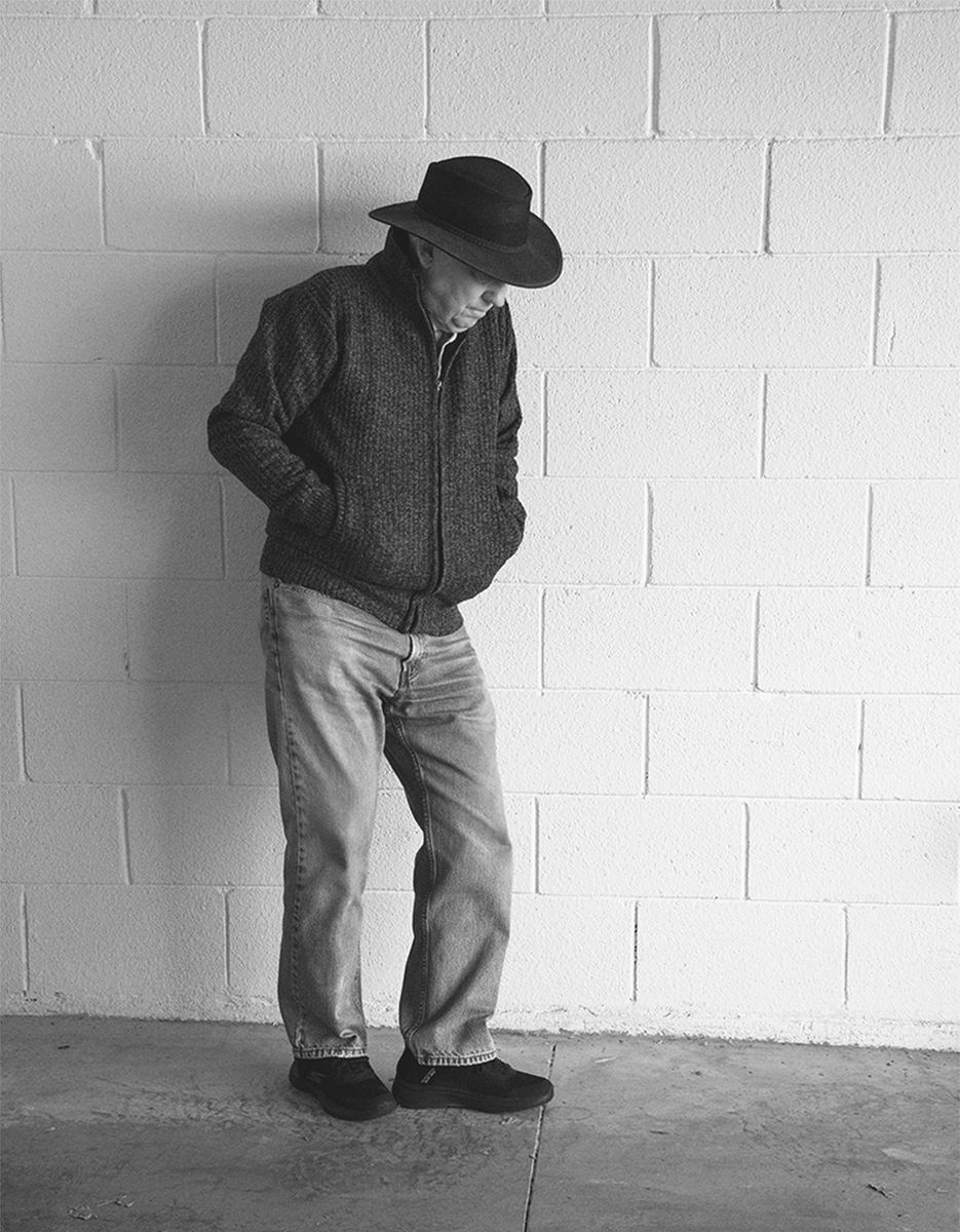
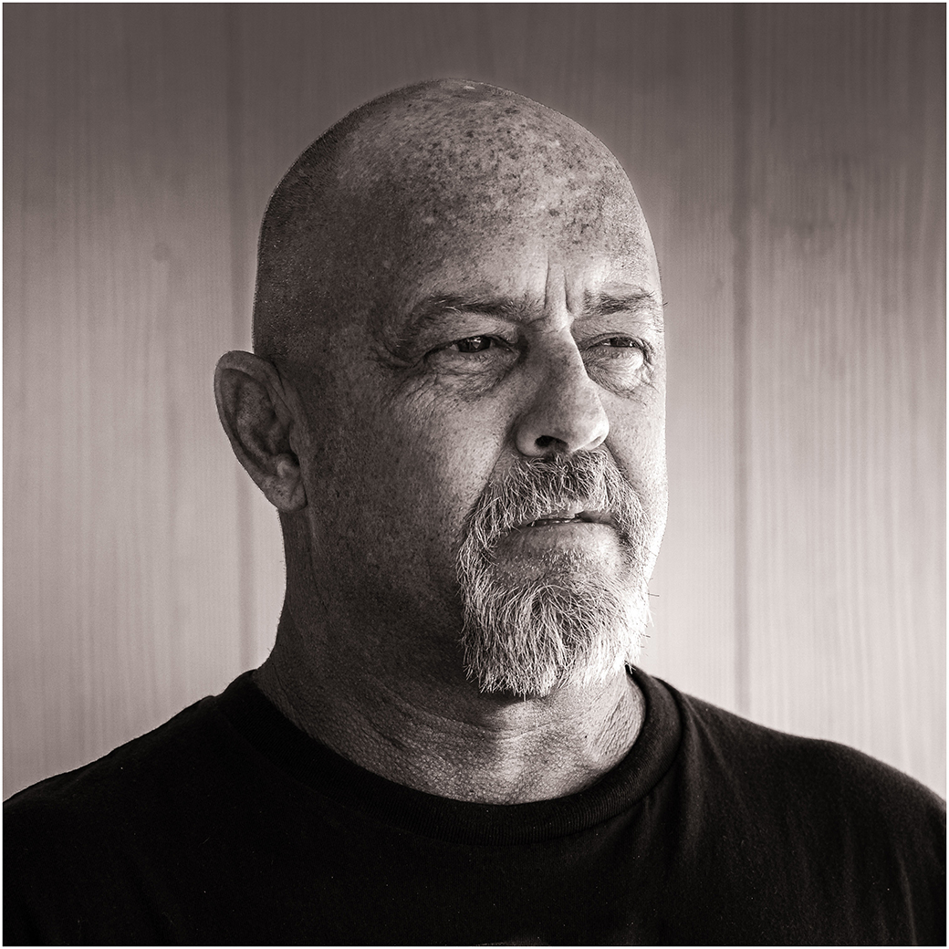
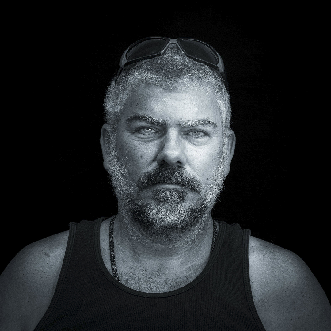
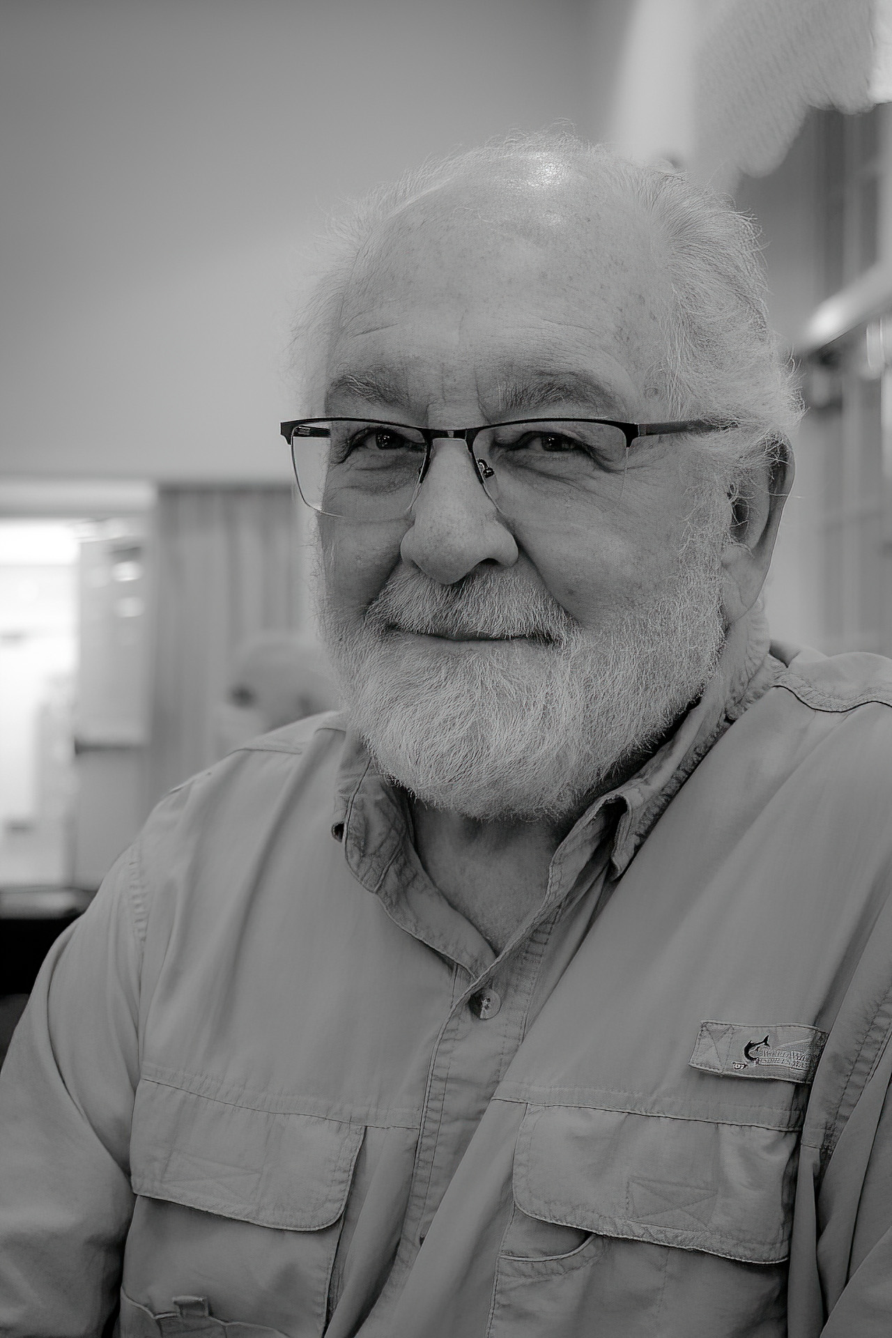
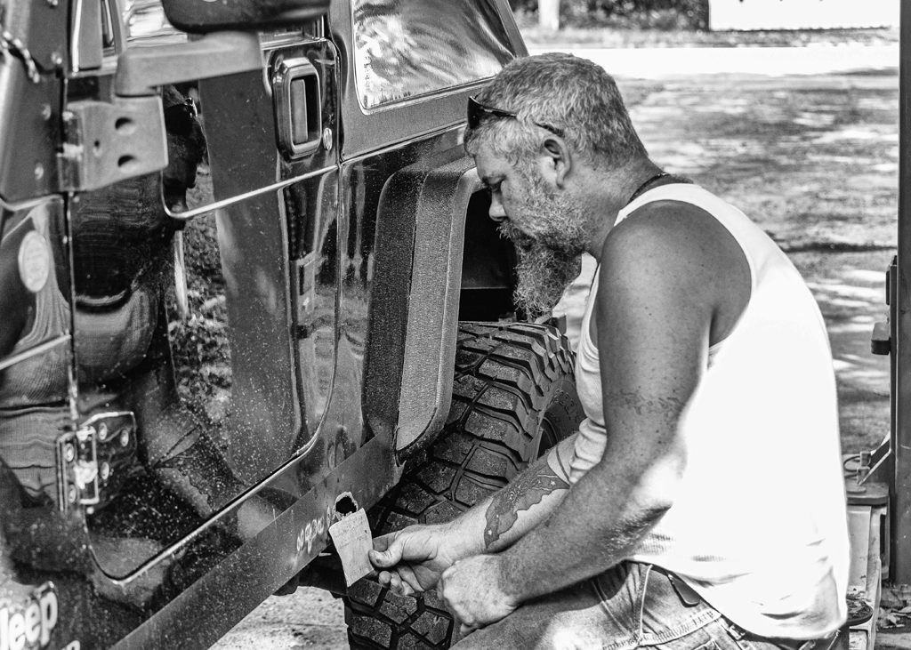
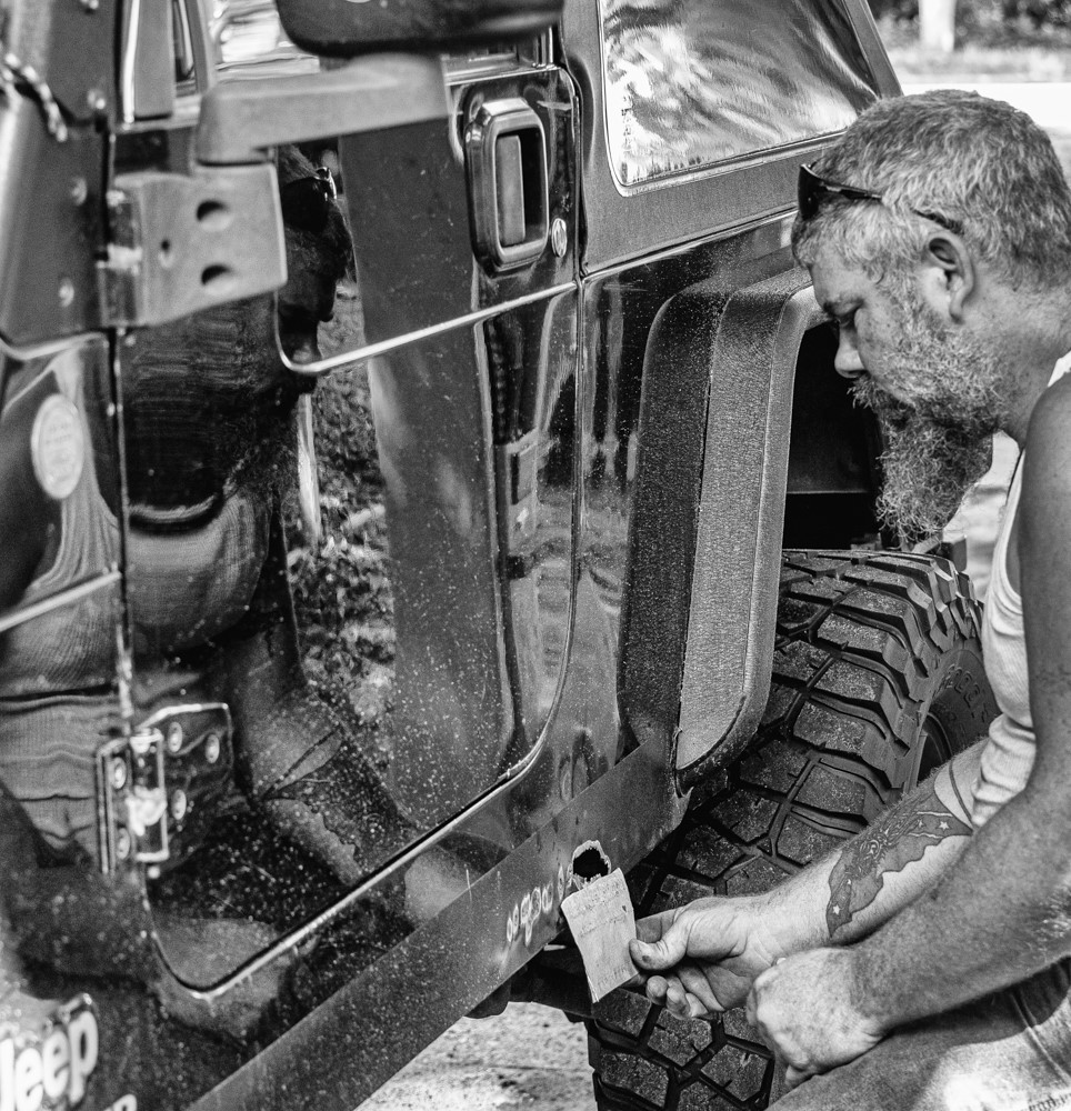
Thank you. Dennis makes a great subject for a character study. I would love to get him aside for a B&W head and shoulder portrait. Perhaps in infrared. |
Oct 19th |
| 87 |
Oct 20 |
Reply |
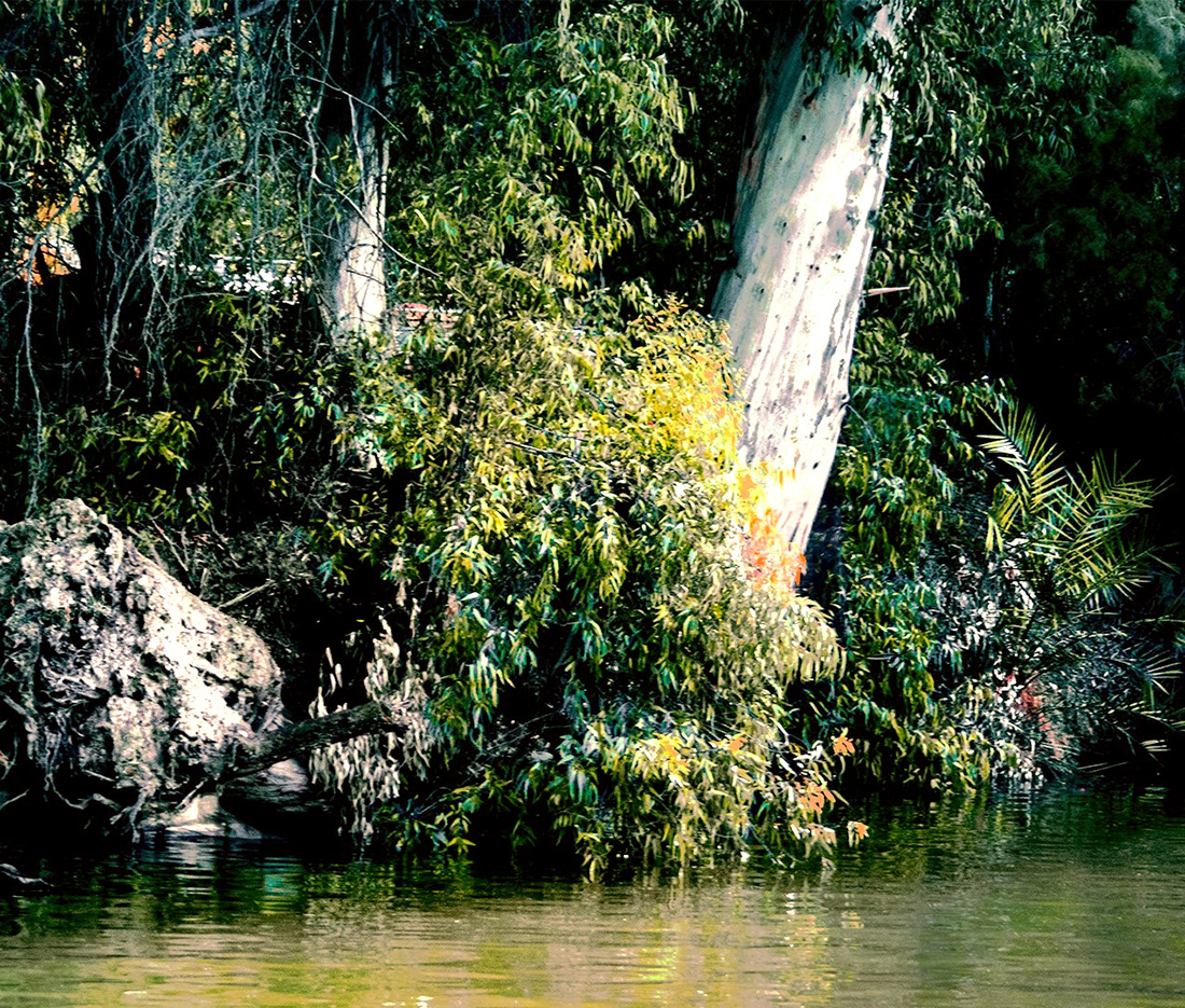
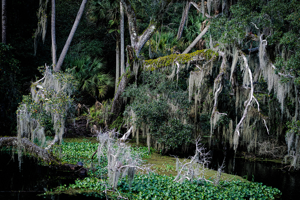
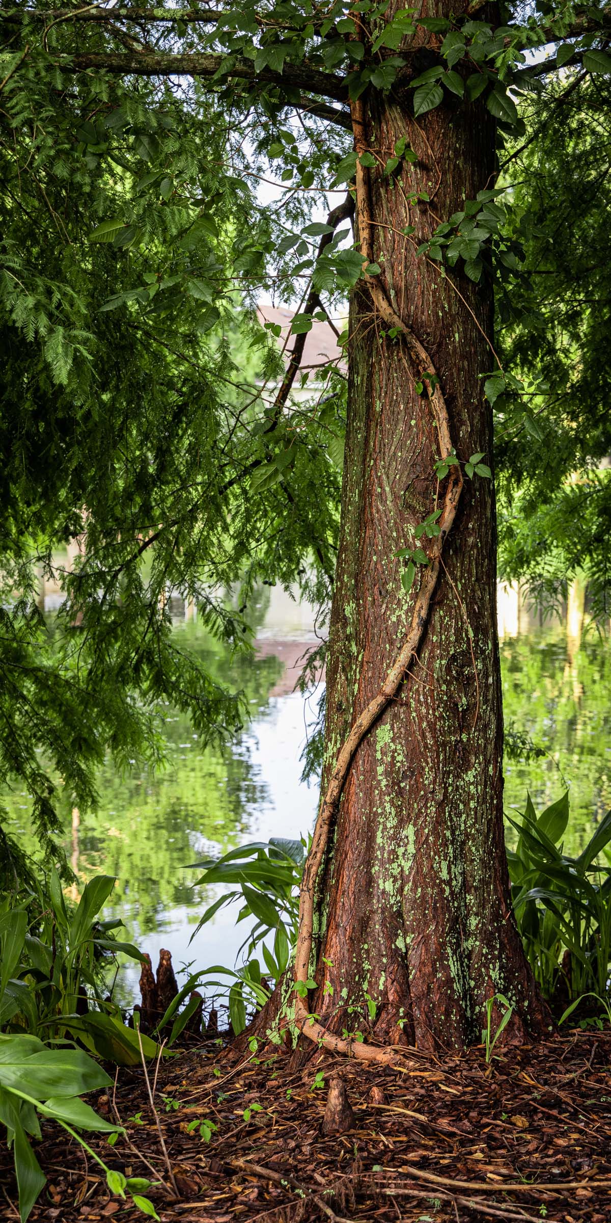
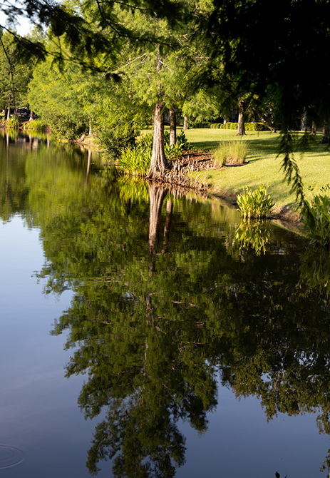
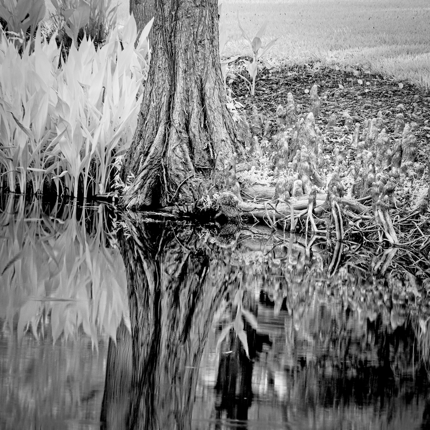
As I look at this image I see no need to have the full tree or the full reflection in the image. It appears obvious that including the full tree only add more of the small branches of which there are plenty aready included. Sometimes what is not included serves to lead the eye to the primery subject. Just my thought. |
Oct 16th |
| 87 |
Oct 20 |
Comment |
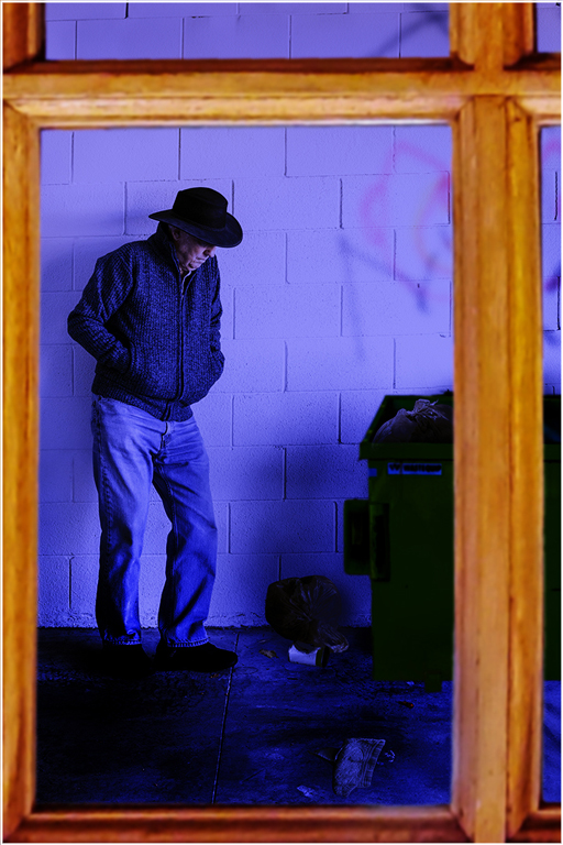
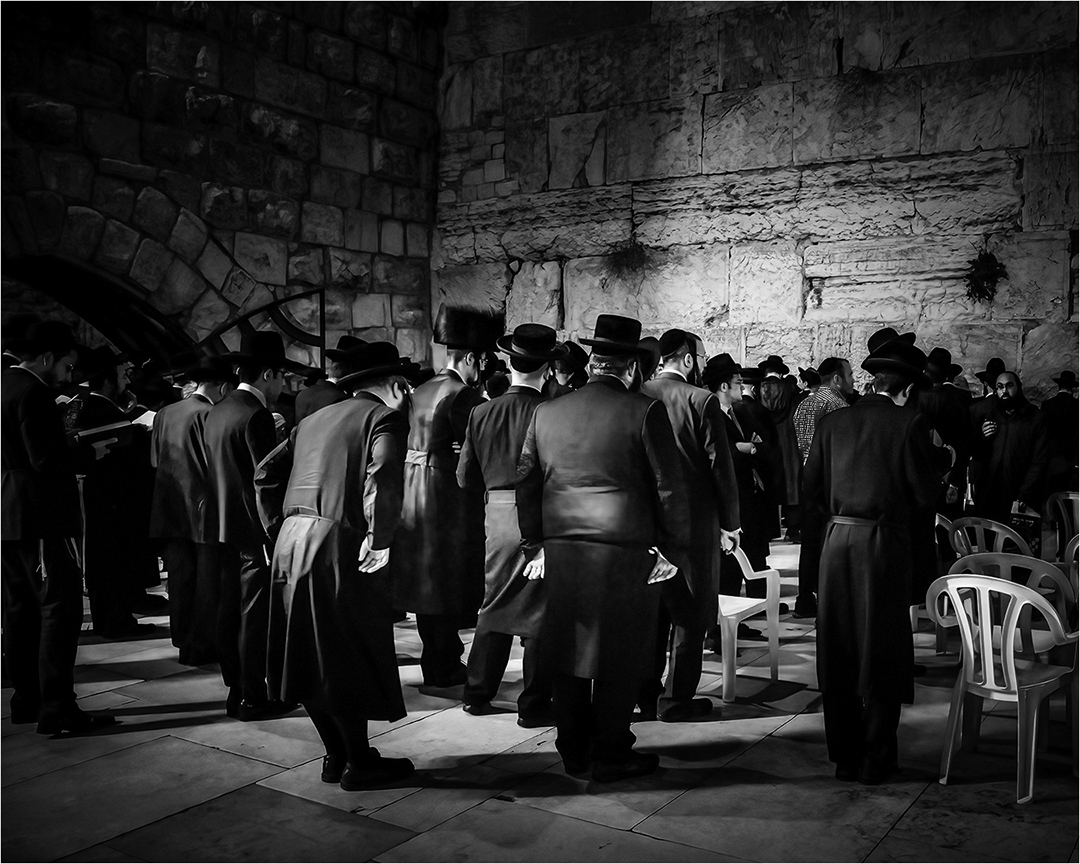
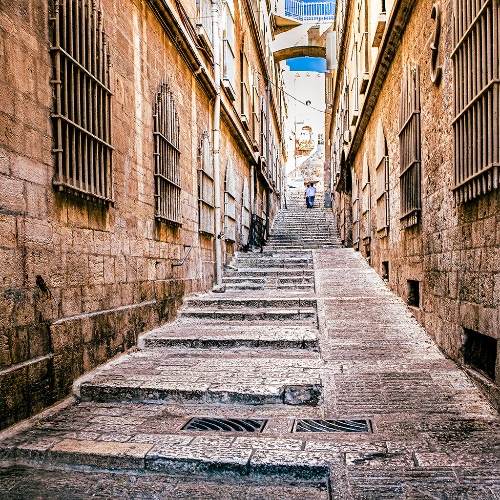
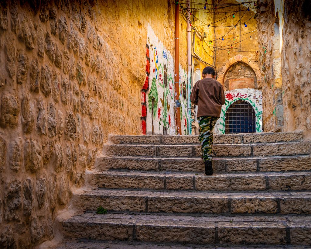
I find myself drawn into the image. As much as I like the view of the steep hill we are being led into, with the tall buildings on either side, to me it is the silhouette of the man at the bottom that makes the differance bewteen a nice record photograph and an interesting urban art photograph. I think the backlight on the subject is what makes the image what it is. |
Oct 14th |
| 87 |
Oct 20 |
Comment |
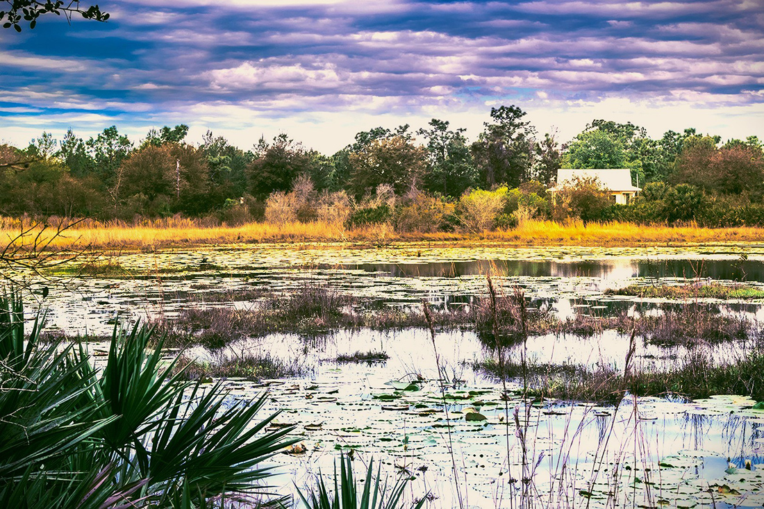
Lance has said it. The tall bird, the tall crop, and then the horizontal line of the waves in the water. I also like the little touch of the thin frame that you added. You could crop up from the bottom and cut out the reflection and still have a very nice image. But, please do not do that. |
Oct 14th |
| 87 |
Oct 20 |
Comment |
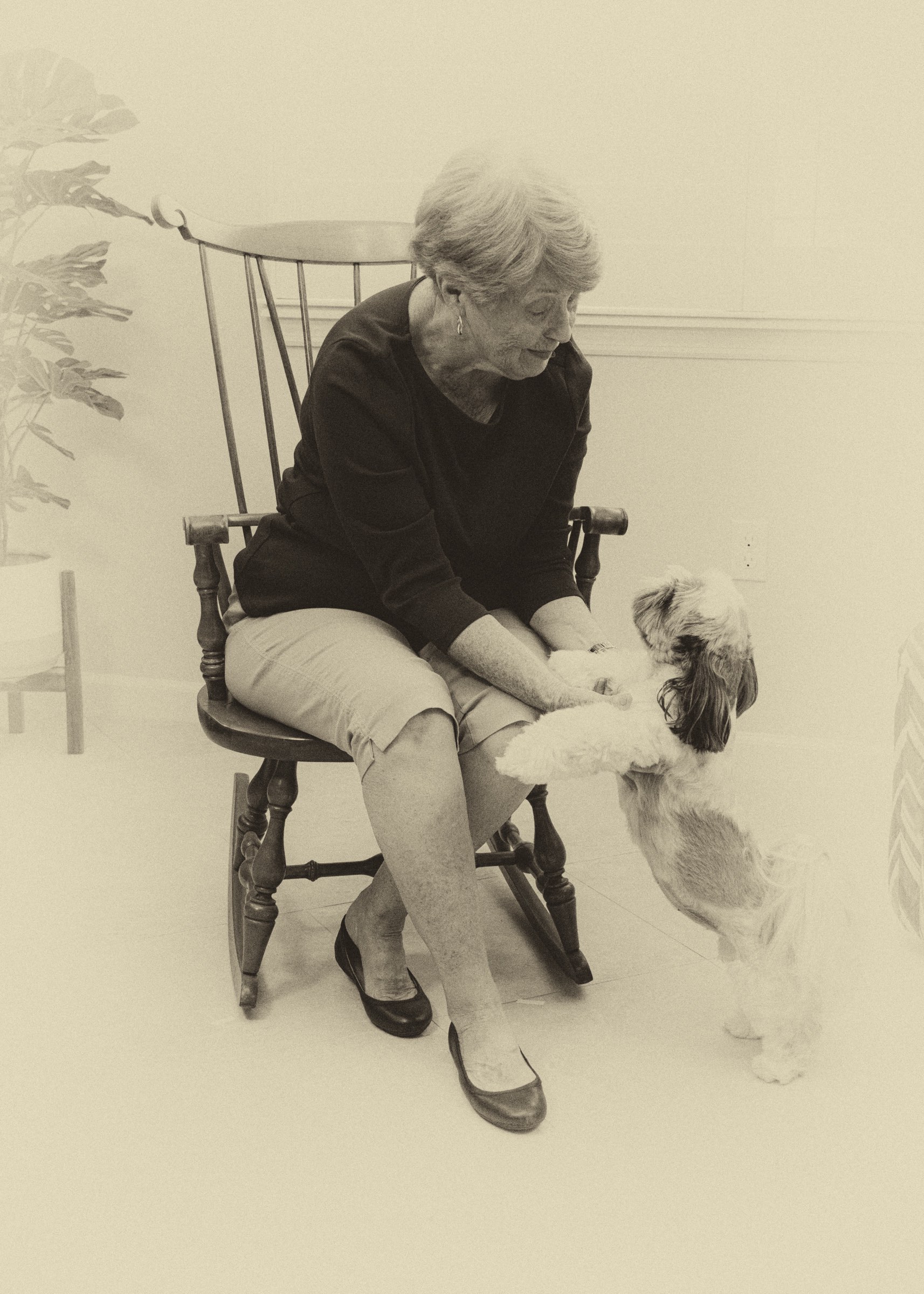
Who wouldn't love that face? Those sad eyes. The long floppy ears. There does seem to be a piece of hair (possibly from a long eyebrow) in the left eye. This is somewhat distracting, but does not overy distract until you see it. I would like to see a slightly looser crop that did not crowd the botom of the front paw. Over all, this image captures and holds my attension. Good work. |
Oct 14th |
| 87 |
Oct 20 |
Comment |
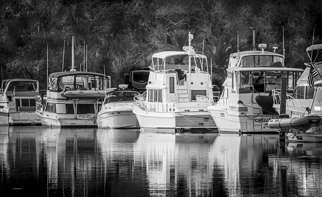
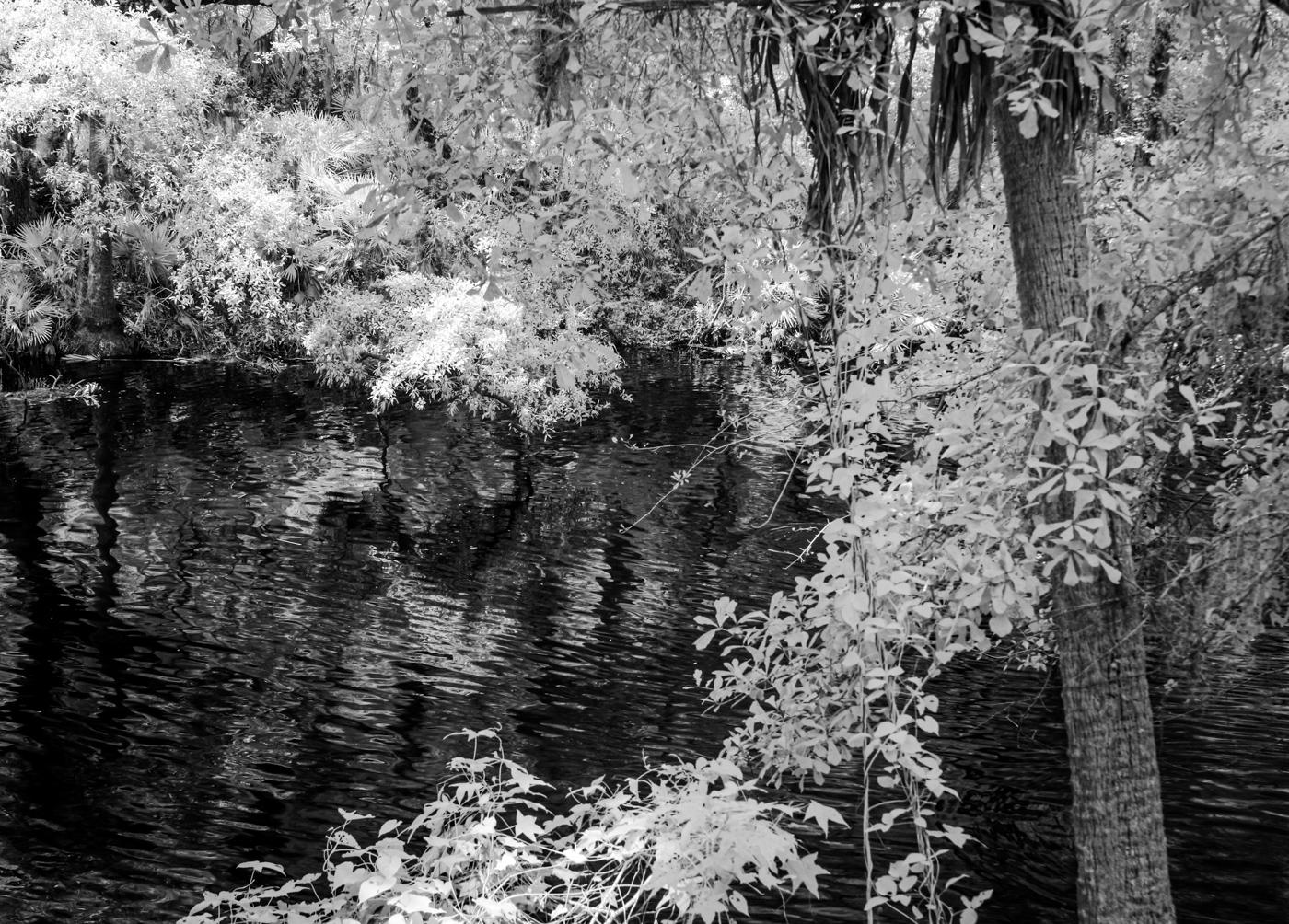
Very nice image. Your choice of B&W, plus your choice of crop works very well. The bright reflections of the buildings add ballanceing weight to the lower half if the image and provides leading lines into the image. I also like that the crop provides a nice contrast between the country feel of the water and the trees and the "big city" feel of the skyline. Nice composition. |
Oct 14th |
| 87 |
Oct 20 |
Comment |
I do enjoy the image. The blue tone gives it a distinct feel. I have found that learning to "see" in B&W helps to see structure and tones without the distraction of color. I do believe that my early film work in B&W has help me in seeing composition. |
Oct 14th |
| 87 |
Oct 20 |
Reply |
Lance: Thank you. I like the image but struggled with what to do with the great contrast in lighting. I could never feel quite right about the results. Jennifer's suggestion has merit, as you noted, but your insight has given me confidance in my initial vision. This is a great group to brainstorm with. I sense constant improvement in my work. (Some ups and downs, but up overall.) |
Oct 13th |
| 87 |
Oct 20 |
Reply |
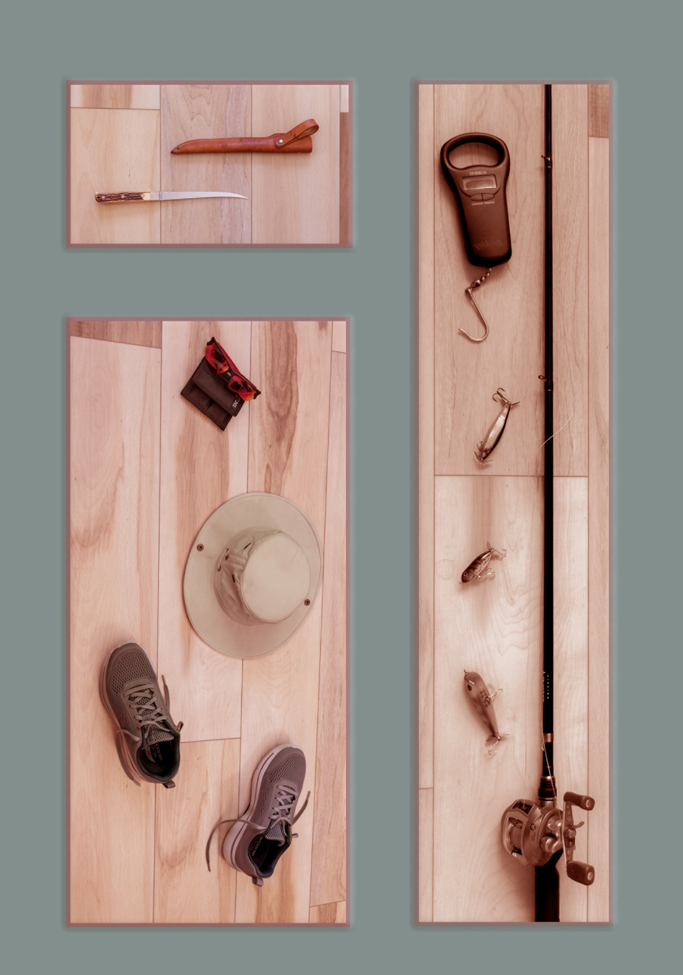
I like your idea of cropping even closer from the right side. I held a piece of paper up to crop that side, and by going close to square I could crop all of the over exposure on his back and elbow. |
Oct 12th |
 |
| 87 |
Oct 20 |
Reply |
Steve: Good catch on the photo posted as the origenal. This is one of a series of three that I took in just a few moments. I did not catch the error. As for the left elbow, the area you refer to is one where the bright shaft of sunlight over-exposed the image.
Thanks for you comments. |
Oct 9th |
5 comments - 5 replies for Group 87
|
| 91 |
Oct 20 |
Reply |
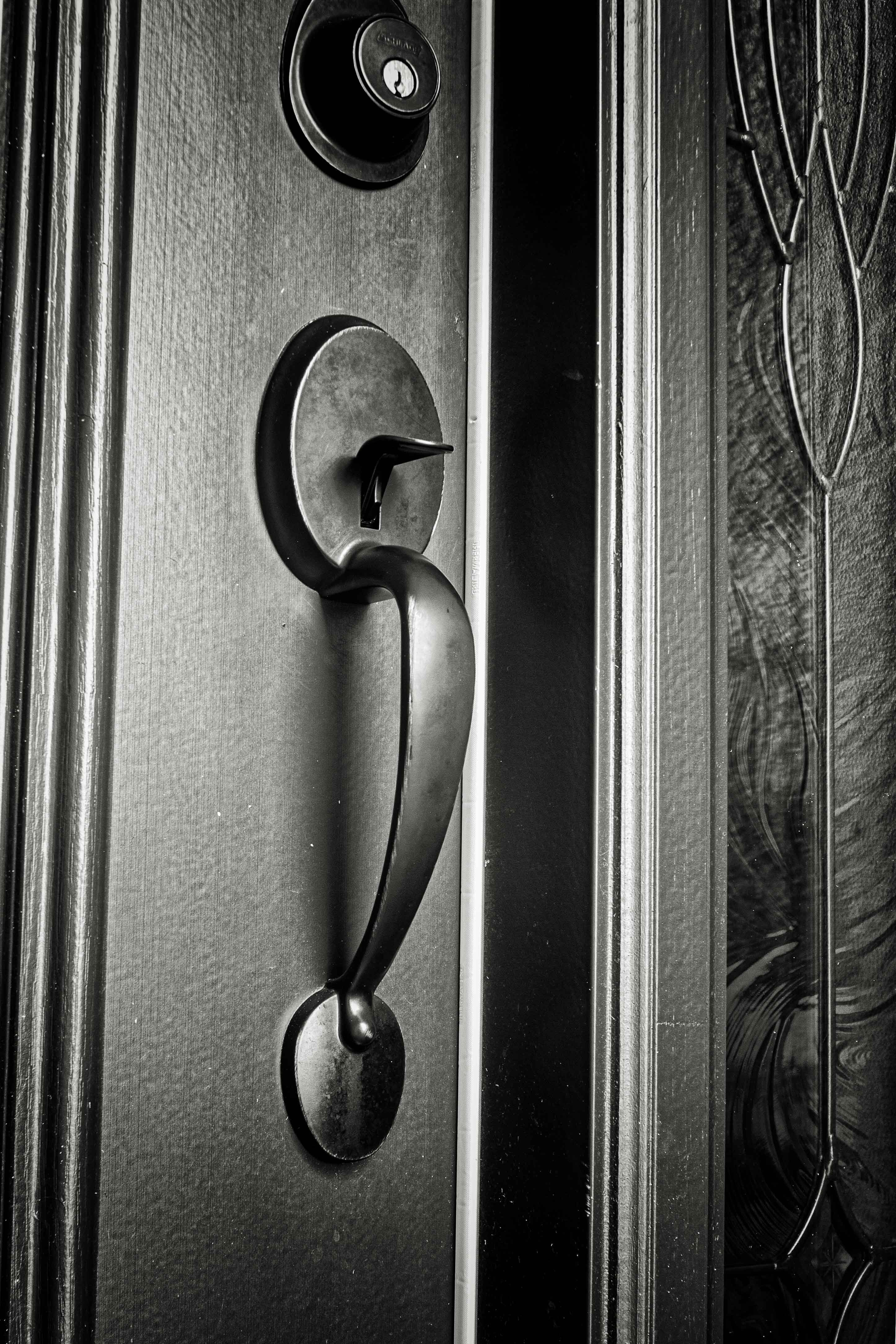
Yes, there is that pesky left side molding that tilts in. However, the rest appears to be vertical. I know I could have gone into Photoshop and fixed it, but that is a feature I have little experience with. Time to learn. |
Oct 31st |
| 91 |
Oct 20 |
Reply |
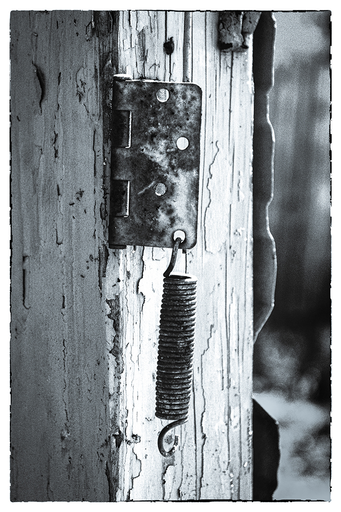
Thanks for your comments. As for the lines, the image is taken from a slight angle in order to see the separation of the curved handle from the door. This will cause some lines at the close end of the image to seem to lean in. Note the line in the glass pannel at the right. It is not leaning. I have my viewfinder set to show me the level on each exposure. the camera is on a tripod. |
Oct 17th |
| 91 |
Oct 20 |
Comment |
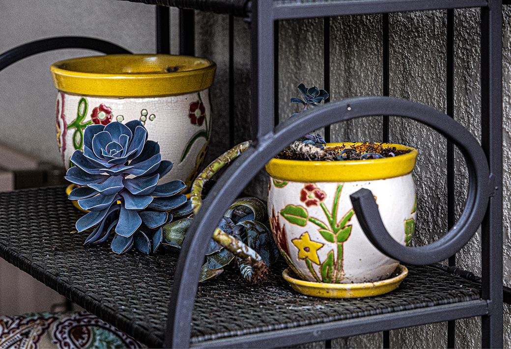
Interesting image. You have caused me to notice these "tode stools" all over the place as I take my daily walks. The image does, however, tend to look somewhat muted in color. Could the color be intensified to give the image a little more Pop? |
Oct 15th |
| 91 |
Oct 20 |
Comment |
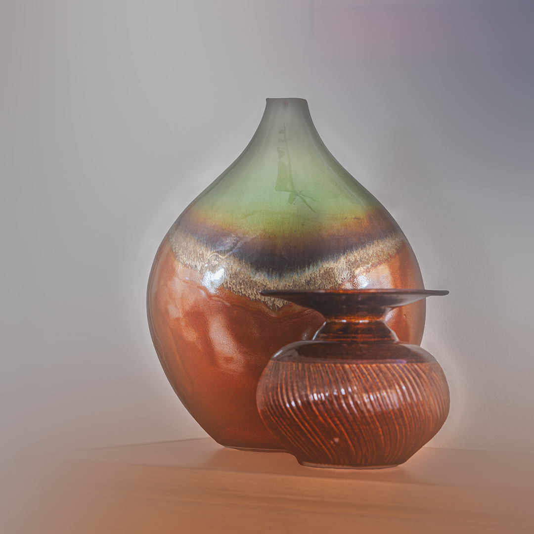
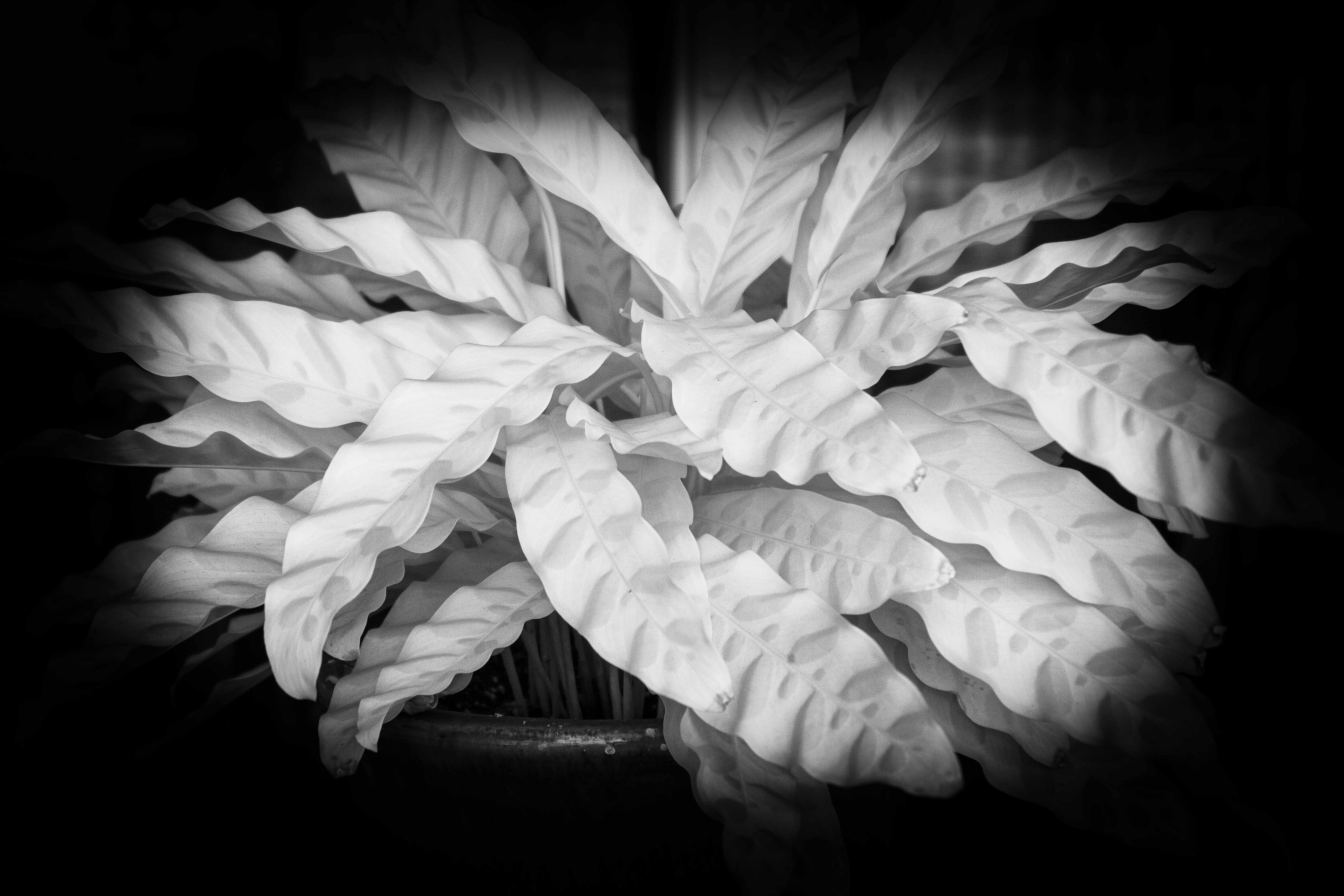
Very nice image. Is the final print from the origenal image. The crop seems to confuse me as I look at it. If so, you have made remarkable improvements in your post processing. Congratulations. The overall orange tint works. Had you concidered B&W? |
Oct 15th |
 |
| 91 |
Oct 20 |
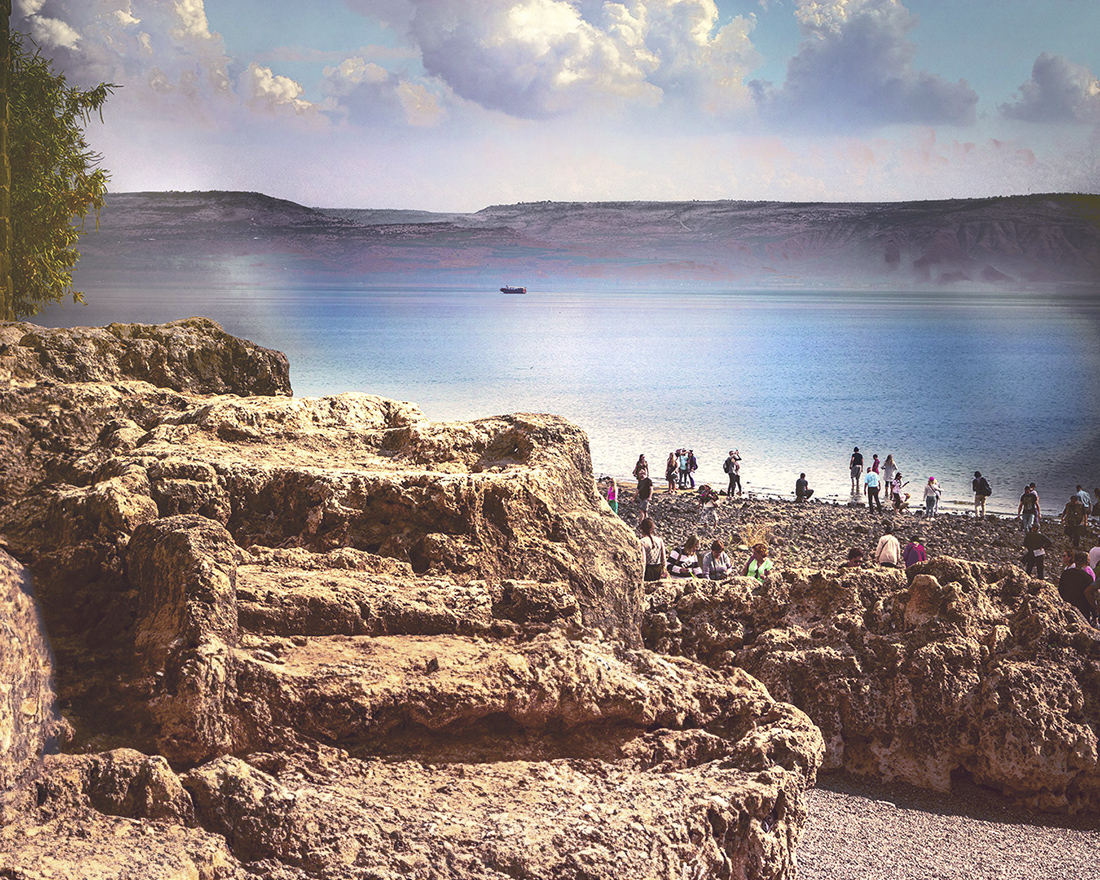
Comment |
Very nice image. The crop up from the bottom keeps the image from being unballanced by the weight of the very dark bottom. I like what you did with the color. Well composed. It works for me. |
Oct 15th |
| 91 |
Oct 20 |
Comment |
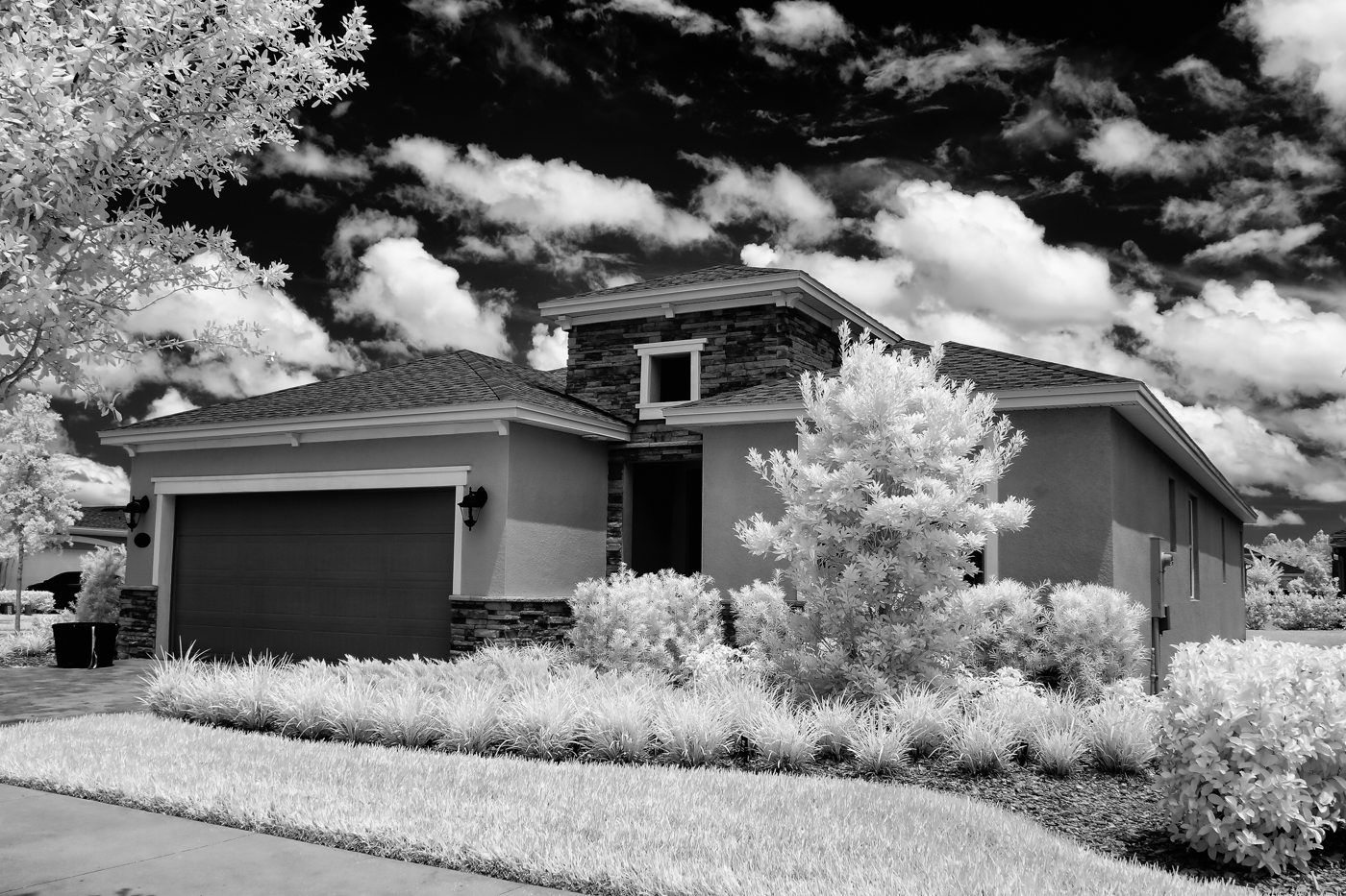
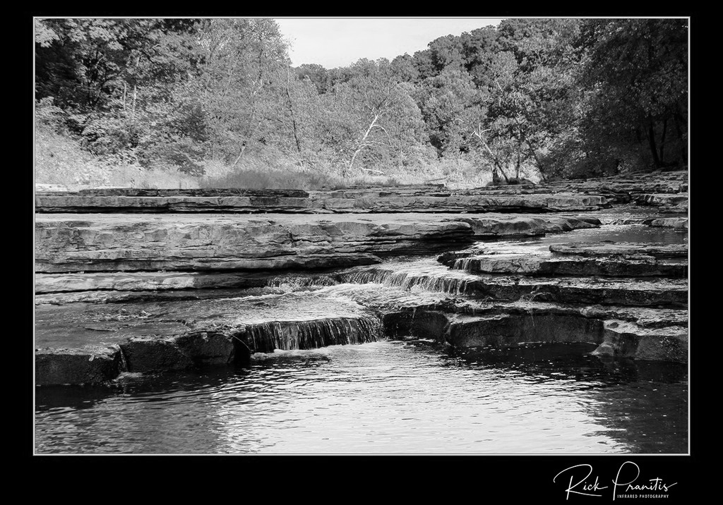
I like this image. Very good tonal range. The horizontal crop up from the bottom adds to the wide expance feeling. The trackes (automobiles, trucks or four wheelers) adds interest. Allthough I might like to see more sky, I can see the sky probably did not contain enough cloud formation to add interest. |
Oct 15th |
4 comments - 2 replies for Group 91
|
9 comments - 7 replies Total
|