|
| Group |
Round |
C/R |
Comment |
Date |
Image |
| 87 |
Feb 20 |
Reply |
Thanks for your welcome.
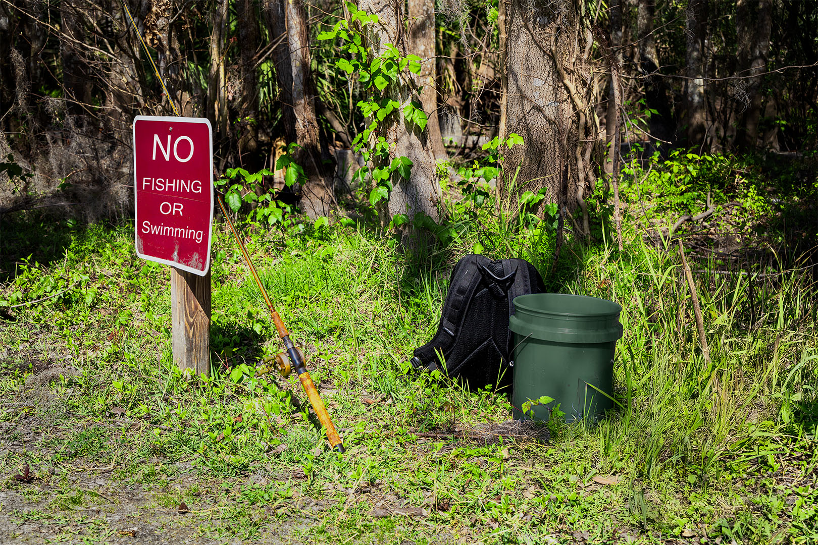
One of my suggested rules for wedding photography is to avoid (if you can) doing work for friends or family. |
Feb 2nd |
| 87 |
Feb 20 |
Reply |
Thanks for your observations. I do see that eliminating the other two leaves would result in a strong, but different image. Good suggestion. On the other hand I believe leaving the other two helps to create contexts, and the points of those leaves create leading lines directing eyes to the main subject. |
Feb 2nd |
| 87 |
Feb 20 |
Reply |
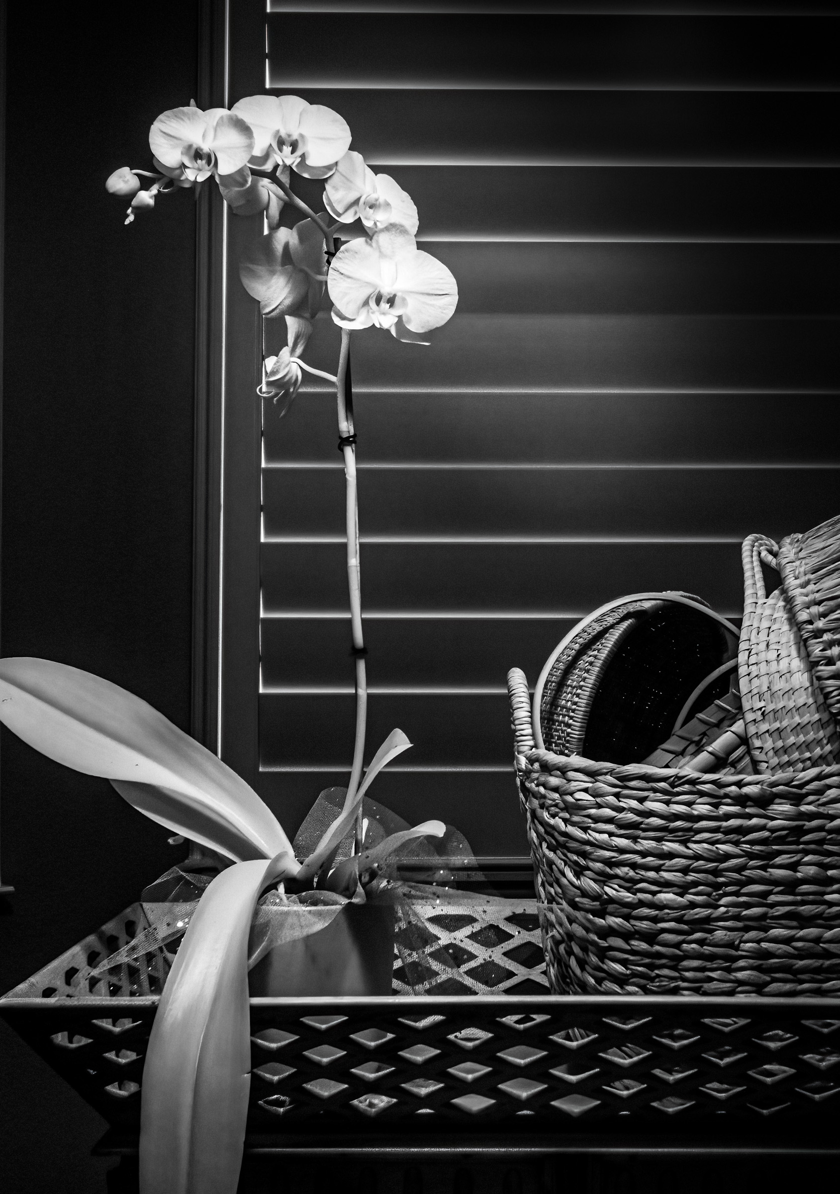
Mike:
Thank you for this image. By posting the color capture of this image you have shown this image needs to be in B&W. In my mind the color rendition lacks the visual interest and impact of the B&W. I also like that you used a curved center line for the leaf. This, for me, keeps the image from becoming to static. |
Feb 2nd |
| 87 |
Feb 20 |
Comment |
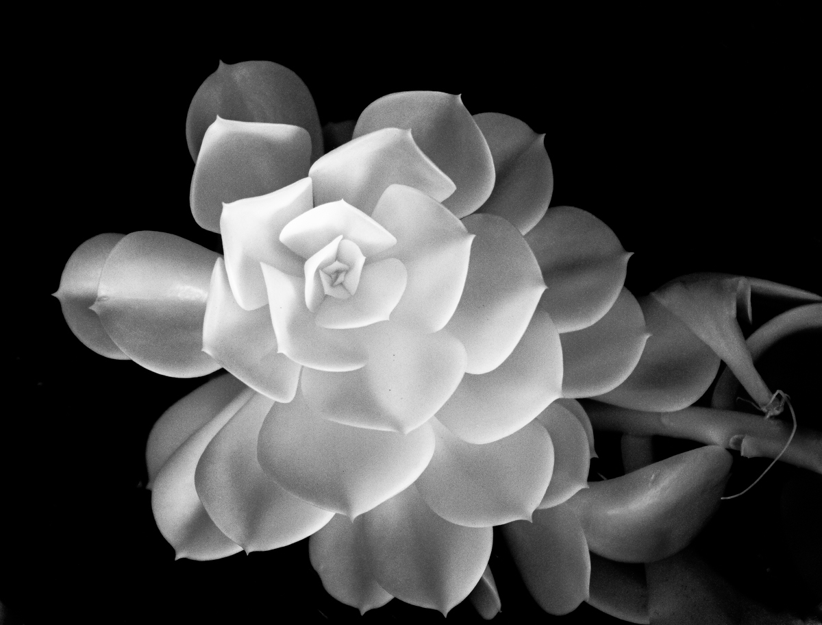
Steven:
Wow! What a great image! I really like your technique. The black background, the vain patterns, the fine hairs, and the purple out-line merge to create tremendous interest. |
Feb 2nd |
| 87 |
Feb 20 |
Reply |
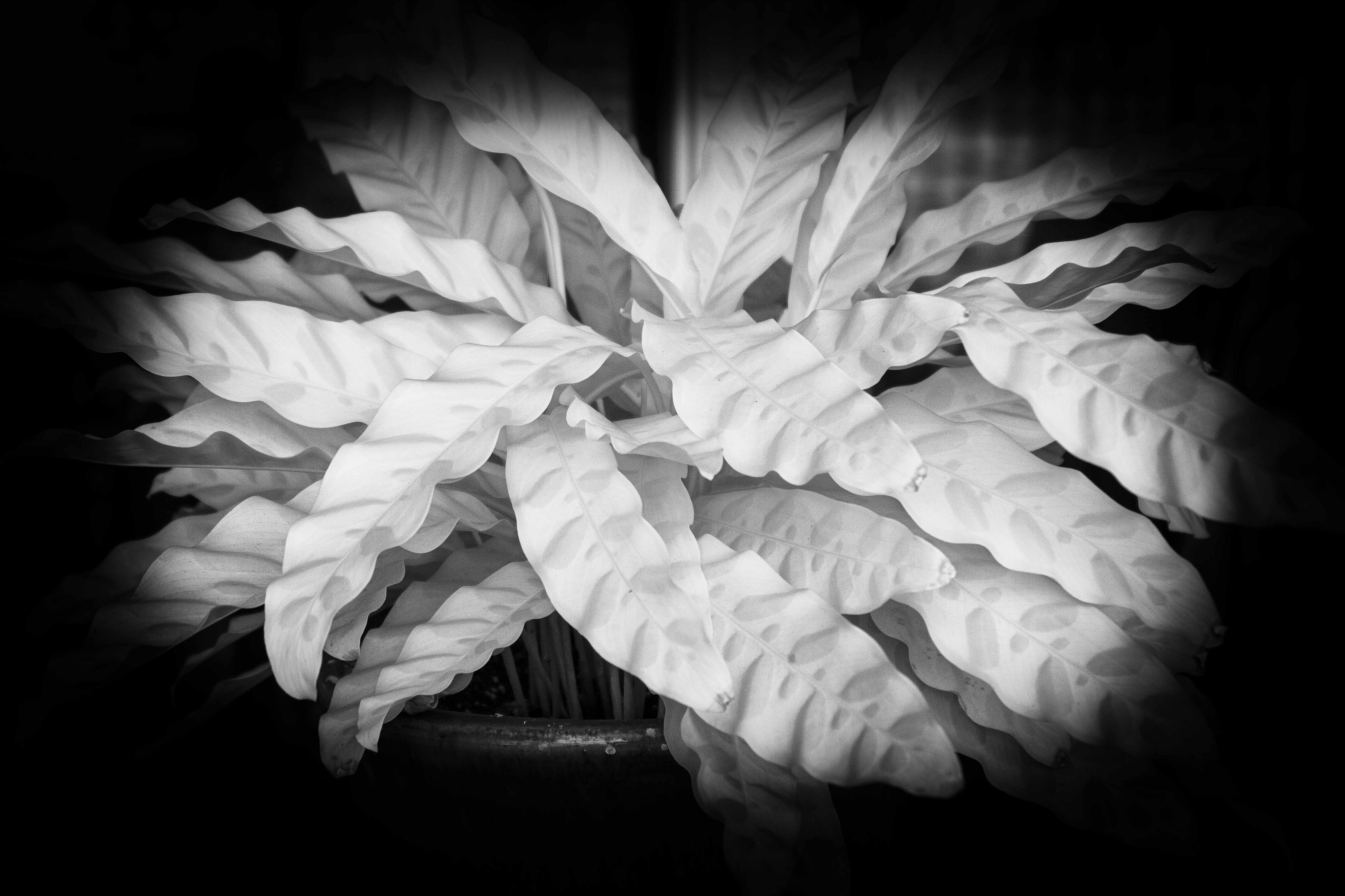
Lance:
Thank you. I probably would have completely missed seeing this image if I had been looking for a subject to photograph.
This encourages me to look more closely at what is around me.
By posting the second image showing a larger context, you helped me understand. On my first viewing of the original, I was lead by the fact both leaves were coming from small depressions in the sand to believe you may have placed them there to create the composition you were after. |
Feb 2nd |
| 87 |
Feb 20 |
Reply |
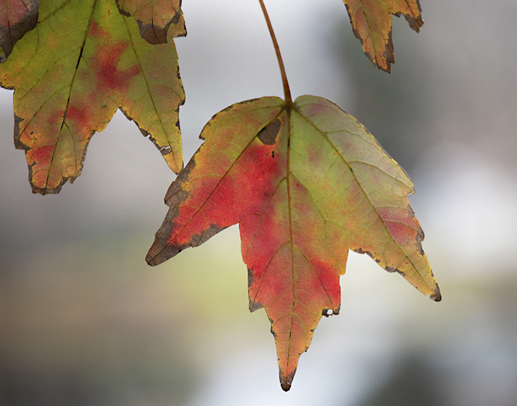
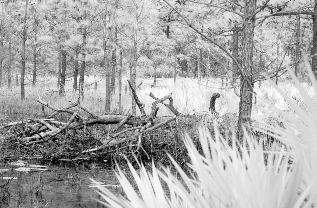
Jennifer:
It appears we had similar ideas on this project. How do we photograph leaves in late January. I agree that the number of small limbs in the first posting seemed to add confusion to the composition and lead my eyes away from your intended subject. The closer crop work better. I do greatly love good B&W, but feel in the case of this image the slight touch of color in the leaf adds interest. |
Feb 2nd |
1 comment - 5 replies for Group 87
|
| 91 |
Feb 20 |
Comment |
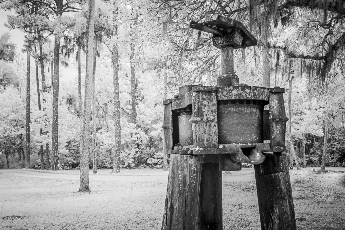
Very nice image. I see a wide range of tonal values. The weathered old posts show texture and immediately draws me in. My visual boat (my eyes) wants to sail right through the path to the open water, but the large log blocks my path.
I know some would object to replacing one sky with another, but to me, it is the final image that matters. |
Feb 10th |
| 91 |
Feb 20 |
Comment |
I like the image,though it is a bit confusing to me. I can't tell where the water ends and the sky begins. The bit of beach sand helps to give me a sense of place. The bright, white bit of cloud at the top center seems to be burnt out with no detail left.
I can see that I have entered a group of very talented photographic artists. That's good. |
Feb 10th |
| 91 |
Feb 20 |
Comment |
I do very much like this image. Perhaps their are too many buildings, but they are there. I have only two concerns. 1. I would like to see if a little more contrast would help the final image. It looks a bit flat to me. 2. The horse head distracts me. It would be easy to remove.
I have a fondness for old church buildings. |
Feb 10th |
| 91 |
Feb 20 |
Reply |
Gary: Thank you for your helpful critic. I do see the issues you wrote about and agree. I will work to fix them. |
Feb 10th |
3 comments - 1 reply for Group 91
|
4 comments - 6 replies Total
|