|
| Group |
Round |
C/R |
Comment |
Date |
Image |
| 93 |
Jan 26 |
Reply |
I have taken note of your comments and gave this another look. I've cropped in from the left side to remove the building and thus eliminated the bright area in the lower left corner and the light reflection on the water on the left side. I like it better. Thanks for your comments, and do you think I've improved the photo? |
Jan 28th |
 |
| 93 |
Jan 26 |
Comment |
I like the composition as I think you have captured a good sense of the valley and the clouds coming in over the hills. I also like how you used the foliage around the edges to frame the image.
I think the shot could use a good bit of dehazing and sharpening. I also think that the sky could be darkened a bit so more of the detail could be brought out in the clouds, which I think would enhance the sense of a storm coming. |
Jan 28th |
| 93 |
Jan 26 |
Comment |
My first impression is positive in that this image conveys to me the stark beauty that can be present in winter scenes and it does convey the sense of cold that winter brings. For me you've done a good job of bring out an emotional feeling with this photo. I like the composition with the stream coming up through the center of the frame and bringing my eye into the scene.
I agree with the others in in thinking that there is a bit too much blue. I've not worked with presets so I don't know how to evaluate the sunset you've added, but I'm not really comfortable with the skyline. I also find the blurry branches in the lower right foreground distracting (but I doubt you had a pruning saw available to deal with that).
Overall I think it is a good shot. |
Jan 28th |
| 93 |
Jan 26 |
Comment |
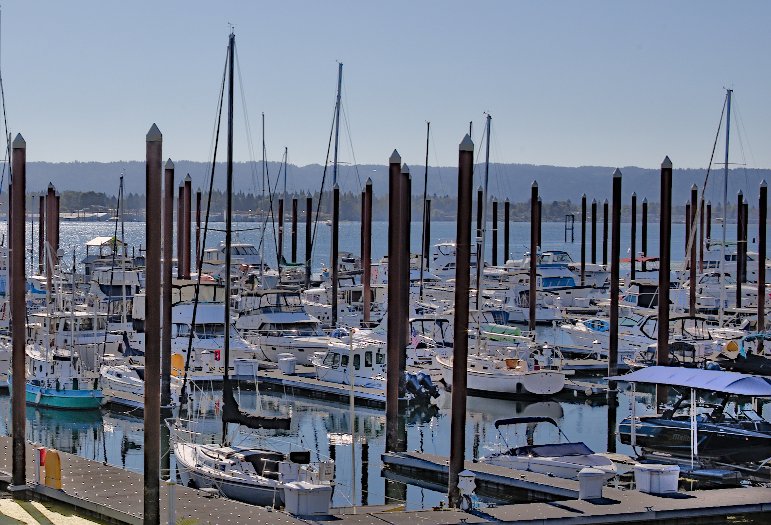
I like the symmetry of the shot and the color contrast with the water against the rock and foliage. I think your shutter speed gives nice texture to the water, especially in the foreground. In my opinion you did a very good job in bringing out more detail (and just more interest) in the clouds in the sky which adds to the photo. I also like the way you lightened up the rest of the photo below the sky.
To me the blue of the water looks a little over saturated and I would like to see it toned down a bit. |
Jan 23rd |
| 93 |
Jan 26 |
Comment |
I like the composition in the way that the stream curves in from the bottom and then leads my eye into the center of the image. I like the way the colors work together without having harsh contrast. For my eye the focus looks a little soft but I think that is a positive for this photo.
Overall I think the image looks a bit washed out, especially the lower left corner, thus I agree with Dawn's comment. For me I think the original shows better detai. |
Jan 23rd |
| 93 |
Jan 26 |
Comment |
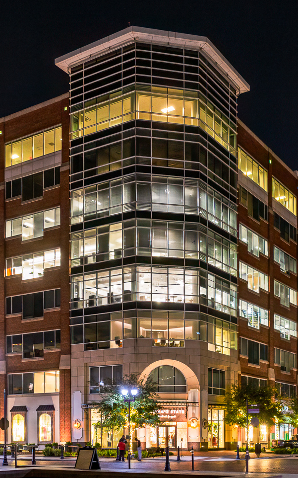
This photo captures my attention with the high key color contrast and the very sharp focus, good job.
In my opinion the street lights on the post on the left side of the image are a little too bright and draw my eye there instead of the center of the photo. I like what you've done but I was wondering if it would have more impact if you cropped to highlight just the center section that makes up the corner of the building. What do you think? |
Jan 22nd |
 |
5 comments - 1 reply for Group 93
|
5 comments - 1 reply Total
|


