|
| Group |
Round |
C/R |
Comment |
Date |
Image |
| 93 |
Jul 25 |
Comment |
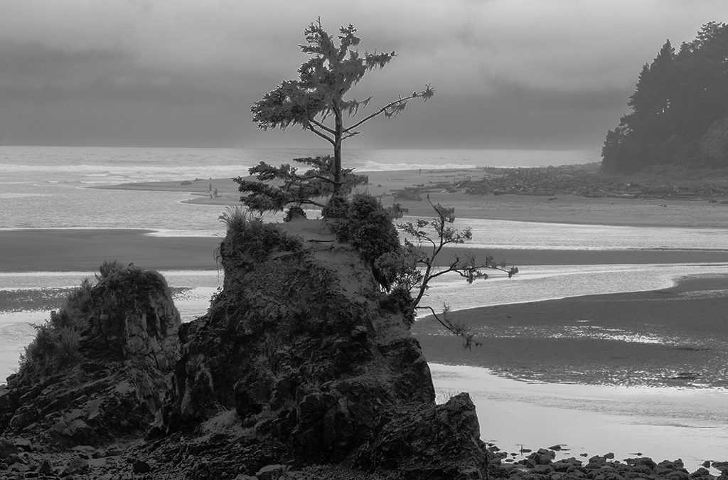
I'm comfortable with this photo, but that's perhaps because it shows the conditions whenever I go out to take photos. The daily marine layer mist that we always get does make for flat lighting which can be a problem but I think you've been successful in bringing out a nice level of softness.
I think you have two photos here: the tree on the rock in the foreground; and the beach scene in the background. The foreground image tends, in my opinion, to screen out the background image and I'm not sure they work well together.
I picked up on Francois and Dawn's comment of B&W so I gave it a try. I think it looks better in B&W, what do you think? |
Jul 24th |
 |
| 93 |
Jul 25 |
Comment |
I like the composition in the way the mountains for a V and bring my eye into the center. I agree with Tom in his edit as he bring the boats more into the image, and I like the way he has dropped the sky. The color and lighting look good to me and project the sense of a sunset.
I like your use of a graduated filter, I have one but I haven't used it enough and this helps me think more on how to use it.
The image seems to have some barrel distortion. Are you able to adjust that in post processing? Had you thought about doing multiple shots and stitching them together as a pano? With all that said I really think this is a great shot. |
Jul 24th |
| 93 |
Jul 25 |
Comment |
Impressive image. I like how you captured the dominance of the rock in the scene and I especially like how you included the reflection of the rock in the water. Technically I think the photo is VERY good and I appreciate the steps you have taken in post processing (you skill level on that score is way above mine).
I agree with Francois's cropping in the horizontal directions as I thing removing the sun allows the rock to stand out more, but for the vertical direction I would have left it alone as I like seeing the full reflection in the water. |
Jul 22nd |
| 93 |
Jul 25 |
Comment |
I like the composition with the tower being the main item of interest and set off center to the right. I agree with Francois in that this looks better in mono and I appreciated the high amount of contrast that you have. I don't quite agree with Darcy and Francois in that I'd like to see the tip of the tower. I think the dull sky really helps out to accentuate the buildings, the ship, and the water. Technically in regards to the lighting, focus and contrast I think you did a great job. |
Jul 22nd |
4 comments - 0 replies for Group 93
|
4 comments - 0 replies Total
|


