|
| Group |
Round |
C/R |
Comment |
Date |
Image |
| 93 |
Jun 25 |
Comment |
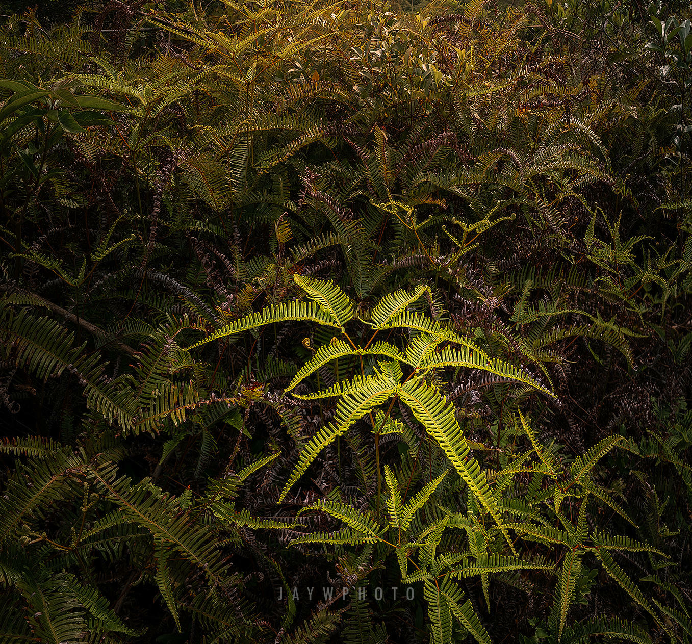
Jay, I like what you've done with this and I am impressed with your technical skills. By making the fern in the middle lighter and therefore the primary interest point of your photo I think is is too low in the image and my eye competes with the clouds. I hope you don't mind that I cropped to eliminate the sky and make the lighter fern center; just a matter of my taste. Overall I like your use of lighting and the sharp focus throughout. Great shot. |
Jun 26th |
 |
| 93 |
Jun 25 |
Comment |
I've been over that bridge a few times and I never knew that Cincinnati could look that good. As with Dawn, I like the composition having the bridge bring my eye in from the left and to the city in the center of the frame. I think your timeing of using the twilight to keep the buildings lit so we can see details while projecting the outline of the skyline. I think the colors work well together and the reflections on the water are a plus. Nice job. |
Jun 24th |
| 93 |
Jun 25 |
Comment |
I like the effect you have created with this photo. I think your composition is good and I like the way you combined the elements. For me the colors work well together and the focus / depth of field is good. I like the edited version a bit better as the sun isn't over exposed.
I'm not comfortable with the foreground and the slow shutter speed, but that is just my taste and I recognize that it is a key element of the photo. |
Jun 24th |
| 93 |
Jun 25 |
Comment |
Another one of your great landscape shots. I like it. It encourages me to just throw a blanket on the ground, pull out a bottle of wine, some cheese and a bit of sausage from a picnic basket and soak in the scene for a while. I prefer photos that appeal to my emotions.
Technically I think you did a great job with the composition and the use of the colors. For me the white clouds against the blue of the sky are a big plus. The more intense combination of browns and greens of the trees and rocks create more interest for me. Again, I like it. |
Jun 19th |
| 93 |
Jun 25 |
Comment |
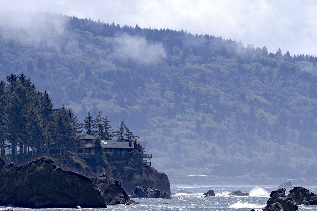
I like your composition with the positioning of the house a bit to the left and looking out over the ocean at the rocks. I agree with Francois about getting more of the rocks in the image and less of the sky and hill side. For me there is a nice mood with the clouds and the sky on the hill but I'm wondering if there is a way you could reduce the haze in the foreground but leave it alone in the background. I tried it with my software (Darktable on Linux) - did it work? what do you think? |
Jun 19th |
 |
| 93 |
Jun 25 |
Reply |
Thanks for the input Darcy, Yes that center image is on pebbles (I took it on the beach infront of the Brookings harbor). I thought I could fit it into the center, but I will be reconsidering. |
Jun 7th |
| 93 |
Jun 25 |
Reply |
Thank you Dawn, your comments are what I am looking for. I'm sure I can make some of your suggestions work, and for others I'll just have to go out on the beach and find a better shot - not that much of a problem. (note; for a PSA portfolio this would be the cover page accompanied with a full size shot of each photo).
Thanks a lot. |
Jun 6th |
5 comments - 2 replies for Group 93
|
5 comments - 2 replies Total
|


