|
| Group |
Round |
C/R |
Comment |
Date |
Image |
| 93 |
Apr 24 |
Comment |
I think this is a very good effort in capturing the desert in bloom. I like your layering with the flowers in the foreground, then with the mountains on the middle right side and finishing with the good cloud formations in the sky. The combination of colors and the contrast you have created with them work well for me. |
Apr 23rd |
| 93 |
Apr 24 |
Comment |
I like the composition with the symmetrical placement of the mountain in the center and with the ice pieces right below them. I think having the clouds on either side of the mountain is a big plus. The colors work well for me and for me the sharp focus throughout the image is very good.
I see what you are doing with the ice pieces in the foreground however, for me, they don't seem to tie in with the mountain and sky in the background. |
Apr 23rd |
| 93 |
Apr 24 |
Comment |
George, I think you have use a GREAT photo to introduce yourself to the group. Now how are you going to top this moving forward?
I like the composition and that you have chosen to present this in portrait format as, in my opinion, it helps to accentuate the rock with the sea arch. I also like your choice of shutter speed in that it smooths out the water a bit, but still leaves enough detail so that you get the sense of dynamic action. And what you've done with the sky is, for me, very positive. For me the colors work well and you have nice contrast. I like it. |
Apr 20th |
| 93 |
Apr 24 |
Comment |
Nice job of combining great street photography with great Mono. I like your composition in the way you have created a "narrow" scene with lots of people and activity. I also like how you've included the upper stories of the buildings which, in my mind, enhance the effect of confinement and crowd. I think you have lots of nice contrast which makes the B&W work well.
I do agree with Dawn in that the upper portion of the buildings is a bit over exposed, and I like how she fixed it. |
Apr 20th |
| 93 |
Apr 24 |
Comment |
Mark, your photos always have an artistic element that leaves me in awe, and this is no exception. I like that you have made this a monochrome image and the contrast you have include with the dark tones in the upper section and the bluish white of the portion to the lower right. I think the exposure and detail are good and work well to enhance the image. In my mind just a great artistic image. Good job. |
Apr 16th |
| 93 |
Apr 24 |
Comment |
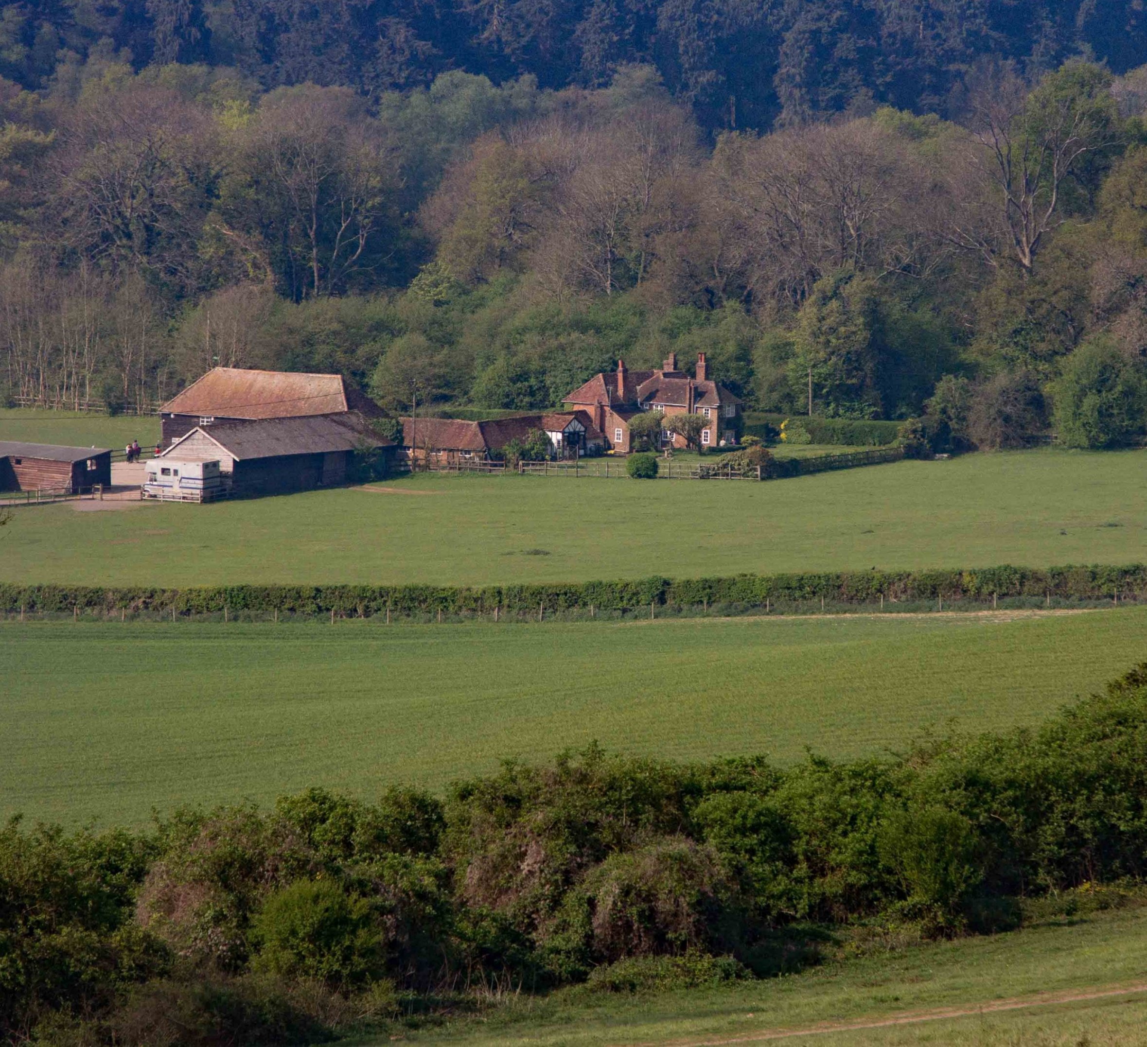
This photo is going to change my impression of what it is like in England. I like the peaceful sense of countryside that it presents. I think the low key colors work well together and I like the way the lines of the hedges and foliage work to create interesting patterns with the farm houses.
I agree with Paul in that there seems to be a bit of haze, especially with the upper line of trees. I like the photo the way it is but for me the shrub on the left is a bit distracting. I tried cropping a bit to make the buildings stand out more, what do you think? While I think your version is pretty good I just wanted to see a different perspective. |
Apr 16th |
 |
6 comments - 0 replies for Group 93
|
6 comments - 0 replies Total
|


