|
| Group |
Round |
C/R |
Comment |
Date |
Image |
| 93 |
Apr 22 |
Comment |
Niel, I like the way you have included several compositional elements into this one photo. While the photo is mostly monochrome with the grey stone and dark shadows having the central path take my eye back into the photo where there is the green foliage works very well for me. (Reminds me of the movie "Schindler's List" which is shot in B&W and then at the end of the war they revert back into color). The blue sky above also adds, to my mind, the sense of "coming through" the dark area. I think the textures and contrast are used very effectively. This photo really conveys a story for me.
The only thing that I'm uncomfortable with is lens curvature on the towers in the foreground, but that is just my taste. Overall great job, glad your in our group. |
Apr 25th |
| 93 |
Apr 22 |
Comment |
For me Paul, this is another one of your great B&W photos that make me want to do more work in B&W. I agree with Mark as I like the range of tones that you have incorporated into the scene with the logs of the cabin standing out and making it the primary subject. The wispy clouds in the sky are a great addition, I think the composition is well done with the cabin positioned a bit lower so you can have the texture of the aspens stand out. Great job, as always.
To my eye the snow on top of the cabin seems a little overexposed (always a problem with snow) and I'm wondering if you could have toned it down in post processing. |
Apr 25th |
| 93 |
Apr 22 |
Comment |
In my opinion Mark, this is another photo which exemplifies the creative artistry of you photos. I think you have use simplicity and composition very creatively for this photo. The framing of the frozen lake with the shore coming in from the sides and leading back to the mountains works well for me and I think the impression is enhanced with the "bubbles" in the ice that lead my eye further into the scene. There is, in my opinion, just enough detail in the clouds to maintain interest and for me you have made excellent use of negative space. The subdued colors of blue and white I think add to the sense of "winter cold". Great Shot! |
Apr 21st |
| 93 |
Apr 22 |
Comment |
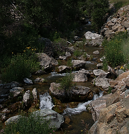
I consider this to be a nice relaxing scene. The colors work well for me with the pairing of the brown of the rocks with the green of the foliage. The capturing of the water moving is, in my opinion, a positive element of the photo. For my eye the focus and depth of field are well done. I like the way you brought out more detail in the group of trees in the center of the photo as I think it was a bit too dark in the original.
For me I not sure that I see a primary item of interest and the photo to my eye looks a little off balance with all the green on one side and the brown of the rocks on the other. I hope you don't mind but I took the liberty to do some significant cropping to primarily include only the stream, thus making it the item of interest, just another view of the same subject.
|
Apr 19th |
 |
| 93 |
Apr 22 |
Comment |
This photo creates a high level of interest for me. I like the composition with the positioning of the rock and its juxtaposition with the surfer and I think you are making excellent use of negative space. The lighting is, I think, a strong positive with the rock highlighted and the rest of the image showing a lower intensity. And it that isn't enough, there is the color contrast with the warm colors of the rock placed in the cool colors of the water and sky. Great job, I think this photo could be a prize winner. |
Apr 17th |
5 comments - 0 replies for Group 93
|
5 comments - 0 replies Total
|


