|
| Group |
Round |
C/R |
Comment |
Date |
Image |
| 93 |
Feb 22 |
Reply |
By the way Paul, if you ever want to visit the Central Oregon Coast for photo ops, our guest room is open to you. And that goes to everyone in our group. |
Feb 16th |
| 93 |
Feb 22 |
Reply |
Paul,
I know you communicate with Dan Mottaz a bit, and he has long been familiar with Florence OR and photo opportunities on the Oregon coast, which is why he was here last month and my wife and I got to host him. He lives in Boise ID, as does my daughter, so next week I'll be visiting him there. I think he is considering moving to Florence, and if the does you start seeing a lot better photos of the area than I've done so far. |
Feb 16th |
| 93 |
Feb 22 |
Comment |
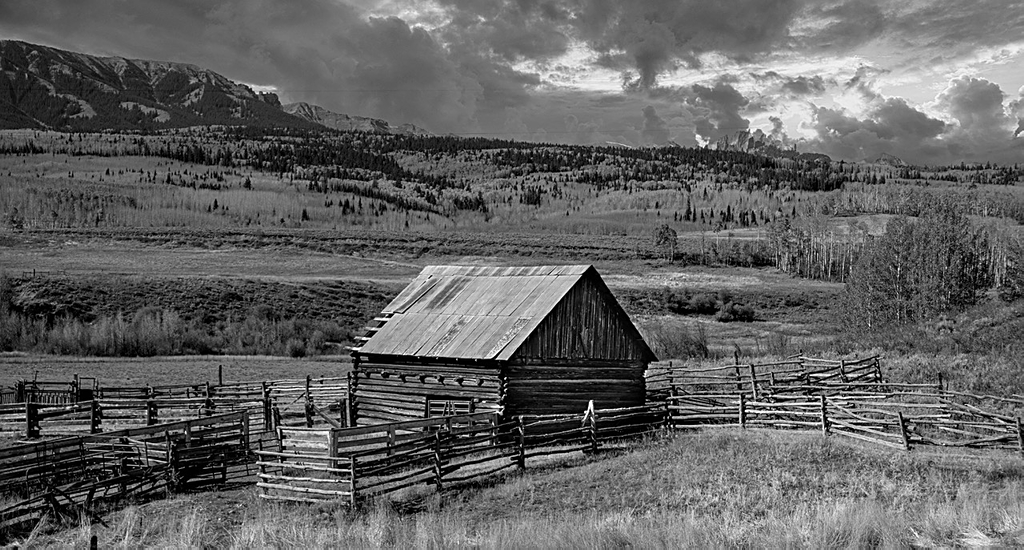
Paul, I only have one problem with your B&W photos: as I work on improving my B&W skills you keep setting the bar higher for me to measure up to. I like the high contrast in the image and I think the composition is well done. I think you have layered the image well with the grass in the foreground, then the barn with the hills and sky behind it. The lighting in the clouds works well for me.
I consider the fence along the bottom of the image a bit distracting and I don't see it adding to the impact of the photo. So if you don't mind, I took the liberty of cropping it out. Still, your shot is great. |
Feb 14th |
 |
| 93 |
Feb 22 |
Comment |
Mark, Recently I commented that when looking at a photo I always try to consider the artistic impact first and I think you have again out done yourself with this photo. To my eye it presents itself somewhat like an abstract piece and in keeping with your opening comment, I'm not a big fan of abstract art, but I still think it's a great photo. I like the composition and your effective use of negative space above the two pools. With that in mind I think you made a good choice in cropping out the water in the upper corner of the original. I like the way you used color contrast with the bright sandy brown of the pools against the muted cool blue surrounding it.
Great job, if I was into abstract I'd want this hanging in my living room. |
Feb 13th |
| 93 |
Feb 22 |
Comment |
Darcy,
Based upon you description of what your were working on for post processing you have been, in my opinion, successful. As I see it the colors in the original look "washed out" however in your final they do, especially the greens, look more lively to me. I also like the way you have given the clouds more detail and thus, for me, they add positively to the image.
From overall composition I'm not too impressed with the gate and the image I think might be improved if it were removed. However that wasn't part of the exercise you were trying.
Good job. |
Feb 13th |
| 93 |
Feb 22 |
Comment |
I agree with Mark in that I like the way you have layered the tones and lighting with the soft clouds on the top and then working down to the more intense lighting with the snow at the bottom. I think your work to bring out the details in the forest was worth it. In my opinion the herd in the center is the primary point of interest and again I agree with Mark in the way he cropped your photo to bring more attention to the heard. Good Job |
Feb 10th |
| 93 |
Feb 22 |
Reply |
I like what you did Mark, I really have to work on my post processing skills. |
Feb 10th |
| 93 |
Feb 22 |
Comment |
The peacefulness of this scene is a strong positive for me. I like the projected stillness and the way the colors complement each other. I think the clouds coming on over the ridge help add a send of dimension to the scene. It doesn't bother me that you don't have the complete pond in the frame. In my opinion the two small trees on the opposite side of the edge of the pond help provide a central focal point for me. |
Feb 9th |
5 comments - 3 replies for Group 93
|
5 comments - 3 replies Total
|


