|
| Group |
Round |
C/R |
Comment |
Date |
Image |
| 93 |
Nov 20 |
Comment |
For me this photo has a strong impact. I like the contrast of the smooth dunes with the curving lines and shadows in the foreground as compared to the sharp lines of the mountains in the background. I am also impressed with the color contrast with the light browns of the dunes against the dark redish browns of the mountains. I think the composition is well done with the dunes being the primary area on interest for me and they occupy the most of the frame while the lines in the dunes draw my eye into the image and lead me back to the mountains. Great shot |
Nov 21st |
| 93 |
Nov 20 |
Comment |
I have never worked with filters and the filtered image moves me out of my comfort zone, and that is good. But because of that it challenges me to submit a critical analysis, so I'll just make some general comments. I think your photo is good and I like what you have done with it in the filtered image. I like the cropping and I like the way the colors work together. The filtering for me has the effect of softening the overall image. Overall I think you did a good job in applying the filter (and makes me think that I should investigate using them).
One thing that distracts me is that the horizon line does not appear to be level. |
Nov 20th |
| 93 |
Nov 20 |
Comment |
For me this photo has a very strong story telling impact; what's he looking at or what is he thinking etc. and I see everything about the image as supporting the "story telling" aspect. I think it is well executed from a technical perspective with very good focus and depth of field, good exposure without any over or under exposure areas and good detail throughout. I like the way the colors work together I thing the composition is good with the positioning of your son and the reflections in the pond below him. |
Nov 16th |
| 93 |
Nov 20 |
Comment |
I see several things to admire in this photo. What impressed me first is the composition. I like the way you have positioned the peaks so that they are shown poking up from the clouds with a layer of clouds above them and I like the way you have one in the foreground with the other in the background. I also appreciate the way you caught the whiff of clouds forming just above the peaks for me adds interest to the image. The depth of field looks very sharp to me with detail visible for both peaks. I also appreciate the way you have the blue of the sky and I think the colors work well together. Great Shot |
Nov 14th |
| 93 |
Nov 20 |
Reply |
Again another helpful comment Jerry, I wasn't thinking of it as an environmental statement, but I should have thought of that as I do have an advanced degree in Environmental History. I have started to re-think how I'd want to use this image. |
Nov 10th |
| 93 |
Nov 20 |
Comment |
What captures my attention most in this photo is the repetitive pattern and curved lines of the ovens. I see this as a nice study in form and structure. I agree with Jeff as I like the B&W better and I also agree with him in thinking that the image would be enhanced with more contrast on the clouds in the sky. I think the focus is good with the way it allows the detail of the bricks to become apparent.
My eye is a bit distracted by the shrub in the lower left corner in that it appears to be more exposed than the rest of the shrubs along the bottom. Perhaps, in post processing, a mask could be used to bring down the exposure/brightness just for that corner. |
Nov 8th |
| 93 |
Nov 20 |
Comment |
I am impressed by the vastness that is expressed with the photo (especially since I have driven on that road myself) which conveys to me a sense of the natural grandeur of the Alaska mountains. I like the ribbon of tree line that runs across the bottom of the image as it helps, for my eye, to get a sense of how big that valley is. I think the color contrast of this photo is excellent with the cool blues and white of the snow capped mountains with the warm colors of the clouds. Great photo, has me thinking about going back. |
Nov 8th |
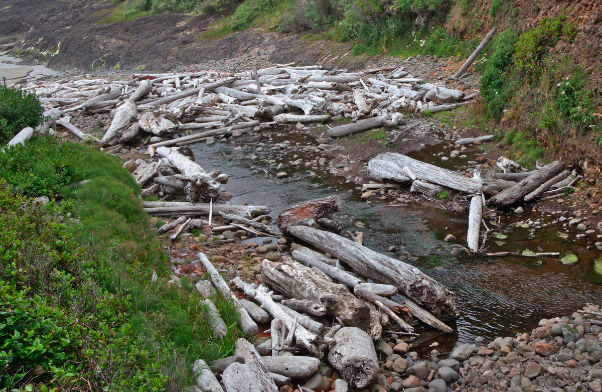
| 93 |
Nov 20 |
Reply |
Jeff, I appreciate your criticism and I've taken a second look at the image. I've tried isolating on one of the two log groups but I really didn't like that. I did crop in to make it a bit tighter on both groups and I worked a little on intensifying the green. Thanks for encouraging me to take a second look. |
Nov 4th |
 |
6 comments - 2 replies for Group 93
|
6 comments - 2 replies Total
|


