|
| Group |
Round |
C/R |
Comment |
Date |
Image |
| 93 |
Sep 20 |
Reply |
Yes Jeff, this was taken in the afternoon on a bright sunny day
|
Sep 19th |
| 93 |
Sep 20 |
Comment |
Jeff, I really like this photo. For me the main point of interest is center of the lower clouds where you have a brighter exposure. I think the colors are great and work well together with the bright red/orange of the clouds above contrasted with the greens and browns of the marshland below. I like what you have done with the lighting, having the brightest part in the middle of the frame and then radiating out with the intensity of light dropping off to the edges. For me that accentuates the colors of the clouds in the center. I also appreciate that you have crisp focus and depth of field throughout.
The only thing I wonder about is the branches showing in the upper left corner. I see that they help frame the image but I think it might help if they were removed.
Great picture and it shows that we are lucky to have you joining our group. |
Sep 18th |
| 93 |
Sep 20 |
Comment |
Michael, you have again given us an image to consider that makes me a bit more humble and reminds me that I have to work harder to improve to your level. I think it is a great scene of the wetlands and the mountains together. Overall I find it pleasing and I like the composition in conjunction with the colors with the sharp golden browns of the vegetation in the lower half, the diagonal line of blue water leading my eye up to the muted grays of the mountains and topped with the details of the grey clouds on the top. I think your exposure is good with no strong shadows or highlights.
I agree with Darcy in that I think the vegetation on the bottom right is a bit out of focus and I wonder if using f-stop higher that f/8 might give you better depth of field. I also find the yellow channel marker a bit distracting. |
Sep 14th |
| 93 |
Sep 20 |
Reply |
Jerry, it is my opinion that a successful photograph is capable of evoking strong feelings for the viewer by bringing out memories or stories that specifically relate to that viewer. While it is individual to me your photo does that for me as it brings out feelings of beauty as well as memories of frustration for me. For a period I have visited La Jolla a lot as my daughter went to college there. I got to see the beauty of the place and my daughter actually had a view of the ocean like that from her dorm room. My frustration was that the view from my house was just of my neighbors driveway while she had that kind of view - AND I HAD TO PAY FOR IT. |
Sep 10th |
| 93 |
Sep 20 |
Comment |
I feel it necessary to repeat the positive comments made above by Paul, Darcy and Michael as I fully agree with them all. I like the way you have captured the light rays coming down from the breaks in the clouds along with the darker portion of the rocks in the lower section. I think your composition is excellent with the sky for the upper third and the rocks in the lower third and then the line of reflection of the sun on the water leading from one to the other. I like the way the line of the reflection leads to the right of the rocks and not directly too them. And I don't think the picture would be the same if you hadn't included the rocks. The focus is, in my opinion, very good with lots of sharp detail. I also think your exposure works well in keeping detail in the surf and adding texture an interest in the lower portion of the image.
|
Sep 10th |
| 93 |
Sep 20 |
Comment |
Two things stand out for me in this photo. First is the soft "painted" effect that you mention with the Topaz filter however I'm not familiar with that but I like it (now you've given me another task - to learn about a Topaz filter, and how I get it on my Linux system). Second is that I really like your selection of colors for this photo. I think what I see as muted yellows and soft greens really work well together and along with the "Topaz" effect create for me what is a very relaxing image. I think your focus is good with the softness in the foreground being enhanced by the bokeh of the background. I also appreciate that your lighting is not intense thus keeping the image on the "soft" side.
I wonder if the upper right corner is lacking of something of interest and might turning your camera a bit to the left bring in another flower or two. |
Sep 10th |
| 93 |
Sep 20 |
Reply |
Paul, I love it! Now I have a task to see how my Linux software can achieve the same kind of results you got. Thanks |
Sep 9th |
| 93 |
Sep 20 |
Comment |
This photo is very captivating for me. I am most attracted by the colors and the way they work together and their vibrancy. I think the "almost" stillness of the water allowing for the reflection of the red building in the water is a strong plus. For me the focus and depth of field are very good with sharp detail throughout. I also like the composition with the positioning of the buildings with the taller on the left and then leading my eye down to the center of the image. Great Job!
P.S. I agree with Jerry about this being a "picture postcard". Actually I googled "Peggy's Cove" and FineArtAmerica has an image of this very scene for sale, however it was taken from a different angle than yours and I believe you did a much better job! |
Sep 8th |
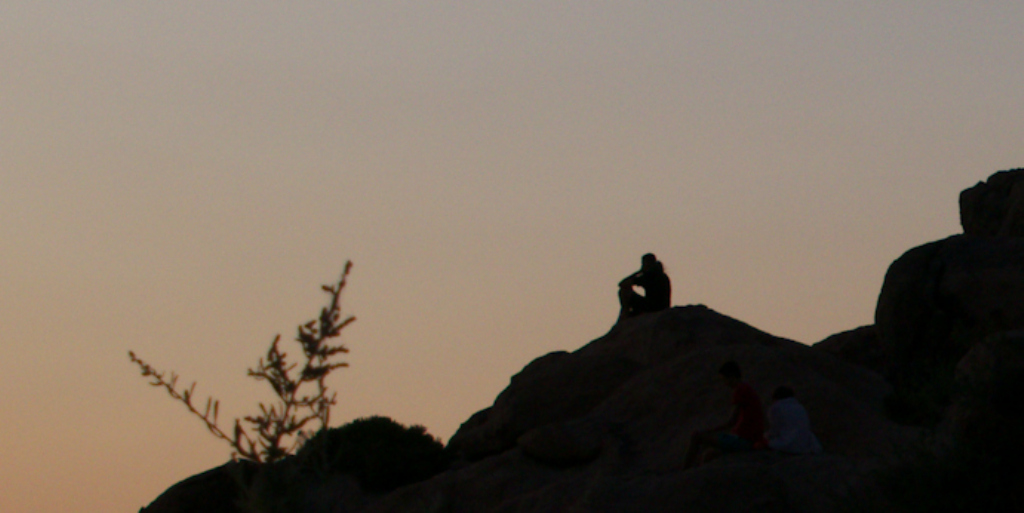
| 93 |
Sep 20 |
Comment |
I like the silhouette effect and I think the simplicity of the photo positively adds to the image. I think it is intriguing that you have allowed just a small bit of detail in the rocks perceivable. I think the soft coloring of the sky also works to excellent benefit.
I think a tighter crop would make the individual stand out more and, in my opinion would make it more interesting. |
Sep 8th |
 |
6 comments - 3 replies for Group 93
|
6 comments - 3 replies Total
|


