|
| Group |
Round |
C/R |
Comment |
Date |
Image |
| 31 |
Feb 21 |
Reply |
Thank you Paul. |
Feb 16th |
| 31 |
Feb 21 |
Reply |
Thank you Ian, I appreciate it. |
Feb 15th |
| 31 |
Feb 21 |
Reply |
Thank you Ella. I agree with your sentiment. |
Feb 12th |
| 31 |
Feb 21 |
Reply |
Thank you John, I appreciate it. |
Feb 10th |
| 31 |
Feb 21 |
Reply |
Thank you Peter, I will see what I can do. Definitely will need to use a very small brush. |
Feb 9th |
| 31 |
Feb 21 |
Reply |
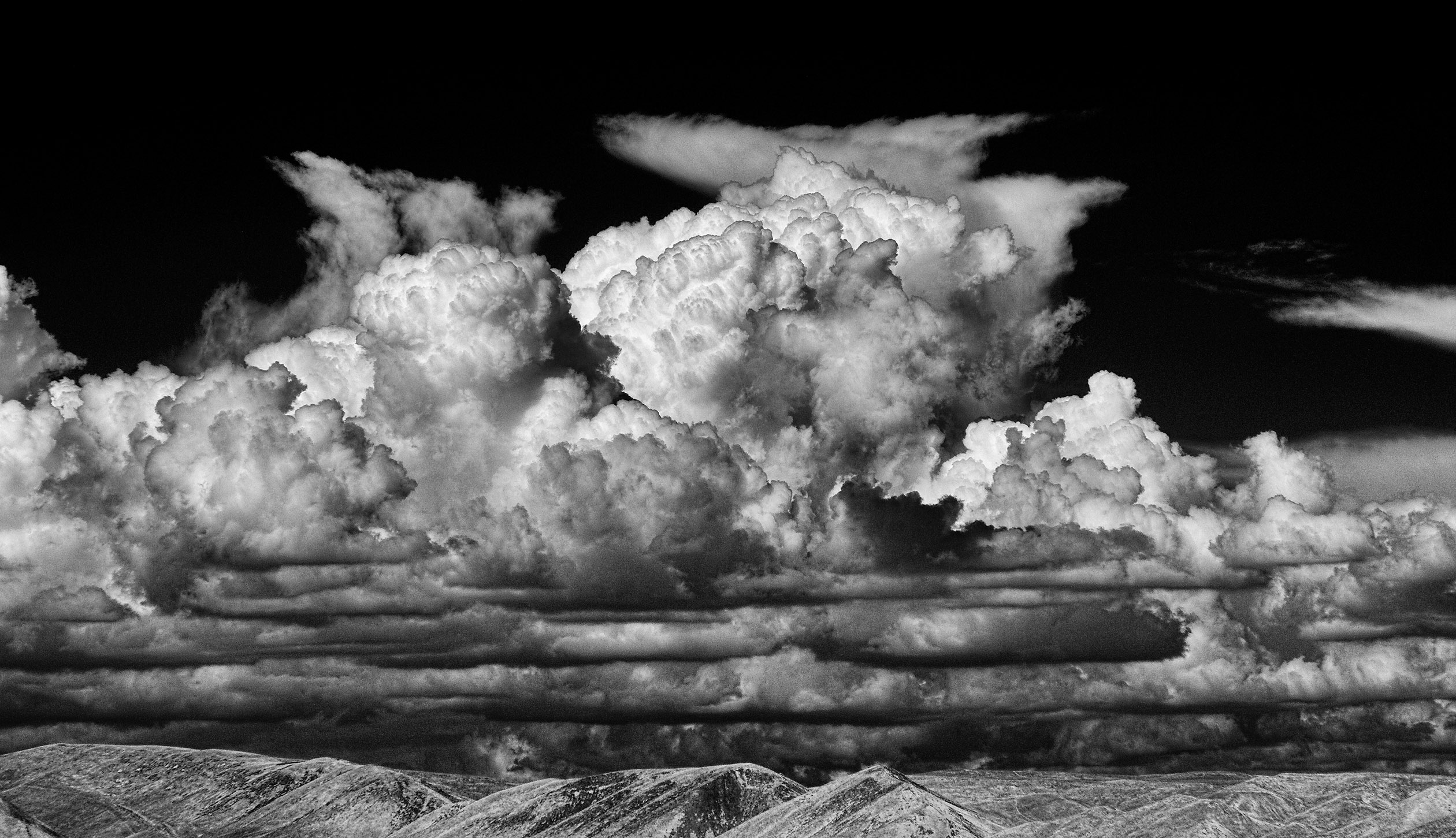
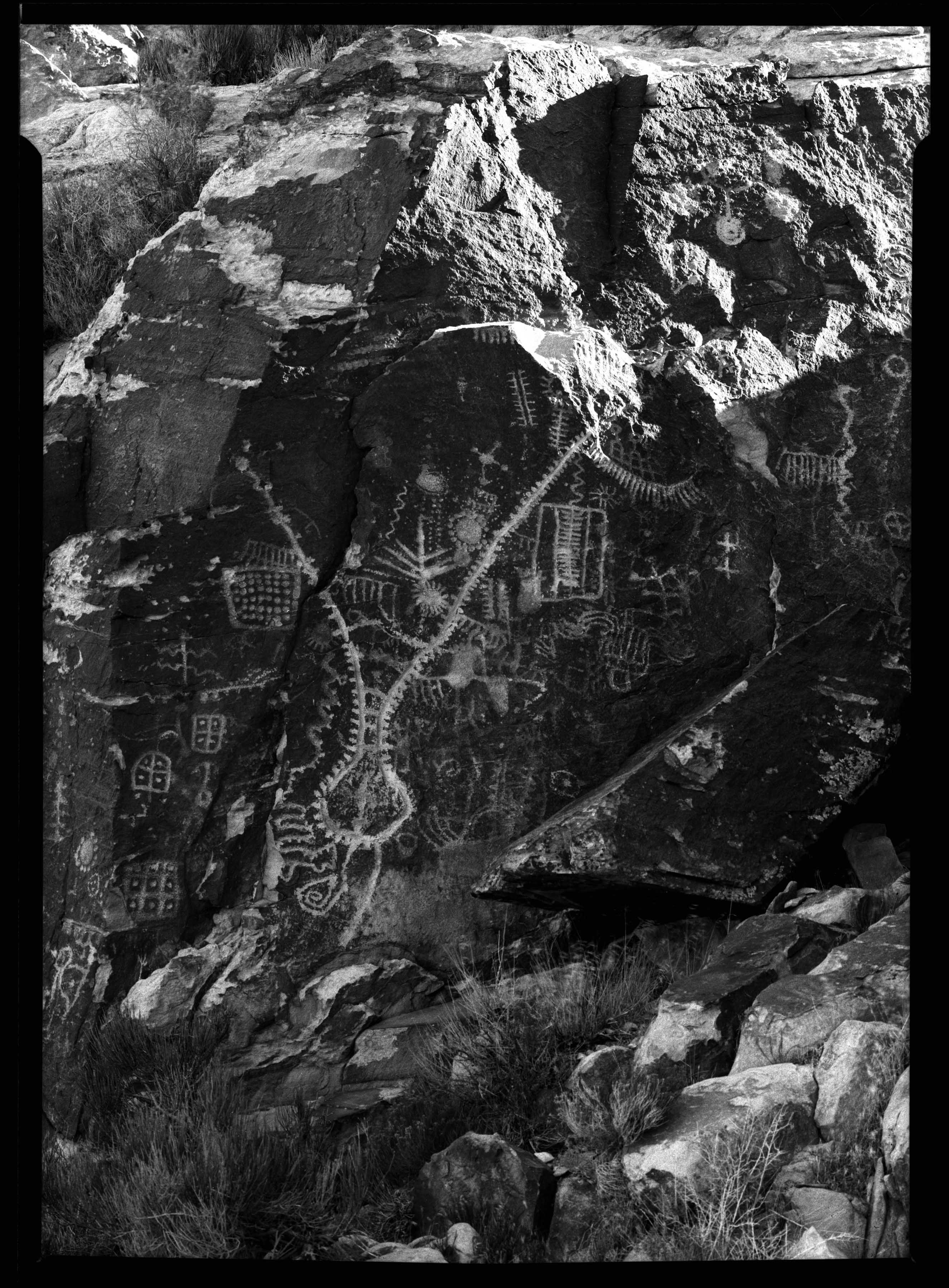
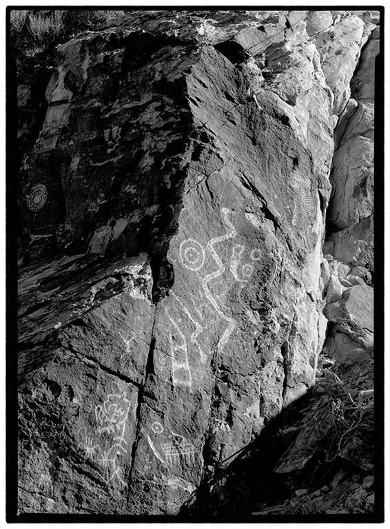
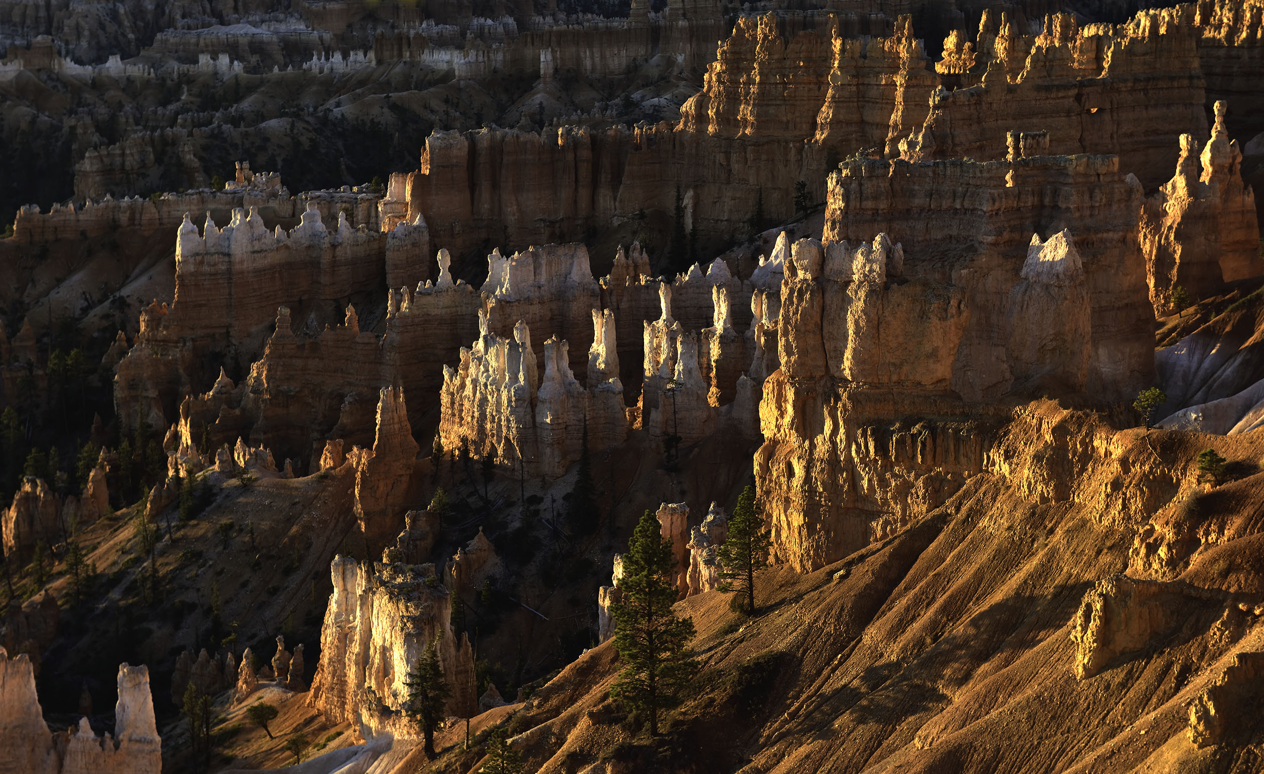
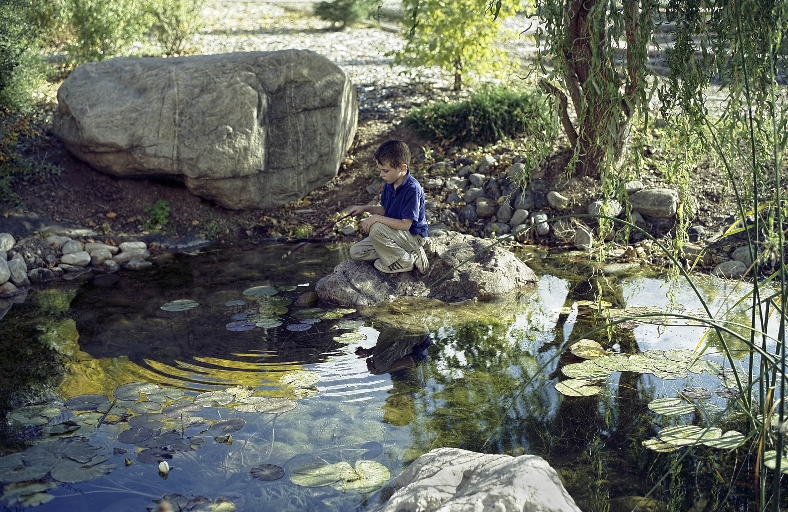
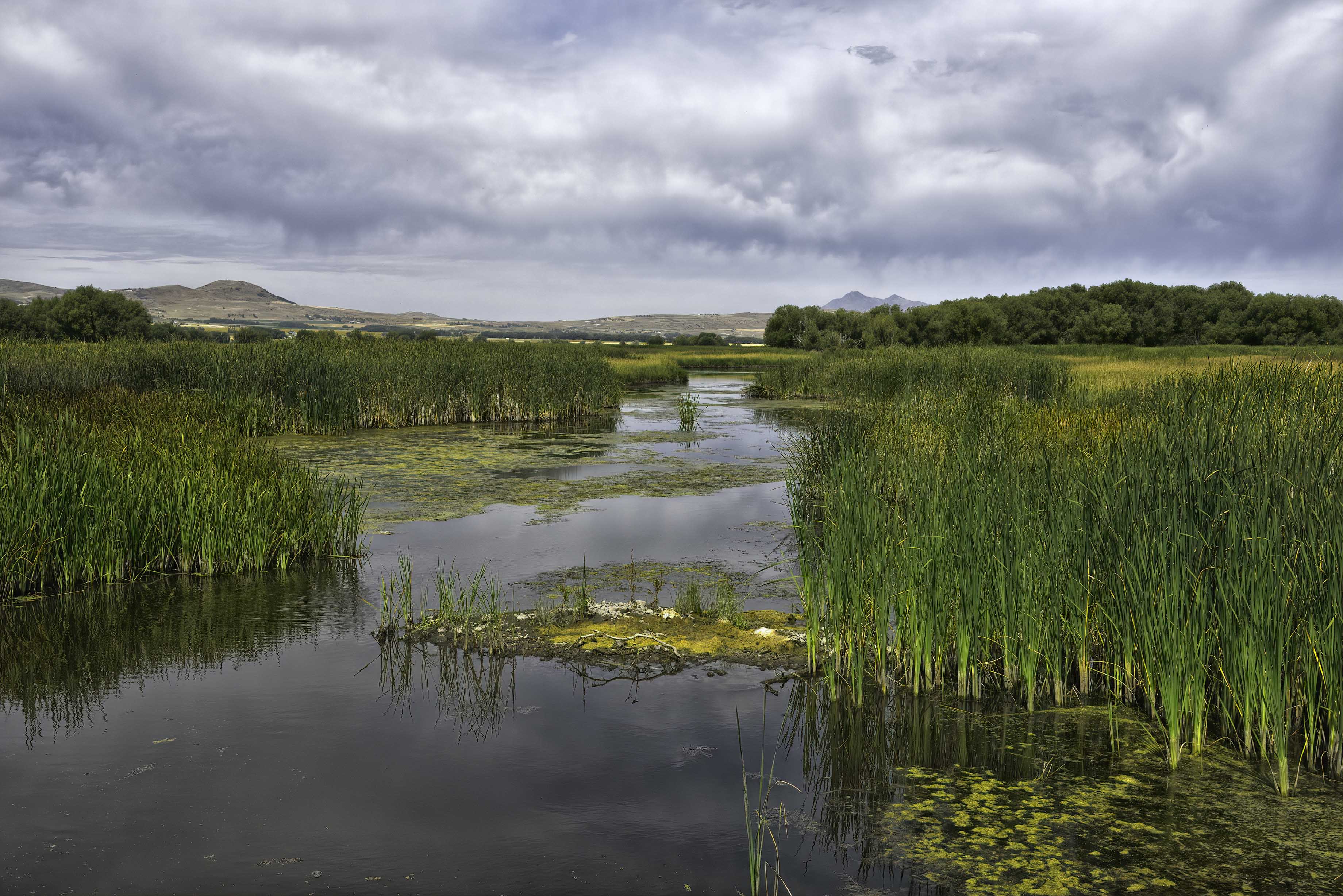
Thank you Ed. The main emphasis is on what I would describe as structure and form. Do the shadows and texture along with line make a good composition? Is the image flat or does it draw the eye in and lead the eye through the image? Is there enough detail in the image to provide a sense of scale? |
Feb 7th |
0 comments - 6 replies for Group 31
|
| 93 |
Feb 21 |
Reply |
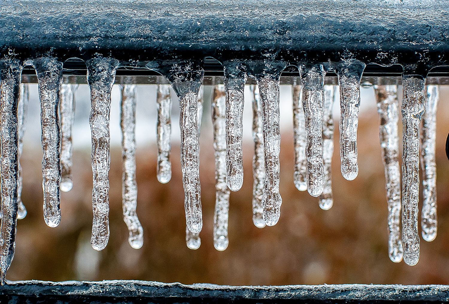
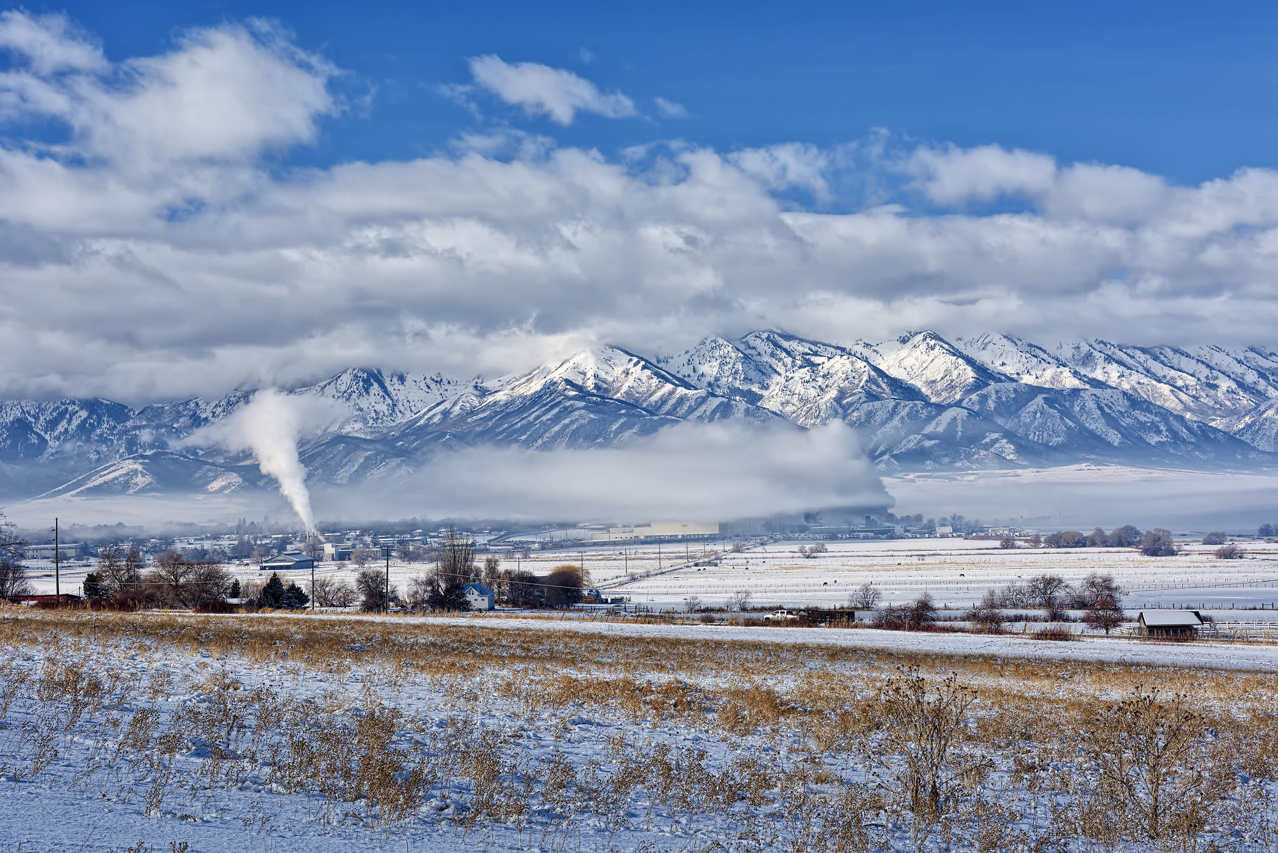
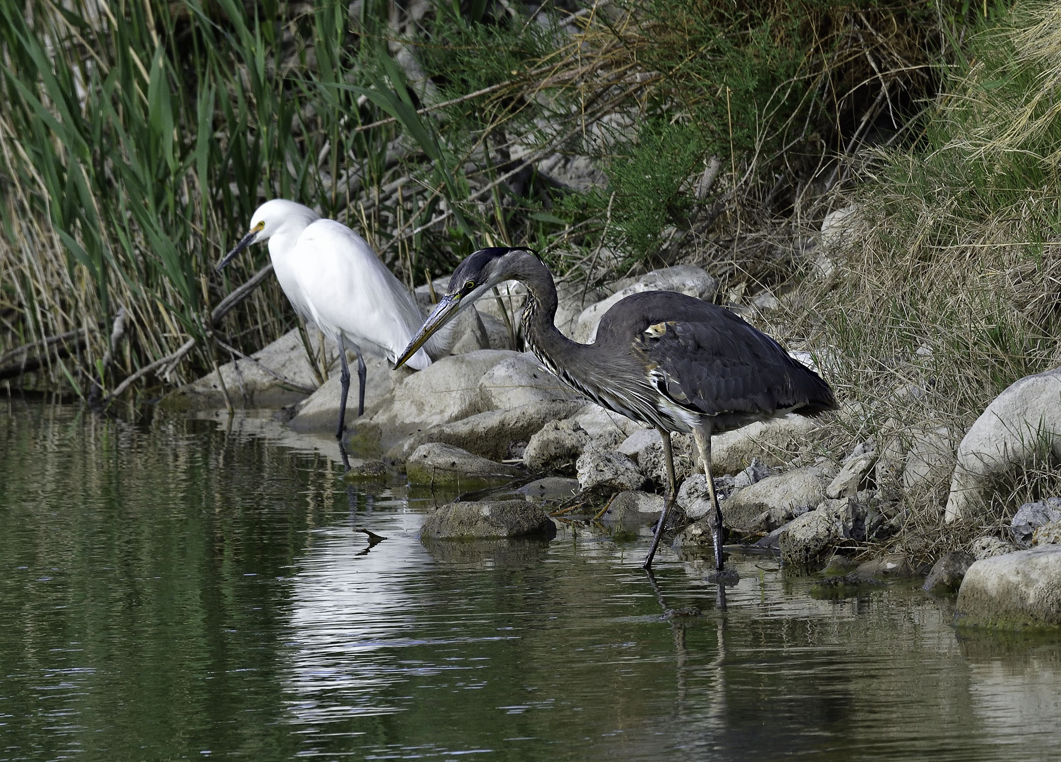
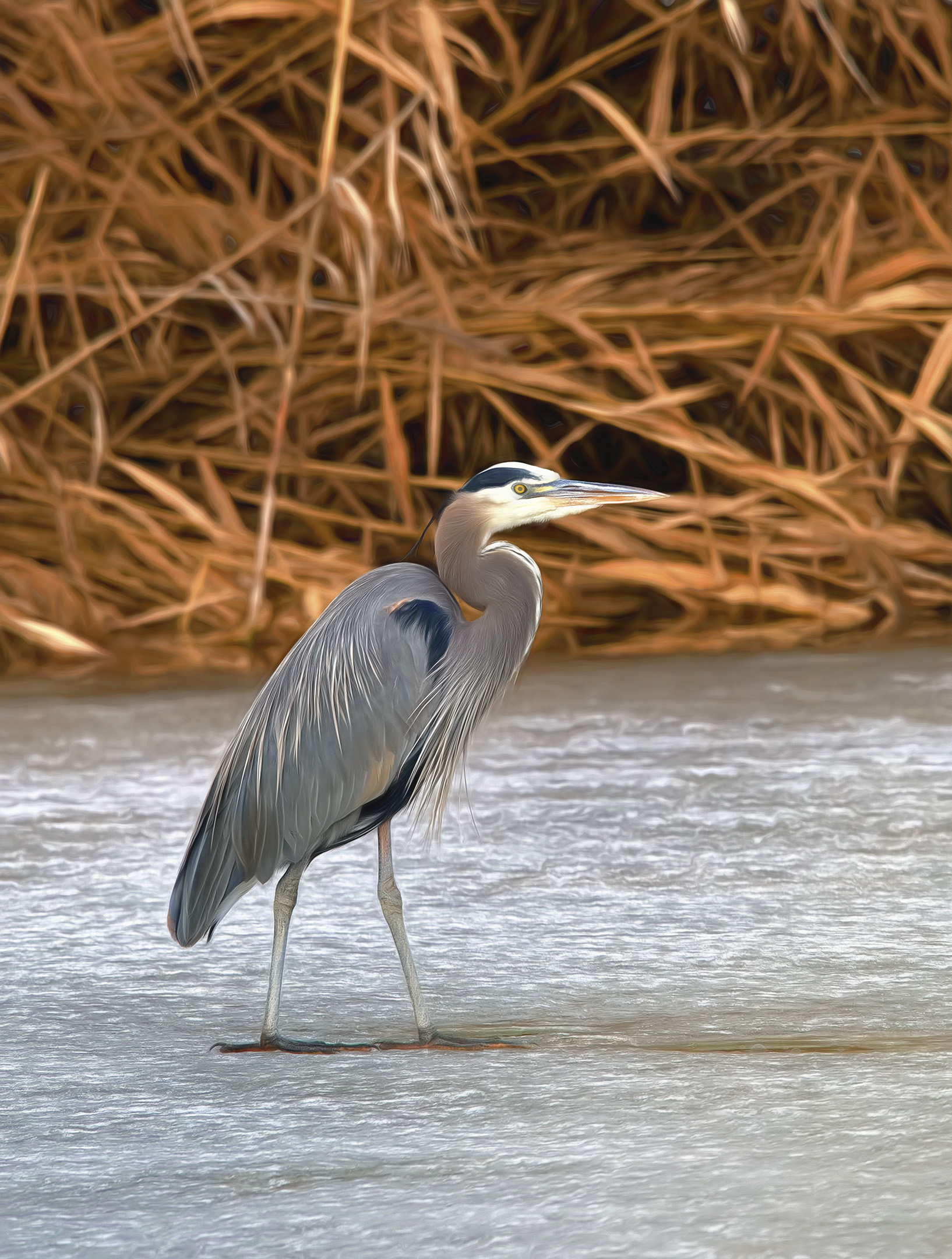
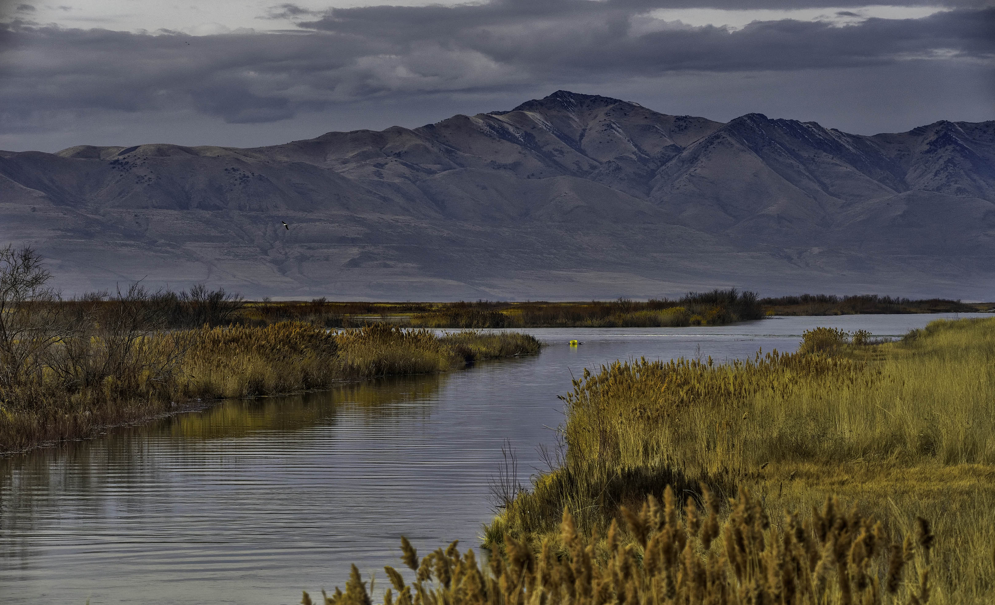
Thanks Mark, I appreciate it. Here in northern Utah winter is cold and rarely gets above freezing. The Bear River Migratory Bird refuge where this image was taken is only about 20 miles south of the Idaho border, therefore the ice. The "effect" that you mention was in using Topaz Impression as a separate layer and reducing its opacity before merging the layers together. What sets Topaz Impression apart from other plugins is that it is designed to produce a "painterly" effect reminiscent of various impressionist painters. On this occasion I choose a Cezanne filter and adjusted its various parameters before reducing the opacity and blending the various layers. Another idea in use comes from Harold Davis and his book "The Photographer's Black and White Handbook" where he creates B&W HDR prints. Almost all of his layer modifications come in opposing pairs - such as a sharpen layer followed by a blurring layer before blending the layers. For this specific image I used both Topaz Denoise and Topaz Sharpen to make the edges and subsequent definition very pronounced. This was followed by the Cezanne filter (on a separate layer) to produce an effect similar to a soft blur on the edges. The overall effect was to move the Heron visually forward as though I had used a large aperture to reduce the depth of field. You can see the effect best if you look at the wing feathers of both images (when enlarged for viewing details) and comparing them. The individual wing feathers are not very sharp in the final image but the Heron appears sharp in the overall image.
Hope you didn't mind my long winded answer. I am anxious to see your image next month. Welcome to the group. |
Feb 22nd |
| 93 |
Feb 21 |
Reply |
Thank you Ed, I appreciate it. I agree on the white under the eye is overexposed in the original - thus the loss of detail in the chin feathers. |
Feb 22nd |
| 93 |
Feb 21 |
Reply |
Thank you Paul. Glad you like it. |
Feb 3rd |
| 93 |
Feb 21 |
Comment |
I like the final composition. You have made an excellent composite image utilizing the selection and background change. Be careful, making composite images like this can be addicting. |
Feb 1st |
| 93 |
Feb 21 |
Comment |
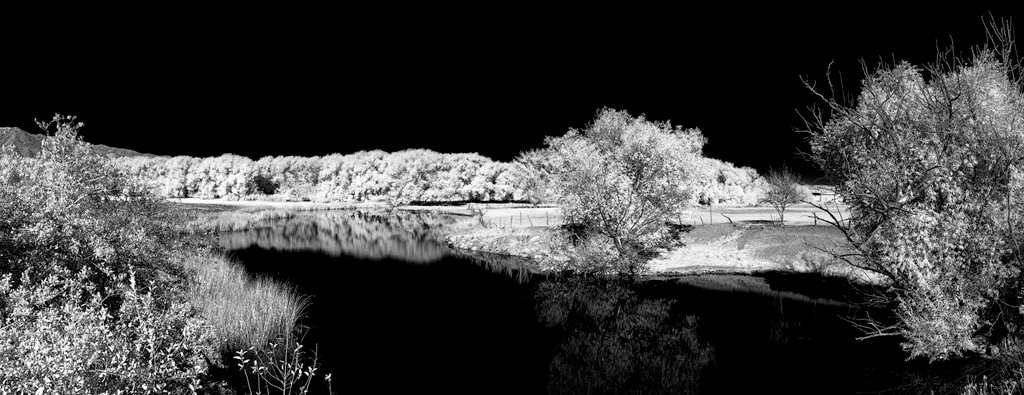
I like how the silhouette of the tree has enough color remaining that it is not solid black. The long exposure really smooths out the water allowing for a soft reflection. To me, this is a very introspective image that calms the mind. Well done. |
Feb 1st |
| 93 |
Feb 21 |
Reply |
Thank you Jeff, I appreciate it. |
Feb 1st |
2 comments - 4 replies for Group 93
|
2 comments - 10 replies Total
|